Tag Archives: Image Processing

Imagen Editor and EditBench: Advancing and evaluating text-guided image inpainting

In the last few years, text-to-image generation research has seen an explosion of breakthroughs (notably, Imagen, Parti, DALL-E 2, etc.) that have naturally permeated into related topics. In particular, text-guided image editing (TGIE) is a practical task that involves editing generated and photographed visuals rather than completely redoing them. Quick, automated, and controllable editing is a convenient solution when recreating visuals would be time-consuming or infeasible (e.g., tweaking objects in vacation photos or perfecting fine-grained details on a cute pup generated from scratch). Further, TGIE represents a substantial opportunity to improve training of foundational models themselves. Multimodal models require diverse data to train properly, and TGIE editing can enable the generation and recombination of high-quality and scalable synthetic data that, perhaps most importantly, can provide methods to optimize the distribution of training data along any given axis.

In “Imagen Editor and EditBench: Advancing and Evaluating Text-Guided Image Inpainting”, to be presented at CVPR 2023, we introduce Imagen Editor, a state-of-the-art solution for the task of masked inpainting — i.e., when a user provides text instructions alongside an overlay or “mask” (usually generated within a drawing-type interface) indicating the area of the image they would like to modify. We also introduce EditBench, a method that gauges the quality of image editing models. EditBench goes beyond the commonly used coarse-grained “does this image match this text” methods, and drills down to various types of attributes, objects, and scenes for a more fine-grained understanding of model performance. In particular, it puts strong emphasis on the faithfulness of image-text alignment without losing sight of image quality.

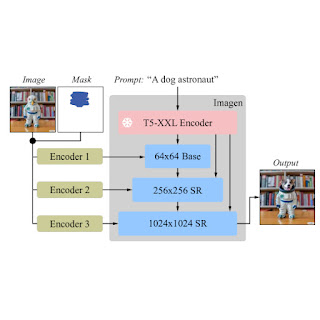
Given an image, a user-defined mask, and a text prompt, Imagen Editor makes localized edits to the designated areas. The model meaningfully incorporates the user’s intent and performs photorealistic edits.


Imagen Editor

Imagen Editor is a diffusion-based model fine-tuned on Imagen for editing. It targets improved representations of linguistic inputs, fine-grained control and high-fidelity outputs. Imagen Editor takes three inputs from the user: 1) the image to be edited, 2) a binary mask to specify the edit region, and 3) a text prompt — all three inputs guide the output samples.

Imagen Editor depends on three core techniques for high-quality text-guided image inpainting. First, unlike prior inpainting models (e.g., Palette, Context Attention, Gated Convolution) that apply random box and stroke masks, Imagen Editor employs an object detector masking policy with an object detector module that produces object masks during training. Object masks are based on detected objects rather than random patches and allow for more principled alignment between edit text prompts and masked regions. Empirically, the method helps the model stave off the prevalent issue of the text prompt being ignored when masked regions are small or only partially cover an object (e.g., CogView2).

Random masks (left) frequently capture background or intersect object boundaries, defining regions that can be plausibly inpainted just from image context alone. Object masks (right) are harder to inpaint from image context alone, encouraging models to rely more on text inputs during training.

Next, during training and inference, Imagen Editor enhances high resolution editing by conditioning on full resolution (1024×1024 in this work), channel-wise concatenation of the input image and the mask (similar to SR3, Palette, and GLIDE). For the base diffusion 64×64 model and the 64×64→256×256 super-resolution models, we apply a parameterized downsampling convolution (e.g., convolution with a stride), which we empirically find to be critical for high fidelity.

Imagen is fine-tuned for image editing. All of the diffusion models, i.e., the base model and super-resolution (SR) models, are conditioned on high-resolution 1024×1024 image and mask inputs. To this end, new convolutional image encoders are introduced.

Finally, at inference we apply classifier-free guidance (CFG) to bias samples to a particular conditioning, in this case, text prompts. CFG interpolates between the text-conditioned and unconditioned model predictions to ensure strong alignment between the generated image and the input text prompt for text-guided image inpainting. We follow Imagen Video and use high guidance weights with guidance oscillation (a guidance schedule that oscillates within a value range of guidance weights). In the base model (the stage-1 64x diffusion), where ensuring strong alignment with text is most critical, we use a guidance weight schedule that oscillates between 1 and 30. We observe that high guidance weights combined with oscillating guidance result in the best trade-off between sample fidelity and text-image alignment.


EditBench

The EditBench dataset for text-guided image inpainting evaluation contains 240 images, with 120 generated and 120 natural images. Generated images are synthesized by Parti and natural images are drawn from the Visual Genome and Open Images datasets. EditBench captures a wide variety of language, image types, and levels of text prompt specificity (i.e., simple, rich, and full captions). Each example consists of (1) a masked input image, (2) an input text prompt, and (3) a high-quality output image used as reference for automatic metrics. To provide insight into the relative strengths and weaknesses of different models, EditBench prompts are designed to test fine-grained details along three categories: (1) attributes (e.g., material, color, shape, size, count); (2) object types (e.g., common, rare, text rendering); and (3) scenes (e.g., indoor, outdoor, realistic, or paintings). To understand how different specifications of prompts affect model performance, we provide three text prompt types: a single-attribute (Mask Simple) or a multi-attribute description of the masked object (Mask Rich) – or an entire image description (Full Image). Mask Rich, especially, probes the models’ ability to handle complex attribute binding and inclusion.

The full image is used as a reference for successful inpainting. The mask covers the target object with a free-form, non-hinting shape. We evaluate Mask Simple, Mask Rich and Full Image prompts, consistent with conventional text-to-image models.

Due to the intrinsic weaknesses in existing automatic evaluation metrics (CLIPScore and CLIP-R-Precision) for TGIE, we hold human evaluation as the gold standard for EditBench. In the section below, we demonstrate how EditBench is applied to model evaluation.


Evaluation

We evaluate the Imagen Editor model — with object masking (IM) and with random masking (IM-RM) — against comparable models, Stable Diffusion (SD) and DALL-E 2 (DL2). Imagen Editor outperforms these models by substantial margins across all EditBench evaluation categories.

For Full Image prompts, single-image human evaluation provides binary answers to confirm if the image matches the caption. For Mask Simple prompts, single-image human evaluation confirms if the object and attribute are properly rendered, and bound correctly (e.g., for a red cat, a white cat on a red table would be an incorrect binding). Side-by-side human evaluation uses Mask Rich prompts only for side-by-side comparisons between IM and each of the other three models (IM-RM, DL2, and SD), and indicates which image matches with the caption better for text-image alignment, and which image is most realistic.

Human evaluation. Full Image prompts elicit annotators’ overall impression of text-image alignment; Mask Simple and Mask Rich check for the correct inclusion of particular attributes, objects and attribute binding.

For single-image human evaluation, IM receives the highest ratings across-the-board (10–13% higher than the 2nd-highest performing model). For the rest, the performance order is IM-RM > DL2 > SD (with 3–6% difference) except for with Mask Simple, where IM-RM falls 4-8% behind. As relatively more semantic content is involved in Full and Mask Rich, we conjecture IM-RM and IM are benefited by the higher performing T5 XXL text encoder.

Single-image human evaluations of text-guided image inpainting on EditBench by prompt type. For Mask Simple and Mask Rich prompts, text-image alignment is correct if the edited image accurately includes every attribute and object specified in the prompt, including the correct attribute binding. Note that due to different evaluation designs, Full vs. Mask-only prompts, results are less directly comparable.

EditBench focuses on fine-grained annotation, so we evaluate models for object and attribute types. For object types, IM leads in all categories, performing 10–11% better than the 2nd-highest performing model in common, rare, and text-rendering.

Single-image human evaluations on EditBench Mask Simple by object type. As a cohort, models are better at object rendering than text-rendering.

For attribute types, IM is rated much higher (13–16%) than the 2nd highest performing model, except for in count, where DL2 is merely 1% behind.

Single-image human evaluations on EditBench Mask Simple by attribute type. Object masking improves adherence to prompt attributes across-the-board (IM vs. IM-RM).

Side-by-side compared with other models one-vs-one, IM leads in text alignment with a substantial margin, being preferred by annotators compared to SD, DL2, and IM-RM.

Side-by-side human evaluation of image realism & text-image alignment on EditBench Mask Rich prompts. For text-image alignment, Imagen Editor is preferred in all comparisons.

Finally, we illustrate a representative side-by-side comparative for all the models. See the paper for more examples.

Example model outputs for Mask Simple vs. Mask Rich prompts. Object masking improves Imagen Editor’s fine-grained adherence to the prompt compared to the same model trained with random masking.


Conclusion

We presented Imagen Editor and EditBench, making significant advancements in text-guided image inpainting and the evaluation thereof. Imagen Editor is a text-guided image inpainting fine-tuned from Imagen. EditBench is a comprehensive systematic benchmark for text-guided image inpainting, evaluating performance across multiple dimensions: attributes, objects, and scenes. Note that due to concerns in relation to responsible AI, we are not releasing Imagen Editor to the public. EditBench on the other hand is released in full for the benefit of the research community.


Acknowledgments

Thanks to Gunjan Baid, Nicole Brichtova, Sara Mahdavi, Kathy Meier-Hellstern, Zarana Parekh, Anusha Ramesh, Tris Warkentin, Austin Waters, and Vijay Vasudevan for their generous support. We give thanks to Igor Karpov, Isabel Kraus-Liang, Raghava Ram Pamidigantam, Mahesh Maddinala, and all the anonymous human annotators for their coordination to complete the human evaluation tasks. We are grateful to Huiwen Chang, Austin Tarango, and Douglas Eck for providing paper feedback. Thanks to Erica Moreira and Victor Gomes for help with resource coordination. Finally, thanks to the authors of DALL-E 2 for giving us permission to use their model outputs for research purposes.

Source: Google AI Blog


HDR+ with Bracketing on Pixel Phones

We're continuously working to improve the Pixel — making it more helpful, more capable, and more fun — with regular updates, such as the recent V8.2 update to the Camera app. One such improvement (launched on Pixel 5 and Pixel 4a 5G in October) is a feature that operates “under the hood”, HDR+ with Bracketing. This feature works by merging images taken with different exposure times to improve image quality (especially in shadows), resulting in more natural colors, improved details and texture, and reduced noise.

Why Are HDR Scenes Hard to Capture?
The original HDR+ burst photography system is the engine behind high-quality mobile photography, which captures a rapid series of deliberately underexposed images, then combines and renders them in a way that preserves detail across the range of tones. But this system had one limitation: scenes with high dynamic range (HDR) like the one below were noisy in the shadows because all images captured are underexposed.

The same photo using HDR+ (red outline) and HDR+ with Bracketing (green outline). While the characteristic HDR+ look remains the same, bracketing improves image quality, especially in shadows, with more natural colors, improved details and texture, and reduced noise.

Capturing HDR scenes is difficult because of the physical constraints of image sensors combined with limited signal in the shadows. We can correctly expose either the shadows or the highlights, but not both at the same time.

The same scene shot with different exposure settings and tonemapped to similar overall brightness. Left/Top: Exposure set for the highlights. The bright blue sky is preserved, but the shadows are very noisy. Right/Bottom: Exposure set for the shadows. Noise in the shadows is reduced, but the sky is clipped (white).

Photographers sometimes work around these limitations by taking two different exposures and combining them. This approach, known as exposure bracketing, can deliver the best of both worlds, but it is time-consuming to do by hand. It is also challenging in computational photography because it requires:

  1. Capturing additional long exposure frames while maintaining the fast, predictable capture experience of the Pixel camera.
  2. Taking advantage of long exposure frames while avoiding ghosting artifacts caused by motion between frames.

To avoid these challenges, the original HDR+ system used a different approach to handle high dynamic range scenes.

The Limits of HDR+
The capture strategy used by HDR+ is based on underexposure, which avoids loss of detail in the highlights. While this strategy comes at the expense of noise in the shadows, HDR+ offsets the increased noise through the use of burst photography.

Using bursts to improve image quality. HDR+ starts from a burst of full-resolution raw images (left). Depending on conditions, between 2 and 15 images are aligned and merged into a computational raw image (middle). The merged image has reduced noise and increased dynamic range, leading to a higher quality final result (right).

This approach works well for scenes with moderate dynamic range, but breaks down for HDR scenes. To understand why, we need to take a closer look at how two types of noise get into an image.

Noise in Burst Photography
One important type of noise is called shot noise, which depends only on the total amount of light captured — the sum of N frames, each with E seconds of exposure time has the same amount of shot noise as a single frame exposed for N × E seconds. If this were the only type of noise present in captured images, burst photography would be as efficient as taking longer exposures. Unfortunately, a second type of noise, read noise, is introduced by the sensor every time a frame is captured. Read noise doesn’t depend on the amount of light captured but instead depends on the number of frames taken — that is, with each frame taken, an additional fixed amount of read noise is added.

This is why using burst photography to reduce total noise isn’t as efficient as simply taking longer exposures: taking multiple frames can reduce the effect of shot noise, but will also increase read noise. Even though read noise increases with the number of frames, it is still possible to reduce the overall noisiness with burst photography, but it becomes less efficient. If one were to break a long exposure into N shorter exposures, the ratio of signal to noise in the final image would be lower because of the additional read noise. In this case, to get back to the signal-to-noise ratio in the single long exposure, one would need to merge N2 short-exposure frames. In the example below, if a long exposure were divided into 12 short exposures, we'd have to capture 144 (12 × 12) short frames to match the signal-to-noise ratio in the shadows! Capturing and processing this many frames would be much more time consuming — burst capture and processing could take over a minute and result in a poor user experience. Instead, with bracketing one can capture both short and long exposures — combining highlight protection and noise reduction.

Left: The result of merging 12 short-exposure frames in Night Sight mode. Right: A single frame whose exposure time is 12 times longer than an individual short exposure. The longer exposure has significantly less noise in the shadows but sacrifices the highlights.

Solving with Bracketing
While the challenges of bracketing prevented the original HDR+ system from using it, incremental improvements since then, plus a recent concentrated effort, have made it possible in the Camera app. To start, adding bracketing to HDR+ required redesigning the capture strategy. Capturing is complicated by zero shutter lag (ZSL), which underpins the fast capture experience on Pixel. With ZSL, the frames displayed in the viewfinder before the shutter press are the frames we use for HDR+ burst merging. For bracketing, we capture an additional long exposure frame after the shutter press, which is not shown in the viewfinder. Note that holding the camera still for half a second after the shutter press to accommodate the long exposure can help improve image quality, even with a typical amount of handshake.

Capture strategy. Top: The original HDR+ method captures short exposures before the shutter press, six in this example. Bottom: HDR+ with Bracketing captures five short exposures before the shutter press and one long exposure after the shutter press.

For Night Sight, the capture strategy isn't constrained by the viewfinder — because all frames are captured after the shutter press while the viewfinder is stopped, this mode easily accommodates capturing longer exposure frames. In this case, we capture three long exposures to further reduce noise.

Capture strategy for Night Sight. Top: The original Night Sight captured 15 short exposure frames. Bottom: Night Sight with bracketing captures 12 short and 3 long exposures.

The Merging Algorithm
When merging bracketed shots, we choose one of the short frames as the reference frame to avoid potentially clipped highlights and motion blur. All other frames are aligned to this frame before they are merged. This introduces a challenge — for complex scene motion or occluded regions, it is impossible to find exactly matching regions and a naïve merge algorithm would produce ghosting artifacts in these cases.

Left: Ghosting artifacts are visible around the silhouette of a moving person, when deghosting is disabled.
Right: Robust merging produces a clean image.

To address this, we designed a new spatial merge algorithm, similar to the one used for Super Res Zoom, that decides per pixel whether image content should be merged or not. This deghosting is more complicated for frames with different exposures. Long exposure frames have different noise characteristics, clipped highlights, and different amounts of motion blur, which makes comparisons with the short exposure reference frame more difficult. In addition, ghosting artifacts are more visible in bracketed shots, because noise that would otherwise mask these errors is reduced. Despite those challenges, our algorithm is as robust to these issues as the original HDR+ and Super Res Zoom and doesn’t produce ghosting artifacts. At the same time, it merges images 40% faster than its predecessors. Because it merges RAW images early in the photographic pipeline, we were able to achieve all of those benefits while keeping the rest of processing and the signature HDR+ look unchanged. Furthermore, users who prefer to use computational RAW images can take advantage of those image quality and performance improvements.

Bracketing on Pixel
HDR+ with Bracketing is available to users of Pixel 4a (5G) and 5 in the default camera, as well as in Night Sight and Portrait modes. For users of Pixel 4 and 4a, the Google Camera app supports bracketing in Night Sight mode. No user interaction is needed to activate HDR+ with Bracketing — depending on the dynamic range of the scene, and the presence of motion, HDR+ with bracketing chooses the best exposures to maximize image quality (examples).

Acknowledgements
HDR+ with Bracketing is the result of a collaboration across several teams at Google. The project would not have been possible without the joint efforts of Sam Hasinoff, Dillon Sharlet, Kiran Murthy, Mike Milne, Andy Radin, Nicholas Wilson, Navin Sarma‎, Gabriel Nava, Emily To, Sushil Nath, Alexander Schiffhauer, Isaac Reynolds, Bill Strathearn, Marius Renn, Alex Hong, Jose Ricardo Lima, Bob Hung, Ying Chen Lou, Joy Hsu, Blade Chiu, David Massoud, Jean Hsu, Ellie Yang, and Marc Levoy.

Source: Google AI Blog


Ultra-High Resolution Image Analysis with Mesh-TensorFlow


Deep neural network models form the backbone of most state-of-the-art image analysis and natural language processing algorithms. With the recent development of large-scale deep learning techniques such as data and model parallelism, large convolutional neural network (CNN) models can be trained on datasets of millions of images in minutes. However, applying a CNN model on ultra-high resolution images, such as 3D computed tomography (CT) images that can have up to 108 pixels, remains challenging. With existing techniques, a processor still needs to host a minimum of 32GB of partial, intermediate data, whereas individual GPUs or TPUs typically have only 12-32GB memory. A typical solution is to process image patches separately from one another, which leads to complicated implementation and sub-optimal performance due to information loss.

In “High Resolution Medical Image Analysis with Spatial Partitioning”, a collaboration with the Mayo Clinic, we push the boundary of massive data and model parallelism through use of the Mesh-TensorFlow framework, and demonstrate how this technique can be used for ultra-high resolution image analysis without compromising input resolution for practical feasibility. We implement a halo exchange algorithm to handle convolutional operations across spatial partitions in order to preserve relationships between neighboring partitions. As a result, we are able to train a 3D U-Net on ultra-high resolution images (3D images with 512 pixels in each dimension), with 256-way model parallelism. We have additionally open-sourced our Mesh-TensorFlow-based framework for both GPUs and TPUs for use by the broader research community.

Data and Model Parallelism with Mesh-TensorFlow
Our implementation is based on the Mesh-TensorFlow framework for easy and efficient data and model parallelism, which enables users to split tensors across a mesh of devices according to the user defined image layout. For example, users may provide the mesh of computational devices as 16 rows by 16 columns for a total of 256 processors, with two cores per processor. They then define the layout to map the spatial dimension x of their image to processor rows, map spatial dimension y to processor columns, and map the batch dimension (i.e., the number of image segments to be processed simultaneously) to cores. The partitioning and distributing of a training batch is implemented by Mesh-TensorFlow at the tensor level, without users worrying about implementation details. The figure below shows the concept with a simplified example:
Spatial partitioning of ultra-high resolution images, in this case, a 3D CT scan.
Spatial Partitioning with Halo Exchange
A convolution operation executed on an image often applies a filter that extends beyond the edge of the frame. While there are ways to address this when dealing with a single image, standard approaches do not take into account that for segmented images information beyond the frame edge may still be relevant. In order to yield accurate results, convolution operations on an image that has been spatially partitioned and redistributed across processors must take into account each image segment’s neighbors.

One potential solution might be to include overlapping regions in each spatial partition. However, since there are very likely many subsequent convolutional layers and each of them introduces overlap, the overlap will be relatively large — in fact, in most cases, the overlap could cover the entire image. Moreover, all overlapping regions must be included from the start, at the very first layer, which may run into the memory constraints that we are trying to resolve.

Our solution is totally different: we implemented a data communication step called halo exchange. Before every convolution operation, each spatial partition exchanges (receives and sends) margins with its neighbors, effectively expanding the image segment at its margins. The convolution operations are then applied locally on each device. This ensures that the result of the convolutions for the whole of the image remain identical with or without spatial partitioning.
Halo exchange ensures that cross-partition convolutions handle image segment edges correctly.
Proof of Concept - Segmentation of Liver Tumor CT Scans
We then applied this framework to the task of segmenting 3D CT scans of liver tumors (LiTS benchmark). For the evaluation metric, we use the Sørensen–Dice coefficient, which ranges from 0.0 to 1.0 with a score of 0 indicating no overlap between segmented and ground truth tumor regions and 1 indicating a perfect match. The results shown below demonstrate that higher data resolution yields better results. Although the return tends to diminish when using the full 5123 resolution (512 pixels in each of x, y, z directions), this work does open the possibility for ultra-high resolution image analysis.
Higher resolution data yields better segmentation accuracy.
Conclusion
Existing data and model parallelism techniques enabled the training of neural networks with billions of parameters, but cannot handle input images above ~108 pixels. In this work, we explore the applicability of CNNs on these ultra-high resolution images, and demonstrate promising results. Our Mesh-TensorFlow-based implementation works on both GPUs and TPUs, and with the released code, we hope to provide a possible solution for some previously impossible tasks.

Acknowledgments
We thank our collaborators Panagiotis Korfiatis, Ph.D., and Daniel Blezek, Ph.D., from Mayo Clinic for providing the initial 3D U-net model and training data. Thank you Greg Mikels for the POC work with Mayo Clinic. Special thanks to all the co-authors of the paper especially Noam Shazeer.

Source: Google AI Blog


Recursive Sketches for Modular Deep Learning


Much of classical machine learning (ML) focuses on utilizing available data to make more accurate predictions. More recently, researchers have considered other important objectives, such as how to design algorithms to be small, efficient, and robust. With these goals in mind, a natural research objective is the design of a system on top of neural networks that efficiently stores information encoded within—in other words, a mechanism to compute a succinct summary (a “sketch”) of how a complex deep network processes its inputs. Sketching is a rich field of study that dates back to the foundational work of Alon, Matias, and Szegedy, which can enable neural networks to efficiently summarize information about their inputs.

For example: Imagine stepping into a room and briefly viewing the objects within. Modern machine learning is excellent at answering immediate questions, known at training time, about this scene: “Is there a cat? How big is said cat?” Now, suppose we view this room every day over the course of a year. People can reminisce about the times they saw the room: “How often did the room contain a cat? Was it usually morning or night when we saw the room?”. However, can one design systems that are also capable of efficiently answering such memory-based questions even if they are unknown at training time?

In “Recursive Sketches for Modular Deep Learning”, recently presented at ICML 2019, we explore how to succinctly summarize how a machine learning model understands its input. We do this by augmenting an existing (already trained) machine learning model with “sketches” of its computation, using them to efficiently answer memory-based questions—for example, image-to-image-similarity and summary statistics—despite the fact that they take up much less memory than storing the entire original computation.

Basic Sketching Algorithms
In general, sketching algorithms take a vector x and produce an output sketch vector that behaves like x but whose storage cost is much smaller. The fact that the storage cost is much smaller allows one to succinctly store information about the network, which is critical for efficiently answering memory-based questions. In the simplest case, a linear sketch x is given by the matrix-vector product Ax where A is a wide matrix, i.e., the number of columns is equal to the original dimension of x and the number of rows is equal to the new reduced dimension. Such methods have led to a variety of efficient algorithms for basic tasks on massive datasets, such as estimating fundamental statistics (e.g., histogram, quantiles and interquartile range), finding popular items (known as frequent elements), as well as estimating the number of distinct elements (known as support size) and the related tasks of norms and entropy estimation.
A simple method to sketch the vector x is to multiply it by a wide matrix A to produce a lower-dimensional vector y.
This basic approach works well in the relatively simple case of linear regression, where it is possible to identify important data dimensions simply by the magnitude of weights (under the common assumption that they have uniform variance). However, many modern machine learning models are actually deep neural networks and are based on high-dimensional embeddings (such as Word2Vec, Image Embeddings, Glove, DeepWalk and BERT), which makes the task of summarizing the operation of the model on the input much more difficult. However, a large subset of these more complex networks are modular, allowing us to generate accurate sketches of their behavior, in spite of their complexity.

Neural Network Modularity
A modular deep network consists of several independent neural networks (modules) that only communicate via one’s output serving as another’s input. This concept has inspired several practical architectures, including Neural Modular Networks, Capsule Neural Networks and PathNet. It is also possible to split other canonical architectures to view them as modular networks and apply our approach. For example, convolutional neural networks (CNNs) are traditionally understood to behave in a modular fashion; they detect basic concepts and attributes in their lower layers and build up to detecting more complex objects in their higher layers. In this view, the convolution kernels correspond to modules. A cartoon depiction of a modular network is given below.
This is a cartoon depiction of a modular network for image processing. Data flows from the bottom of the figure to the top through the modules represented with blue boxes. Note that modules in the lower layers correspond to basic objects, such as edges in an image, while modules in upper layers correspond to more complex objects, like humans or cats. Also notice that in this imaginary modular network, the output of the face module is generic enough to be used by both the human and cat modules.
Sketch Requirements
To optimize our approach for these modular networks, we identified several desired properties that a network sketch should satisfy:
  • Sketch-to-Sketch Similarity: The sketches of two unrelated network operations (either in terms of the present modules or in terms of the attribute vectors) should be very different; on the other hand, the sketches of two similar network operations should be very close.
  • Attribute Recovery: The attribute vector, e.g., the activations of any node of the graph can be approximately recovered from the top-level sketch.
  • Summary Statistics: If there are multiple similar objects, we can recover summary statistics about them. For example, if an image has multiple cats, we can count how many there are. Note that we want to do this without knowing the questions ahead of time.
  • Graceful Erasure: Erasing a suffix of the top-level sketch maintains the above properties (but would smoothly increase the error).
  • Network Recovery: Given sufficiently many (input, sketch) pairs, the wiring of the edges of the network as well as the sketch function can be approximately recovered.
This is a 2D cartoon depiction of the sketch-to-sketch similarity property. Each vector represents a sketch and related sketches are more likely to cluster together.
The Sketching Mechanism
The sketching mechanism we propose can be applied to a pre-trained modular network. It produces a single top-level sketch summarizing the operation of this network, simultaneously satisfying all of the desired properties above. To understand how it does this, it helps to first consider a one-layer network. In this case, we ensure that all the information pertaining to a specific node is “packed” into two separate subspaces, one corresponding to the node itself and one corresponding to its associated module. Using suitable projections, the first subspace lets us recover the attributes of the node whereas the second subspace facilitates quick estimates of summary statistics. Both subspaces help enforce the aforementioned sketch-to-sketch similarity property. We demonstrate that these properties hold if all the involved subspaces are chosen independently at random.

Of course, extra care has to be taken when extending this idea to networks with more than one layer—which leads to our recursive sketching mechanism. Due to their recursive nature, these sketches can be “unrolled” to identify sub-components, capturing even complicated network structures. Finally, we utilize a dictionary learning algorithm tailored to our setup to prove that the random subspaces making up the sketching mechanism together with the network architecture can be recovered from a sufficiently large number of (input, sketch) pairs.

Future Directions
The question of succinctly summarizing the operation of a network seems to be closely related to that of model interpretability. It would be interesting to investigate whether ideas from the sketching literature can be applied to this domain. Our sketches could also be organized in a repository to implicitly form a “knowledge graph”, allowing patterns to be identified and quickly retrieved. Moreover, our sketching mechanism allows for seamlessly adding new modules to the sketch repository—it would be interesting to explore whether this feature can have applications to architecture search and evolving network topologies. Finally, our sketches can be viewed as a way of organizing previously encountered information in memory, e.g., images that share the same modules or attributes would share subcomponents of their sketches. This, on a very high level, is similar to the way humans use prior knowledge to recognize objects and generalize to unencountered situations.

Acknowledgements
This work was the joint effort of Badih Ghazi, Rina Panigrahy and Joshua R. Wang.

Source: Google AI Blog


An Inside Look at Google Earth Timelapse


Six years ago, we first introduced Google Earth Timelapse, a global, zoomable time-lapse video that lets anyone explore our changing planet’s surface—from the global scale to the local scale. Earth Timelapse consists of 83 million multi-resolution overlapping video tiles, which are made interactively explorable through the open-source Time Machine client software developed at Carnegie Mellon University’s CREATE Lab. At its core, Google Earth Timelapse is an example of how organizing information can make it more accessible and useful, turning petabytes of satellite imagery into an interactive experience that shows the dynamic changes occurring across space and time.
In April, we introduced several updates to Timelapse, including two additional years of imagery to the time-series visualization, which now spans from 1984 to 2018, with visual upgrades that make exploring more accessible and intuitive. We are especially excited that this update includes support for mobile and tablet devices, which are quickly overtaking desktop computers as the dominant source of app traffic.

Building the Global Visualization
Making a planetary-sized time-lapse video required a significant amount of pixel crunching in Earth Engine, Google's cloud platform for petabyte-scale geospatial analysis. The new release followed a process similar to what we did in 2013, but at a significantly greater scale—turning 15 million satellite images acquired over the last three and a half decades from the USGS/NASA Landsat and European Sentinel programs into 35 cloud-free 4-terapixel images of the planet—one for each year from 1984 to 2018.
At its native resolution, the Timelapse visualization is a 4 terapixel video (that's four trillion pixels), which would take about 12 days to download on a 95 Mb/s internet connection. Most computers would have difficulty playing a video of this size, let alone with an interactive, zoomable interface. The problem is even more severe for a mobile device.

A solution was pioneered by Google Maps in 2004 with the map pyramiding technique. Before that time, navigating a map required the use of directional arrows to pan and zoom, with each step requiring the page to reload. The map pyramiding technique assembles the full map image displayed on-screen from tens of small 256x256 pixel non-overlapping image tiles in an array, with new tiles fetched as needed at an appropriate resolution as the user pans and zooms across the map.
A traditional Mercator map pyramid contains non-overlapping image tiles.
This works very well for maps made of static images, but less so for pyramids of video tiles, such as those used by Timelapse, since it requires a web browser to keep up to 16 videos in sync while interacting with the visualization. The solution is embodied in CREATE Lab’s open source Time Machine software: create much larger video tiles that can cover the entire screen and only show one whole-screen tile at a time. The tiles create a pyramid, where sibling tiles overlap with their neighbors to provide a seamless transition between tiles while panning and zooming. Though the overlapping tiles require the use of about 16x more videos, this pyramid structure enables the use of Timelapse on mobile devices by minimizing the amount of data required for visualization.

In our newest release, the global video pyramid consists of 83 million videos across 13 zoom levels, which required about 2 million CPU hours distributed across thousands of machines in Google Cloud to generate.
Earth Timelapse uses a pyramid of overlapping video tiles.
Time Travel, Wherever You Are
Prior to April's update, ~30% of visitors to the Timelapse visualization were on mobile devices and didn't actually experience the visualization; instead they saw a YouTube playlist of locations in Timelapse. Until recently, the hardware and CPUs for phones and tablets could not decode videos fast enough without significant delays when someone attempted to zoom in or pan across a video, making mobile exploration unpleasant, if not impossible. In addition, in order for the visualization to be smooth as you pan and zoom, each video that is loaded must sync to the previously playing video and begin playing automatically. But, until only recently, mobile browser vendors had disabled video autoplay at the browser level for bandwidth reasons.

Now that mobile browser vendors have re-enabled video autoplay, we are able to take advantage of current mobile hardware and CPU capabilities, while leveraging the pyramid mapping technique’s efficient use of data, to enable Timelapse on mobile.

Redesigning Timelapse for Exploration Across Devices
Timelapse is a tool for exploration, so we designed for immersiveness, devoting as much real estate as possible to the map. On the other hand, it's not just a map, but a map of videos. So we kept controls visible, like pausing and restarting the timeline or choosing highlights, by leveraging Material Design with simple, clean lines and clear focal areas.
Navigate with Google Maps using the new "Maps Mode" toggle.
To explore, you need to know where you are or where somewhere else is, so the new interface includes a new "Maps Mode" toggle that lets the user navigate with Google Maps. We also built in scalability to the timeline element of the UI, so that new features added in the future, such as lengthening the time-lapse or adding options for different time increments, won’t break the design. The timeline also allows the user to go backwards in time—an interesting way to compare the present with the past.

For desktop browsers supporting WebGL, we also added a new WebGL viewer to the open source project, which loads and synchronizes multiple videos to fill the screen at optimal resolution. The aesthetic improvement of this is nontrivial, with >4x better resolution.

What's next
We're excited about the abundance of freely available, openly licensed satellite imagery and remote sensing data available, enabling new visualizations across time, space, and the visual and non-visual spectrum. We've found it's often the data combined with supplemental layers, such as the World Database on Protected Areas (WDPA) boundaries, that can spark new insights. For example, seeing the visual connection between declining home ownership and shifts in the city of Pittsburgh's racial makeup tells a story about inequality that numbers on a page simply cannot. Visual evidence can transcend language and cultural barriers and, we hope, generate productive conversations about our global challenges.

Acknowledgements
Randy Sargent, Senior Systems Scientist, Carnegie Mellon University CREATE Lab and the Google Earth Engine team

Source: Google AI Blog


See Better and Further with Super Res Zoom on the Pixel 3


Digital zoom using algorithms (rather than lenses) has long been the “ugly duckling” of mobile device cameras. As compared to the optical zoom capabilities of DSLR cameras, the quality of digitally zoomed images has not been competitive, and conventional wisdom is that the complex optics and mechanisms of larger cameras can't be replaced with much more compact mobile device cameras and clever algorithms.

With the new Super Res Zoom feature on the Pixel 3, we are challenging that notion.

The Super Res Zoom technology in Pixel 3 is different and better than any previous digital zoom technique based on upscaling a crop of a single image, because we merge many frames directly onto a higher resolution picture. This results in greatly improved detail that is roughly competitive with the 2x optical zoom lenses on many other smartphones. Super Res Zoom means that if you pinch-zoom before pressing the shutter, you’ll get a lot more details in your picture than if you crop afterwards.
Crops of 2x Zoom: Pixel 2, 2017 vs. Super Res Zoom on the Pixel 3, 2018.
The Challenges of Digital Zoom
Digital zoom is tough because a good algorithm is expected to start with a lower resolution image and "reconstruct" missing details reliably — with typical digital zoom a small crop of a single image is scaled up to produce a much larger image. Traditionally, this is done by linear interpolation methods, which attempt to recreate information that is not available in the original image, but introduce a blurry- or “plasticy” look that lacks texture and details. In contrast, most modern single-image upscalers use machine learning (including our own earlier work, RAISR). These magnify some specific image features such as straight edges and can even synthesize certain textures, but they cannot recover natural high-resolution details. While we still use RAISR to enhance the visual quality of images, most of the improved resolution provided by Super Res Zoom (at least for modest zoom factors like 2-3x) comes from our multi-frame approach.

Color Filter Arrays and Demosaicing
Reconstructing fine details is especially difficult because digital photographs are already incomplete — they’ve been reconstructed from partial color information through a process called demosaicing. In typical consumer cameras, the camera sensor elements are meant to measure only the intensity of the light, not directly its color. To capture real colors present in the scene, cameras use a color filter array placed in front of the sensor so that each pixel measures only a single color (red, green, or blue). These are arranged in a Bayer pattern as shown in the diagram below.
A Bayer mosaic color filter. Every 2x2 group of pixels captures light filtered by a specific color — two green pixels (because our eyes are more sensitive to green), one red, and one blue. This pattern is repeated across the whole image.
A camera processing pipeline then has to reconstruct the real colors and all the details at all pixels, given this partial information.* Demosaicing starts by making a best guess at the missing color information, typically by interpolating from the colors in nearby pixels, meaning that two-thirds of an RGB digital picture is actually a reconstruction!
Demosaicing reconstructs missing color information by using neighboring neighboring pixels.
In its simplest form, this could be achieved by averaging from neighboring values. Most real demosaicing algorithms are more complicated than this, but they still lead to imperfect results and artifacts - as we are limited to only partial information. While this situation exists even for large-format DSLR cameras, their bigger sensors and larger lenses allow for more detail to be captured than is typical in a mobile camera.

The situation gets worse if you pinch-zoom on a mobile device; then algorithms are forced to make up even more information, again by interpolation from the nearby pixels. However, not all is lost. This is where burst photography and the fusion of multiple images can be used to allow for super-resolution, even when limited by mobile device optics.

From Burst Photography to Multi-frame Super-resolution

While a single frame doesn't provide enough information to fill in the missing colors , we can get some of this missing information from multiple images taken successively. The process of capturing and combining multiple sequential photographs is known as burst photography. Google’s HDR+ algorithm, successfully used in Nexus and Pixel phones, already uses information from multiple frames to make photos from mobile phones reach the level of quality expected from a much larger sensor; could a similar approach be used to increase image resolution?

It has been known for more than a decade, including in astronomy where the basic concept is known as “drizzle”, that capturing and combining multiple images taken from slightly different positions can yield resolution equivalent to optical zoom, at least at low magnifications like 2x or 3x and in good lighting conditions. In this process, called muti-frame super-resolution, the general idea is to align and merge low-resolution bursts directly onto a grid of the desired (higher) resolution. Here's an example of how an idealized multi-frame super-resolution algorithm might work:
As compared to the standard demosaicing pipeline that needs to interpolate the missing colors (top), ideally, one could fill some holes from multiple images, each shifted by one pixel horizontally or vertically.
In the example above, we capture 4 frames, three of them shifted by exactly one pixel: in the horizontal, vertical, and both horizontal and vertical directions. All the holes would get filled, and there would be no need for any demosaicing at all! Indeed, some DSLR cameras support this operation, but only if the camera is on a tripod, and the sensor/optics are actively moved to different positions. This is sometimes called "microstepping".

Over the years, the practical usage of this “super-res” approach to higher resolution imaging remained confined largely to the laboratory, or otherwise controlled settings where the sensor and the subject were aligned and the movement between them was either deliberately controlled or tightly constrained. For instance, in astronomical imaging, a stationary telescope sees a predictably moving sky. But in widely used imaging devices like the modern-day smartphone, the practical usage of super-res for zoom in applications like mobile device cameras has remained mostly out of reach.

This is in part due to the fact that in order for this to work properly, certain conditions need to be satisfied. First, and most important, is that the lens needs to resolve detail better than the sensor used (in contrast, you can imagine a case where the lens is so poorly-designed that adding a better sensor provides no benefit). This property is often observed as an unwanted artifact of digital cameras called aliasing.

Image Aliasing
Aliasing occurs when a camera sensor is unable to faithfully represent all patterns and details present in a scene. A good example of aliasing are Moiré patterns, sometimes seen on TV as a result of an unfortunate choice of wardrobe. Furthermore, the aliasing effect on a physical feature (such as an edge of a table) changes when things move in a scene. You can observe this in the following burst sequence, where slight motions of the camera during the burst sequence create time-varying alias effects:
Left: High-resolution, single image of a table edge against a high frequency patterned background, Right: Different frames from a burst. Aliasing and Moiré effects are visible between different frames — pixels seem to jump around and produce different colored patterns.
However, this behavior is a blessing in disguise: if one analyzes the patterns produced, it gives us the variety of color and brightness values, as discussed in the previous section, to achieve super-resolution. That said, many challenges remain, as practical super-resolution needs to work with a handheld mobile phone and on any burst sequence.

Practical Super-resolution Using Hand Motion

As noted earlier, some DSLR cameras offer special tripod super-resolution modes that work in a way similar to what we described so far. These approaches rely on the physical movement of the sensors and optics inside the camera, but require a complete stabilization of the camera otherwise, which is impractical in mobile devices, since they are nearly always handheld. This would seem to create a catch-22 for super-resolution imaging on mobile platforms.

However, we turn this difficulty on its head, by using the hand-motion to our advantage. When we capture a burst of photos with a handheld camera or phone, there is always some movement present between the frames. Optical Image Stabilization (OIS) systems compensate for large camera motions - typically 5-20 pixels between successive frames spaced 1/30 second apart - but are unable to completely eliminate faster, lower magnitude, natural hand tremor, which occurs for everyone (even those with “steady hands”). When taking photos using mobile phones with a high resolution sensor, this hand tremor has a magnitude of just a few pixels.
Effect of hand tremor as seen in a cropped burst, after global alignment.
To take advantage of hand tremor, we first need to align the pictures in a burst together. We choose a single image in the burst as the “base” or reference frame, and align every other frame relative to it. After alignment, the images are combined together roughly as in the diagram shown earlier in this post. Of course, handshake is unlikely to move the image by exactly single pixels, so we need to interpolate between adjacent pixels in each newly captured frame before injecting the colors into the pixel grid of our base frame.

When hand motion is not present because the device is completely stabilized (e.g. placed on a tripod), we can still achieve our goal of simulating natural hand motion by intentionally “jiggling” the camera, by forcing the OIS module to move slightly between the shots. This movement is extremely small and chosen such that it doesn’t interfere with normal photos - but you can observe it yourself on Pixel 3 by holding the phone perfectly still, such as by pressing it against a window, and maximally pinch-zooming the viewfinder. Look for a tiny but continuous elliptical motion in distant objects, like that shown below.
Overcoming the Challenges of Super-resolution
The description of the ideal process we gave above sounds simple, but super-resolution is not that easy — there are many reasons why it hasn’t widely been used in consumer products like mobile phones, and requires the development of significant algorithmic innovations. Challenges can include:
  • A single image from a burst is noisy, even in good lighting. A practical super-resolution algorithm needs to be aware of this noise and work correctly despite it. We don’t want to get just a higher resolution noisy image - our goal is to both increase the resolution but also produce a much less noisy result.
    Left: Single frame frame from a burst taken in good light conditions can still contain a substantial amount of noise due to underexposure. Right: Result of merging multiple frames after burst processing.
  • Motion between images in a burst is not limited to just the movement of the camera. There can be complex motions in the scene such as wind-blown leaves, ripples moving across the surface of water, cars, people moving or changing their facial expressions, or the flicker of a flame — even some movements that cannot be assigned a single, unique motion estimate because they are transparent or multi-layered, such as smoke or glass. Completely reliable and localized alignment is generally not possible, and therefore a good super-resolution algorithm needs to work even if motion estimation is imperfect.
  • Because much of motion is random, even if there is good alignment, the data may be dense in some areas of the image and sparse in others. The crux of super-resolution is a complex interpolation problem, so the irregular spread of data makes it challenging to produce a higher-resolution image in all parts of the grid.
All the above challenges would seem to make real-world super-resolution either infeasible in practice, or at best limited to only static scenes and a camera placed on a tripod. With Super Res Zoom on Pixel 3, we’ve developed a stable and accurate burst resolution enhancement method that uses natural hand motion, and is robust and efficient enough to deploy on a mobile phone.

Here’s how we’ve addressed some of these challenges:
  • To effectively merge frames in a burst, and to produce a red, green, and blue value for every pixel without the need for demosaicing, we developed a method of integrating information across the frames that takes into account the edges of the image, and adapts accordingly. Specifically, we analyze the input frames and adjust how we combine them together, trading off increase in detail and resolution vs. noise suppression and smoothing. We accomplish this by merging pixels along the direction of apparent edges, rather than across them. The net effect is that our multi-frame method provides the best practical balance between noise reduction and enhancement of details.
    Left: Merged image with sub-optimal tradeoff of noise reduction and enhanced resolution. Right: The same merged image with a better tradeoff.
  • To make the algorithm handle scenes with complex local motion (people, cars, water or tree leaves moving) reliably, we developed a robustness model that detects and mitigates alignment errors. We select one frame as a “reference image”, and merge information from other frames into it only if we’re sure that we have found the correct corresponding feature. In this way, we can avoid artifacts like “ghosting” or motion blur, and wrongly merged parts of the image.
    A fast moving bus in a burst of images. Left: Merge without robustness model. Right: Merge with robustness model.
Pushing the State of the Art in Mobile Photography
The Portrait mode last year, and the HDR+ pipeline before it, showed how good mobile photography can be. This year, we set out to do the same for zoom. That’s another step in advancing the state of the art in computational photography, while shrinking the quality gap between mobile photography and DSLRs. Here is an album containing full FOV images, followed by Super Res Zoom images. Note that the Super Res Zoom images in this album are not cropped — they are captured directly on-device using pinch-zoom.
Left: Crop of 7x zoomed image on Pixel 2. Right: Same crop from Super Res Zoom on Pixel 3.
The idea of super-resolution predates the advent of smart-phones by at least a decade. For nearly as long, it has also lived in the public imagination through films and television. It’s been the subject of thousands of papers in academic journals and conferences. Now, it is real — in the palm of your hands, in Pixel 3.
An illustrative animation of Super Res Zoom. When the user takes a zoomed photo, the Pixel 3 takes advantage of the user’s natural hand motion and captures a burst of images at subtly different positions. These are then merged together to add detail to the final image.
Acknowledgements
Super Res Zoom is the result of a collaboration across several teams at Google. The project would not have been possible without the joint efforts of teams managed by Peyman Milanfar, Marc Levoy, and Bill Freeman. The authors would like to thank Marc Levoy and Isaac Reynolds in particular for their assistance in the writing of this blog.

The authors wish to especially acknowledge the following key contributors to the Super Res Zoom project: Ignacio Garcia-Dorado, Haomiao Jiang, Manfred Ernst, Michael Krainin, Daniel Vlasic, Jiawen Chen, Pascal Getreuer, and Chia-Kai Liang. The project also benefited greatly from contributions and feedback by Ce Liu, Damien Kelly, and Dillon Sharlet.


How to get the most out of Super Res Zoom?
Here are some tips on getting the best of Super Res Zoom on a Pixel 3 phone:
  • Pinch and zoom, or use the + button to increase zoom by discrete steps.
  • Double-tap the preview to quickly toggle between zoomed in and zoomed out.
  • Super Res works well at all zoom factors, though for performance reasons, it activates only above 1.2x. That’s about half way between no zoom and the first “click” in the zoom UI.
  • There are fundamental limits to the optical resolution of a wide-angle camera. So to get the most out of (any) zoom, keep the magnification factor modest.
  • Avoid fast moving objects. Super Res zoom will capture them correctly, but you will not likely get increased resolution.


* It’s worth noting that the situation is similar in some ways to how we see — in human (and other mammalian) eyes, different eye cone cells are sensitive to some specific colors, with the brain filling in the details to reconstruct the full image.

Source: Google AI Blog


Introducing NIMA: Neural Image Assessment


Quantification of image quality and aesthetics has been a long-standing problem in image processing and computer vision. While technical quality assessment deals with measuring pixel-level degradations such as noise, blur, compression artifacts, etc., aesthetic assessment captures semantic level characteristics associated with emotions and beauty in images. Recently, deep convolutional neural networks (CNNs) trained with human-labelled data have been used to address the subjective nature of image quality for specific classes of images, such as landscapes. However, these approaches can be limited in their scope, as they typically categorize images to two classes of low and high quality. Our proposed method predicts the distribution of ratings. This leads to a more accurate quality prediction with higher correlation to the ground truth ratings, and is applicable to general images.

In “NIMA: Neural Image Assessment” we introduce a deep CNN that is trained to predict which images a typical user would rate as looking good (technically) or attractive (aesthetically). NIMA relies on the success of state-of-the-art deep object recognition networks, building on their ability to understand general categories of objects despite many variations. Our proposed network can be used to not only score images reliably and with high correlation to human perception, but also it is useful for a variety of labor intensive and subjective tasks such as intelligent photo editing, optimizing visual quality for increased user engagement, or minimizing perceived visual errors in an imaging pipeline.

Background
In general, image quality assessment can be categorized into full-reference and no-reference approaches. If a reference “ideal” image is available, image quality metrics such as PSNR, SSIM, etc. have been developed. When a reference image is not available, “blind” (or no-reference) approaches rely on statistical models to predict image quality. The main goal of both approaches is to predict a quality score that correlates well with human perception. In a deep CNN approach to image quality assessment, weights are initialized by training on object classification related datasets (e.g. ImageNet), and then fine-tuned on annotated data for perceptual quality assessment tasks.

NIMA
Typical aesthetic prediction methods categorize images as low/high quality. This is despite the fact that each image in the training data is associated to a histogram of human ratings, rather than a single binary score. A histogram of ratings is an indicator of overall quality of an image, as well as agreements among raters. In our approach, instead of classifying images a low/high score or regressing to the mean score, the NIMA model produces a distribution of ratings for any given image — on a scale of 1 to 10, NIMA assigns likelihoods to each of the possible scores. This is more directly in line with how training data is typically captured, and it turns out to be a better predictor of human preferences when measured against other approaches (more details are available in our paper).

Various functions of the NIMA vector score (such as the mean) can then be used to rank photos aesthetically. Some test photos from the large-scale database for Aesthetic Visual Analysis (AVA) dataset, as ranked by NIMA, are shown below. Each AVA photo is scored by an average of 200 people in response to photography contests. After training, the aesthetic ranking of these photos by NIMA closely matches the mean scores given by human raters. We find that NIMA performs equally well on other datasets, with predicted quality scores close to human ratings.
Ranking some examples labelled with the “landscape” tag from AVA dataset using NIMA. Predicted NIMA (and ground truth) scores are shown below each image.
NIMA scores can also be used to compare the quality of images of the same subject which may have been distorted in various ways. Images shown in the following example are part of the TID2013 test set, which contain various types and levels of distortions.
Ranking some examples from TID2013 dataset using NIMA. Predicted NIMA scores are shown below each image.
Perceptual Image Enhancement
As we’ve shown in another recent paper, quality and aesthetic scores can also be used to perceptually tune image enhancement operators. In other words, maximizing NIMA score as part of a loss function can increase the likelihood of enhancing perceptual quality of an image. The following example shows that NIMA can be used as a training loss to tune a tone enhancement algorithm. We observed that the baseline aesthetic ratings can be improved by contrast adjustments directed by the NIMA score. Consequently, our model is able to guide a deep CNN filter to find aesthetically near-optimal settings of its parameters, such as brightness, highlights and shadows.

NIMA can be used as a training loss to enhance images. In this example, local tone and contrast of images is enhanced by training a deep CNN with NIMA as its loss. Test images are obtained from the MIT-Adobe FiveK dataset.
Looking Ahead
Our work on NIMA suggests that quality assessment models based on machine learning may be capable of a wide range of useful functions. For instance, we may enable users to easily find the best pictures among many; or to even enable improved picture-taking with real-time feedback to the user. On the post-processing side, these models may be used to guide enhancement operators to produce perceptually superior results. In a direct sense, the NIMA network (and others like it) can act as reasonable, though imperfect, proxies for human taste in photos and possibly videos. We’re excited to share these results, though we know that the quest to do better in understanding what quality and aesthetics mean is an ongoing challenge — one that will involve continuing retraining and testing of our models.


Introducing a New Foveation Pipeline for Virtual/Mixed Reality


Virtual Reality (VR) and Mixed Reality (MR) offer a novel way to immerse people into new and compelling experiences, from gaming to professional training. However, current VR/MR technologies present a fundamental challenge: to present images at the extremely high resolution required for immersion places enormous demands on the rendering engine and transmission process. Headsets often have insufficient display resolution, which can limit the field of view, worsening the experience. But, to drive a higher resolution headset, the traditional rendering pipeline requires significant processing power that even high-end mobile processors cannot achieve. As research continues to deliver promising new techniques to increase display resolution, the challenges of driving those displays will continue to grow.

In order to further improve the visual experience in VR and MR, we introduce a pipeline that takes advantage of the characteristics of human visual perception to enable a amazing visual experience at low compute and power cost. The pipeline proposed in this article considers the full system dependency including the rendering engine, memory bandwidth and capability of display module itself. We determined that the current limitation is not just in the content creation, but it also may be in transmitting data, handling latency and enabling interaction with real objects (mixed reality applications). The pipeline consists of 1. Foveated Rendering with a focus on reducing of compute per pixel. 2. Foveated Image Processing with a focus on the reduction of visual artifacts and 3. Foveated Transmission with a focus on bits per pixel transmitted.

Foveated Rendering
In the human visual system, the fovea centralis allows us to see at high-fidelity in the center of our vision, allowing our brain to pay less attention to things in our peripheral vision. Foveated rendering takes advantage of this characteristic to improve the performance of the rendering engine by reducing the spatial or bit-depth resolution of objects in our peripheral vision. To make this work, the location of the High Acuity (HA) region needs to be updated with eye-tracking to align with eye saccades, which preserves the perception of a constant high-resolution across the field of view. In contrast, systems with no eye-tracking may need to render a much larger HA region.
The left image is rendered at full resolution. The right image uses two layers of foveation — one rendered at high resolution (inside the yellow region) and one at lower resolution (outside).
A traditional foveation technique may divide a frame buffer into multiple spatial resolution regions. Aliasing introduced by rendering to lower spatial resolution may cause perceptible temporal artifacts when there is motion in the content due to head motion or animation. Below we show an example of temporal artifacts introduced by head rotation.
A smooth full rendering (image on the left). The image on the right shows temporal artifacts introduced by motion in foveated region.
In the following sections, we present two different methods we use aimed at reducing these artifacts: Phase-Aligned Foveated Rendering and Conformal Foveated Rendering. Each of these methods provide different benefits for visual quality during rendering and are useful under different conditions.

Phase-Aligned Rendering
Aliasing occurs in the Low-Acuity (LA) region during foveated rendering due to the subsampling of rendered content. In traditional foveated rendering discussed above, these aliasing artifacts flicker from frame to frame, since the display pixel grid moves across the virtual scene as the user moves their head. The motion of these pixels relative to the scene cause any existing aliasing artifacts to flicker, which is highly perceptible to the user, even in the periphery.

In Phase-Aligned rendering, we force the LA region frustums to be aligned rotationally to the world (e.g. always facing north, east, south, etc.), not the current frame's head-rotation. The aliasing artifacts are mostly invariant to head pose and therefore much less detectable. After upsampling, these regions are then reprojected onto the final display screen to compensate for the user's head rotation, which reduces temporal flicker. As with traditional foveation, we render the high-acuity region in a separate pass, and overlay it onto the merged image at the location of the fovea. The figure below compares traditional foveated rendering with phase-aligned rendering, both at the same level of foveation.
Temporal artifacts in non-world aligned foveated rendered content (left) and the phase-aligned method (right).
This method gives a major benefit to reducing the severity of visual artifacts during foveated rendering. Although phase-aligned rendering is more expensive to compute than traditional foveation under the same level of acuity reduction, we can still yield a net savings by pushing foveation to more aggressive levels that would otherwise have yielded too many artifacts.

Conformal Rendering
Another approach for foveated rendering is to render content in a space that matches the smoothly varying reduction in resolution of our visual acuity, based on a nonlinear mapping of the screen distance from the visual fixation point.

This method gives two main benefits. First, by more closely matching the visual fidelity fall-off of the human eye, we can reduce the total number of pixels computed compared to other foveation techniques. Second, by using a smooth fall-off in fidelity, we prevent the user from seeing a clear dividing line between High-Acuity and Low-Acuity, which is often one of the first artifacts that is noticed. These benefits allow for aggressive foveation to be used while preserving the same quality levels, yielding more savings.

We perform this method by warping the vertices of the virtual scene into non-linear space. This scene is then rasterized at a reduced resolution, then unwarped into linear space as a post-processing effect combined with lens distortion correction.
Comparison of traditional foveation (left) to conformal rendering (right), where content is rendered to a space matched to visual perception acuity and HMD lens characteristics. Both methods use the same number of total pixels.
A major benefit of this method over the phase-aligned method above is that conformal rendering only requires a single pass of rasterization. For scenes with lots of vertices, this difference can provide major savings. Additionally, although phase-aligned rendering reduces flicker, it still produces a distinct boundary between the high- and low-acuity regions, whereas conformal rendering does not show this artifact. However, a downside of conformal rendering compared to phase-alignment is that aliasing artifacts still flicker in the periphery, which may be less desirable for applications that require high visual fidelity.

Foveated Image Processing
HMDs often require image processing steps to be performed after rendering, such as local tone mapping, lens distortion correction, or lighting blending. With foveated image-processing, different operations are applied for different foveation regions. As an example, lens distortion correction, including chromatic aberration correction, may not require the same spatial accuracy for each part of the display. By running lens distortion correction on foveated content before upscaling, significant savings are gained in computation. This technique does not introduce perceptible artifacts.
Correction for head-mounted-display lens chromatic aberration in foveated space. Top image shows the conventional pipeline. The bottom image (in Green) shows the operation in the foveated space.
The left image shows reconstructed foveated content after lens distortion. The right image shows image difference when lens distortion correction is performed in a foveated manner. The right image shows that minimal error is introduced close to edges of frame buffer. These errors are imperceptible in an HMD.

Foveated Transmission
A non-trivial source of power consumption for standalone HMDs is data transmission from the system-on-a-chip (SoC) to the display module. Foveated transmission aims to save power and bandwidth by transmitting the minimum amount of data necessary to the display as shown in figure below.
Rather than streaming upscaled foveated content (left image), foveated transmission enables streaming content pre-reconstruction (right image) and reducing the number of bits transmitted.
This change requires moving the simple upscaling and blending operations to the display side and transmitting only the foveated rendered content. Complexity arises if the foveal region, the red box in above figure, moves with eyetracking. Such motion may cause temporal artifacts (figure below) since Display Stream Compression (DSC) used between SoC and the display is not designed for foveated content.
Comparison of full integration of foveation and compression techniques (left) versus typical flickering artifacts that may be introduced by applying DSC to foveated content (right).
Toward a New Pipeline
We have focused on a few components of a “foveation pipeline” for MR and VR applications. By considering the impact of foveation in every part of a display system — rendering, processing and transmission — we can enable the next generation of lightweight, low-power, and high resolution MR/VR HMDs. This topic has been an active area of research for many years and it seems reasonable to expect the appearance of VR and MR headsets with foveated pipelines in the coming years.

Acknowledgements
We would like to recognize the work done by the following collaborators:
  • Haomiao Jiang and Carlin Vieri on display compression and foveated transmission
  • Brian Funt and Sylvain Vignaud on the development of new foveated rendering algorithms

Using Deep Learning to Create Professional-Level Photographs


Machine learning (ML) excels in many areas with well defined goals. Tasks where there exists a right or wrong answer help with the training process and allow the algorithm to achieve its desired goal, whether it be correctly identifying objects in images or providing a suitable translation from one language to another. However, there are areas where objective evaluations are not available. For example, whether a photograph is beautiful is measured by its aesthetic value, which is a highly subjective concept.
A professional(?) photograph of Jasper National Park, Canada.
To explore how ML can learn subjective concepts, we introduce an experimental deep-learning system for artistic content creation. It mimics the workflow of a professional photographer, roaming landscape panoramas from Google Street View and searching for the best composition, then carrying out various postprocessing operations to create an aesthetically pleasing image. Our virtual photographer “travelled” ~40,000 panoramas in areas like Alps, Banff and Jasper National Parks, big sur in California, and Yellowstone National Park, returned with creations that are quite impressive, some even approaching professional quality -- as judged by professional photographers.

Training the Model
While aesthetics can be modelled using datasets like AVA, using it naively to enhance photos may miss some aspect in aesthetics, such as making a photo over-saturated. Using supervised learning to learn multiple aspects in aesthetics properly, however, may require a labelled dataset that is intractable to collect.

Our approach relies only on a collection of professional quality photos, without before/after image pairs, or any additional labels. It breaks down aesthetics into multiple aspects automatically, each of which is learned individually with negative examples generated by a coupled image operation. By keeping these image operations semi-”orthogonal”, we can enhance a photo on its composition, saturation/HDR level and dramatic lighting with fast and separable optimizations:
A panorama (a) is cropped into (b), with saturation and HDR strength enhanced in (c), and with dramatic mask applied in (d). Each step is guided by one learned aspect of aesthetics.
A traditional image filter was used to generate negative training examples for saturation, HDR detail and composition. We also introduce a special operation named dramatic mask, which was created jointly while learning the concept of dramatic lighting. The negative examples were generated by applying a combination of image filters that modify brightness randomly on professional photos, degrading their appearance. For the training we use a generative adversarial network (GAN), where a generative model creates a mask to fix lighting for negative examples, while a discriminative model tries to distinguish enhanced results from the real professional ones. Unlike shape-fixed filters such as vignette, dramatic mask adds content-aware brightness adjustment to a photo. The competitive nature of GAN training leads to good variations of such suggestions. You can read more about the training details in our paper.

Results
Some creations of our system from Google Street View are shown below. As you can see, the application of the trained aesthetic filters creates some dramatic results (including the image we started this post with!):
Jasper National Park, Canada.
Interlaken, Switzerland.
Park Parco delle Orobie Bergamasche, Italy.
Jasper National Park, Canada.
Professional Evaluation
To judge how successful our algorithm was, we designed a “Turing-test”-like experiment: we mix our creations with other photos at different quality, and show them to several professional photographers. They were instructed to assign a quality score for each of them, with meaning defined as following:
  • 1: Point-and-shoot without consideration for composition, lighting etc.
  • 2: Good photos from general population without a background in photography. Nothing artistic stands out.
  • 3: Semi-pro. Great photos showing clear artistic aspects. The photographer is on the right track of becoming a professional.
  • 4: Pro.
In the following chart, each curve shows scores from professional photographers for images within a certain predicted score range. For our creations with a high predicted score, about 40% ratings they received are at “semi-pro” to “pro” levels.
Scores received from professional photographers for photos with different predicted scores.
Future Work
The Street View panoramas served as a testing bed for our project. Someday this technique might even help you to take better photos in the real world. We compiled a showcase of photos created to our satisfaction. If you see a photo you like, you can click on it to bring out a nearby Street View panorama. Would you make the same decision if you were there holding the camera at that moment?

Acknowledgements
This work was done by Hui Fang and Meng Zhang from Machine Perception at Google Research. We would like to thank Vahid Kazemi for his earlier work in predicting AVA scores using Inception network, and Sagarika Chalasani, Nick Beato, Bryan Klingner and Rupert Breheny for their help in processing Google Street View panoramas. We would like to thank Peyman Milanfar, Tomas Izo, Christian Szegedy, Jon Barron and Sergey Ioffe for their helpful reviews and comments. Huge thanks to our anonymous professional photographers!