Tag Archives: Data Studio

Simplifying Data Studio embeds and social sharing

Today we are introducing two new features to make sharing your Data Studio visualizations easier, including enhanced support for embedding your reports across the web, and rich snippets of your reports when you share them on social networks.

Embed with Embed.ly

Data Studio now supports embedding interactive reports on Medium, Reddit and hundreds of other sites that use Embed.ly. To embed your report, simply paste the report URL in your article. Simply embed your report and it will sync in real time, making it possible for you to distribute your interactive reports. Learn more.

Here are some examples of embedded reports:

DS Embed 1

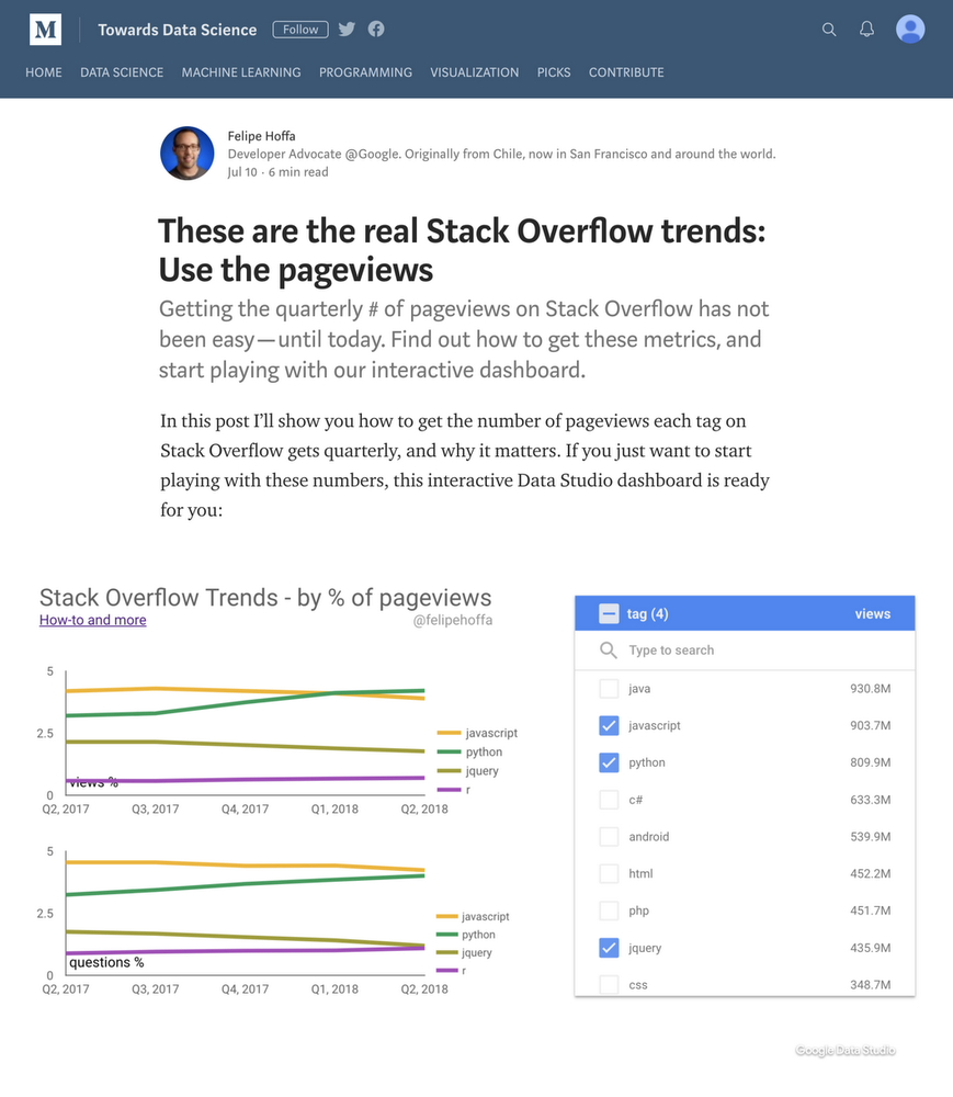
Medium article showing Stack Overflow trends. Link

DS Embed 2

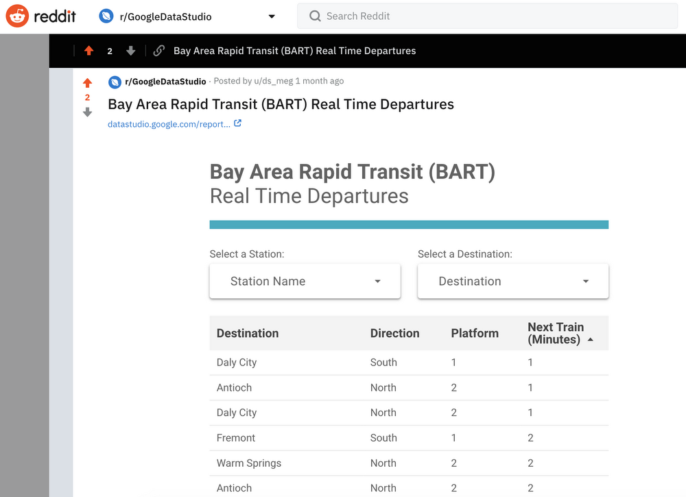
Reddit post showing real time departures for BART (Bay Area Rapid Transit). Link

Share rich snippets on social

When you share your report link on social platforms or messaging apps, you will now see a rich snippet including the title, thumbnail and description of the report. Your audience will know what to expect from the link and have better visibility to your reports. Rich snippets also help make your content more searchable on social networks.

To generate rich snippets, post the report URL you intend to share.

Here's an example of a rich snippet:

DS Embed 3

Rich snippets work on any social platform or messaging app that supports Open Graph Protocol including Google+, Facebook, Twitter, LinkedIn, Reddit and apps like Hangouts, iMessage and Slack.

Data Studio’s new features help you tell more compelling stories

In today’s ever-changing, multi-channel landscape, marketers need to quickly gather and visualize all their data in order to gain new insights. Data Studio helps marketers turn their raw data into informative, easy-to-read and easy-to-share reports—leading you to insights that can help drive businesses forward. Today, we’re launching three new features that make it easier for marketers to tell compelling data stories and make better, more informed business decisions.

Here’s a look at the three additions.


Explorer: Bring your data analysis together with one click

Get insights from your data faster—no coding required. Explorer eliminates the time-consuming work of combing through large amounts of data to find the insights you need. And with Data Studio’s one-click integration with BigQuery, it’s especially easy for businesses to find the insight they need. That speeds up the analyst workflow and opens up querying to non-technical users.

data studio explorer


Data Blending: See your data in a single visualization

Imagine you’re an enterprise business that wants to analyze and visualize information from multiple accounts across its organization. That could be data from Google Ads, from other products in Google Marketing Platform, or from other media providers. How do you get all this information into a single chart with the least amount of work? By using Data Blending, which lets you bring multiple data sources together to analyze and visualize right in Data Studio. Soon, you’ll also be able to add additional fields to create new calculations from the blended data. All this lets you tell your complete data story with an interactive, compelling chart that’s easy to create.

data studio data blending


Google Marketing Platform Report Gallery: Create comprehensive reports like never before

The new Google Marketing Platform Report Gallery has a series of report templates that help you quickly create consolidated and informative reports using data from any of Google Marketing Platform’s products. Use a report template and customize it to capture exactly what you need, all in a few minutes. This new feature was designed to help businesses avoid inefficiencies that can come from collecting data, and lets them get actionable insights quickly to share with their teams.

data studio report gallery


With these powerful new features launched and ready to go, you can start turning data into compelling visual insights right away. Create your first report today and start to create a fuller picture of your digital marketing strategy.

Introducing the Data Studio Community Connector Codelab

Posted by Minhaz Kazi, Developer Advocate, Google Data Studio

Data Studio is Google's free next gen business intelligence and data visualization platform. Community Connectors for Data Studio let you build connectors to any internet-accessible data source using Google Apps Script. You can build Community Connectors for commercial, enterprise, and personal use. Learn how to build Community Connectors using the Data Studio Community Connector Codelab.

Use the Community Connector Codelab

The Community Connector Codelab explains how Community Connectors work and provides a step by step tutorial for creating your first Community Connector. You can get started if you have a basic understanding of Javascript and web APIs. You should be able to build your first connector in 30 mins using the Codelab.

If you have previously imported data into Google Sheets using Apps Script, you can use this Codelab to get familiar with the Community Connectors and quickly port your code to fetch your data directly into Data Studio.

Why create your own Community Connector

Community Connectors can help you to quickly deliver an end-to-end visualization solution that is user-friendly and delivers high user value with low development efforts. Community Connectors can help you build a reporting solution for personal, public, enterprise, or commercial data, and also do explanatory visualizations.

  • If you provide a web based service to customers, you can create template dashboards or even let your users create their own visualization based on the users' data from your service.
  • Within an enterprise, you can create serverless and highly scalable reporting solutions where you have complete control over your data and sharing features.
  • You can create an aggregate view of all your metrics across different commercial platforms and service providers while providing drill down capabilities.
  • You can create connectors to public and open datasets. Sharing these connectors will enable other users to quickly gain access to these datasets and dive into analysis directly without writing any code.

By building a Community Connector, you can go from scratch to a push button customized dashboard solution for your service in a matter of hours.

The following dashboard uses Community Connectors to fetch data from Stack Overflow, GitHub, and Twitter. Try using the date filter to view changes across all sources:

This dashboard uses the following Community Connectors:

You can build your own connector to any preferred service and publish it in the Community Connector gallery. The Community Connector gallery now has over 70 Partner Connectors connecting to more than 400 data sources.

Once you have completed the Codelab, view the Community Connector documentation and sample code on the Data Studio open source repository to build your own connector.

What’s New in Google Data Studio?

The Data Studio team has been hard at work launching some new features, including clearer tables, colorful numbers, and more ways to visualize your data. Let's take a look at the highlights:
Need to narrow down a large data set? Pivot Tables take the rows in a standard table and pivot them so they become columns. This lets you reorganize metrics and dimensions, and group and summarize the data in ways a standard table can't provide. Pivot tables also help you analyze relationships between data points that might otherwise be hard to spot.

Learn more about pivot tables (and see how Sheets can now intelligently suggest them for you!) »
Coordinated Coloring binds colors to specific data for easy comparison of metrics and dimensions across different visualizations. When a new visualization is created, Data Studio automatically binds colors to the data, so that color:data pairs stay consistent with all filters and versions. Coordinated coloring is automatically turned on for all new reports, and you can add it yourself to old reports.

Learn more about coordinated coloring »

In this image, the table and pie charts both show sampled Google Analytics 
data (with orange indicator); the geo chart doesn't. 


Google Analytics often samples data to provide accurate reporting in a timely manner. Data Studio reports now includes a simple Google Analytics Sampling Indicator to show you any component that contains sampled Analytics data.

Learn more about sampling indicators »


Field Reports Editing: Data Studio has recently added new functionality that makes it easier to create and edit the visualizations that you need, rather than going back and forth to the data source. You can use these new options to:
  • Rename fields
  • Change aggregation types, semantic types and date functions
  • Apply % of total, difference from total, or % difference from total to metrics from within the report. 


Display Images in Tables: The new IMAGE function is a useful way to display images in tables -- for instance, adding YouTube video thumbnails or product images to your reports.


Data controls let each team select the accounts that are relevant to them. 

Data Control updates: Data Control lets every user bring their own data to existing Data Studio reports. This means every user can select from a list of their own accounts to populate the visualizations -- so there's no need to build new reports for every account and user. This makes it possible to scale report “templates” across a number of users with different access to accounts, an important use case for agencies or companies with subsidiaries. And now Data Control supports Attribution 360 (TV Attribution) and DFP (DoubleClick for Publishers) data sets.

Learn more about Data Control »

We hope these new features will help you continue to make the most from Data Studio. Keep the data rolling!

Note: Though not an official G Suite service, Data Studio is currently available globally for free.

Launch release calendar
Launch detail categories
Get these product update alerts by email
Subscribe to the RSS feed of these updates

Get the most out of Data Studio Community Connectors

Data Studio Community Connectors enable direct connections from Data Studio to any internet accessible data source. Anyone can build their own Community Connector or use any available ones.

Try out the new Community Connectors in the gallery

We have recently added additional Community Connectors to the Data Studio Community Connector gallery from developers including: DataWorx, Digital Inspiration, G4interactive, Kevpedia, Marketing Miner, MarketLytics, Mito, Power My Analytics, ReportGarden, and Supermetrics. These connectors will let you access data from additional external sources, leveraging Data Studio as a free and powerful reporting and analysis solution. You can now use more than 50 Community Connectors from within the Gallery to access all your data.

Try out these free Community Connectors: Salesforce, Twitter, Facebook Marketing.

Find the connector you need

In the Data Studio Community Connector gallery, it is possible for multiple connectors to connect to the same data source. There are also instances where a single connector can connect to multiple data sources. To help users find the connector they need, we have added the Data Sources page where you can search for Data Sources and see what connectors are available to use. The connector list includes native connectors in Data Studio as well as verified and Open Source Community Connectors. You can directly use the connectors by clicking the direct links on the Data Sources page.

Vote for your data source

If your data source is not available to use through any existing connector, you can Vote for your data source. This will let developers know which Data Sources are most in demand. Developers should also let us know which Community Connector you are building. We will use this information to update the Data Sources page.

Tell us your story

If you have any interesting connector stories, ideas, or if you’d like to share some amazing reports you’ve created using Community Connectors please let us know by giving us a shout or send us your story at [email protected].

Open Source Community Connectors for Data Studio

More than six hundred developers have signed up for developer access to Data Studio Community Connectors since the Developer Launch. Community Connectors give developers an opportunity to come up with innovative solutions for data access and broaden the scope of data sources users can connect to.

Based on community feedback, we recognized that many of you are looking to share your work on connectors with the community. Also, developers are looking for more examples to follow. With these community needs in mind, today, we are announcing the Open Source Community Connectors repository on GitHub.


Use open source Community Connectors


For every connector that is hosted in the open source repository, the Data Studio Developer Relations team will manage a deployment for the connector’s latest code. This managed deployment will enable all users to immediately try the connector in Data Studio by simply clicking a link. Managed deployments also make it easier for developers since you do not have to deploy and maintain the connectors yourself; we’ll take care of this for you.

You can try out the following Open Source connectors directly in Data Studio:


Example dashboards using these connectors:


Learn about best practices


If you want to connect to new Data Sources using Data Studio but have not yet looked into Community Connectors, now would be the best time to start since a variety of example connector code have become available. These examples will give you a head start and create a platform for you to learn and share with other community members.

Initially, we are releasing these connectors in our open source repository:


Contribute to the community


If want to submit your own open source connector to the repository, you can send us a pull request. Alternatively you can maintain your own repository and link to that from the official repository.

This Git repository is a small start where we plan to make new additions. We have already seen other open source Community Connectors like data.world and getSTAT. We are hoping that initiative will help developers and users to create connectors to new Data Sources and thus make more data accessible in Data Studio. Developers can also collaborate with each other as well as report new issues and fix existing ones through these open source connectors.

This collaboration platform gives developers the option to leverage support from the community. If you want to develop your own connector but are unable to maintain it in the long run, you can add it to our repository so that the community can support it.

Visit the repository and start building your own Community Connector today!


Posted by Minhaz Kazi, Google Analytics team

Data Studio: Richer Visualizations and Analytical Functions

The Data Studio team has been hard at work launching new features to allow for richer visualization and new views on data. Today, we'll highlight some of these recent launches.

Pivot Tables

Pivot tables let users narrow down a large data set or analyze relationships between data points. Additionally, they reorganize user's dimensions and metrics to help quickly summarize data and see relationships that might otherwise be hard to spot.

Example Pivot Table (Help center doc here)

Coordinated Coloring

Coordinated coloring allows users to bind colors to specific data. When a user creates visualizations, Data Studio automatically binds colors to data, so that color:data pairs stay consistent between visualizations and when filtering. This feature is automatically turned on for all new reports, and available in old reports.

Example Coordinated Coloring (Help center doc here)

Google Analytics Sampling Indicator

Google Analytics samples data in order to provide accurate reporting in a timely manner. Data Studio now shows a sampling indicator in Data Studio reports when a component contains sampled Analytics data.

GA Sampling indicator (Help center doc here)

Field Reports Editing

Data Studio has also recently added new options to the chips in reporting. These new options allow you to:
  • Rename fields
  • Change aggregation types
  • Change semantic types
  • Change date functions
  • Apply % of total, difference from total, or percent difference from total to a metric from within the report.
Example of new field editing options (Help center doc here).

Submitting and voting for new features

The Data Studio team will continue to introduce new features and product enhancements based on your submissions. You can view requests submitted by other users, upvote your favorites, or create new ones. Learn more here.

Google Data Studio: quicker and broader access to data

Over the past 6 months we’ve launched over 25 new features in Google Data Studio including: making the product free and available globally, adding support for PostgreSQL and MySQL, and providing many new report layout options. Overall feedback has been great!

Now we’re adding new features to make it quicker to access your data.

Community Connectors Developer Launch
We want to make it easy to access all your data within Data Studio. Today we are launching a new Data Studio “Community Connectors” developer program allowing you to visualize data from any source.

Community connectors are created using Google Apps Scripts and are easy to build! (our UX team even built one to monitor bitcoin prices). Once created, a connector can be shared with other users, who can use the connector to access their own data.

Today we have over 10 partners who have built connectors to over 200 sources and we’re excited to welcome more developers and data providers to the Data Studio community.  Check out the Community Connector Gallery to explore what our partners built.

Data Studio Community Connector Gallery

Embedded Reports

Many customers want to bring Data Studio reports into their workflows or publish Data Studio reports on their own website. Now you can embed Data Studio reports in your websites and apps using simple iframe embedding. To see your report in your site, edit it, select Report > File > Embed report, then put the HTML code snippet into an iframe. Embeds can be fully interactive, and support both private, public, and non-logged in access, giving you fine-grained control over who can see your data.This new capability will allow you to share compelling data stories through your public websites and blogs, or share critical insights using your own business applications for no additional cost.


Data Control
Large organizations and agencies often have access to many accounts; for example, thousands of AdWords accounts, or hundreds YouTube channels. To simplify reporting, the new data control allows you to reuse a single report across all your accounts, dramatically reducing the time it takes to view data in a report. The data control can also be used to templatize reports, allowing viewers to see their data in a report without having to create anything in Data Studio. The data control supports the following connectors: AdWords (Account & MCC), YouTube Analytics, Search Console, DoubleClick Campaign Manager, and Google Analytics. We plan to add support for more connectors in the future.


Data Studio report with AdWords, Search Console, YouTube, and DoubleClick Data Controls

And a few other updates
We’ve also added a couple of additional capabilities. You can now export any chart data directly to Google Sheets. We added a new Google Cloud Storage connector, making it easy to use Data Studio with your data in Google Cloud Storage. We’ve added SSL support for the MySQL connector. We’ve added the ability to see the totals in the table visualization. And finally, we’ve made the product available in Russia.

These announcements make accessing your data within Google Data Studio easier than ever. We’re excited to see what people do with them. For more information, check out:


Thanks!

Posted by Nick Mihailovski, on behalf of the entire Data Studio team

Google Data Studio: New Feature Roundup

The Data Studio team is constantly working on new features to improve the user experience for both report creators and viewers! In this blog post we’ll highlight some recent launches that you may have missed.

Filter controls: search 
Filters give report viewers a powerful way to slice data by specific segments. But filters with hundreds or even thousands of possible values to choose from were previously difficult to use, requiring scrolling through very long lists of filter items. We recently added a search feature within the filter component, letting users quickly find and select or deselect specific items.


Filter controls: single-select 
There are also scenarios when it only makes sense to filter a report on a single value, as filtering on multiple values would return confusing or nonsensical data. Report creators now have the ability to configure filters to allow for single-selection only.


Combo charts
New Combo charts allow users to create a line chart with a non-time-based dimension on the X-axis (previously only time-based dimensions were supported). The new component can plot a single dimension with up to 5 metrics, or 2 dimensions with a single metric. Learn more about Combo charts here.


Links in tabular data 
Tables in Data Studio reports can now display clickable links! This feature introduces a new type of interactivity, as viewers can now be redirected to to relevant content outside the report. To use this feature, report owners must use a data source containing a column of URLs. Data Studio will detect this column and assign it to the URL field type (if automatic detection does not work data source owners can also set the field type to URL manually). Learn more about this here.


Submitting and voting for new features
The Data Studio team will continue to introduce new features and product enhancements. Have a feature request? You can view requests submitted by other users, upvote your favorites, or create new ones. Learn more here.

Posted by Alon Gotesman, Product Manager, Google Data Studio

New Data Studio Data Control

Today we’ve made it dramatically easier to view your Google Analytics data in Data Studio using the new Data control. When a report is created using the Data Control, all viewers can see their own data in the report, without creating anything.

Check out these quick video to see this feature in action
Try it out now! 
We added the Data control to these templates so you test it out with your data:  

Overview Report

Ecommerce Template

This feature is great if you:
Are an agency or large organization with access to many Google Analytics views and do not want to create a Data Studio report for each view. For example, if you have a set of charts and data you monitor every day, you can now build a report in Data Studio with those charts and data, add the Data Control, and quickly go between any of the views you have access to, allowing you to monitor your entire business very fast.

Are a large organization with many websites across: different brands, different regions, or different business units, and want to unify reporting and KPIs across your entire organization. Now you can build a template report in Data Studio, add the Data Control, and share the report across your organization. Every user will be able to see their data, in your curated report.

The data control is public for all users.

Read the Help Center for more details on how to use it.

If you build an exciting report, please submit to our gallery, so we can showcase it.

Posted By Nick Mihailovski, Product Manager, Data Studio