Tag Archives: Data Visualization

Introducing the Data Studio Community Connector Codelab

Posted by Minhaz Kazi, Developer Advocate, Google Data Studio

Data Studio is Google's free next gen business intelligence and data visualization platform. Community Connectors for Data Studio let you build connectors to any internet-accessible data source using Google Apps Script. You can build Community Connectors for commercial, enterprise, and personal use. Learn how to build Community Connectors using the Data Studio Community Connector Codelab.

Use the Community Connector Codelab

The Community Connector Codelab explains how Community Connectors work and provides a step by step tutorial for creating your first Community Connector. You can get started if you have a basic understanding of Javascript and web APIs. You should be able to build your first connector in 30 mins using the Codelab.

If you have previously imported data into Google Sheets using Apps Script, you can use this Codelab to get familiar with the Community Connectors and quickly port your code to fetch your data directly into Data Studio.

Why create your own Community Connector

Community Connectors can help you to quickly deliver an end-to-end visualization solution that is user-friendly and delivers high user value with low development efforts. Community Connectors can help you build a reporting solution for personal, public, enterprise, or commercial data, and also do explanatory visualizations.

  • If you provide a web based service to customers, you can create template dashboards or even let your users create their own visualization based on the users' data from your service.
  • Within an enterprise, you can create serverless and highly scalable reporting solutions where you have complete control over your data and sharing features.
  • You can create an aggregate view of all your metrics across different commercial platforms and service providers while providing drill down capabilities.
  • You can create connectors to public and open datasets. Sharing these connectors will enable other users to quickly gain access to these datasets and dive into analysis directly without writing any code.

By building a Community Connector, you can go from scratch to a push button customized dashboard solution for your service in a matter of hours.

The following dashboard uses Community Connectors to fetch data from Stack Overflow, GitHub, and Twitter. Try using the date filter to view changes across all sources:

This dashboard uses the following Community Connectors:

You can build your own connector to any preferred service and publish it in the Community Connector gallery. The Community Connector gallery now has over 70 Partner Connectors connecting to more than 400 data sources.

Once you have completed the Codelab, view the Community Connector documentation and sample code on the Data Studio open source repository to build your own connector.

Harness your data with Data Studio Community Connectors

Posted by Minhaz Kazi, Developer Advocate

Google Data Studio lets users build live, interactive dashboards with beautiful data visualizations, for free. Users can fetch their data from a variety of sources and create unlimited reports in Data Studio, with full editing and sharing capabilities.

Community Connectors is a new feature for Data Studio that lets you use Apps Script to build connectors to any internet accessible data source. You can share Community Connectors with other people so they can access their own data from within Data Studio.

For example, if you are providing a web-based service to your customers, you can create a Community Connector with a template dashboard to fetch data from your API. In just 3 to 4 clicks, your customers can log into your web app, authenticate with Data Studio, and see their individualized data displayed in a beautiful interactive dashboard.

Here's an example Data Studio dashboard that uses a Community Connector to show live data using the Stack Overflow API:

Try out this Stack Overflow Community Connector yourself or view the code.

Why build Community Connectors

  • Leverage Data Studio as a reporting platform for your customers.
    Provide significant value to your customers by providing them with a ready-made reporting platform. With a minimal development investment, you can rely on Data Studio as a free and powerful dashboarding and analysis solution for your customers.

  • Reach a larger audience and also monetize your connector.
    Publish and promote your Community Connector in the Data Studio Community Connector gallery that is visible to all Data Studio users. Published connectors are also directly accessible from the public Community Connector Gallery. There are also multiple approaches if you want to monetize your connector.

  • Develop customized enterprise solutions for your business.
    Fetch your business data from a variety of sources (e.g. BigQuery, CloudSQL, web API etc.) and create a customized solution specifically for your business. By providing templates with your connectors, you can significantly cut down dashboard building time.

  • Benefit from Apps Script features and use your existing code.
    Since Community Connectors are developed using Google Apps Script, you can benefit from features such as caching, storage, translation, authentication etc. If you already have a Google Sheets connector, it is easy to reuse that same code for a Community Connector.

  • Did we mention it's free?
    Data Studio is completely free to use. And there is no cost for developing or publishing Community Connectors.

How to build Community Connectors

The Get Started Guide can help you to build your first Community Connector. Since Apps Script is a subset of Javascript, you can easily build a connector even if you have not worked with Apps Script before.

You can also jump ahead and view specific steps of the typical development life cycle of a Community Connector:

  • Build: Write your connector code in Apps Script.
  • Use and test: Try out your connector in Data Studio.
  • Deploy: Create deployments for other users.
  • Share: Share your connector.

Publish your connector

You can keep your connector private or share them with other users. You also have the option to publish your connector. Publishing will feature your connector both in Data Studio as well as in the public Community Connector gallery. This enables you to reach all Data Studio users and showcase your service. Furthermore, we encourage you to submit your connector to our Open Source repo so that the community can benefit from it.

What next

If you have any interesting connector stories, ideas, or if you'd like to share some amazing reports you've created using Community Connectors, give us a shout or send us your story at [email protected].

Google Data Studio: New Feature Roundup

The Data Studio team is constantly working on new features to improve the user experience for both report creators and viewers! In this blog post we’ll highlight some recent launches that you may have missed.

Filter controls: search 
Filters give report viewers a powerful way to slice data by specific segments. But filters with hundreds or even thousands of possible values to choose from were previously difficult to use, requiring scrolling through very long lists of filter items. We recently added a search feature within the filter component, letting users quickly find and select or deselect specific items.


Filter controls: single-select 
There are also scenarios when it only makes sense to filter a report on a single value, as filtering on multiple values would return confusing or nonsensical data. Report creators now have the ability to configure filters to allow for single-selection only.


Combo charts
New Combo charts allow users to create a line chart with a non-time-based dimension on the X-axis (previously only time-based dimensions were supported). The new component can plot a single dimension with up to 5 metrics, or 2 dimensions with a single metric. Learn more about Combo charts here.


Links in tabular data 
Tables in Data Studio reports can now display clickable links! This feature introduces a new type of interactivity, as viewers can now be redirected to to relevant content outside the report. To use this feature, report owners must use a data source containing a column of URLs. Data Studio will detect this column and assign it to the URL field type (if automatic detection does not work data source owners can also set the field type to URL manually). Learn more about this here.


Submitting and voting for new features
The Data Studio team will continue to introduce new features and product enhancements. Have a feature request? You can view requests submitted by other users, upvote your favorites, or create new ones. Learn more here.

Posted by Alon Gotesman, Product Manager, Google Data Studio

New Data Studio Data Control

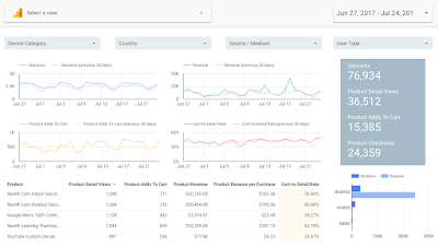
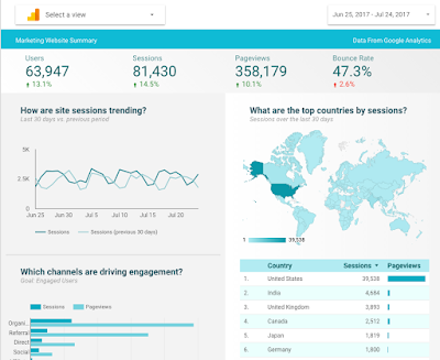
Today we’ve made it dramatically easier to view your Google Analytics data in Data Studio using the new Data control. When a report is created using the Data Control, all viewers can see their own data in the report, without creating anything.

Check out these quick video to see this feature in action
Try it out now! 
We added the Data control to these templates so you test it out with your data:  

Overview Report

Ecommerce Template

This feature is great if you:
Are an agency or large organization with access to many Google Analytics views and do not want to create a Data Studio report for each view. For example, if you have a set of charts and data you monitor every day, you can now build a report in Data Studio with those charts and data, add the Data Control, and quickly go between any of the views you have access to, allowing you to monitor your entire business very fast.

Are a large organization with many websites across: different brands, different regions, or different business units, and want to unify reporting and KPIs across your entire organization. Now you can build a template report in Data Studio, add the Data Control, and share the report across your organization. Every user will be able to see their data, in your curated report.

The data control is public for all users.

Read the Help Center for more details on how to use it.

If you build an exciting report, please submit to our gallery, so we can showcase it.

Posted By Nick Mihailovski, Product Manager, Data Studio 

Data Studio: Enhanced AdWords MCC Support

An AdWords manager account (MCC) is a powerful tool for handling multiple AdWords accounts. Manager accounts allow users to link several accounts so they can be viewed in a single location, and are frequently used by third-party advertisers such as agencies and marketing professionals.

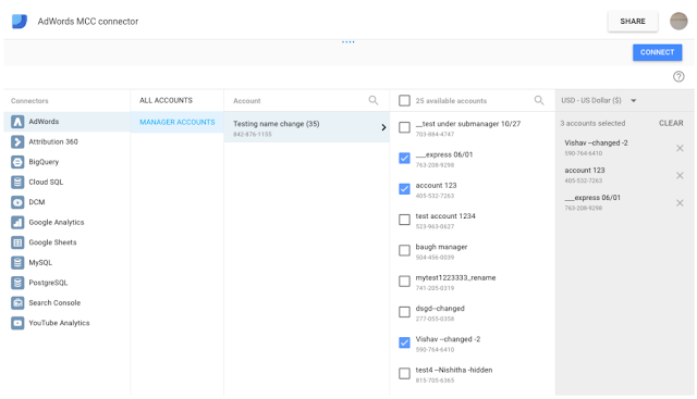
Today the Data Studio team is releasing an enhanced AdWords connector, giving users the ability to select MCC sub-accounts and set up reports for accounts containing multiple sub-account currencies.

Click image for full-size version
New capabilities

There are two major enhancements to the AdWords connector:

1. Selecting sub-accounts: prior to this release it was only possible to connect to an entire MCC account as the data source for a Data Studio report. This enhancement allows users to define a data source by selecting up to 75 individual sub-accounts within an MCC account.

2. Filtering on currencies: one common challenge with MCC accounts occurs when sub-accounts are set to different currencies. While metrics such as impressions and clicks can be aggregated correctly across these sub-accounts, currency fields like Cost and Average CPC cannot. The enhanced AdWords connector allows MCC account holders to filter sub-accounts by currency to avoid this problem, and removes currency fields from the connector if multiple currencies are present.

Connecting to AdWords MCC accounts
To connect to MCC accounts, create a new Data Studio data source and select the AdWords connector. If you have access to an MCC account, a “MANAGER ACCOUNTS” option will appear. The account holder can then select sub-accounts they are interested in, or use the pull-down menu in the upper-right corner to filter for sub-account currencies.

Note that existing Data Studio connections to MCC accounts must be edited and reconnected or recreated from scratch to take advantage of the new enhancements.

Your feedback and questions is welcomed in the Data Studio community forums

Happy Reporting!

Posted by Alon Gotesman, Google Data Studio team

Data Studio: Search Console Connector

Google Search Console is a free service offered by Google that helps webmasters monitor and maintain their site's presence in Google Search results. Search Console helps users understand how Google views their site and allows them to optimize their performance in search results.

Search Console’s Search Analytics feature shows webmasters how often their site appears in Google search results for various keywords. This data is extremely powerful but currently lives in Search Console’s Search Analytics Report and is hard to combine with other data sources.

Today we are announcing a new Data Studio connector for Search Console. With this launch users can pull their data into Data Studio to build reports that include impressions, clicks, and average position broken out by keyword, date, country, and device.


Search Console users can now build Data Studio reports to understand how their search traffic changes over time, where traffic is coming from, and what search queries are most likely to drive traffic to their sites. Users can also filter reports for mobile traffic to improve mobile targeting, and to analyze clickthrough rates for various organic search terms.

As always, Data Studio report creators can add components from other data sources into a single report. With this new connector, users can use the Search Console and AdWords connectors to compare performance across paid and organic search, or add Google Analytics data to analyze site-side performance.

Note that Search Console metrics can be aggregated by either site or by page (URL). This is configured in the Data Source creation flow, where users can select either “Site Impression” or “URL Impression”. To learn more about the distinction between these two methods please see the Search Analytics Report Help Center article.

Want to learn more? Looking for a new connector in Data Studio?

To learn more about the new Search Console connector, please visit our Help Center or post your questions in the Data Studio community forums.

Is there a specific data service you wish to be able to access and visualize through Data Studio? We welcome your feedback via the connector feedback form — we read all responses and use them to prioritize new connectors.

Happy reporting!

Posted by The Data Studio team

3 Ways to Better Support Marketing Decisions with Data

It’s often said that marketing is both an art and a science. The science side is increasingly in the spotlight as companies use data to optimize the customer experience at every touchpoint. But, ensuring that insights surfaced from that data lead to action requires the arts of communication and collaboration.

Highly data-driven organizations are three times more likely than others to report significant improvement in decision-making.1 Yet, 62% of executives still rely more on experience than data to make their decisions.2 When the stakes are high, decision-makers need information they can trust, easily consume, and understand.

Below are three ways marketing organizations can take action on their data to better support decisions:

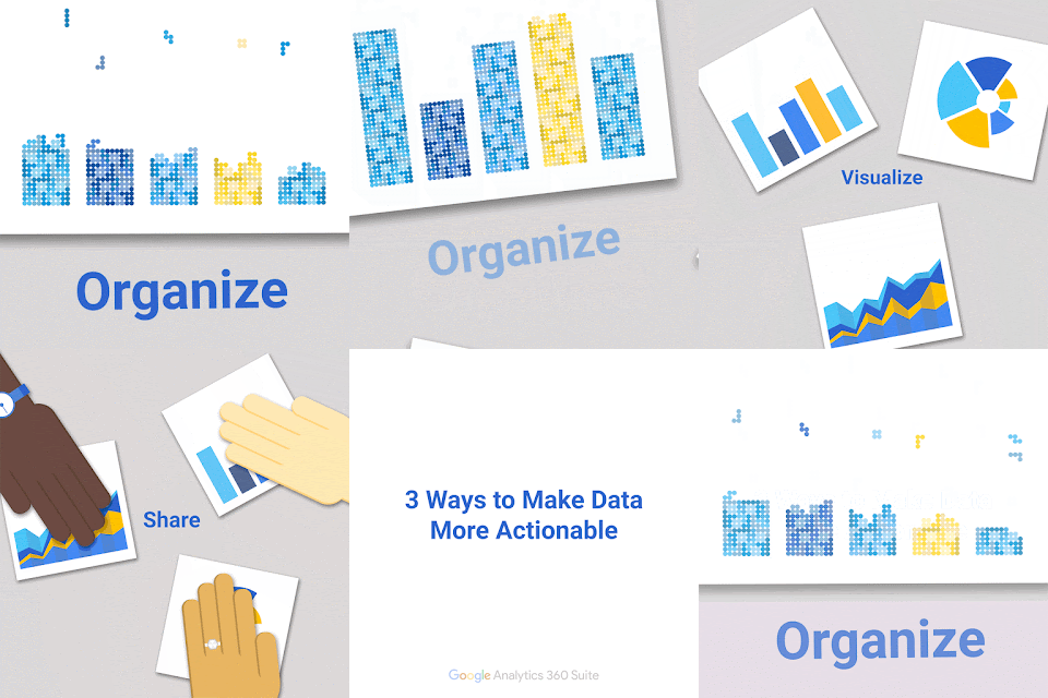
1. Organize
Whether you have trouble connecting teams or data sources, silos can prevent your marketing organization from reaching current and potential customers. Data silos prevent you from gaining a holistic view of the customer journey. Organizational silos slow down the flow of information and ideas. What’s more, organizational silos are the number one barrier to improving customer experience.3

Outline a data strategy to organize and integrate information sources so you have the complete picture to your customers’ journeys. Collaboration and communication between departments is also key. Better yet, make sure marketers and analysts all have access to the same data sets and technology.

2. Visualize
Good data storytelling means making data easy to process. By taking the time to visualize your data, you’ll be able to tell a compelling story at a glance.

The goal of a revenue chart, heat map, or bar graph should be to simplify a complicated idea or communicate a body of information in seconds. Tools can help make data quickly actionable by taking multiple data sources and turning them into interactive reports and dashboards. Focus on reducing misinterpretations of your data and making it easy for decision makers to act.

3. Share
If the data can’t be understood, its insights cannot be acted on. But just as important, if the data and ideas are not shared with the right people at the right time, decision makers can’t fully leverage the power of marketing data.

“Real-time data is critically important. Otherwise, business leaders may be making decisions off data that is no longer relevant. The business landscape changes so quickly, and stale data may inadvertently lead to the wrong decision,” says Suzanne Mumford, head of marketing for the Google Analytics 360 Suite.

Look for solutions that offer data visualization and built-in collaboration capabilities so you can start practicing all three steps right away:
The companies that shine at optimizing the customer experience go beyond analytics and measurement. The whole organization collaborates in order to connect the data dots and communicate the meaning and impact of insights surfaced. Leading marketing organizations build a culture of growth — one that uses data, testing, and optimization to improve the customer experience every day — and share insights in ways that everyone across the organization can understand and act on. 


Download “Measuring Marketing Insights,” a collection of Harvard Business Review articles, to learn more about how to turn data into action.

A version of this article first appeared as sponsor content on HBR.org in August 2016.

1 PwC's Global Data and Analytics Survey, Big Decisions™, Base: 1,135 senior executives, Global, May 2016 
2 PwC's Global Data and Analytics Survey, Big Decisions™, Base: 2,106 senior executives, Global, May 2016 
3 Harvard Business Review Analytic Services, "Marketing in the Driver's Seat: Using Analytics to Create Customer Value," 2015.


The New Google Data Studio PostgreSQL Connector

Over the past months, we’ve been hard at work adding and enhancing all of our connectors. After our recent launch of the MySQL connector, many users asked for a PostgreSQL connector.

So today we’ve launched a new PostgreSQL connector in Google Data Studio!

Visualizing your data hasn’t been easier.

PostgreSQL data visualized in Data Studio
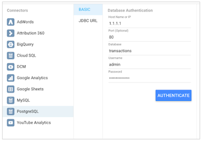
To get started, create a new Report, add a new Data Source, and select the PostgreSQL Connector. Then use the wizard to configure access to your PostgreSQL database. a new Report, add a new Data Source, and select the PostgreSQL Connector. Then use the wizard to configure access to your PostgreSQL database.

The new connector in our ever expanding list
Once connected, you will see a list of all your columns and you can create custom aggregations and calculations over your data directly in Data Studio!

Calculations on top of fields accessed from postgreSQL
We’re excited to learn about what you do with this connector. Visit the Data Studio PostgreSQL connector help center article, for more details on how this connector works.

Finally, we prioritized this connector directly from your feedback. If there are any additional connectors you would like added, please fill out the Data Studio Data Integrations Survey.

Posted By Anand Shah, Product Manager, on behalf of the Google Data Studio team

Data Studio: DoubleClick Campaign Manager Connector

Google Data Studio (beta) allows users to connect, transform, visualize, and share data no matter where it lives. Today we are happy to announce that DoubleClick Campaign Manager (DCM) customers can pull their data into Data Studio dashboards instantly!


With this new connector, DCM customers no longer need to import data into spreadsheets. Users can now quickly create dashboards with over 50 DCM metrics and dimensions. These dashboards are an effective way to track and optimize campaign performance and share reports with client and agency stakeholders.

Creating a new report with DCM data
Ready to get started? The first step is to connect to your DCM network or advertiser through the Data Sources page.


Next you can create a new report from scratch or use our DCM template. With just a few clicks, the dashboard is populated with your data.

Want to learn more? Looking for a new connector in Data Studio?

To learn more about the new DCM connector, please visit our Help Center or post your questions in the Data Studio community forums.

Is there a specific data service you wish to be able to access and visualize through Data Studio? We welcome your feedback via the connector feedback form — we read all responses and use them to prioritize new connectors.

Happy reporting!

The Data Studio team