Tag Archives: Data Studio

Use these tools to boost Web Stories performance

Once you’ve created content in the form of Web Stories, you’re probably wondering who your Web Stories are reaching and whether they’re resonating with your audience. Google Analytics and Data Studio are easy-to-use tools that help you understand how your Web Stories are performing on your website — or anywhere else on the web.

Viewing Web Stories performance in Google Analytics

The first step to measuring your Web Stories performance with Google Analytics is to set up tracking. Most Web Story editors, including Web Stories for WordPress, MakeStories, Newsroom AI and others, provide a simple way to add tracking in Google Analytics for each story created. You’ll need to provide the UA Tracking ID associated with the Google Analytics property you’re using for Web Stories.

Once your Stories are being tracked, key performance metrics will become available via the Events report in Google Analytics. This report is accessible by navigating to Behavior > Events > Overview in the navigation bar. The metrics available include:

  • Story Starts: A measure of how many users started reading your Story. These are reported as pageviews in Google Analytics.
  • Time Spent: A measure of how long users spend reading your Story, on average. This metric is helpful when determining how engaging your story is. This is reported as Avg. Time on Page in Google Analytics.
  • Story Pages Viewed: A measure of how many users read each page in your Story. This can be a helpful indicator to determine how far users get into your Story and where they might lose interest. These are reported as story_pages_viewed events in Google Analytics, and can be found in the Events Report.
  • Story Completions: A measure of how many users completed your Story by reaching the last page. These are reported as story_completion events in Google Analytics.
A detailed screenshot of a Google Analytics report focused on Event Action metrics.

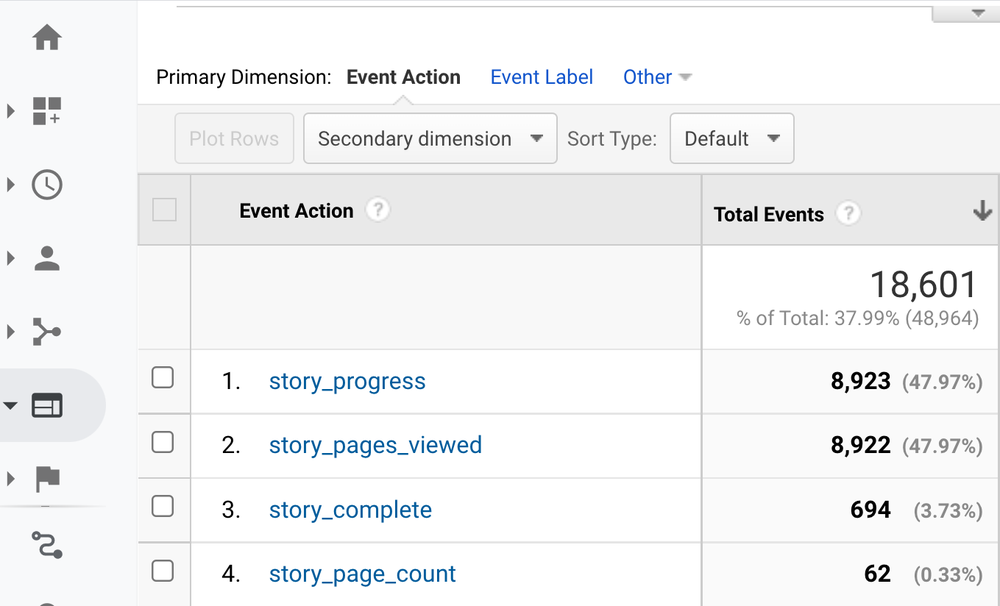
The Events Overview report in Google Analytics will report the story title under Event Category. You can click into each of your Stories listed to view data for each of the metrics above by selecting Event Action as the primary dimension.

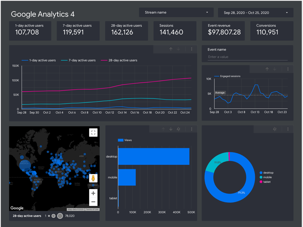
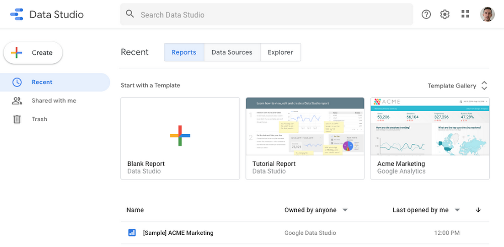
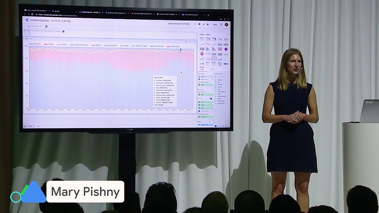
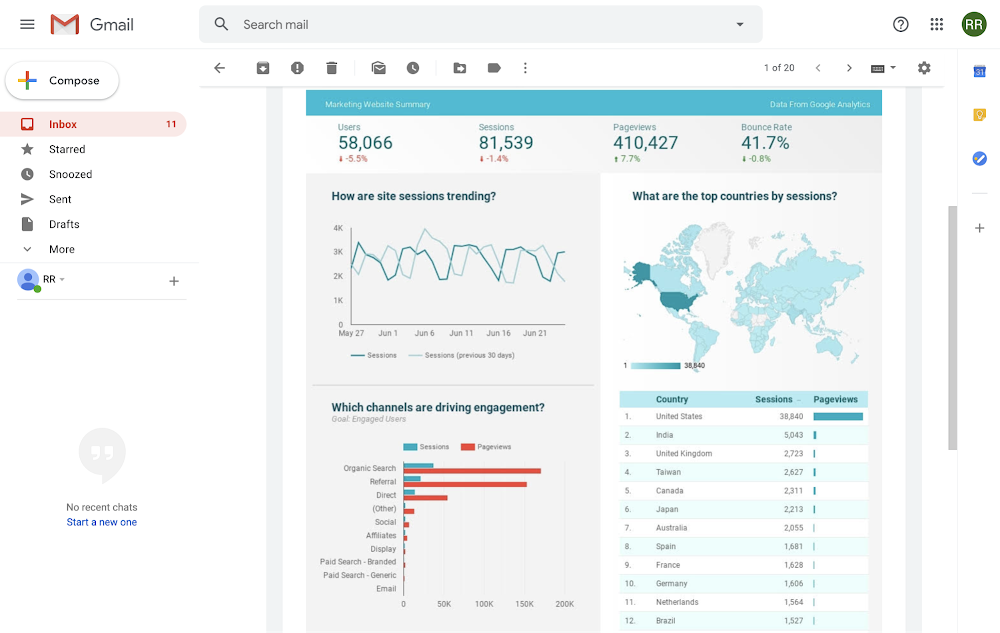
Even simpler access to Web Story performance insights with Data Studio

A screenshot of the Web Stories Insights dashboard displays a blue and yellow line graph charting Story Starts and Story Completions, charts showing audience demographic and other metrics.

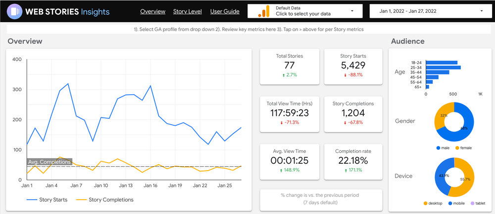
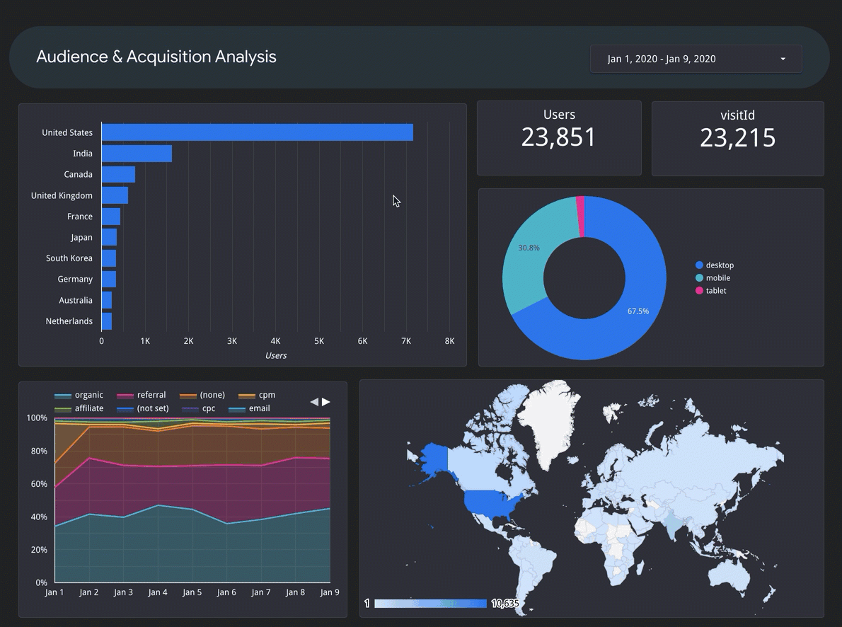
The Web Stories Insights dashboard template in Data Studio provides an overview of your Web Stories’ performance by pulling data from Google Analytics into a simple and visually engaging report. The dashboard displays several essential metrics to consider when evaluating performance, including:

  • Key Metrics: Story Starts, Page Views, Time Spent and Completion Rate
  • Audience Metrics: Age, Gender and Device breakdown across all stories published
  • Top Stories: Your top 10 stories during the selected time period, sorted by Story Starts
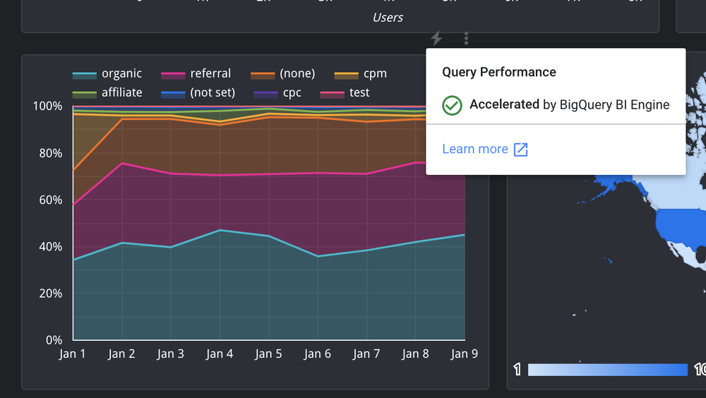
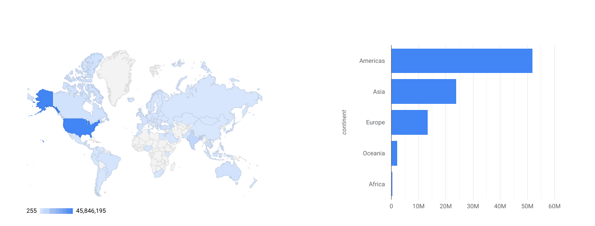
  • Traffic Channels: An overview of where users are finding and reading your Web Stories
  • Story Level Performance: Key metrics and a breakdown of pageviews for a specific story are available on the ‘Story Level’ page.

Anyone can access the dashboard by visiting goo.gle/web-stories-insights and selecting your Google Analytics account via the Click to Select your Data dropdown. Note you'll only have access to analytics that your Google account is linked to, so be sure to verify which account you’re using. You can also create a copy of the template and adjust it according to your specific analytics needs.

We hope that Google Analytics and Data Studio will help you improve your Web Stories for your audience.

Access Google Surveys and Google Analytics 4 data in Data Studio

Today, Data Studio users can access over 300 data sets in just a couple clicks. From Google Ads to BigQuery to your CRM data, you can spend more time finding and sharing insights and less time configuring data sources. With two brand new data connectors you can access even more data through Data Studio to help you analyze your marketing investments and make decisions. You can now access your market research data with our new Google Surveys connector and connect to the next generation of Google Analytics with support for Google Analytics 4 properties. 


Google Surveys give you a quick, cost-effective way to get valuable insights into the minds of your target audience. Gather the insights you need to make smarter, faster business decisions—in a fraction of the time it takes for traditional market research. With the new Data Studio integration, you can quickly visualize your Surveys data alongside your marketing data from sources like Google Ads and Google Analytics.

Google Surveys report in Data Studio

Google Surveys report in Data Studio 

We’ve made it easy to visualize your Google Surveys data. Simply click “View report in Data Studio” when you’re in Google Surveys to see your survey data in a template that you can customize and share in a couple clicks.

View your report in Data Studio in one click

View your report in Data Studio in one click

In addition to expanding access to Google Surveys, we’re also excited to announce support for Google Analytics 4 properties. You can now connect to your Google Analytics 4 properties in Data Studio along with your Universal Analytics properties.

Google Analytics 4 report in Data Studio

Google Analytics 4 report in Data Studio

Accessing the data you need to make better decisions is only the first step. Finding insights from the data and determining the best way to communicate the insights to stakeholders can be challenging and time consuming. We’re making it easier to get started with new marketing templates across common data sets like Google Ads, Search Ads 360 and more. You can find over 30 solutions to help you get started in the Data Studio gallery.

New Google Ads performance report in Data Studio solution gallery

New Google Ads performance report in Data Studio solution gallery

We are excited to hear how these new data connections and template solutions help you find insights and make decisions. Drop us a line in our community forum to let us know what’s working well and what you’re excited for next. 

New Enterprise IT Controls for Data Studio

As people use Data Studio throughout their organizations, IT administrators have asked to manage how Data Studio can be used. Today, we’re launching three free enterprise features providing IT administrators new visibility and control over Data Studio in their organization.

Organization management through Cloud Identity integration


Data Studio now integrates with Google Cloud Identity to provide organization-wide administrative capabilities. With this integration, Cloud Identity admins can manage who can use Data Studio and how they can use it. Existing G Suite and Cloud Identity customers get Data Studio integration out of the box, and can start using the new Data Studio administration features today. Customers using other identity providers, such as Active Directory, can synchronize their users with Google Cloud Identity, so that creating, suspending, and deleting users happens in one place. 


Enterprise audit logging


Data Studio now offers audit logging, providing IT admins organization-wide visibility into Data Studio usage, similar to that available for apps like Drive and Calendar. For example, admins can understand which users are creating Data Studio reports, and who they are sharing those reports with. Admins can also identify which reports have the most engagement, to scale successful reports across the organization. With custom alerts, you can monitor potentially risky activity like external sharing of data sources, and can export audit logs to BigQuery and use Data Studio to drill into the details. Learn more.
Audit Log

Organization sharing policies


New Data Studio sharing policies allow you to reduce the risk of data exfiltration. You can set limits to prevent users from sharing reports outside of your organization, or make sure they don’t expose company data by disabling public link sharing.


Sharing policies offer you the flexibility to define sharing permissions that meet your business needs. You can give certain users the ability to share reports externally, while allowing other users to share only within the organization. Learn more.


Organization sharing policies

There’s no charge for audit logging or sharing controls — they’re included with every edition of G Suite and Cloud Identity, including Cloud Identity Free. We’re committed to making Data Studio a solution that works for businesses of all sizes, and we’ll continue to build on this foundation. That way, everyone in your organization can uncover insights that matter, and you can rest assured knowing that your valuable business data is safe. 


Do more with Data Studio Community Visualizations

Data Studio Community Visualizations, currently in beta, allow you to create and integrate custom JavaScript components into your dashboards. You can use Community Visualizations to expand your chart selection, customize your report styling, or create custom components that perform advanced analysis or even in-browser machine learning.

New galleries for Data Studio Community Visualizations

Showcase gallery for Community Visualization reports

The Data Studio team recently launched the Community Visualization Report Gallery.

There, you can explore how others in the community have leveraged Community Visualizations to make the most of their data and dashboards.


Reports featuring Community Visualizations

Reports featuring Community Visualizations

Public Partner Visualization Gallery

Additionally, we’ve added a new gallery of Partner Community Visualizations that we’ve made available. Browse them in the new Data Studio Visualizations gallery.
The Data Studio Visualizations Gallery

The Data Studio Visualizations Gallery

Click-to-add Partner Visualizations

To add these Partner Visualizations to a report, click “Explore more” in the Community Visualizations drop down. There, you can browse and install a variety of partner-built charts, including funnel visualizations and Gantt charts.

The new in-product Partner Visualization gallery

The new in-product Partner Visualization gallery

Community Visualizations can add to a Data Studio dashboard in different ways - from providing custom charts and styling to integrating calculations with reporting.

Statistical analysis with Community Visualizations

Anvil Analytics + Insights works to bring data-driven decision making to all of their work, including optimized paid media campaigns. They used Community Visualizations to build their own Chi-Square statistical analyzer.


Several Anvil customers noticed that channels in Google Ads and Analytics converted at different rates, and wanted to know if the variance in conversion rates was statistically significant. 


Prior to using Community Visualizations, the Anvil Insights team manually exported the data out of Google Analytics into a separate tool, then ran the statistical analysis. Depending on where Anvil ran the analysis, the results were either stored separately from their reports, or not stored at all. Every time they wanted to test a different hypothesis or run a different variation of the test, they had to repeat the same time-intensive process.


In order to speed up hypothesis testing and integrate the tests and results into Data Studio reports, Anvil used Data Studio Community Visualizations and built a Chi-Square calculator within a week. 


Anvil’s calculator takes in data, just like any Data Studio chart. Once the calculation is complete, the analyzer presents the statistical significance, and either calls the viewer’s attention to a relationship in the data, or comments that there was nothing of note in the data. Now, all it takes to test new hypotheses is switching out the data for the component, just like you would for any other Data Studio chart. See it live.
Anvil Analytics + Insights Community Visualization Chi-Square Calculator

Anvil Analytics + Insights Community Visualization Chi-Square Calculator

“This has been a much faster way to find statistical significance in our campaigns and in other hypotheses we want to test. Anvil’s Director of Analytics and Decision Science, Brett Lohmeyer says, “The best part is that it gives us an easy way for our team to better communicate the value of using statistical significance to our clients.”

Try it yourself

Check out the new in-product Partner Visualizations Gallery to browse and add new partner-built Community Visualizations to your reports. To build your own Community Visualizations, check out the developer documentation.

“Up and to the right” with Data Studio

Millions of people from global enterprises, small businesses, governments and educational institutions are choosing Data Studio to make data-driven decisions. Over the last year, people used Data Studio to monitor ad performance, track brand performance, visualize student progress, and build machine learning models. 

Google Ads monitoring report by Search Foresight

In 2019, we launched more than 80 new features and over 50 new connectors to data. A heartfelt thanks to our users and developers who made 2019 a year to remember. Here are a few highlights. 


Visual Analysis

Throughout the year, we invested in visual analysis allowing faster data exploration and insights discovery. We made it possible to turn a chart into a filter using chart interaction controls. We also launched cross-chart interactions and drill downs. These investments, alongside updates like optional metrics, give users the tools they need to explore and interact with their data.
Drill Down GIF

Fast performance through In-Memory BI Engine

Having the right tools to interact with and analyze data is critical but if report performance is slow, analyzing and visualizing large data sets can be frustrating. In collaboration with the Google Cloud BigQuery team, we launched BI Engine to bring sub second performance to Data Studio. BI Engine is an in-memory analysis service that integrates with your BigQuery data to return blazingly fast results in Data Studio. No more waiting for the page to load!
BI Engine

Scheduled PDF export

Listening to what our users need has always been a priority for the Data Studio team. Two of the top requests we heard from our users was the need to create PDFs and schedule emails of reports. Users can now do both. We’re happy to let you know that as of last week you can now set a custom schedule for scheduled emails. Learn more.
Email Delivery

Conditional formatting

We recently launched conditional formatting, which allows users to apply formatting based on a set of rules, making it easier to tell a story with your data. We’re continuing to invest in conditional formatting and recently added  AND and OR conditions to support compound conditions. Learn more.
Conditional formatting

In 2020 the Data Studio team is committed to delivering a great product that helps our users make better decisions with data. To stay in the loop on what’s happening in Data Studio, subscribe to email updates under Settings > Marketing Preferences or check our Help Center each week to learn “What’s new.”


Get to insights quicker with Data Studio’s new home page

It should be easy for everyone to discover and share insights from their data. As of today, Data Studio has a new home page, making finding and creating reports more efficient. Together with recent improvements to chart interactivity and sharing, and the 25+ Data Studio features launched this year, you can go from data to insights to action faster than ever.

Data Studio Home Page

Create in a snap with a streamlined home page

Data Studio’s clean new look puts the focus on what’s most important, so you can start digging into your data right away. We’ve heard that you frequently use search to find reports, so we put the search box front and center. You can also create a Report, Data Source, or Explorer in less time with the new Create button. Finally, the new design should be familiar to users of G Suite products like Drive and Gmail, and is in line with our material design principles.

Data Studio Design

Reveal additional insights with interactive charts

Earlier this year, we introduced the ability to interact with charts to filter other charts on the report page. Since then, we’ve brought even more interactivity to charts. If a report viewer wants to sort a chart differently, you can now allow them to do so right from the chart, without needing to edit the report. If they want to see a breakdown at a lower level of detail—for example, by city rather than by country—you can now allow them to drill down right within the chart.

Data Studio Interactive Charts

Explore your data at the speed of thought with BigQuery BI Engine

We also launched support for BigQuery BI Engine (Beta), a super-fast in-memory engine for interactive visual analysis. Together, Data Studio and BigQuery BI Engine enable you to interact with your data and see results in a fraction of a second.

Visualize your marketing data to unlock new insights with Data Studio

Share insights with others through scheduled email

Want to send someone an offline copy or snapshot of a report? You can download a report as a PDF. Want to send someone a report on a regular basis? Automate the task with scheduled email delivery.

Data Studio Scheduled Email

Data Studio’s new home page and these new features make it easier than ever to find and create reports, discover insights, and share them with others.