Tag Archives: Data Studio

Get to insights quicker with Data Studio’s new home page

It should be easy for everyone to discover and share insights from their data. As of today, Data Studio has a new home page, making finding and creating reports more efficient. Together with recent improvements to chart interactivity and sharing, and the 25+ Data Studio features launched this year, you can go from data to insights to action faster than ever.

Data Studio Home Page

Create in a snap with a streamlined home page

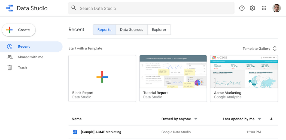
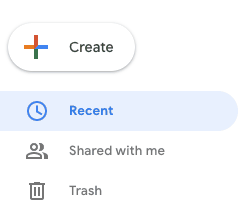
Data Studio’s clean new look puts the focus on what’s most important, so you can start digging into your data right away. We’ve heard that you frequently use search to find reports, so we put the search box front and center. You can also create a Report, Data Source, or Explorer in less time with the new Create button. Finally, the new design should be familiar to users of G Suite products like Drive and Gmail, and is in line with our material design principles.

Data Studio Design

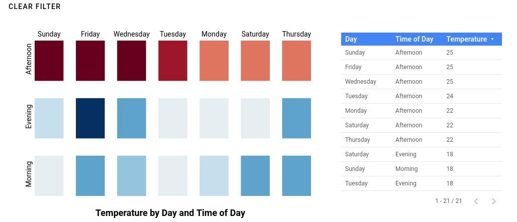
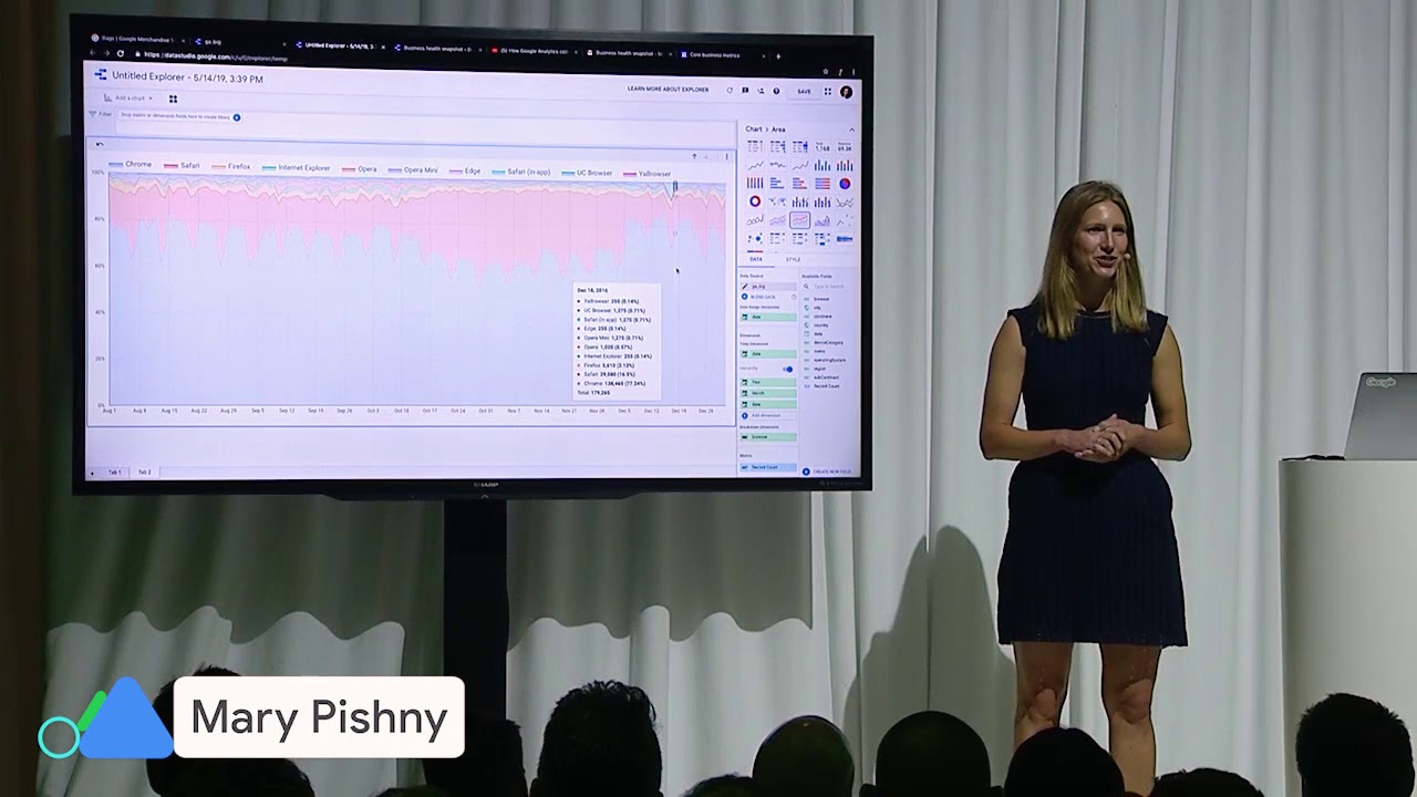
Reveal additional insights with interactive charts

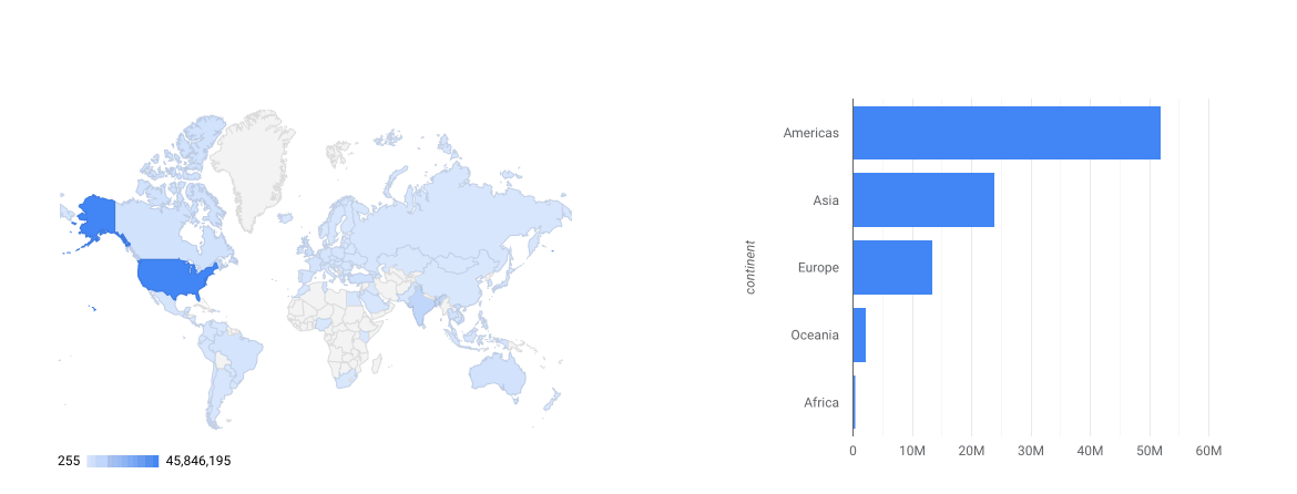
Earlier this year, we introduced the ability to interact with charts to filter other charts on the report page. Since then, we’ve brought even more interactivity to charts. If a report viewer wants to sort a chart differently, you can now allow them to do so right from the chart, without needing to edit the report. If they want to see a breakdown at a lower level of detail—for example, by city rather than by country—you can now allow them to drill down right within the chart.

Data Studio Interactive Charts

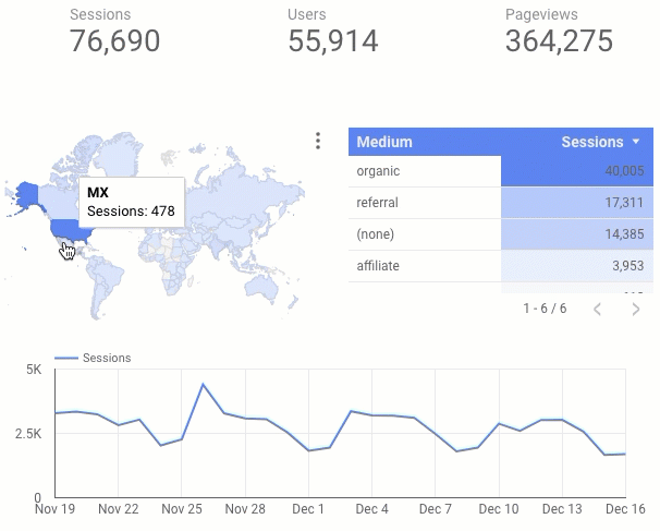
Explore your data at the speed of thought with BigQuery BI Engine

We also launched support for BigQuery BI Engine (Beta), a super-fast in-memory engine for interactive visual analysis. Together, Data Studio and BigQuery BI Engine enable you to interact with your data and see results in a fraction of a second.

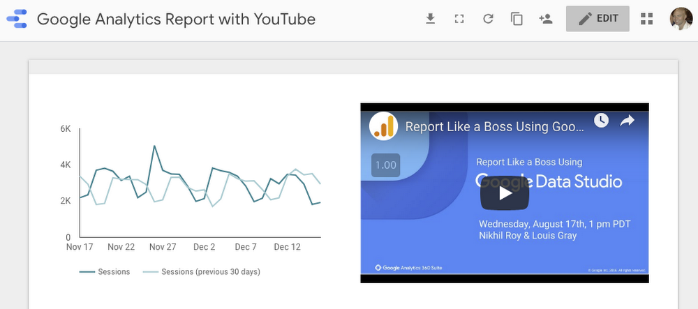
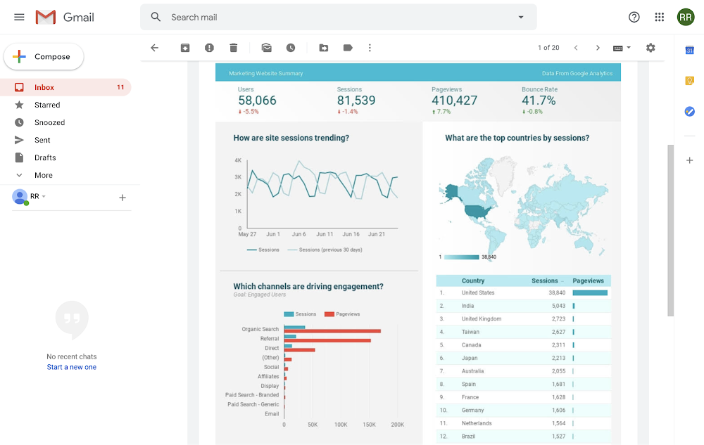
Share insights with others through scheduled email

Want to send someone an offline copy or snapshot of a report? You can download a report as a PDF. Want to send someone a report on a regular basis? Automate the task with scheduled email delivery.

Data Studio Scheduled Email

Data Studio’s new home page and these new features make it easier than ever to find and create reports, discover insights, and share them with others. 

Introducing BigQuery parameters in Data Studio

If you’re one of the many Data Studio users writing custom queries for BigQuery, you can now run parameterized queries. This provides better customization and interaction options to your users while making your reports faster.


When connecting to BigQuery from Data Studio you can use special date parameters or define your own named parameters as part of a custom query. Parameters in custom queries introduce two key benefits: queries can be dynamically updated from the report - no need to create new data sources; this works even if the report user does not have edit access to the data source. You can optimize query cost and gain dashboard performance improvements since less data is passed from BigQuery to Data Studio for parameterized queries.

Creating parameterized custom queries


Let's say you're interested in analyzing word usage by corpus for a selected set of Shakepeare's works. The following BigQuery Public Dataset, bigquery-public-data.samples.shakespeare,is available to carry out this analysis:
BQ Public Dataset

To allow report editors to choose which corpus to analyze from Shakespeare’s works you can use the Custom Query interface of the BigQuery connector in Data Studio to define corpus as a parameter as part of a filter. You can define the type of UI element for the parameter (e.g., text input, single select, checkbox, etc.) and provide default values.


In the following example, the corpus parameter has been defined as a single-select dropdown with Hamlet as the default value along with other works as options such as Othello, King Lear, etc.

A BigQuery custom query with a custom corpus parameter

A BigQuery custom query with a custom corpus parameter

What’s really cool is that once you’ve defined the configuration, report editors will then be able to choose a specific corpus to analyze by using the dropdown from the parameters section of the report property panel:

Report Property Panel

E.g. The corpus parameter options in the

Data Studio property panel.

Using date parameters


Prior to date parameters, custom queries for date sharded or partitioned tables could not be limited to a date range based on a report’s date control. Instead, your custom query would have to fetch all rows for all dates, leaving Data Studio to do the job of filtering for the date range selected by the report user. The result is slower and less efficient reports.


With date parameters, you can use the reserved start and end date parameters as part of a custom query. When report users select a date range for analysis the dates selected will automatically be included as part of your custom query, resulting in a much more efficient query and fetching only the rows needed for the requested date range.


The following example custom query uses the @DS_START_DATE and @DS_END_DATE parameters as part of a filter on the creation date column of a table. The records produced by the query will be limited to the date range selected by the report user, reducing the number of records returned and resulting in a faster query:


BQ Custom Query

A BigQuery custom query using start and end date parameters

The standard Data Studio date settings and controls will determine the date values for your custom query. A report editor can set a default date or add a date control to a report and the start and end dates for your query will change based on the report date control.


In both cases, named and date parameters offer a more efficient way to retrieve data from a single BigQuery data source while giving your report users flexible options to analyze different data.


Try it out!

To learn more about how parameters work review data source parameters and connecting to BigQuery


As you have a chance to experiment with parameters, send us feedback or give us a shout out at @googleanalytics.


New Data Studio developer tools make building connectors and viz easier

Data Studio, Google’s data visualization platform, includes a developer features that expand the flexibility and functionality of your dashboards. Using Data Studio community connectors and community visualizations, you can connect to any internet-connected data source, and create custom visualizations tailored to your data and storytelling needs.

Recently, we created the Data Studio Community Component generator (dscc-gen), a command-line tool that streamlines building community connectors and community visualizations. dscc-gen provides working templates and opinionated workflows that make it quick and easy to create and deploy your projects.

Community Connectors tooling

Typically, developing a community connector means using the online Apps Scripts environment. The online editor is an excellent tool that can be used for all online tasks, but it doesn't support automating repetitive (and error-prone) tasks. By using a project generated from dscc-gen, updating a deployment becomes as easy as running npm run update_production and trying out your latest changes is just npm run open_latest.

To create a new community connector with dscc-gen, just run this command:

npx @google/dscc-gen connector

After the command finishes, you will have a working connector with a production deployment and best-practice deployment scripts. If you have an existing connector, you can still use dscc-gen to get the best-practice deployment scripts. See existing connectors for details.

For more information on commands that are available, see the local development developer documentation.  

Community Visualization tooling

Typically, developing a community visualization means editing local files, re-uploading the changes, and reloading a Data Studio report. This template provides a local development cycle and scripts that make bundling and deploying your code a breeze. By using a project generated by dscc-gen, deploying a visualization with caching enabled becomes as easy as running npm run build:prod && npm run push:prod.

To create a new community visualization with dscc-gen, just run this command:

npx @google/dscc-gen viz

After the command finishes, you will have a working visualization with a lightning-fast local workflow and best-practice build/deployment scripts.

For a rundown of how to best use this tool, visit the local development developer documentation.

Templates and use casesOur tooling supports the most common use-cases for connectors and visualizations. We’ve open sourced the library and code on GitHub, where you can make and request improvements.

Looking forward

We’re continually adding features to our developer platform. Community visualizations just added support for filter interactions, and connectors added many improvements throughout 2018. Sign up for updates on our the Data Studio developer ecosystem.

Introducing Data Studio Community Visualizations as Chart Interaction Filters

Community Visualizations as Chart Filters

At the beginning of 2019, we introduced richer interactivity in Data Studio, enabling charts to  act as filters, facilitating more interactive data explorations and faster time to insight. If you’ve been following the community visualizations developer preview, you may have noticed that community visualizations haven’t yet supported chart interaction filters.

Now, we’ve added the capability for developers to add filter interaction functionality to community visualizations. When interacting with a community visualization that supports filter interactions, your interactions with the community visualization can filter the rest of your dashboard.

For example: below is a community visualization heatmap that acts as a chart interaction filter.

Data Studio Community Visualizations

Temperature heatmap community visualization. Each cell is selectable and can filter the table underneath. See the report live.


Community visualizations acting as chart filters make even more custom, interactive charts possible in your reports. You can create calendar heatmaps where you can click-and-drag to select a date range, or a timeseries chart where you filter dragging a rolling window along your chart. You could even create a dendrogram of organizational chart data, and select different nodes to filter the dashboard by the individuals represented at each node.

Report editors can enable filter interactions for each visualization, and use them to filter other components on the dashboard, just like the Data Studio built-in charts.

We’re continuing to add features to make community visualizations more powerful and easier to use. Learn how to add filter interactions to your community visualization by reviewing our developer documentation, and sign up to keep up with the latest in Data Studio developer features.

Richer interactivity in Data Studio

To start 2019, the Data Studio team added a number of new features to allow for faster insights and richer reporting. Today, we’ll highlight some of these recent launches.

Interactive Charts

We’re extending Data Studio’s filtering capabilities directly into our charts. Editors can now turn any chart into a filter that filters other charts. When viewing a dashboard, you can now click or brush on any data in order to initiate filters, enabling much faster exploration and shortening the time to insight.

Interactive charts in action

Interactive charts in action. See help center article for more information.

Search Filters

Data Studio now gives the ability to search for any value in your data, whether you have hundreds or billions of unique records. For example, as In the instance below, you can search your name’s popularity over time by looking at a hundred years of USA name data, hosted in BigQuery, Google's serverless, highly scalable, enterprise data warehouse.

See the help center article here to learn more.

Embed External Content

We’re making it easy to bring in any content from the web to your report. Now, you can embed an entire webpage in a Data Studio report. You can add YouTube videos explaining your content, Google Sheets containing the source data for your report, Forms to get feedback on the usefulness of your report, or any embeddable content from the web.


Sample report with embedded YouTube video

Sample report with an embedded YouTube video. See help center article for more information.

As always, we will continue to introduce new features and enhancements based on your feedback. Please request features and upvote your favorites here.

Introducing the Data Studio Community Visualizations Developer Preview

Data Studio provides a variety of easy-to-use charts to help you tell stories with your data, allowing you to visualize data from different sources. Sometimes, though, you want a custom chart to convey information more effectively to your teams, or to customize style options for the kind of data you are presenting.


The new Data Studio Community Visualizations feature, in developer preview, allows you to build new charts and styling options, providing even more freedom and flexibility in the stories you tell with your data. Community visualizations integrate seamlessly with the rest of your Data Studio dashboard, including all of the data sources you bring together, to enable you to quickly gain insight from your data.

Community Visualizations

A community visualization Sankey diagram with style options in the property panel

What are Community Visualizations?

Community visualizations integrate seamlessly into your dashboards. You can use them with all of your data sources, and configure the data and styling options in the property panel, just like you would with a built-in chart.


ClickInsight, a Google Marketing Platform partner, says this about community visualizations:


"Choosing the right chart type is essential to effectively telling a story with data. Thanks to Community Visualizations, we now have the flexibility to build our own charts to suit every unique situation."

Developer preview launch

The Community Visualizations developer preview launch means that the Community Visualization feature is stable and enabled for all users. To build a community visualization, you should be comfortable with JavaScript, HTML, and writing visualization code. However, there are many features and improvements you can look forward to in the coming year.


To learn more about Community Visualizations and how to get started, visit Community Visualizations, Developer Preview. Once you’ve built a visualization you’d like to share, submit a report to the showcase and share your code with other Data Studio users.

2018: The Year in Data Studio Community Connectors

It's been a busy year for Data Studio Community Connectors. Since the developer launch, we've added over ten new features, had significant growth, seen partners grow their businesses, and collaborated with the community on open source projects. As we move forward, we're reflecting on what has been accomplished, and what's coming next for Community Connectors.

Where were we last year?

In late 2017, we launched Community Connectorsto allow Data Studio users to connect to their external data and started working with partners to bring access to new data sources. The developer preview provided a platform for developers to build connectors, but there were a lot of features to add and work to do before it was ready for a full launch. This is what we've been busy working on the last year. Since then, we've seen 140+ partner connectors, 500+ data sources, integrated solutions, and fun data sets.


Now that we've delivered on the key improvements and updates highlighted at the outset of the developer launch, we've concluding the developer preview phase. Let's look at what's been added in 2018.

New Developer Features

Throughout 2018, we‘ve added features to improve the connector developer experience and enabled new use-cases.


We introduced the community-connectors GitHub repository as a place to let the community contribute open source connector code.


There are new ways to authenticate a connector. Services that expect username & password, API tokens, or username and API key are easier to add. See Authentication for full details.


Connectors can define the semantic types for their schemas ahead of time. This means your users no longer have to tweak settings on the schema configuration page every time they make a data source from your connector.


The Data Studio Apps Scripts service is now available and provides useful builders & validation to make building a connector a breeze.


Error handling has been vastly improved. Through the Data Studio App Scripts service, you can clearly indicate to a user when something goes wrong (and hopefully how to fix it!).

Some other features worth mentioning:


What Partners Are Saying

Our connector partners and their customers have seen great success with community connectors. Mikael Thuneberg, CEO of Supermetrics, had this to say:


"The focus we’ve put on creating high-quality connectors has been rewarded by the large number of companies around the world who have chosen these as their primary cross-platform marketing reporting tool. [ … ] Data Studio connectors have become an exciting and rapidly growing business area for Supermetrics."


Marc Soares, Manager at Clickinsight, has also seen success through community connectors:


"[Community Connectors have] allowed us to fully take advantage of Data Studio as a central reporting platform. Thanks to community connectors, our analysts spend less time making reports and more time conducting meaningful analysis for our clients."

What's Coming Next?

Next year, we're planning to provide even more ways to configure connectors, extending existing features, and adding more educational content to help you get the most out of community connectors.


If you're new and want to get started making your own connector, check out the codelab and  documentation. To stay up to date with changes and the community, see support for options.


It’s been a great year, and we're excited for what's coming in the future.

New Google Marketing Platform connectors available in Data Studio

When marketers can access all of their data in one place, they are able to make smarter decisions about where and how to spend their resources. While data tends to be siloed and it can be a challenge to connect all of it in one place, your marketing investment will go further if you do.


Data Studio gives marketers access to a diverse and growing catalogue of connectors for over 500 data sources to help centralize your datasets for simple reporting and visualization in one place. And we’ve recently added two more. Earlier this fall we launched connectors for Display & Video 360 and Search Ads 360. These two connectors enable access to your Google Marketing Platform advertising data in your Data Studio dashboards and reports. Explore the data independently, or join it with your other marketing data from Google Analytics, Google Sheets, Google Ads, and other first party data sources to surface powerful insights you can easily share and take action on.


Once your Google Marketing Platform data is in Data Studio, you can customize your reports based on your needs. For example, you can add custom branding or repurpose visualizations like charts or graphs that your team already uses elsewhere to make it your own. And, Data Studio reports are easily shareable outside of the interface. With Display & Video 360 and Search Ads 360 data now accessible in Data Studio, you can share dynamic Google Marketing Platform advertising reports with anyone, using Google Drive sharing permissions you have complete control of.


Let’s say you want to build a report to compare how your advertising is performing across Display & Video 360, Search Ads 360 and Google Ads. You can use the out-of-the-box, new Google advertising performance template to view top-line metrics with your own data, or create a custom report, using connectors to import your data.  From there, you can use the Explorer functionality to experiment with visualizations and organize the data to your liking. You can also blend the data together and do analysis across all three (or more) datasets. Add your Google Analytics data for example, and see aggregate trends in customer behavior on your site alongside your advertising campaign performance. Then share with your media team or agency and take action to optimize your campaigns based on the insights you find.

With Data Studio’s rich visualization and reporting features, marketers can elevate insights from their ad campaigns and breakdown silos among many disparate datasets. By bringing Google Marketing Platform advertising data into Data Studio, you can now see a fuller picture across your customer touchpoints and make more informed, faster marketing decisions.

Announcing Kaggle integration with Google Data Studio

Kaggle and Data Studio

As of today, Kaggle is now officially integrated with Data Studio, Google’s serverless business intelligence and data visualization platform. You’ll be able to connect to and visualize Kaggle datasets directly from Data Studio using the Kaggle Community Connector.


Kaggle is the world's largest online community of data scientists. Its two million users come to the platform to explore, create, and share data projects using Kernels, a free hosted notebook IDE. Over 10,000 public datasets can be analyzed using Kernels, accessed via the web or Kaggle's public API. This new integration, users can analyze these datasets in Kaggle; and then visualize findings and publish their data stories using Data Studio.


Here’s an example dashboard in Data Studio using a Kaggle dataset:

As a free-to-use reporting solution, Data Studio makes it easier for users to understand their data, derive key insights, and effectively communicate findings using compelling interactive dashboards. Data Studio is creating an innovative landscape where users can spend less time building their data pipeline and more time on creating data stories and sharing them with the right audience.


With this integration, users can browse to a dataset in Kaggle, pick a file, and use the one-click integration button to launch Data Studio with the selected data. From there, users can create and publish their own interactive dashboard, which can be embedded in websites and blogs. Since there is no cost to use Data Studio and the infrastructure is handled by Google, users don't have to worry about scalability, even if millions of people view the dashboard.


Here’s a quick clip showing how easy it is to use this integration to build dashboards in Data Studio:

Dashboards

See Connecting Kaggle Datasets to Data Studio to learn more.


Data Studio helps data professionals bring the power of visual analytics to their data. The hassle-free publishing process means everyone can tell engaging stories, open up dashboards for others to interact with, and make better-informed decisions. We're also releasing the connector code for this integration in the Data Studio Open Source Repository. This should help both Data Studio developers and Kaggle users to build newer and better solutions.


To get started, try out a Kaggle maintained dataset and launch the Kaggle connector for Data Studio. Let’s analyze more data and build awesome dashboards!