The Data Studio team has been hard at work launching some new features, including clearer tables, colorful numbers, and more ways to visualize your data. Let's take a look at the highlights:
Need to narrow down a large data set? Pivot Tables take the rows in a standard table and pivot them so they become columns. This lets you reorganize metrics and dimensions, and group and summarize the data in ways a standard table can't provide. Pivot tables also help you analyze relationships between data points that might otherwise be hard to spot.
Learn more about pivot tables (and see how Sheets can now intelligently suggest them for you!) »
Coordinated Coloring binds colors to specific data for easy comparison of metrics and dimensions across different visualizations. When a new visualization is created, Data Studio automatically binds colors to the data, so that color:data pairs stay consistent with all filters and versions. Coordinated coloring is automatically turned on for all new reports, and you can add it yourself to old reports.
Learn more about coordinated coloring »
Google Analytics often samples data to provide accurate reporting in a timely manner. Data Studio reports now includes a simple Google Analytics Sampling Indicator to show you any component that contains sampled Analytics data.
Learn more about sampling indicators »
Field Reports Editing: Data Studio has recently added new functionality that makes it easier to create and edit the visualizations that you need, rather than going back and forth to the data source. You can use these new options to:
 Display Images in Tables: The new IMAGE function is a useful way to display images in tables -- for instance, adding YouTube video thumbnails or product images to your reports.
Data Control updates: Data Control lets every user bring their own data to existing Data Studio reports. This means every user can select from a list of their own accounts to populate the visualizations -- so there's no need to build new reports for every account and user. This makes it possible to scale report “templates” across a number of users with different access to accounts, an important use case for agencies or companies with subsidiaries. And now Data Control supports Attribution 360 (TV Attribution) and DFP (DoubleClick for Publishers) data sets.
Learn more about Data Control »
We hope these new features will help you continue to make the most from Data Studio. Keep the data rolling!
Note: Though not an official G Suite service, Data Studio is currently available globally for free.
Launch release calendar
Launch detail categories
Get these product update alerts by email
Subscribe to the RSS feed of these updates
Need to narrow down a large data set? Pivot Tables take the rows in a standard table and pivot them so they become columns. This lets you reorganize metrics and dimensions, and group and summarize the data in ways a standard table can't provide. Pivot tables also help you analyze relationships between data points that might otherwise be hard to spot.
Learn more about pivot tables (and see how Sheets can now intelligently suggest them for you!) »
Coordinated Coloring binds colors to specific data for easy comparison of metrics and dimensions across different visualizations. When a new visualization is created, Data Studio automatically binds colors to the data, so that color:data pairs stay consistent with all filters and versions. Coordinated coloring is automatically turned on for all new reports, and you can add it yourself to old reports.
Learn more about coordinated coloring »

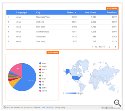
In this image, the table and pie charts both show sampled Google Analytics
data (with orange indicator); the geo chart doesn't.
Google Analytics often samples data to provide accurate reporting in a timely manner. Data Studio reports now includes a simple Google Analytics Sampling Indicator to show you any component that contains sampled Analytics data.
Learn more about sampling indicators »
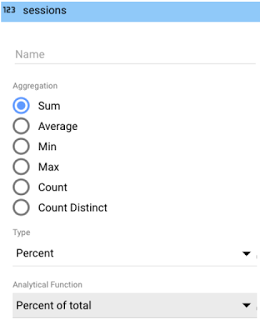
Field Reports Editing: Data Studio has recently added new functionality that makes it easier to create and edit the visualizations that you need, rather than going back and forth to the data source. You can use these new options to:
- Rename fields
- Change aggregation types, semantic types and date functions
- Apply % of total, difference from total, or % difference from total to metrics from within the report.

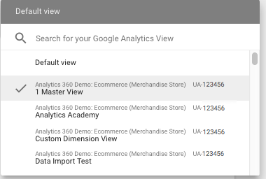
Data controls let each team select the accounts that are relevant to them.
Data Control updates: Data Control lets every user bring their own data to existing Data Studio reports. This means every user can select from a list of their own accounts to populate the visualizations -- so there's no need to build new reports for every account and user. This makes it possible to scale report “templates” across a number of users with different access to accounts, an important use case for agencies or companies with subsidiaries. And now Data Control supports Attribution 360 (TV Attribution) and DFP (DoubleClick for Publishers) data sets.
Learn more about Data Control »
We hope these new features will help you continue to make the most from Data Studio. Keep the data rolling!
Note: Though not an official G Suite service, Data Studio is currently available globally for free.
Launch release calendar
Launch detail categories
Get these product update alerts by email
Subscribe to the RSS feed of these updates