Tag Archives: adaptive layouts

A product manager’s guide to adapting Android apps across devices

Posted by Fahd Imtiaz, Product Manager, Android Developer Experience
Today, Android is launching a few updates across the platform! This includes the start of Android 16's rollout, with details for both developers and users, a Developer Preview for enhanced Android desktop experiences with connected displays, and updates for Android users across Google apps and more, plus the June Pixel Drop. We're also recapping all the Google I/O updates for Android developers focused on building excellent, adaptive Android apps.

With new form factors emerging continually, the Android ecosystem is more dynamic than ever.

From phones and foldables to tablets, Chromebooks, TVs, cars, Wear and XR, Android users expect their apps to run seamlessly across an increasingly diverse range of form factors. Yet, many Android apps fall short of these expectations as they are built with UI constraints such as being locked to a single orientation or restricted in resizability.

With this in mind, Android 16 introduced API changes for apps targeting SDK level 36 to ignore orientation and resizability restrictions starting with large screen devices, shifting toward a unified model where adaptive apps are the norm. This is the moment to move ahead. Adaptive apps aren’t just the future of Android, they’re the expectation for your app to stand out across Android form factors.

Why you should prioritize adaptive now

500+ devices including foldables, tablets, Chromebooks, and mobile-app capable cars
Source: internal Google data

Prioritizing optimizations to make your app adaptive isn't just about keeping up with the orientation and resizability API changes in Android 16 for apps targeting SDK 36. Adaptive apps unlock tangible benefits across user experience, development efficiency, and market reach.

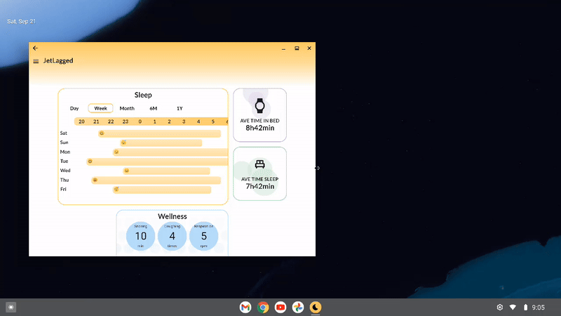
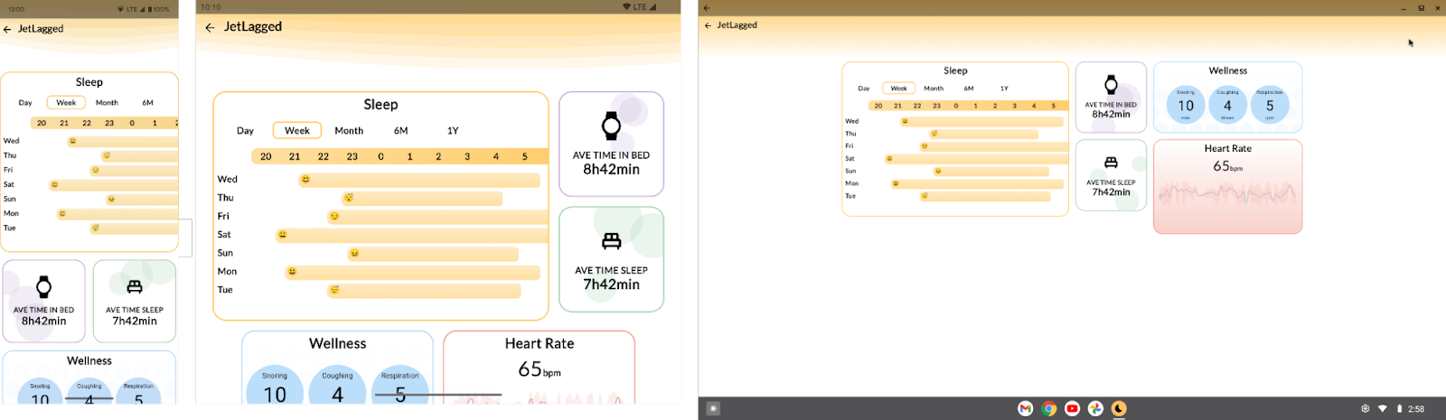
    • Mobile apps can now reach users on over 500 million active large screen devices: Mobile apps run on foldables, tablets, Chromebooks, and even compatible cars, with minimal changes. Android 16 will introduce significant advancements in desktop windowing for a true desktop-like experience on large screens, including connected displays. And Android XR opens a new dimension, allowing your existing apps to be available in immersive environments. The user expectation is clear: a consistent, high-quality experience that intelligently adapts to any screen – be it a foldable, a tablet with a keyboard, or a movable, resizable window on a Chromebook.

    • “The new baseline” with orientation and resizability API changes in Android 16: We believe mobile apps are undergoing a shift to have UI adapt responsively to any screen size, just like websites. Android 16 will ignore app-defined restrictions like fixed orientation (portrait-only) and non-resizable windows, beginning with large screens (smallest width of the device is >= 600dp) including tablets and inner displays on foldables. For most apps, it’s key to helping them stretch to any screen size. In some cases if your app isn't adaptive, it could deliver a broken user experience on these screens. This moves adaptive design from a nice-to-have to a foundational requirement.
Side by side displays of non-adaptive app UI with on the left with text reading Goodbye 'mobile-only' apps and adaptive app UI on the right with text reads Hello adaptive apps
    • Increase user reach and app discoverability in Play: Adaptive apps are better positioned to be ranked higher in Play, and featured in editorial articles across form factors, reaching a wider audience across Play search and homepages. Additionally, Google Play Store surfaces ratings and reviews across all form factors. If your app is not optimized, a potential user's first impression might be tainted by a 1-star review complaining about a stretched UI on a device they don't even own yet. Users are also more likely to engage with apps that provide a great experience across their devices.
    • Increased engagement on large screens: Users on large screen devices often have different interaction patterns. On large screens, users may engage for longer sessions, perform more complex tasks, and consume more content.
    • Concepts saw a 70% increase in user engagement on large screens after optimizing.

      Usage for 6 major media streaming apps in the US was up to 3x more for tablet and phone users, as compared to phone only users.

    • More accessible app experiences: According to the World Bank, 15% of the world’s population has some type of disability. People with disabilities depend on apps and services that support accessibility to communicate, learn, and work. Matching the user’s preferred orientation improves the accessibility of applications, helping to create an inclusive experience for all.

Today, most apps are building for smartphones only

A display of varying Android form factors, including a tablet, a desktop monitor, a laptop, a large-screen mobile, hand-held device, and an in-car app screen

“...looking at the number of users, the ROI does not justify the investment”.

That's a frequent pushback from product managers and decision-makers, and if you're just looking at top-line analytics comparing the number of tablet sessions to smartphone sessions, it might seem like a closed case.

While top-line analytics might show lower session numbers on tablets compared to smartphones, concluding that large screens aren't worth the effort based solely on current volume can be a trap, causing you to miss out on valuable engagement and future opportunities.

Let's take a deeper look into why:

      1. The user experience ‘chicken and egg’ loop: Is it possible that the low usage is a symptom rather than the root cause? Users are quick to abandon apps that feel clunky or broken. If your app on large screens is a stretched-out phone interface, the app likely provides a negative user experience. The lack of users might reflect the lack of a good experience, not always necessarily lack of potential users.

      2. Beyond user volume, look at user engagement: Don't just count users, analyze their worth. Users interact with apps on large screens differently. The large screen often leads to longer sessions and more immersive experiences. As mentioned above, usage data shows that engagement time increases significantly for users who interact with apps on both their phone and tablet, as compared to phone only users.

      3. Market evolution: The Android device ecosystem is continuing to evolve. With the rise of foldables, upcoming connected displays support in Android 16, and form factors like XR and Android Auto, adaptive design is now more critical than ever. Building for a specific screen size creates technical debt, and may slow your development velocity and compromise the product quality in the long run.

Okay, I am convinced. Where do I start?

A three-step workflow outlines how to optimize your Android app to be adaptive

For organizations ready to move forward, Android offers many resources and developer tools to optimize apps to be adaptive. See below for how to get started:

      1.Check how your app looks on large screens today: Begin by looking at your app’s current state on tablets, foldables (in different postures), Chromebooks, and environments like desktop windowing. Confirm if your app is available on these devices or if you are unintentionally leaving out these users by requiring unnecessary features within your app.

      2. Address common UI issues: Assess what feels awkward in your app UI today. We have a lot of guidance available on how you can easily translate your mobile app to other screens.

          a. Check the Large screens design gallery for inspiration and understanding how your app UI can evolve across devices using proven solutions to common UI challenges.

          b. Start with quick wins. For example, prevent buttons from stretching to the full screen width, or switch to a vertical navigation bar on large screens to improve ergonomics.

          c. Identify patterns where canonical layouts (e.g. list-detail) could solve any UI awkwardness you identified. Could a list-detail view improve your app's navigation? Would a supporting pane on the side make better use of the extra space than a bottom sheet?

      3. Optimize your app incrementally, screen by screen: It may be helpful to prioritize how you approach optimization because not everything needs to be perfectly adaptive on day one. Incrementally improve your app based on what matters most – it's not all or nothing.

          a. Start with the foundations. Check out the large screen app quality guidelines which tier and prioritize the fixes that are most critical to users. Remove orientation restrictions to support portrait and landscape, and ensure support for resizability (for when users are in split screen), and prevent major stretching of buttons, text fields, and images. These foundational fixes are critical, especially with API changes in Android 16 that will make these aspects even more important.

          b. Implement adaptive layout optimizations with a focus on core user journeys or screens first.

              i. Identify screens where optimizations (for example a two-pane layout) offer the biggest UX win

              ii. And then proceed to screens or parts of the app that are not as often used on large screens

          c. Support input methods beyond touch, including keyboard, mouse, trackpad, and stylus input. With new form factors and connected displays support, this sets users up to interact with your UI seamlessly.

          d. Add differentiating hero user experiences like support for tabletop mode or dual-screen mode on foldables. This can happen on a per-use-case basis - for example, tabletop mode is great for watching videos, and dual screen mode is great for video calls.

While there's an upfront investment in adopting adaptive principles (using tools like Jetpack Compose and window size classes), the long-term payoff may be significant. By designing and building features once, and letting them adapt across screen sizes, the benefits outweigh the cost of creating multiple bespoke layouts. Check out the adaptive apps developer guidance for more.

Unlock your app's potential with adaptive app design

The message for my fellow product managers, decision-makers, and businesses is clear: adaptive design will uplevel your app for high-quality Android experiences in 2025 and beyond. An adaptive, responsive UI is the scalable way to support the many devices in Android without developing on a per-form factor basis. If you ignore the diverse device ecosystem of foldables, tablets, Chromebooks, and emerging form factors like XR and cars, your business is accepting hidden costs from negative user reviews, lower discovery in Play, increased technical debt, and missed opportunities for increased user engagement and user acquisition.

Maximize your apps' impact and unlock new user experiences. Learn more about building adaptive apps today.

Announcing Jetpack Navigation 3

Posted by Don Turner - Developer Relations Engineer

Navigating between screens in your app should be simple, shouldn't it? However, building a robust, scalable, and delightful navigation experience can be a challenge. For years, the Jetpack Navigation library has been a key tool for developers, but as the Android UI landscape has evolved, particularly with the rise of Jetpack Compose, we recognized the need for a new approach.

Today, we're excited to introduce Jetpack Navigation 3, a new navigation library built from the ground up specifically for Compose. For brevity, we'll just call it Nav3 from now on. This library embraces the declarative programming model and Compose state as fundamental building blocks.

Why a new navigation library?

The original Jetpack Navigation library (sometimes referred to as Nav2 as it's on major version 2) was initially announced back in 2018, before AndroidX and before Compose. While it served its original goals well, we heard from you that it had several limitations when working with modern Compose patterns.

One key limitation was that the back stack state could only be observed indirectly. This meant there could be two sources of truth, potentially leading to an inconsistent application state. Also, Nav2's NavHost was designed to display only a single destination – the topmost one on the back stack – filling the available space. This made it difficult to implement adaptive layouts that display multiple panes of content simultaneously, such as a list-detail layout on large screens.

illustration of single pane and two-pane layouts showing list and detail features
Figure 1. Changing from single pane to multi-pane layouts can create navigational challenges

Founding principles

Nav3 is built upon principles designed to provide greater flexibility and developer control:

    • You own the back stack: You, the developer, not the library, own and control the back stack. It's a simple list which is backed by Compose state. Specifically, Nav3 expects your back stack to be SnapshotStateList<T> where T can be any type you choose. You can navigate by adding or removing items (Ts), and state changes are observed and reflected by Nav3's UI.
    • Get out of your way: We heard that you don't like a navigation library to be a black box with inaccessible internal components and state. Nav3 is designed to be open and extensible, providing you with building blocks and helpful defaults. If you want custom navigation behavior you can drop down to lower layers and create your own components and customizations.
    • Pick your building blocks: Instead of embedding all behavior within the library, Nav3 offers smaller components that you can combine to create more complex functionality. We've also provided a "recipes book" that shows how to combine components to solve common navigation challenges.

illustration of the Nav3 display observing changes to the developer-owned back stack
Figure 2. The Nav3 display observes changes to the developer-owned back stack.

Key features

    • Adaptive layouts: A flexible layout API (named Scenes) allows you to render multiple destinations in the same layout (for example, a list-detail layout on large screen devices). This makes it easy to switch between single and multi-pane layouts.
    • Modularity: The API design allows navigation code to be split across multiple modules. This improves build times and allows clear separation of responsibilities between feature modules.

      moving image demonstrating custom animations and predictive back features on a mobile device
      Figure 3. Custom animations and predictive back are easy to implement, and easy to override for individual destinations.

      Basic code example

      To give you an idea of how Nav3 works, here's a short code sample.

      // Define the routes in your app and any arguments.
      data object Home
      data class Product(val id: String)
      
      // Create a back stack, specifying the route the app should start with.
      val backStack = remember { mutableStateListOf<Any>(ProductList) }
      
      // A NavDisplay displays your back stack. Whenever the back stack changes, the display updates.
      NavDisplay(
          backStack = backStack,
      
          // Specify what should happen when the user goes back
          onBack = { backStack.removeLastOrNull() },
      
          // An entry provider converts a route into a NavEntry which contains the content for that route.
          entryProvider = { route ->
              when (route) {
                  is Home -> NavEntry(route) {
                      Column {
                          Text("Welcome to Nav3")
                          Button(onClick = {
                              // To navigate to a new route, just add that route to the back stack
                              backStack.add(Product("123"))
                          }) {
                              Text("Click to navigate")
                          }
                      }
                  }
                  is Product -> NavEntry(route) {
                      Text("Product ${route.id} ")
                  }
                  else -> NavEntry(Unit) { Text("Unknown route: $route") }
              }
          }
      )
      

      Get started and provide feedback

      To get started, check out the developer documentation, plus the recipes repository which provides examples for:

        • common navigation UI, such as a navigation rail or bar
        • conditional navigation, such as a login flow
        • custom layouts using Scenes

      We plan to provide code recipes, documentation and blogs for more complex use cases in future.

      Nav3 is currently in alpha, which means that the API is liable to change based on feedback. If you have any issues, or would like to provide feedback, please file an issue.

      Nav3 offers a flexible and powerful foundation for building modern navigation in your Compose applications. We're really excited to see what you build with it.

      Explore this announcement and all Google I/O 2025 updates on io.google starting May 22.

What’s New in Jetpack Compose

Posted by Nick Butcher – Product Manager

At Google I/O 2025, we announced a host of features, performance, stability, libraries, and tools updates for Jetpack Compose, our recommended Android UI toolkit. With Compose you can build excellent apps that work across devices. Compose has matured a lot since it was first announced (at Google I/O 2019!) and we're now seeing 60% of the top 1,000 apps in the Play Store such as MAX and Google Drive use and love it.

New Features

Since I/O last year, Compose Bill of Materials (BOM) version 2025.05.01 adds new features such as:

    • Autofill support that lets users automatically insert previously entered personal information into text fields.
    • Auto-sizing text to smoothly adapt text size to a parent container size.
    • Visibility tracking for when you need high-performance information on a composable's position in its root container, screen, or window.
    • Animate bounds modifier for beautiful automatic animations of a Composable's position and size within a LookaheadScope.
    • Accessibility checks in tests that let you build a more accessible app UI through automated a11y testing.

LookaheadScope {
    Box(
        Modifier
            .animateBounds(this@LookaheadScope)
            .width(if(inRow) 100.dp else 150.dp)
            .background(..)
            .border(..)
    )
}
moving image of animate bounds modifier in action

For more details on these features, read What’s new in the Jetpack Compose April ’25 release and check out these talks from Google I/O:

If you’re looking to try out new Compose functionality, the alpha BOM offers new features that we're working on including:

    • Pausable Composition (see below)
    • Updates to LazyLayout prefetch
    • Context Menus
    • New modifiers: onFirstVisible, onVisbilityChanged, contentType
    • New Lint checks for frequently changing values and elements that should be remembered in composition

Please try out the alpha features and provide feedback to help shape the future of Compose.

Material Expressive

At Google I/O, we unveiled Material Expressive, Material Design’s latest evolution that helps you make your products even more engaging and easier to use. It's a comprehensive addition of new components, styles, motion and customization options that help you to build beautiful rich UIs. The Material3 library in the latest alpha BOM contains many of the new expressive components for you to try out.

moving image of material expressive design example

Learn more to start building with Material Expressive.

Adaptive layouts library

Developing adaptive apps across form factors including phones, foldables, tablets, desktop, cars and Android XR is now easier with the latest enhancements to the Compose adaptive layouts library. The stable 1.1 release adds support for predictive back gestures for smoother transitions and pane expansion for more flexible two pane layouts on larger screens. Furthermore, the 1.2 (alpha) release adds more flexibility for how panes are displayed, adding strategies for reflowing and levitating.

moving image of compose adaptive layouts updates in the Google Play app
Compose Adaptive Layouts Updates in the Google Play app

Learn more about building adaptive android apps with Compose.

Performance

With each release of Jetpack Compose, we continue to prioritize performance improvements. The latest stable release includes significant rewrites and improvements to multiple sub-systems including semantics, focus and text optimizations. Best of all these are available to you simply by upgrading your Compose dependency; no code changes required.

bar chart of internal benchmarks for performance run on a Pixel 3a device from January to May 2023 measured by jank rate
Internal benchmark, run on a Pixel 3a

We continue to work on further performance improvements, notable changes in the latest alpha BOM include:

    • Pausable Composition allows compositions to be paused, and their work split up over several frames.
    • Background text prefetch enables text layout caches to be pre-warmed on a background thread, enabling faster text layout.
    • LazyLayout prefetch improvements enabling lazy layouts to be smarter about how much content to prefetch, taking advantage of pausable composition.

Together these improvements eliminate nearly all jank in an internal benchmark.

Stability

We've heard from you that upgrading your Compose dependency can be challenging, encountering bugs or behaviour changes that prevent you from staying on the latest version. We've invested significantly in improving the stability of Compose, working closely with the many Google app teams building with Compose to detect and prevent issues before they even make it to a release.

Google apps develop against and release with snapshot builds of Compose; as such, Compose is tested against the hundreds of thousands of Google app tests and any Compose issues are immediately actioned by our team. We have recently invested in increasing the cadence of updating these snapshots and now update them daily from Compose tip-of-tree, which means we’re receiving feedback faster, and are able to resolve issues long before they reach a public release of the library.

Jetpack Compose also relies on @Experimental annotations to mark APIs that are subject to change. We heard your feedback that some APIs have remained experimental for a long time, reducing your confidence in the stability of Compose. We have invested in stabilizing experimental APIs to provide you a more solid API surface, and reduced the number of experimental APIs by 32% in the last year.

We have also heard that it can be hard to debug Compose crashes when your own code does not appear in the stack trace. In the latest alpha BOM, we have added a new opt-in feature to provide more diagnostic information. Note that this does not currently work with minified builds and comes at a performance cost, so we recommend only using this feature in debug builds.

class App : Application() {
   override fun onCreate() {
        // Enable only for debug flavor to avoid perf impact in release
        Composer.setDiagnosticStackTraceEnabled(BuildConfig.DEBUG)
   }
}

Libraries

We know that to build great apps, you need Compose integration in the libraries that interact with your app's UI.

A core library that powers any Compose app is Navigation. You told us that you often encountered limitations when managing state hoisting and directly manipulating the back stack with the current Compose Navigation solution. We went back to the drawing-board and completely reimagined how a navigation library should integrate with the Compose mental model. We're excited to introduce Navigation 3, a new artifact designed to empower you with greater control and simplify complex navigation flows.

We're also investing in Compose support for CameraX and Media3, making it easier to integrate camera capture and video playback into your UI with Compose idiomatic components.

@Composable
private fun VideoPlayer(
    player: Player?, // from media3
    modifier: Modifier = Modifier
) {
    Box(modifier) {
        PlayerSurface(player) // from media3-ui-compose
        player?.let {
            // custom play-pause button UI
            val playPauseButtonState = rememberPlayPauseButtonState(it) // from media3-ui-compose
            MyPlayPauseButton(playPauseButtonState, Modifier.align(BottomEnd).padding(16.dp))
        }
    }
}
To learn more, see the media3 Compose documentation and the CameraX samples.

Tools

We continue to improve the Android Studio tools for creating Compose UIs. The latest Narwhal canary includes:

    • Resizable Previews instantly show you how your Compose UI adapts to different window sizes
    • Preview navigation improvements using clickable names and components
    • Studio Labs 🧪: Compose preview generation with Gemini quickly generate a preview
    • Studio Labs 🧪: Transform UI with Gemini change your UI with natural language, directly from preview.
    • Studio Labs 🧪: Image attachment in Gemini generate Compose code from images.

For more information read What's new in Android development tools.

moving image of resizable preview in Jetpack Compose
Resizable Preview

New Compose Lint checks

The Compose alpha BOM introduces two new annotations and associated lint checks to help you to write correct and performant Compose code. The @FrequentlyChangingValue annotation and FrequentlyChangedStateReadInComposition lint check warns in situations where function calls or property reads in composition might cause frequent recompositions. For example, frequent recompositions might happen when reading scroll position values or animating values. The @RememberInComposition annotation and RememberInCompositionDetector lint check warns in situations where constructors, functions, and property getters are called directly inside composition (e.g. the TextFieldState constructor) without being remembered.

Happy Composing

We continue to invest in providing the features, performance, stability, libraries and tools that you need to build excellent apps. We value your input so please share feedback on our latest updates or what you'd like to see next.

Explore this announcement and all Google I/O 2025 updates on io.google starting May 22.


Creating a responsive dashboard layout for JetLagged with Jetpack Compose

Posted by Rebecca Franks - Developer Relations Engineer

This blog post is part of our series: Adaptive Spotlight Week where we provide resources—blog posts, videos, sample code, and more—all designed to help you adapt your apps to phones, foldables, tablets, ChromeOS and even cars. You can read more in the overview of the Adaptive Spotlight Week, which will be updated throughout the week.


We’ve heard the news, creating adaptive layouts in Jetpack Compose is easier than ever. As a declarative UI toolkit, Jetpack Compose is well suited for designing and implementing layouts that adjust themselves to render content differently across a variety of sizes. By using logic coupled with Window Size Classes, Flow layouts, movableContentOf and LookaheadScope, we can ensure fluid responsive layouts in Jetpack Compose.

Following the release of the JetLagged sample at Google I/O 2023, we decided to add more examples to it. Specifically, we wanted to demonstrate how Compose can be used to create a beautiful dashboard-like layout. This article shows how we’ve achieved this.

Moving image demonstrating responsive design in Jetlagged where items animate positions automatically
Responsive design in Jetlagged where items animate positions automatically

Use FlowRow and FlowColumn to build layouts that respond to different screen sizes

Using Flow layouts ( FlowRow and FlowColumn ) make it much easier to implement responsive, reflowing layouts that respond to screen sizes and automatically flow content to a new line when the available space in a row or column is full.

In the JetLagged example, we use a FlowRow, with a maxItemsInEachRow set to 3. This ensures we maximize the space available for the dashboard, and place each individual card in a row or column where space is used wisely, and on mobile devices, we mostly have 1 card per row, only if the items are smaller are there two visible per row.

Some cards leverage Modifiers that don’t specify an exact size, therefore allowing the cards to grow to fill the available width, for instance using Modifier.widthIn(max = 400.dp), or set a certain size, like Modifier.width(200.dp).

FlowRow(
    modifier = Modifier.fillMaxSize(),
    horizontalArrangement = Arrangement.Center,
    verticalArrangement = Arrangement.Center,
    maxItemsInEachRow = 3
) {
    Box(modifier = Modifier.widthIn(max = 400.dp))
    Box(modifier = Modifier.width(200.dp))
    Box(modifier = Modifier.size(200.dp))
    // etc 
}

We could also leverage the weight modifier to divide up the remaining area of a row or column, check out the documentation on item weights for more information.


Use WindowSizeClasses to differentiate between devices

WindowSizeClasses are useful for building up breakpoints in our UI for when elements should display differently. In JetLagged, we use the classes to know whether we should include cards in Columns or keep them flowing one after the other.

For example, if WindowWidthSizeClass.COMPACT, we keep items in the same FlowRow, where as if the layout it larger than compact, they are placed in a FlowColumn, nested inside a FlowRow:

            FlowRow(
                modifier = Modifier.fillMaxSize(),
                horizontalArrangement = Arrangement.Center,
                verticalArrangement = Arrangement.Center,
                maxItemsInEachRow = 3
            ) {
                JetLaggedSleepGraphCard(uiState.value.sleepGraphData)
                if (windowSizeClass == WindowWidthSizeClass.COMPACT) {
                    AverageTimeInBedCard()
                    AverageTimeAsleepCard()
                } else {
                    FlowColumn {
                        AverageTimeInBedCard()
                        AverageTimeAsleepCard()
                    }
                }
                if (windowSizeClass == WindowWidthSizeClass.COMPACT) {
                    WellnessCard(uiState.value.wellnessData)
                    HeartRateCard(uiState.value.heartRateData)
                } else {
                    FlowColumn {
                        WellnessCard(uiState.value.wellnessData)
                        HeartRateCard(uiState.value.heartRateData)
                    }
                }
            }

From the above logic, the UI will appear in the following ways on different device sizes:

Side by side comparisons of the differeces in UI on three different sized devices
Different UI on different sized devices

Use movableContentOf to maintain bits of UI state across screen resizes

Movable content allows you to save the contents of a Composable to move it around your layout hierarchy without losing state. It should be used for content that is perceived to be the same - just in a different location on screen.

Imagine this, you are moving house to a different city, and you pack a box with a clock inside of it. Opening the box in the new home, you’d see that the time would still be ticking from where it left off. It might not be the correct time of your new timezone, but it will definitely have ticked on from where you left it. The contents inside the box don’t reset their internal state when the box is moved around.

What if you could use the same concept in Compose to move items on screen without losing their internal state?

Take the following scenario into account: Define different Tile composables that display an infinitely animating value between 0 and 100 over 5000ms.


@Composable
fun Tile1() {
    val repeatingAnimation = rememberInfiniteTransition()

    val float = repeatingAnimation.animateFloat(
        initialValue = 0f,
        targetValue = 100f,
        animationSpec = infiniteRepeatable(repeatMode = RepeatMode.Reverse,
            animation = tween(5000))
    )
    Box(modifier = Modifier
        .size(100.dp)
        .background(purple, RoundedCornerShape(8.dp))){
        Text("Tile 1 ${float.value.roundToInt()}",
            modifier = Modifier.align(Alignment.Center))
    }
}

We then display them on screen using a Column Layout - showing the infinite animations as they go:

A purple tile stacked in a column above a pink tile. Both tiles show a counter, counting up from 0 to 100 and back down to 0

But what If we wanted to lay the tiles differently, based on if the phone is in a different orientation (or different screen size), and we don’t want the animation values to stop running? Something like the following:

@Composable
fun WithoutMovableContentDemo() {
    val mode = remember {
        mutableStateOf(Mode.Portrait)
    }
    if (mode.value == Mode.Landscape) {
        Row {
           Tile1()
           Tile2()
        }
    } else {
        Column {
           Tile1()
           Tile2()
        }
    }
}

This looks pretty standard, but running this on device - we can see that switching between the two layouts causes our animations to restart.

A purple tile stacked in a column above a pink tile. Both tiles show a counter, counting upward from 0. The column changes to a row and back to a column, and the counter restarts everytime the layout changes

This is the perfect case for movable content - it is the same Composables on screen, they are just in a different location. So how do we use it? We can just define our tiles in a movableContentOf block, using remember to ensure its saved across compositions:

val tiles = remember {
        movableContentOf {
            Tile1()
            Tile2()
        }
 }

Now instead of calling our composables again inside the Column and Row respectively, we call tiles() instead.

@Composable
fun MovableContentDemo() {
    val mode = remember {
        mutableStateOf(Mode.Portrait)
    }
    val tiles = remember {
        movableContentOf {
            Tile1()
            Tile2()
        }
    }
    Box(modifier = Modifier.fillMaxSize()) {
        if (mode.value == Mode.Landscape) {
            Row {
                tiles()
            }
        } else {
            Column {
                tiles()
            }
        }

        Button(onClick = {
            if (mode.value == Mode.Portrait) {
                mode.value = Mode.Landscape
            } else {
                mode.value = Mode.Portrait
            }
        }, modifier = Modifier.align(Alignment.BottomCenter)) {
            Text("Change layout")
        }
    }
}

This will then remember the nodes generated by those Composables and preserve the internal state that these composables currently have.

A purple tile stacked in a column above a pink tile. Both tiles show a counter, counting upward from 0 to 100. The column changes to a row and back to a column, and the counter continues seamlessly when the layout changes

We can now see that our animation state is remembered across the different compositions. Our clock in the box will now keep state when it's moved around the world.

Using this concept, we can keep the animating bubble state of our cards, by placing the cards in movableContentOf:

Language
val timeSleepSummaryCards = remember { movableContentOf { AverageTimeInBedCard() AverageTimeAsleepCard() } } LookaheadScope { FlowRow( modifier = Modifier.fillMaxSize(), horizontalArrangement = Arrangement.Center, verticalArrangement = Arrangement.Center, maxItemsInEachRow = 3 ) { //.. if (windowSizeClass == WindowWidthSizeClass.Compact) { timeSleepSummaryCards() } else { FlowColumn { timeSleepSummaryCards() } } // } }

This allows the cards state to be remembered and the cards won't be recomposed. This is evident when observing the bubbles in the background of the cards, on resizing the screen the bubble animation continues without restarting the animation.

A purple tile showing Average time in bed stacked in a column above a green tile showing average time sleep. Both tiles show moving bubbles. The column changes to a row and back to a column, and the bubbles continue to move across the tiles as the layout changes

Use Modifier.animateBounds() to have fluid animations between different window sizes

From the above example, we can see that state is maintained between changes in layout size (or layout itself), but the difference between the two layouts is a bit jarring. We’d like this to animate between the two states without issue.

In the latest compose-bom-alpha (2024.09.03), there is a new experimental custom Modifier, Modifier.animateBounds(). The animateBounds modifier requires a LookaheadScope.

LookaheadScope enables Compose to perform intermediate measurement passes of layout changes, notifying composables of the intermediate states between them. LookaheadScope is also used for the new shared element APIs, that you may have seen recently.

To use Modifier.animateBounds(), we wrap the top-level FlowRow in a LookaheadScope, and then apply the animateBounds modifier to each card. We can also customize how the animation runs, by specifying the boundsTransform parameter to a custom spring spec:

val boundsTransform = { _ : Rect, _: Rect ->
   spring(
       dampingRatio = Spring.DampingRatioNoBouncy,
       stiffness = Spring.StiffnessMedium,
       visibilityThreshold = Rect.VisibilityThreshold
   )
}


LookaheadScope {
   val animateBoundsModifier = Modifier.animateBounds(
       lookaheadScope = this@LookaheadScope,
       boundsTransform = boundsTransform)
   val timeSleepSummaryCards = remember {
       movableContentOf {
           AverageTimeInBedCard(animateBoundsModifier)
           AverageTimeAsleepCard(animateBoundsModifier)
       }
   }
   FlowRow(
       modifier = Modifier
           .fillMaxSize()
           .windowInsetsPadding(insets),
       horizontalArrangement = Arrangement.Center,
       verticalArrangement = Arrangement.Center,
       maxItemsInEachRow = 3
   ) {
       JetLaggedSleepGraphCard(uiState.value.sleepGraphData, animateBoundsModifier.widthIn(max = 600.dp))
       if (windowSizeClass == WindowWidthSizeClass.Compact) {
           timeSleepSummaryCards()
       } else {
           FlowColumn {
               timeSleepSummaryCards()
           }
       }


       FlowColumn {
           WellnessCard(
               wellnessData = uiState.value.wellnessData,
               modifier = animateBoundsModifier
                   .widthIn(max = 400.dp)
                   .heightIn(min = 200.dp)
           )
           HeartRateCard(
               modifier = animateBoundsModifier
                   .widthIn(max = 400.dp, min = 200.dp),
               uiState.value.heartRateData
           )
       }
   }
}

Applying this to our layout, we can see the transition between the two states is more seamless without jarring interruptions.

A purple tile showing Average time in bed stacked in a column above a green tile showing average time sleep. Both tiles show moving bubbles. The column changes to a row and back to a column, and the bubbles continue to move across the tiles as the layout changes

Applying this logic to our whole dashboard, when resizing our layout, you will see that we now have a fluid UI interaction throughout the whole screen.

Moving image demonstrating responsive design in Jetlagged where items animate positions automatically

Summary

As you can see from this article, using Compose has enabled us to build a responsive dashboard-like layout by leveraging flow layouts, WindowSizeClasses, movable content and LookaheadScope. These concepts can also be used for your own layouts that may have items moving around in them too.

For more information on these different topics, be sure to check out the official documentation, for the detailed changes to JetLagged, take a look at this pull request.

Here’s what happening in our latest Spotlight Week: Adaptive Android Apps

Posted by Alex Vanyo - Developer Relations Engineer

Adaptive Spotlight Week

With Android powering a diverse range of devices, users expect a seamless and optimized experience across their foldables, tablets, ChromeOS, and even cars. To meet these expectations, developers need to build their apps with multiple screen sizes and form factors in mind. Changing how you approach UI can drastically improve users' experiences across foldables, tablets, and more, while preventing tech debt that a portrait-only mindset can create – simply put, building adaptive is a great way to help future-proof your app.

The latest in our Spotlight Week series will focus on Building Adaptive Android apps all this week (October 14-18), and we’ll highlight the many ways you can improve your mobile app to adapt to all of these different environments.


Here’s what we’re covering during Adaptive Spotlight Week

Monday: What is adaptive?

October 14, 2024

Check out the new documentation for building adaptive apps and catch up on building adaptive Android apps if you missed it at I/O 2024. Also, learn how adaptive apps can be made available on another new form factor: cars!

Tuesday: Adaptive UIs with Compose

October 15, 2024

Learn the principles for how you can use Compose to build layouts that adapt to available window size and how the Material 3 adaptive library enables you to create list-detail and supporting pane layouts with out-of-the-box behavior.

Wednesday: Desktop windowing and productivity

October 16, 2024

Learn what desktop windowing on Android is, together with details about how to handle it in your app and build productivity experiences that let users take advantage of more powerful multitasking Android environments.

Thursday: Stylus

October 17, 2024

Take a closer look at how you can build powerful drawing experiences across stylus and touch input with the new Ink API.

Friday: #AskAndroid

October 18, 2024

Join us for a live Q&A on making apps more adaptive. During Spotlight Week, ask your questions on X and LinkedIn with #AskAndroid.


These are just some of the ways that you can improve your mobile app’s experience for more than just the smartphone with touch input. Keep checking this blog post for updates. We’ll be adding links and more throughout the week. Follow Android Developers on X and Android by Google at LinkedIn to hear even more about ways to adapt your app, and send in your questions with #AskAndroid.

Jetpack Compose APIs for building adaptive layouts using Material guidance now stable

Posted by Alex Vanyo – Developer Relations Engineer

The 1.0 stable version of the Compose adaptive APIs with Material guidance is out, ready to be used in production. The library helps you build adaptive layouts that provide an optimized user experience on any window size.

The team at SAP Mobile Start were early adopters of the Compose adaptive APIs. It took their developers only five minutes to integrate the NavigationSuiteScaffold from the new Compose Material 3 adaptive library, rapidly adapting the app’s navigation UI to different window sizes.

Each of the new components in the library, NavigationSuiteScaffold, ListDetailPaneScaffold and SupportingPaneScaffold are adaptive: based on the window size and posture, different components are displayed to the user based on which one is most appropriate in the current context. This helps build UI that adapts to a wide variety of window sizes instead of just stretching layouts.

For an overview of the components, check out the dedicated I/O session and our new documentation pages to get started.

In this post, we’re going to take a more detailed look at the layering of the new library so you have a better understanding of how customisable it is, to fit a wide variety of use cases you might have.

Similar to Compose itself, the adaptive libraries are layered into multiple dependencies, so that you can choose the appropriate level of abstraction for your application.There are four new artifacts as part of the adaptive libraries:

    • For the core building blocks for building adaptive UI, including computing the window size class and the current posture, add androidx.compose.material3.adaptive:adaptive:1.0.0

    • For implementing multi-pane layouts, add androidx.compose.material3.adaptive:adaptive-layout:1.0.0


    • For standalone navigators for the multi-pane scaffold layouts, add androidx.compose.material3.adaptive:adaptive-navigation:1.0.0

    • For implementing adaptive navigation UI, add androidx.compose.material3:material3-adaptive-navigation-suite:1.3.0

The libraries have the following dependencies:

Flow diagram showing dependencies between material3-adaptive 1.0.0 and material 1.3.0 libraries
New library dependency graph

To explore this layering more, let’s start with the highest level example with the most built-in functionality using a NavigableListDetailPaneScaffold from androidx.compose.material3.adaptive:adaptive-navigation:

val navigator = rememberListDetailPaneScaffoldNavigator<Any>()

NavigableListDetailPaneScaffold(
    navigator = navigator,
    listPane = {
        // List pane
    },
    detailPane = {
        // Detail pane
    },
)

This snippet of code gives you all of our recommended adaptive behavior out of the box for a list-detail layout: determining how many panes to show based on the current window size, hiding and showing the correct pane when the window size changes depending on the previous state of the UI, and having the back button conditionally bring the user back to the list, depending on the window size and the current state.

A list layout adapting to and from a list detail layout depending on the window size

This encapsulates a lot of behavior – and this might be all you need, and you don’t need to go any deeper!

However, there may be reasons why you may want to tweak this behavior, or more directly manage the state by hoisting parts of it in a different way.

Remember, each layer builds upon the last. This snippet is at the outermost layer, and we can start unwrapping the layers to customize it where we need.

Let’s go one level deeper with NavigableListDetailPaneScaffold and drop down one layer. Behavior won’t change at all with these direct inlinings, since we are just inlining the default behavior at each step:

(Fun fact: You can follow along with this directly in Android Studio and for any other component you desire. If you choose Refactor > Inline function, you can directly replace a component with its implementation. You can’t delete the original function in the library of course.)

val navigator = rememberListDetailPaneScaffoldNavigator<Any>()

BackHandler(
    enabled = navigator.canNavigateBack(BackNavigationBehavior.PopUntilContentChange)
) {
    navigator.navigateBack(BackNavigationBehavior.PopUntilContentChange)
}
ListDetailPaneScaffold(
    directive = navigator.scaffoldDirective,
    value = navigator.scaffoldValue,
    listPane = {
        // List pane
    },
    detailPane = {
        // Detail pane
    },
)

With the first inlining, we see the BackHandler that NavigableListDetailPaneScaffold includes by default. If using ListDetailPaneScaffold directly, back handling is left up to the developer to include and hoist to the appropriate place.

This also reveals how the navigator provides two pieces of state to control the ListDetailPaneScaffold:

    • directive —- how the panes should be arranged in the ListDetailPaneScaffold, and
    • value —- the current state of the panes, as calculated from the directive and the current navigation state.

These are both controlled by the navigator, and the next unpeeling shows us the default arguments to the navigator for directive and the adapt strategy, which is used to calculate value:

val navigator = rememberListDetailPaneScaffoldNavigator<Any>(
    scaffoldDirective = calculatePaneScaffoldDirective(currentWindowAdaptiveInfo()),
    adaptStrategies = ListDetailPaneScaffoldDefaults.adaptStrategies(),
)

BackHandler(
    enabled = navigator.canNavigateBack(BackNavigationBehavior.PopUntilContentChange)
) {
    navigator.navigateBack(BackNavigationBehavior.PopUntilContentChange)
}
ListDetailPaneScaffold(
    directive = navigator.scaffoldDirective,
    value = navigator.scaffoldValue,
    listPane = {
        // List pane
    },
    detailPane = {
        // Detail pane
    },
)

The directive controls the behavior for how many panes to show and the pane spacing, based on currentWindowAdaptiveInfo, which contains the size and posture of the window.

This can be customized with a different directive, to show two panes side-by-side at a smaller medium width:

val navigator = rememberListDetailPaneScaffoldNavigator<Any>(
    scaffoldDirective = calculatePaneScaffoldDirectiveWithTwoPanesOnMediumWidth(currentWindowAdaptiveInfo()),
    adaptStrategies = ListDetailPaneScaffoldDefaults.adaptStrategies(),
)

By default, showing two panes at a medium width can result in UI that is too narrow, especially for complex content. However, this can be a good option to use the window space more optimally by showing two panes for less complex content.

The AdaptStrategy controls what happens to panes when there isn’t enough space to show all of them. Right now, this always hides panes for which there isn’t enough space.

This directive is used by the navigator to drive its logic and, combined with the adapt strategy to determine the scaffold value, the resulting target state for each of the panes.

The scaffold directive and the scaffold value are then passed to the ListDetailPaneScaffold, driving the behavior of the scaffold.

This layering allows hoisting the scaffold state away from the display of the scaffold itself. This layering also allows custom implementations for controlling how the scaffold works and for hoisting related state. For example, if you are using a custom navigation solution instead of the navigator, you could drive the ListDetailPaneScaffold directly with state derived from your custom navigation solution.

The layering is enforced in the library with the different artifacts:

    • androidx.compose.material3.adaptive:adaptive contains the underlying methods to calculate the current window adaptive info
    • androidx.compose.material3.adaptive:adaptive-layout contains the layouts ListDetailPaneScaffold and SupportingPaneScaffold
    • androidx.compose.material3.adaptive:adaptive-navigation contains the navigator APIs (like rememberListDetailPaneScaffoldNavigator)

Therefore, if you aren’t going to use the navigator and instead use a custom navigation solution, you can skip using androidx.compose.material3.adaptive:adaptive-navigation and depend on androidx.compose.material3.adaptive:adaptive-layout directly.

When adding the Compose Adaptive library to your app, start with the most fully featured layer, and then unwrap if needed to tweak behavior. As we continue to work on the library and add new features, we’ll keep adding them to the appropriate layer. Using the higher-level layers will mean that you will be able to get these new features most easily. If you need to, you can use lower layers to get more fine-grained control, but that also means that more responsibility for behavior is transferred to your app, just like the layering in Compose itself.

Try out the new components today, and send us your feedback for bugs and feature requests.