Sigstore project announces general availability and v1.0 releases


Today, the Sigstore community announced the general availability of their free, community-operated certificate authority and transparency log services. In addition, two of Sigstore’s foundational projects, Fulcio and Rekor, published v1.0 releases denoting a commitment to API stability. Google is proud to celebrate these open source community milestones. ?

Sigstore is a standard for signing, verifying, and protecting open source software. With increased industry attention being given to software supply chain security, including the recent Executive Order on Cybersecurity, the ability to know and trust where software comes from has never been more important. Sigstore simplifies and automates the complex parts of digitally signing software—making this more accessible and trustworthy than ever before.

Beginning in 2020 as an open source collaboration between Red Hat and Google, the Sigstore project has grown into a vendor-neutral, community operated and designed project that is part of the Open Source Security Foundation (OpenSSF). The ecosystem has also continued to grow spanning multiple package managers and ecosystems, and now if you download a new release by open source projects like Python or Kubernetes, you’ll see that they’ve been signed by Sigstore.

Google is an active, contributing member of the Sigstore community. In addition to upstream code contributions, Google has contributed in several other ways:
We are part of a larger open source community helping develop and run Sigstore, and welcome new adopters and contributors! To learn more about getting started using Sigstore, the project documentation helps guide you through the process of signing and verifying your software. To get started contributing, several individual repositories within the Sigstore GitHub organization use “good first issue” labels to give a hint of approachable tasks. The project maintains a Slack community (use the invite to join) and regularly holds community meetings.

By Dave Lester – Google Open Source Programs Office, and Bob Callaway – Google Open Source Security Team

Supporting African news organisations who are advancing media literacy


Today, 72% of people surveyed in Kenya and Nigeria express concern about being exposed to false and misleading information. The interconnectedness of the spread of news and information today calls for each of us to play a role in advocating for media literacy.


Our work at Google supports both journalists and fact-checking organisations who are doing the work to fight misinformation, and we help to create products and tools to help news consumers around the world better understand what they are seeing online.


Today, we’re rolling out additional initiatives through the Google News Initiative (GNI) that will help African journalists and publishers to navigate the challenges and opportunities of changing news habits.


Product Innovation
Google is at its heart a technology company. We’ve invested in product features to support the fight against the spread of misinformation online and to advance media literacy. One example is About this Result, a feature in Search which provides critical context on a result before you visit the page, including how widely a source is circulated, whether a company is owned by another entity - all pieces of information that can provide important context.


In Africa, we’re working with media lab Fathm (our partners in the UK) and publishers The Daily Maverick (South Africa), Premium Times (Nigeria) and The Standard Group (Kenya) to trial an entirely new way of delivering news to people across the continent. This pilot of ‘direct publishing’ will help innovative news outlets create interactive stories combining images, video and text and publishing them directly to users within the Android Messages app. The trial uses Android’s Rich Communication Service (RCS) to deliver news in Kenya, Nigeria and South Africa.


"Direct publishing is an exciting prospect that has the opportunity to enhance our brand of journalism,” said Styli Charalambous, CEO & Co-Founder of the Daily Maverick. “Digital offerings that go beyond passive consumption have the potential to elevate the service of journalism and attract new audiences. This project is innovative, with the potential to augment our offering and deliver on our mission. We jumped at the chance when asked."


Fact Checking
Africa Check was the first independent fact-checking organization established on the continent, and with support from Google they were able to both scale their training efforts across eastern Africa and help strengthen the local fact checking ecosystem. Africa Check will begin hosting ‘train the trainers’ fact-checking workshops, designed to improve the quality of information relied upon by millions of news consumers in Eastern Africa.

"We train and mentor journalists in fact-checking to ensure that information shared with the wider public is accurate and verified,” said Dudu Mkhize, Head of Outreach at Africa Check. “Google will support our train-the-trainer programme to ensure that we have more trainers to train journalists across Africa, which will strengthen the information ecosystem on the continent as more journalists have the necessary skill to fact-check their reports."


The trainers from this program will go on to support journalists working in the Democratic Republic of Congo, Ethiopia, Uganda, Zimbabwe and Angola, providing guidance on fact checking, verification tools and techniques.


Additionally, equipping journalists with the digital skills to find, verify and tell news stories online is critical. That’s why Dubawa will train 500 journalists in Nigeria, Ghana, Sierra Leone, Liberia, and The Gambia with support from the GNI. The workshops will focus on equipping journalists with the digital skills to find, verify and tell news stories online.


“Our mission at CJID and Dubawa is to enable a West African media that promotes democratic accountability for sustainable development,” said Dr. Tobi Oluwatola, Executive Director at the Centre for Journalism Innovation and Development (CJID). “We're excited that this partnership allows us to scale our fact checking and digital literacy capacity building to benefit hundreds of journalists across Anglophone West Africa.”


Fact checking is critical even as information becomes more accessible globally. By supporting the ‘Africa Facts’ conference to be held in November in Nairobi, we want to help connect ideas and expert practitioners, and further strengthen fact checking across the continent.


These new initiatives build on the media literacy training programme, WebRangers, that we facilitate with Media Monitoring Africa, focused on training teens in South Africa on how to identify and report misinformation.


We believe the future of news across Africa is bright and support for it is critical. We are eager to continue finding ways to connect people to relevant and quality news across the region.


Posted by Dorothy Ooko, 
Head of Communications & Public Affairs, Google, Africa


 ==== 

Modern Android Development at Android Developer Summit ‘22

Posted by Nick Butcher, Developer Relations Engineer

The Android Developer Summit is back and the first stop on the world tour just finished! We focussed on the latest developments in Modern Android Development: our set of libraries, tools and guidance that make it faster and easier to build amazing Android apps. Here a recap of the top 3 announcements from the conference.

#1: Jetpack Compose October ‘22

The October ‘22 stable release of Jetpack Compose brings support for staggered grids, snapping behaviors, pull to refresh, drawing text directly to canvas and many bug fixes and performance improvements. It also includes the first stable release of the Compose Material 3 library, helping you to build fresh, beautiful apps with updated components and styling.

We’ve also released a new Gradle BOM to simplify how you specify compose dependencies and launched the first alphas of Compose for Android TV—in our continued efforts to bring the joys of writing Compose UIs to all Android form factors.

#2: Stable Baseline Profile generation

If you haven’t tried them yet, Baseline Profiles are a powerful way to improve app startup and runtime performance—without changing a single line of app code—and we’ve seen them yield up to 40% faster startup times.

With Jetpack Benchmark 1.1 and Android Gradle Plugin 7.3 both reaching stable, the toolchain for generating a profile is now completely stable and ready to integrate into your app and start seeing the speed benefits. See the “Making Apps Blazing Fast with Baseline Profiles” talk for all the details.

#3: Architectural Guidance

A solid app needs a strong architecture and we’ve been bikeshedding on your behalf to provide detailed guidance on building scalable, testable, high quality apps. Check out the talks and new docs on Modularization, State holders & State Production, UI Events, Flow collection, building Offline first apps and more.

Those were the top three announcements about Modern Android Development at Android Developer Summit. To learn more, check out the full playlist.

Custom emojis coming to Chat

This announcement was made at Google Cloud Next ‘22. Visit the Cloud Blog to learn more about the latest Google Workspace innovations for the ever-changing world of work. 


What’s changing

Emojis are a great way for people to express themselves in Google Chat. We're excited to announce that we're making emojis even more expressive and personalized by allowing people to create custom emojis. Everyone in an organization can view and use custom emojis uploaded by their colleagues in Chat messages and reactions. 

Before launching to end users, admins can set organizational guidelines and designate emoji managers who can browse and delete custom emojis that do not adhere to the company’s guidelines. These admin controls will begin rolling out before the end user functionality to create custom emojis is available. See the "Rollout" section below for more information. 


Who’s impacted 

Admins and end users 


Why it matters 

As one of our top feature requests, custom emojis help teams develop their culture and enable people to express themselves more authentically in Chat. 


Getting started 

  • Admins: This feature will be ON by default for everyone in the organization. Admins can limit who can create new custom emojis, including turning it OFF for everyone at the organizational unit level. Admins can also designate emoji managers at the organizational unit level. 
    • Within the Admin console, navigate to Apps > Google Workspace > Settings for Google Chat and classic Hangouts > Emoji Options. 
    • To limit the creation of custom emojis, select the top-level organizational unit and turn OFF “Allow users to create custom emojis.” You can then turn it ON for specific child organizational units. 
    • To designate emoji managers, select the organizational unit for that role and turn ON “Allow users to manage all custom emojis.” 
    • Visit the Help Center to learn more about managing custom emoji permissions. 
  • End users: 
    • If the creation of custom emojis is enabled for your organizational unit, you can create custom emojis in the web versions of Chat or Gmail by navigating to the “Create” button within the emoji picker. There, you can upload an image of your choice and give it a descriptive name, and then use your custom emoji while sending or reacting to messages in Chat. 
      • Note: Custom emojis you create can be viewed and used by everyone in your organization. 
    • To use custom emojis, navigate to the “Custom Emojis” tab within the emoji picker in messages and reactions. You will then see custom emojis created by everyone in your organization that are available for you to use. 
      • Note: Custom emojis are only available in conversations without guests or external participants. 
    • Help Center content will be added shortly. 

Rollout pace 

Admin controls: 
End-user functionality: 

Availability 

  • Available to all Google Workspace customers, as well as legacy G Suite Basic and Business customers
  • Not available to users with personal Google Accounts 

Resources 

Material Design 3 for Compose hits stable

Posted by Gurupreet Singh, Developer Advocate; Android

Today marks the first stable release of Compose Material 3. The library allows you to build Jetpack Compose UIs with Material Design 3, the next evolution of Material Design. You can start using Material Design 3 in your apps today!

Note: The terms "Material Design 3", "Material 3", and "M3" are used interchangeably. 

Material 3 includes updated theming and components, exclusive features like dynamic color, and is designed to be aligned with the latest Android visual style and system UI.
ALT TEXT
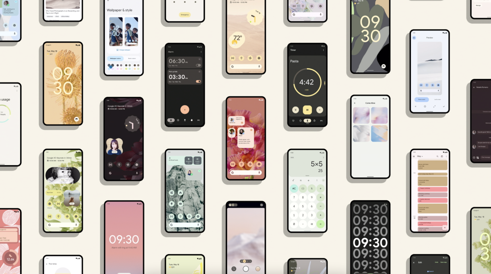
Multiple apps using Material Design 3 theming

You can start using Material Design 3 in your apps by adding the Compose Material 3 dependency to your build.gradle files:

// Add dependency in module build.gradle

implementation "androidx.compose.material3:material3:$material3_version" 


Note: See the latest M3 versions on the Compose Material 3 releases page.


Color schemes

Material 3 brings extensive, finer grained color customisation, and comes with both light and dark color scheme support out of the box. The Material Theme Builder allows you to generate a custom color scheme using core colors, and optionally export Compose theming code. You can read more about color schemes and color roles.
ALT TEXT
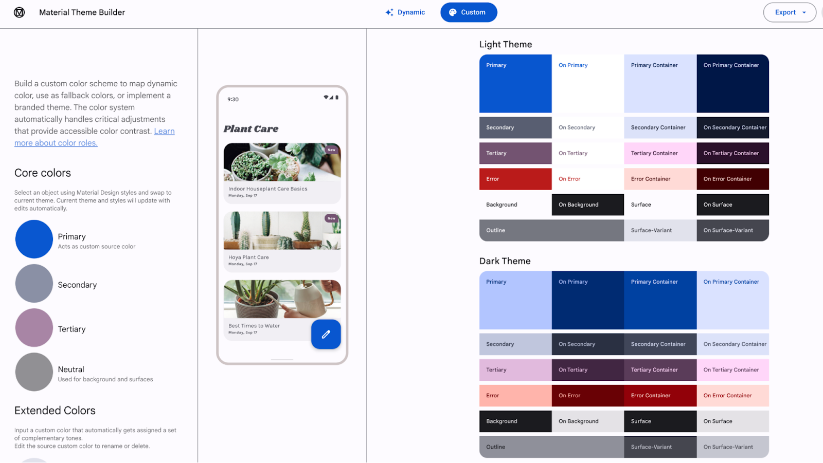
Material Theme Builder to export Material 3 color schemes
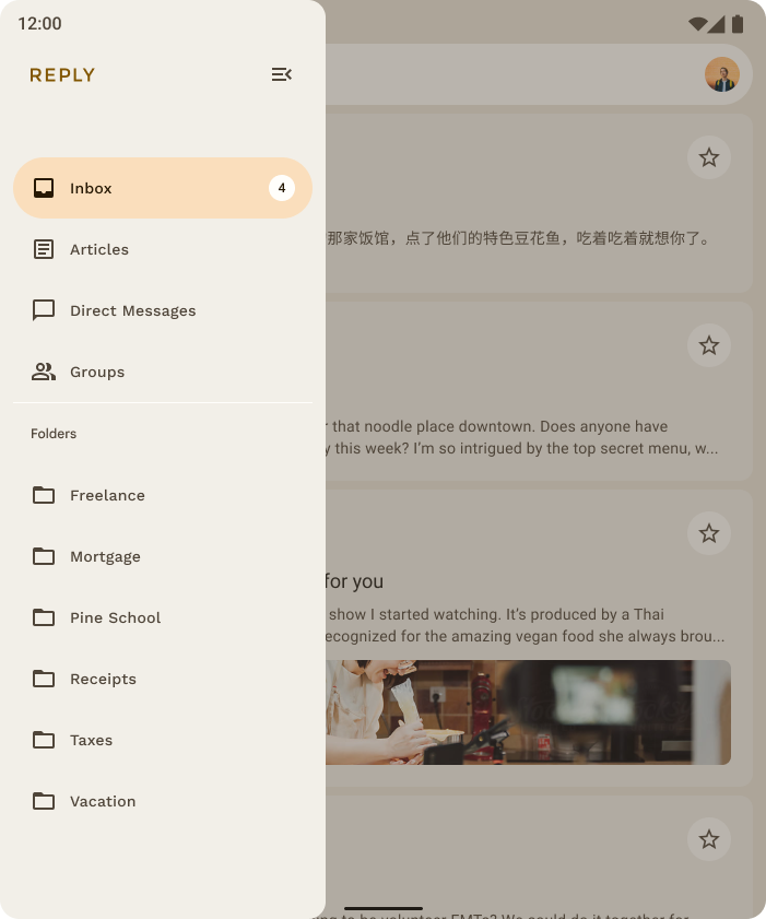

Dynamic color

Dynamic color derives from the user’s wallpaper. The colors can be applied to apps and the system UI.

Dynamic color is available on Android 12 (API level 31) and above. If dynamic color is available, you can set up a dynamic ColorScheme. If not, you should fall back to using a custom light or dark ColorScheme.
Reply Dynamic theming from wallpaper(Left) and Default app theming (Right)


The ColorScheme class provides builder functions to create both dynamic and custom light and dark color schemes:

Theme.kt

// Dynamic color is available on Android 12+
val dynamicColor = Build.VERSION.SDK_INT >= Build.VERSION_CODES.S
val colorScheme = when {
  dynamicColor && darkTheme -> dynamicDarkColorScheme(LocalContext.current)
  dynamicColor && !darkTheme -> dynamicLightColorScheme(LocalContext.current)
  darkTheme -> darkColorScheme(...)
  else -> lightColorScheme(...)
}

MaterialTheme(
  colorScheme = colorScheme,
  typography = typography,
  shapes = shapes
) {
  // M3 App content
}


Material components

The Compose Material 3 APIs contain a wide range of both new and evolved Material components, with more planned for future versions. Many of the Material components, like CardRadioButton and CheckBox, are no longer considered experimental; their APIs are stable and they can be used without the ExperimentalMaterial3Api annotation.

The M3 Switch component has a brand new UI refresh with accessibility-compliant minimum touch target size support, color mappings, and optional icon support in the switch thumb. The touch target is bigger, and the thumb size increases on user interaction, providing feedback to the user that the thumb is being interacted with.
ALT TEXT
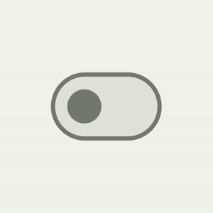
Material 3 Switch thumb interaction

Switch(
      checked = isChecked,
      onCheckedChange = { /*...*/ },
      thumbContent = {
          Icon(
              imageVector = Icons.Default.Check,
              contentDescription = stringResource(id = R.string.switch_check)
          )
      },
  )


Navigation drawer components now provide wrapper sheets for content to change colors, shapes, and elevation independently.

Navigation drawer component

Content
ModalNavigationDrawerModalDrawerSheet
PermanentNavigationDrawer

PermanentDrawerSheet
DismissableNavigationDrawerDismissableDrawerSheet


ALT TEXT
ModalNavigationDrawer with content wrapped in ModalDrawerSheet

ModalNavigationDrawer {
    ModalDrawerSheet(
        drawerShape = MaterialTheme.shapes.small,
        drawerContainerColor = MaterialTheme.colorScheme.primaryContainer,
        drawerContentColor = MaterialTheme.colorScheme.onPrimaryContainer,
        drawerTonalElevation = 4.dp,
    ) {
        DESTINATIONS.forEach { destination ->
            NavigationDrawerItem(
                selected = selectedDestination == destination.route,
                onClick = { ... },
                icon = { ... },
                label = { ... }
            )
        }
    }
}


We have a brand new CenterAlignedTopAppBar  in addition to already existing app bars. This can be used for the main root page in an app: you can display the app name or page headline with home and action icons.


ALT TEXT
Material CenterAlignedTopAppBar with home and action items.

CenterAlignedTopAppBar(
          title = {
              Text(stringResources(R.string.top_stories))
          },
          scrollBehavior = scrollBehavior,
          navigationIcon =  { /* Navigation Icon */},
          actions = { /* App bar actions */}
      )


See the latest M3 components and layouts on the Compose Material 3 API reference overview. Keep an eye on the releases page for new and updated APIs.


Typography

Material 3 simplified the naming and grouping of typography to:
  • Display
  • Headline
  • Title
  • Body
  • Label
There are large, medium, and small sizes for each, providing a total of 15 text style variations.

The 
Typography constructor offers defaults for each style, so you can omit any parameters that you don’t want to customize:

val typography = Typography(
  titleLarge = TextStyle(
      fontWeight = FontWeight.SemiBold,
      fontSize = 22.sp,
      lineHeight = 28.sp,
      letterSpacing = 0.sp
  ),
  titleMedium = TextStyle(
      fontWeight = FontWeight.SemiBold,
      fontSize = 16.sp,
      lineHeight = 24.sp,
      letterSpacing = 0.15.sp
  ),
  ...
}


You can customize your typography by changing default values of TextStyle and font-related properties like fontFamily and letterSpacing.

bodyLarge = TextStyle(
  fontWeight = FontWeight.Normal,
  fontFamily = FontFamily.SansSerif,
  fontStyle = FontStyle.Italic,
  fontSize = 16.sp,
  lineHeight = 24.sp,
  letterSpacing = 0.15.sp,
  baselineShift = BaselineShift.Subscript
)


Shapes

The Material 3 shape scale defines the style of container corners, offering a range of roundedness from square to fully circular.

There are different sizes of shapes:
  • Extra small
  • Small
  • Medium
  • Large
  • Extra large

ALT TEXT
Material Design 3 shapes used in various components as default value.

Each shape has a default value but you can override it:

val shapes = Shapes(
  extraSmall = RoundedCornerShape(4.dp),
  small = RoundedCornerShape(8.dp),
  medium = RoundedCornerShape(12.dp),
  large = RoundedCornerShape(16.dp),
  extraLarge = RoundedCornerShape(28.dp)
)


You can read more about applying shape.


Window size classes

Jetpack Compose and Material 3 provide window size artifacts that can help make your apps adaptive. You can start by adding the Compose Material 3 window size class dependency to your build.gradle files:

// Add dependency in module build.gradle

implementation "androidx.compose.material3:material3-window-size-class:$material3_version"


Window size classes group sizes into standard size buckets, which are breakpoints that are designed to optimize your app for most unique cases.


ALT TEXT
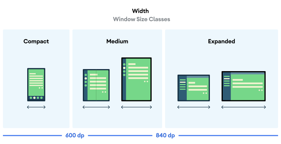
WindowWidthSize Class for grouping devices in different size buckets

See the Reply Compose sample to learn more about adaptive apps and the window size classes implementation.


Window insets support

M3 components, like top app bars, navigation drawers, bar, and rail, include built-in support for window insets. These components, when used independently or with Scaffold, will automatically handle insets determined by the status bar, navigation bar, and other parts of the system UI.

Scaffold now supports the contentWindowInsets parameter which can help to specify insets for the scaffold content.

Scaffold insets are only taken into consideration when a topBar or bottomBar is not present in Scaffold, as these components handle insets at the component level.

Scaffold(
    contentWindowInsets = WindowInsets(16.dp)
) {
    // Scaffold content
}


Resources

With Compose Material 3 reaching stable, it’s a great time to start learning all about it and get ready to adopt it in your apps. Check out the resources below to get started.

Stronger Admin console protection with risk-based re-authentication challenges

What’s changing 

In August 2022, we announced strengthened safeguards for sensitive actions taken in your Google Workspace end users accounts. Specifically, this update protected users from bad actors taking over accounts via cookie theft. Beginning today, we’re extending this protection to the Admin console. 


Currently, the Admin console prompts users to re-authenticate every hour. We are extending our current protections with additional signals to detect potential cookie theft. If a risky session is detected, we will issue extra challenges such as mobile notifications or the use of a security key. Once the user has successfully verified, they’ll be directed back to the admin page they came from. 


Who’s impacted 

Admins 


Why it’s important 

This added layer of security helps to intercept bad actors who have gained access to the Admin console using a stolen cookie. Cookie theft is a session hijacking technique whereby accounts can be accessed by exploiting cookies stored in the browser. 


The additional “Verify it’s you” challenges help ensure only authorized users are accessing your organization’s sensitive information and data, preventing bad actors from taking damaging actors. Further, these challenge attempts will be logged as Admin log events allowing for further admin investigation. 


Additional details 

To avoid situations where a bad actor has a cookie that marks a device as trusted, admins can configure a device to be trusted based upon login. 


If an admin gets legitimately stuck trying to access the Admin console, other admins can temporarily turn off login challenges, including additional log-in challenges. We strongly recommend only using this option if contact with the user is credibly established, such as via a video call. 


Getting started 


Rollout pace 


Availability 

  • Available to all Google Workspace customers, as well as legacy G Suite Basic and Business customers 

Resources