Improving Consistency of Background Work on Android

Posted by Sanat Kamal Bahl, Product Manager, Android Frameworks

Since its inception, Android has been designed to be the world’s first open and innovative platform for mobile devices.

Today, Android powers a rich and open ecosystem of devices serving billions of users around the world. The openness of the Android platform enables innovation in new mobile form factors like foldable phones. This openness also enables smart features in cars, watches, and televisions. While this openness unlocks great opportunities, with so many unique devices, it can make your life harder as a developer. One such challenge we have heard from the community involves restrictions on foreground services and background work that make it harder for you to create apps that work across different device models.

Looking to solve these consistency challenges, we are announcing deeper partnerships with Android hardware manufacturers to help ensure APIs for background work are supported predictably and consistently across the ecosystem. We are excited to announce that Samsung, representing one of Android’s longest partnerships, is our first partner on this journey:

“To strengthen the Android platform, our collaboration with Google has resulted in a unified policy that we expect will create a more consistent and reliable user experience for Galaxy users. Since One UI 6.0, foreground services of apps targeting Android 14 will be guaranteed to work as intended so long as they are developed according to Android's new foreground service API policy.” - Samsung

As mentioned in the Android 14 Developer Preview 1 blog post, we have:

We believe our expanding partnerships with hardware manufacturers and these changes will make it easier for developers to create apps that work consistently across different Android devices.

We encourage you to try the new Android 14 APIs and let us know what you think using the Android 14 Issue Tracker. We welcome you to contribute to CTS-D tests to help catch consistency issues. Lastly, If you see behavior differences across Android devices, be sure to file a ticket using goo.gle/devicespecificissue to bring it to our attention.

How to optimize your Android app for large screens (And what NOT to do!)

Posted by the Android team

Large foldables, tablets, and desktop devices like Chromebooks – with more active large screen Android devices each year, it’s more important than ever for apps to ensure they provide their users with a seamless experience on large screens. For example, these devices offer more screen space, and users expect apps to do more with that space. We’ve seen that apps enjoy better business metrics on these devices when they do work to support them.

These devices can also be used in different places and in different ways than we might expect on a handset. For example foldables can be used in tabletop mode, users may sit further away from a desktop display, and many large screen devices may be used with a mouse and keyboard.

These differences introduce new things to consider. For example:
  • Can a user reach the most important controls when using your app with two hands on a tablet?
  • Does all of your app’s functionality work with a keyboard and mouse?
  • Does your app’s camera preview have the right orientation regardless of the position of the device?
image showing differentiated experiences across large sceen devices

Large Screen Design and Quality

Defining great design and quality on large screens can be difficult, because different apps will have different ways to excel. You know your product best, so it’s important to use your app on large screen devices and reflect on what will provide the best experience. If you don’t have access to a large screen device; try one of the foldable, desktop, or tablet virtual devices.

Google also provides resources thoughout the development process to help as you optimize your app. If you’re looking for design guidance, there are thoughtful design resources like the large screen Material Design guidance and ready to use compositions like the Canonical layouts. For inspiration, there are great examples of a variety of different apps in the large screens gallery. If you’re looking for a structured way to approach large screen quality, the Large screen app quality guidelines provide a straight-forward checklist and a set of tests to give you confidence that your app is ready for large screens.


Dos and Don’ts of Optimizing for Large Screens

Whether you already have beautiful large screen designs or not, we want to highlight some helpful tips and common mistakes to avoid when optimizing your app for large screens.

Don’t: assume exclusive access to resources

  • Don’t assume you have exclusive access to hardware resources like the camera. Large screens commonly have more than one app active at a time, and those other apps may try to access the same resources.
  • This means you should test your app side by side simultaneously with other apps, and never assume a resource is available at any given time.

Do: handle hardware access gracefully

  • Check for hardware resources like the camera before trying to use them. Remember that hardware peripherals can be added and removed at any time via USB.
  • Fail gracefully when access to a given resource isn’t available at runtime.
try { // Attempt to use the camera ... } catch (e: CameraAccessException) { e.message?.let { Log.e(TAG, it) } // Fail gracefully if the camera isn't currently available } }

Do: respond appropriately to lifecycle events:

  • Your app may still be visible during onPause(), especially when multiple apps on onscreen, so you need to keep media playing and your UI fresh until onStop() is called

Don’t: stop your app’s UI in onPause()

override fun onPause() { //DON'T clean up resources here. //Your app can still be visible. super.onPause() }

Don’t: rely on device-type booleans like “isTablet

  • In the past, a common pattern for apps to use was to leverage screen width to create a boolean like “isTablet” to make changes based on the kind of device the app is running on, but this approach is fragile. The core problem with this approach is that it looks for a proxy to determine what the device type is, and those proxies are error-prone. For example, if you determine a device is a tablet because it has a large display when your app launches, your app can behave incorrectly when its window is resized to not take up the full screen. Even if your device-type boolean responds to configuration changes, unfolding a foldable would change your experience in a way that it couldn’t return to until another configuration change occurs, such as refolding the device.

Do: work to replace existing uses of device-type booleans with the right approach

Query for the information about the device that’s necessary for what you’re trying to accomplish. For example:

  • If you’re using device-type booleans to adapt your layout, use WindowSizeClasses instead. The library has support for both Views and for Jetpack Compose, and it makes it clear and easy to adapt your UI to pre-defined breakpoints.
// androidx.compose.material3.windowsizeclass.WindowSizeClass class MainActivity : ComponentActivity() { … setContent { val windowSizeClass = calculateWindowSizeClass(this) WindowSizeClassDisplay(windowSizeClass) } @Composable fun WindowSizeClassDisplay(windowSizeClass : WindowSizeClass) { when (windowSizeClass.widthSizeClass) { WindowWidthSizeClass.Compact -> { compactLayout() } WindowWidthSizeClass.Medium -> { mediumLayout() } WindowWidthSizeClass.Expanded -> { expandedLayout() } } }
  • If you’re using isTablet for changing user facing strings like “your tablet”, you might not need any more information. The solution can be as simple as using more general phrasing such as “your Android device”.
  • If you’re using a device-type boolean to predict the presence of a hardware feature or resource (e.g. - telephony, bluetooth, etc), check for the desired capabilities directly at runtime before trying to use them, and fail gracefully when they become unavailable. This feature-based approach ensures that your app can respond appropriately to peripheral devices that can be attached or removed. It also avoids cases where a feature is missing even though it could be supported by the device.
val packageManager: PackageManager = context.packageManager val hasTelephony = packageManager.hasSystemFeature(PackageManager.FEATURE_TELEPHONY)

Do: use Jetpack CameraX when possible

  • There can be a surprising amount of complexity in showing camera previews – orientation, aspect ratio, and more. When you use Jetpack CameraX, the library will handle as many of these details as possible for you.

Don’t: assume that your camera preview will align with device orientation

  • There are several kinds of orientation to consider when implementing a camera preview in your app - natural orientation, device orientation, and display orientation. Proper implementation of a camera preview requires accounting for the various kinds of orientation and adapting as the device’s conditions change.

Don’t: assume that aspect ratios are static

Do: declare hardware feature requirements correctly

  • When you’re declaring your app’s feature requirements, refer to the guidance in the Large Screens Cookbook. To ensure that you aren’t unnecessarily limiting your app’s reach, be sure to use the most inclusive manifest entries that work with your app.
<uses-feature android:name="android.hardware.camera.any" android:required="false" /> <uses-feature android:name="android.hardware.camera" android:required="false" /> <uses-feature android:name="android.hardware.camera.autofocus" android:required="false" /> <uses-feature android:name="android.hardware.camera.flash" android:required="false" />

Don’t: assume window insets are static

  • Large screens can change frequently, and that includes their WindowInsets. This means we can’t just check the insets when our app is launched and never change them.

Do: use the WindowInsetsListener APIs for Views

  • The WindowInsetsListener APIs notify your app when insets change
    ViewCompat.setOnApplyWindowInsetsListener(view) { view, windowInsets -> val insets = windowInsets.getInsets( WindowInsetsCompat.Type.systemBars()) view.updateLayoutParams<MarginLayoutParams>( leftMargin = insets.left, bottomMargin = insets.bottom, rightMargin = insets.right, ) WindowInsetsCompat.CONSUMED }

    Do: use the windowInsetsPadding Modifier for Jetpack Compose

    • The windowInsetsPadding Modifier will dynamically pad based on the given type of window insets. Additionally, multiple instances of the Modifier can communicate with each other to avoid adding duplicate padding, and they’re automatically animated.

    Don’t: assume the device has a touch screen

    Do: test your app on large screens

    • The most important thing you can do to ensure your app’s experience is great on large screens is to test it yourself. If you want a rigorous test plan that’s already prepared for you, try out the large screen compatibility tests.

    Do: leverage the large screen tools in Android Studio

    • Android Studio provides tools to use during development that make it much easier to optimize for large screens. For example, multipreview annotations allow you to visualize your app in many conditions at the same time. There’s also a wide variety of tablet, desktop, and foldable AVDs available in the Android Virtual Device Manager to help you test your app on large screens today.

    Stay tuned for Google I/O

    These tips are a great starting point as you optimize your app for large screens, and there are even more updates to come at Google I/O on May 10th. Tune in to watch the latest news and innovations from Google, with live streamed keynotes and helpful product updates on demand.

    5 things to know before customizing your first machine learning model with MediaPipe Model Maker

    Posted by Jen Person, DevRel Engineer, CoreML

    If you're reading this blog, then you're probably interested in creating a custom machine learning (ML) model. I recently went through the process myself, creating a custom dog detector to go with a Codelab, Create a custom object detection web app with MediaPipe. Like any new coding task, the process took some trial and error to figure out what I was doing along the way. To minimize the error part of your "trial and error" experience, I'm happy to share five takeaways from my model training experience with you.


    1. Preparing data takes a long time. Be sure to make the time

    Preparing your data for training will look different depending on the type of model you're customizing. In general, there is a step for sourcing data and a step for annotating data.

    Sourcing data

    Finding enough data points that best represent your use case can be a challenge. For one, you want to make sure you have the right to use any images or text you include in your data. Check the licensing for your data before training. One way to resolve this is to provide your own data. I just so happen to have hundreds of photos of my dogs, so choosing them for my object detector was a no-brainer. You can also look for existing datasets on Kaggle. There are so many options on Kaggle covering a wide range of use cases. If you're lucky, you'll find an existing dataset that serves your needs and it might even already have annotations!

    Annotating data

    MediaPipe Model Maker accepts data where each input has a corresponding XML file listing its annotations. For example:

    There are several software programs that can help with annotation. This is especially useful when you need to highlight specific areas in images. Some software programs are designed to enable collaboration–an intuitive UI and instructions for annotators mean you can enlist the help of others. A common open source option is Label Studio, which is what I used to annotate my images.

    So expect this step to take a long time, but keep in mind that it will take longer than you expect.


    2. Simplify your custom model

    If you're anything like me, you have a wonderfully grand idea planned for your first custom model. My dog Ben was the inspiration for my first model. He came from a local golden retriever rescue, but when I did a DNA test, it turned out that he's 0% golden retriever! My first idea was to create a golden retriever detector – a solution that could tell you if a dog was a "golden retriever" or "not golden retriever". I thought it could be fun to see what the model thought of Ben, but I quickly realized that I would have to source a lot more images of dogs than I had so I could run the model on other dogs as well. And, I'd have to make sure that it could accurately identify golden retrievers of all shades. After hours into this endeavor I realized I needed to simplify. That's when I decided to try building a solution for just my three dogs. I had plenty of photos to choose from, so I picked the ones that best showed the dogs in detail. This was a much more successful solution, and a great proof of concept for my golden retriever model because I refuse to abandon that idea.

    Here are a few ways to simplify your first custom model:

    1. Start with fewer labels. Choose 2-5 classes to assign to your data.
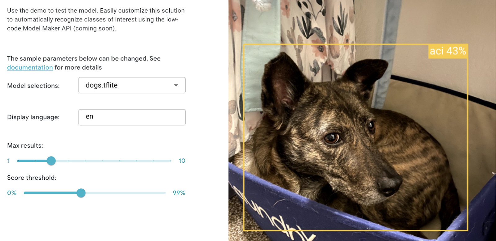
    2. Leave off the edge cases. If you're coming from a background in software engineering, then you're used to paying attention to and addressing any edge cases. In machine learning, you might be introducing some errors or strange behavior when you try to train for edge cases. For example, I didn't choose any dog photos where their heads aren't visible. Sure, I may want a model that can detect my dogs even from just the back half. But I left partial dog photos out of my training and it turns out that the model is still able to detect them.
      Image showing partial photo of author's dog being recognized by model with 50% confidence
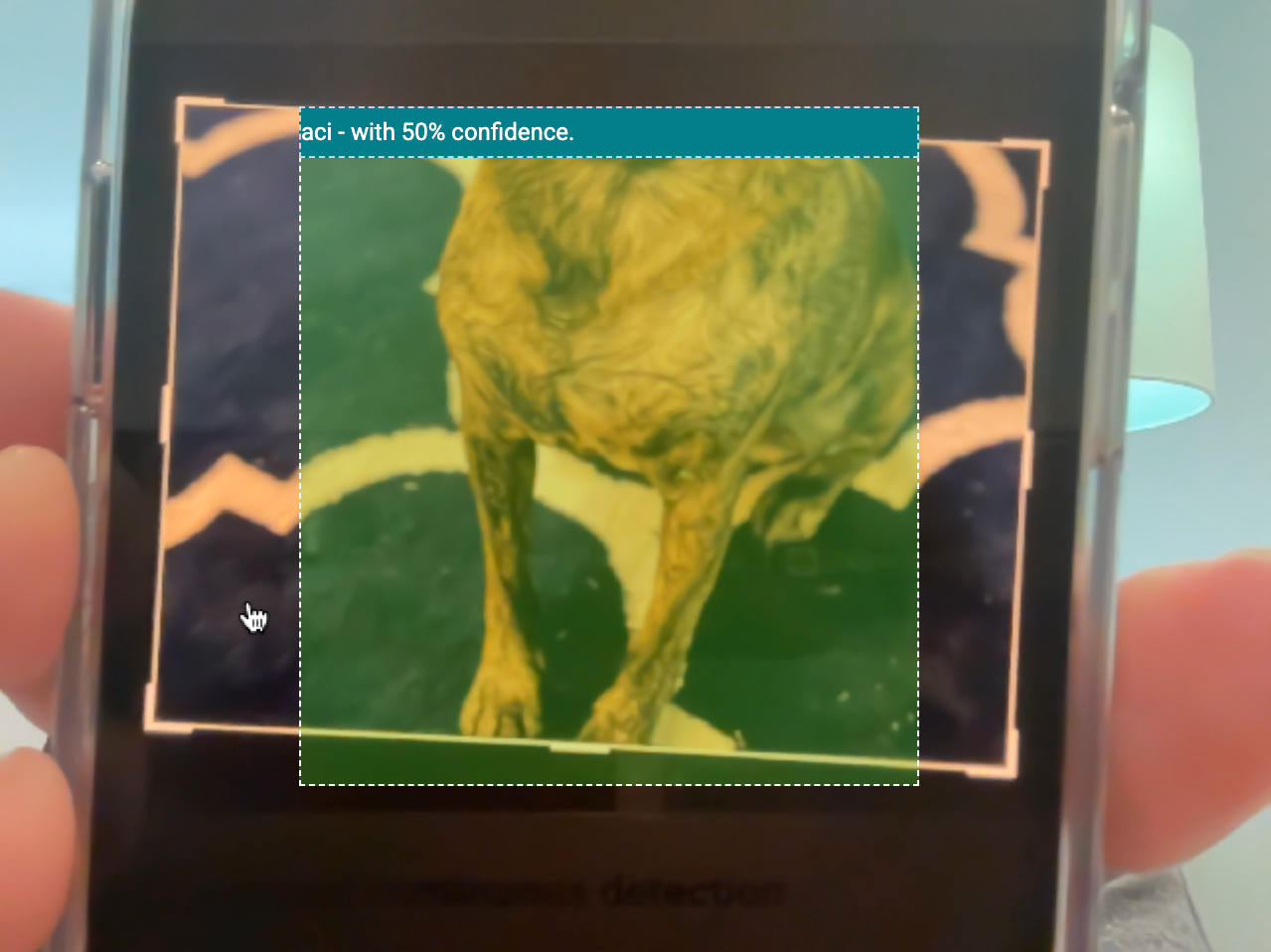
      The web app still identifies ACi in an image even when her head isn't visible
      Include some edge cases in your testing and prototyping to see how the model handles them. Otherwise, don't sweat the edge cases.
    3. A little data goes a long way. Since MediaPipe Model Maker uses transfer learning, you need much less data to train than you would if you were training a model from scratch. Aim for 100 examples for each class. You might be able to train with fewer than 100 examples if there aren't many possible iterations of the data. For example, my colleague trained a model to detect two different Android figurines. He didn't need too many photos because there are only so many angles at which to view the figurines. You might need more than 100 examples to start if you need more to show the possible iterations of the data. For example, a golden retriever comes in many colors. You might need several dozen examples for each color to ensure the model can accurately identify them, resulting in over 100 examples.

    So when it comes to your first ML training experience, remember to simplify, simplify, simplify.

    Simplify.

    Simplify.


    3. Expect several training iterations

    As much as I'd like to confidently say you'll get the right results from your model the first time you train, it probably won't happen. Taking your time with choosing data samples and annotation will definitely improve your success rate, but there are so many factors that can change how the model behaves. You might find that you need to start with a different model architecture to reach your desired accuracy. Or, you might try a different split of training and validation data. You might need to add more samples to your dataset. Fortunately, transfer learning with MediaPipe Model Maker generally takes several minutes, so you can turn around new iterations fairly quickly.


    4. Prototype outside of your app

    When you finish training a model, you're probably going to be very excited and eager to add it to your app. However, I encourage you to first try out your model in MediaPipe Studio for a couple of reasons:

    1. Any time you make a change to your app, you probably have to wait for some compile and/or build step to complete. Even with a hot reload, there can be a wait time. So if you decide you want to tweak a configuration option like score threshold, you'll be waiting through every tweak you make and that time can add up. It's not worth the extra time to wait for a whole app to build out when you're just trying to test one component. With MediaPipe Studio, you can try out options and see results with very low latency.
    2. If you don't get the expected results, you can't confidently determine if the issue is with your model, task configuration, or app.

    With MediaPipe Studio, I was able to quickly try out different score thresholds on various images to determine what threshold I should use in my app. I also eliminated my own web app as a factor in this performance.

    Image showing screen grab of author testing the score threshold of the model with a photo of the author's pet sitting in a box. the model has identified the photo with 43% confidence

    5. Make incremental changes

    After sourcing quality data, simplifying your use case, training, and prototyping, you might find that you need to repeat the cycle to get the right result. When that happens, choose just one part of the process to change, and make a small change. In my case, many photos of my dogs were taken on the same blue couch. If the model started picking up on this couch since it's often inside the bounding box, that could be affecting how it categorized images where the dogs aren't on the couch. Rather than throwing out all the couch photos, I removed just a couple and added about 10 more of each dog where they aren't on the couch. This greatly improved my results. If you try to make a big change right away, you might end up introducing new issues rather than resolving them.


    Go forth and customize!

    With these tips in mind, it's time for you to customize your own ML solution! You can customize your image classification, gesture recognition, text classification, or object detection model to use in MediaPipe Tasks.

    If you’d like to share some learnings from training your first model, post the details on LinkedIn along with a link to this blog post, and then tag me. I can't wait to see what you learn and what you build!

    Chrome Beta for Android Update

    Hi everyone! We've just released Chrome Beta 114 (114.0.5735.14) for Android. It's now available on Google Play.

    You can see a partial list of the changes in the Git log. For details on new features, check out the Chromium blog, and for details on web platform updates, check here.

    If you find a new issue, please let us know by filing a bug.

    Harry Souders
    Google Chrome

    Beta Channel Update for ChromeOS / ChromeOS Flex

    The Beta channel is being updated to OS version: 15393.44.0, Browser version: 113.0.5672.85 for most ChromeOS devices.

    If you find new issues, please let us know one of the following waysInterested in switching channels? Find out how.

    Matt Nelson,

    Google ChromeOS

    Beta Channel Update for Desktop

    The Chrome team is excited to announce the promotion of Chrome 114 to the Beta channel for Windows, Mac and Linux. Chrome 114.0.5735.16 contains our usual under-the-hood performance and stability tweaks, but there are also some cool new features to explore - please head to the Chromium blog to learn more!


    A full list of changes in this build is available in the log. Interested in switching release channels? Find out how here. If you find a new issues, please let us know by filing a bug. The community help forum is also a great place to reach out for help or learn about common issues.


    Srinivas Sista Google Chrome

    Get ready for I/O ‘23: start planning your sessions, and take a look at some of Android’s favorite moments!

    Posted by Maru Ahues Bouza, Director, Android Developer Relations

    Google I/O 2023 is just a week away, kicking off on Wednesday May 10 at 10AM PT with the Google Keynote and followed at 12:15PM PT by the Developer Keynote. The program schedule launched last week, allowing you to save sessions to your calendar and start previewing content.

    To help you get ready for this year's Google I/O, we’re taking a look back at some of Android’s favorite moments from past Google I/Os, as well as a playlist of developer content to help you prepare. Take a look below, and start getting ready!


    Modern Android Development

    Helping you stay more productive and create better apps, Modern Android Development is Android’s set of tools and APIs, and they were born across many Google I/Os. Tor Norbye, Director of Engineering for Android, reflects on how Android development tools, APIs, and best practices have evolved over the years, starting in 2013 when he and the team announced Android Studio. Here are some of the talks we’re excited for in developer productivity at this year’s Google I/O:


    Building for a multi-device world

    From the launch of Android Auto and Android Wear in 2014 to last year’s preview of the Google Pixel Tablet, Google I/O has always been an important moment for seeing the new form factors that Android is extending to. Sara Hamilton, Developer Relations Engineer for Android, discusses how we are continuing to invest in multi-device experiences and making it easier for you to build for the entire Android device ecosystem. Sara shares her excitement for developers continuing to bring unique experiences to all screen sizes and types, from tablets and foldables, to watches and tvs. Some of our favorite talks at this year’s Google I/O in the multi-device world include:


    The platform and app quality

    From originally playing a smaller part in Google I/O keynotes in the early days to announcing 3 billion monthly active users in 2021, Dan Sandler, Software Engineer for Android, looks back at the tremendous growth of the Android platform and how it’s continuing to evolve. With a focus on helping you make quality apps, here are some of our favorite Android platform talks this year:


    We can’t wait to show you all that’s new across Android in just under a week. Be sure to tune in on the Google I/O website on May 10 to catch the latest Android updates and announcements this year!