Tag Archives: Environment

New Insights into Human Mobility with Privacy Preserving Aggregation


Understanding human mobility is crucial for predicting epidemics, urban and transit infrastructure planning, understanding people’s responses to conflict and natural disasters and other important domains. Formerly, the state-of-the-art in mobility data was based on cell carrier logs or location "check-ins", and was therefore available only in limited areas — where the telecom provider is operating. As a result, cross-border movement and long-distance travel were typically not captured, because users tend not to use their SIM card outside the country covered by their subscription plan and datasets are often bound to specific regions. Additionally, such measures involved considerable time lags and were available only within limited time ranges and geographical areas.

In contrast, de-identified aggregate flows of populations around the world can now be computed from phones' location sensors at a uniform spatial resolution. This metric has the potential to be extremely useful for urban planning since it can be measured in a direct and timely way. The use of de-identified and aggregated population flow data collected at a global level via smartphones could shed additional light on city organization, for example, while requiring significantly fewer resources than existing methods.

In “Hierarchical Organization of Urban Mobility and Its Connection with City Livability”, we show that these mobility patterns — statistics on how populations move about in aggregate — indicate a higher use of public transportation, improved walkability, lower pollutant emissions per capita, and better health indicators, including easier accessibility to hospitals. This work, which appears in Nature Communications, contributes to a better characterization of city organization and supports a stronger quantitative perspective in the efforts to improve urban livability and sustainability.
Visualization of privacy-first computation of the mobility map. Individual data points are automatically aggregated together with differential privacy noise added. Then, flows of these aggregate and obfuscated populations are studied.
Computing a Global Mobility Map While Preserving User Privacy
In line with our AI principles, we have designed a method for analyzing population mobility with privacy-preserving techniques at its core. To ensure that no individual user’s journey can be identified, we create representative models of aggregate data by employing a technique called differential privacy, together with k-anonymity, to aggregate population flows over time. Initially implemented in 2014, this approach to differential privacy intentionally adds random “noise” to the data in a way that maintains both users' privacy and the data's accuracy at an aggregate level. We use this method to aggregate data collected from smartphones of users who have deliberately chosen to opt-in to Location History, in order to better understand global patterns of population movements.

The model only considers de-identified location readings aggregated to geographical areas of predetermined sizes (e.g., S2 cells). It "snaps" each reading into a spacetime bucket by discretizing time into longer intervals (e.g., weeks) and latitude/longitude into a unique identifier of the geographical area. Aggregating into these large spacetime buckets goes beyond protecting individual privacy — it can even protect the privacy of communities.

Finally, for each pair of geographical areas, the system computes the relative flow between the areas over a given time interval, applies differential privacy filters, and outputs the global, anonymized, and aggregated mobility map. The dataset is generated only once and only mobility flows involving a sufficiently large number of accounts are processed by the model. This design is limited to heavily aggregated flows of populations, such as that already used as a vital source of information for estimates of live traffic and parking availability, which protects individual data from being manually identified. The resulting map is indexed for efficient lookup and used to fuel the modeling described below.

Mobility Map Applications
Aggregate mobility of people in cities around the globe defines the city and, in turn, its impact on the people who live there. We define a metric, the flow hierarchy (Φ), derived entirely from the mobility map, that quantifies the hierarchical organization of cities. While hierarchies across cities have been extensively studied since Christaller’s work in the 1930s, for individual cities, the focus has been primarily on the differences between core and peripheral structures, as well as whether cities are mono- or poly-centric. Our results instead show that the reality is much more rich than previously thought. The mobility map enables a quantitative demonstration that cities lie across a spectrum of hierarchical organization that strongly correlates with a series of important quality of life indicators, including health and transportation.

Below we see an example of two cities — Paris and Los Angeles. Though they have almost the same population size, those two populations move in very different ways. Paris is mono-centric, with an "onion" structure that has a distinct high-mobility city center (red), which progressively decreases as we move away from the center (in order: orange, yellow, green, blue). On the other hand, Los Angeles is truly poly-centric, with a large number of high-mobility areas scattered throughout the region.
Mobility maps of Paris (left) and Los Angeles (right). Both cities have similar population sizes, but very different mobility patterns. Paris has an "onion" structure exhibiting a distinct center with a high degree of mobility (red) that progressively decreases as we move away from the center (in order: orange, yellow, green, blue). In contrast, Los Angeles has a large number of high-mobility areas scattered throughout the region.
More hierarchical cities — in terms of flows being primarily between hotspots of similar activity levels — have values of flow hierarchy Φ closer to the upper limit of 1 and tend to have greater levels of uniformity in their spatial distribution of movements, wider use of public transportation, higher levels of walkability, lower pollution emissions, and better indicators of various measures of health. Returning to our example, the flow hierarchy of Paris is Φ=0.93 (in the top quartile across all 174 cities sampled), while that of Los Angeles is 0.86 (bottom quartile).

We find that existing measures of urban structure, such as population density and sprawl composite indices, correlate with flow hierarchy, but in addition the flow hierarchy conveys comparatively more information that includes behavioral and socioeconomic factors.
Connecting flow hierarchy Φ with urban indicators in a sample of US cities. Proportion of trips as a function of Φ, broken down by model share: private car, public transportation, and walking. Sample city names that appear in the plot: ATL (Atlanta), CHA (Charlotte), CHI (Chicago), HOU (Houston), LA (Los Angeles), MIN (Minneapolis), NY (New York City), and SF (San Francisco). We see that cities with higher flow hierarchy exhibit significantly higher rates of public transportation use, less car use, and more walkability.
Measures of urban sprawl require composite indices built up from much more detailed information on land use, population, density of jobs, and street geography among others (sometimes up to 20 different variables). In addition to the extensive data requirements, such metrics are also costly to obtain. For example, censuses and surveys require a massive deployment of resources in terms of interviews, and are only standardized at a country level, hindering the correct quantification of sprawl indices at a global scale. On the other hand, the flow hierarchy, being constructed from mobility information alone, is significantly less expensive to compile (involving only computer processing cycles), and is available in real-time.

Given the ongoing debate on the optimal structure of cities, the flow hierarchy, introduces a different conceptual perspective compared to existing measures, and can shed new light on the organization of cities. From a public-policy point of view, we see that cities with greater degree of mobility hierarchy tend to have more desirable urban indicators. Given that this hierarchy is a measure of proximity and direct connectivity between socioeconomic hubs, a possible direction could be to shape opportunity and demand in a way that facilitates a greater degree of hub-to-hub movement than a hub-to-spoke architecture. The proximity of hubs can be generated through appropriate land use, that can be shaped by data-driven zoning laws in terms of business, residence or service areas. The presence of efficient public transportation and lower use of cars is another important factor. Perhaps a combination of policies, such as congestion-pricing, used to disincentivize private transportation to socioeconomic hubs, along with building public transportation in a targeted fashion to directly connect the hubs, may well prove useful.

Next Steps
This work is part of our larger AI for Social Good efforts, a program that focuses Google's expertise on addressing humanitarian and environmental challenges.These mobility maps are only the first step toward making an impact in epidemiology, infrastructure planning, and disaster response, while ensuring high privacy standards.

The work discussed here goes to great lengths to ensure privacy is maintained. We are also working on newer techniques, such as on-device federated learning, to go a step further and enable computing aggregate flows without personal data leaving the device at all. By using distributed secure aggregation protocols or randomized responses, global flows can be computed without even the aggregator having knowledge of individual data points being aggregated. This technique has also been applied to help secure Chrome from malicious attacks.

Acknowledgements
This work resulted from a collaboration of Aleix Bassolas and José J. Ramasco from the Institute for Cross-Disciplinary Physics and Complex Systems (IFISC, CSIC-UIB), Brian Dickinson, Hugo Barbosa-Filho, Gourab Ghoshal, Surendra A. Hazarie, and Henry Kautz from the Computer Science Department and Ghoshal Lab at the University of Rochester, Riccardo Gallotti from the Bruno Kessler Foundation, and Xerxes Dotiwalla, Paul Eastham, Bryant Gipson, Onur Kucuktunc, Allison Lieber, Adam Sadilek at Google.

The differential privacy library used in this work is open source and available on our GitHub repo.

Source: Google AI Blog


Acoustic Detection of Humpback Whales Using a Convolutional Neural Network


Over the last several years, Google AI Perception teams have developed techniques for audio event analysis that have been applied on YouTube for non-speech captions, video categorizations, and indexing. Furthermore, we have published the AudioSet evaluation set and open-sourced some model code in order to further spur research in the community. Recently, we’ve become increasingly aware that many conservation organizations were collecting large quantities of acoustic data, and wondered whether it might be possible to apply these same technologies to that data in order to assist wildlife monitoring and conservation.

As part of our AI for Social Good program, and in partnership with the Pacific Islands Fisheries Science Center of the U.S. National Oceanic and Atmospheric Administration (NOAA), we developed algorithms to identify humpback whale calls in 15 years of underwater recordings from a number of locations in the Pacific. The results of this research provide new and important information about humpback whale presence, seasonality, daily calling behavior, and population structure. This is especially important in remote, uninhabited islands, about which scientists have had no information until now. Additionally, because the dataset spans a large period of time, knowing when and where humpback whales are calling will provide information on whether or not the animals have changed their distribution over the years, especially in relation to increasing human ocean activity. That information will be a key ingredient for effective mitigation of anthropogenic impacts on humpback whales.
HARP deployment locations. Green: sites with currently active recorders. Red: previous recording sites.
Passive Acoustic Monitoring and the NOAA HARP Dataset
Passive acoustic monitoring is the process of listening to marine mammals with underwater microphones called hydrophones, which can be used to record signals so that detection, classification, and localization tasks can be done offline. This has some advantages over ship-based visual surveys, including the ability to detect submerged animals, longer detection ranges and longer monitoring periods. Since 2005, NOAA has collected recordings from ocean-bottom hydrophones at 12 sites in the Pacific Island region, a winter breeding and calving destination for certain populations of humpback whales.

The data was recorded on devices called high-frequency acoustic recording packages, or HARPs (Wiggins and Hildebrand, 2007; full text PDF). In total, NOAA provided about 15 years of audio, or 9.2 terabytes after decimation from 200 kHz to 10kHz. (Since most of the sound energy in humpback vocalizations is in the 100Hz-2000Hz range, little is lost in using the lower sample rate.)

From a research perspective, identifying species of interest in such large volumes of data is an important first stage that provides input for higher-level population abundance, behavioral or oceanographic analyses. However, manually marking humpback whale calls, even with the aid of currently available computer-assisted methods, is extremely time-consuming.

Supervised Learning: Optimizing an Image Model for Humpback Detection
We made the common choice of treating audio event detection as an image classification problem, where the image is a spectrogram — a histogram of sound power plotted on time-frequency axes.
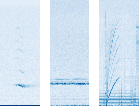
Example spectrograms of audio events found in the dataset, with time on the x-axis and frequency on the y-axis. Left: a humpback whale call (in particular, a tonal unit), Center: narrow-band noise from an unknown source, Right: hard disk noise from the HARP
This is a good representation for an image classifier, whose goal is to discriminate, because the different spectra (frequency decompositions) and time variations thereof (which are characteristic of distinct sound types) are represented in the spectrogram as visually dissimilar patterns. For the image model itself, we used ResNet-50, a convolutional neural network architecture typically used for image classification that has shown success at classifying non-speech audio. This is a supervised learning setup, where only manually labeled data could be used for training (0.2% of the entire dataset — in the next section, we describe an approach that makes use of the unlabeled data.)

The process of going from waveform to spectrogram involves choices of parameters and gain-scaling functions. Common default choices (one of which was logarithmic compression) were a good starting point, but some domain-specific tuning was needed to optimize the detection of whale calls. Humpback vocalizations are varied, but sustained, frequency-modulated, tonal units occur frequently in time. You can listen to an example below:


If the frequency didn't vary at all, a tonal unit would appear in the spectrogram as a horizontal bar. Since the calls are frequency-modulated, we actually see arcs instead of bars, but parts of the arcs are close to horizontal.

A challenge particular to this dataset was narrow-band noise, most often caused by nearby boats and the equipment itself. In a spectrogram it appears as horizontal lines, and early versions of the model would confuse it with humpback calls. This motivated us to try per-channel energy normalization (PCEN), which allows the suppression of stationary, narrow-band noise. This proved to be critical, providing a 24% reduction in error rate of whale call detection.
Spectrograms of the same 5-unit excerpt from humpback whale song beginning at 0:06 in the above recording. Top: PCEN. Bottom: log of squared magnitude. The dark blue horizontal bar along the bottom under log compression has become much lighter relative to the whale call when using PCEN
Aside from PCEN, averaging predictions over a longer period of time led to much better precision. This same effect happens for general audio event detection, but for humpback calls the increase in precision was surprisingly large. A likely explanation is that the vocalizations in our dataset are mainly in the context of whale song, a structured sequence of units than can last over 20 minutes. At the end of one unit in a song, there is a good chance another unit begins within two seconds. The input to the image model covers a short time window, but because the song is so long, model outputs from more distant time windows give extra information useful for making the correct prediction for the current time window.

Overall, evaluating on our test set of 75-second audio clips, the model identifies whether a clip contains humpback calls at over 90% precision and 90% recall. However, one should interpret these results with care; training and test data come from similar equipment and environmental conditions. That said, preliminary checks against some non-NOAA sources look promising.

Unsupervised Learning: Representation for Finding Similar Song Units
A different way to approach the question, "Where are all the humpback sounds in this data?", is to start with several examples of humpback sound and, for each of these, find more in the dataset that are similar to that example. The definition of similar here can be learned by the same ResNet we used when this was framed as a supervised problem. There, we used the labels to learn a classifier on top of the ResNet output. Here, we encourage a pair of ResNet output vectors to be close in Euclidean distance when the corresponding audio examples are close in time. With that distance function, we can retrieve many more examples of audio similar to a given one. In the future, this may be useful input for a classifier that distinguishes different humpback unit types from each other.

To learn the distance function, we used a method described in "Unsupervised Learning of Semantic Audio Representations", based on the idea that closeness in time is related to closeness in meaning. It randomly samples triplets, where each triplet is defined to consist of an anchor, a positive, and a negative. The positive and the anchor are sampled so that they start around the same time. An example of a triplet in our application would be a humpback unit (anchor), a probable repeat of the same unit by the same whale (positive) and background noise from some other month (negative). Passing the 3 samples through the ResNet (with tied weights) represents them as 3 vectors. Minimizing a loss that forces the anchor-negative distance to exceed the anchor-positive distance by a margin learns a distance function faithful to semantic similarity.

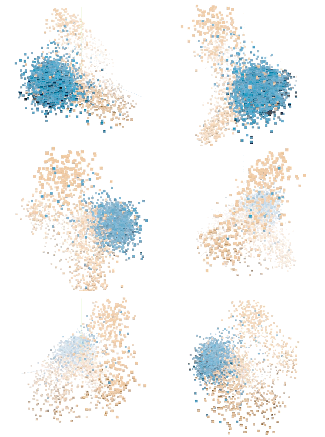
Principal component analysis (PCA) on a sample of labeled points lets us visualize the results. Separation between humpback and non-humpback is apparent. Explore for yourself using the TensorFlow Embedding Projector. Try changing Color by to each of class_label and site. Also, try changing PCA to t-SNE in the projector for a visualization that prioritizes preserving relative distances rather than sample variance.
A sample of 5000 data points in the unsupervised representation. (Orange: humpback. Blue: not humpback.)
Given individual "query" units, we retrieved the nearest neighbors in the entire corpus using Euclidean distance between embedding vectors. In some cases we found hundreds more instances of the same unit with good precision.
Manually chosen query units (boxed) and nearest neighbors using the unsupervised representation.
We intend to use these in the future to build a training set for a classifier that discriminates between song units. We could also use them to expand the training set used for learning a humpback detector.

Predictions from the Supervised Classifier on the Entire Dataset
We plotted summaries of the model output grouped by time and location. Not all sites had deployments in all years. Duty cycling (example: 5 minutes on, 15 minutes off) allows longer deployments on limited battery power, but the schedule can vary. To deal with these sources of variability, we consider the proportion of sampled time in which humpback calling was detected to the total time recorded in a month:
Time density of presence on year / month axes for the Kona and Saipan sites.
The apparent seasonal variation is consistent with a known pattern in which humpback populations spend summers feeding near Alaska and then migrate to the vicinity of the Hawaiian Islands to breed and give birth. This is a nice sanity check for the model.

We hope the predictions for the full dataset will equip experts at NOAA to reach deeper insights into the status of these populations and into the degree of any anthropogenic impacts on them. We also hope this is just one of the first few in a series of successes as Google works to accelerate the application of machine learning to the world's biggest humanitarian and environmental challenges.

Acknowledgements
We would like to thank Ann Allen (NOAA Fisheries) for providing the bulk of the ground truth data, for many useful rounds of feedback, and for some of the words in this post. Karlina Merkens (NOAA affiliate) provided further useful guidance. We also thank the NOAA Pacific Islands Fisheries Science Center as a whole for collecting and sharing the acoustic data.

Within Google, Jiayang Liu, Julie Cattiau, Aren Jansen, Rif A. Saurous, and Lauren Harrell contributed to this work. Special thanks go to Lauren, who designed the plots in the analysis section and implemented them using ggplot.

Source: Google AI Blog


Safety-first AI for autonomous data center cooling and industrial control

Many of society’s most pressing problems have grown increasingly complex, so the search for solutions can feel overwhelming. At DeepMind and Google, we believe that if we can use AI as a tool to discover new knowledge, solutions will be easier to reach.

In 2016, we jointly developed an AI-powered recommendation system to improve the energy efficiency of Google’s already highly-optimized data centers. Our thinking was simple: Even minor improvements would provide significant energy savings and reduce CO2 emissions to help combat climate change.

Now we’re taking this system to the next level: instead of human-implemented recommendations, our AI system is directly controlling data center cooling, while remaining under the expert supervision of our data center operators. This first-of-its-kind cloud-based control system is now safely delivering energy savings in multiple Google data centers.

How it works

Every five minutes, our cloud-based AI pulls a snapshot of the data center cooling system from thousands of sensors and feeds it into our deep neural networks, which predict how different combinations of potential actions will affect future energy consumption. The AI system then identifies which actions will minimize the energy consumption while satisfying a robust set of safety constraints. Those actions are sent back to the data center, where the actions are verified by the local control system and then implemented.

The idea evolved out of feedback from our data center operators who had been using our AI recommendation system. They told us that although the system had taught them some new best practices—such as spreading the cooling load across more, rather than less, equipment—implementing the recommendations required too much operator effort and supervision. Naturally, they wanted to know whether we could achieve similar energy savings without manual implementation.


We’re pleased to say the answer was yes!

We wanted to achieve energy savings with less operator overhead. Automating the system enabled us to implement more granular actions at greater frequency, while making fewer mistakes.
Dan Fuenffinger
Dan Fuenffinger
Data Center Operator, Google

Designed for safety and reliability

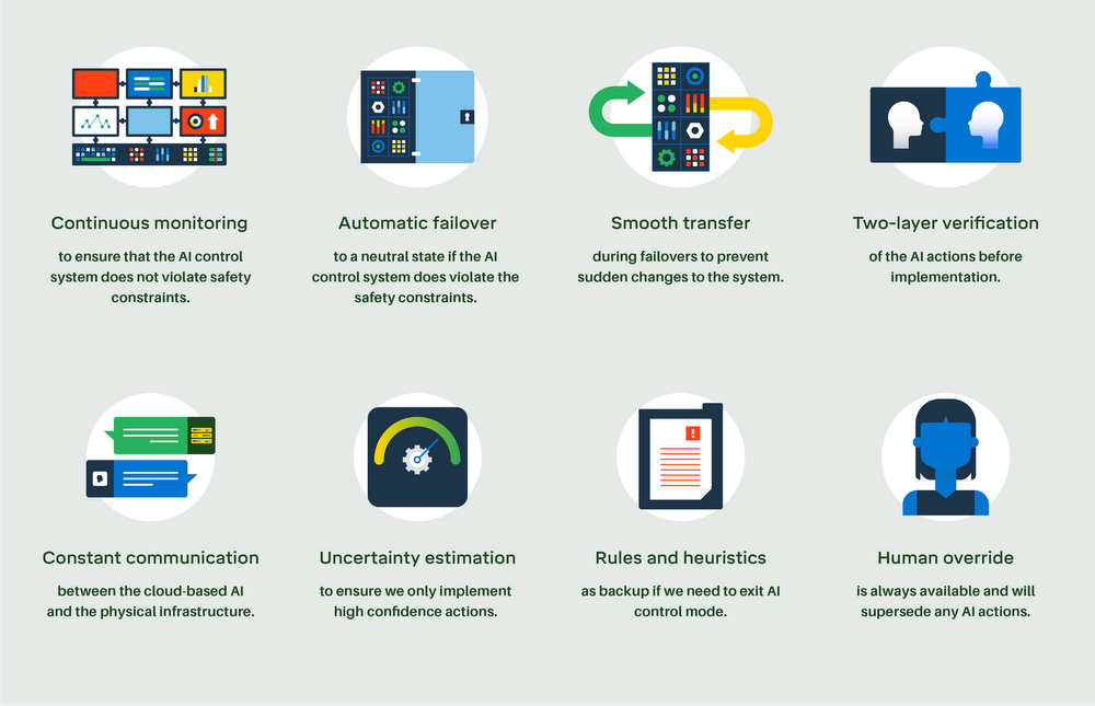
Google's data centers contain thousands of servers that power popular services including Google Search, Gmail and YouTube. Ensuring that they run reliably and efficiently is mission-critical. We've designed our AI agents and the underlying control infrastructure from the ground up with safety and reliability in mind, and use eight different mechanisms to ensure the system will behave as intended at all times.

One simple method we’ve implemented is to estimate uncertainty. For every potential action—and there are billions—our AI agent calculates its confidence that this is a good action. Actions with low confidence are eliminated from consideration.

Another method is two-layer verification. Optimal actions computed by the AI are vetted against an internal list of safety constraints defined by our data center operators. Once the instructions are sent from the cloud to the physical data center, the local control system verifies the instructions against its own set of constraints. This redundant check ensures that the system remains within local constraints and operators retain full control of the operating boundaries.

Most importantly, our data center operators are always in control and can choose to exit AI control mode at any time. In these scenarios, the control system will transfer seamlessly from AI control to the on-site rules and heuristics that define the automation industry today.

Find out about the other safety mechanisms we’ve developed below:

DME_DCIQ_v08-05.png

Increasing energy savings over time

Whereas our original recommendation system had operators vetting and implementing actions, our new AI control system directly implements the actions. We’ve purposefully constrained the system’s optimization boundaries to a narrower operating regime to prioritize safety and reliability, meaning there is a risk/reward trade off in terms of energy reductions.

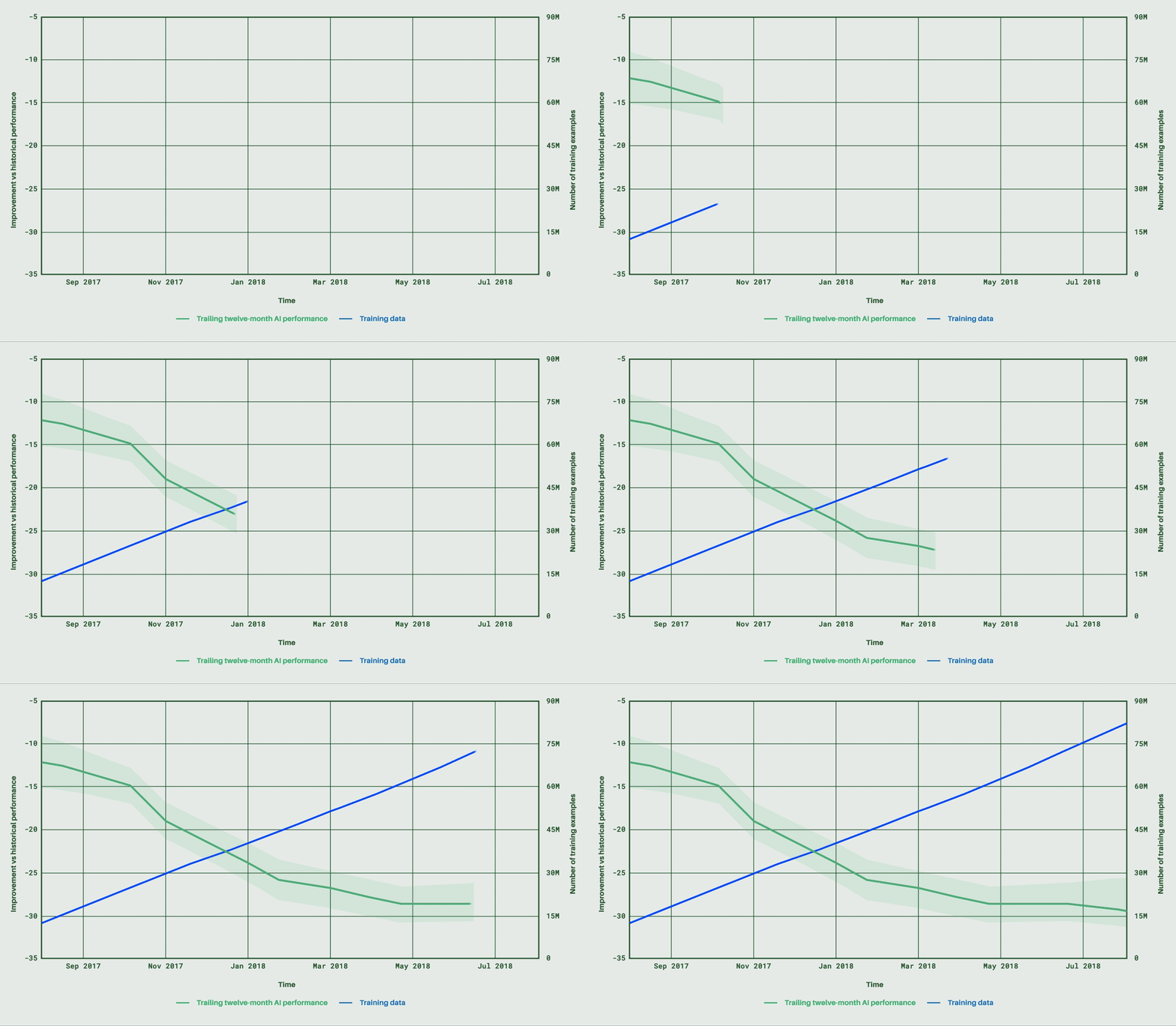
Despite being in place for only a matter of months, the system is already delivering consistent energy savings of around 30 percent on average, with further expected improvements. That’s because these systems get better over time with more data, as the graph below demonstrates. Our optimization boundaries will also be expanded as the technology matures, for even greater reductions.

graph.gif

This graph plots AI performance over time relative to the historical baseline before AI control. Performance is measured by a common industry metric for cooling energy efficiency, kW/ton (or energy input per ton of cooling achieved). Over nine months, our AI control system performance increases from a 12 percent improvement (the initial launch of autonomous control) to around a 30 percent improvement.

Our direct AI control system is finding yet more novel ways to manage cooling that have surprised even the data center operators. Dan Fuenffinger, one of Google’s data center operators who has worked extensively alongside the system, remarked: "It was amazing to see the AI learn to take advantage of winter conditions and produce colder than normal water, which reduces the energy required for cooling within the data center. Rules don’t get better over time, but AI does."

We’re excited that our direct AI control system is operating safely and dependably, while consistently delivering energy savings. However, data centers are just the beginning. In the long term, we think there's potential to apply this technology in other industrial settings, and help tackle climate change on an even grander scale.

Close encounters of the fishy kind

When the Earth is viewed from space, we can see that our planet is more blue than green. From the diverse organisms that call the ocean home, to the complex ways it stabilizes the climate, our survival is undeniably intertwined with the health of our oceans.

Much of the ocean is severely overfished with some species teetering on the brink of collapse. By harnessing big data and artificial intelligence, Global Fishing Watch, a platform founded by Google, Skytruth, and Oceana, provided the first near real-time view of large-scale fishing activities around the world. Launched in 2016, it has proven to be a critical tool for fish population management and in protecting critical marine habitats. Today we're adding two new data layers to increase transparency and awareness around fishing activity, in order to ultimately influence sustainable policies.


Revealing vessel rendezvous at sea

Illegal, unreported and unregulated (IUU) fishing accounts for an estimated $23.5 billion worth of fish annually worldwide(that’s one in every five fish that goes to market).Transshipment—one of the methods used to conduct IUU fishing practices—occurs when one fishing vessel offloads its catch to a refrigerated vessel at sea, making it easier for illegally caught fish to be combined with legitimate seafood. This typically occurs in regions of unclear jurisdiction or just outside of a country’s national waters. It often goes unreported and unnoticed and sometimes provides cover for human rights issues of bonded labor and trafficking.

By using machine learning to classify over 300 thousand vessels into 12 types, we can then identify when a fishing vessel is alongside refrigerator vessels for a sufficient amount of time for a transshipment. Regulations vary widely for transshipment, so the data does not suggest illegality—rather, it reveals patterns and hotspots where events occur, the vessels involved, and provides a new perspective into this sometimes abused practice to further investigations around specific incidents as well as general policy discussions.

GFW

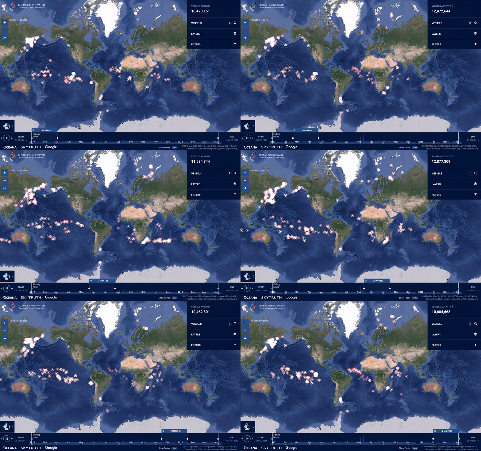
Close encounters: Each pink circle on the map represents an encounter between two vessels. By zooming into the circles it’s possible to identify the vessels and track their journey.

Lighting up the Dark Fleet
Not all fishing vessels carry GPS broadcasting devices like Automatic Identification Systems (AIS), and there are technical complications in some dense regions that prevent full reception. So getting a comprehensive picture of fishing activity is challenging.

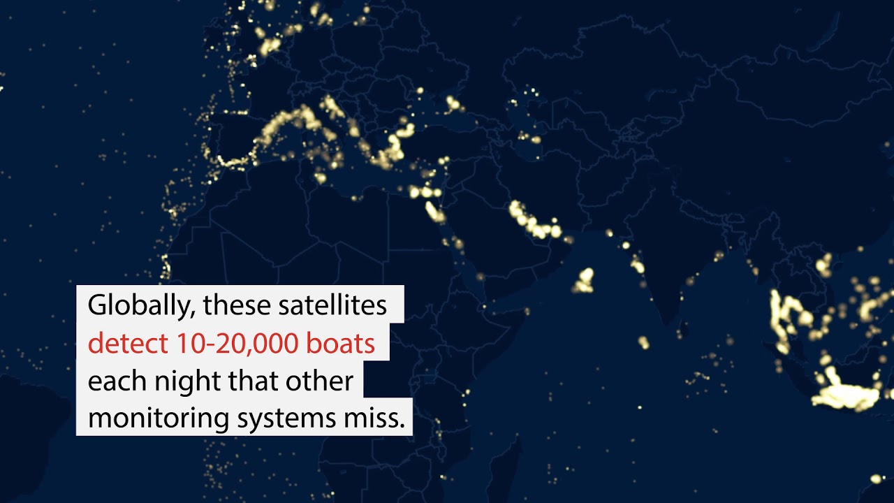
Global Fishing Watch now publishes the location of brightly lit vessels operating at night The U.S. National Oceanic and Atmospheric Administration (NOAA) produces this data from weather satellites that image the entire Earth every night that are sensitive enough to detect light emitted by a single brightly lit vessel. For example, Squid Jiggers —a practice poorly regulated in many regions— fish at night by illuminating the water surface to attract their catch. These operations range from small wooden boats with basic lights, to massive industrial vessels with the equivalent of sport stadium lighting. While we do not get any identifying characteristics or visuals of the detected vessel, it enables us to show an additional 10 to 20 thousand boats for a more complete view of fishing activities.

In search of squid: A fleet of Chinese squid fishing vessels works a pocket of the Arabian Sea just outside the national waters of Oman and Yemen. Because they fish only at night using lights to attract the squid to the surface, new detection methods show the fleet is considerably larger.

In search of squid: A fleet of Chinese squid fishing vessels works a pocket of the Arabian Sea just outside the national waters of Oman and Yemen. Because they fish only at night using lights to attract the squid to the surface, new detection methods show the fleet is considerably larger.

Google was a founding partner of Global Fishing Watch from the beginning, bringing the latest machine learning and cloud computing technology to create an unprecedented view of human interactions with our oceans’ natural resources. Fisheries, a traditionally opaque industry, is ushering a new wave of transparency, driven by the consumer and market demands, and enabled by technology.

Explore the high seas in VR and Google Earth on World Oceans Day

On World Oceans Day, we honor one of our most unique ecosystems and important resources. This year, we invite you to learn more about our vast and varied oceans, and some of the challenges facing them, by immersing yourself in virtual reality (VR) and diving into curated nautical adventures in Google Earth.


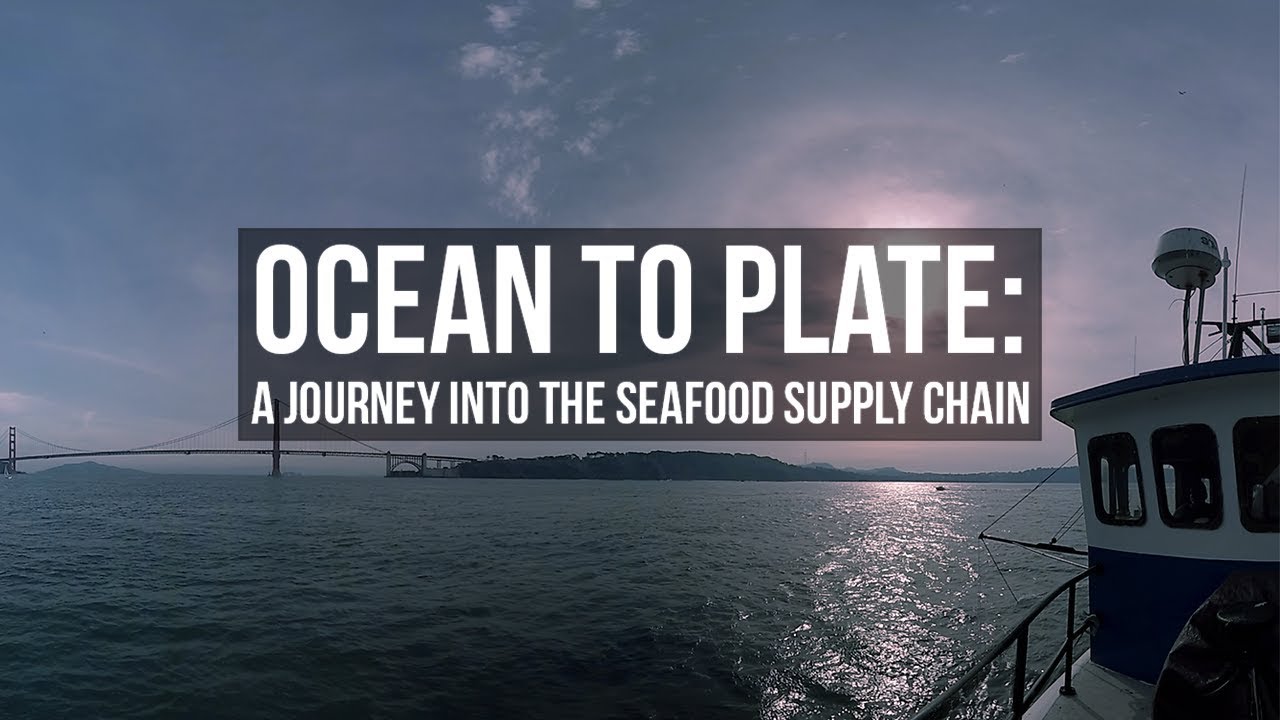
It’s estimated that around 35 percent of harvested fish and seafood is lost or wasted somewhere between when it’s caught and when it appears on your plate. As part of our Daydream Impact program, the World Wildlife Fund and Condition One brought this journey to life through a virtual reality documentary showing how fish get from Ocean to Plate. Short of actually being on a fishing boat or in a processing plant, there’s no better way to understand the fishing industry supply chain and its impact on our oceans. Check out the video below, or by using a VR viewer like Cardboard or Daydream View. You can also experience this journey in Google Earth.
Ocean to Plate: A Journey into the Seafood Supply Chain

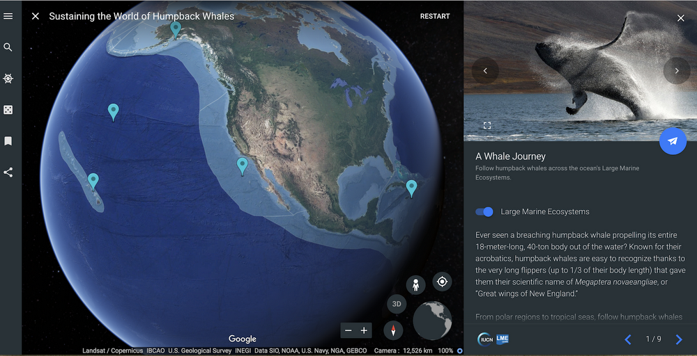
We’ve also schooled up with some of the world's leading storytellers, scientists and nonprofits in Google Earth Voyager. Dive in and learn about humpback whales with the International Union for Conservation of Nature, an organization that researches large marine ecosystems that make up our planet’s oceans. Understanding how these ecosystems interact can help humpback whales and other oceanic creatures thrive. Plus, you can hear the song of the summer performed by humpback whales near Hawaii.

Shamoo

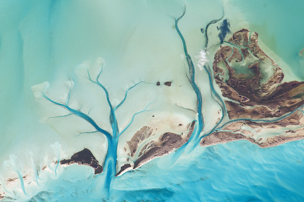
And finally, we’ll take a satellite view of the oceans with “Waterways from Space” from NASA’s Earth Observatory. The latest in our series of views of the planet from above, this stunning collection of imagery shows some of the most beautiful oceans, seas and lakes as captured by satellites and astronauts on the International Space Station.

Image 3

We hope these stories and sights will inspire you to get involved and help protect our vast and fragile waters.

Measuring our impact in data center communities

Over 10 years ago, we built our first data center in Oregon. And a few weeks ago we broke ground on what will be our eighth data center in the U.S., helping to run Google’s products across the country and the world.

These data centers contribute significantly to job growth and income gains at both the national and state level. Even more important are the economic contributions that Google data centers make to the communities they call home.

Today, we’re releasing a report, prepared by Oxford Economics, which details the economic impact our data centers have had in their local communities. The report concludes that, as of 2016, Google data centers generated $1.3 billion in economic activity across the US, and have generated over 11,000 jobs.

Those 11,000 jobs cause a ripple effect—people with greater financial flexibility can support the local economy, which has led to the creation of an additional 4,700 jobs. In fact, when direct, indirect and induced jobs are considered, the report finds that each Google data center job supports an additional 4.9 jobs throughout the U.S.

Last year, we became the first company of our size to purchase enough energy from sources like wind and solar to exceed the amount of electricity used by our operations around the world, including offices and data centers. This commitment to renewables has economic and environmental benefits. Oxford’s report shows that eight U.S. renewable energy generation projects—most of which are located in states where we have data centers—resulted in over $2 billion of investments, created 2,800 direct jobs, and supported 520 ongoing jobs in maintenance and operations.

What we’re most proud of, however, are the ways we invest in our local communities through workforce development and education. Our community grants program supports important local initiatives, like installing Wi-Fi on school buses for kids with long commutes, and partnering with school districts to develop student STEM programs.

We are proud of our economic impact in communities across the country, but here at Google, it’s about more than just the numbers. It’s about the people we hire and the communities where we live and work.

I’m Feeling Earthy: Earth Day trends and more

It’s Earth Day—take a walk with us.

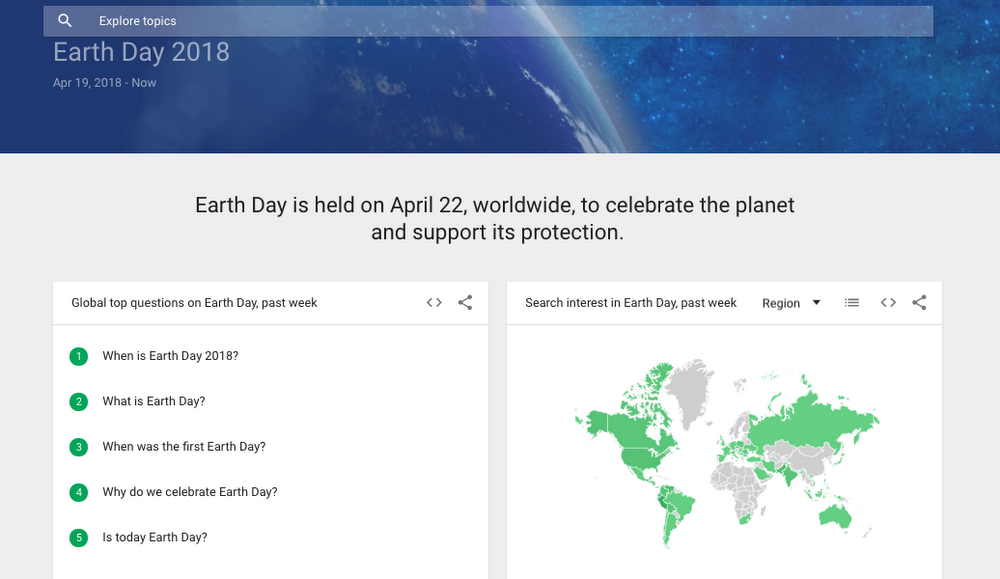
First, let’s dig into issues taking root in Search. Ahead of Earth Day, “solar energy,” “drought” and “endangered species” climbed in popularity this week. Meanwhile, people are looking for ways their own actions can make a positive impact. The top “how to recycle” searches were for plastic, paper, batteries, plastic bags, and styrofoam. And around the world, trending queries about Earth Day were “how many trees will be saved by recycling?” and “which type of plastic is more friendly to the environment?”  

To explore some of the other searches that are blooming for Earth Day, take a look at our trends page.

ed

In our corner of the world, Earth Day celebrations started on Google Earth’s first birthday (tweet at @googleearth with #ImFeelingEarthy and see where it takes you!). The party continues today with a special tribute to Jane Goodall in today’s Doodle, and kids inspired by the Doodle can create their own Google logo, thanks to our partnership with World Wildlife Fund. And while we’re feeling extra Earthy this week, the environment is important to our work all year long—here’s what we’re doing for our operations, our surroundings, our customers, and our community.

Designing for human and environmental health

Imagine a world of abundance—a world where products are infinitely recycled and the design process itself begins with considering the health and well-being of people and the environment. Imagine those products flowing through an economy that is both profitable and stems depletion of raw materials. That’s the world we want for all of us, and Google is working with the experts who are getting us there.


This vision is embodied in a model called the circular economy—and achieving it requires changing our relationship to natural resources, as well as engagement from designers, material scientists, chemists, policy makers, industry partners and consumers. It requires the development of new materials and processes that optimize for human and environmental health, and capture more value from materials by keeping them in use longer.


Today, we published a joint white paper with the Ellen MacArthur Foundation to share a vision for how safer chemistry and healthy materials are essential to unlocking the circular economy. For the past two years, we’ve partnered with The Ellen MacArthur Foundation on a range of circular economy issues and initiatives, and today’s paper is the next step in this partnership. It's also the culmination of more than a decade of hands-on experience at Google in driving safer chemistry and healthy material innovation across supply chains.


Our Real Estate and Workplace Services team has been working to remove toxins from materials in our built environment for years. It started when we were opening new spaces and started asking questions about the “new space smell,” like carpeting and paint. The answers (or lack thereof) told us that we needed to do more to ensure that our expanded spaces were healthy and sustainable for our employees—and that the manufacturers we were working with knew what was in their materials.


At the same time, our consumer hardware business—like Pixel and Google Home—is rapidly expanding. The growth of our consumer hardware business means that we aren’t just applying this approach to building materials, but also to the manufacturing of consumer tech products, like phones and smart speakers. It also means that we have a responsibility to understand and address the impacts associated with material selection, production, transportation, use, serviceability and the recycling of our products.


We take this responsibility seriously, not only because it’s part of who we are at Google, but because we believe we must do so if we are going to realize sustainable, profitable enterprise. That's why we're investing in the creation and adoption of safer chemistry and healthy materials, and working to accelerate the transition to a circular economy.

A new partnership to drive renewable energy growth in the U.S.

In our global search to find renewable energy for our data centers, we’ve long wanted to work with the state of Georgia. Solar is abundant and cost-competitive in the region, but until now the market rules did not allow companies like ours to purchase renewable energy. We’re pleased to announce that in partnership with Walmart, Target, Johnson & Johnson, and Google, the state of Georgia has approved a new program that would allow companies to buy renewable energy directly through the state’s largest utility, Georgia Power.

Through this program, Google will procure 78.8 megawatts (MW) of solar energy for our Douglas County, Georgia data center, as part of our effort to utilize renewable energy in every market where we operate. As we build and expand data centers and offices to meet growing demand for Google’s products, we constantly add renewable energy to our portfolio to match 100 percent of our energy use.

This program, the first of its kind in Georgia, greenlights the construction of two solar energy projects with a total capacity of 177MW. When these new projects become operational in 2019 and 2020, participating customers like us will be able to substitute a portion of our electricity bill with a fixed price matched to the production of renewable energy generated. This shows that providing a cost-competitive, fixed-price clean power option is not only good for the environment, it also makes business sense.

What we’ve accomplished in partnership with Georgia Power and other major corporate energy buyers in the region is a testament to the important role that businesses can play in unlocking access to renewable energy. We collaborated for over two years to help build this program, which passes the costs directly to corporate buyers, while adding more low-cost, renewable electricity to the state’s energy mix. This arrangement, and others like it throughout the country, help companies and utilities meet their renewable energy goals.

The program is a promising step forward as utilities begin to meet the growing demand for renewables by businesses everywhere. Today’s announcement shows how companies and utilities can work together to make that option available to all customers, regardless of varying energy needs.

And this is happening in other parts of the U.S. as well. We just broke ground on our new data center in Alabama and through a partnership with the Tennessee Valley Authority, we’ll be able to scout new wind and solar projects locally and work with TVA to bring new renewable energy onto their electrical grid.

As we expand our data centers across the U.S. and globally, we will keep working with new partners to help make this a cost-effective choice available to everyone.

Coming home to Alabama

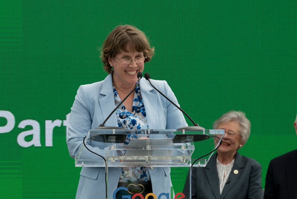
Editor’s Note:Google is starting construction on our newest data center in Jackson County, Alabama. The new site marks a $600 million investment for our company and will bring as many as 100 high-skilled jobs to the community. This is part of Google’s expansion to 14 new data centers and offices across the country. Today, our head of global technology partnerships for Google Cloud, Dr. Nan Boden, spoke at the groundbreaking in Widows Creek, the site of a former coal-fired power plant where her father once worked.

Data centers are the engine of the internet. They help make technological advances around the world not only possible, but accessible to billions of people who use cloud services. Every day, more people are coming online, asking and answering big questions, and identifying new opportunities and solutions to bring about change.

Google_0111 (1).jpg

At the groundbreaking in Jackson County 

I help build global partnerships for Google Cloud, and we depend on our data centers to ensure that large companies, small businesses, students, educators, nonprofit organizations and individuals can access key services and tools in a fast and reliable way. 

Today, I participated in the groundbreaking of our newest data center in my home state of Alabama. I was born in Sheffield, raised in Athens and am a proud University of Alabama alum. My family roots run deep with the Tennessee Valley Authority (TVA)—both my late father and grandfather were career TVA electricians. My father’s job at TVA gave me and my family a better life, and his personal focus on education created an even greater path to opportunity for me. 

That’s why I’m so proud that Google can help bring that same opportunity—for education and employment opportunities—to families here in Jackson County. As part of our commitment to this community, Google will donate $100,000 to the Jackson County School District for the growth and development of the region's student STEM programs.

With the new data center, Jackson County will help deliver information to people all over the world. From an infrastructure perspective, this means focusing on how to best route data securely, reliably, and quickly. And that takes energy.

Since the 1960s, Widows Creek has generated energy for this region, and now we will use the plant’s many electric transmission lines to power our new data center. Thanks to our partnership with the TVA, we’ll be able to scout new wind and solar projects locally and work with TVA to bring new renewable energy onto their electrical grid. Ultimately, this helps Google to continue to purchase 100% renewable energy for our growing operations around the world.

Being a part of this groundbreaking, not far from where my father worked at a coal plant years ago, humbles and inspires me. My work at Google brought me home to Alabama, and now Google can call Alabama home, too.