 Posted by Mindy Brooks – Senior Director, Android Platform
App developers play a vital role in shaping how people of all ages interact with technology. Whether your app content is specifically designed for kids or simply attracts their attention, there is an added responsibility to ensure a safe and trusted experience. Google is here to support you in that work. Today, we’re sharing some important reminders and updates on how we empower developers to build high-quality, engaging, and age-appropriate apps across the Android ecosystem.
Help Determine Android User Age with Digital IDs
Understanding a user's age range can be critical for providing minors with safer and more appropriate app experiences, as well as complying with local age-related regulations. Android’s new Credential Manager API, now in Beta, addresses this challenge by helping developers verify a user’s age with a digital ID saved to any digital wallet application. Importantly, Android’s Credential Manager was built with both safety and privacy at its core – it minimizes data exposure by only sharing information necessary with developers and asks the user for explicit permission to share an age signal. We encourage you to try out the Beta API for yourself and look forward to hearing your feedback.
While digital IDs are still in their early days, we’re continuing to work with governments on further adoption to strengthen this solution. Android is also exploring how the API can support a range of age assurance methods, helping developers to safely confirm the age of their users, especially for users that can't or don't want to use a digital ID. Please keep in mind that ID-based solutions are just one tool that developers can use to determine age and the best approach will depend on your app.

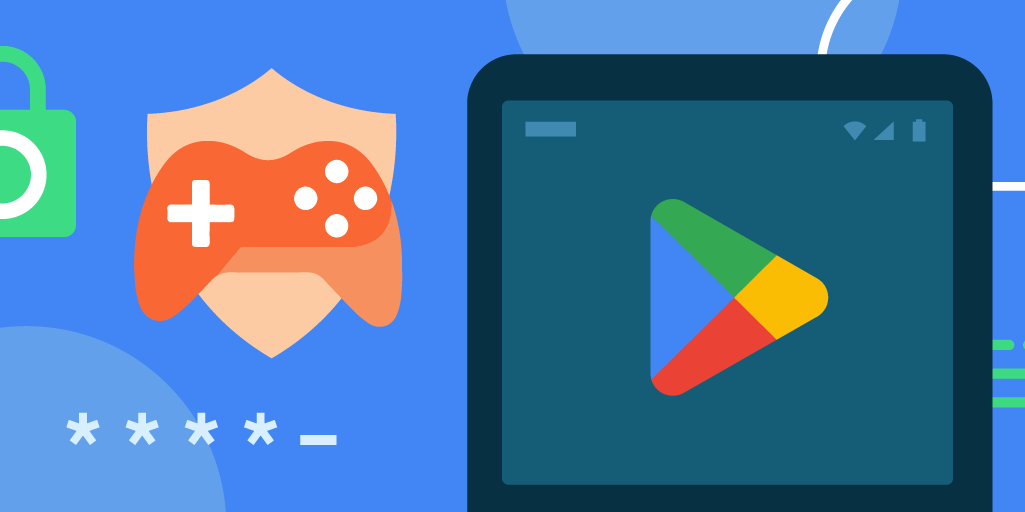
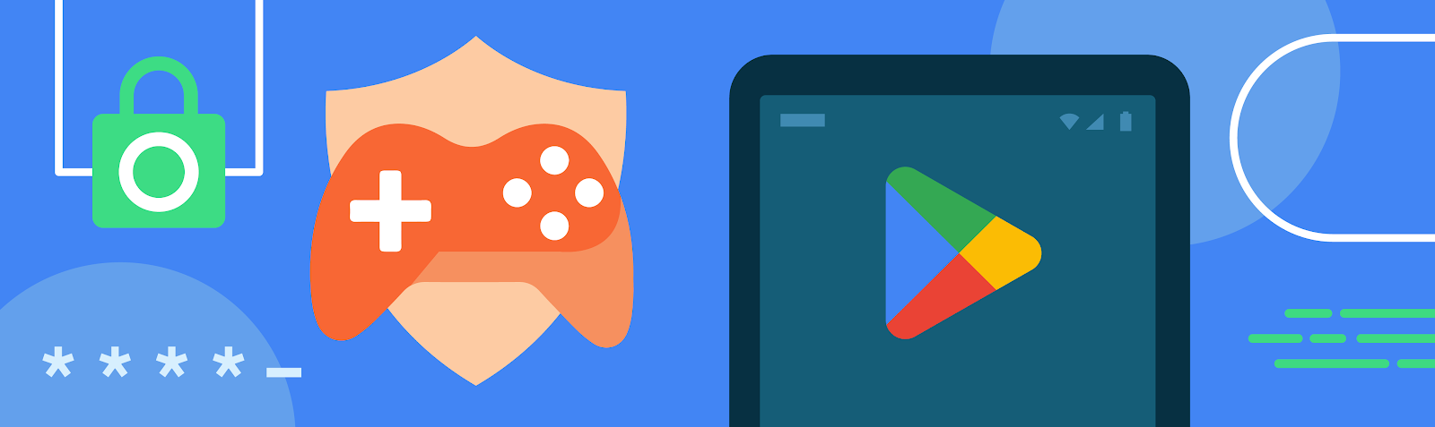
Shield Young Users from Inappropriate Content on Google Play
As part of our continued commitment to creating a safe and positive environment for children across the Play Store, we recently launched the Restrict Declared Minors (RDM) setting within the Google Play Console that allows developers to designate their app as inappropriate for minors. When enabled, Google Play users with declared ages below 18 will not be able to download or purchase the app nor will they be able to continue subscriptions or make new purchases if the app is already installed.
Beyond Play’s broader kids safety policies, this new setting gives developers an additional tool to proactively prevent minors from accessing content that may be unsuitable for them. It also empowers developers to take a more proactive role in ensuring their apps reach the appropriate audience. As a reminder, this feature is simply one tool of many to keep your apps safe and we are continuing to improve it based on early feedback. Developers remain solely responsible for compliance with relevant laws and regulations. You can learn more about opting in to RDM here.
Develop Teacher Approved Apps and Games on Google Play
Great content for kids can take many forms, whether that’s sparking curiosity, helping kids learn, or just plain fun. Google Play’s Teacher Approved program highlights high-quality apps that are reviewed and rated by teachers and child development specialists. Our team of teachers and experts across the world review and rate apps on factors like age-appropriateness, quality of experience, enrichment, and delight. For added transparency, we include information in the app listing about why the app was rated highly to help parents determine if the app is right for their child. Apps in the program also must meet strict privacy and security requirements.
Building a teacher-approved app not only helps raise app quality for kids – it can also increase your reach and engagement. All apps in this program are eligible to appear and be featured on Google Play's Kids tab where families go to easily discover quality apps and games. Please visit Google Play Academy for more information about how to design high-quality apps for kids.
Stay Updated With Google Play’s Families Policies
Google Play policies provide additional protections for children and families. Our Families policies require that apps and games targeted to children have appropriate content, show ads suitable for children, and meet other requirements including ones related to personally identifiable information. We frequently update and strengthen these policies to ensure that Google Play remains a place where families can find safe and high-quality content for their children. This includes our new Child Safety Standards Policy for social and dating apps that goes into effect in January.
Developers can showcase compliance with Play’s Families policies with a special badge on the Google Play Data safety section. This is another great way that you can better help families find apps that meet their needs, while supporting Play’s commitment to provide users more transparency and control over their data. To display the badge, please visit the "Security practices" section of your Data Safety form in your Google Play Developer Console.

Additional Resources
Protecting kids online is a responsibility we all share and we hope these reminders are helpful as you prepare for 2025. We’re grateful for your partnership in making Android and Google Play fantastic platforms for delightful, high-quality content for kids and families. For more resources:
- Learn more about Android’s Credential Manager API.
- Watch our interactive Play Academy courses on complying with Play’s Families policies, including SDK requirements, selecting your target age and content settings, and more.
- Review the updated Child Safety Standards Policy ahead of the January deadline.
 Posted by Robbie McLachlan, Developer Marketing


 Posted by Prabhat Sharma – Director, Trust and Safety, Play, Android, and Chrome

 Posted by Thomas Ezan – Sr Developer Relation Engineer (@lethargicpanda)
 Posted by Niharika Arora – Developer Relations Engineer


 Posted by Robbie McLachlan, Developer Marketing


 Posted by Matthew McCullough – VP of Product Management, Android Developer


