Tag Archives: machine learning

Open Sourcing the Hunt for Exoplanets


Recently, we discovered two exoplanets by training a neural network to analyze data from NASA’s Kepler space telescope and accurately identify the most promising planet signals. And while this was only an initial analysis of ~700 stars, we consider this a successful proof-of-concept for using machine learning to discover exoplanets, and more generally another example of using machine learning to make meaningful gains in a variety of scientific disciplines (e.g. healthcare, quantum chemistry, and fusion research).

Today, we’re excited to release our code for processing the Kepler data, training our neural network model, and making predictions about new candidate signals. We hope this release will prove a useful starting point for developing similar models for other NASA missions, like K2 (Kepler’s second mission) and the upcoming Transiting Exoplanet Survey Satellite mission. As well as announcing the release of our code, we’d also like take this opportunity to dig a bit deeper into how our model works.

A Planet Hunting Primer
First, let’s consider how data collected by the Kepler telescope is used to detect the presence of a planet. The plot below is called a light curve, and it shows the brightness of the star (as measured by Kepler’s photometer) over time. When a planet passes in front of the star, it temporarily blocks some of the light, which causes the measured brightness to decrease and then increase again shortly thereafter, causing a “U-shaped” dip in the light curve.
A light curve from the Kepler space telescope with a “U-shaped” dip that indicates a transiting exoplanet.
However, other astronomical and instrumental phenomena can also cause the measured brightness of a star to decrease, including 
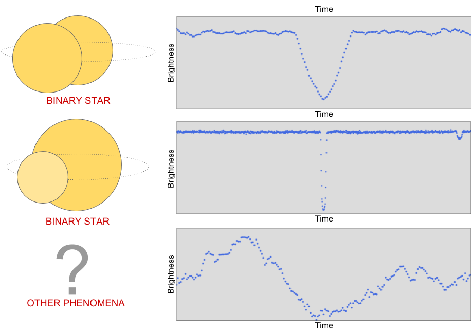
binary star systems, starspots, cosmic ray hits on Kepler’s photometer, and instrumental noise.
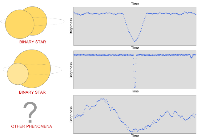
The first light curve has a “V-shaped” pattern that tells us that a very large object (i.e. another star) passed in front of the star that Kepler was observing. The second light curve contains two places where the brightness decreases, which indicates a binary system with one bright and one dim star: the larger dip is caused by the dimmer star passing in front of the brighter star, and vice versa. The third light curve is one example of the many other non-planet signals where the measured brightness of a star appears to decrease.
To search for planets in Kepler data, scientists use automated software (e.g. the Kepler data processing pipeline) to detect signals that might be caused by planets, and then manually follow up to decide whether each signal is a planet or a false positive. To avoid being overwhelmed with more signals than they can manage, the scientists apply a cutoff to the automated detections: those with signal-to-noise ratios above a fixed threshold are deemed worthy of follow-up analysis, while all detections below the threshold are discarded. Even with this cutoff, the number of detections is still formidable: to date, over 30,000 detected Kepler signals have been manually examined, and about 2,500 of those have been validated as actual planets!

Perhaps you’re wondering: does the signal-to-noise cutoff cause some real planet signals to be missed? The answer is, yes! However, if astronomers need to manually follow up on every detection, it’s not really worthwhile to lower the threshold, because as the threshold decreases the rate of false positive detections increases rapidly and actual planet detections become increasingly rare. However, there’s a tantalizing incentive: it’s possible that some potentially habitable planets like Earth, which are relatively small and orbit around relatively dim stars, might be hiding just below the traditional detection threshold — there might be hidden gems still undiscovered in the Kepler data!

A Machine Learning Approach
The Google Brain team applies machine learning to a diverse variety of data, from human genomes to sketches to formal mathematical logic. Considering the massive amount of data collected by the Kepler telescope, we wondered what we might find if we used machine learning to analyze some of the previously unexplored Kepler data. To find out, we teamed up with Andrew Vanderburg at UT Austin and developed a neural network to help search the low signal-to-noise detections for planets.
We trained a convolutional neural network (CNN) to predict the probability that a given Kepler signal is caused by a planet. We chose a CNN because they have been very successful in other problems with spatial and/or temporal structure, like audio generation and image classification.
Luckily, we had 30,000 Kepler signals that had already been manually examined and classified by humans. We used a subset of around 15,000 of these signals, of which around 3,500 were verified planets or strong planet candidates, to train our neural network to distinguish planets from false positives. The inputs to our network are two separate views of the same light curve: a wide view that allows the model to examine signals elsewhere on the light curve (e.g., a secondary signal caused by a binary star), and a zoomed-in view that enables the model to closely examine the shape of the detected signal (e.g., to distinguish “U-shaped” signals from “V-shaped” signals).

Once we had trained our model, we investigated the features it learned about light curves to see if they matched with our expectations. One technique we used (originally suggested in this paper) was to systematically occlude small regions of the input light curves to see whether the model’s output changed. Regions that are particularly important to the model’s decision will change the output prediction if they are occluded, but occluding unimportant regions will not have a significant effect. Below is a light curve from a binary star that our model correctly predicts is not a planet. The points highlighted in green are the points that most change the model’s output prediction when occluded, and they correspond exactly to the secondary “dip” indicative of a binary system. When those points are occluded, the model’s output prediction changes from ~0% probability of being a planet to ~40% probability of being a planet. So, those points are part of the reason the model rejects this light curve, but the model uses other evidence as well - for example, zooming in on the centred primary dip shows that it's actually “V-shaped”, which is also indicative of a binary system.
Searching for New Planets
Once we were confident with our model’s predictions, we tested its effectiveness by searching for new planets in a small set 670 stars. We chose these stars because they were already known to have multiple orbiting planets, and we believed that some of these stars might host additional planets that had not yet been detected. Importantly, we allowed our search to include signals that were below the signal-to-noise threshold that astronomers had previously considered. As expected, our neural network rejected most of these signals as spurious detections, but a handful of promising candidates rose to the top, including our two newly discovered planets: Kepler-90 i and Kepler-80 g.

Find your own Planet(s)!
Let’s take a look at how the code released today can help (re-)discover the planet Kepler-90 i. The first step is to train a model by following the instructions on the code’s home page. It takes a while to download and process the data from the Kepler telescope, but once that’s done, it’s relatively fast to train a model and make predictions about new signals. One way to find new signals to show the model is to use an algorithm called Box Least Squares (BLS), which searches for periodic “box shaped” dips in brightness (see below). The BLS algorithm will detect “U-shaped” planet signals, “V-shaped” binary star signals and many other types of false positive signals to show the model. There are various freely available software implementations of the BLS algorithm, including VARTOOLS and LcTools. Alternatively, you can even look for candidate planet transits by eye, like the Planet Hunters.
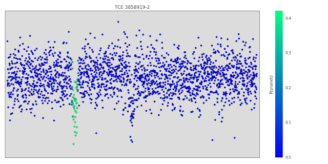
A low signal-to-noise detection in the light curve of the Kepler 90 star detected by the BLS algorithm. The detection has period 14.44912 days, duration 2.70408 hours (0.11267 days) beginning 2.2 days after 12:00 on 1/1/2009 (the year the Kepler telescope launched).
To run this detected signal though our trained model, we simply execute the following command:
python predict.py  --kepler_id=11442793 --period=14.44912 --t0=2.2
--duration=0.11267 --kepler_data_dir=$HOME/astronet/kepler
--output_image_file=$HOME/astronet/kepler-90i.png
--model_dir=$HOME/astronet/model
The output of the command is prediction = 0.94, which means the model is 94% certain that this signal is a real planet. Of course, this is only a small step in the overall process of discovering and validating an exoplanet: the model’s prediction is not proof one way or the other. The process of validating this signal as a real exoplanet requires significant follow-up work by an expert astronomer — see Sections 6.3 and 6.4 of our paper for the full details. In this particular case, our follow-up analysis validated this signal as a bona fide exoplanet, and it’s now called Kepler-90 i!
Our work here is far from done. We’ve only searched 670 stars out of 200,000 observed by Kepler — who knows what we might find when we turn our technique to the entire dataset. Before we do that, though, we have a few improvements we want to make to our model. As we discussed in our paper, our model is not yet as good at rejecting binary stars and instrumental false positives as some more mature computer heuristics. We’re hard at work improving our model, and now that it’s open sourced, we hope others will do the same!

If you’d like to learn more, Chris is featured on the latest episode of This Week In Machine Learning & AI discussing his work.

Machine learning meets culture

Whether helpingphysicians identify disease orfinding photos of “hugs,” AI is behind a lot of the work we do at Google. And at our Arts & Culture Lab in Paris, we’ve been experimenting with how AI can be used for the benefit of culture. Today, we’re sharing our latest experiments—prototypes that build on seven years of work in partnership the 1,500 cultural institutions around the world. Each of these experimental applications runs AI algorithms in the background to let you unearth cultural connections hidden in archives—and even find artworks that match your home decor.

Art Palette

From interior design to fashion, color plays a fundamental role in expression, communicating personality, mood and emotion. Art Palette lets you choose a color palette, and using a combination of computer vision algorithms, it matches artworks from cultural institutions from around the world with your selected hues. See how Van Gogh's Irises share a connection of color with a 16th century Iranian folio and Monet’s water lilies. You can also snap a photo of your outfit today or your home decor and can click through to learn about the history behind the artworks that match your colors.


Watch how legendary fashion designer, Sir Paul Smith uses Art Palette:
The art of color: Paul Smith experiences Art Palette #GoogleArts

Giving historic photos a new lease on LIFE

Beginning in 1936, LIFE Magazine captured some of the most iconic moments of the 20th century. In its 70-year-run, millions of photos were shot for the magazine, but only 5 percent of them were published at the time. 4 million of those photos are now available for anyone to look through. But with an archive that stretches 6,000 feet (about 1,800 meters) across three warehouses, where would you start exploring? The experiment LIFE Tags uses Google’s computer vision algorithm to scan, analyze and tag all the photos from the magazine’s archives, from the A-line dress to the zeppelin. Using thousands of automatically created labels, the tool turns this unparalleled record of recent history and culture into an interactive web of visuals everyone can explore. So whether you’re looking for astronauts, an Afghan Hound or babies making funny faces, you can navigate the LIFE Magazine picture archive and find them with the press of a button.

Baby Making Funny Faces.gif

Identifying MoMA artworks through machine learning

Starting with their first exhibition in 1929, The Museum of Modern Art in New York took photos of their exhibitions. While the photos documented important chapters of modern art, they lacked information about the works in them. To identify the art in the photos, one would have had to comb through 30,000 photos—a task that would take months even for the trained eye. The tool built in collaboration with MoMA did the work of automatically identifying artworks—27,000 of them—and helped turn this repository of photos into an interactive archive of MoMA’s exhibitions.
Identifying art through machine learning with the MoMA #GoogleArts

We unveiled our first set of experiments that used AI to aid cultural discoveries in 2016. Since then we’ve collaborated with institutions and artists, including stage designer Es Devlin, who created an installation for the Serpentine Galleries in London that uses machine learning to generate poetry.  We hope these experimental applications will not only lead you to explore something new, but also shape our conversations around the future of technology, its potential as an aid for discovery and creativity.

You can try all our experiments at g.co/artsexperiments or through the free Google Arts & Culture app for iOS and Android.

The Building Blocks of Interpretability


(Crossposted on the Google Open Source Blog)

In 2015, our early attempts to visualize how neural networks understand images led to psychedelic images. Soon after, we open sourced our code as DeepDream and it grew into a small art movement producing all sorts of amazing things. But we also continued the original line of research behind DeepDream, trying to address one of the most exciting questions in Deep Learning: how do neural networks do what they do?

Last year in the online journal Distill, we demonstrated how those same techniques could show what individual neurons in a network do, rather than just what is “interesting to the network” as in DeepDream. This allowed us to see how neurons in the middle of the network are detectors for all sorts of things — buttons, patches of cloth, buildings — and see how those build up to be more and more sophisticated over the networks layers.
Visualizations of neurons in GoogLeNet. Neurons in higher layers represent higher level ideas.
While visualizing neurons is exciting, our work last year was missing something important: how do these neurons actually connect to what the network does in practice?

Today, we’re excited to publish “The Building Blocks of Interpretability,” a new Distill article exploring how feature visualization can combine together with other interpretability techniques to understand aspects of how networks make decisions. We show that these combinations can allow us to sort of “stand in the middle of a neural network” and see some of the decisions being made at that point, and how they influence the final output. For example, we can see things like how a network detects a floppy ear, and then that increases the probability it gives to the image being a “Labrador retriever” or “beagle”.

We explore techniques for understanding which neurons fire in the network. Normally, if we ask which neurons fire, we get something meaningless like “neuron 538 fired a little bit,” which isn’t very helpful even to experts. Our techniques make things more meaningful to humans by attaching visualizations to each neuron, so we can see things like “the floppy ear detector fired”. It’s almost a kind of MRI for neural networks.
We can also zoom out and show how the entire image was “perceived” at different layers. This allows us to really see the transition from the network detecting very simple combinations of edges, to rich textures and 3d structure, to high-level structures like ears, snouts, heads and legs.
These insights are exciting by themselves, but they become even more exciting when we can relate them to the final decision the network makes. So not only can we see that the network detected a floppy ear, but we can also see how that increases the probability of the image being a labrador retriever.
In addition to our paper, we’re also releasing Lucid, a neural network visualization library building off our work on DeepDream. It allows you to make the sort lucid feature visualizations we see above, in addition to more artistic DeepDream images.

We’re also releasing colab notebooks. These notebooks make it extremely easy to use Lucid to reproduce visualizations in our article! Just open the notebook, click a button to run code — no setup required!
In colab notebooks you can click a button to run code, and see the result below.
This work only scratches the surface of the kind of interfaces that we think it’s possible to build for understanding neural networks. We’re excited to see what the community will do — and we’re excited to work together towards deeper human understanding of neural networks.

Machine Learning Crash Course

Posted by Barry Rosenberg, Google Engineering Education Team

Today, we're happy to share our Machine Learning Crash Course (MLCC) with the world. MLCC is one of the most popular courses created for Google engineers. Our engineering education team has delivered this course to more than 18,000 Googlers, and now you can take it too! The course develops intuition around fundamental machine learning concepts.

What does the course cover?

MLCC covers many machine learning fundamentals, starting with loss and gradient descent, then building through classification models and neural nets. The programming exercises introduce TensorFlow. You'll watch brief videos from Google machine learning experts, read short text lessons, and play with educational gadgets devised by instructional designers and engineers.

How much does it cost?

MLCC is free.

I don't get it. Why are you offering MLCC to everyone?

We believe that the potential of machine learning is so vast that every technical person should learn machine learning fundamentals. We're offering the course in English, Spanish, Korean, Mandarin, and French.

Does the real world make an appearance in the course?

Yes, MLCC ends with short lessons on designing real-world machine learning systems. MLCC also contains sections enabling you to learn from the mistakes that our experts have made.

Do I have enough mathematical background to understand MLCC?

Understanding a little algebra and a little elementary statistics (mean and standard deviation) is helpful. If you understand calculus, you'll get a bit more out of the course, but calculus is not a requirement. MLCC contains a helpful section to refresh your memory on the background math.

Is this a programming course?

MLCC contains some Python programming exercises. However, those exercises comprise only a small percentage of the course, which non-programmers may safely skip.

I'm new to Python. Will the programming exercises be too hard for me?

Many of the Google engineers who took MLCC didn't know any Python but still completed the exercises. That's because you'll write only a few lines of code during the programming exercises. Instead of writing code from scratch, you'll primarily manipulate the values of existing variables. That said, the code will be easier to understand if you can program in Python.

But how will I learn machine learning concepts without programming?

MLCC relies on a variety of media and hands-on interactive tools to build intuition in fundamental machine learning concepts. You need a technical mind, but you don't need programming skills.

How can I show off my machine learning skills?

As your knowledge about Machine Learning grows, you can test your skill by helping others. We're also kicking off a Kaggle competition to help DonorsChoose.org. DonorsChoose.org is an organization that empowers public school teachers from across the country to request materials and experiences they need to help their students grow. Teachers submit hundreds of thousands of project proposals each year; 500,000 proposals are expected in 2018.

Currently, DonorsChoose.org relies on a large number of volunteers to screen the proposals. The Kaggle competition hopes to help DonorsChoose.org use ML to accelerate the screening process, which will enable volunteers to make better use of their time. In addition, this work should help increase the consistency of decisions about projects.

Is MLCC Google's only machine learning educational project?

MLCC is merely one of many ways to learn about machine learning. To explore the universe of machine learning educational opportunities from Google, see our new Learn with Google AI program at g.co/learnwithgoogleai. To start on MLCC, see g.co/machinelearningcrashcourse.

Making Healthcare Data Work Better with Machine Learning


Over the past 10 years, healthcare data has moved from being largely on paper to being almost completely digitized in electronic health records. But making sense of this data involves a few key challenges. First, there is no common data representation across vendors; each uses a different way to structure their data. Second, even sites that use the same vendor may differ significantly, for example, they typically use different codes for the same medication. Third, data can be spread over many tables, some containing encounters, some containing lab results, and yet others containing vital signs.

The Fast Healthcare Interoperability Resources (FHIR) standard addresses most of these challenges: it has a solid yet extensible data-model, is built on established Web standards, and is rapidly becoming the de-facto standard for both individual records and bulk-data access. But to enable large-scale machine learning, we needed a few additions: implementations in various programming languages, an efficient way to serialize large amounts of data to disk, and a representation that allows analyses of large datasets.

Today, we are happy to open source a protocol buffer implementation of the FHIR standard, which addresses these issues. The current version supports Java, and support for C++, Go, and Python will follow soon. Support for profiles will follow shortly as well, plus tools to help convert legacy data into FHIR.

FHIR as the core data model
Over the past few years, as we’ve been partnering with academic medical centers to apply machine learning to de-identified medical records, it became clear that we needed to address the complexity of healthcare data head-on. Indeed, for machine learning to be effective on medical data, we need a holistic view of what happened to each patient over time. And as a bonus, we want a data representation that is directly applicable in a clinical setting.

While the FHIR standard addresses most of our needs, making healthcare data substantially easier to manage than “legacy” data structures and enabling large-scale machine-learning independent of vendors, we believe the introduction of protocol buffers can help both application developers and (machine-learning) researchers use FHIR.

Current release of protocol buffers
We’ve taken care to make our protocol buffer representation suitable for both programmatic access and database queries. One of the provided examples shows how to upload FHIR data into Google Cloud BigQuery and have it available for querying, and we are adding other examples that upload directly from bulk data export. Our protocol buffers adhere to the FHIR standard (they are in fact auto-generated from it) but make for more elegant queries.

The current release does not yet include support for training TensorFlow models, but keep an eye out for future updates. We aim to open-source as much as possible of our recent work, to help make our research more reproducible and applicable to real-world scenarios. Furthermore, we are working closely with our colleagues in Google Cloud on more tools for managing healthcare data at scale.

Acknowledgements
We enjoyed great discussions and helpful feedback from the FHIR community, including Grahame Grieve, Ewout Kramer, Josh Mandel and others. Thanks to our colleagues at DeepMind, the Google Brain team and our academic collaborators.

Google-Landmarks: A New Dataset and Challenge for Landmark Recognition


Image classification technology has shown remarkable improvement over the past few years, exemplified in part by the Imagenet classification challenge, where error rates continue to drop substantially every year. In order to continue advancing the state of the art in computer vision, many researchers are now putting more focus on fine-grained and instance-level recognition problems – instead of recognizing general entities such as buildings, mountains and (of course) cats, many are designing machine learning algorithms capable of identifying the Eiffel Tower, Mount Fuji or Persian cats. However, a significant obstacle for research in this area has been the lack of large annotated datasets.

Today, we are excited to advance instance-level recognition by releasing Google-Landmarks, the largest worldwide dataset for recognition of human-made and natural landmarks. Google-Landmarks is being released as part of the Landmark Recognition and Landmark Retrieval Kaggle challenges, which will be the focus of the CVPR’18 Landmarks workshop. The dataset contains more than 2 million images depicting 30 thousand unique landmarks from across the world (their geographic distribution is presented below), a number of classes that is ~30x larger than what is available in commonly used datasets. Additionally, to spur research in this field, we are open-sourcing Deep Local Features (DELF), an attentive local feature descriptor that we believe is especially suited for this kind of task.

Geographic distribution of landmarks in our dataset.
Landmark recognition presents some noteworthy differences from other problems. For example, even within a large annotated dataset, there might not be much training data available for some of the less popular landmarks. Additionally, since landmarks are generally rigid objects which do not move, the intra-class variation is very small (in other words, a landmark’s appearance does not change that much across different images of it). As a result, variations only arise due to image capture conditions, such as occlusions, different viewpoints, weather and illumination, making this distinct from other image recognition datasets where images of a particular class (such as a dog) can vary much more. These characteristics are also shared with other instance-level recognition problems, such as artwork recognition — so we hope the new dataset can benefit research for other image recognition problems as well.

The two Kaggle challenges provide access to annotated data to help researchers address these problems. The recognition track challenge is to build models that recognize the correct landmark in a dataset of challenging test images, while the retrieval track challenges participants to retrieve images containing the same landmark.

A few examples of images from the Google-Landmarks dataset, including landmarks such as Big Ben, Sacre Coeur Basilica, the rock sculpture of Decebalus and the Megyeri Bridge, among others.
If you plan to be at CVPR this year, we hope you’ll attend the CVPR’18 Landmarks workshop. However, everyone is able to participate in the challenge, and access to the new dataset is available via the Kaggle website. We hope this resource is valuable to your research and we can’t wait to see the ideas you will come up with for recognizing landmarks!

Acknowledgments
Jack Sim, Will Cukierski, Maggie Demkin, Hartwig Adam, Bohyung Han, Shih-Fu Chang, Ondrej Chum, Torsten Sattler, Giorgos Tolias, Xu Zhang, Fernando Brucher, Marco Andreetto, Gursheesh Kour.

Learn with Google AI: Making ML education available to everyone

During college, while doing a geophysics internship aboard an oil rig, I realized that software was the future—so I switched my major to computer science. After more than a decade working at Google, I had a similar moment where I realized that AI is the future of computer science. Today, I lead Google’s machine learning education effort, in the hope of making AI and its benefits accessible to everyone.


AI can solve complex problems and has the potential to transform entire industries, which means it's crucial that AI reflect a diverse range of human perspectives and needs. That’s why part of Google AI’s mission is to help anyone interested in machine learning succeed—from researchers, to developers and companies, to students like Abu.


To help everyone understand how AI can solve challenging problems, we’ve created a resource called Learn with Google AI. This site provides ways to learn about core ML concepts, develop and hone your ML skills, and apply ML to real-world problems. From deep learning experts looking for advanced tutorials and materials on TensorFlow, to “curious cats” who want to take their first steps with AI, anyone looking for educational content from ML experts at Google can find it here.


Learn with Google AI also features a new, free course called Machine Learning Crash Course (MLCC). The course provides exercises, interactive visualizations, and instructional videos that anyone can use to learn and practice ML concepts.


Our engineering education team originally developed this fast-paced, practical introduction to ML fundamentals for Googlers. So far, more than 18,000 Googlers have enrolled in MLCC, applying lessons from the course to enhance camera calibration for Daydream devices, build virtual reality for Google Earth, and improve streaming quality at YouTube. MLCC's success at Google inspired us to make it available to everyone.


There’s more to come from Learn with Google AI, including additional courses and documentation. We’re excited to help everyone learn more about AI.

Assessing Cardiovascular Risk Factors with Computer Vision


Heart attacks, strokes and other cardiovascular (CV) diseases continue to be among the top public health issues. Assessing this risk is critical first step toward reducing the likelihood that a patient suffers a CV event in the future. To do this assessment, doctors take into account a variety of risk factors — some genetic (like age and sex), some with lifestyle components (like smoking and blood pressure). While most of these factors can be obtained by simply asking the patient, others factors, like cholesterol, require a blood draw. Doctors also take into account whether or not a patient has another disease, such as diabetes, which is associated with significantly increased risk of CV events.

Recently, we’ve seen many examples [1–4] of how deep learning techniques can help to increase the accuracy of diagnoses for medical imaging, especially for diabetic eye disease. In “Prediction of Cardiovascular Risk Factors from Retinal Fundus Photographs via Deep Learning,” published in Nature Biomedical Engineering, we show that in addition to detecting eye disease, images of the eye can very accurately predict other indicators of CV health. This discovery is particularly exciting because it suggests we might discover even more ways to diagnose health issues from retinal images.

Using deep learning algorithms trained on data from 284,335 patients, we were able to predict CV risk factors from retinal images with surprisingly high accuracy for patients from two independent datasets of 12,026 and 999 patients. For example, our algorithm could distinguish the retinal images of a smoker from that of a non-smoker 71% of the time. In addition, while doctors can typically distinguish between the retinal images of patients with severe high blood pressure and normal patients, our algorithm could go further to predict the systolic blood pressure within 11 mmHg on average for patients overall, including those with and without high blood pressure.
LEFT: image of the back of the eye showing the macula (dark spot in the middle), optic disc (bright spot at the right), and blood vessels (dark red lines arcing out from the bright spot on the right). RIGHT: retinal image in gray, with the pixels used by the deep learning algorithm to make predictions about the blood pressure highlighted in shades of green (heatmap). We found that each CV risk factor prediction uses a distinct pattern, such as blood vessels for blood pressure, and optic disc for other predictions.
In addition to predicting the various risk factors (age, gender, smoking, blood pressure, etc) from retinal images, our algorithm was fairly accurate at predicting the risk of a CV event directly. Our algorithm used the entire image to quantify the association between the image and the risk of heart attack or stroke. Given the retinal image of one patient who (up to 5 years) later experienced a major CV event (such as a heart attack) and the image of another patient who did not, our algorithm could pick out the patient who had the CV event 70% of the time. This performance approaches the accuracy of other CV risk calculators that require a blood draw to measure cholesterol.

More importantly, we opened the “black box” by using attention techniques to look at how the algorithm was making its prediction. These techniques allow us to generate a heatmap that shows which pixels were the most important for a predicting a specific CV risk factor. For example, the algorithm paid more attention to blood vessels for making predictions about blood pressure, as shown in the image above. Explaining how the algorithm is making its prediction gives doctor more confidence in the algorithm itself. In addition, this technique could help generate hypotheses for future scientific investigations into CV risk and the retina.

At the broadest level, we are excited about this work because it may represent a new method of scientific discovery. Traditionally, medical discoveries are often made through a sophisticated form of guess and test — making hypotheses from observations and then designing and running experiments to test the hypotheses. However, with medical images, observing and quantifying associations can be difficult because of the wide variety of features, patterns, colors, values and shapes that are present in real images. Our approach uses deep learning to draw connections between changes in the human anatomy and disease, akin to how doctors learn to associate signs and symptoms with the diagnosis of a new disease. This could help scientists generate more targeted hypotheses and drive a wide range of future research.

With these promising results, a lot of scientific work remains. Our dataset had many images labeled with smoking status, systolic blood pressure, age, gender and other variables, but it only had a few hundred examples of CV events. We look forward to developing and testing our algorithm on larger and more comprehensive datasets. To make this useful for patients, we will be seeking to understand the effects of interventions such as lifestyle changes or medications on our risk predictions and we will be generating new hypotheses and theories to test.


References

[1] Gulshan, V. et al. Development and Validation of a Deep Learning Algorithm for Detection of Diabetic Retinopathy in Retinal Fundus Photographs. JAMA 316, 2402–2410 (2016).

[2] Ting, D. S. W. et al. Development and Validation of a Deep Learning System for Diabetic Retinopathy and Related Eye Diseases Using Retinal Images From Multiethnic Populations With Diabetes. JAMA 318, 2211–2223 (2017).

[3] Esteva, A. et al. Dermatologist-level classification of skin cancer with deep neural networks. Nature (2017). doi:10.1038/nature21056

[4] Ehteshami Bejnordi, B. et al. Diagnostic Assessment of Deep Learning Algorithms for Detection of Lymph Node Metastases in Women With Breast Cancer. JAMA 318, 2199–2210 (2017).

Use Pixel 2 for better photos in Instagram, WhatsApp and Snapchat

https://storage.googleapis.com/gweb-uniblog-publish-prod/images/PixelVisualCore_3.max-2800x2800.jpg
With Pixel 2, we wanted to build the best smartphone camera in the world. One of the ways we did that is with HDR+ technology, which helps you capture better photos in challenging lighting conditions, like scenes with both bright and shaded areas or those with dim light. This technology has always been available when you take photos from Pixel’s main camera app. Now we’re bringing it to your favorite photography, social media, and camera apps.


Today we’re turning on Pixel Visual Core for Pixel 2 users—a custom designed co-processor for Pixel 2. Using computational photography and machine learning (which powers Pixel’s HDR+ technology,) Pixel Visual Core improves image quality in apps that take photos. This means it’ll be easier to shoot and share amazing photos on Instagram, WhatsApp, and Snapchat, along with many other apps which use the Pixel 2 camera. All you need to do is take the photo and Pixel 2 will do the rest. Your photos will be bright, detailed, and clear.


Same picture taken without (left) and with HDR+ on Pixel Visual Core (right).
Same picture taken without (top) and with HDR+ on Pixel Visual Core (bottom).
 
Same picture taken without (left) and with HDR+ on Pixel Visual Core (right).
 
Same picture taken without (left) and with HDR+ on Pixel Visual Core (right).
 
Pixel Visual Core is built to do heavy-lifting image processing while using less power, which saves battery. That means we're able to use that additional computing power to improve the quality of your pictures by running the HDR+ algorithm. Like the main Pixel camera, Pixel Visual Core also runs RAISR, which means zoomed-in shots look sharper and more detailed than ever before. Plus, it has Zero Shutter Lag to capture the frame right when you press the shutter, so you can time shots perfectly. What’s also exciting is these new features are available to any app—developers can find information on Google Open Source.


These updates are rolling out over the next few days, along with other Pixel software improvements, so download the February monthly update when you see the notification.


These aren’t the only updates coming to Pixel this month. As we announced last year, our goal is to build new features for Pixel over time so your phone keeps getting better. Later this week, we’re adding new Augmented Reality (AR) Stickers themed around winter sports, so you can dress up videos and photos with freestyle skiers, twirling ice skaters, hockey players, and more. Like all AR stickers, these characters interact with both the camera and each other, creating a fun-filled way to enhance the moments you capture and share.


If you post photos or videos to your favorite apps, tag your pictures with #teampixel so we can see all the great moments you’ve captured.

Posted by Ofer Shacham, Engineering Manager for Pixel Visual Core