Tag Archives: Visualization

Scanned Objects by Google Research: A Dataset of 3D-Scanned Common Household Items

Many recent advances in computer vision and robotics rely on deep learning, but training deep learning models requires a wide variety of data to generalize to new scenarios. Historically, deep learning for computer vision has relied on datasets with millions of items that were gathered by web scraping, examples of which include ImageNet, Open Images, YouTube-8M, and COCO. However, the process of creating these datasets can be labor-intensive, and can still exhibit labeling errors that can distort the perception of progress. Furthermore, this strategy does not readily generalize to arbitrary three-dimensional shapes or real-world robotic data.
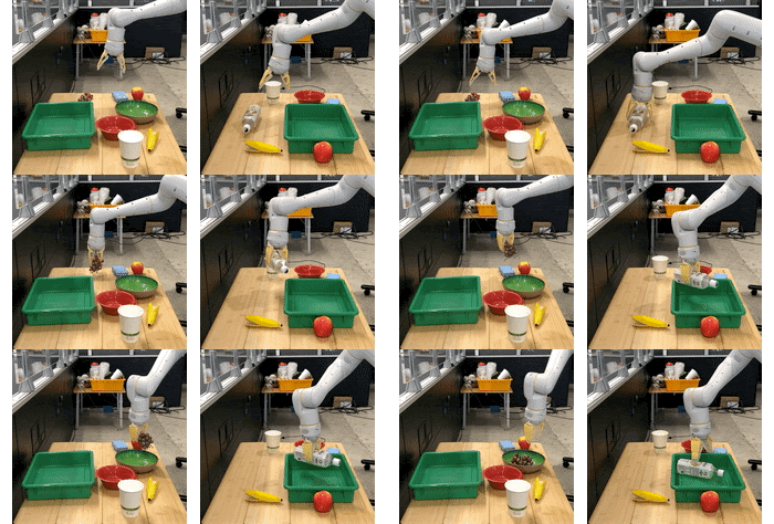
Real-world robotic data collection is very useful, but difficult to scale and challenging to label (figure from BC-Z).

Simulating robots and environments using tools such as Gazebo, MuJoCo, and Unity can mitigate many of the inherent limitations in these datasets. However, simulation is only an approximation of reality — handcrafted models built from polygons and primitives often correspond poorly to real objects. Even if a scene is built directly from a 3D scan of a real environment, the movable objects in that scan will act like fixed background scenery and will not respond the way real-world objects would. Due to these challenges, there are few large libraries with high-quality models of 3D objects that can be incorporated into physical and visual simulations to provide the variety needed for deep learning.

In “Google Scanned Objects: A High-Quality Dataset of 3D Scanned Household Items”, presented at ICRA 2022, we describe our efforts to address this need by creating the Scanned Objects dataset, a curated collection of over 1000 3D-scanned common household items. The Scanned Objects dataset is usable in tools that read Simulation Description Format (SDF) models, including the Gazebo and PyBullet robotics simulators. Scanned Objects is hosted on Open Robotics, an open-source hosting environment for models compatible with the Gazebo simulator.

History
Robotics researchers within Google began scanning objects in 2011, creating high-fidelity 3D models of common household objects to help robots recognize and grasp things in their environments. However, it became apparent that 3D models have many uses beyond object recognition and robotic grasping, including scene construction for physical simulations and 3D object visualization for end-user applications. Therefore, this Scanned Objects project was expanded to bring 3D experiences to Google at scale, collecting a large number of 3D scans of household objects through a process that is more efficient and cost effective than traditional commercial-grade product photography.

Scanned Objects was an end-to-end effort, involving innovations at nearly every stage of the process, including curation of objects at scale for 3D scanning, the development of novel 3D scanning hardware, efficient 3D scanning software, fast 3D rendering software for quality assurance, and specialized frontends for web and mobile viewers. We also executed human-computer interaction studies to create effective experiences for interacting with 3D objects.
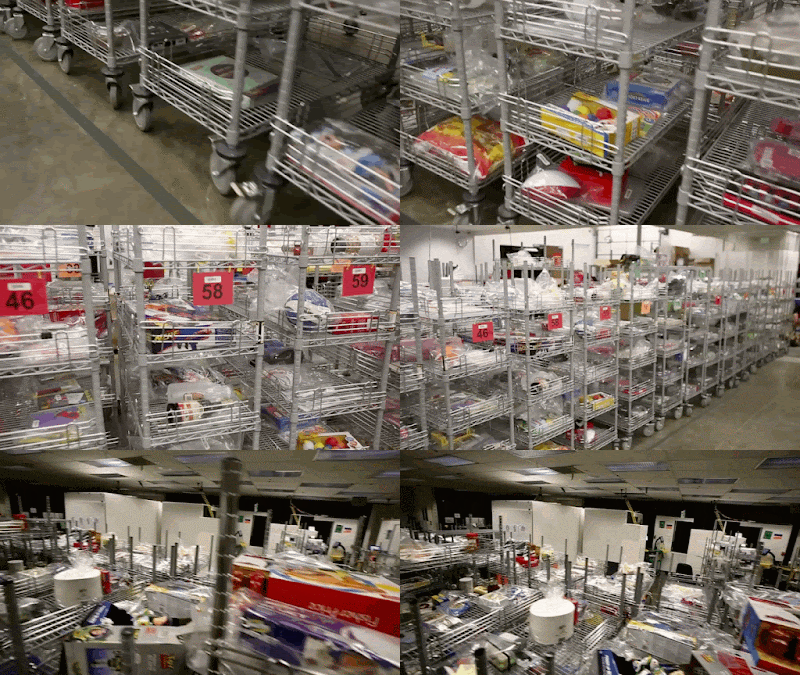
Objects that were acquired for scanning.

These object models proved useful in 3D visualizations for Everyday Robots, which used the models to bridge the sim-to-real gap for training, work later published as RetinaGAN and RL-CycleGAN. Building on these earlier 3D scanning efforts, in 2019 we began preparing an external version of the Scanned Objects dataset and transforming the previous set of 3D images into graspable 3D models.

Object Scanning
To create high-quality models, we built a scanning rig to capture images of an object from multiple directions under controlled and carefully calibrated conditions. The system consists of two machine vision cameras for shape detection, a DSLR camera for high-quality HDR color frame extraction, and a computer-controlled projector for pattern recognition. The scanning rig uses a structured light technique that infers a 3D shape from camera images with patterns of light that are projected onto an object.
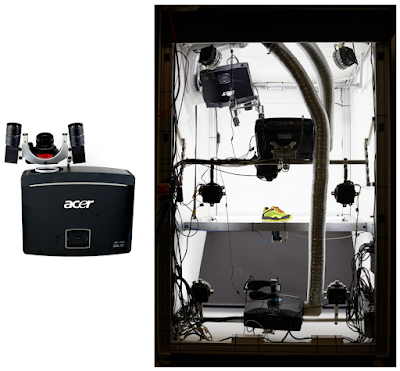
The scanning rig used to capture 3D models.
A shoe being scanned (left). Images are captured from several directions with different patterns of light and color. A shadow passing over an object (right) illustrates how a 3D shape can be captured with an off-axis view of a shadow edge.

Simulation Model Conversion
The early internal scanned models used protocol buffer metadata, high-resolution visuals, and formats that were not suitable for simulation. For some objects, physical properties, such as mass, were captured by weighing the objects at scanning time, but surface properties, such as friction or deformation, were not represented.

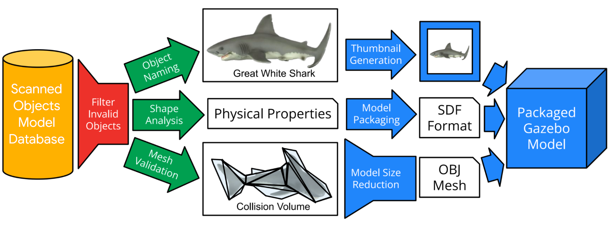
So, following data collection, we built an automated pipeline to solve these issues and enable the use of scanned models in simulation systems. The automated pipeline filters out invalid or duplicate objects, automatically assigns object names using text descriptions of the objects, and eliminates object mesh scans that do not meet simulation requirements. Next, the pipeline estimates simulation properties (e.g., mass and moment of inertia) from shape and volume, constructs collision volumes, and downscales the model to a usable size. Finally, the pipeline converts each model to SDF format, creates thumbnail images, and packages the model for use in simulation systems.
The pipeline filters models that are not suitable for simulation, generates collision volumes, computes physical properties, downsamples meshes, generates thumbnails, and packages them all for use in simulation systems.
A collection of Scanned Object models rendered in Blender.

The output of this pipeline is a simulation model in an appropriate format with a name, mass, friction, inertia, and collision information, along with searchable metadata in a public interface compatible with our open-source hosting on Open Robotics’ Gazebo.

The output objects are represented as SDF models that refer to Wavefront OBJ meshes averaging 1.4 Mb per model. Textures for these models are in PNG format and average 11.2 Mb. Together, these provide high resolution shape and texture.

Impact
The Scanned Objects dataset contains 1030 scanned objects and their associated metadata, totaling 13 Gb, licensed under the CC-BY 4.0 License. Because these models are scanned rather than modeled by hand, they realistically reflect real object properties, not idealized recreations, reducing the difficulty of transferring learning from simulation to the real world.
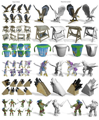
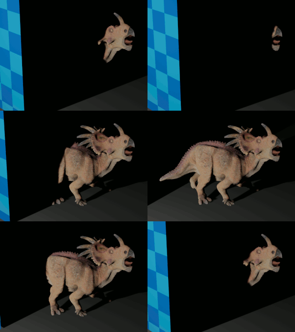
Input views (left) and reconstructed shape and texture from two novel views on the right (figure from Differentiable Stereopsis).
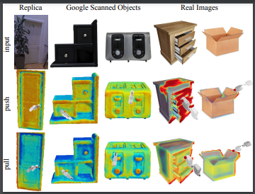
Visualized action scoring predictions over three real-world 3D scans from the Replica dataset and Scanned Objects (figure from Where2Act).

The Scanned Objects dataset has already been used in over 25 papers across as many projects, spanning computer vision, computer graphics, robot manipulation, robot navigation, and 3D shape processing. Most projects used the dataset to provide synthetic training data for learning algorithms. For example, the Scanned Objects dataset was used in Kubric, an open-sourced generator of scalable datasets for use in over a dozen vision tasks, and in LAX-RAY, a system for searching shelves with lateral access X-rays to automate the mechanical search for occluded objects on shelves.

Unsupervised 3D keypoints on real-world data (figure from KeypointDeformer).

We hope that the Scanned Objects dataset will be used by more robotics and simulation researchers in the future, and that the example set by this dataset will inspire other owners of 3D model repositories to make them available for researchers everywhere. If you would like to try it yourself, head to Gazebo and start browsing!

Acknowledgments
The authors thank the Scanned Objects team, including Peter Anderson-Sprecher, J.J. Blumenkranz, James Bruce, Ken Conley, Katie Dektar, Charles DuHadway, Anthony Francis, Chaitanya Gharpure, Topraj Gurung, Kristy Headley, Ryan Hickman, John Isidoro, Sumit Jain, Brandon Kinman, Greg Kline, Mach Kobayashi, Nate Koenig, Kai Kohlhoff, James Kuffner, Thor Lewis, Mike Licitra, Lexi Martin, Julian (Mac) Mason, Rus Maxham, Pascal Muetschard, Kannan Pashupathy, Barbara Petit, Arshan Poursohi, Jared Russell, Matt Seegmiller, John Sheu, Joe Taylor, Vincent Vanhoucke, Josh Weaver, and Tommy McHugh.

Special thanks go to Krista Reymann for organizing this project, helping write the paper, and editing this blogpost, James Bruce for the scanning pipeline design and Pascal Muetschard for maintaining the database of object models.
Source: Google AI Blog


The Language Interpretability Tool (LIT): Interactive Exploration and Analysis of NLP Models

As natural language processing (NLP) models become more powerful and are deployed in more real-world contexts, understanding their behavior is becoming increasingly critical. While advances in modeling have brought unprecedented performance on many NLP tasks, many research questions remain about not only the behavior of these models under domain shift and adversarial settings, but also their tendencies to behave according to social biases or shallow heuristics.

For any new model, one might want to know in which cases a model performs poorly, why a model makes a particular prediction, or whether a model will behave consistently under varying inputs, such as changes to textual style or pronoun gender. But, despite the recent explosion of work on model understanding and evaluation, there is no “silver bullet” for analysis. Practitioners must often experiment with many techniques, looking at local explanations, aggregate metrics, and counterfactual variations of the input to build a better understanding of model behavior, with each of these techniques often requiring its own software package or bespoke tool. Our previously released What-If Tool was built to address this challenge by enabling black-box probing of classification and regression models, thus enabling researchers to more easily debug performance and analyze the fairness of machine learning models through interaction and visualization. But there was still a need for a toolkit that would address challenges specific to NLP models.

With these challenges in mind, we built and open-sourced the Language Interpretability Tool (LIT), an interactive platform for NLP model understanding. LIT builds upon the lessons learned from the What-If Tool with greatly expanded capabilities, which cover a wide range of NLP tasks including sequence generation, span labeling, classification and regression, along with customizable and extensible visualizations and model analysis.

LIT supports local explanations, including salience maps, attention, and rich visualizations of model predictions, as well as aggregate analysis including metrics, embedding spaces, and flexible slicing. It allows users to easily hop between visualizations to test local hypotheses and validate them over a dataset. LIT provides support for counterfactual generation, in which new data points can be added on the fly, and their effect on the model visualized immediately. Side-by-side comparison allows for two models, or two individual data points, to be visualized simultaneously. More details about LIT can be found in our system demonstration paper, which was presented at EMNLP 2020.

Exploring a sentiment classifier with LIT.

Customizability
In order to better address the broad range of users with different interests and priorities that we hope will use LIT, we’ve built the tool to be easily customizable and extensible from the start. Using LIT on a particular NLP model and dataset only requires writing a small bit of Python code. Custom components, such as task-specific metrics calculations or counterfactual generators, can be written in Python and added to a LIT instance through our provided APIs. Also, the front end itself can be customized, with new modules that integrate directly into the UI. For more on extending the tool, check out our documentation on GitHub.

Demos
To illustrate some of the capabilities of LIT, we have created a few demos using pre-trained models. The full list is available on the LIT website, and we describe two of them here:

  • Sentiment analysis: In this example, a user can explore a BERT-based binary classifier that predicts if a sentence has positive or negative sentiment. The demo uses the Stanford Sentiment Treebank of sentences from movie reviews to demonstrate model behavior. One can examine local explanations using saliency maps provided by a variety of techniques (such as LIME and integrated gradients), and can test model behavior with perturbed (counterfactual) examples using techniques such as back-translation, word replacement, or adversarial attacks. These techniques can help pinpoint under what scenarios a model fails, and whether those failures are generalizable, which can then be used to inform how best to improve a model.
    Analyzing token-based salience of an incorrect prediction. The word “laughable” seems to be incorrectly raising the positive sentiment score of this example.
  • Masked word prediction: Masked language modeling is a "fill-in-the-blank" task, where the model predicts different words that could complete a sentence. For example, given the prompt, "I took my ___ for a walk", the model might predict a high score for "dog." In LIT one can explore this interactively by typing in sentences or choosing from a pre-loaded corpus, and then clicking specific tokens to see what a model like BERT understands about language, or about the world.
    Interactively selecting a token to mask, and viewing a language model's predictions.

LIT in Practice and Future Work
Although LIT is a new tool, we have already seen the value that it can provide for model understanding. Its visualizations can be used to find patterns in model behavior, such as outlying clusters in embedding space, or words with outsized importance to the predictions. Exploration in LIT can test for potential biases in models, as demonstrated in our case study of LIT exploring gender bias in a coreference model. This type of analysis can inform next steps in improving model performance, such as applying MinDiff to mitigate systemic bias. It can also be used as an easy and fast way to create an interactive demo for any NLP model.

Check out the tool either through our provided demos, or by bringing up a LIT server for your own models and datasets. The work on LIT has just started, and there are a number of new capabilities and refinements planned, including the addition of new interpretability techniques from cutting edge ML and NLP research. If there are other techniques that you’d like to see added to the tool, please let us know! Join our mailing list to stay up to date as LIT evolves. And as the code is open-source, we welcome feedback on and contributions to the tool.

Acknowledgments
LIT is a collaborative effort between the Google Research PAIR and Language teams. This post represents the work of the many contributors across Google, including Andy Coenen, Ann Yuan, Carey Radebaugh, Ellen Jiang, Emily Reif, Jasmijn Bastings, Kristen Olson, Leslie Lai, Mahima Pushkarna, Sebastian Gehrmann, and Tolga Bolukbasi. We would like to thank all those who contributed to the project, both inside and outside Google, and the teams that have piloted its use and provided valuable feedback.

Source: Google AI Blog


Recreating Historical Streetscapes Using Deep Learning and Crowdsourcing

For many, gazing at an old photo of a city can evoke feelings of both nostalgia and wonder — what was it like to walk through Manhattan in the 1940s? How much has the street one grew up on changed? While Google Street View allows people to see what an area looks like in the present day, what if you want to explore how places looked in the past?

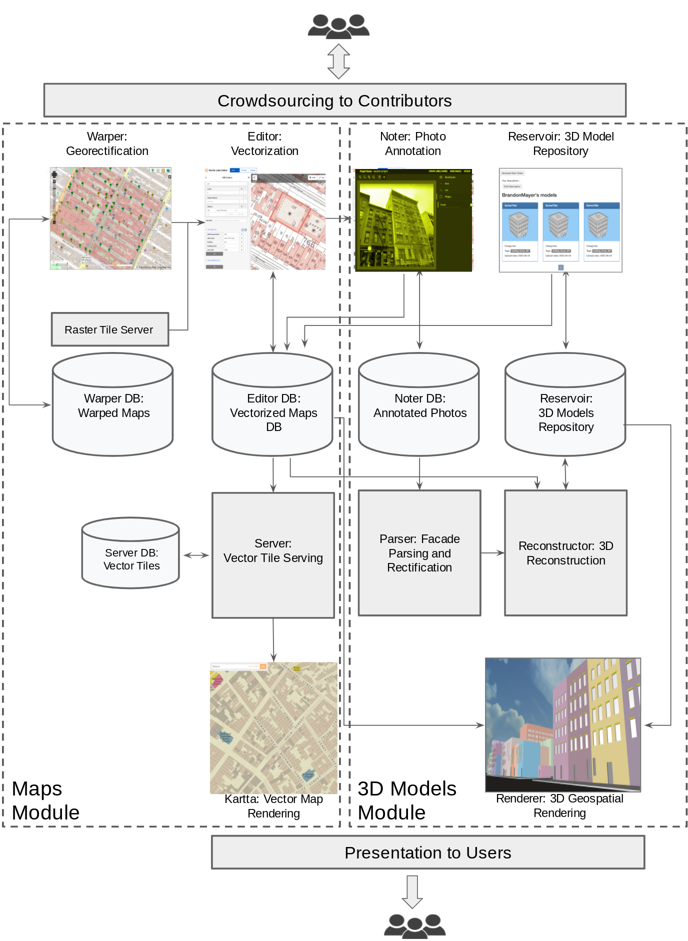
To create a rewarding “time travel” experience for both research and entertainment purposes, we are launching (pronounced as re”turn"), an open source, scalable system running on Google Cloud and Kubernetes that can reconstruct cities from historical maps and photos, representing an implementation of our suite of open source tools launched earlier this year. Referencing the common prefix meaning again or anew, is meant to represent the themes of reconstruction, research, recreation and remembering behind this crowdsourced research effort, and consists of three components:

  • A crowdsourcing platform, which allows users to upload historical maps of cities, georectify (i.e., match them to real world coordinates), and vectorize them
  • A temporal map server, which shows how maps of cities change over time
  • A 3D experience platform, which runs on top of the map server, creating the 3D experience by using deep learning to reconstruct buildings in 3D from limited historical images and maps data.

Our goal is for to become a compendium that allows history enthusiasts to virtually experience historical cities around the world, aids researchers, policy makers and educators, and provides a dose of nostalgia to everyday users.

Bird’s eye view of Chelsea, Manhattan with a time slider from 1890 to 1970, crafted from historical photos and maps and using ’s 3D reconstruction pipeline and colored with a preset Manhattan-inspired palette.

Crowdsourcing Data from Historical Maps
Reconstructing how cities used to look at scale is a challenge — historical image data is more difficult to work with than modern data, as there are far fewer images available and much less metadata captured from the images. To help with this difficulty, the maps module is a suite of open source tools that work together to create a map server with a time dimension, allowing users to jump back and forth between time periods using a slider. These tools allow users to upload scans of historical print maps, georectify them to match real world coordinates, and then convert them to vector format by tracing their geographic features. These vectorized maps are then served on a tile server and rendered as slippy maps, which lets the user zoom in and pan around.

Sub-modules of the suite of tools

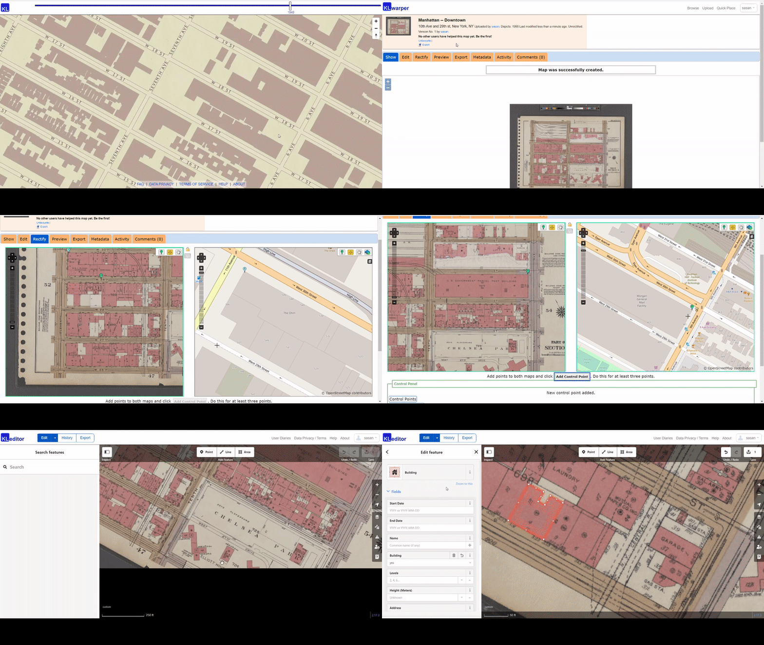
The entry point of the maps module is Warper, a web app that allows users to upload historical images of maps and georectify them by finding control points on the historical map and corresponding points on a base map. The next app, Editor, allows users to load the georectified historical maps as the background and then trace their geographic features (e.g., building footprints, roads, etc.). This traced data is stored in an OpenStreetMap (OSM) vector format. They are then converted to vector tiles and served from the Server app, a vector tile server. Finally, our map renderer, Kartta, visualizes the spatiotemporal vector tiles allowing the users to navigate space and time on historical maps. These tools were built on top of numerous open source resources including OpenStreetMap, and we intend for our tools and data to be completely open source as well.

Warper and Editor work together to let users upload a map, anchor it to a base map using control points, and trace geographic features like building footprints and roads.

3D Experience
The 3D Models module aims to reconstruct the detailed full 3D structures of historical buildings using the associated images and maps data, organize these 3D models properly in one repository, and render them on the historical maps with a time dimension.

In many cases, there is only one historical image available for a building, which makes the 3D reconstruction an extremely challenging problem. To tackle this challenge, we developed a coarse-to-fine reconstruction-by-recognition algorithm.

High-level overview of ’s 3D reconstruction pipeline, which takes annotated images and maps and prepares them for 3D rendering.

Starting with footprints on maps and façade regions in historical images (both are annotated by crowdsourcing or detected by automatic algorithms), the footprint of one input building is extruded upwards to generate its coarse 3D structure. The height of this extrusion is set to the number of floors from the corresponding metadata in the maps database.

In parallel, instead of directly inferring the detailed 3D structures of each façade as one entity, the 3D reconstruction pipeline recognizes all individual constituent components (e.g., windows, entries, stairs, etc.) and reconstructs their 3D structures separately based on their categories. Then these detailed 3D structures are merged with the coarse one for the final 3D mesh. The results are stored in a 3D repository and ready for 3D rendering.

The key technology powering this feature is a number of state-of-art deep learning models:

  • Faster region-based convolutional neural networks (RCNN) were trained using the façade component annotations for each target semantic class (e.g., windows, entries, stairs, etc), which are used to localize bounding-box level instances in historical images.
  • DeepLab, a semantic segmentation model, was trained to provide pixel-level labels for each semantic class.
  • A specifically designed neural network was trained to enforce high-level regularities within the same semantic class. This ensured that windows generated on a façade were equally spaced and consistent in shape with each other. This also facilitated consistency across different semantic classes such as stairs to ensure they are placed at reasonable positions and have consistent dimensions relative to the associated entry ways.

Key Results

Street level view of 3D-reconstructed Chelsea, Manhattan

Conclusion
With , we have developed tools that facilitate crowdsourcing to tackle the main challenge of insufficient historical data when recreating virtual cities. The 3D experience is still a work-in-progress and we aim to improve it with future updates. We hope acts as a nexus for an active community of enthusiasts and casual users that not only utilizes our historical datasets and open source code, but actively contributes to both.

Acknowledgements
This effort has been successful thanks to the hard work of many people, including, but not limited to the following (in alphabetical order of last name): Yale Cong, Feng Han, Amol Kapoor, Raimondas Kiveris, Brandon Mayer, Mark Phillips, Sasan Tavakkol, and Tim Waters (Waters Geospatial Ltd).

Source: Google AI Blog


Releasing the Drosophila Hemibrain Connectome — The Largest Synapse-Resolution Map of Brain Connectivity


A fundamental way to describe a complex system is to measure its “network” — the way individual parts connect and communicate with each other. For example, biologists study gene networks, social scientists study social networks and even search engines rely, in part, on analyzing the way web pages form a network by linking to one another.

In neuroscience, a long-standing hypothesis is that the connectivity between brain cells plays a major role in the function of the brain. While technical difficulties have historically been a barrier for neuroscientists trying to study brain networks in detail, this is beginning to change. Last year, we announced the first nanometer-resolution automated reconstruction of an entire fruit fly brain, which focused on the individual shape of the cells. However, this accomplishment didn't reveal information about their connectivity.

Today, in collaboration with the FlyEM team at HHMI’s Janelia Research Campus and several other research partners, we are releasing the “hemibrain” connectome, a highly detailed map of neuronal connectivity in the fly brain, along with a suite of tools for visualization and analysis. The hemibrain is derived from a 3D image of roughly half the fly brain, and contains verified connectivity between ~25,000 neurons that form more than twenty-million connections. To date, this is the largest synapse-resolution map of brain connectivity that has ever been produced, in any species. The goal of this project has been to produce a public resource that any scientist can use to advance their own work, similar to the fly genome, which was released twenty years ago and has become a fundamental tool in biology.
Fly brain regions contained within the hemibrain connectome. Also available: interactive version (example region: mushroom body).
Imaging, Reconstructing, and Proofreading the Hemibrain Connectome
Over a decade of research and development from numerous research partners was required to overcome the challenges in producing the hemibrain connectome. At Janelia, new methods were developed to stain the fly brain and then divide the tissue into separate 20-micron thick slabs. Each slab was then imaged at 8x8x8nm3 voxel-resolution using focused ion beam scanning electron microscopes customized for months-long continuous operation. Computational methods were developed to stitch and align the raw data into a coherent 26-trillion pixel 3D volume.

However, without an accurate 3D reconstruction of the neurons in a fly brain, producing a connectome from this type of imaging data is impossible. Forming a collaboration with Janelia in 2014, Google began working on the fly brain data, focused on automating 3D reconstruction to jointly work towards producing a connectome. After several iterations of technological development we devised a method called flood-filling networks (FFNs) and applied it towards reconstructing the entire hemibrain dataset. In the current project, we worked closely with our collaborators to optimize the reconstruction results to be more useful for generating a connectome (i.e., embedded within a proofreading and synaptic detection pipeline), rather than just showing the shape of the neurons.
A flood-filling network segmenting (tracing) part of a neuron in the fly hemibrain data.
FFNs were the first automated segmentation technology to yield reconstructions that were sufficiently accurate to enable the overall hemibrain project to proceed. This is because errors in automated reconstruction require correction by expert human “proofreaders,” and previous approaches were estimated to require tens of millions of hours of human effort. With FFNs, the hemibrain was proofread using hundreds of thousands of human hours: a two order-of-magnitude improvement. This (still substantial) proofreading effort was performed over two years by a team of highly skilled and dedicated annotators, using tools and workflows pioneered at Janelia for this purpose. For example, annotators used VR headsets and custom 3D object-editing tools to examine neuron shapes and fix errors in the automated reconstruction. These revisions were then used to retrain the FFN models, leading to revised and more accurate machine output.

Finally, after proofreading, the reconstruction was combined with automated synaptic detection in order to produce the hemibrain connectome. Janelia scientists manually labeled individual synapses and then trained neural network classifiers to automate the task. Generalization was improved through multiple rounds of labeling, and the results from two different network architectures were merged to produce robust classifications across the hemibrain.

Further details about producing the hemibrain can be found in HHMI’s press release.

What Is Being Released?
The focus of today’s announcement is a set of inter-related datasets and tools that enable any interested person to visually and programmatically study the fly connectome. Specifically, the following resources are available:
  • Terabytes of raw data, proofread 3D reconstruction, and synaptic annotations can be interactively visualized or downloaded in bulk.
  • A web-based tool neuPrint, which can be used to query the connectivity, partners, connection strengths and morphologies of any specified neurons.
  • A downloadable, compact representation of the connectome that is roughly a million-times smaller in bytes than the raw data from which it was derived.
  • Documentation and video tutorials explaining the use of these resources.
  • A pre-print with further details related to the production and analysis of the hemibrain connectome.
Next Steps
Researchers have begun using the hemibrain connectome to develop a more robust understanding of the drosophila nervous system. For example, a major brain circuit of interest is the “central complex” which integrates sensory information and is involved in navigation, motor control, and sleep:
A detailed view of “ring neurons” in the central complex of the fly brain, one of many neural circuits that can be studied using the hemibrain reconstruction and connectome. Interactive version: ring neurons and ellipsoid body.
Another circuit that is being intensely studied is the “mushroom body,” a primary site of learning and memory in the drosophila brain whose detailed structure is contained within the hemibrain connectome (interactive visualization).

Acknowledgements
We would like to acknowledge core contributions from Tim Blakely, Laramie Leavitt, Peter Li, Larry Lindsey, Jeremy Maitin-Shepard (Google), Stuart Berg, Gary Huang, Bill Katz, Chris Ordish, Stephen Plaza, Pat Rivlin, Shin-ya Takemura (Janelia collaborators who worked closely with Google’s team), and other amazing collaborators at Janelia and elsewhere who were involved in the hemibrain project.

Source: Google AI Blog


Turbo, An Improved Rainbow Colormap for Visualization


False color maps show up in many applications in computer vision and machine learning, from visualizing depth images to more abstract uses, such as image differencing. Colorizing images helps the human visual system pick out detail, estimate quantitative values, and notice patterns in data in a more intuitive fashion. However, the choice of color map can have a significant impact on a given task. For example, interpretation of “rainbow maps” have been linked to lower accuracy in mission critical applications, such as medical imaging. Still, in many applications, “rainbow maps” are preferred since they show more detail (at the expense of accuracy) and allow for quicker visual assessment.
Left: Disparity image displayed as greyscale. Right: The commonly used Jet rainbow map being used to create a false color image.
One of the most commonly used color mapping algorithms in computer vision applications is Jet, which is high contrast, making it useful for accentuating even weakly distinguished image features. However, if you look at the color map gradient, one can see distinct “bands” of color, most notably in the cyan and yellow regions. This causes sharp transitions when the map is applied to images, which are misleading when the underlying data is actually smoothly varying. Because the rate at which the color changes ‘perceptually’ is not constant, Jet is not perceptually uniform. These effects are even more pronounced for users that are color blind, to the point of making the map ambiguous:
The above image with simulated Protanopia
Today there are many modern alternatives that are uniform and color blind accessible, such as Viridis or Inferno from matplotlib. While these linear lightness maps solve many important issues with Jet, their constraints may make them suboptimal for day to day tasks where the requirements are not as stringent.
ViridisInferno
Today we are happy to introduce Turbo, a new colormap that has the desirable properties of Jet while also addressing some of its shortcomings, such as false detail, banding and color blindness ambiguity. Turbo was hand-crafted and fine-tuned to be effective for a variety of visualization tasks. You can find the color map data and usage instructions for Python here and C/C++ here, as well as a polynomial approximation here.

Development
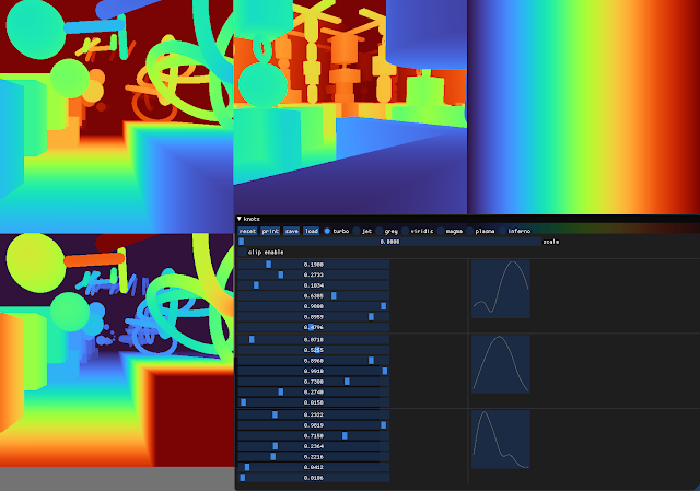
To create the Turbo color map, we created a simple interface that allowed us to interactively adjust the sRGB curves using a 7-knot cubic spline, while comparing the result on a selection of sample images as well as other well known color maps.
Screenshot of the interface used to create and tune Turbo.
This approach provides control while keeping the curve C2 continuous. The resulting color map is not “perceptually linear” in the quantitative sense, but it is more smooth than Jet, without introducing false detail.

Turbo
Jet
Comparison with Common Color Maps
Viridis is a linear color map that is generally recommended when false color is needed because it is pleasant to the eye and it fixes most issues with Jet. Inferno has the same linear properties of Viridis, but is higher contrast, making it better for picking out detail. However, some feel that it can be harsh on the eyes. While this isn’t a concern for publishing, it does affect people’s choice when they must spend extended periods examining visualizations.
TurboJet
ViridisInferno
Because of rapid color and lightness changes, Jet accentuates detail in the background that is less apparent with Viridis and even Inferno. Depending on the data, some detail may be lost entirely to the naked eye. The background in the following images is barely distinguishable with Inferno (which is already punchier than Viridis), but clear with Turbo.
InfernoTurbo
Turbo mimics the lightness profile of Jet, going from low to high back down to low, without banding. As such, its lightness slope is generally double that of Viridis, allowing subtle changes to be more easily seen. This is a valuable feature, since it greatly enhances detail when color can be used to disambiguate the low and high ends.
TurboJet
ViridisInferno
Lightness plots generated by converting the sRGB values to CIECAM02-UCS and displaying the lightness value (J) in greyscale. The black line traces the lightness value from the low end of the color map (left) to the high end (right).
The Viridis and Inferno plots are linear, with Inferno exhibiting a higher slope and over a broader range. Jet’s plot is erratic and peaky, and banding can be seen clearly even in the grayscale image. Turbo has a similar asymmetric profile to Jet with the lows darker than the highs.This is intentional, to make cases where low values appear next to high values more distinct. The curvature in the lower region is also different from the higher region, due to the way blues are perceived in comparison to reds.

Although this low-high-low curve increases detail, it comes at the cost of lightness ambiguity. When rendered in grayscale, the coloration will be ambiguous, since some of the lower values will look identical to higher values. Consequently, Turbo is inappropriate for grayscale printing and for people with the rare case of achromatopsia.

Semantic Layers
When examining disparity maps, it is often desirable to compare values on different sides of the image at a glance. This task is much easier when values can be mentally mapped to a distinct semantic color, such as red or blue. Thus, having more colors helps the estimation ease and accuracy.
TurboJet
ViridisInferno
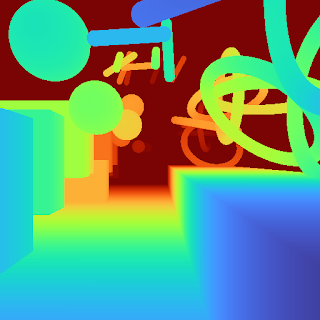
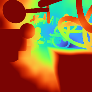
With Jet and Turbo, it’s easy to see which objects on the left of the frame are at the same depth as objects on the right, even though there is a visual gap in the middle. For example, you can easily spot which sphere on the left is at the same depth as the ring on the right. This is much harder to determine using Viridis or Inferno, which have far fewer distinct colors. Compared to Jet, Turbo is also much more smooth and has no “false layers” due to banding. You can see this improvement more clearly if the incoming values are quantized:
Left: Quantized Turbo colormap. Up to 33 quantized colors remain distinguishable and smooth in both lightness and hue change. Right: Quantized Jet color map. Many neighboring colors appear the same; Yellow and Cyan colors appear brighter than the rest.
Quick Judging
When doing a quick comparison of two images, it’s much easier to judge the differences in color than in lightness (because our attention system prioritizes hue). For example, imagine we have an output image from a depth estimation algorithm beside the ground truth. With Turbo it’s easy to discern whether or not the two are in agreement and which regions may disagree.
“Output” Viridis“Ground Truth” Viridis
“Output” Turbo“Ground Truth” Turbo
In addition, it is easy to estimate quantitative values, since they map to distinguishable and memorable colors.
Diverging Map Use Cases
Although the Turbo color map was designed for sequential use (i.e., values [0-1]), it can be used as a diverging colormap as well, as is needed in difference images, for example. When used this way, zero is green, negative values are shades of blue, and positive values are shades of red. Note, however, that the negative minimum is darker than the positive maximum, so it is not truly balanced.
"Ground Truth" disparity imageEstimated disparity image
Difference Image (ground truth - estimated disparity image), visualized with Turbo
Accessibility for Color Blindness
We tested Turbo using a color blindness simulator and found that for all conditions except Achromatopsia (total color blindness), the map remains distinguishable and smooth. In the case of Achromatopsia, the low and high ends are ambiguous. Since the condition affects 1 in 30,000 individuals (or 0.00003%), Turbo should be usable by 99.997% of the population.
Test Image
ProtanomalyProtanopia
DeuteranomalyDeuteranopia
TritanomalyTritanopia
Blue cone monochromacyAchromatopsia
Conclusion
Turbo is a slot-in replacement for Jet, and is intended for day-to-day tasks where perceptual uniformity is not critical, but one still wants a high contrast, smooth visualization of the underlying data. It can be used as a sequential as well as a diverging map, making it a good all-around map to have in the toolbox. You can find the color map data and usage instructions for Python here and for C/C++ here. There is also a polynomial approximation here, for cases where a look-up table may not be desirable.Our team uses it for visualizing disparity maps, error maps, and various other scalar quantities, and we hope you’ll find it useful as well.

Acknowledgements
Ambrus Csaszar stared at many color ramps with me in order to pick the right tradeoffs between uniformity and detail accentuation. Christian Haene integrated the map into our team’s tools, which caused wide usage and thus spurred further improvements. Matthias Kramm and Ruofei Du came up with closed form approximations.

Source: Google AI Blog


An Interactive, Automated 3D Reconstruction of a Fly Brain


The goal of connectomics research is to map the brain’s "wiring diagram" in order to understand how the nervous system works. A primary target of recent work is the brain of the fruit fly (Drosophila melanogaster), which is a well-established research animal in biology. Eight Nobel Prizes have been awarded for fruit fly research that has led to advances in molecular biology, genetics, and neuroscience. An important advantage of flies is their size: Drosophila brains are relatively small (one hundred thousand neurons) compared to, for example, a mouse brain (one hundred million neurons) or a human brain (one hundred billion neurons). This makes fly brains easier to study as a complete circuit.

Today, in collaboration with the Howard Hughes Medical Institute (HHMI) Janelia Research Campus and Cambridge University, we are excited to publish “Automated Reconstruction of a Serial-Section EM Drosophila Brain with Flood-Filling Networks and Local Realignment”, a new research paper that presents the automated reconstruction of an entire fruit fly brain. We are also making the full results available for anyone to download or to browse online using an interactive, 3D interface we developed called Neuroglancer.
A 40-trillion pixel fly brain reconstruction, open to anyone for interactive viewing. Bottom right: smaller datasets that Google AI analyzed in publications in 2016 and 2018.
Automated Reconstruction of 40 Trillion Pixels
Our collaborators at HHMI sectioned a fly brain into thousands of ultra-thin 40-nanometer slices, imaged each slice using a transmission electron microscope (resulting in over forty trillion pixels of brain imagery), and then aligned the 2D images into a coherent, 3D image volume of the entire fly brain. Using thousands of Cloud TPUs we then applied Flood-Filling Networks (FFNs), which automatically traced each individual neuron in the fly brain.

While the algorithm generally performed well, we found performance degraded when the alignment was imperfect (image content in consecutive sections was not stable) or when occasionally there were multiple consecutive slices missing due to difficulties associated with the sectioning and imaging process. In order to compensate for these issues we combined FFNs with two new procedures. First, we estimated the slice-to-slice consistency everywhere in the 3D image and then locally stabilized the image content as the FFN traced each neuron. Second, we used a “Segmentation-Enhanced CycleGAN” (SECGAN) to computationally “hallucinate” missing slices in the image volume. SECGANs are a type of generative adversarial network specialized for image segmentation. We found that the FFN was able to trace through locations with multiple missing slices much more robustly when using the SECGAN-hallucinated image data.
Interactive Visualization of the Fly Brain with Neuroglancer
When working with 3D images that contain trillions of pixels and objects with complicated shapes, visualization is both essential and difficult. Inspired by Google’s history of developing new visualization technologies, we designed a new tool that was scalable and powerful, but also accessible to anybody with a web browser that supports WebGL. The result is Neuroglancer, an open-source project (github) that enables viewing of petabyte-scale 3D volumes, and supports many advanced features such as arbitrary-axis cross-sectional reslicing, multi-resolution meshes, and the powerful ability to develop custom analysis workflows via integration with Python. This tool has become heavily used by collaborators at the Allen Institute for Brain Science, Harvard University, HHMI, Max Planck Institute, MIT, Princeton University, and elsewhere.
A recorded demonstration of Neuroglancer. Interactive version available here.
Next Steps
Our collaborators at HHMI and Cambridge University have already begun using this reconstruction to accelerate their studies of learning, memory, and perception in the fly brain. However, the results described above are not yet a true connectome since establishing a connectome requires the identification of synapses. We are working closely with the FlyEM team at Janelia Research Campus to create a highly verified and exhaustive connectome of the fly brain using images acquired with “FIB-SEM” technology.

Acknowledgements
We would like to acknowledge core contributions from Tim Blakely, Viren Jain, Michal Januszewski, Laramie Leavitt, Larry Lindsey, Mike Tyka (Google), as well as Alex Bates, Davi Bock, Greg Jefferis, Feng Li, Mathew Nichols, Eric Perlman, Istvan Taisz, and Zhihao Zheng (Cambridge University, HHMI Janelia, Johns Hopkins University, and University of Vermont).

Source: Google AI Blog


Exploring Neural Networks with Activation Atlases


Neural networks have become the de facto standard for image-related tasks in computing, currently being deployed in a multitude of scenarios, ranging from automatically tagging photos in your image library to autonomous driving systems. These machine-learned systems have become ubiquitous because they perform more accurately than any system humans were able to directly design without machine learning. But because essential details of these systems are learned during the automated training process, understanding how a network goes about its given task can sometimes remain a bit of a mystery.

Today, in collaboration with colleagues at OpenAI, we're publishing "Exploring Neural Networks with Activation Atlases", which describes a new technique aimed at helping to answer the question of what image classification neural networks "see" when provided an image. Activation atlases provide a new way to peer into convolutional vision networks, giving a global, hierarchical, and human-interpretable overview of concepts within the hidden layers of a network. We think of activation atlases as revealing a machine-learned alphabet for images — an array of simple, atomic concepts that are combined and recombined to form much more complex visual ideas. We are also releasing some jupyter notebooks to help you get you started in making your own activation atlases.

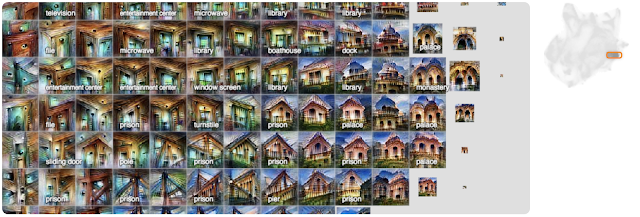
A detail view of an activation atlas from one of the layers of the InceptionV1 vision classification network. It reveals many of the visual detectors that the network uses to classify images, such as different types of fruit-like textures, honeycomb patterns and fabric-like textures.
The activation atlases shown below are built from a convolutional image classification network, Inceptionv1, that was trained on the ImageNet dataset. In general, classification networks are shown an image and then asked to give that image a label from one of 1,000 predetermined classes — such as "carbonara", "snorkel" or "frying pan". To do this, our network evaluates the image data progressively through about ten layers, each made of hundreds of neurons that each activate to varying degrees on different types of image patches. One neuron at one layer might respond positively to a dog's ear, another at an earlier layer might respond to a high-contrast vertical line.

An activation atlas is built by collecting the internal activations from each of these layers of our neural network from one million images. These activations, represented by a complex set of high-dimensional vectors, is projected into useful 2D layouts via UMAP, a dimensionality-reduction technique that preserving some of the local structure of the original high-dimensional space.

This takes care of organizing our activation vectors, but we also need to aggregate them into a more manageable number — all the activations are too many to consume at a glance. To do this, we draw a grid over the 2D layout we created. For each cell in our grid, we average all the activations that lie within the boundaries of that cell, and use feature visualization to create an iconic representation.
Left: A randomized set of one million images is fed through the network, collecting one random spatial activation per image. Center: The activations are fed through UMAP to reduce them to two dimensions. They are then plotted, with similar activations placed near each other. Right: We then draw a grid, average the activations that fall within a cell, and run feature inversion on the averaged activation.
Below we can see an activation atlas for just one layer in a neural network (remember that these classification models can have half a dozen or more layers). It reveals a universe of the visual concepts the network has learned to classify images at this layer. This atlas can be a bit overwhelming at first glance — there's a lot going on! This diversity is a reflection of the variety of visual abstractions and concepts the model has developed.
An overview of an activation atlas for one of the many layers (mixed4c) within Inception v1. It is about halfway through the network.
In this detail, we can see detectors for different types of leaves and plants.
Here we can see different detectors for water, lakes and sandbars.
Here we see different types of buildings and bridges.
As we mentioned before, there are many more layers in this network. Let's look at the layers that came before this one to see how these concepts become more refined as we go deeper into the network (Each layer builds its activations on top of the preceding layer's activations).
In an early layer, mixed4a, there is a vague "mammalian" area.
By the next layer in the network, mixed4b, animals and people have been disentangled, with some fruit and food emerging in the middle.
By layer mixed4c these concepts are further refined and differentiated into small "peninsulas".
Here we've seen the global structure evolve from layer to layer, but each of the individual concepts also become more specific and complex from layer to layer. If we focus on the areas of three layers that contribute to a specific classification, say "cabbage", we can see this clearly.
Left: This early layer is very nonspecific in comparison to the others. Center: By the middle layer, the images definitely resemble leaves, but they could be any type of plant. Right: By the last layer the images are very specific to cabbage, leaves curved into rounded balls.
There is another phenomenon worth noting: not only are concepts being refined as you move from layer to layer, but new concepts seem to be appearing out of combinations of old ones.
You can see how sand and water are distinct concepts in a middle layer, mixed4c (left and center), both with strong attributions to the classification of "sandbar". Contrast this with a later layer (right), mixed5b, where the two ideas seem to be fused into one activation.
Instead of zooming in on certain areas of the whole atlas for a specific layer, we can also create an atlas at a specific layer for just one of the 1,000 classes in ImageNet. This will show the concepts and detectors that the network most often uses to classify a specific class, say "red fox" for instance.
Here we can more clearly see what the network is focusing on to classify a "red fox". There are pointy ears, white snouts surrounded by red fur, and wooded or snowy backgrounds.
Here we can see the many different scales and angles of detectors for "tile roof".
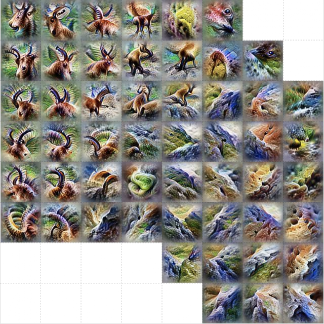
For "ibex", we see detectors for horns and brown fur, but also environments where we might find such animals, like rocky hillsides.
Like the detectors for tile roof, "artichoke" also has many different sizes of detectors for the texture of an artichoke, but we also get some purple flower detectors. These are presumably detecting the blossoms of an artichoke plant.
These atlases not only reveal nuanced visual abstractions within a model, but they can also reveal high-level misunderstandings. For example, by looking at an activation atlas for a "great white shark" we water and triangular fins (as expected) but we also see something that looks like a baseball. This hints at a shortcut taken by this research model where it conflates the red baseball stitching with the open mouth of a great white shark.
We can test this by using a patch of an image of a baseball to switch the model's classification of a particular image from "grey whale" to "great white shark".
We hope that activation atlases will be a useful tool in the quiver of techniques that are making machine learning more accessible and interpretable. To help you get started, we've released several jupyter notebooks which can be executed immediately in your browser with one click via colab. They build upon the previously released toolkit Lucid, which includes code for many other interpretability visualization techniques included as well. We're excited to see what you discover!

Source: Google AI Blog