With free measurement tools from Google, you can get insights into how customer behavior has changed due to COVID-19 and then take action to update your marketing strategy. Read more to learn about how to get started, and for specific tips to help your business navigate the coming months.
Understand the impact of your Google media
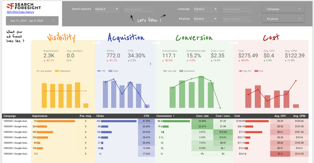
If you’re running marketing campaigns to drive visits to your website or app, it’s important for these visits to turn into sales. Attribution in Google Ads helps you understand the paths people take to complete a conversion, and then award credit for that conversion to different ads, clicks, and factors along the way.We recently launched a new look for attribution reports in Google Ads that helps you quickly see how customers interact with your marketing throughout the purchase cycle. This makes it easier for you to then take action in the areas that are driving results.
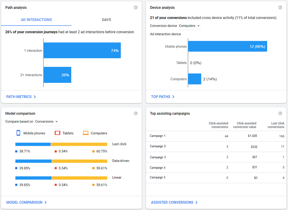
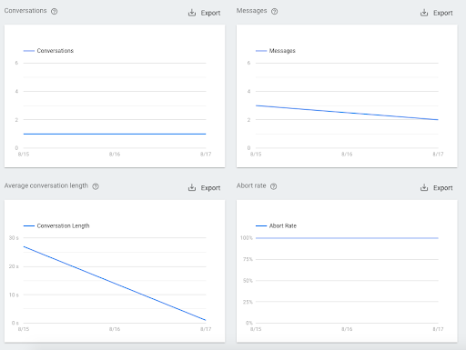
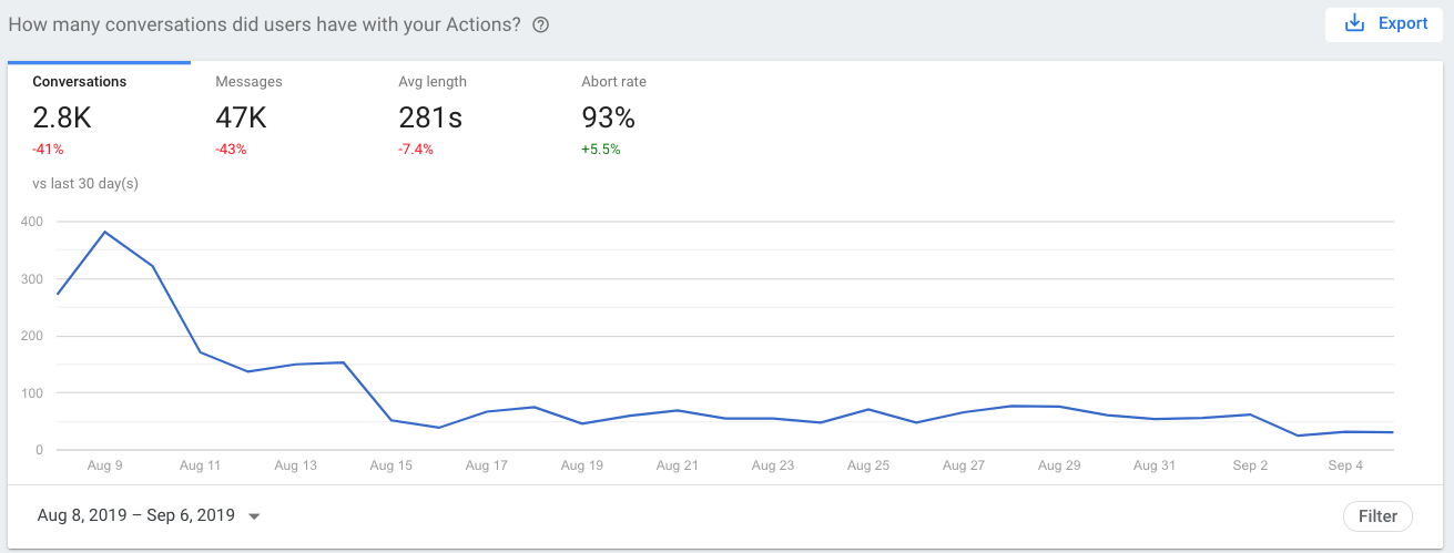
Revamped overview page that displays simplified and intuitive set of attribution reports.
Attribution models give you a deeper understanding of how your ads perform to help you decide where to allocate your marketing investment. One model, data-driven attribution, uses machine learning to determine how much credit to assign to each click on the customer journey, helping it better account for changes in customer behavior during turbulent times. For example, if you're working on behalf of a grocery store experiencing an increase in online orders from mobile devices, data-driven attribution may indicate that your mobile ads are having a greater impact on driving conversions than you realized, giving you the insight you need to optimize your campaign performance. If you’d like to learn which attribution model is right for your business, check out our official guide to attribution modeling.
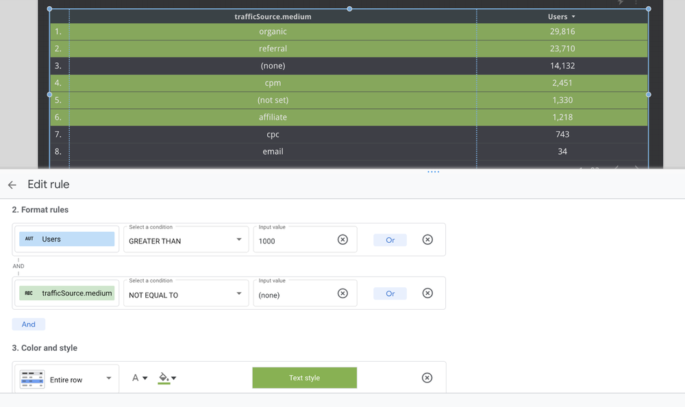
We’ve put together a guide that lists a few reporting shortcuts in Analytics that can help you easily get useful insights. For example, if your business has shifted to online only, you need to make sure you’re converting as many site or app visits into sales as possible. You can use a shortcut to see your weekly conversion rate for the last 60 days and identify areas you might be able to improve upon – without digging through multiple reports in your account.
Visualize trends about your business
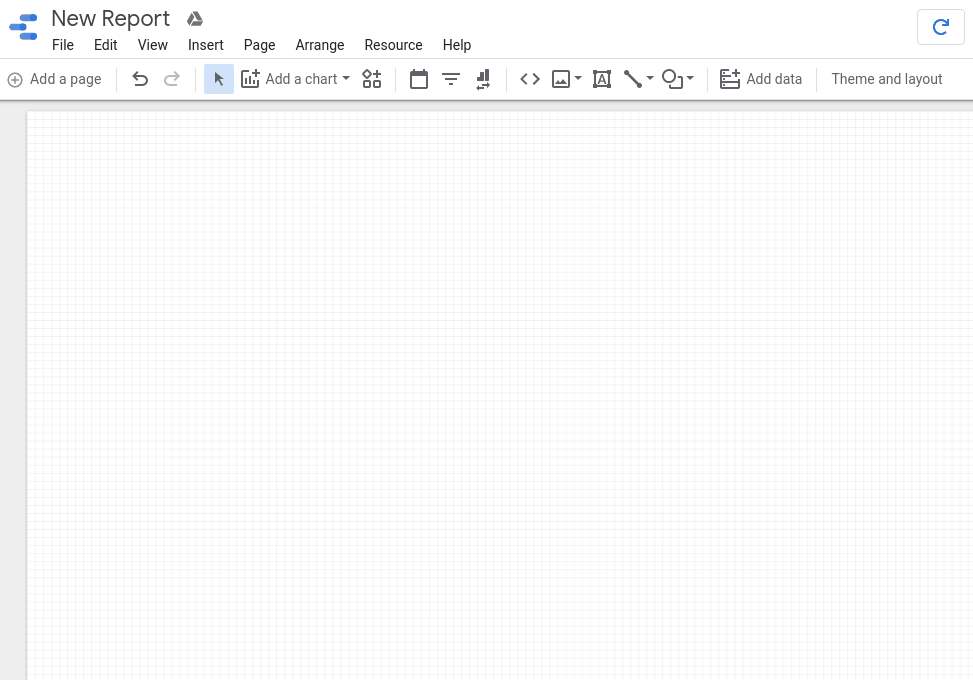
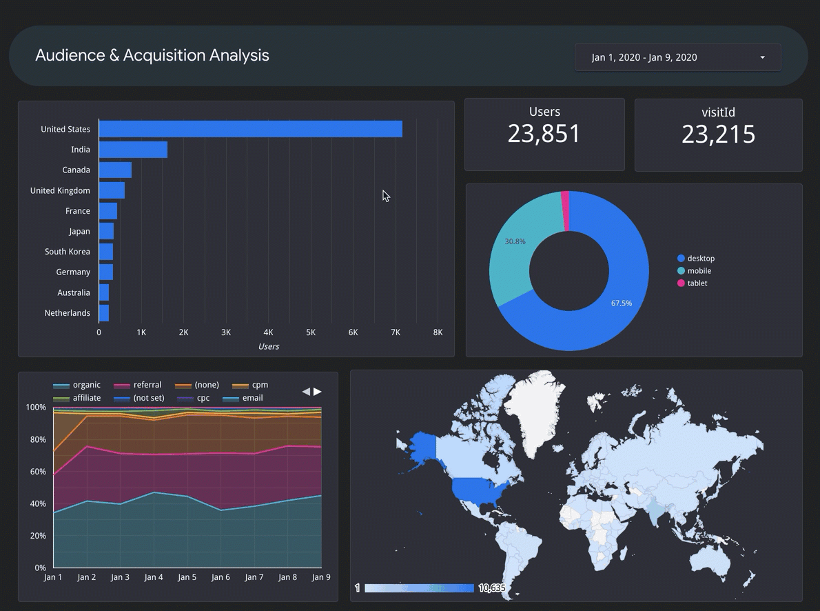
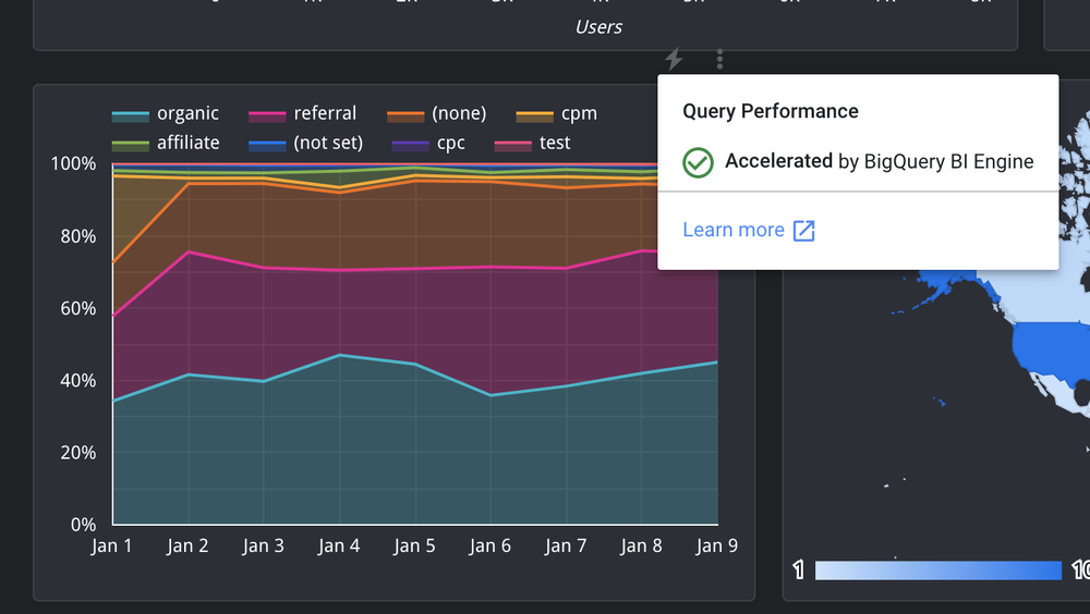
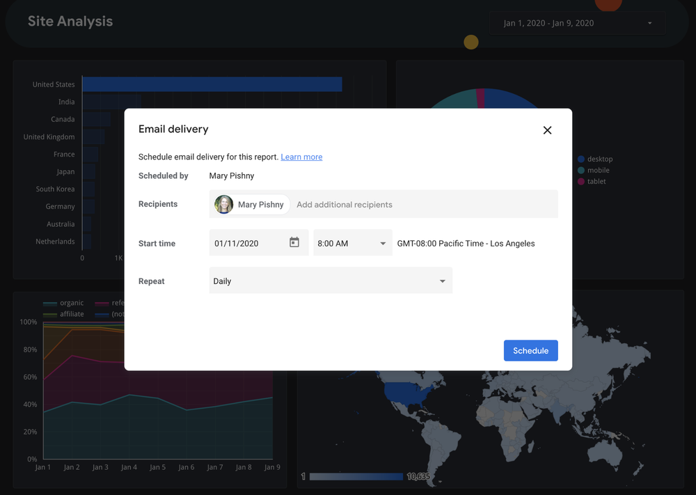
With so much changing so rapidly, you’ll want to understand how your business has been impacted. You can use Google Data Studio to help you create a report and visualize the changes that have happened over the past few months. Data Studio is easy to use, anyone on your team can quickly start using it.If you’ve connected Data Studio to your marketing campaigns, you can use these curated marketing templates to monitor the performance of those campaigns. Let’s say you need to create a report that shows daily online sales from each of your Google Ads campaigns over the last 60 days. You can use one of those templates to quickly build the report and then identify which campaigns are performing best so you can re-allocate your marketing budget to those campaigns.
Keep your website updated
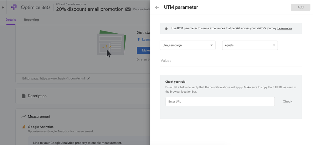
During this time, you might have different business hours or shipping policies. Instead of having to invest in an additional resource to update your website, you can do it for free with Google Optimize. When you log into your account, you can use a new feature to easily add a message for your customers to the top of your homepage. Either use our templated banner or customize the message by editing the color, size or text.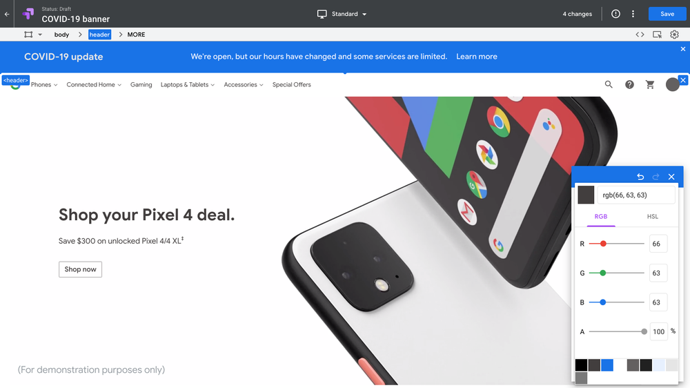
Use our template to post a banner at the top of your website with an important message.
And if you need to make other changes throughout your site, you can still continue to use Optimize to create site personalizations. Optimize users would normally be limited to running 10 site personalizations at once, but we’ve removed that restriction for the next 90 days, until July 31.
All of these products and features are available for free today. We hope they are helpful as you navigate your business through changing times.


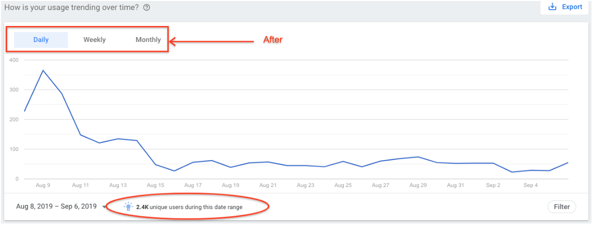
 After:
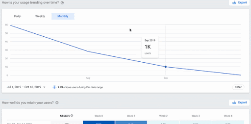
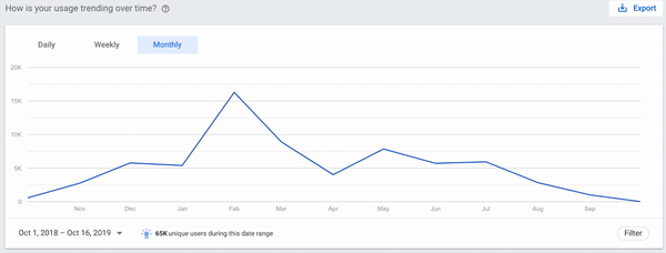