 Posted by Summers Pitman – Developer Relations Engineer, and Ivy Knight – Senior Design Advocate

Widgets can bring more productive, delightful and customized experiences to users' home screens, but they can be tricky to design to ensure a high quality focused experience. In this blog post, we’ll cover how easy Widget Canonical Layouts can make this process.
But, what is a Canonical Layout? It is a common layout pattern that works for various screen sizes. You can use them as a starting point, ready-to-use compositions that help layouts adapt for common use cases and screen sizes. Widgets also provide Canonical Layouts to get started crafting higher quality widgets.
The Widget Canonical Layouts Figma makes previewing your widget content in multiple breakpoints and layout types. Join me in our Figma design resource to explore how they can simplify designing a widget for one of our sample apps, JetNews.
1. Content to adapt
Jetnews is a sample news reading app, built with Jetpack Compose. With the experience in mind, the primary user journey is reading articles.
- A widget should be glanceable, so displaying a full article would not be a good use case.
- Since they are timely news articles, surfacing newer content could be more productive for users.
- We’ll want to give a condensed version of each article similar to the app home feed.
- The addition of a bookmark action would allow the user to save and read later in the full app experience.
2. Choosing a Canonical Layout
With our content and user journey established, we’ll take a glance at which canonical layouts would make sense.
We want to show at least a few new articles with a headline, truncated description, and possible thumbnail. Which brings us to the Image + Text Grid layout and maybe the list layout.
Within our new Figma Widget Canonical Layout preview, we can add in some mock content to check out how these layouts will look in various sizes.
3. Adapting to breakpoint sizes
Now that we’ve previewed our content in both the grid and list layouts, we don’t have to choose between just one!
The grid layout better displays our content for larger sizes, where we have some more room to take advantage of multiple columns and a larger thumbnail image. While the list is working nicely for smaller sizes, giving a one column layout with a smaller thumbnail.
But we can adapt even further to allow the user to have more resizing flexibility and anticipate different OEM grid sizing. For JetNews, we decided on an additional extra small layout to accommodate a smaller grid size and vertical height while still using the List layout. For this size I decided to remove the thumbnail all together to give the title and action space.
Consider these in-between design tweaks as needed (between any of the breakpoints), that can be applied as general rules in your widget designs.
Here are a few guidelines to borrow:
- Establish a content hierarchy on what to hide as the widget shrinks.
- Use a type scale so the type scales consistently.
- Create some parameters for image scaling with aspect ratios and cropping techniques.
- Use component presentation changes. For example, the title bar’s FAB can be reduced to a standard icon.
Last, I’ll swap the app icon, round up all the breakpoint sizes, and provide an option with brand colors.
These are ready to send over to dev! Tune in for the code along to check out how to implement the final widget.
Go try it out and explore more widgets
You can find the Widget Canonical Layouts at our new Figma Community Page: figma.com/@androiddesign. Stay tuned for more Android Figma resources.
Check out the official Android documentation for detailed information and best practices Widgets on Android and more on Widget Quality Tiers, and join us for the rest of Widget Spotlight week!
This blog post is part of our series: Spotlight Week on Widgets, where we provide resources—blog posts, videos, sample code, and more—all designed to help you design and create widgets. You can read more in the overview of Spotlight Week: Widgets, which will be updated throughout the week.
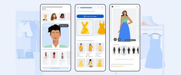 Learn more about Google Shopping’s new AI tools, like image generation for shopping, new AR beauty features and more.
 Posted by

 Learn how AI is making accurate health information more accessible and personalized and how AI can accelerate scientific discoveries with AI co-scientist.
 Posted by Anirudh Dewani, Director – Android Developer Relations


