Category Archives: Google Analytics Blog

The latest news, tips and resources straight from the Google Analytics team

Google Data Studio for Ecommerce Businesses

Google Data Studio is a great tool to visualize datasets from multiple sources, such as Google Sheets, BigQuery, AdWords, and others. But being part of the Google Analytics 360 Suite, it is no surprise that it makes a perfect visualization tool for Google Analytics too! In the coming weeks and months we will showcase some best practices and sample reports in this blog, but we thought we would start with something you are acquainted with: Google Analytics. 

With that in mind, we decided to create a sample report that may give you some inspiration on how to build your next dashboard. The example below will provide some good ideas on which charts, dimensions and metrics to use to visualize your Ecommerce data. Please note that some of this data will be available only for accounts that have Enhanced Ecommerce implemented.

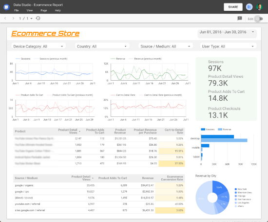
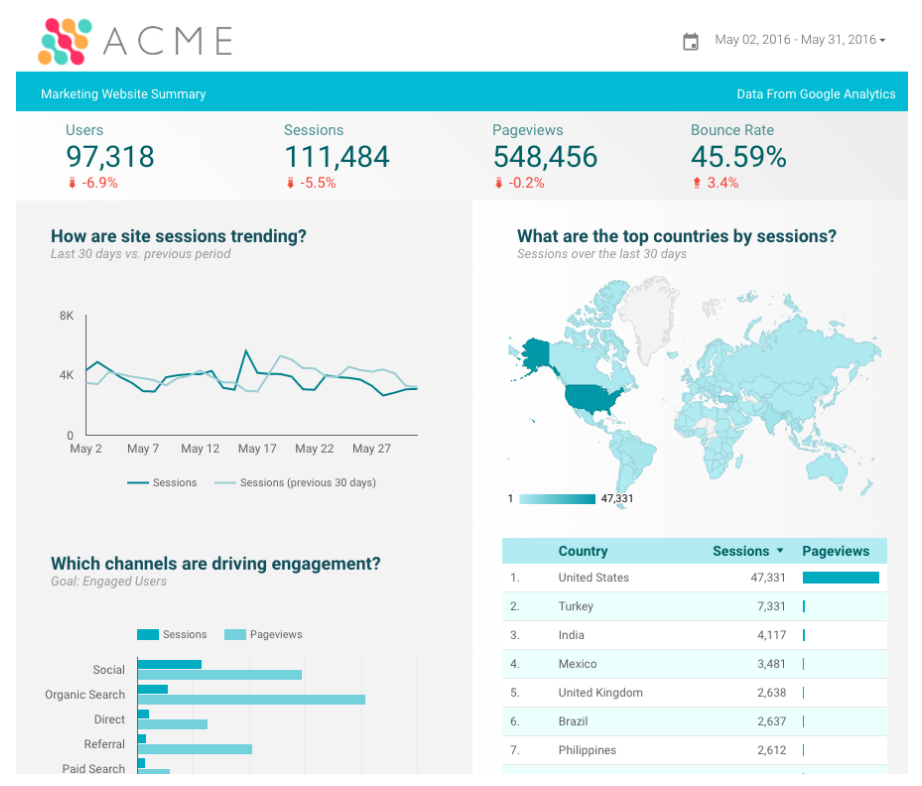
Report created using Google Analytics data on Google Data Studio 

Let’s go over some of the elements you see in the screenshot above.
  1. Header: it is always helpful to provide some info and controls in the top of the report. In this case you will see the website logo, a time range control and a series of four filter controls, with which you can segment your reports by Device, Country, Source or User Type.
  2. Trend charts: the four line charts in the top left will show how the business is performing over time (also compared to the previous period). This is important to understand drops and spikes in the data.
  3. Scorecards: the overall stats (green background) show in a glance how the business is doing, they provide a quick and effective way to understand the bottom line.
  4. Detailed information: tables are the best way to represent data in a detailed way. As seen in the report, the tables provide more information about the products being sold and also the traffic sources bringing the most users.
  5. Additional info: depending on your business, you might want to add special metrics and dimensions to enrich your report (e.g. custom dimensions & metrics). In the report above you will find some additional information on the bar and pie charts in the bottom right corner.
We hope that this sample report helps you get up and running. Feel free to share your own report in the comments, we would love to learn how you are using Data Studio to report and visualize your data!

This report was created using a Google Analytics data source, check this step-by-step guide for a detailed account on how to create Data Studio reports using Google Analytics. Learn more about Data Studio in the Help Centre: https://support.google.com/datastudio/ 

Posted by Daniel Waisberg, Analytics Advocate

Data Studio: New, Simplified, AdWords Connector

Google Data Studio is our new Business Intelligence product that makes it easy to connect, visualize, and share data. Today we updated the Google Data Studio AdWords connector to be more flexible and easier to use.

The AdWords connector allows AdWords customers to access their AdWords account data in Data Studio, build visually stunning reports, and share those reports to business stakeholders across their organization.


Report built with the AdWords connector in Google Data Studio 

With our recent update, the new AdWords connector now unifies over 100 AdWords dimensions and metrics as a single list, making it easier select the data you want to visualize.


20 of over 100 dimensions and metrics available in the new connector 

The new connector also supports many more combinations of dimensions and metrics, dramatically simplifying building reports.


Customizing a table with AdWords data in the Report Editor 

Of course, when you build AdWords reports with Data Studio, all the existing Data Studio features are compatible with this data including: calculated metrics, derived fields, custom visualizations, rich styling and custom branding, simplified sharing through Google Drive and realtime collaboration. 

These new changes are available today in both Data Studio 360 and Data Studio versions. To use the new connector, you must create a new Data Studio Data Source. Data Source using the previous connector will continue to work. Please read our help documentation on how to migrate to the new version

We’re excited to see all of the new reports customers will create with this enhancement.

Posted by Nick Mihailovski, Google Data Studio team

Let us know your thoughts on Google Data Studio

Are you a current or past users of Google Data Studio? We would love to hear your thoughts about your experience so far with Google Data Studio.

The survey should take around 10 minutes to complete. Your comments will help us build a better product!

Note: Your answers will be held in strict confidentiality. The results will be reported in aggregate form only, and cannot be identified individually. Thank you!

Posted by the Google Data Studio Team

Get Facebook, Bing, Twitter & more into Google Data Studio

Google Data Studio is the biggest step forward in Google’s data reporting & visualization offering since the launch of Google Analytics in 2005. It lets you build great-looking, interactive dashboards that you can share in a similar manner as Google Drive files (see for example this web analytics dashboard). It's a giant leap forward from the old Google Analytics dashboards and a game changer for online marketers.

Google Data Studio provides native integration with a few Google platforms (Google Analytics, AdWords, YouTube, BigQuery, Attribution 360). Of course, most marketers, to use Google Data Studio as their primary dashboarding tool, would like to include data from many more sources, such as Facebook Ads, Bing Ads and Twitter Ads.

Fortunately, there’s a really simple method for adding many more data sources into Google Data Studio, using its Google Sheets connector. Here’s a quick step-by-step guide for doing that.

1. Create a Google Sheet with data to be imported 
There are a number of ways to do this. For instance, to get Facebook Ads data, you can go to Facebook Ads Manager to do a CSV export of your data, and then upload it to Google Drive. For some data sources, you can use spreadsheet functions like IMPORTXML. Or you can build your own Google Apps Script connectors.

For a fully automated data importing workflow, I recommend you try our Supermetrics add-on for Google Sheets (available here; free for 30 days, then $49/mo). It has an easy-to-use query builder and connects to a large number of data sources, like Facebook, Bing, Twitter, MailChimp, even Adobe SiteCatalyst.

To run a simple query using Supermetrics:

  1. Launch Supermetrics from the Add-ons menu 
  2. Log in to a data source (eg. Facebook Ads) 
  3. Pick a few metrics (eg. impressions and cost) 
  4. Split to rows by one or more dimensions (eg. country) 
  5. Click the blue Get Data to Table button 
After you’ve fetched the data, your Google Sheet should look something like this (here we’re splitting by country):


If you don’t want to test Supermetrics now, you can make a copy of this sheet to try out the following steps.

2. Import the data into Google Data Studio
You can launch Google Data Studio here. If you haven’t yet used Data Studio, you can get the free version here (US only for the time being). 

In DATA SOURCES, click the plus button in the lower-right corner:

From connectors, select Google Sheets and the file you just created, then click CONNECT


Next, Google shows you a list of fields imported from the Google Sheet. Click CREATE REPORT, and in the next window, ADD TO REPORT.

3. Using the data 
You now have a blank report where you can start working with the data. To check everything has been imported ok, try inserting a table. You can change the columns displayed in the Table Properties sidebar.


You can then start building your report. After some trying, you’ll be able to make something great like this:


In many cases, you will want to include more than one Google Sheets data connector, to fetch data from different sources or with different metrics & dimensions. This can be done very easily, just repeat step 1 and 2. Go back to Google Sheets to fetch new data, e.g. Twitter Ads, to another sheet. Then in Data Studio, when adding a graph or table, in the properties sidebar press the arrow next to Data Source to add a connection to the new sheet.

4. Ensure your reports stay up-to-date
If you used the Supermetrics add-on to fetch data into Google Sheets, you can set the those queries to refresh automatically every day, so your Data Studio report will always have the latest data. In Google Sheets, go to Add-ons: Supermetrics: Schedule refresh & emailing, and store a daily refresh trigger.

Final thoughts 
Google Data Studio is a powerful dashboarding tool for any marketer, but by default only works with Google platforms. To make the most of it, use its Google Sheets connector in combination with the Supermetrics Google Sheets add-on to build cross-channel reports.

Posted by Mikael Thuneberg, Google Analytics Certified Partner

Attracting the Right Audiences with Google Analytics and Remarketing Lists for Search Ads


This post was contributed by Andrew Garberson, Search Department Manager at LunaMetrics, a Google Analytics Certified Partner. Read their full case study describing how Teach For America partnered with LunaMetrics to attract diverse and top talent using RLSA and Google Analytics.

Many website users provide details about their needs and preferences throughout the conversion process. University applicants declare an area of study, homebuyers select a price tier, analytics training attendees choose a city.

This volunteered information can be captured and stored in Google Analytics as Custom Dimensions. Using the scenarios above, that may mean:
  • Applicant A wants to study biology. 
  • Buyer B wants a $200,000 home. 
  • Attendee C wants a training in Pittsburgh.

Now apply that concept to all of the users who express interest in a business. Instead of one university applicant or one homebuyer or one training attendee, we have thousands, or hundreds of thousands. These Custom Dimensions can organize users into related Audiences.


Marketers can then use these Audiences to create campaigns that nurture users along the path toward a goal completion. Remarketing Lists for Search Ads (RLSA) show more personalized messaging to users in the search results, acting as a reminder to finish the process that they started.

These core concepts presented an opportunity for Teach For America. The organization recruits some of the most distinguished and desirable job applicants in the world while they are also pursued by big brands offering big salaries. Keeping these applicants engaged throughout a rigorous selection process is essential. 

Teach For America and LunaMetrics partnered to stay top-of-mind with their illustrious applicants, using self-identified information to personalize messaging and better target candidates. The results were a 57% increase in conversion rate over campaigns without audience targeting and a more effective identification and targeting of applicants. Read the entire case study.
“There is no greater win as a marketer than to be certain you’re finding the right people in the right place at the right time. The results speak for themselves: The marriage between Google Analytics and RSLA insured we were able to deliver the message we wanted to the people we wanted.” —Stacey Jaffe, Senior Managing Director, Digital Acquisitions and Channel Growth, Teach For America


Posted by Daniel Waisberg, Analytics Advocate, Google Analytics team

Case Study in Online-to-Store Measurement: Petit Bateau & Google Analytics

Knowing that many people research products online before going into a physical store to make a purchase, French clothing retailer Petit Bateau wanted to develop a better understanding of the online-to-offline (in-store) behaviour of its customer base. The brand leveraged Google Analytics and its robust features: User ID and Measurement Protocol, to reach the objectives.

Petit Bateau customers in France can shop in 153 physical stores as well as on Petit-bateau.fr. Users log into the website which makes it possible to later match the traffic of logged-in users with subsequent in-store transactions made with a loyalty card.


Petit Bateau uploaded personally non-identifiable in-store data into Google Analytics and discovered that digital played a significant role in driving in-store purchases:

  • 44% of in-store buyers had visited the site within the seven days before making their purchases, 
  • 9% of in-store buyers had visited the site on the same day as their purchase in the physical shop. 
Further analysis revealed that the online-to-store effect was particularly important on mobile. Mobile visitors converted within stores at an 11% higher rate than desktop visitors, and their in-store spend was 8% greater.

By using Google Analytics to measure online-to-offline purchase behaviour, Petit Bateau was able to better understand the impact of online marketing on in-store sales and use the data to recalculate AdWords return on ad spend – which proved to be six times higher with in-store sales incorporated. Taking in-store transactions into consideration in this way is enabling Petit Bateau to optimise the brand’s digital marketing programmes, make more informed decisions around media budget allocation and design better experiences for consumers as they move seamlessly between digital and physical shopping environments.

You can find the full case study with all the details here.

Posted by the Google Analytics team

Announcing Data Studio: our free, new, Data Visualization Product

Earlier this year, as part of the Google Analytics 360 Suite announcement, we unveiled a new data visualization and reporting platform for large enterprises — Data Studio 360.

Yesterday, at the Google Performance Summit, we announced a free version of Data Studio for individuals and smaller teams. Data Studio lets you connect to all your marketing data and turn that data into beautiful, informative reports that are easy to understand, share, and fully customizable. We wanted to take a moment to give you some of the details about Data Studio.

Making it easy to share data within your organization — or with the world

One of the fundamental ideas behind Data Studio is that data should be easily accessible to anyone in an organization. We believe that as more people have access to data, better decisions will be made.

With multiple data connectors, you can now easily create dashboards from many different types of data and share with everyone in your organization - and you can mix and match data sources within a single report. For example, you can combine Google Analytics data and Google AdWords data into a single report.


Today, we’re offering multiple data connectors, so you can connect to Google Analytics, Google AdWords, Google Sheets and many other Google services. But Data Studio offers integration with a wide variety of data sources. There’s also a connector for BigQuery and we will soon have connectors to SQL databases that will let you access first party data.

Data Studio is more that just sharing reports with other people — it’s true collaboration. We used the same infrastructure as Google Docs, so you can edit reports together, in real time. This is useful as you combine data from multiple teams and need others to add analysis and context to the report.

Visualization tools to style your reports and data 

In addition to new sharing and collaboration tools, Data Studio gives you many flexible ways to present your data. Sure, there’s the usual assortment of bar charts, pie charts, and time series. But we’ve also included some new visualizations — like bullet charts that help you communicate your progress towards a business goal.


Another advanced feature is the ability to create a heatmap using tabular data. This visualization makes it easy to instantly identify outliers within a table of data.


Data Studio also has an array of other features to help you customize how you present your data. There are a number stylistic tools that enable you to design your reports to represent your specific brand. There are also interactive data controls, like a date picker and dynamic filters, that enable report editors to make reports interactive for viewers.

For example, let’s say you want to let users segment a report by country. Just add a control element to the top of your report and the user can dynamically segment the data. In the image below the check boxes will change the data in the map and data table based on what a user selects.


These are just a few of the tools that you can use to help others in your organization understand data. 

Two versions for different types of organizations

 The primary difference between Data Studio 360 and the free version, Data Studio, is the the number of reports you can create, which is five per account. Both versions support connecting to unlimited data sources and offer unlimited report viewing, editing and collaboration. For more information, check out our Help Center.

Getting started

If you’re ready to get started, watch this brief overview that will help you build your first reports.


Then check out the interactive walkthrough - it’s built with Data Studio. Just choose “Welcome to Data Studio (Start Here)” from the list of reports in your account.

 Data Studio is currently available to users in the United States and we’ll be rolling it out to other geographic regions throughout the year. We hope it helps you share more data and make better business decisions.

Happy Dashboarding,

Posted by Nick Mihailovski & Nathan Moon, Data Studio team

Announcing: Smarter, more sharable analytics innovations


We’re incredibly excited to share with you the new analytics product innovations announced just moments ago at the Google Performance Summit. These innovations for the Analytics 360 Suite are more integrated, more collaborative, and use built-in intelligence to handle more data than ever in our new multi-screen, cross-channel world.

Why are these innovations arriving now? Because across the millions of websites using Google Analytics today, more than half of all web traffic now comes from smartphones and tablets1. And every year, over half of the trillions of searches on Google happen on mobile2.

This shift to mobile has made marketers' jobs more complex. We all have more opportunities than ever to reach consumers all day and measure their behavior in their I-want-to-know, I-want-to-go, I-want-to-do and I want-to-buy moments. But it's also harder to keep all the channels and touchpoints straight. You can’t market effectively in today’s world with products that were designed for a desktop-first world.

Two months ago we announced the Google Analytics 360 Suite, an enterprise-class modern measurement solution built from the ground up to help enterprise marketers and analytics professionals succeed in this new multi-screen world.

Today, we announced new innovations focused on three themes: 


Read on to learn the analytics highlights from today’s announcements.

Enterprise analytics re-imagined for modern marketing 

Google Analytics 360 Suite is beginning to roll out to current customers. This includes Google Analytics 360 (formerly known as Premium), Attribution 360 (formerly known as Adometry), Audience Center 360, and Tag Manager 360 when used as part of Analytics 360. The rollout will occur in phases over the next several months, and users will see an improved and unified product experience and a new look and feel across all Analytics 360 Suite products.

Google Optimize 360, our website testing and personalization product, is now available in paid BETA globally. The results from our closed beta have been amazing: one of our beta customers reduced the time to deploy a site experiment from three days to 10 minutes. Optimize 360’s deep integrations with Analytics 360 increase testing agility and reduce setup times. With just a few clicks, you can use the audiences and goals you’ve already created in Analytics 360 to run experiments with Optimize 360.

Google Data Studio 360, our data visualization product, will start rolling out in paid BETA in the US. This is our enterprise version with licensing starting at 200 users. Data Studio 360 allows you to connect to all your data with native integrations across many popular Google products, as well as non-Google data. Visualize your data by creating reports and dashboards. Share your data across your organization with built-in, real-time collaboration.

Google Data Studio is a completely new, free version of Data Studio 360 that we’re launching today! Starting now, anyone can use Data Studio to create up to 5 reports with unlimited sharing, editing and collaboration. We’re starting the BETA in the U.S. and rolling out to other regions throughout the year.

Succeeding together 

With massive volumes of data being created across screens, channels and touchpoints, built-in intelligence has become foundational in approach to analytics product development. This means we’re doing more of the heavy lifting for you, and we’re seeing a tremendous response from businesses. For example, Smart Goals in Analytics is now enabling more than 60K advertisers to optimize their AdWords performance. You’ll continue to see exciting developments in the future related to intelligence.

As consumers blur the lines between online and offline, it’s more important than ever to build your business in new ways. Google is excited to go on this journey with you, and we're building much more for the multi-screen, cross-channel world. Visit our website to learn more about all the new products in the Analytics 360 Suite.

To see the full range of ads and analytics innovations announced this morning, watch the Google Performance Summit keynote here.


1 Google Analytics 2016 
2 Google 2016

App-First Analytics with Firebase Analytics

While Firebase Analytics is separate from Google Analytics for mobile apps, both solutions were built by the same team to ensure Google Analytics, Google Tag Manager, the Google Analytics 360 Suite, and Firebase Analytics work together seamlessly. Below, we’ve cross-posted a deep dive into Firebase Analytics from the Firebase blog so you can learn more about the exciting app analytics capabilities available in Firebase. If you’d like to understand more about how Google Analytics products work with Firebase Analytics, check out our Analytics 360 and Google Analytics overviews.

Cross-posted from the Firebase blog by Russell Ketchum, Group Product Manager:
Welcome, current and new Firebase developers! There's a lot to discover with the Firebase platform -- more than we could possibly explain in a single blog post. So over the next several weeks, we'll be sharing posts focusing on each of the individual features of Firebase. For our first post, we wanted to let you know about Firebase Analytics -- the free and unlimited analytics solution for mobile developers.

Analytics are at the heart of successful apps, so when we expanded Firebase to help mobile developers build better apps and grow successful businesses, we thought it was important to build an analytics solution that serves the needs of all app developers, from two-person startups to large, established companies.

Meet Firebase Analytics, a free and unlimited analytics tool built from the ground up for mobile apps. Firebase Analytics is at the core of the Firebase platform, providing the insights you need to build successful apps.

All your app analytics in one place.
Firebase Analytics helps you understand what your users are doing in your app. It has all of the metrics that you’d expect in an app analytics tool (average revenue per user (ARPU), active users, retention reports, event counts, etc.) combined with user properties like device type, app version, and OS version to give you insight into how users interact with your app.

Collecting all of this data is simple and works right out of the box. When you add Firebase to your app, key events are measured automatically – including first opens (think of these like installs), in-app purchases, and more. With up to 500 distinct event types (each with up to 25 key-value pair parameters), you can measure additional suggested and custom events that are unique to your app with just a few lines of code.

Some events are more important to you than others, so with conversion tracking you can define the most important events that happen in your app (like purchasing an item, or sharing your app with others) and create funnels just for these events to discover where users drop out of the process.


But Firebase Analytics helps you analyze more than just user behavior. It also provides a rich set of data that helps describe your users – data like geographic information, demographics, and interests that can help you better tune your app and refine your marketing activities.

While standard demographic data is helpful, it’s also important to understand user properties specific to your app. Firebase Analytics lets you define custom user properties for all of your users. For example, your fitness app can record a user's favorite exercise or your music app can record your user's favorite genre. Firebase Analytics is also integrated with BigQuery, Google’s fully-managed data warehouse, so you can export your raw Firebase data and join it with custom data for additional analysis.

Smarter, more effective app marketing.
Understanding user behavior is just one important part of Firebase Analytics -- you also need to understand how your advertising and marketing activities influence those behaviors. Firebase Analytics can automatically link user behaviors within your app to a traffic source so you know where your valuable users are coming from. It works with Google AdWords and more than 20 other major ad networks without having to install any additional SDKs, making it easy to understand the ROI of your marketing and advertising spend. You can also import Firebase Analytics conversion events directly into Google AdWords, so you can bid on specific user events that happen in your app with just a few clicks.

Firebase Analytics makes all of Firebase better.
Firebase Analytics is designed to make your analytics data actionable. You can use the Audiences feature to create a segment of users based on their event data and user properties. For example, an audience of people who have added items to their cart but haven't made a purchase. Or, an audience of classical music fans who have listened to more than 200 songs.

You can then use these audiences in conjunction with other Firebase features, like Remote Config, which allows you to change the look-and-feel of your app just for a specific audience. Want to create a customized home screen for users who have subscribed to your newsletter or have reached a certain level in your fitness app? You can do that directly from the Firebase console using Remote Config and Audiences in Firebase Analytics.

Firebase Analytics Audiences also works with Notifications, allowing you to send in-app notifications to any audience that you've defined. So, if you've just added a new set of armor to your game's in-app storefront, you can notify only the users who have purchased in-game items in the past. In addition, when your Firebase account is linked to AdWords, you can use audiences to re-engage lapsed users with ad campaigns. To learn more about the app analytics capabilities in Firebase Analytics, check out our video:
While Firebase works well as a standalone tool, the true power of Firebase Analytics lies in the customer insight it brings to other Firebase capabilities - insight that helps you grow, develop, and earn with your mobile app.