Posted by the Android teamJetpack Compose is Android’s modern UI toolkit which is used by many well-known apps such as Pinterest, SoundCloud and Lyft. It enables developers to more intuitively and efficiently build better quality Android apps. To help developers around the world take advantage of these benefits, we launched Compose Camp, an Android meetup series where developers were able to learn Jetpack Compose, network with peers, and work on hands-on coding projects together, with the guidance of “Camp Leaders” who facilitated the sessions.
To help developers across different experience levels, Compose Camp offered 2 tracks. The beginner track was aimed at individuals new to Android development or coding. In this track, developers learned the basics of building Android apps and how to create UI with Compose. The experienced track was designed to help developers who were already familiar with building for Android, but wanted to learn how to use Jetpack Compose. Developers learned more advanced concepts in layouts, theming, architecture, migration, and more.
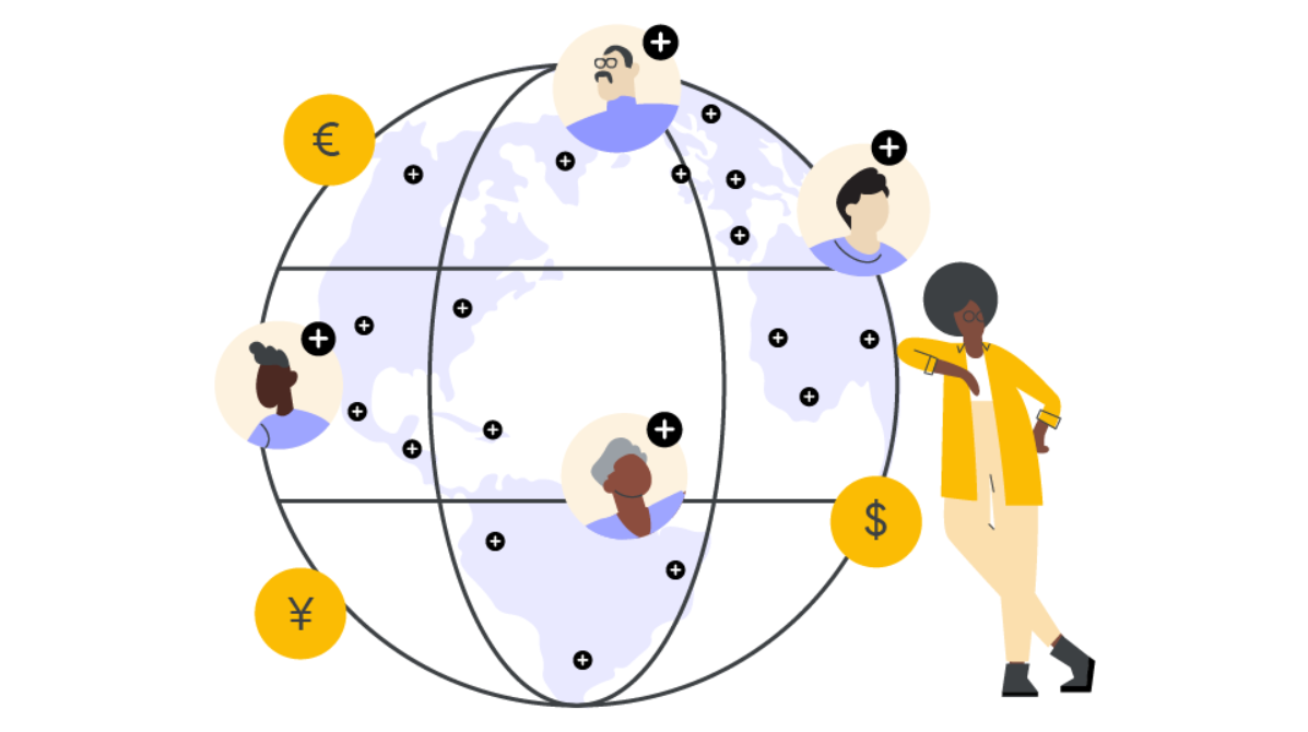
Campers around the world
It was great to see hundreds of thousands of you around the world participate in Compose Camp! Whether it was through a Google Developer Group, Google Developer Student Club, with your peers and colleagues, or if you went “solo-camping” and took the course on your own, we saw how many of you were engaged in the learning materials, recorded your sessions so you can help others, and shared your projects on social with #ComposeCamp.
We heard from Rahul Sain, an enthusiastic Android developer who was a Compose Camp Leader for GDSC Bhagwan Parshuram Institute of Technology - Delhi.
“Compose Camp enabled me to educate others about new technologies used by developers, and helped me learn about them in the process. Our college now has a group of fellow developers who concentrate solely on the development of Android apps."
Rahul has built several of his own apps, including Scribble.io, which he built using Jetpack Compose.
“I used Jetpack Compose in my published game, which has received more than 10,000 installs in the first three months of its release!”
We also had the opportunity to hear from Madona Wambua, a Google Developer Expert and Senior Android Engineer at Western Governors University, residing in New York. She visited Kenya for an extended vacation, during which she led Compose Camp sessions through the Google Developer Group and Women Techmakers Nairobi chapters. Madona led her students through the beginner track of Compose Camp, and added additional activities to keep students engaged as her fun spin on the program.
“Compose Camps are engaging and fun! Some of my favorite parts were when the students saw how cool it was to use one language to write the UI, and asked questions about Kotlin. I love teaching; when I see my students solving problems together, sharing ideas, and learning how easy it is to write their UI in Compose, this warms my heart.”
If you’re looking to lead a learning session with your peers, check out the Compose Camp Organizer Guide for everything you need to lead an Android development workshop.
Learning tips from the community
Everyone has different methods for learning something new, so we asked Compose Camp participants to share their favorite tips and tricks for learning Jetpack Compose, and these were some of our favorite answers. We hope they help you on your Android development learning journey:
“Check out the Compose samples and the Now in Android(NiA) app from Android on GitHub. They are great assets for learning Compose best practices! 😍😊” -Odin from Norway
“Use [the] Accompanist animation library to add cool animations in your Compose UI.” -Mansi from GDG Ahmedabad in India
“One magic word for Android developers’ ears, Modifier. Make round edges, draw borders, and set shadows with ease. Learn Modifier, and the flexibility of customization [in] your UI elements is insane.” -Ban from Montenegro
“@PreviewParameter provides sample data for Composables, which allows a preview of the Composable and accelerates development by providing sample data.” -Google Developer Expert Nav Singh from GDG Montreal in Canada
For more tips on learning Compose, check out the Compose Basics series on the Android Developers YouTube channel.
Advance your learning and get started with Compose
We recommend using Jetpack Compose if you’re looking to build a new app, and you can use the same development concepts to extend your app to tablets, foldables, and Wear OS. In case you missed Compose Camp or if you’re looking to deepen your learning, you can take the Jetpack Compose for Android Developers or the Android Basics with Compose courses online now. For additional Android learning opportunities in your local area, check out our Google Developer Communities near you.
Posted by Diego Zavala - Product Manager, Lee Campbell - Tech Lead
Today, we are glad to announce the alpha release of Credential Manager, a new Jetpack API that allows app developers to simplify their users' authentication journey, while also increasing security with support of passkeys.
Credential Manager supports multiple sign-in methods, such as username/password, passkeys, and federated sign-in solutions (e.g., Sign-in with Google) in a single API, thus simplifying the integration for developers. Furthermore, for users, Credential Manager unifies the sign-in interface across authentication methods, making it clearer and easier for users to sign-in to apps, regardless of the method they choose.
Since our update in October 2022, we’ve been expanding support for passkeys - the new industry standard for passwordless authentication - across Android and Chrome. Credential Manager allows users to create passkeys and store them in Google Password Manager. Their passkeys will sync across all of their devices that are signed in to the same Google Account, allowing users to seamlessly sign in to apps that support passkeys across these devices.
Please stay tuned for more updates from us throughout this year, as we roll out third-party password manager support to integrate with Credential Manager.
The benefits of Credential Manager
Users face multiple sign-in methods and in many of those cases the sign-in methods are parallel ways for the user to get into the same account. Credential Manager aggregates all available sign-in methods for the app into one list, while deduplicating entries for the same account. This simplification allows users to focus on selecting the account without needing understand the underlying sign-in technology:
Add Credential Manager to your app
To make sign-in easier in your app use Credential Manager. Visit this Android Developer guide to learn more.
Share feedback
We'd love to hear your inputs during this alpha release, so please let us know about your experience integrating with Credential Manager, using passkeys, or any other feedback you might have:
Posted by Steve Suppe, Product Manager, Google Play and Manuel Wang, Product Manager, Google Play; Ashley Marshall, UX Writing Lead, Google Play
Google Play Console is constantly evolving to improve how you manage and publish your apps. We know that launch moments are really important to you. Whether that's launching a new version of your app, or updating your store listing – you need the right tools to help you launch with confidence.
One challenge you’ve shared with us is a lack of predictability and control over the app review process. Previously, it was hard to predict which changes would be sent to Google for review, and which changes would be published immediately. There was also no way to send multiple changes for review together, for example, if you wanted to update your app at the same time as one of your store listing screenshots.
As a result of your feedback, we're making some changes to give you more flexibility and control over the app review process.
Control when changes are sent to Google for review
On the Publishing overview page in Play Console, you’ll soon see a new section called “Changes ready to send for review.” Whenever you save a change in Play Console that is subject to review, it will be listed here – instead of it being automatically sent for review. You can then send these changes for review together, whenever you’re ready.
On the Publishing overview page in Play Console, you’ll soon see a new “Changes ready to send for review” section where your changes will be saved for you to send for review.
How this works with managed publishing
Once you send changes to Google for review, they'll appear in the “Changes in review” section on the Publishing overview page.
If you have managed publishing turned on, these changes will appear in the “Ready to publish” section as soon as they're approved. You can then publish these changes whenever you're ready.
If you have managed publishing turned off, changes will be published automatically as soon as they're approved. We recommend turning managed publishing on when you want more control over app changes or wish to push an app update live at a specific time.
Remove changes that are ready to publish or in review
To give you even more flexibility, we're also adding the ability for you to remove changes that have already been sent for review, or that are ready to publish.
Changes you remove will once again appear in the “Changes ready to send for review” section.
How it works
Here's an example of how we think these new changes will add predictability and control to your app publishing process, and how they will enable more flexible workflows.
Imagine you have a major update to your app that is due to go live and requires several changes to happen at the same time, such as publishing a new release, updating your store listing screenshots, and making changes to your Data safety form. Here's how this would look with all of the new improvements that we've made in Play Console.
1.Make changes to your app, store listing, and Data safety form in Play Console
You can make changes to all of the different parts of your app at your own pace, with confidence that these changes won't be sent for review or published until you're ready.
2.Send changes for review when you're ready
On the Publishing overview page, you'll now see all of the changes that have been made. You can send them for review together when you decide you’re ready.
3.Remove changes if you've made a mistake
Imagine that you've made a change to something else by accident, or your marketing team has told you that some of the screenshots you originally uploaded need to be changed. On the Publishing overview page, you can now remove these changes from the review, make any necessary updates, and send the changes for review – again.
4. Publish according to your schedule with managed publishing
Plans change all the time. Imagine that your marketing team tells you that your launch date has been delayed by a week. Or, what if you don't want your changes to go live on a weekend, when no one is in the office? You can choose to turn on managed publishing and control exactly when approved changes are published.
We’re really excited to share these upcoming features with you, and hope these changes give you more predictability and control over the app publishing process.
Posted by Paris Hsu, Product Manager, Android Developer
Android Studio Electric Eel splash screen
Today, we are ⚡️electrified⚡️ to announce the latest stable release of the official IDE for building Android applications: Android Studio Electric Eel (2022.1.1)!
This release includes updates and new features that cover across design, build & dependencies, emulators & devices, and IntelliJ. Read or watch below to learn more about how they can help you more productively build apps, and download the latest stable version today to try it out for yourself!
Design
Compose Preview updatesautomatically - In earlier versions of Android Studio, you had to manually refresh Compose Previews after making changes. In Electric Eel, Previews update automatically after you make compatible code changes in the same file, allowing you to iterate on your UI faster. If your code change was incompatible, Previews will show a “Needs Rebuild” status to indicate needing a full build. When your code contains compilation errors during editing, Previews are temporarily paused, and then resumed again when the errors are fixed.
Compose Preview updates automatically
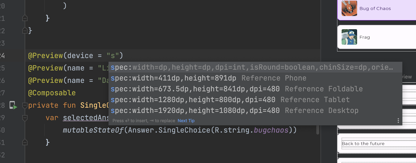
Compose Preview device spec - Another update for Compose Preview is that you can now edit the device parameter of the Preview annotation to specify the configuration of the device. You can choose from reference devices or create your own, in which case autocomplete will help you with what options are available and what values they accept. This works together nicely with multipreview annotations, which are available since Dolphin.
Compose Preview Device Spec
Layout Inspector recomposition rendering highlights: To make it easier to quickly see which of your composables are recomposing, Layout inspector now highlights recomposition. This allows you to identify where in the application the most recent activity caused the highest changes in recomposition counts. The UI elements with the most recent changes are temporarily overlaid with a color. This makes it easy to track down unexpected or excessive recompositions happening in your app. You can learn more about using the layout inspector to debug recomposition in Jetpack Compose: Debugging Recomposition.
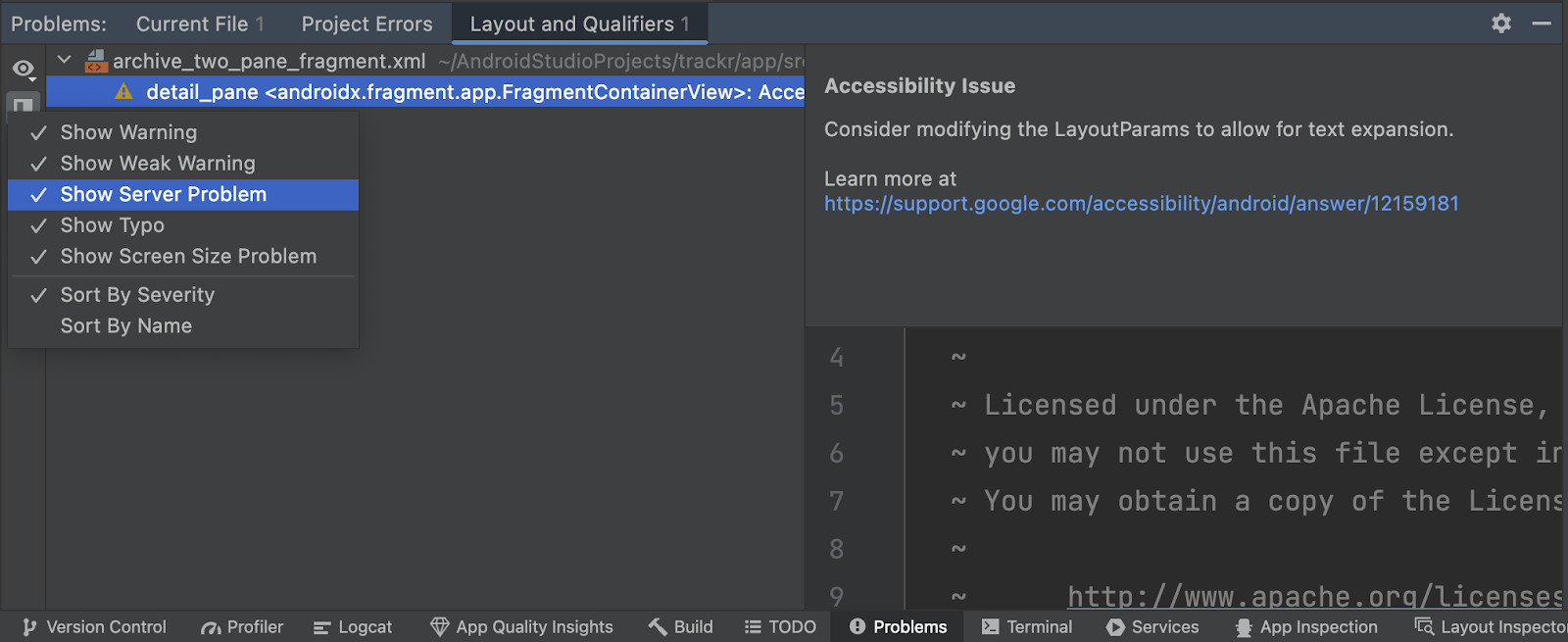
Visual Linting for Views: New for XML layouts, Visual linting now runs in the background to check for issues across different form factors, detecting problems such as overlapping or non-visible elements on a given device configuration.
For example, in the animated screen capture below, you can see that the layout file has two validation problems: a TextView covered by an ImageView on certain screen sizes and an ImageView, which is partially out-of-bounds in some configurations. Clicking on the problem in the Problems panel will open the Layout Validation panel to see your layouts rendered for the various device sizes and highlight the configurations with the selected issue.
Visual Linting for Views
Universal Problems Panel: We have consolidated all the problems reported by various tools within Android Studio into the new Problems panel. This includes visual linting, navigation, and Compose related issues.
Universal Problems Panel
Build & Dependencies
Improved Sync performance with parallel project imports: Parts of Gradle Sync now run in parallel by default; this can result in significant speedups for very large projects. Square has reported that their Gradle Enterprise metrics show an average reduction of 60% in sync times, saving an estimated 1,600 hours in developer productivity per year. Note: These improvements are specific to the time it takes Gradle to build models and don't change the performance of the IDE's processing of those models.
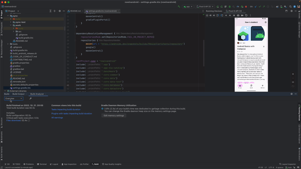
Download impact in Build Analyzer: The Build Analyzer tool provides you insight into what happens during your builds. This now includes a summary of any dependency downloads that happened. You can use this information to determine the impact of downloads on your build, and to spot problems such as downloads happening during incremental builds.
The information of the download impact is broken down by repositories, so you can see where each dependency was downloaded from. You can also see if a repository takes a long time to serve artifacts, or has a high number of failed requests. If that’s the case, you should consider removing the repository, if possible, or moving it lower in your repository configuration, so that other repositories take priority over it.
Download impact in Build Analyzer
Upgrade Assistant post-upgrade report and rollback support: The Upgrade Assistant that helps you upgrade your project’s Android Gradle Plugin version also got more helpful in Electric Eel. After performing a version upgrade, the assistant will attempt to sync your project, and report whether it was successful. It now also gives you a summary of what steps were executed. Moreover, if the project sync fails after the upgrade, you can use the new Revert button to undo the changes to your build files.
Upgrade Assistant post-upgrade report and rollback support
SDK Index integration: We announced Google Play SDK Index earlier this year, which provides you information about various SDKs that you can integrate into your app. SDK developers can mark versions of their SDKs as outdated in the SDK index, and this information is now shown directly in Android Studio.
Baseline Profile fix for App Bundles: Under certain circumstances Baseline Profiles could have been compressed when the app was built as an Android App Bundle. This resulted in the profile not being picked up when installing the app locally. In this local only scenario, benchmark results would be slower than anticipated. The bundletool version shipping with Electric Eel addresses and fixes this problem.
Inspect
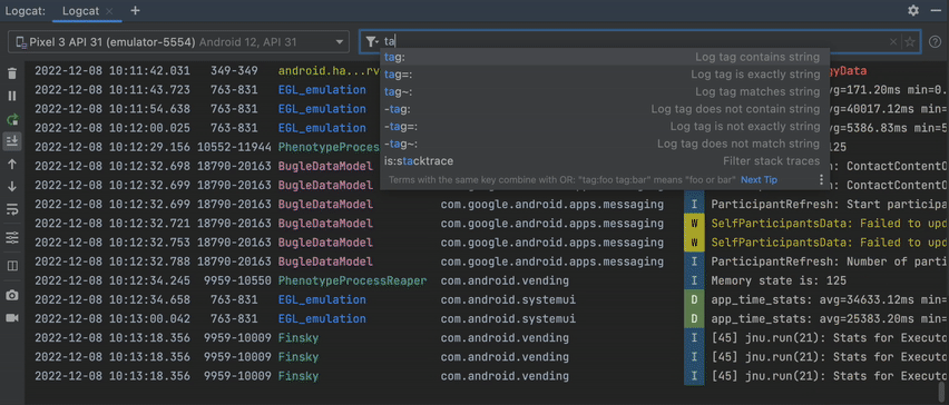
All-new Logcat: Logcat has been rewritten from the ground up to make it easier to parse, query, and track logs. The new Logcat UI has been available to try as an opt-in feature in Dolphin, and it’s now enabled by default in Electric Eel, including a number of quality-of-life and stability fixes. Some highlights include better formatting for logs, a smarter search field with autocomplete support to filter for the logs you want to see, ability to persist log output across app restarts, and options to customize what’s displayed.
Logcat New UI
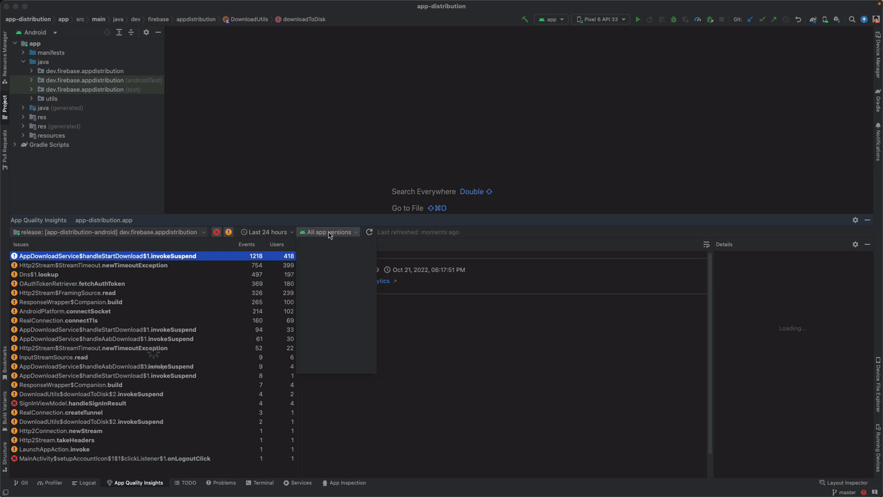
App Quality Insights window: The new App Quality Insights tools let you browse and investigate crash data from Firebase Crashlytics directly in Android Studio without having to jump back and forth between the IDE and a browser.
The IDE displays your top issues, which you can filter to show only the most recent crashes, or crashes from a specific version of your app. For each issue, you can see the number of affected users and the stack trace, which allows you to quickly navigate to the place in your code where the crash occurred. Moreover, you’ll see gutter icons in your source files, which indicate parts of your code that show up in your app’s top crash reports. Simply click on the link to navigate from the code to the crash report in the App Quality Insights window. To get started, read the official documentation.
App Quality Insights window
Emulators & devices
New "Desktop" category & Desktop AVD: In Electric Eel, you now have the option to create a Desktop emulator. This lets you test how your app behaves on devices such as Chromebooks. There are a handful of interactions that are different on these devices that you should test with your app. For example, apps can be freeform resized or minimized, which your app should handle gracefully.
Testing apps on new Desktop AVDs
Resizable Emulator (Experimental): The Resizable emulator helps you test your app on different screen sizes without having to run multiple emulators. After creating and launching a resizable emulator, you can use the Display Mode menu to switch between different reference device sizes and see how your app behaves.
Using the Resizable Emulator
Physical Devices Mirroring (Experimental, Opt-in): You can now mirror your physical device to Android Studio and interact with it similarly to how you’d use an emulator. This is an opt-in feature in Electric Eel so that you can share feedback with us. In order to use it, you need to first go to Preference> Experimental> Device Mirroring to enable it. Then, connect your physical device through ADB (either through wired or wireless), and it will show up in the Running Devices panel. Once mirrored, you can interact with it much like you’re used to with emulators, such as multi-touch, physical buttons, and device rotation. Mouse and keyboard events are forwarded, and you can use the controls on the toolbar to input button presses, or to rotate the device.
You can also drag and drop files onto the mirrored device (just like on an emulator). If the file is an APK, it will be installed, which can be really useful for quickly testing a build. For other file types, the file will be copied to the device’s Download folder.
Physical Devices Mirroring (Android Studio and Physical Deice)
IntelliJ
IntelliJ Platform Update - Android Studio Electric Eel (2022.1.1) includes the IntelliJ 2022.1 platform release, which has many new features such as Dependency Analyzer to facilitate dependency management and conflict resolution and the Notifications tool window that offers a new, streamlined way to receive notifications from the IDE. It also includes a number of other notable improvements that are covered here.
To recap, Android Studio Electric Eel (2022.1.1) includes these new enhancements & features:
It is a good time to download Android Studio Electric Eel (2022.1.1) to incorporate the new features into your workflow. As always, we appreciate any feedback on things you like and issues or features you would like to see. If you find a bug or issue, please file an issue and also check out known-issues.Remember to also follow us on Twitter, Medium, or YouTube for more Android Development updates!
Posted by Anton Hansson, Software EngineerAndroid 10 and higher support Modular System Components that allow us to expedite functional and security updates to the Android ecosystem outside of major API level releases and make new functionality backward compatible on already-released Android versions. These improvements help make development more flexible and broaden the reach for app developers. We've built a new Extension SDK framework for you to integrate with these APIs, and today, we’re releasing the first public version of the Extension SDK (Extension Level 4).
Faster API and feature introductions
Having the ability to introduce new functionality outside of major API level releases allows faster innovations. As shared in a previous post, beginning this year we plan to roll out the initial Privacy Sandbox on Android Beta release to Android 13 devices. You can start using the Extension SDK to integrate your solutions with the AdServices APIs to prepare for limited production testing. Learn more on how to participate in the Privacy Sandbox Beta release, and set up your development environment with a test device or emulator.
Backward compatibility
Extension SDKs also allow us to extend the support of certain platform functionality to existing Android versions, increasing user reach. For example, the PhotoPicker APIs previously available only on API level 33 (Android T) and above are now also available all the way back to API level 30 (Android R) through the Extension SDK on devices with an R extension version of at least 2.
Check for API availability
To help you identify extension API availability, we’ve added additional information to the API reference that indicates for which API levels and the minimum extension versions that the API is available. For example, the API reference for ACTION_PICK_IMAGES indicates its availability on “Android R Extensions version 2” and above.
You can query the extension version at runtime in a similar way to how Build.VERSION.SDK_INT is commonly used to check for the Android version. For example, if you need to verify the availability of the PhotoPicker APIs, use the new API SdkExtensions.getExtensionVersion. For the R extensions, the version code (30) that corresponds to R is used:
This check is still safe and correct, but this function would return false on some devices where the API is now available. As a result, the SDK_INT check is not optimal, and the extension version check is a better way to check for API availability. All devices with SDK_INT >= 33also have an R extension version of>= 2, but there are devices with SDK_INT < 33 with R extension versions >= 2.
Similarly, the AdServices API reference may indicate that it’s “added in Ad Services Extensions 4”. The Ad Services extension uses the SdkExtensions.AD_SERVICES constant. The availability check looks like this:
For developer convenience, we are extending Jetpack to make it easier to work with extension versions. For example, you can use a Jetpack library function to check for PhotoPicker availability, which abstracts away the conditional version checks. We expect to be releasing more Jetpack libraries (such as the Privacy Preserving APIs in the Privacy Sandbox) to aid the correct use of APIs released via Extension SDKs.
Tooling support
To help ensure app quality, we added Extension versions tooling support to Android Lint's NewApi check. Since Android Studio Flamingo, it can auto-generate the correct version checks for APIs that have been launched via SDK extensions. Using these new version checks is completely optional, but adopting them could help lead to more widespread use of new APIs when they exist.
Get familiarized with SDK extensions
We’re just beginning the SDK Extension developer journey and plan to make more features available in the future. You can get the latest SDK extension 4 available in the SDK Manager today. Learn more about the SDK Extensions and our documentation on the Privacy Sandbox Beta and the photo picker.
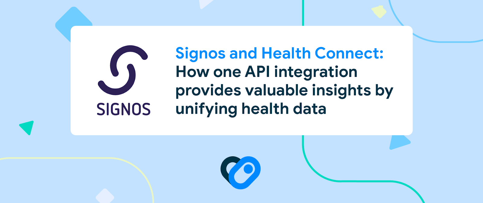
Posted by the Android TeamSignos helps people make healthier decisions and achieve their health goals by giving them a simple way to track and monitor their body’s response to glucose throughout the day. Pairing a continuous glucose monitor with an AI-driven app, Signos builds an understanding of a member's metabolic profile in real time, providing personalized nutrition suggestions based on their glucose patterns. This includes determining which foods are best for a member and when to eat them, or when to exercise to bring glucose levels back within a healthy range for optimal weight loss.
The Signos team knew that having more context on a member’s daily lifestyle behaviors—including exercise, sleep, and stress—would give a clearer view of health and allow the app to deliver more personalized recommendations. To integrate these additional wellness insights into its app, Signos developers used Health Connect, an Android API that unifies health and fitness data from multiple devices and apps into one platform.
Putting the member first
Signos integrated Health Connect so its members’ health and fitness data from apps like Fitbit, Samsung Health, and Google Fit can be automatically synced to the Signos app. Instead of requiring members to manually input this data from multiple sources, they can use Health Connect and enable Signos to sync with the other integrated apps they use to support their well-being. Not only does this save members time, it also ensures consistent and accurate data.
With Health Connect, it’s easier for Signos to identify patterns in a member's health and offer more insightful recommendations based on their glucose patterns. It also provides Signos members with a better understanding of how their daily choices affect their glucose, metabolic health, and weight by bringing their health data together in Signos, where they can easily view it and make comprehensive connections.
Signos understands data privacy is important, and with Health Connect, Signos members can securely manage their health information on Android devices. When a member first opens Health Connect, they're guided through the process of selecting which health metrics and apps they want to provide access to, giving them complete control of what's made available to Signos.
One implementation for many data sources
Before implementing Health Connect, Signos developers struggled to connect relevant data from multiple sources because many APIs weren't available or too many integrations needed to be created and maintained. This meant the Signos team had to write individual integrations to support multiple API surfaces for every app they wanted to sync data from. Now, they only need to write one, saving them a tremendous amount of development time and effort.
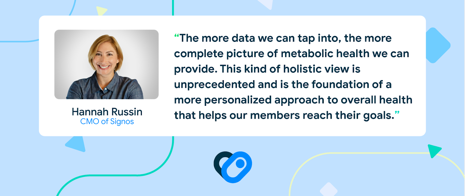
With a single API connection through Health Connect, Signos was able to unify health and wellness data from the apps most used by members. “Now that data from workouts, sleep, weight logs, and heart rate automatically sync from other apps, members can see how all of this data impacts their glucose throughout the day,” said Emma Allison, vice president of product at Signos.
Additionally, implementing Health Connect is simple. Using specialized constructors, Signos developers were able to take Health Connect records and convert them into the internal models used for Signos’ health data. This allowed the Signos app to process Health Connect data the same way it processes its own, so the experience is completely seamless to members. Sleep logged from their wearables that’s synced through Health Connect looks exactly the same to them as sleep logged straight into Signos.
“One aspect I was pleasantly surprised by was the user onboarding UX,” said Signos developer Jake Smith. “A simple, drop-in piece of code brings them straight to the Play Store to install Health Connect and then right back to the app so they can set up the permissions and start reaping the benefits.”
More connections, more opportunities
Currently, Health Connect’s first integration with Signos syncs personal wellness data like exercise, heart rate, sleep, and hydration. In the future, Signos plans to build out more robust integrations and in-app experiences with each data set, including women’s health, nutrition, and even mindfulness.
Signos is excited about what the future of Health Connect will bring. Health Connect helps standardize different data types and allows Android apps to freely connect to the API, so Signos won’t have to create any further integrations as other apps adopt Health Connect. This means that as the Health Connect ecosystem grows, so will Signos’ ability to help its members.
This year the Google Developer Educators India team launched the “Android Learn and Inspire Series” for Android Developers who were eager to learn Jetpack Compose and inspire others to upskill. Meet the developers who completed the series and hosted workshops on Jetpack Compose to find out their motivation to teach others!
Alankrita Shah, Lead Android Developer, Bolo Live
How did you get started with Android Development?
My journey with Android started back in my 3rd year of my undergraduate studies. I got an internship in a startup where I learned to develop an application that lets users watch videos. It was a simple application but that helped me start exploring android development. I was always in awe of the capabilities of Android applications.
What keeps you motivated to learn and stay up to date ?
In Android development, there are frequent updates that help developers write fast and efficient code. Keeping up with it would help build good quality products. Becoming part of communities where you can discuss and share best practices is an interesting way to learn and grow.
Which method of knowledge sharing did you find most effective?
I experimented with a few methods in the Android Learn and Inspire series. There are a few that I found quite effective.
Adding some fun activities helps in bringing energy to the session. You can put up some fun activities that will include the learnings of the session in a fun way.
Write up for the topic covered : Post the session, you can share a blog and/or code for the same. The members can access it if they want to revisit what they learned.”
Amardeep Kumar, Android Engineer, Walmart
How did you get started with Android Development?
I completed my Engineering in Information Technology from Siliguri Institute of Technology back in 2011. I was one of those unlucky 10% of students who graduated without any job offer. After a few months of struggle, I got a job offer from a company called Robosoft (this time I was one of the 3 selected out of 2,000+ candidates). Hence, I started as an Android developer from day 1 of joining Robosoft from the Honeycomb and Ice cream sandwich.
What keeps you motivated to learn and share?
One thing was consistent in my Android journey and that was connecting with good Android developers. BlrDroid, GDG Bangalore, Udacity Nanodegree and the Android community helped me to connect with people and learn every day. Solving tech problems and Android tech discussions are part of daily life. I like to develop Android apps because of its reach in countries like India. Open source is also one of the reasons to love Android. I got trained in my first job from my seniors on Android and that motivated me to share my Android knowledge in the community.
Which method of knowledge sharing did you find most effective?
One tip I would like to share is let’s bring those good engineers in Android who are expert in solving Android problems but shy in sharing knowledge.
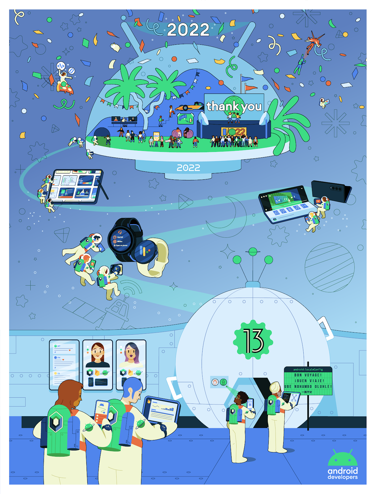
We put together a highlights recap, and a commemorative poster celebrating 2022 - download it to bring some holiday cheer to your workspace, wherever you may be this season.
Have a festive holiday season and we look forward to continuing our work with you in the new year.
Posted by Leticia Lago, Developer MarketingAnshul, Meet, and Harsh became friends while living and working together. They never realised Meet used to stutter until he explained he taught himself speech therapy exercises to overcome the disorder. This motivated the trio to found their company Stamurai Speech Therapy, creating an app to help thousands of people just like Meet. Their inspirational story becomes our latest to be featured in #WeArePlay, our campaign celebrating the people behind apps and games around the world.
"Stuttering had a huge impact on me since I was a kid”, explains Meet. “It affected my professional and personal life. I decided to look for help as it is not only a speech disorder, it is an emotional disorder as well”.
After hours of studying medical books and practicing therapies, he learned how to manage stuttering and grow his confidence to complete seemingly simple tasks which previously made him anxious.
“I avoided ordering my favorite food, going shopping and talking to strangers. These speech exercises allowed me to do things that seemed simple for some, but were a struggle to me".
Meet, co-founder of Stamurai Speech Therapy
They realized there was a gap in the market for people to easily find help to manage disorders like his. Having a background in coding for Android, they got to work and created their app Stamurai Stuttering Therapy on Google Play.
Now available in 150 countries, they’re looking to the future as they begin working on adding more languages and more exercises. The positive impact the app is having spurs them on - "we like reading the reviews to see how the app has changed people's lives. Some are simply commenting they are now doing job interviews. This was something that could be a struggle for many".
Check out all the stories now at g.co/play/weareplay and stay tuned for even more coming soon.
Posted by Purnima Kochikar, Vice President of Play Partnerships
Hello everyone,
This year, Google Play celebrated our first decade of partnering with your businesses. So whether you just launched your first app or game, or have been with us since the beginning, thank you for joining us — and more than 2.5 billion users — on this journey.
2022 was a year of uncertainty, with challenges to the global economy leaving many people and businesses looking for ways to adapt to difficult circumstances. But despite these difficult circumstances, your apps and games continued to help people manage, live and enjoy their lives.
We launched #WeArePlay this year to document your stories from around the world and showcase how your apps and games are improving people’s lives.One of my favorites is from brothers Kennedy and Duke, who use their ambition to help small businesses with their finance needs to create Kippa, and are now helping to empower entrepreneurs all across Africa.
In the US, Andrew Glantz used his passion to support local communities to create GiftAMeal, a fantastic app which encourages restaurant customers to take photos of their meal, following which a meal is given to someone at a local food bank. Andrew estimates that 500 restaurants have donated over 1 million meals to date, which is an amazing achievement. We’re excited to continue spotlighting your stories from all over the world throughout next year.
In the mobile-first world we live in today, it is clear to see the impact of the experiences you build on people's lives, and it inspires my team every day.
Helping you grow your businesses more efficiently
In uncertain economic times, we know it’s important to keep your costs low, improve your outcomes, and stay productive. That’s why we recently made a number of enhancements to help you acquire and re-engage your users more efficiently, and shared actionable best practices through our app growth series.
For example, you now can create up to 50 Custom Store Listings to appeal to specific segments of people, so you can communicate what’s great about your app in ways that are relevant to each audience. I am also excited to see the impact of Churned-user Custom Store Listingsin the new year; these will tell a more customized story to people who uninstalled your apps or games, and help you bring them back. You can be one of the first to try this new feature by expressing your interest here.
For select titles, another efficient way to engage with new and existing users is by utilizing Promotional content cards, which games have been using for a while. This is a great way to reach users on Google Play with offers, launches, and events. For example, Three Kingdoms Tactics used the cards for exposure on all major events like pre-registration, new version release, and new season. The cards released during their first anniversary event in Hong Kong SAR and Taiwan increased their game’s exposure in the Play Store by 35%.
We are also excited to see apps starting to use the cards. Live streaming service Twitch has run almost 200 Promotional content campaigns this year, generating 36 million unique viewers and over 50 thousand app installs from the cards. It is wonderful to see these results.
On average, businesses using Promotional content cards drive +3.6% increase in revenue and a +5.1% increase in 28 daily active users versus similar titles that don’t. By measuring your success with the new reporting dashboard, you’ll see that the opportunities for optimization are huge. If you're one of the thousands of titles that already use Promotional Content, look for messages in your Play Console Inbox to find out more. We're looking to expand access to even more apps and games next year.
Helping you enter new markets
One great way to find new users is to go global. For mobile games, mature markets like Western Europe show a good growth rate, but the global growth rate is even higher thanks to the number of mobile gamers growing in emerging markets such as Southeast Asia, Latin America, India, and the Middle East & Africa. An increasing number of apps and games are monetizing successfully across emerging markets — for example, Türkiye has seen a ~70% increase in consumer spend on apps this year, and a ~50% increase for games.
For those considering entering new markets, local payments and monetization tools can help you increase buyer conversion, engagement, and retention. This year we launched strategic guidance in Play Console, which brings you a number of insights including peerset comparisons and per-country breakdowns. These can help you quickly identify growth opportunities, like what markets are underperforming and where you are a market leader. For more best practices for entering new markets, check out our Google Play Academy courses, with more coming soon.
Supporting you to find users on more devices
As we look to the future for your business growth, it is not only about reaching people in more markets, but also about reaching people on more devices. Users are increasingly investing in connected devices beyond their phones. Just this year, the number of active non-mobile Android devices has grown by almost 30%. That’s why it’s more important than ever to be able to meet your users where they are, whatever their device.
Supporting multi-platform gaming has been a major investment this year. We expanded Google Play Games to PCs as a beta experience across more markets around the world, gathering your feedback and improving the product to better fit the needs of your players around the world. Our greater aim is to help you to meet players where they are, and give them access to their games on as many devices as possible.
Many of you are already creating amazing experiences across multi-form factors, such as wearables and foldables. Strava is one great example of how building these experiences can boost engagement. They tapped into Google’s APIs, libraries and Android tools to take the app experience to the next level for people who have invested in a wearable, and found that wearable users also had 30% more active days than those who did not use a wearable.
Keeping the ecosystem safe
We know how hard you work to build and grow these amazing apps. As you scale your businesses, we are also committed to helping you better understand the policies that keep the ecosystem safe for people everywhere. Recent policies to help you navigate trust and safety on Google Play include expanding the Developer Helpline program to help navigate policy compliance issues, and launching a Strike Removal program to help compliance and deeper education on commonly misunderstood policy areas.
Rallying together into 2023
To maximize your success during periods of change, we need to rally together. We were so excited to celebrate 100,000 followers this year on our Google Play Business Community Twitter channel, and welcome you to follow our community spaces on Twitter and LinkedIn to connect with your peers and build knowledge.
Take care of yourselves and each other — and happy holidays from our team to yours.
Purnima Kochikar, Vice President, Google Play Partnerships
 Jetpack Compose is Android’s modern UI toolkit which is used by many well-known apps such as Pinterest, SoundCloud and Lyft. It enables developers to more intuitively and efficiently build better quality Android apps. To help developers around the world take advantage of these benefits, we launched Compose Camp, an Android meetup series where developers were able to learn Jetpack Compose, network with peers, and work on hands-on coding projects together, with the guidance of “Camp Leaders” who facilitated the sessions.


.png)

 Posted by