Posted by Agustin Fonts, Product Manager, Android Support Library It's important to keep current when you're dealing with technology. That’s why we're constantly working to improve the quality of our software, particularly libraries that are linked into your apps, such as the Support Library. The Support Library is a suite of libraries that provides backward compatibility along with additional features across many Android releases.
We have just released version 25.2 of the Support Library. If you're making use of the android.support.v7.media.MediaRouter class in revision 25.1.1 or 25.1.0, we strongly recommend that you update due to a known issue. If you haven't updated recently, you've missed out on some great bug fixes such as these:
25.2:
Corrected a severe mediarouter issue in which using an A2DP Bluetooth device and media routing APIs could cause the device to become unresponsive, requiring a reboot
Showing a slide presentation with screen mirroring no longer causes the device to disconnect from Wi-Fi
Media button now properly handles media apps that did not register themselves with setMediaButtonReceiver()
TextInputLayout correctly overlays hint and text if text is set by XML (AOSP issue 230171)
Corrected a memory leak in MediaControllerCompat (AOSP issue 231441)
RecyclerView no longer crashes when recycling view holders (AOSP issue 225762)
Reporting (and fixing) a Bug
The Support Library is developed by the Android Framework and Developer Relations teams, and, just like the Android platform, you can file bugs using the AOSP issue tracker, or submit fixes to our Git repository. Your feedback is critical in helping us to make the Support Library the most productive environment to use for developing Android applications.
With the release of the 25.1.0 Support Library, there's a new entry in the family: the ExifInterface Support Library. With significant improvements introduced in Android 7.1 to the framework's ExifInterface, it only made sense to make those available to all API 9+ devices via the Support Library's ExifInterface.
The basics are still the same: the ability to read and write Exif tags embedded within image files: now with 140 different attributes (almost 100 of them new to Android 7.1/this Support Library!) including information about the camera itself, the camera settings, orientation, and GPS coordinates.
Camera Apps: Writing Exif Attributes
For Camera apps, the writing is probably the most important - writing attributes is still limited to JPEG image files. Now, normally you wouldn't need to use this during the actual camera capturing itself - you'd instead be calling the Camera2 API CaptureRequest.Builder.set() with JPEG_ORIENTATION, JPEG_GPS_LOCATION or the equivalents in the Camera1 Camera.Parameters. However, using ExifInterface allows you to make changes to the file after the fact (say, removing the location information on the user's request).
Reading Exif Attributes
For the rest of us though, reading those attributes is going to be our bread-and-butter; this is where we see the biggest improvements.
Firstly, you can read Exif data from JPEG and raw images (specifically, DNG, CR2, NEF, NRW, ARW, RW2, ORF, PEF, SRW and RAF files). Under the hood, this was a major restructuring, removing all native dependencies and building an extensive test suite to ensure that everything actually works.
For apps that receive images from other apps with a content:// URI (such as those sent by apps that target API 24 or higher), ExifInterface now works directly off of an InputStream; this allows you to easily extract Exif information directly out of content:// URIs you receive without having to create a temporary file.
Uri uri; // the URI you've received from the other app
InputStream in;
try {
  in = getContentResolver().openInputStream(uri);
  ExifInterface exifInterface = new ExifInterface(in);
  // Now you can extract any Exif tag you want
  // Assuming the image is a JPEG or supported raw format
} catch (IOException e) {
  // Handle any errors
} finally {
  if (in != null) {
    try {
      in.close();
    } catch (IOException ignored) {}
  }
}
Note: ExifInterface will not work with remote InputStreams, such as those returned from a HttpURLConnection. It is strongly recommended to only use them with content:// or file:// URIs.
One of the most important attributes when it comes to displaying images is the image orientation, stored in the aptly-named TAG_ORIENTATION, which returns one of the ORIENTATION_ constants. To convert this to a rotation angle, you can post-process the value.
int rotation = 0;
int orientation = exifInterface.getAttributeInt(
    ExifInterface.TAG_ORIENTATION,
    ExifInterface.ORIENTATION_NORMAL);
switch (orientation) {
  case ExifInterface.ORIENTATION_ROTATE_90:
    rotation = 90;
    break;
  case ExifInterface.ORIENTATION_ROTATE_180:
    rotation = 180;
    break;
  case ExifInterface.ORIENTATION_ROTATE_270:
    rotation = 270;
    break;
}
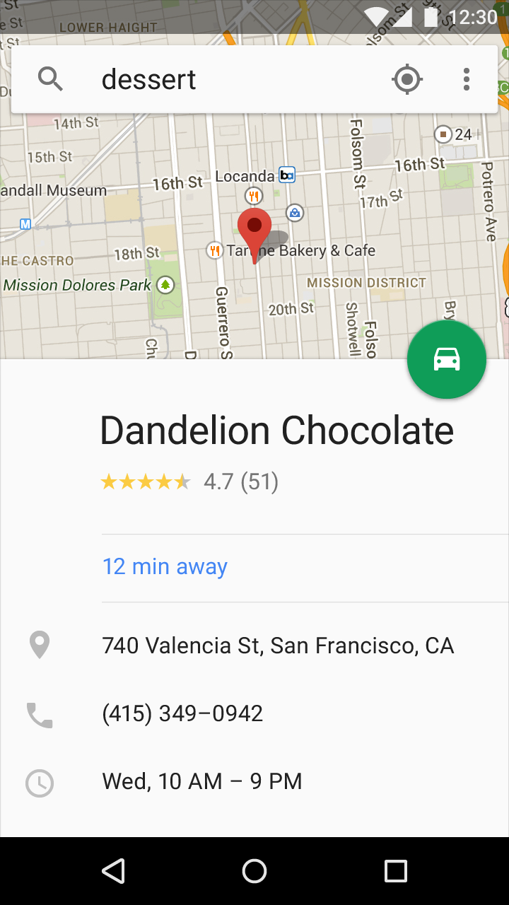
There are some helper methods to extract values from specific Exif tags. For location data, the getLatLong() method gives you the latitude and longitude as floats and getAltitude() will give you the altitude in meters. Some images also embed a small thumbnail. You can check for its existence with hasThumbnail() and then extract the byte[] representation of the thumbnail with getThumbnail() - perfect to pass to BitmapFactory.decodeByteArray().
Working with Exif: Everything is optional
One thing that is important to understand with Exif data is that there are no required tags: each and every tag is optional - some services even specifically strip Exif data. Therefore throughout your code, you should always handle cases where there is no Exif data, either due to no data for a specific attribute or an image format that doesn't support Exif data at all (say, the ubiquitous PNGs or WebP images).
Add the ExifInterface Support Library to your project with the following dependency:
But when an Exif attribute is exactly what you need to prevent a mis-rotated image in your app, the ExifInterface Support Library is just what you need to #BuildBetterApps
When talking about the Android Support Library, it is important to realize this isn’t one monolithic library, but a whole collection of libraries that seek to provide backward-compatible versions of APIs, as well as offer unique features without requiring the latest platform version. Version 23.2 adds a few new support libraries as well as new features to many of the existing libraries.
Support Vector Drawables and Animated Vector Drawables
Vector drawables allow you to replace multiple png assets with a single vector graphic, defined in XML. While previously limited to Lollipop and higher devices, both VectorDrawable and AnimatedVectorDrawable are now available through two new Support Libraries support-vector-drawable and support-animated-vector-drawable, respectively.
Android Studio 1.4 introduced limited support for vector drawables by generating pngs at build time. To disable this functionality (and gain the true advantage and space savings of this Support Library), you need to add vectorDrawables.useSupportLibrary = true to your build.gradle file:
You’ll note this new attribute only exists in the version 2.0 of the Gradle Plugin. If you are using Gradle 1.5 you’ll instead use
 // Gradle Plugin 1.5
 android {
   defaultConfig {
     generatedDensities = []
  }

  // This is handled for you by the 2.0+ Gradle Plugin
  aaptOptions {
    additionalParameters "--no-version-vectors"
  }
 }
You’ll be able to use VectorDrawableCompat back to API 7 and AnimatedVectorDrawableCompat on all API 11 and higher devices. Due to how drawables are loaded by Android, not every place that accepts a drawable id (such as in an XML file) will support loading vector drawables. Thankfully, AppCompat has added a number of features to make it easy to use your new vector drawables.
Firstly, when using AppCompat with ImageView (or subclasses such as ImageButton and FloatingActionButton), you’ll be able to use the new app:srcCompat attribute to reference vector drawables (as well as any other drawable available to android:src):
And if you’re changing drawables at runtime, you’ll be able to use the same setImageResource() method as before - no changes there. Using AppCompat and app:srcCompat is the most foolproof method of integrating vector drawables into your app.
You’ll find directly referencing vector drawables outside of app:srcCompat will fail prior to Lollipop. However, AppCompat does support loading vector drawables when they are referenced in another drawable container such as a StateListDrawable, InsetDrawable, LayerDrawable, LevelListDrawable, and RotateDrawable. By using this indirection, you can use vector drawables in cases such as TextView’sandroid:drawableLeft attribute, which wouldn’t normally be able to support vector drawables.
AppCompat DayNight theme
While enabling the use of vector graphics throughout your app is already a large change to AppCompat, there’s a new theme added to AppCompat in this release: Theme.AppCompat.DayNight.
Prior to API 14, The DayNight theme and its descendents DayNight.NoActionBar, DayNight.DarkActionBar, DayNight.Dialog, etc. become their Light equivalents. But on API 14 and higher devices, this theme allows apps to easily support both a Light and Dark theme, effectively switching from a Light theme to a Dark theme based on whether it is ‘night’.
By default, whether it is ‘night’ will match the system value (from UiModeManager.getNightMode()), but you can override that value with methods in AppCompatDelegate. You’ll be able to set the default across your entire app (until process restart) with the static AppCompatDelegate.setDefaultNightMode() method or retrieve an AppCompatDelegate via getDelegate() and use setLocalNightMode() to change only the current Activity or Dialog.
When using AppCompatDelegate.MODE_NIGHT_AUTO, the time of day and your last known location (if your app has the location permissions) are used to automatically switch between day and night, while MODE_NIGHT_NO and MODE_NIGHT_YES forces the theme to never or always use a dark theme, respectively.
It is critical that you test your app thoroughly when using the DayNight themes as hardcoded colors can easily make for unreadable text or icons. If you are using the standard TextAppearance.AppCompat styles for your text or colors pulled from your theme such as android:textColorPrimary, you’ll find these automatically update for you.
However, if you’d like to customize any resources specifically for night mode, AppCompat reuses the night resource qualifier folder, making it possible customize every resource you may need. Please consider using the standard colors or taking advantage of the tinting support in AppCompat to make supporting this mode much easier.
By attaching a BottomSheetBehavior to a child View of a CoordinatorLayout (i.e., adding app:layout_behavior=”android.support.design.widget.BottomSheetBehavior”), you’ll automatically get the appropriate touch detection to transition between five state:
STATE_COLLAPSED: this collapsed state is the default and shows just a portion of the layout along the bottom. The height can be controlled with the app:behavior_peekHeight attribute (defaults to 0)
STATE_DRAGGING: the intermediate state while the user is directly dragging the bottom sheet up or down
STATE_SETTLING: that brief time between when the View is released and settling into its final position
STATE_EXPANDED: the fully expanded state of the bottom sheet, where either the whole bottom sheet is visible (if its height is less than the containing CoordinatorLayout) or the entire CoordinatorLayout is filled
STATE_HIDDEN: disabled by default (and enabled with the app:behavior_hideable attribute), enabling this allows users to swipe down on the bottom sheet to completely hide the bottom sheet
Keep in mind that scrolling containers in your bottom sheet must support nested scrolling (for example, NestedScrollView, RecyclerView, or ListView/ScrollView on API 21+).
If you’d like to receive callbacks of state changes, you can add a BottomSheetCallback:
 // The View with the BottomSheetBehavior
 View bottomSheet = coordinatorLayout.findViewById(R.id.bottom_sheet);
 BottomSheetBehavior behavior = BottomSheetBehavior.from(bottomSheet);
 behavior.setBottomSheetCallback(new BottomSheetCallback() {
    @Override
    public void onStateChanged(@NonNull View bottomSheet, int newState) {
      // React to state change
    }
      @Override
      public void onSlide(@NonNull View bottomSheet, float slideOffset) {
       // React to dragging events
   }
 });
While BottomSheetBehavior captures the persistent bottom sheet case, this release also provides a BottomSheetDialog and BottomSheetDialogFragment to fill the modal bottom sheets use case. Simply replace AppCompatDialog or AppCompatDialogFragment with their bottom sheet equivalents to have your dialog styled as a bottom sheet.
Support v4: MediaBrowserServiceCompat
The Support v4 library serves as the foundation for much of the support libraries and includes backports of many framework features introduced in newer versions of the platform (as well a number of unique features).
Adding onto the previously released MediaSessionCompat class to provide a solid foundation for media playback, this release adds MediaBrowserServiceCompat and MediaBrowserCompat providing a compatible solution that brings the latest APIs (even those added in Marshmallow) back to all API 4 and higher devices. This makes it much easier to support audio playback on Android Auto and browsing through media on Android Wear along with providing a standard interface you can use to connect your media playback service and your UI.
RecyclerView
The RecyclerView widget provides an advanced and flexible base for creating lists and grids as well as supporting animations. This release brings an exciting new feature to the LayoutManager API: auto-measurement! This allows a RecyclerView to size itself based on the size of its contents. This means that previously unavailable scenarios, such as using WRAP_CONTENT for a dimension of the RecyclerView, are now possible. You’ll find all built in LayoutManagers now support auto-measurement.
Due to this change, make sure to double check the layout parameters of your item views: previously ignored layout parameters (such as MATCH_PARENT in the scroll direction) will now be fully respected.
If you have a custom LayoutManager that does not extend one of the built in LayoutManagers, this is an opt-in API - you’ll be required to call setAutoMeasureEnabled(true) as well as make some minor changes as detailed in the Javadoc of the method.
Note that although RecyclerView animates its children, it does not animate its own bounds changes. If you would like to animate the RecyclerView bounds as they change, you can use the Transition APIs.
Custom Tabs
Custom Tabs makes it possible to seamlessly transition to web content while keeping the look and feel of your app. With this release, you’ll now be able to add actions to a bottom bar for display alongside the web content.
With the new addToolbarItem() method, you’ll be able to add up to currently 5 (MAX_TOOLBAR_ITEMS) actions to the bottom bar and update them with setToolbarItem() once the session has begun. Similar to the previous setToolbarColor() method, you’ll also find a setSecondaryToolbarColor() method for customizing the background color of the bottom bar.
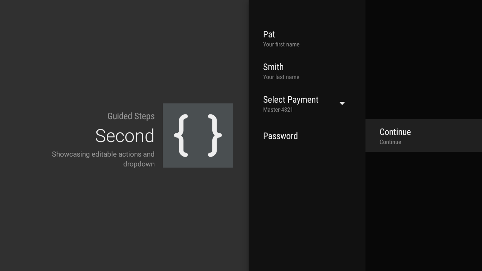
The most visible change may be the introduce of a second column used for action buttons (added by overriding onCreateButtonActions() or calling setButtonActions()). This makes it much easier to reach completion actions without having to scroll through the list of available GuidedActions.
Speaking of GuidedActions, there’s a number of new features to allow richer input including editable descriptions (via descriptionEditable()), sub actions in the form of a dropdown (with subActions()), and a GuidedDatePickerAction.
These components should make it much easier for you to get information from the user when absolutely required.
Available Now
Version 23.2 of the Android Support Library is available via your SDK Manager and Android Studio. Take advantage of all of the new features as well as additional bug fixes starting now! As always, file bug reports at b.android.com and connect with other developers on the Android Development Google+ community.
One of the benefits of Android development is the flexibility provided by the large number of APIs in the Android framework and Support Library, not even including the Google Play services APIs. However, that can be a lot to understand, particularly when confronted with multiple options or design decisions. Thankfully, things are about to get a lot clearer with a new series: Android Development Patterns.
The goal of Android Development Patterns is to focus on the fundamental components and best practices that can make the biggest difference in your app. We spend time talking about the why behind each API, so that you know exactly what is best for your situation.
Centered on Android framework APIs, the Android Support Library, and high level app structure and design, we’ll augment the many videos on the Android Developers YouTube channel to bring the focus back towards Android development at its core.
Android Development Patterns are more than just videos. You’ll find written pro-tips from in-house experts at Google, such as Joanna Smith and Ian Lake, every week through the Android Development Patterns Google+ Collection.
Material design is a new system for visual, interaction and motion design. We originally launched the Topeka web app as an Open Source example of material design on the web.
Today, we’re publishing a new material design example: The Android version of Topeka. It demonstrates that the same branding and material design principles can be used to create a consistent experience across platforms.
Grab the code today on GitHub.
The juicy bits
While the project demonstrates a lot of different aspects of material design, let’s take a quick look at some of the most interesting bits.
Transitions
Topeka for Android features several possibilities for transition implementation. For starters the Transitions API within ActivityOptions provides an easy, yet effective way to make great transitions between Activities.
To achieve this, we register the shared string in a resources file like this:
For multiple transition participants with ActivityOptions you can take a look at the CategorySelectionFragment.
Animations
When it comes to more complex animations you can orchestrate your own animations as we did for scoring.
To get this right it is important to make sure all elements are carefully choreographed.
The AbsQuizView class performs a handful of carefully crafted animations when a question has been answered:
The animation starts with a color change for the floating action button, depending on the provided answer. After this has finished, the button shrinks out of view with a scale animation. The view holding the question itself also moves offscreen. We scale this view to a small green square before sliding it up behind the app bar. During the scaling the foreground of the view changes color to match the color of the fab that just disappeared. This establishes continuity across the various quiz question states.
All this takes place in less than a second’s time. We introduced a number of minor pauses (start delays) to keep the animation from being too overwhelming, while ensuring it’s still fast.
The code responsible for this exists within AbsQuizView’s performScoreAnimation method.
FAB placement
The recently announced Floating Action Buttons are great for executing promoted actions. In the case of Topeka, we use it to submit an answer. The FAB also straddles two surfaces with variable heights; like this:
To achieve this we query the height of the top view (R.id.question_view) and then set padding on the FloatingActionButton once the view hierarchy has been laid out:
private void addFloatingActionButton() {
    final int fabSize = getResources().getDimensionPixelSize(R.dimen.fab_size);
    int bottomOfQuestionView = findViewById(R.id.question_view).getBottom();
    final LayoutParams fabLayoutParams = new LayoutParams(fabSize, fabSize,
            Gravity.END | Gravity.TOP);
    final int fabPadding = getResources().getDimensionPixelSize(R.dimen.padding_fab);
    final int halfAFab = fabSize / 2;
    fabLayoutParams.setMargins(0, // left
        bottomOfQuestionView - halfAFab, //top
        0, // right
        fabPadding); // bottom
    addView(mSubmitAnswer, fabLayoutParams);
}
To make sure that this only happens after the initial layout, we use an OnLayoutChangeListener in the AbsQuizView’s constructor:
addOnLayoutChangeListener(new OnLayoutChangeListener() {
    @Override
    public void onLayoutChange(View v, int l, int t, int r, int b,
            int oldLeft, int oldTop, int oldRight, int oldBottom) {
        removeOnLayoutChangeListener(this);
        addFloatingActionButton();
    }
});
Round OutlineProvider
Creating circular masks on API 21 onward is now really simple. Just extend the ViewOutlineProvider class and override the getOutline() method like this:
@Override
public final void getOutline(View view, Outline outline) {
    final int size = view.getResources().
        getDimensionPixelSize(R.id.view_size);
    outline.setOval(0, 0, size, size);
}
and setClipToOutline(true) on the target view in order to get the right shadow shape.
We use vector drawables to display icons in several places throughout the app. You might be aware of our collection of Material Design Icons on GitHub which contains about 750 icons for you to use. The best thing for Android developers: As of Lollipop you can use these VectorDrawables within your apps so they will look crisp no matter what density the device’s screen. For example, the back arrow ic_arrow_back from the icons repository has been adapted to Android’s vector drawable format.
The vector drawable only has to be stored once within the res/drawable folder. This means less disk space is being used for drawable assets.
Property Animations
Did you know that you can easily animate any property of a View beyond the standard transformations offered by the ViewPropertyAnimator class (and it’s handy View#animate syntax)? For example in AbsQuizView we define a property for animating the view’s foreground color.
// Property for animating the foreground
public static final Property FOREGROUND_COLOR =
        new IntProperty("foregroundColor") {

            @Override
            public void setValue(FrameLayout layout, int value) {
                if (layout.getForeground() instanceof ColorDrawable) {
                    ((ColorDrawable) layout.getForeground()).setColor(value);
                } else {
                    layout.setForeground(new ColorDrawable(value));
                }
            }

            @Override
            public Integer get(FrameLayout layout) {
                return ((ColorDrawable) layout.getForeground()).getColor();
            }
        };
This can later be used to animate changes to said foreground color from one value to another like this:
final ObjectAnimator foregroundAnimator = ObjectAnimator
        .ofArgb(this, FOREGROUND_COLOR, Color.WHITE, backgroundColor);
This is not particularly new, as it has been added with API 12, but still can come in quite handy when you want to animate color changes in an easy fashion.
Tests
In addition to exemplifying material design components, Topeka for Android also features a set of unit and instrumentation tests that utilize the new testing APIs, namely “Gradle Unit Test Support” and the “Android Testing Support Library.” The implemented tests make the app resilient against changes to the data model. This catches breakages early, gives you more confidence in your code and allows for easy refactoring. Take a look at the androidTest and test folders for more details on how these tests are implemented within Topeka. For a deeper dive into Testing on Android, start reading about the Testing Tools.
What’s next?
With Topeka for Android, you can see how material design lets you create a more consistent experience across Android and the web. The project also highlights some of the best material design features of the Android 5.0 SDK and the new Android Design Library.
While the project currently only supports API 21+, there’s already a feature request open to support earlier versions, using tools like AppCompat and the new Android Design Support Library.
Have a look at the project and let us know in the project issue tracker if you’d like to contribute, or on Google+ or Twitter if you have questions.
Android 5.0 Lollipop was one of the most significant Android releases ever, in no small part due to the introduction of material design, a new design language that refreshed the entire Android experience. Our detailed spec is a great place to start to adopt material design, but we understand that it can be a challenge for developers, particularly ones concerned with backward compatibility. With a little help from the new Android Design Support Library, we’re bringing a number of important material design components to all developers and to all Android 2.1 or higher devices. You’ll find a navigation drawer view, floating labels for editing text, a floating action button, snackbar, tabs, and a motion and scroll framework to tie them together.
Navigation View
The navigation drawer can be an important focal point for identity and navigation within your app and consistency in the design here can make a considerable difference in how easy your app is to navigate, particularly for first time users. NavigationView makes this easier by providing the framework you need for the navigation drawer as well as the ability to inflate your navigation items through a menu resource.
You use NavigationView as DrawerLayout’s drawer content view with a layout such as:
You’ll note two attributes for NavigationView: app:headerLayout controls the (optional) layout used for the header. app:menu is the menu resource inflated for the navigation items (which can also be updated at runtime). NavigationView takes care of the scrim protection of the status bar for you, ensuring that your NavigationView interacts with the status bar appropriately on API21+ devices.
The simplest drawer menus will be a collection of checkable menu items:
You’ll get callbacks on selected items by setting a OnNavigationItemSelectedListener using setNavigationItemSelectedListener(). This provides you with the MenuItem that was clicked, allowing you to handle selection events, changed the checked status, load new content, programmatically close the drawer, or any other actions you may want.
Floating labels for editing text
Even the humble EditText has room to improve in material design. While an EditText alone will hide the hint text after the first character is typed, you can now wrap it in a TextInputLayout, causing the hint text to become a floating label above the EditText, ensuring that users never lose context in what they are entering.
In addition to showing hints, you can also display an error message below the EditText by calling setError().
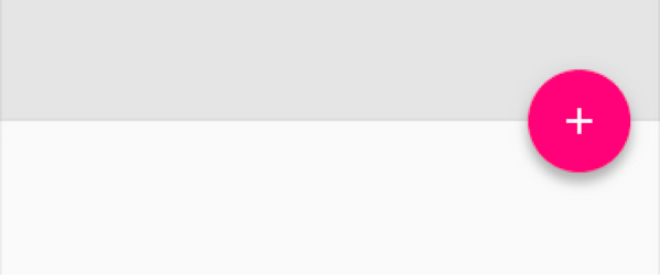
Floating Action Button
A floating action button is a round button denoting a primary action on your interface. The Design library’s FloatingActionButton gives you a single consistent implementation, by default colored using the colorAccent from your theme.
In addition to the normal size floating action button, it also supports the mini size (fabSize="mini") when visual continuity with other elements is critical. As FloatingActionButton extends ImageView, you’ll use android:src or any of the methods such as setImageDrawable() to control the icon shown within the FloatingActionButton.
Snackbar
Providing lightweight, quick feedback about an operation is a perfect opportunity to use a snackbar. Snackbars are shown on the bottom of the screen and contain text with an optional single action. They automatically time out after the given time length by animating off the screen. In addition, users can swipe them away before the timeout.
By including the ability to interact with the Snackbar through swiping it away or actions, these are considerably more powerful than toasts, another lightweight feedback mechanism. However, you’ll find the API very familiar:
You’ll note the use of a View as the first parameter to make() - Snackbar will attempt to find an appropriate parent of the Snackbar’s view to ensure that it is anchored to the bottom.
Tabs
Switching between different views in your app via tabs is not a new concept to material design and they are equally at home as a top level navigation pattern or for organizing different groupings of content within your app (say, different genres of music).
The Design library’s TabLayout implements both fixed tabs, where the view’s width is divided equally between all of the tabs, as well as scrollable tabs, where the tabs are not a uniform size and can scroll horizontally. Tabs can be added programmatically:
However, if you are using a ViewPager for horizontal paging between tabs, you can create tabs directly from your PagerAdapter’s getPageTitle() and then connect the two together using setupWithViewPager(). This ensures that tab selection events update the ViewPager and page changes update the selected tab.
CoordinatorLayout, motion, and scrolling
Distinctive visuals are only one part of material design: motion is also an important part of making a great material designed app. While there are a lot of parts of motion in material design including touch ripples and meaningful transitions, the Design library introduces CoordinatorLayout, a layout which provides an additional level of control over touch events between child views, something which many of the components in the Design library take advantage of.
CoordinatorLayout and floating action buttons
A great example of this is when you add a FloatingActionButton as a child of your CoordinatorLayout and then pass that CoordinatorLayout to your Snackbar.make() call - instead of the snackbar displaying over the floating action button, the FloatingActionButton takes advantage of additional callbacks provided by CoordinatorLayout to automatically move upward as the snackbar animates in and returns to its position when the snackbar animates out on Android 3.0 and higher devices - no extra code required.
CoordinatorLayout also provides an layout_anchor attribute which, along with layout_anchorGravity, can be used to place floating views, such as the FloatingActionButton, relative to other views.
CoordinatorLayout and the app bar
The other main use case for the CoordinatorLayout concerns the app bar (formerly action bar) and scrolling techniques. You may already be using a Toolbar in your layout, allowing you to more easily customize the look and integration of that iconic part of an app with the rest of your layout. The Design library takes this to the next level: using an AppBarLayout allows your Toolbar and other views (such as tabs provided by TabLayout) to react to scroll events in a sibling view marked with a ScrollingViewBehavior. Therefore you can create a layout such as:
Now, as the user scrolls the RecyclerView, the AppBarLayout can respond to those events by using the children’s scroll flags to control how they enter (scroll on screen) and exit (scroll off screen). Flags include:
scroll: this flag should be set for all views that want to scroll off the screen - for views that do not use this flag, they’ll remain pinned to the top of the screen
enterAlways: this flag ensures that any downward scroll will cause this view to become visible, enabling the ‘quick return’ pattern
enterAlwaysCollapsed: When your view has declared a minHeight and you use this flag, your View will only enter at its minimum height (i.e., ‘collapsed’), only re-expanding to its full height when the scrolling view has reached it’s top.
exitUntilCollapsed: this flag causes the view to scroll off until it is ‘collapsed’ (its minHeight) before exiting
One note: all views using the scroll flag must be declared before views that do not use the flag. This ensures that all views exit from the top, leaving the fixed elements behind.
Collapsing Toolbars
Adding a Toolbar directly to an AppBarLayout gives you access to the enterAlwaysCollapsed and exitUntilCollapsed scroll flags, but not the detailed control on how different elements react to collapsing. For that, you can use CollapsingToolbarLayout:
This setup uses CollapsingToolbarLayout’s app:layout_collapseMode="pin" to ensure that the Toolbar itself remains pinned to the top of the screen while the view collapses. Even better, when you use CollapsingToolbarLayout and Toolbar together, the title will automatically appear larger when the layout is fully visible, then transition to its default size as it is collapsed. Note that in those cases, you should call setTitle() on the CollapsingToolbarLayout, rather than on the Toolbar itself.
In addition to pinning a view, you can use app:layout_collapseMode="parallax" (and optionally app:layout_collapseParallaxMultiplier="0.7" to set the parallax multiplier) to implement parallax scrolling (say of a sibling ImageView within the CollapsingToolbarLayout). This use case pairs nicely with the app:contentScrim="?attr/colorPrimary" attribute for CollapsingToolbarLayout, adding a full bleed scrim when the view is collapsed.
CoordinatorLayout and custom views
One thing that is important to note is that CoordinatorLayout doesn’t have any innate understanding of a FloatingActionButton or AppBarLayout work - it just provides an additional API in the form of a Coordinator.Behavior, which allows child views to better control touch events and gestures as well as declare dependencies between each other and receive callbacks via onDependentViewChanged().
Views can declare a default Behavior by using the CoordinatorLayout.DefaultBehavior(YourView.Behavior.class) annotation,or set it in your layout files by with the app:layout_behavior="com.example.app.YourView$Behavior" attribute. This framework makes it possible for any view to integrate with CoordinatorLayout.
Available now!
The Design library is available now, so make sure to update the Android Support Repository in the SDK Manager. You can then start using the Design library with a single new dependency:
compile 'com.android.support:design:22.2.0'
Note that as the Design library depends on the Support v4 and AppCompat Support Libraries, those will be included automatically when you add the Design library dependency. We also took care that these new widgets are usable in the Android Studio Layout Editor’s Design view (find them under CustomView), giving you an easier way to preview some of these new components.
The Design library, AppCompat, and all of the Android Support Library are important tools in providing the building blocks needed to build a modern, great looking Android app without building everything from scratch.
Today at Google I/O, we announced a developer preview of the next version of Android, the M release. Last year’s developer preview was a first for Android and we received great feedback. We want to continue to give you developers early access to Android so you have time to get your apps ready for the next version of Android. This time with the M Developer Preview, we will provide a clear timeline for testing and feedback plus more updates to the preview build.
For the M release, we focused on improving the core user experience of Android, from fixing thousands of bugs, to making some big changes to the fundamentals of the platform:
Permissions - We are giving users control of app permissions in the M release. Apps can trigger requests for permissions at runtime, in the right context, and users can choose whether to grant the permission. Making permission requests right when they’re needed means users can get up and running in your app faster. Also, users have easy access to manage all their app permissions in settings. On M, as a developer, you should design your app to prompt for permissions in context and account for permissions that don’t get granted. As more devices upgrade to M, app permission behavior will be a critical development flow to test.
Runtime App Permissions
App links - We are making it even easier to link between apps. Android has always allowed apps to register to natively handle URLs. Now you can add an autoVerify attribute to your app manifest so that users can be linked deep into your native app without any disambiguation prompt. App links, along with App Indexing for Google search, make it easier for users to discover and re-engage with your app.
Battery - We’re making Android devices smarter about managing power through a new feature called Doze. With M, Android uses significant motion detection to learn if a device has been left unattended for a while. In this state, Android will exponentially back off background activity, trading off a little bit of app freshness for longer battery life. Consider how this may affect your app; for instance, if you’re building a chat app, you may want to make use of high priority messages to wake your app when the device is dozing.
The Android M release: advancing assistance and payments
We are also delighted to announce a couple of big new features:
Now on tap - We are making it even easier for Android users to get assistance with Now on tap -- whenever they need it, wherever they are on their device. For example, if your friend texts you about dinner at a new restaurant, without leaving the app, you can ask Google Now for help. Using just that context, Google can find menus, reviews, help you book a table, navigate there, and deep link you into relevant apps. As a developer, you can implement App Indexing for Google search to let users discover and re-engage with your app through Now on tap.
Now on tap
Android Pay & Fingerprint - We’ve built on our work with Near Field Communications (NFC) in Gingerbread and Host Card Emulation in Kitkat to develop Android Pay. Android Pay will enable Android users to simply and securely use their Android phone to pay in stores or in thousands of Android Pay partner apps. With M, native fingerprint support enhances Android Pay by allowing users to confirm a purchase with their fingerprint. Moreover, fingerprint on M can be used to unlock devices and make purchases on Google Play. With new APIs in M, it’s easy for you to add fingerprint authorization to your app and have it work consistently across a range of devices and sensors.
These are just a few highlights from the M Developer Preview that we announced today. The M preview will be available for download right after the keynote.
Android Developer Tools
In addition to the developer preview, we are launching new tools to help you in the development of your Android App:
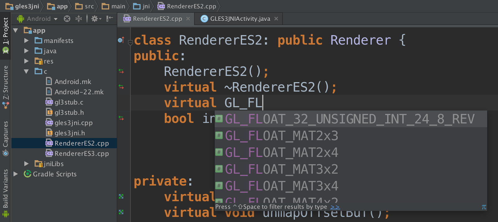
Android Studio v1.3 Preview - To help take advantage of the M Developer Preview features, we are releasing a new version of Android Studio. Most notable is a much requested feature from our Android NDK & game developers: code editing and debugging for C/C++ code. Based on JetBrains Clion platform, the Android Studio NDK plugin provides features such as refactoring and code completion for C/C++ code alongside your Java code. Java and C/C++ code support is integrated into one development experience free of charge for Android app developers. Update to Android Studio v1.3 via the Canary channel and let us know what you think.
Android Studio 1.3 with Android NDK Support
Android Design Support Library - Making Material design apps gets even easier with the new Android Design support library. We have packaged a set a key design components (e.g floating action button, snackbar, navigation view, motion enabled Toolbars) that are backward compatible to API 7 and can be added to your app to create a modern, great looking Android app without building everything from scratch.
Google Play Services - Today we also are releasing v7.5 of Google Play services which includes new features ranging from Smart Lock for Passwords, new APIs for Google Cloud Messaging and Google Cast, to Google Maps API on Android Wear devices.
Get Started
The M Developer Preview includes an updated SDK with tools, system images for testing on the official Android emulator, and system images for testing on Nexus 5, Nexus 6, Nexus 9, and Nexus Player devices. We are excited to expand the program and give you more time to ensure your apps support M when it launches this fall. Based on your feedback, we plan to update the M Developer preview system images often during the developer preview program. The sooner we hear from you, the more feedback we can integrate, so let us know!
To get started with the M Developer Preview and prepare your apps for the full release, just follow these steps:
You may have heard the phrase ‘the best code is no code.’ While we don’t recommend not writing any code at all, the code you do write should be adding unique value to your app rather than replicating common boilerplate code. The Android Support Library is one of the best resources for accomplishing this by taking care of the little things for you.
The latest release of the Android Support Library is no different, adding a number of extremely helpful components and changes across the Support V4, AppCompat, Leanback, RecyclerView, Palette, and Renderscript libraries. From the new AppCompatActivity and AppCompatDialog to a new guided step flow for Android TV, there’s a lot to get excited about in this release.
Support V4
The Support V4 library serves as the base of much of the Android Support Library and contains many of the classes focused on making backward compatibility much easier.
In addition, we’re making some of the internals of Palette available to all via the ColorUtils class, giving you pre-built tools to better work with colors. ColorUtils makes it easy to calculate the contrast ratio between colors, determine the minimum alpha value to maintain a minimum contrast (perfect for ensuring readable text), or convert colors to their HSL components.
Interpolators are an important part of any animation system, controlling the rate of change in an animation (say accelerating, decelerating, etc). A number of interpolators were added in Lollipop to android.R.interpolator including fast_out_linear_in, fast_out_slow_in, and linear_out_slow_in: important parts of building authentic motion. These are now available via the Support Library via the FastOutLinearInInterpolator, FastOutSlowInInterpolator, and LinearOutSlowInInterpolator classes, making it possible to use these via code for all animations. In addition to those pre-built interpolators, we’ve also created PathInterpolatorCompat, allowing you to build quadratic and cubic Bezier curves as well.
This release also moves the Space widget from the GridLayout library into Support V4, making it available without requiring a separate dependency. The Space widget is a lightweight, invisible View that can be used to create gaps between components.
AppCompat
The AppCompat Support Library started with humble, but important beginnings: a single consistent Action Bar for all API 7 and higher devices. In revision 21, it took on new responsibility: bringing material color palette, widget tinting, Toolbar support, and more to all API 7+ devices. With that, the name ActionBarActivity didn’t really cover the full scope of what it really did.
In this release, ActionBarActivity has been deprecated in favor of the new AppCompatActivity. However, this wasn’t just a rename. In fact, the internal logic of AppCompat is now available via AppCompatDelegate - a class you can include in any Activity, hook up the appropriate lifecycle methods, and get the same consistent theming, color tinting, and more without requiring you to use AppCompatActivity (although that remains the easiest way to get started).
With the help of the new AppCompatDelegate, we’ve also added support for consistent, material design dialogs via the AppCompatDialog class. If you’ve used AlertDialog before, you’ll be happy to know there is also now a Support Library version in support.v7.app.AlertDialog, giving you the same API as well as all the benefits of AppCompatDialog.
The ability to tint widgets automatically when using AppCompat is incredibly helpful in keeping strong branding and consistency throughout your app. This is done automatically when inflating layouts - replacing Button with AppCompatButton, TextView with AppCompatTextView, etc. to ensure that each could support tinting. In this release, those tint aware widgets are now publicly available, allowing you to keep tinting support even if you need to subclass one of the supported widgets.
The full list of tint aware widgets at this time is:
AppCompatAutoCompleteTextView
AppCompatButton
AppCompatCheckBox
AppCompatCheckedTextView
AppCompatEditText
AppCompatMultiAutoCompleteTextView
AppCompatRadioButton
AppCompatRatingBar
AppCompatSpinner
AppCompatTextView
Lollipop added the ability to overwrite the theme at a view by view level by using the android:theme XML attribute - incredibly useful for things such as dark action bars on light activities. Now, AppCompat allows you to use android:theme for Toolbars (deprecating the app:theme used previously) and, even better, brings android:theme support to all views on API 11+ devices.
If you’re just getting started with AppCompat, check out how easy it is to get started and bring a consistent design to all of your users:
Leanback
With the Leanback library serving as the collection of best practices for Android TV apps, we’d be remiss to not make an even better 10’ experience as part of the release. You’ll notice immediately upon loading up the updated Leanback sample the new guided step functionality.
This set of classes and themes can be used to build a multiple step process that looks great on Android TV. It is constructed from a guidance view on the left and a list of actions on the right. Each is customizable via themes with a parent of Theme.Leanback.GuidedStep or, if even more customization is needed, through custom a GuidanceStylist and GuidedActionsStylist.
You’ll also find a large number of bug fixes, performance improvements, and an extra coat of polish throughout the library - all with the goal of making the Leanback experience even better for users and developers alike.
RecyclerView
Besides a healthy set of bug fixes, this release adds a new SortedList data structure. This collection makes it easy to maintain a sorted list of custom objects, correctly dispatching change events as the data changes through to RecyclerView.Adapter: maintaining the item added/deleted/moved/changed animations provided by RecyclerView.
In addition, SortedList also supports batching changes together, dispatching just a single set of operations to the Adapter, ensuring the best user experience when a large number of items change simultaneously.
Palette
If you’ve been using Palette to extract colors from images, you’ll be happy to know that it is now 6-8 times faster without sacrificing quality!
Palette now uses a Builder pattern for instantiation. Rather than directly calling Palette.generate(Bitmap) or their equivalents, you’ll use Palette.from(Bitmap) to retrieve a Palette.Builder. You can then optionally change the maximum number of colors to generate and set the maximum size of the image to run Palette against before calling generate() or generateAsync() to retrieve the color Swatches.
Renderscript
Renderscript gives you massive compute potential and the Support Library version makes a number of the pre-defined scripts, called script intrinsics, available to all API 8+ devices. This release improves reliability and performance across all devices with an improved detection algorithm in determining whether the native Renderscript functionality can be used - ensuring the fastest, most reliable implementation is always chosen. Two additional intrinsics are also added in this release: ScriptIntrinsicHistogram and ScriptIntrinsicResize, rounding out the collection to ten.
SDK available now!
There’s no better time to get started with the Android Support Library. You can get started developing today by downloading the Android Support Library and Android Support Repository from the Android SDK Manager.
To learn more about the Android Support Library and the APIs available to you through it, visit the Support Library section on the Android Developer site.
The Android 5.0 SDK was released last Friday, featuring new UI widgets and material design, our visual language focused on good design. To enable you to bring your latest designs to older Android platforms we have expanded our support libraries, including a major update to AppCompat, as well as new RecyclerView, CardView and Palette libraries.
In this post we'll take a look at what’s new in AppCompat and how you can use it to support material design in your apps.
What's new in AppCompat?
AppCompat (aka ActionBarCompat) started out as a backport of the Android 4.0 ActionBar API for devices running on Gingerbread, providing a common API layer on top of the backported implementation and the framework implementation. AppCompat v21 delivers an API and feature-set that is up-to-date with Android 5.0
In this release, Android introduces a new Toolbar widget. This is a generalization of the Action Bar pattern that gives you much more control and flexibility. Toolbar is a view in your hierarchy just like any other, making it easier to interleave with the rest of your views, animate it, and react to scroll events. You can also set it as your Activity’s action bar, meaning that your standard options menu actions will be display within it.
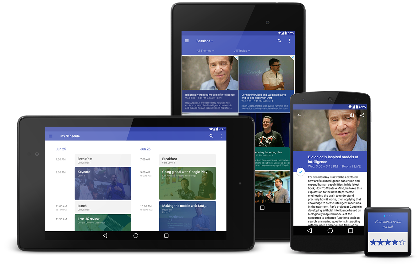
You’ve likely already been using the latest update to AppCompat for a while, it has been included in various Google app updates over the past few weeks, including Play Store and Play Newsstand. It has also been integrated into the Google I/O Android app, pictured above, which is open-source.
Setup
If you’re using Gradle, add appcompat as a dependency in your build.gradle file:
If you are not currently using AppCompat, or you are starting from scratch, here's how to set it up:
All of your Activities must extend from ActionBarActivity, which extends from FragmentActivity from the v4 support library, so you can continue to use fragments.
All of your themes (that want an Action Bar/Toolbar) must inherit from Theme.AppCompat. There are variants available, including Light and NoActionBar.
When inflating anything to be displayed on the action bar (such as a SpinnerAdapter for list navigation in the toolbar), make sure you use the action bar’s themed context, retrieved via getSupportActionBar().getThemedContext().
You must use the static methods in MenuItemCompat for any action-related calls on a MenuItem.
For more information, see the Action Bar API guide which is a comprehensive guide on AppCompat.
Migration from previous setup
For most apps, you now only need one theme declaration, in values/:
values/themes.xml:

<style name="Theme.MyTheme" parent="Theme.AppCompat.Light">
    <!-- Set AppCompat’s actionBarStyle -->
    <item name="actionBarStyle">@style/MyActionBarStyle</item>

    <!-- Set AppCompat’s color theming attrs -->
    <item name=”colorPrimary”>@color/my_awesome_red</item>
    <item name=”colorPrimaryDark”>@color/my_awesome_darker_red</item>

    <!-- The rest of your attributes -->
</style>
You can now remove all of your values-v14+ Action Bar styles.
values/themes.xml:

<style name="Theme.MyTheme" parent="Theme.AppCompat.Light">
    <!-- colorPrimary is used for the default action bar background -->
    <item name=”colorPrimary”>@color/my_awesome_color</item>

    <!-- colorPrimaryDark is used for the status bar -->
    <item name=”colorPrimaryDark”>@color/my_awesome_darker_color</item>

    <!-- colorAccent is used as the default value for colorControlActivated,
         which is used to tint widgets -->
    <item name=”colorAccent”>@color/accent</item>

    <!-- You can also set colorControlNormal, colorControlActivated
         colorControlHighlight, and colorSwitchThumbNormal. -->

</style>
When you set these attributes, AppCompat automatically propagates their values to the framework attributes on API 21+. This automatically colors the status bar and Overview (Recents) task entry.
On older platforms, AppCompat emulates the color theming where possible. At the moment this is limited to coloring the action bar and some widgets.
Widget tinting
When running on devices with Android 5.0, all of the widgets are tinted using the color theme attributes we just talked about. There are two main features which allow this on Lollipop: drawable tinting, and referencing theme attributes (of the form ?attr/foo) in drawables.
AppCompat provides similar behaviour on earlier versions of Android for a subset of UI widgets:
Everything provided by AppCompat’s toolbar (action modes, etc)
You don’t need to do anything special to make these work, just use these controls in your layouts as usual and AppCompat will do the rest (with some caveats; see the FAQ below).
Toolbar Widget
Toolbar is fully supported in AppCompat and has feature and API parity with the framework widget. In AppCompat, Toolbar is implemented in the android.support.v7.widget.Toolbar class. There are two ways to use Toolbar:
Use a Toolbar as an Action Bar when you want to use the existing Action Bar facilities (such as menu inflation and selection, ActionBarDrawerToggle, and so on) but want to have more control over its appearance.
Use a standalone Toolbar when you want to use the pattern in your app for situations that an Action Bar would not support; for example, showing multiple toolbars on the screen, spanning only part of the width, and so on.
Action Bar
To use Toolbar as an Action Bar, first disable the decor-provided Action Bar. The easiest way is to have your theme extend from Theme.AppCompat.NoActionBar (or its light variant).
Second, create a Toolbar instance, usually via your layout XML:
The height, width, background, and so on are totally up to you; these are just good examples. As Toolbar is just a ViewGroup, you can style and position it however you want.
Then in your Activity or Fragment, set the Toolbar to act as your Action Bar:
From this point on, all menu items are displayed in your Toolbar, populated via the standard options menu callbacks.
Standalone
The difference in standalone mode is that you do not set the Toolbar to act as your action bar. For this reason, you can use any AppCompat theme and you do not need to disable the decor-provided Action Bar.
In standalone mode, you need to manually populate the Toolbar with content/actions. For instance, if you want it to display actions, you need to inflate a menu into it:
@Override
public void onCreate(Bundle savedInstanceState) {
    super.onCreate(savedInstanceState);
    setContentView(R.layout.blah);

    Toolbar toolbar = (Toolbar) findViewById(R.id.my_awesome_toolbar);

    // Set an OnMenuItemClickListener to handle menu item clicks
    toolbar.setOnMenuItemClickListener(new Toolbar.OnMenuItemClickListener() {
        @Override
        public boolean onMenuItemClick(MenuItem item) {
            // Handle the menu item
            return true;
        }
    });

    // Inflate a menu to be displayed in the toolbar
    toolbar.inflateMenu(R.menu.your_toolbar_menu);
}
There are many other things you can do with Toolbar. For more information, see the Toolbar API reference.
Styling
Styling of Toolbar is done differently to the standard action bar, and is set directly onto the view.
Here's a basic style you should be using when you're using a Toolbar as your action bar:
The app:theme declaration will make sure that your text and items are using solid colors (i.e 100% opacity white).
DarkActionBar
You can style Toolbar instances directly using layout attributes. To achieve a Toolbar which looks like 'DarkActionBar' (dark content, light overflow menu), provide the theme and popupTheme attributes:
AppCompat offers Lollipop’s updated SearchView API, which is far more customizable and styleable (queue the applause). We now use the Lollipop style structure instead of the old searchView* theme attributes.
You do not need to set all (or any) of these, the defaults will work for the majority of apps.
Toolbar is coming...
Hopefully this post will help you get up and running with AppCompat and let you create some awesome material apps. Let us know in the comments/G+/Twitter if you’re have questions about AppCompat or any of the support libraries, or where we could provide more documentation.
FAQ
Why is my EditText (or other widget listed above) not being tinted correctly on my pre-Lollipop device?
The widget tinting in AppCompat works by intercepting any layout inflation and inserting a special tint-aware version of the widget in its place. For most people this will work fine, but I can think of a few scenarios where this won’t work, including:
You have your own custom version of the widget (i.e. you’ve extended EditText)
You are creating the EditText without a LayoutInflater (i.e., calling new EditText()).
The special tint-aware widgets are currently hidden as they’re an unfinished implementation detail. This may change in the future.
Why has X widget not been material-styled when running on pre-Lollipop?
Only some of the most common widgets have been updated so far. There are more coming in future releases of AppCompat.
Why does my Action Bar have a shadow on Android Lollipop? I’ve set android:windowContentOverlay to null.
On Lollipop, the action bar shadow is provided using the new elevation API. To remove it, either call getSupportActionBar().setElevation(0), or set the elevation attribute in your Action Bar style.
Why are there no ripples on pre-Lollipop?
A lot of what allows RippleDrawable to run smoothly is Android 5.0’s new RenderThread. To optimize for performance on previous versions of Android, we've left RippleDrawable out for now.
How do I use AppCompat with Preferences?
You can continue to use PreferenceFragment in your ActionBarActivity when running on an API v11+ device. For devices before that, you will need to provide a normal PreferenceActivity which is not material-styled.
Now that the full Android Wear SDK is available, it’s time to port your existing wearable-enabled notification code from the Developer Preview. In the process, you’ll switch to using the latest Android support library, and there are some small API changes that will require you to update your code. This article will show you how to update my previous code samples that were released earlier for stacks and pages, which you can use to guide the conversion of your own code as well.
To get started with an existing project in Android Studio, you should update to the 0.8 or later release. You also need to make sure you’ve downloaded the Google Support Library version 20 or later from the SDK Manager. Since this is only a notification-based example, there’s no need to download the full Android Wear SDK, which is only needed if you want to create an APK to run on the wearable device.
Unix diff output is used to show the necessary changes in an easy to understand way. Do not copy the + or - symbols at the start of each line, and ignore the lines starting with @@ which are used to indicate the line number that changed. For the curious, I used the following command to generate the diff output from the last commit in my GIT repository (the -U1 shows one line of context to keep the output simple):
git show HEAD -U1
Gradle changes
To add the new support-v4 library, you need to edit your build.gradle file like so:
Make sure you remove the wearable-preview-support.jar that was provided with the Developer Preview from your libs directory and build.gradle file, since these features are now in the standard support library.
Package imports
Since the APIs and package names have changed, the import statements at the top of MainActivity.java need to be adjusted like this:
@@ -7,3 +7,2 @@ import android.view.MenuItem;
-import android.support.v4.app.NotificationCompat;
import android.app.Notification;
@@ -13,4 +12,9 @@ import android.graphics.Bitmap;
import android.graphics.BitmapFactory;
-import android.preview.support.v4.app.NotificationManagerCompat;
-import android.preview.support.wearable.notifications.WearableNotifications;+import android.support.v4.app.NotificationCompat;
+import android.support.v4.app.NotificationManagerCompat;
+
+// Extra dependencies needed for the pages example
+import java.util.ArrayList;
+import java.util.List;
+import android.support.v4.app.NotificationCompat.BigTextStyle;
Stacking notifications
Since the preview SDK, we have simplified how notifications are implemented. The existing NotificationCompat.Builder() was extended to support groups directly, instead of a separate WearableNotifications class. The steps are a lot simpler, as can be seen with the following changes to showStackNotifications():
@@ -63,3 +67,3 @@ public class MainActivity extends ActionBarActivity {
// Group notification that will be visible on the phone
- NotificationCompat.Builder builderG = new NotificationCompat.Builder(this)+ Notification summaryNotification = new NotificationCompat.Builder(this)
.setContentTitle("2 Pet Notifications")
@@ -67,5 +71,5 @@ public class MainActivity extends ActionBarActivity {
.setSmallIcon(R.drawable.ic_launcher)
- .setLargeIcon(bitmapMila);
- Notification summaryNotification = new WearableNotifications.Builder(builderG)
- .setGroup(GROUP_KEY_MESSAGES, WearableNotifications.GROUP_ORDER_SUMMARY)+ .setLargeIcon(bitmapMila)
+ .setGroup(GROUP_KEY_MESSAGES)
+ .setGroupSummary(true)
.build();
@@ -76,3 +80,3 @@ public class MainActivity extends ActionBarActivity {
PendingIntent.getActivity(this, notificationId+1, viewIntent1, 0);
- NotificationCompat.Builder builder1 = new NotificationCompat.Builder(this)+ Notification notification1 = new NotificationCompat.Builder(this)
.addAction(R.drawable.ic_action_done, "Treat Fed", viewPendingIntent1)
@@ -81,4 +85,3 @@ public class MainActivity extends ActionBarActivity {
+ "Can we have steak?")
- .setSmallIcon(R.drawable.ic_launcher);
- Notification notification1 = new WearableNotifications.Builder(builder1)+ .setSmallIcon(R.drawable.ic_launcher)
.setGroup(GROUP_KEY_MESSAGES)
@@ -89,3 +92,3 @@ public class MainActivity extends ActionBarActivity {
PendingIntent.getActivity(this, notificationId+2, viewIntent2, 0);
- NotificationCompat.Builder builder2 = new NotificationCompat.Builder(this)+ Notification notification2 = new NotificationCompat.Builder(this)
.addAction(R.drawable.ic_action_done, "Water Filled", viewPendingIntent2)
@@ -93,4 +96,3 @@ public class MainActivity extends ActionBarActivity {
.setContentText("Can you refill our water bowl?")
- .setSmallIcon(R.drawable.ic_launcher);
- Notification notification2 = new WearableNotifications.Builder(builder2)+ .setSmallIcon(R.drawable.ic_launcher)
.setGroup(GROUP_KEY_MESSAGES)
Page notifications
Page notifications have also changed to use a WearableExtender() class instead of the WearableNotifications class, as can be seen here in showPageNotifications():
@@ -151,3 +153,3 @@ public class MainActivity extends ActionBarActivity {
PendingIntent.getActivity(this, notificationId+1, viewIntent1, 0);
- NotificationCompat.Builder builder1 = new NotificationCompat.Builder(this)+ Notification notification1 = new NotificationCompat.Builder(this)
.addAction(R.drawable.ic_action_done, "Returned", viewPendingIntent1)
@@ -155,5 +157,4 @@ public class MainActivity extends ActionBarActivity {
.setContentText("You have " + numOverdue + " books due at the library")
- .setSmallIcon(R.drawable.ic_launcher);
- Notification notification1 = new WearableNotifications.Builder(builder1)
- .addPages(extras)+ .setSmallIcon(R.drawable.ic_launcher)
+ .extend(new NotificationCompat.WearableExtender().addPages(extras))
.build();
Conclusion
If you want to download the final source code of showStackNotifications() and showPageNotifications(), you can download the MainActivity.java file. You can build this file easily by creating a new project in Android Studio, adding the support library, and then copying in this MainActivity.java.
As you can see, porting this previous code over to the latest Android Wear SDK is really easy! It should take you hardly any time at all to get your experimental applications ported over and ready for publishing on the Google Play!


