Trello is a visual collaboration tool that gives teams a shared perspective on projects. It’s built around the concept of a traditional office whiteboard. Simplicity and flexibility are core to the product, so the Trello team recently redesigned their Android app using the material design guidelines to double down on that effort.
According to Fyza Hashim, Designer at Trello, material design had an immediate impact on streamlining app-design and -development at the company. She added that, “Because the guidelines are so thorough and well thought out, you don’t have to go back and forth with developers.”
Sharing is a key component of Trello, so material design helped continue the same cohesive design and intuitive experience on both web and mobile. This makes sharing even easier. As a result, Trello has also seen double digit growth in user engagement with more and more sessions added per week.
Watch the video where we caught up with Michael Pryor, CEO; Hamid Palo, Mobile Lead; and Fyza at the Trello offices in New York to learn more.
Material design — learn more about material design and how it helps you create beautiful, engaging apps.
Android 5.0 Lollipop was one of the most significant Android releases ever, in no small part due to the introduction of material design, a new design language that refreshed the entire Android experience. Our detailed spec is a great place to start to adopt material design, but we understand that it can be a challenge for developers, particularly ones concerned with backward compatibility. With a little help from the new Android Design Support Library, we’re bringing a number of important material design components to all developers and to all Android 2.1 or higher devices. You’ll find a navigation drawer view, floating labels for editing text, a floating action button, snackbar, tabs, and a motion and scroll framework to tie them together.
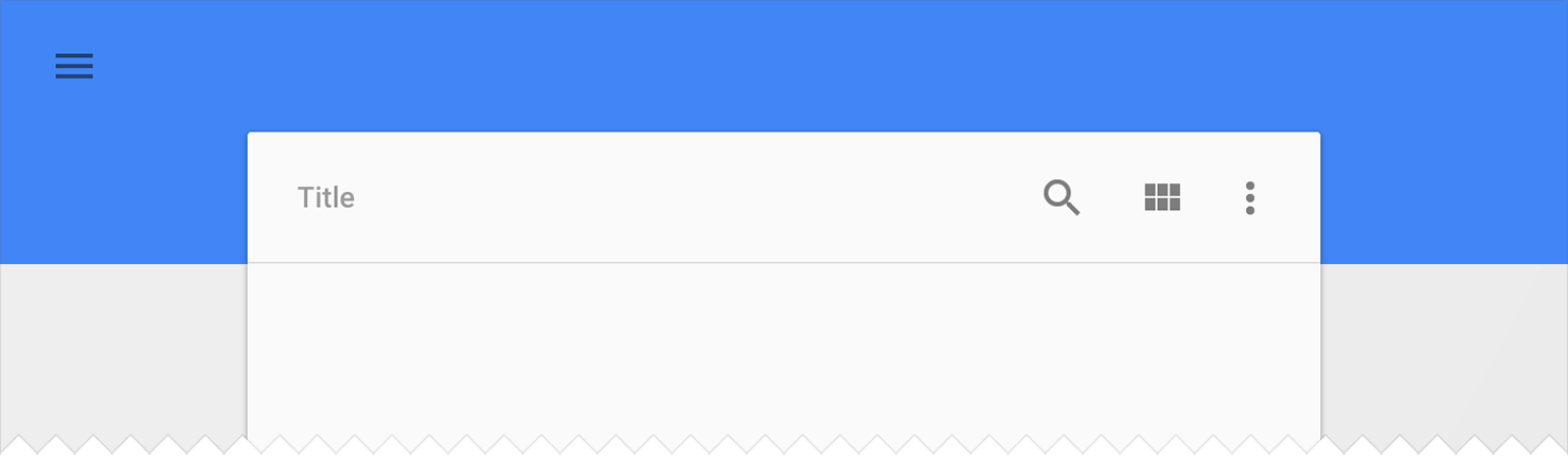
Navigation View
The navigation drawer can be an important focal point for identity and navigation within your app and consistency in the design here can make a considerable difference in how easy your app is to navigate, particularly for first time users. NavigationView makes this easier by providing the framework you need for the navigation drawer as well as the ability to inflate your navigation items through a menu resource.
You use NavigationView as DrawerLayout’s drawer content view with a layout such as:
You’ll note two attributes for NavigationView: app:headerLayout controls the (optional) layout used for the header. app:menu is the menu resource inflated for the navigation items (which can also be updated at runtime). NavigationView takes care of the scrim protection of the status bar for you, ensuring that your NavigationView interacts with the status bar appropriately on API21+ devices.
The simplest drawer menus will be a collection of checkable menu items:
You’ll get callbacks on selected items by setting a OnNavigationItemSelectedListener using setNavigationItemSelectedListener(). This provides you with the MenuItem that was clicked, allowing you to handle selection events, changed the checked status, load new content, programmatically close the drawer, or any other actions you may want.
Floating labels for editing text
Even the humble EditText has room to improve in material design. While an EditText alone will hide the hint text after the first character is typed, you can now wrap it in a TextInputLayout, causing the hint text to become a floating label above the EditText, ensuring that users never lose context in what they are entering.
In addition to showing hints, you can also display an error message below the EditText by calling setError().
Floating Action Button
A floating action button is a round button denoting a primary action on your interface. The Design library’s FloatingActionButton gives you a single consistent implementation, by default colored using the colorAccent from your theme.
In addition to the normal size floating action button, it also supports the mini size (fabSize="mini") when visual continuity with other elements is critical. As FloatingActionButton extends ImageView, you’ll use android:src or any of the methods such as setImageDrawable() to control the icon shown within the FloatingActionButton.
Snackbar
Providing lightweight, quick feedback about an operation is a perfect opportunity to use a snackbar. Snackbars are shown on the bottom of the screen and contain text with an optional single action. They automatically time out after the given time length by animating off the screen. In addition, users can swipe them away before the timeout.
By including the ability to interact with the Snackbar through swiping it away or actions, these are considerably more powerful than toasts, another lightweight feedback mechanism. However, you’ll find the API very familiar:
You’ll note the use of a View as the first parameter to make() - Snackbar will attempt to find an appropriate parent of the Snackbar’s view to ensure that it is anchored to the bottom.
Tabs
Switching between different views in your app via tabs is not a new concept to material design and they are equally at home as a top level navigation pattern or for organizing different groupings of content within your app (say, different genres of music).
The Design library’s TabLayout implements both fixed tabs, where the view’s width is divided equally between all of the tabs, as well as scrollable tabs, where the tabs are not a uniform size and can scroll horizontally. Tabs can be added programmatically:
However, if you are using a ViewPager for horizontal paging between tabs, you can create tabs directly from your PagerAdapter’s getPageTitle() and then connect the two together using setupWithViewPager(). This ensures that tab selection events update the ViewPager and page changes update the selected tab.
CoordinatorLayout, motion, and scrolling
Distinctive visuals are only one part of material design: motion is also an important part of making a great material designed app. While there are a lot of parts of motion in material design including touch ripples and meaningful transitions, the Design library introduces CoordinatorLayout, a layout which provides an additional level of control over touch events between child views, something which many of the components in the Design library take advantage of.
CoordinatorLayout and floating action buttons
A great example of this is when you add a FloatingActionButton as a child of your CoordinatorLayout and then pass that CoordinatorLayout to your Snackbar.make() call - instead of the snackbar displaying over the floating action button, the FloatingActionButton takes advantage of additional callbacks provided by CoordinatorLayout to automatically move upward as the snackbar animates in and returns to its position when the snackbar animates out on Android 3.0 and higher devices - no extra code required.
CoordinatorLayout also provides an layout_anchor attribute which, along with layout_anchorGravity, can be used to place floating views, such as the FloatingActionButton, relative to other views.
CoordinatorLayout and the app bar
The other main use case for the CoordinatorLayout concerns the app bar (formerly action bar) and scrolling techniques. You may already be using a Toolbar in your layout, allowing you to more easily customize the look and integration of that iconic part of an app with the rest of your layout. The Design library takes this to the next level: using an AppBarLayout allows your Toolbar and other views (such as tabs provided by TabLayout) to react to scroll events in a sibling view marked with a ScrollingViewBehavior. Therefore you can create a layout such as:
Now, as the user scrolls the RecyclerView, the AppBarLayout can respond to those events by using the children’s scroll flags to control how they enter (scroll on screen) and exit (scroll off screen). Flags include:
scroll: this flag should be set for all views that want to scroll off the screen - for views that do not use this flag, they’ll remain pinned to the top of the screen
enterAlways: this flag ensures that any downward scroll will cause this view to become visible, enabling the ‘quick return’ pattern
enterAlwaysCollapsed: When your view has declared a minHeight and you use this flag, your View will only enter at its minimum height (i.e., ‘collapsed’), only re-expanding to its full height when the scrolling view has reached it’s top.
exitUntilCollapsed: this flag causes the view to scroll off until it is ‘collapsed’ (its minHeight) before exiting
One note: all views using the scroll flag must be declared before views that do not use the flag. This ensures that all views exit from the top, leaving the fixed elements behind.
Collapsing Toolbars
Adding a Toolbar directly to an AppBarLayout gives you access to the enterAlwaysCollapsed and exitUntilCollapsed scroll flags, but not the detailed control on how different elements react to collapsing. For that, you can use CollapsingToolbarLayout:
This setup uses CollapsingToolbarLayout’s app:layout_collapseMode="pin" to ensure that the Toolbar itself remains pinned to the top of the screen while the view collapses. Even better, when you use CollapsingToolbarLayout and Toolbar together, the title will automatically appear larger when the layout is fully visible, then transition to its default size as it is collapsed. Note that in those cases, you should call setTitle() on the CollapsingToolbarLayout, rather than on the Toolbar itself.
In addition to pinning a view, you can use app:layout_collapseMode="parallax" (and optionally app:layout_collapseParallaxMultiplier="0.7" to set the parallax multiplier) to implement parallax scrolling (say of a sibling ImageView within the CollapsingToolbarLayout). This use case pairs nicely with the app:contentScrim="?attr/colorPrimary" attribute for CollapsingToolbarLayout, adding a full bleed scrim when the view is collapsed.
CoordinatorLayout and custom views
One thing that is important to note is that CoordinatorLayout doesn’t have any innate understanding of a FloatingActionButton or AppBarLayout work - it just provides an additional API in the form of a Coordinator.Behavior, which allows child views to better control touch events and gestures as well as declare dependencies between each other and receive callbacks via onDependentViewChanged().
Views can declare a default Behavior by using the CoordinatorLayout.DefaultBehavior(YourView.Behavior.class) annotation,or set it in your layout files by with the app:layout_behavior="com.example.app.YourView$Behavior" attribute. This framework makes it possible for any view to integrate with CoordinatorLayout.
Available now!
The Design library is available now, so make sure to update the Android Support Repository in the SDK Manager. You can then start using the Design library with a single new dependency:
compile 'com.android.support:design:22.2.0'
Note that as the Design library depends on the Support v4 and AppCompat Support Libraries, those will be included automatically when you add the Design library dependency. We also took care that these new widgets are usable in the Android Studio Layout Editor’s Design view (find them under CustomView), giving you an easier way to preview some of these new components.
The Design library, AppCompat, and all of the Android Support Library are important tools in providing the building blocks needed to build a modern, great looking Android app without building everything from scratch.
When we first announced material design in June 2014, we shared an aspirational highlights reel that demonstrated key material principles for motion, interaction, and visual design across a range of hypothetical apps. “Hypothetical” being the key word here—back then, material design was just an idea. Sure, designers and engineers at Google were already working hard on applying material to Google’s Android, iOS, and web apps, but the notion of a single design system that can work across platforms and brands was just an idea.
Fast-forward to today, and thousands of Android apps are adopting material design using the Android 5.0 SDK and AppCompat, while designers and developers begin to experiment with material design on iOS and the web as well. These apps are starting to realize that aspirational vision we set out with that sizzle reel.
Today, we’re celebrating the amazing design work from Google Play developers and announcing the Material Design Showcase and Material Design Awards.
Of those 18 apps, we’re recognizing 6 with a special award, which we handed out during Google I/O today and announced at the Material Now session hosted by Matias Duarte.
These 6 winners of our first ever Material Design Awards represent best-in-class applications of specific aspects of material design:
B&H Photo Video Audio Pro for Immersive Imagery
New York Times for Elegant Typography
Pocket for Adaptive Layouts
Pocket Casts for Seamless Browsing
Tumblr for Delightful Animation
Weather Timeline for Crafted Simplicity
So today, we have a new highlights reel, featuring these six wonderful and very real apps:
The individuals, teams, and companies behind these apps have made the promise of material design that much more of a reality.
What’s next
But remember, this is only the beginning. We’ll continue to recognize excellent material design in the future, evolving the awards as we evolve material design itself—together as a community.
If you’re a designer or developer just starting out with material design, make sure to check out these 18 apps in the Material Design Showcase. They’re a great source of inspiration, in addition to the awesome content on community sites like Dribbble. And if you’re wondering how to start implementing some of these ideas, get started today with the Creating Apps with Material Design training docs. When you publish your next great app with material design, be sure to let us know on Google+ and Twitter!
We've been in San Francisco talking with the team from The Hunt — a style and product sharing community. They've recently lifted the rate at which Android users start hunts to 20 percent after successfully implementing material design in the app, which is a 30 percent improvement over other platforms. As The Hunt’s Product Designer Jenny Davis puts it, “it felt like having a team of design experts on hand,” which lets them focus on what matters to the Android user.
But as we find out, that's not the whole story. Beta testing — managed from the Google Play Developer Console — also allowed them to iterate design and features daily. Based on feedback, they introduced the floating action button, which helped boost new hunts and helpful responses from the community. This speed and freedom is something the team thought possible only with their mobile website, until they started working with the Android tools.
Watch the video to discover more about how design and rapid iteration has been key to building a strong community.
Learn about using the tools that have helped improve user engagement for The Hunt:
Material design — learn more about material design and how it helps you create beautiful, engaging apps.
Beta testing — discover how to easily deliver test versions of your app to users for feedback before release.
Posted by Trevor Johns, Developer Programs Engineer
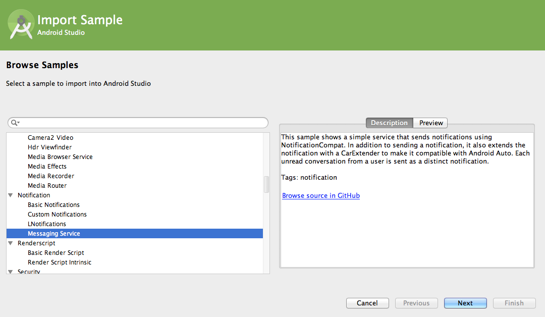
With the launch of Android 5.0 Lollipop, we’ve added more than 20 new code samples demonstrating how to implement some of the great new features of this release. To access the code samples, you can easily import them in Android Studio 1.0 using the new Samples Wizard.
Go to File > Import Sample in order to browse the available samples, which include a description and preview for each. Once you’ve made your selection, select “Next” and a new project will be automatically created for you. Run the project on an emulator or device, and feel free to experiment with the code.
Samples Wizard in Android Studio 1.0
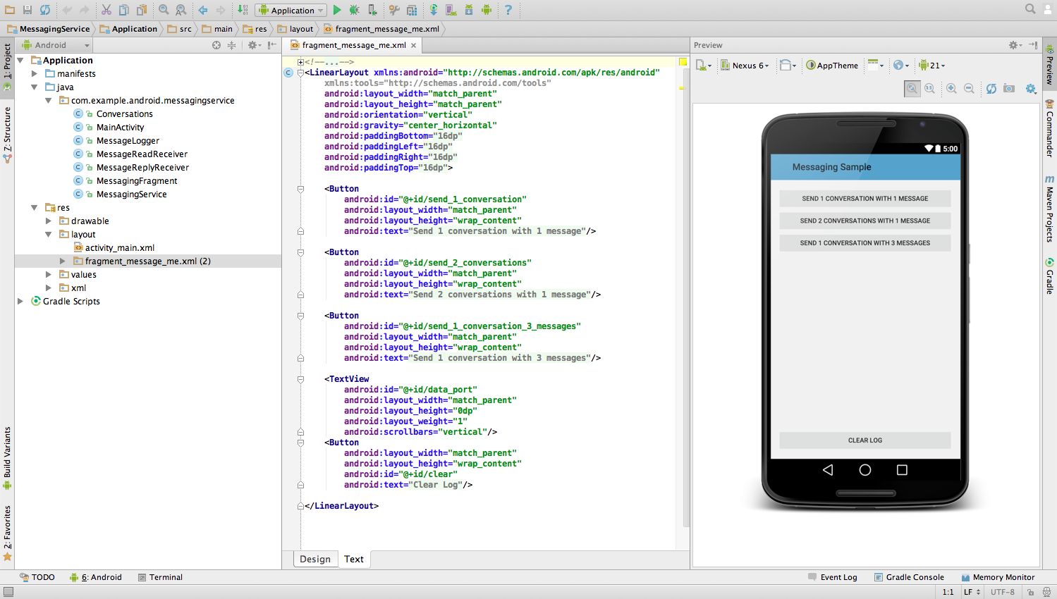
Newly imported sample project in Android Studio
Alternatively, you can browse through them via the Samples browser on the developer site. Each sample has an Overview description, Project page to browse app file structure, and Download link for obtaining a ZIP file of the sample. As a third option, code samples can also be accessed in the SDK Manager by downloading the SDK samples for Android 5.0 (API 21) and importing them as existing projects into your IDE.
Sample demonstrating transition animations
Material Design
When adopting material design, you can refer to our collection of sample code highlighting material elements:
For additional help, please refer to our design checklist, list of key APIs and widgets, and documentation guide.
To view some of these material design elements in action, check out the Google I/O app source code.
Platform
Lollipop brings the most extensive update to the Android platform yet. The Overview screen allows an app to surface multiple tasks as concurrent documents. You can include enhanced notifications with this sample code, which shows you how to use the lockscreen and heads-up notification APIs.
We also introduced a new Camera API to provide developers more advanced image capture and processing capabilities. These samples detail how to use the camera preview and take photos, how to record video, and implement a real-time high-dynamic range camera viewfinder.
Elsewhere, Project Volta encourages developers to make their apps more battery-efficient with new APIs and tools. The JobScheduler sample demonstrates how you can schedule background tasks to be completed later or under specific conditions.
For those interested in the enterprise device administration use case, there are sample apps on setting app restrictions and creating a managed profile.
Android Wear
For Android Wear, we have a speed tracker sample to show how to take advantage of GPS support on wearables. You can browse the rest of the Android Wear samples too, and here are some highlights that demonstrate the unique capabilities of wearables, such as data synchronization, notifications, and supporting round displays:
To try out a game that is specifically optimized for Android TV, download Pie Noon from Google Play. It’s an open-source game developed in-house at Google that supports multiple players using Bluetooth controllers or touch controls on mobile devices.
Since we’ve discussed sample resources for the Android platform and form factors, we also want to mention that there are existing samples for Google Play services. With Google Play services, your app can take advantage of the latest Google-powered APIs such as Maps, Google Fit, Google Cast, and more. Access samples in the Google Play services SDK or visit the individual pages for each API on the developer site. For game developers, you can reference the Google Play Games services samples for how to add achievements, leaderboards, and multiplayer support to your game.
Check out a sample today to help you with your development!
Android 5.0 brings in material design as the new design system for the platform and system apps. Consumers will soon start getting Android 5.0 and they’re already seeing glimpses of material design with apps like Google Play Newsstand, Inbox by Gmail and Tumblr. Meanwhile, developers now have the Android 5.0 SDK, along with AppCompat for backward compatibility. And designers now have access to Photoshop, Illustrator and Sketch templates. All this means that now—yes now!—is the time to start implementing material design in your Android apps. Today, let’s talk about what implementing material design really boils down to.
Below, you’ll find a material design checklist that you can use to mark progress as you implement the new design system. The checklist is divided into 4 key sections based on the 4 key aspects of material design.
If you include a good chunk of the items in the checklist below, especially the ones indicated as signature elements, and follow traditional Android design best practices (i.e. these, these, and things we discussed on ADiA), you’ll be well on your way to material design awesomeness!
Tangible Surfaces
UIs consist of surfaces (pieces of “digital paper”) arranged at varying elevations, casting shadows on surfaces behind them.
Figure 1. Surfaces and layering.
Signature element: Shadows are used to communicate which surfaces are in front of others, helping focus attention and establish hierarchy. Read more on depth and layering in UIs.
In code: This is the android:elevation and android:translationZ attribute in Android 5.0. On earlier versions, shadows are normally provided as PNG assets.
Shadows and surfaces are used in a consistent and structured way. Each shadow indicates a new surface. Surfaces are created thoughtfully and carefully.
There are generally between 2 and 10 surfaces on the screen at once; avoid too much layering/nesting of surfaces.
Scrollable content either scrolls to the edges of the screen or behind another surface that casts a shadow over the content’s surface. Never clip an element against an invisible edge—elements don’t just scroll off into nowhere. Put another way, you rarely scroll the ink on a surface; you scroll the surface itself.
In code: android:clipToPadding=false often helps with this when using ListView and ScrollView.
Surfaces have simple, single-color backgrounds.
A Bold, Print-Like Aesthetic
The “digital ink” you draw on those pieces of digital paper is informed by classic print design, with an emphasis on bold use of color and type, contextual imagery, and structured whitespace.
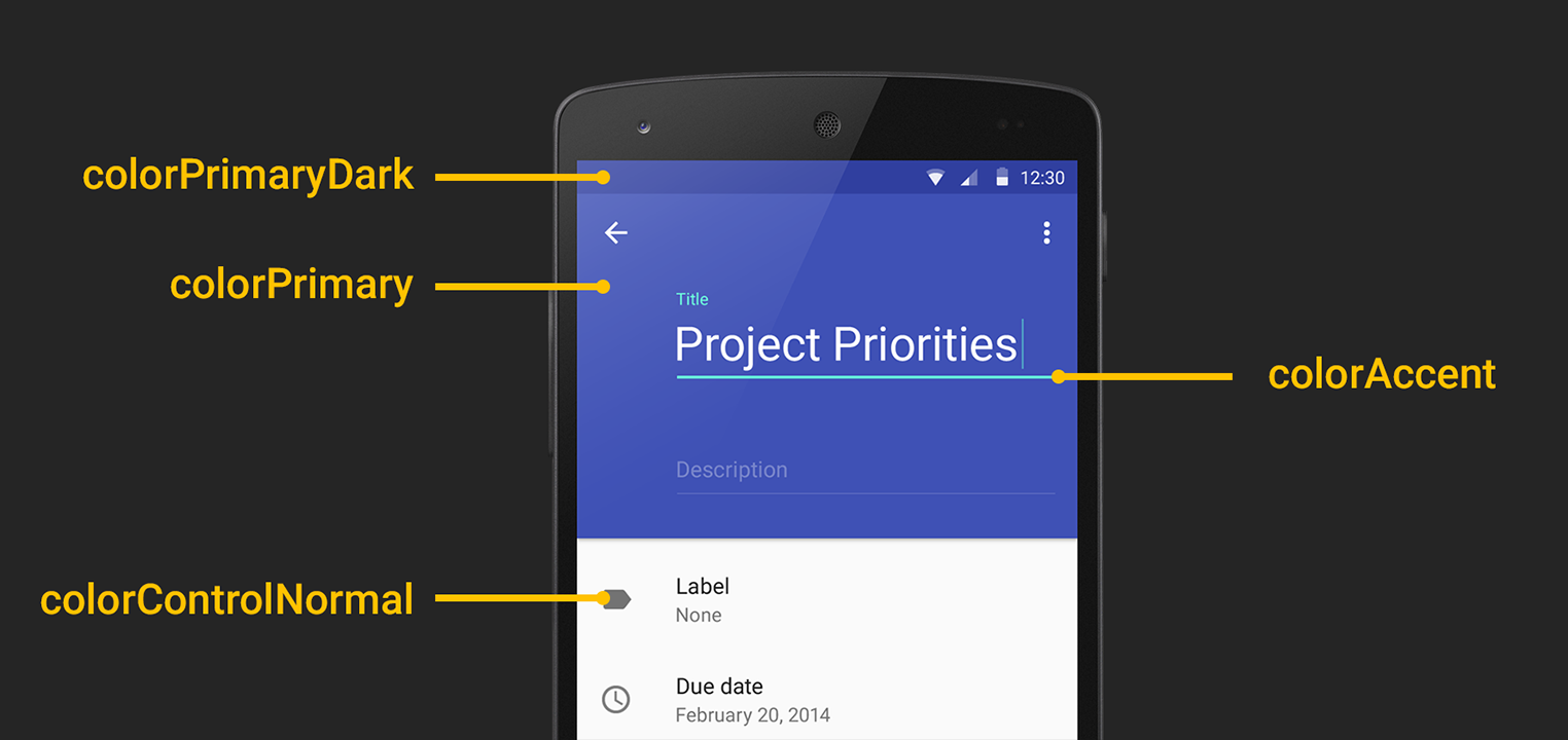
Figure 2. Primary and accent colors. Figure 3. Keylines.
Signature element: Apps use a primary color and an accent color (Figure 2) to color surface backgrounds and key UI widgets such as text fields and checkboxes. The accent color contrasts very well with the primary color (for example an app can use a dark blue primary color and a neon pink accent color). The accent color is high-contrast and is used to call attention to key UI elements, like a circular floating action button, selected tab strips, or form fields.
In code: Set the android:colorPrimary and android:colorAccent attributes in your theme (drop the android prefix if using AppCompat). AppCompat automatically colors text fields, checkboxes, and more on pre-L devices.
Signature element: On Android 5.0, the status bar is colored to match the app’s primary color, or the current screen’s content. For full-bleed imagery, the status bar can be translucent.
In code: Set the android:colorPrimaryDark or android:statusBarColor attribute in your theme (drop the android prefix if using AppCompat) or call Window.setStatusBarColor.
Icons, photos/images, text, and other foreground elements are colored “ink” on their surfaces. They don’t have shadows and don’t use gradients.
Colors extracted from images can be used to color adjacent UI elements or surfaces.
In code: This can be done using the Palette support library.
In code: The new Toolbar widget (and its AppCompat equivalent) can be transparent and placed directly in your layout. For the status bar, check this Stack Overflow post.
Signature element: Where appropriate, elements like body text, thumbnails, app bar titles, etc. are aligned to 3 keylines (Figure 3). On phones, those keylines are 16dp and 72dp from the left edge and 16dp from the right edge of the screen. On tablets those values are 24dp and 80dp.
UI elements are aligned to and sized according to an 8dp baseline grid. For example, app bars are 56dp tall on phones and 64dp tall on tablets. Padding and margins can take on values like 8dp, 16dp, 24dp, etc. More precise text positioning uses a 4dp grid.
Authentic Motion
Motion helps communicate what’s happening in the UI, providing visual continuity across app contexts and states. Motion also adds delight using smaller-scale transitions. Motion isn’t employed simply for motion’s sake.
Figure 4. "Hero" transitions.
In general, UI and content elements don’t just appear or disappear—they animate into place, either together as a unit, or individually.
Signature element: When touching an item to see its details, there’s a “hero” transition (Figure 4) that moves and scales the item between its position in the browsing screen and its position in the detail screen.
In code: These are called “shared element transitions” in the SDK. The support version of FragmentTransaction also includes some shared element support.
Signature element: Ripple effects originating from where you touched the screen are used to show touch feedback on an item.
In code: The default android:selectableItemBackground and android:selectableItemBackgroundBorderless have this, or you can use RippleDrawable (<ripple>) to customize the effect. On pre-5.0 devices, ripples aren’t an expected feature, so defer to the default android:selectableItemBackground behavior.
Signature element: UI elements can appear using a circular “reveal” animation.
In code: See this doc or the ViewAnimationUtils class for more.
Signature element: Animations are used in more subtle, delightful ways, such as to convey the transition between icon states or text states. For example, a “+” icon can morph into an “x” symbol, or an outlined heart icon can be filled using a paint-bucket fill effect.
In code: Icon transitions can be implemented using AnimatedStateListDrawable and its XML counterpart. An example can be found in the Google I/O app source. There’s also support for animated vector icons.
Animations and transitions are fast—generally under 300ms.
Crossfades are often replaced by translate/slide transitions: vertical slides for descendant navigation and horizontal slides for lateral navigation. For slide transitions, prefer quick acceleration and gentle ease-in deceleration over simple linear moves. See the material design spec on motion for more.
Adaptive Design (and UI Patterns)
Tangible surfaces, bold graphic design, and meaningful motion work together to bring a consistent experience across any screen, be it phones, tablets, laptops, desktops, TVs, wearables, or even cars. Additionally, the key UI patterns below help establish a consistent character for the app across devices.
In material design, detail screens are often presented as popups that appear using “hero” transitions (see above).
In multi-pane layouts, the app can use multiple toolbars to place actions contextually next to their related content.
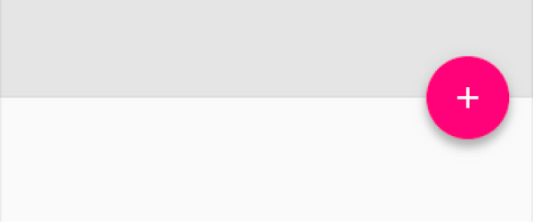
Signature element: Where appropriate, the app promotes the key action on a screen using a circular floating action button (FAB). The FAB (Figure 5) is a circular surface, so it casts a shadow. It is colored with a bright, accent color (see above). It performs a primary action such as send, compose, create, add, or search. It floats in front of other surfaces, and is normally at an 8dp elevation. It frequently appears at the bottom right of the screen, or centered on an edge where two surfaces meet (a seam or a step).
App bar
Signature element: The app uses a standard Android app bar. The app bar doesn’t have an app icon. Color and typography are used for branding instead. The app bar casts a shadow (or has a shadow cast on it by a surface below and behind it). The app bar normally has a 4dp elevation.
In code: Use the new Toolbar widget in Android 5.0 that is placed directly into the activity’s view hierarchy. AppCompat also provides android.support.v7.widget.Toolbar, which supports all modern platform versions.
The app bar might be for example 2 or 3 times taller than the standard height; on scroll, the app bar can smoothly collapse into its normal height.
App bar titles align to the 2nd keyline (see more info on keylines above)
In code: when using the Toolbar widget, use the android:contentInsetStart attribute.
Where appropriate, upon scrolling down, the app bar can scroll off the screen, leaving more vertical space for content. Upon scrolling back up, the app bar should be shown again.
Tabs
Figure 6. Tabs with material design.
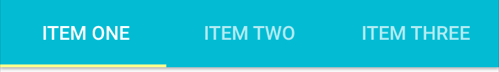
Signature element: Tabs follow the newer material design interactions and styling (Figure 6). There are no vertical separators between tabs. If the app uses top-level tabs, tabs are visually a part of the app bar; tabs are a part of the app bar’s surface.
Tabs should support a swipe gesture for moving between them.
In code: All tabs should be swipeable using the ViewPager widget, which is available in the support library.
Selected tabs are indicated by a foreground color change and/or a small strip below the tab text (or icon) colored with an accent color. The tab strip should smoothly slide as you swipe between tabs.
Navigation drawer
Figure 7. Navigation drawers with material design.
Signature element: If the app uses a navigation drawer, it follows the newer material design interactions and styling (Figure 7). The drawer appears in front of the app bar. It also appears semitransparent behind the status bar.
In code: Implement drawers using the DrawerLayout widget from the support library, along with the new Toolbar widget discussed above. See this Stack Overflow post for more.
Signature element: The leftmost icon in the app bar is a navigation drawer indicator; the app icon is not visible in the app bar. Optionally, on earlier versions of the platform, if the app has a drawer, the top-left icon can remain the app icon and narrower drawer indicator, as in Android 4.0.
The drawer is a standard width: No wider than 320dp on phones and 400dp on tablets, but no narrower than the screen width minus the standard toolbar height (360dp - 56dp = 304dp on the Nexus 5)
Item heights in the drawer follow the baseline grid: 48dp tall rows, 8dp above list sections and 8dp above and below dividers.
Text and icons should follow the keylines discussed above.
More and more apps from Google and across the Google Play ecosystem will be updating with material design soon, so expect Winter 2014 to be a big quarter for design on Android. For more designer resources on material design, check out the DesignBytes series. For additional developer resources, check the Creating Apps with Material Design docs!
Material design is a comprehensive approach to visual, interaction and motion design for the multi-screen world. Android 5.0 Lollipop and the updated support libraries help you to create material UIs. Here’s a rundown of some of the major elements of material design and the APIs and widgets that you can use to implement them in your app.
Tangible surfaces
In material design, UIs are composed of pieces of digital paper & ink. The surfaces and the shadows they cast provide visual cues to the structure of the application, what you can touch and how it will move. This digital material can move, expand and reform to create flexible UIs.
Shadows
A surface’s position and depth result in subtle changes in lighting and shadows. The new elevation property lets you specify a view’s position on the Z-axis and the framework then casts a real-time dynamic shadow on items behind it. You can set the elevation declaratively in your layouts, defined in dips:
<ImageView …
    android:elevation="8dp" />
You can also set this from code using getElevation()/setElevation() (with shims in ViewCompat). The shadow a view casts is defined by its outline, which by default is derived from its background. For example if you set a circular shape drawable as the background for a floating action button, then it would cast an appropriate shadow. If you need finer control of a view’s shadow, you can set a ViewOutlineProvider which can customise the Outline in getOutline().
Cards
Cards are a common pattern for creating surfaces holding a distinct piece of information. The new CardView support library allows you to create them easily, providing outlines and shadows for you (with equivalent behaviour on prior platforms).
<android.support.v7.widget.CardView
    android:layout_width="match_parent"
    android:layout_height="wrap_content">
    <!-- Your card content -->

</android.support.v7.widget.CardView>
CardView extends FrameLayout and provides default elevation and corner radius for you so that cards have a consistent appearance across the platform. You can customise these via the cardElevation and cardCornerRadius attributes, if required. Note that Cards are not the only way of achieving dimensionality and you should be wary of over-cardifying your UI!
Print-like Design
Material utilises classic principles from print design to create clean, simple layouts that put your content front and center. Bold deliberate color choices, intentional whitespace, tasteful typography and a strong baseline grid create hierarchy, meaning and focus.
Typography
Android 5.0 updates the system font Roboto to beautifully and clearly display text no matter the display size. A new medium weight has been added (android:fontFamily=”sans-serif-medium”) and new TextAppearance styles implement the recommended typographic scale for balancing content density and reading comfort. For instance you can easily use the ‘Title’ style by setting android:textAppearance=”@android:style/TextAppearance.Material.Title”. These styles are available on older platforms through the AppCompat support library, e.g. “@style/TextAppearance.AppCompat.Title”.
Color
Your application’s color palette brings branding and personality to your app so we’ve made it simple to colorize UI controls by using the following theme attributes:
colorPrimary. The primary branding color for the app; used as the action bar background, recents task title and in edge effects.
colorAccent. Vibrant complement to the primary branding color. Applied to framework controls such as EditText and Switch.
colorPrimaryDark. Darker variant of the primary branding color; applied to the status bar.
Further attributes give fine grained control over colorizing controls, see: colorControlNormal, colorControlActivated, colorControlHighlight, colorButtonNormal, colorSwitchThumbNormal, colorEdgeEffect, statusBarColor and navigationBarColor.
AppCompat provides a large subset of the functionality above, allowing you to colorize controls on pre-Lollipop platforms.
Dynamic color
Material Design encourages dynamic use of color, especially when you have rich images to work with. The new Palette support library lets you extract a small set of colors from an image to style your UI controls to match; creating an immersive experience. The extracted palette will include vibrant and muted tones as well as foreground text colors for optimal legibility. For example:
Palette.generateAsync(bitmap,
        new Palette.PaletteAsyncListener() {
    @Override
    public void onGenerated(Palette palette) {
         Palette.Swatch vibrant =
                 palette.getVibrantSwatch();
          if (swatch != null) {
              // If we have a vibrant color
              // update the title TextView
              titleView.setBackgroundColor(
                  vibrant.getRgb());
              titleView.setTextColor(
                  vibrant.getTitleTextColor());
          }
    }
});
Authentic Motion
Tangible surfaces don’t just appear out of nowhere like a jump-cut in a movie; they move into place helping to focus attention, establish spatial relationships and maintain continuity. Materials respond to touch to confirm your interaction and all changes radiate outward from your touch point. All motion is meaningful and intimate, aiding the user’s comprehension.
Activity + Fragment Transitions
By declaring ‘shared elements’ that are common across two screens you can create a smooth transition between the two states.
album_grid.xml
…
    <ImageView
        …
        android:transitionName="@string/transition_album_cover" />
album_details.xml
…
    <ImageView
        …
        android:transitionName="@string/transition_album_cover" />

AlbumActivity.java
Intent intent = new Intent();
String transitionName = getString(R.string.transition_album_cover);
…
ActivityOptionsCompat options =
ActivityOptionsCompat.makeSceneTransitionAnimation(activity,
    albumCoverImageView,   // The view which starts the transition
    transitionName    // The transitionName of the view we’re transitioning to
    );
ActivityCompat.startActivity(activity, intent, options.toBundle());
Here we define the same transitionName in two screens. When starting the new Activity and this transition is animated automatically. In addition to shared elements, you can now also choreograph entering and exiting elements.
Ripples
Materials respond to users’ touch with an ink ripple surface reaction. Interactive controls such as Buttons exhibit this behaviour by default when you use or inherit from Theme.Material (as will ?android:selectableItemBackground). You can add this feedback to your own drawables by simply wrapping them in a ripple element:
Custom views should propagate touch location down to their drawables in the View#drawableHotspotChanged callback so that the ripple can start from the touch point.
StateListAnimator
Materials also respond to touch by raising up to meet your finger, like a magnetic attraction. You can achieve this effect by animating the translationZ attribute which is analogous to elevation but intended for transient use; such that Z = elevation + translationZ. The new stateListAnimator attribute allows you to easily animate the translationZ on touch (Buttons do this by default):
A hallmark material transition for showing new content is to reveal it with an expanding circular mask. This helps to reinforce the user’s touchpoint as the start of all transitions, with its effects radiating outward radially. You can implement this using the following Animator:
Animator reveal = ViewAnimationUtils.createCircularReveal(
                    viewToReveal, // The new View to reveal
                    centerX,      // x co-ordinate to start the mask from
                    centerY,      // y co-ordinate to start the mask from
                    startRadius,  // radius of the starting mask
                    endRadius);   // radius of the final mask
reveal.start();
Interpolators
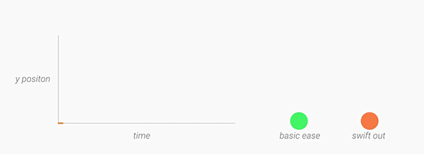
Motion should be deliberate, swift and precise. Unlike typical ease-in-ease-out transitions, in Material Design, objects tend to start quickly and ease into their final position. Over the course of the animation, the object spends more time near its final destination. As a result, the user isn’t left waiting for the animation to finish, and the negative effects of motion are minimized. A new fast-in-slow-out interpolator has been added to achieve this motion.
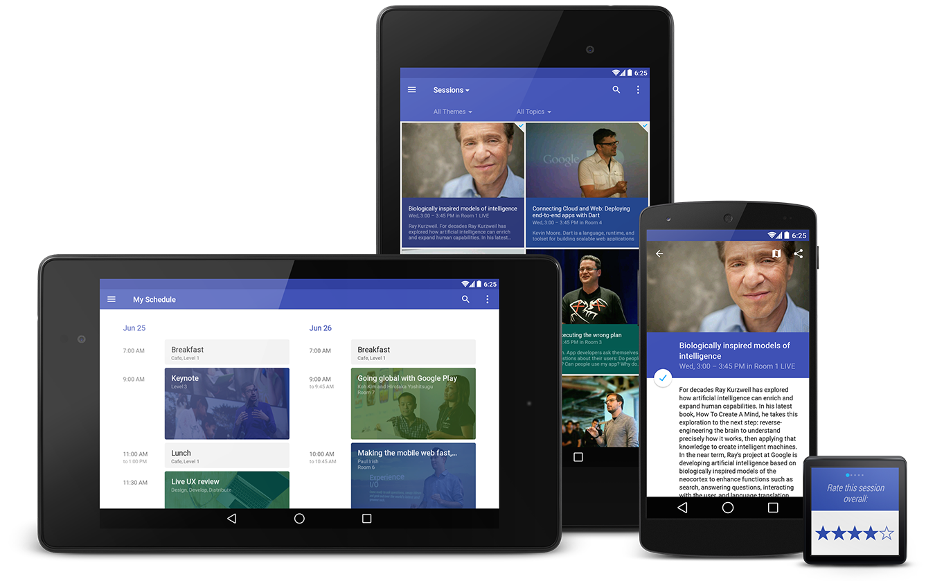
Our final core concept of material is creating a single adaptive design that works across devices of all sizes and shapes, from watches to giant TVs. Adaptive design techniques help us realize the vision that each device reflects a different view of the same underlying system. Each view is tailored to the size and interaction appropriate for that device. Colors, iconography, hierarchy, and spatial relationships remain constant. The material design system provides flexible components and patterns to help you build a design that scales.
Toolbar
The toolbar is a generalization of the action bar pattern, providing similar functionality, but much more flexibility. Unlike the standard action bar, toolbar is a view in your hierarchy just like any other, so you can place instances wherever you like, interleave them with the rest of your views, animate, react to scroll events and so on. You can make the Toolbar act as your Activity’s Action Bar by calling Activity.setActionBar().
In this example, the blue toolbar is an extended height, overlaid by the screen content and provides the navigation button. Note that two further toolbars are used in the list and detail views.
For details of implementing toolbars, see this post.
Go Forth and Materialize
Material Design helps you to build understandable, beautiful and adaptive apps, which are alive with motion. Hopefully, this post has inspired you to apply these principles to your app and signposted some of the new (and compatibility) APIs to achieve this.
Last week, we unveiled the Nexus 6 and Nexus 9, the newest additions to our Nexus family that will ship with Android 5.0 Lollipop. Together, they deliver a pure Google experience, showcasing fresh visual styles with material design, improved performance, and additional features.
Let’s make sure your apps and games are optimized to give your users the best mobile experience on these devices. We’ve outlined some best practices below.
Nexus 6
Screen
The Nexus 6 boasts an impressive 5.96” Quad HD screen display at a resolution of 2560 x 1440 (493 ppi). This translates to ~ 730 x 410 dp (density independent pixels).
Check your assets
It has a quantized density of 560 dpi, which falls in between the xxhdpi and xxxhdpi primary density buckets. For the Nexus 6, the platform will scale down xxxhdpi assets, but if those aren’t available, then it will scale up xxhdpi assets.
Provide at least an xxxhdpi app icon because devices can display large app icons on the launcher. It’s best practice to place your app icons in mipmap- folders (not the drawable- folders) because they are used at resolutions different from the device’s current density. For example, an xxxhdpi app icon can be used on the launcher for an xxhdpi device.
res/
   mipmap-mdpi/
      ic_launcher.png
   mipmap-hdpi/
      ic_launcher.png
   mipmap-xhdpi/
      ic_launcher.png
   mipmap-xxhdpi/
      ic_launcher.png
   mipmap-xxxhdpi/
      ic_launcher.png  # App icon used on Nexus 6 device launcher
Choosing to add xxxhdpi versions for the rest of your assets will provide a sharper visual experience on the Nexus 6, but does increase apk size, so you should make an appropriate decision for your app.
res/
   drawable-mdpi/
      ic_sunny.png
   drawable-hdpi/
      ic_sunny.png
   drawable-xhdpi/
      ic_sunny.png
   drawable-xxhdpi/  # Fall back to these if xxxhdpi versions aren’t available
      ic_sunny.png
   drawable-xxxhdpi/ # Higher resolution assets for Nexus 6
      ic_sunny.png
Make sure you are not filtered on Google Play
If you are using the <compatible-screens> element in the AndroidManifest.xml file, you should stop using it because it’s not scalable to re-compile and publish your app each time new devices come out. However, if you must use it, make sure to update the manifest to add the configuration for these devices (by screen size and density). Otherwise your app may be excluded from Google Play search results on these devices.
Nexus 9
Screen
The Nexus 9 is a premium 8.9” tablet with a screen size of 2048 x 1536 pixels (288 ppi), which translates to 1024 x 768 dip. This is a 4:3 aspect ratio, which is unique compared to earlier tablets. The Nexus 9 falls into the xhdpi density bucket, and you should already have assets in the drawable-xhdpi folder.
Updated Material Design Wall Street Journal app on Nexus 9.
Enable NDK apps for 64-bit
The Nexus 9 runs on a 64-bit Dual Core processor, which makes it the first Android device to ship with a 64-bit ARM instruction set. Support for 64-bit processors was just added in Android 5.0, so if you have an NDK app, enable it by updating the APP_ABI value in your Application.mk file:
APP_ABI := armeabi armeabi-v7a arm64-v8a x86 x86_64 mips mips64
More detailed instructions are provided in the developer site. You can test your 64-bit enabled app on a physical device with a 64-bit processor running Android 5.0, or take advantage of the recently announced 64-bit emulator in Android Studio.
Update your hardware keyboard support
The Nexus 9 Keyboard Folio will be available as an accessory in Google Play. It’s very important that you don’t lock your app to a single orientation. The Nexus 9’s natural orientation is portrait mode, while it’s used in landscape mode with the keyboard. If you lock to the device’s natural orientation, the app may appear sideways for devices with keyboards.
Users should be able to navigate around the main content of the app with the keyboard, while relying on touch input or keyboard shortcuts for toolbar actions and button bars. Therefore, ensure that your app has proper keyboard navigation and shortcuts for primary actions. Keyboard shortcuts that are invoked with Ctrl + [shortcut] combo can be defined via menu items using:
In MainActivity.java:

@Override
public boolean onKeyShortcut(int keyCode, KeyEvent event) {
    switch (keyCode) {
        case KeyEvent.KEYCODE_R:
            Toast.makeText(this, "Reply", Toast.LENGTH_SHORT).show();
            return true;
        default:
            return super.onKeyShortcut(keyCode, event);
    }
}
Responsive layouts with w- and sw- qualifiers
In order to take advantage of the screen real estate on the Nexus 6 and Nexus 9, we emphasize the importance of responsive design. In the past, if you assumed that landscape mode is significantly wider than portrait mode, you may run into problems on a device like the Nexus 9, which has an aspect ratio of 4:3. Instead of declaring layouts using the layout-land or layout-port resource folder qualifiers, we strongly recommend switching to the w<N>dpwidth resource folder qualifier so that content is laid out based on available screen width.
Think about content first and foremost. Decide on min and max screen real estate that your content requires, and determine cutoff points at different screen widths where you can modify the layout composition for your app (# of grid columns, multi-pane layout, etc…).
For example, a single pane layout for your main activity on phones can be defined in:
res/layout/activity_main.xml
On larger screen devices, where the current orientation is at least 600dp in width, a new two-pane layout with a list alongside a detail pane could be declared in:
res/layout-w600dp/activity_main.xml
On even larger screen devices, where the current orientation is at least 720dp in width, a new multi-pane layout where the detail pane requires even more horizontal space could be declared in:
res/layout-w720dp/activity_main.xml
As for attributes based on form factor, instead of declaring them in values-large or values-xlarge resource directories, use the sw<N>dpsmallest width qualifier. For example, you could style your TextViews to have a medium font size on phones.
In res/values/styles.xml:

<style name="DescriptionTextStyle">
  <item name="android:textAppearance">?android:attr/textAppearanceMedium</item>
</style>
Meanwhile, TextViews could have a large font size when the smallest width of the device (taking the minimum of the landscape and portrait widths) is 600dp or wider. This ensures the font size of your app doesn’t change when you rotate this large screen device.
In res/values-sw600dp/styles.xml:

<style name="DescriptionTextStyle">
  <item name="android:textAppearance">?android:attr/textAppearanceLarge</item>
</style>
Nexus 6 and Nexus 9 users will be immersed in the new world of material design, and they’ll expect the same seamless transitions, bold colors, and delightful details from your app. As you invest time in bringing your app up to date with our latest design language, there’s a whole host of resources to help you make the leap, including important new updates to the support library, videos, and a getting started guide. Good luck and we can’t wait to see your apps!
The Android 5.0 SDK was released last Friday, featuring new UI widgets and material design, our visual language focused on good design. To enable you to bring your latest designs to older Android platforms we have expanded our support libraries, including a major update to AppCompat, as well as new RecyclerView, CardView and Palette libraries.
In this post we'll take a look at what’s new in AppCompat and how you can use it to support material design in your apps.
What's new in AppCompat?
AppCompat (aka ActionBarCompat) started out as a backport of the Android 4.0 ActionBar API for devices running on Gingerbread, providing a common API layer on top of the backported implementation and the framework implementation. AppCompat v21 delivers an API and feature-set that is up-to-date with Android 5.0
In this release, Android introduces a new Toolbar widget. This is a generalization of the Action Bar pattern that gives you much more control and flexibility. Toolbar is a view in your hierarchy just like any other, making it easier to interleave with the rest of your views, animate it, and react to scroll events. You can also set it as your Activity’s action bar, meaning that your standard options menu actions will be display within it.
You’ve likely already been using the latest update to AppCompat for a while, it has been included in various Google app updates over the past few weeks, including Play Store and Play Newsstand. It has also been integrated into the Google I/O Android app, pictured above, which is open-source.
Setup
If you’re using Gradle, add appcompat as a dependency in your build.gradle file:
If you are not currently using AppCompat, or you are starting from scratch, here's how to set it up:
All of your Activities must extend from ActionBarActivity, which extends from FragmentActivity from the v4 support library, so you can continue to use fragments.
All of your themes (that want an Action Bar/Toolbar) must inherit from Theme.AppCompat. There are variants available, including Light and NoActionBar.
When inflating anything to be displayed on the action bar (such as a SpinnerAdapter for list navigation in the toolbar), make sure you use the action bar’s themed context, retrieved via getSupportActionBar().getThemedContext().
You must use the static methods in MenuItemCompat for any action-related calls on a MenuItem.
For more information, see the Action Bar API guide which is a comprehensive guide on AppCompat.
Migration from previous setup
For most apps, you now only need one theme declaration, in values/:
values/themes.xml:

<style name="Theme.MyTheme" parent="Theme.AppCompat.Light">
    <!-- Set AppCompat’s actionBarStyle -->
    <item name="actionBarStyle">@style/MyActionBarStyle</item>

    <!-- Set AppCompat’s color theming attrs -->
    <item name=”colorPrimary”>@color/my_awesome_red</item>
    <item name=”colorPrimaryDark”>@color/my_awesome_darker_red</item>

    <!-- The rest of your attributes -->
</style>
You can now remove all of your values-v14+ Action Bar styles.
values/themes.xml:

<style name="Theme.MyTheme" parent="Theme.AppCompat.Light">
    <!-- colorPrimary is used for the default action bar background -->
    <item name=”colorPrimary”>@color/my_awesome_color</item>

    <!-- colorPrimaryDark is used for the status bar -->
    <item name=”colorPrimaryDark”>@color/my_awesome_darker_color</item>

    <!-- colorAccent is used as the default value for colorControlActivated,
         which is used to tint widgets -->
    <item name=”colorAccent”>@color/accent</item>

    <!-- You can also set colorControlNormal, colorControlActivated
         colorControlHighlight, and colorSwitchThumbNormal. -->

</style>
When you set these attributes, AppCompat automatically propagates their values to the framework attributes on API 21+. This automatically colors the status bar and Overview (Recents) task entry.
On older platforms, AppCompat emulates the color theming where possible. At the moment this is limited to coloring the action bar and some widgets.
Widget tinting
When running on devices with Android 5.0, all of the widgets are tinted using the color theme attributes we just talked about. There are two main features which allow this on Lollipop: drawable tinting, and referencing theme attributes (of the form ?attr/foo) in drawables.
AppCompat provides similar behaviour on earlier versions of Android for a subset of UI widgets:
Everything provided by AppCompat’s toolbar (action modes, etc)
You don’t need to do anything special to make these work, just use these controls in your layouts as usual and AppCompat will do the rest (with some caveats; see the FAQ below).
Toolbar Widget
Toolbar is fully supported in AppCompat and has feature and API parity with the framework widget. In AppCompat, Toolbar is implemented in the android.support.v7.widget.Toolbar class. There are two ways to use Toolbar:
Use a Toolbar as an Action Bar when you want to use the existing Action Bar facilities (such as menu inflation and selection, ActionBarDrawerToggle, and so on) but want to have more control over its appearance.
Use a standalone Toolbar when you want to use the pattern in your app for situations that an Action Bar would not support; for example, showing multiple toolbars on the screen, spanning only part of the width, and so on.
Action Bar
To use Toolbar as an Action Bar, first disable the decor-provided Action Bar. The easiest way is to have your theme extend from Theme.AppCompat.NoActionBar (or its light variant).
Second, create a Toolbar instance, usually via your layout XML:
The height, width, background, and so on are totally up to you; these are just good examples. As Toolbar is just a ViewGroup, you can style and position it however you want.
Then in your Activity or Fragment, set the Toolbar to act as your Action Bar:
From this point on, all menu items are displayed in your Toolbar, populated via the standard options menu callbacks.
Standalone
The difference in standalone mode is that you do not set the Toolbar to act as your action bar. For this reason, you can use any AppCompat theme and you do not need to disable the decor-provided Action Bar.
In standalone mode, you need to manually populate the Toolbar with content/actions. For instance, if you want it to display actions, you need to inflate a menu into it:
@Override
public void onCreate(Bundle savedInstanceState) {
    super.onCreate(savedInstanceState);
    setContentView(R.layout.blah);

    Toolbar toolbar = (Toolbar) findViewById(R.id.my_awesome_toolbar);

    // Set an OnMenuItemClickListener to handle menu item clicks
    toolbar.setOnMenuItemClickListener(new Toolbar.OnMenuItemClickListener() {
        @Override
        public boolean onMenuItemClick(MenuItem item) {
            // Handle the menu item
            return true;
        }
    });

    // Inflate a menu to be displayed in the toolbar
    toolbar.inflateMenu(R.menu.your_toolbar_menu);
}
There are many other things you can do with Toolbar. For more information, see the Toolbar API reference.
Styling
Styling of Toolbar is done differently to the standard action bar, and is set directly onto the view.
Here's a basic style you should be using when you're using a Toolbar as your action bar:
The app:theme declaration will make sure that your text and items are using solid colors (i.e 100% opacity white).
DarkActionBar
You can style Toolbar instances directly using layout attributes. To achieve a Toolbar which looks like 'DarkActionBar' (dark content, light overflow menu), provide the theme and popupTheme attributes:
AppCompat offers Lollipop’s updated SearchView API, which is far more customizable and styleable (queue the applause). We now use the Lollipop style structure instead of the old searchView* theme attributes.
You do not need to set all (or any) of these, the defaults will work for the majority of apps.
Toolbar is coming...
Hopefully this post will help you get up and running with AppCompat and let you create some awesome material apps. Let us know in the comments/G+/Twitter if you’re have questions about AppCompat or any of the support libraries, or where we could provide more documentation.
FAQ
Why is my EditText (or other widget listed above) not being tinted correctly on my pre-Lollipop device?
The widget tinting in AppCompat works by intercepting any layout inflation and inserting a special tint-aware version of the widget in its place. For most people this will work fine, but I can think of a few scenarios where this won’t work, including:
You have your own custom version of the widget (i.e. you’ve extended EditText)
You are creating the EditText without a LayoutInflater (i.e., calling new EditText()).
The special tint-aware widgets are currently hidden as they’re an unfinished implementation detail. This may change in the future.
Why has X widget not been material-styled when running on pre-Lollipop?
Only some of the most common widgets have been updated so far. There are more coming in future releases of AppCompat.
Why does my Action Bar have a shadow on Android Lollipop? I’ve set android:windowContentOverlay to null.
On Lollipop, the action bar shadow is provided using the new elevation API. To remove it, either call getSupportActionBar().setElevation(0), or set the elevation attribute in your Action Bar style.
Why are there no ripples on pre-Lollipop?
A lot of what allows RippleDrawable to run smoothly is Android 5.0’s new RenderThread. To optimize for performance on previous versions of Android, we've left RippleDrawable out for now.
How do I use AppCompat with Preferences?
You can continue to use PreferenceFragment in your ActionBarActivity when running on an API v11+ device. For devices before that, you will need to provide a normal PreferenceActivity which is not material-styled.


 UIs consist of surfaces (pieces of “digital paper”) arranged at varying elevations, casting shadows on surfaces behind them.

 The “digital ink” you draw on those pieces of digital paper is informed by classic print design, with an emphasis on bold use of color and type, contextual imagery, and structured whitespace.


 Motion helps communicate what’s happening in the UI, providing visual continuity across app contexts and states. Motion also adds delight using smaller-scale transitions. Motion isn’t employed simply for motion’s sake.
 Tangible surfaces, bold graphic design, and meaningful motion work together to bring a consistent experience across any screen, be it phones, tablets, laptops, desktops, TVs, wearables, or even cars. Additionally, the key UI patterns below help establish a consistent character for the app across devices.


.gif)


