Tag Archives: Fonts

Say Hello to our big new Japanese collection with Zen Fonts: Learn about the complex beauty of Japanese fonts


日本語で記事を読む

By Min-Young Kim

In 2019, Google Fonts started an ambitious project to expand its font library with a variety of typeface designs for Japanese. At that point Google Fonts had fewer than 10 Japanese families, most of which were basic Mincho (serif) and gothic (sans) designs. Since then the collection of Japanese fonts within the library has grown, now with 38 font families from 18 designers, in a variety of styles – from formal text types to fun display fonts. All these Japanese fonts are now live on Google Fonts for anyone to test out and use in any project.

A featured image in the Zen font family in light purple, green, red, and light brown, with black shapes and lines, and the name of the Zen font
The Zen Fonts collection is the largest set of Japanese fonts on Google Fonts
As part of this larger effort to expand Japanese offerings, Google Fonts collaborated with type designer Yoshimichi Ohira to open his prestigious collection of Zen Fonts typefaces to the public. With 23 Japanese and three Latin fonts in various styles of mincho (serif), gothic (sans serif), maru (rounded), and display styles, the Zen Fonts collection is now the largest set of Japanese fonts in Google Fonts’ expansive library, and is also available in Adobe Fonts. Check out The Story of Zen Fonts - interview with Yoshimichi Ohira to learn more.


Four lines of Japanese text with labels for “Katakana,” “Hiragana,” “Kanji,” and “Japanese Punctuation
Different kinds of scripts are used to write in Japanese

Understanding the culture of Japanese fonts

Japanese fonts have unique features and systems that aren’t seen in other Asian scripts. To understand, evaluate, develop, and release quality fonts for partners and users, the Google Fonts team needed to learn about and respect this unique typography culture. As a typography consultant, I developed a new evaluation criteria for Google Fonts that included all the important characteristics of good Japanese fonts.


Japanese is a complicated script

Japanese is a melting pot of scripts! There are five scripts most commonly used today in Japan. The first can be traced back more than a thousand years to China, when Japanese people borrowed Chinese characters to write their language. These Chinese characters are called “Kanji” in Japan. In the 1100s, the Japanese developed much simpler forms of letters called Kana. There are two sets of Kana, Hiragana, and Katakana; Hiragana is used for Japanese words, while Katakana is an alternative to Hiragana used for foreign or unfamiliar words. Kanji, Hiragana, and Katakana were used together to write Japanese text for hundreds of years. In recent centuries, Japanese people also adopted Arabic numerical figures and the Latin script, which is commonly used for English or other European languages—similar to many other places around the world. The very best Japanese fonts support all these writing systems, but many excellent Japanese fonts may have limited or zero Kanji characters.


What a big character set!

Compared to Latin fonts made for European language users, Japanese fonts with Kanji typically contain a huge number of characters—the biggest common standard for Japanese character sets spans over 23,000 glyphs. Not only do Japanese typeface designers have many glyphs to draw, but they must also handle many different kinds of character sets. There are also various different standards for categorizing.   


Kanji sets: Adobe, JIS, Jōyō, and educational Kanji

The Japanese Industrial Standards (JIS) system, with its four levels, is a popular way to categorize Kanji characters. “Name Kanji” are used specifically for names of places and people, and each of the JIS levels has a different selection of them. “Educational Kanji” is the smallest Kanji set, which includes Kanji that are taught in elementary schools, divided into 6 levels. “Jōyō” means “usual usage” and refers to the 2,136 Kanji that are used in official documents or news broadcasts, which people learn up until the end of high school. 


Many Japanese fonts support Adobe’s Japanese character sets. The Adobe Japan 1-3 set (with 9,354 glyphs) is perhaps the most common, while the Adobe-Japan 1-6 set is the biggest. 


These are related to the JIS levels, such as the Adobe-Japan 1-3 character set matching the JIS level 2. These contain all the Kanji used in everyday life, plus some more specific, yet common ones. Adobe-Japan 1-6 supports all four levels of JIS Kanji and enables texts for any occasion in Japan.


  • JIS Level 1:  With a foundation of 2,965 characters, this level includes the “educational Kanji” and “Jōyō Kanji” groups.

  • JIS level 2: With the addition of 3,390 Kanji to the Level 1 set, Level 2 covers all the most commonly used characters in everyday Japanese life. It also matches the Adobe-Japan 1-3 character set.

  • JIS Level 3: This matches Adobe-Japan 1-4 with an additional  1,259 characters, but is a midway to a wider range of Kanji expression; many recently-developed Japanese fonts cover either JIS level 2 or 4.

  • JIS Level 4: This is the JIS Kanji classification level with the biggest character set. Most of the 2,436 Kanji included here are rarely seen in daily life but are still needed for formal publications and government-related texts to address specific words or names.


JIS Level 1 contains simple Kanjis, while JIS Level 4 Kanjis are more complex and consist of more strokes.
The higher the JIS level is, the more often complicated and rare Kanjis are included


In working to publish new font families in the Japanese font development programme, we had to juggle an enormous number of characters. Most font families passed the bar set by the Adobe-Japan 1-3 standard—as that is commonly used as a minimal “full set”—while some fonts had coverage of JIS level 3. Some supported only the Educational Kanji.


Four lines of text displaying the variety of different character types
Japanese fonts with the different kinds of character sets available on Google Fonts

Alternative Kanji glyphs

Kanji can have alternative glyphs and there are two perspectives on the need for this.


Current Kanji letterforms in digital fonts are different from what we write with a pen and a brush. They often use more simple structures, which are easier to design as fonts, but harder for readers to understand as the actual anatomy of the Kanji letterforms may be unclear—especially to learners. An alternative Kanji glyph design trend is to add brush-like characteristics to the letterform designs, which is known as a “humanist” style. These design details allow readers to see more familiar Kanji forms and may enable children to learn Kanji more easily. 


There are several alternative glyphs for the older form of Kanji, mostly used for publications, official documents, or intended design. Even though it’s an “old form”, these Kanjis are still seen on many occasions.


Four examples of default Kanji glyphs vs. their common alternative glyph counterparts (逢, 葛,祇, 噌)
Common alternative Kanji glyphs


The Latin inside Japanese fonts
Japanese typeface designers call the Latin script section of their projects the “Subordinate Latin.” The typical Latin typeface has glyphs with varying proportional widths, but Kanji are designed to fit within a square space which means they are much wider than most Latin letterforms. This means a typical Latin font will look much too narrow when mixed in among Japanese characters.  To allow Latin to blend with the other scripts in Japanese text, Latin letterforms are modified to be slightly wider and have shorter ascenders and descenders and bigger counters. In addition to this adjusted Latin, Japanese fonts also include a “full width” Latin design.


“Hello Type” set in Shippori Mincho Subordinate Latin vs. Times New Roman
Japanese Subordinate Latin (top) compared to Times New Roman (bottom)


What the Japanese library means to the design community

This project to expand the Google Fonts library to better support Japanese users was not just about expanding the fonts themselves. Adding new Japanese fonts to the global font platform demonstrates Google’s recognition of Japanese fonts and culture. Today, in Japan and Korea, many fonts are only available in-country and are not available for purchase or subscription abroad. Through Google Fonts, users from all over the world can now access and use Japanese fonts, and they have a new opportunity to meet and experience the beauty of this unique language.


About the author
Min-Young Kim is a UI/UX & typography consultant based in Tokyo, with a focus on trilingual Korean-Japanese-Latin multiscript typography. While not yet a typeface designer herself, Min has developed a career in the font business as a type project manager, and started her own studio “Em Dash” in 2020. She has recently worked with Google Fonts on Japanese and Korean font development projects, Adobe Creative Cloud on East-Asian UX research & design, and was invited to the jury of the D&AD Awards 2021 for type design, and presented at AtypI Tokyo. With a deep understanding of typography, Min is dedicating her life to diversifying the potential of fonts in various products and environments, and hopes more people can find the fun in choosing and using type. @mintoming 


Zenフォント: 新しい日本語フォントコレクションの登場 – 日本語フォントの複雑な美しさについて –


筆者: きむみんよん

2019年、Google Fontsは日本語フォントコレクションの大幅な拡大プロジェクトを始めた。当時Google Fontsには10ファミリー程度の日本語フォントしかなく、そのほとんどは基本的な明朝体やゴシック体のみだった。それが今では、本文用から見出し用まで様々なスタイルの38の書体が、18組のデザイナーより追加され、豊富で多彩な日本語コレクションとなった。これら新しく追加された日本語フォントは、すべてGoogle Fontsを通して誰でも簡単にダウンロードして、どのようなプロジェクトにも使用することができる。


7種類のZenフォントファミリーの名前と、薄紫、緑、赤、黄土色のそれぞれの背景色にさまざな太さの黒いラインでグラデーションが描かれている
Google Fonts最大規模の日本語フォントコレクション、Zenフォントファミリー

この日本語コレクションの拡大において最も力を注いだものの一つは、大平義道さんによるZenフォントコレクションの招致だった。ZenフォントはGoogle Fontsの新しい日本語コレクションにおける最も大きいファミリーとして、明朝体、ゴシック体、丸ゴシック体、そしてデザイン書体など全部で23の日本語書体と3つの欧文書体が加わり、更にはAdobe Fontsでも利用可能となった。(より詳しくは:『Zenフォントのおはなし:大平義道さんとのインタビュー』


日本語のコンポジションはひらがな、カタカナ、漢字などさまざまな字種を混ぜて文書を作ります。それそれの字種の部分にタグが貼られている。
日本語を書くときは様々な字種を使用する。

日本語フォントの構造を理解する

日本語フォントには他の言語にはない独特の機能やシステムがある。それらを理解しクオリティの高い日本語フォントをリリースするため、Google Fontsチームはこの独特なタイポグラフィカルチャーを学ぶ必要があった。そのため、私はタイポグラフィコンサルタントとして、クオリティの高い日本語フォントが持つべき重要な特徴を評価する新しい基準を設けた。


日本語は複雑な文字である

日本語は文字のるつぼかもしれない。日本語を書くためには、5種類の文字が必要だ。大昔の日本では、中国より漢字を借りて当て字をしていた(これを万葉仮名という)。1100年ごろになって、万葉仮名をくずして書いたひらがな、省略して書いたカタカナが生まれ、現代ではカタカナは外来語表記に使われている。さらに、アラビア数字と、欧米圏の言語表記のためのラテンアルファベットが加わった。これらすべての文字種を含む日本語フォントが主流だが、中には収録している漢字の数が少なかったり、漢字が全く入っていないけれども素晴らしいクオリティの日本語フォントもある。


多様多彩な文字セット

欧米圏のユーザーのために作られた欧文書体に比べ、漢字を含む日本語フォントは膨大な文字数を持っている。最も大きい日本語の文字セットでは、なんと2万3千を超える文字が収録されており、日本語のタイプデザイナーは単純に描かなければいけない文字数が多いだけでなく、たくさんの種類の文字セットを扱わなければいけないのだ。これら日本語文字セットには様々な区分と基準が存在する。


漢字の文字セット:Adobe、JIS、常用漢字、そして教育漢字

日本産業規格(JIS)に則った漢字の区分は4つの水準があり、一般的な漢字の文字セット分類の一つである。「人名用漢字」は戸籍に人の名前として登録できる漢字のうち常用漢字に含まれないものを言い、JIS漢字区分の各水準に分散して収録されている。最も小さい漢字の文字セットの「教育漢字」は、小学校で学ぶ漢字を収録しており、6つの段階で分かれている。「常用漢字」は高校までで習う漢字領域で、法令、公用文書、新聞、雑誌、放送など、一般の社会生活において現代日本で必要不可欠な2,136字の漢字を収録している文字セットである。


多くの日本語フォントはAdobe-Japan 1に準拠しており、Adobe Japan 1-3(9,354文字)が最も一般的で、Adobe-Japan 1-6が最も大きい文字セットだ。

これらはJISの漢字水準とも繋がっており、例えばAdobe-Japan 1-3はJIS漢字の第二水準に相当する。この文字セットは一般生活で必要な漢字に加えて、利用頻度が低めの珍しい漢字もいくつか収録している。Adobe-Japan 1-6はJIS漢字の第四水準まですべて収録しており、どのような日本語文章も組むことができる。


  • JIS 第一水準:  全ての教育漢字と常用漢字の一部を含めた2,965文字を収録している。

  • JIS 第二水準: 第一水準に3,390文字を追加しており、一般生活で必要な漢字が含まれている。Adobe-Japan 1-3文字セットに相当する。


  • JIS 第三水準: 第二水準にさらに1,259文字が追加された、Adobe-Japan 1-4に相当する文字セットだが、中途半端な範囲なため、近年開発される日本語フォントの多くはJIS第二水準もしくは第四水準のどちらかの文字セットを収録している。


  • JIS 第四水準: JIS漢字水準のうち最も大きい文字セット。第四水準で追加される2,436文字のほとんどは極めて珍しい漢字だが、出版物や行政書類などで必要な単語や固有名詞を記すのに必要となる。


JIS 第一水準は永、花、円、英など馴染みのある漢字が含まれ、JIS 第四水準では飂、蘞など日常では滅多に目にすることない漢字が含まれる。
 JISの水準が高いほど、より複雑で珍しく画数も多い漢字が多くなる

Google Fontsの日本語フォントコレクション拡大において、膨大な数のフォントを開発・管理しなければいけなかったため、文字セットの理解はとても重要だった。ほとんどのフォントは最も一般的な文字セットのAdobe-Japan 1-3に準拠していたが、JIS第三水準に準拠したフォントや、教育漢字のみ収録しているフォントなど、様々なフォントがあった。


かなフォントのPalette Mosaicから、JIS第三水準までカバーしているDela Gothicまで4種類のフォントの使用例。
日本語フォントの様々な文字セットの例。すべてGoogle Fontsから利用することができる


漢字の異字体切替

同じ漢字でも異なる形の「異体字」が存在することをご存知だろうか?


現在デジタルフォントで見る漢字と、ペンや筆で書くときの漢字は字体が異なることがある。フォントはよりシンプルで簡素化した形をしているが、そこから漢字そのものの構造や字形を学ぶことは難しい。異体字の中にはこのように実際手で書くときの字体に近い楷書体的な特徴を着せた字形をしているものもある。これによって読者はより見慣れた形の漢字を目にすることができ、子供たちの漢字学習にも役立つ。


さらに、異体字の中には旧字体の漢字を含むものもある。出版物や公式文書、意図的なデザインとして利用されることが多いが、旧字体と言っても中には生活でまだよく目にする、使用頻度の高いものもある。


逢, 葛,祇, 噌の異体字切替。
漢字の異体字切替の例。

日本語フォント内のラテンアルファベット(従属欧文)

日本のタイプデザイナーは、日本語フォント内に入っているラテンアルファベットを「従属欧文」と呼ぶ。一般的な欧文書体は文字によってそれぞれ異なる字幅を持っているが(これをプロポーショナル字幅と言う)、漢字は全角で描かれているため、ほとんどのラテンアルファベットより横に長い平体に見えてしまう。これを解決すべく、日本語フォント内の他の字種と調和させるために、字幅を若干広くする、アセンダーやディセンダーを狭くする、カウンター(ふところ)を大きくするなどの調整を施したものが従属欧文である。加えて、他の言語では類を見ない「全角アルファベット」の収録も日本語フォントでは一般的である。


“Hello Type”の文で比較する従属欧文と純欧文の違い
2つの文章は、各自、上は日本語フォント「しっぽり明朝」の従属欧文、下はTimes New Romanと異なるラテンアルファベットで組まれている。比べて見ると、日本語フォントの従属欧文のほうが、純欧文よりも字面が大きく、カウンター(ふところ)も広く描かれている。

デザインコミュニティにとって日本語フォントコレクション拡大が意味すること

Google Fontsの日本語コレクション拡大は、単にフォントの数が増えるという事実以上の意味を持っている。グローバルフォントプラットフォームに日本語フォントが多数追加されることは、Googleがいかに日本語フォントと文化に注力しているかの証明でもあるのだ。現在、日本や韓国では、フォントの利用は国内でのみ可能で、海外からの購入やサブスクリプション契約はできないことが多い。今回の日本語フォントコレクション拡大により、Google Fontsを通して、全世界のユーザーが日本語フォントが使えるようになっただけではなく、日本語という独特な言語の美しさと出会い、体験することができるのだ。


きむみんよん
日欧韓トリリンガルのUIUX&タイポグラフィコンサルタント。専門は多言語タイポグラフィ。日本の大手タイプファウンダリにてフォントのプロジェクトマネージャーを経て、現在は個人事務所Em Dash(エムダッシュ)を立ち上げ、様々なプロジェクトに参加している。近年ではGoogle Fontsとの日本語および韓国語のフォント開発、Adobe Creative Cloudの東アジア言語のUXリサーチ&デザイン、D&AD Awards 2021にてタイプデザイン部門の審査委員などに携わっている。タイポグラフィの知識を活かし、フォントの可能性を広げ、より多くの人々に文字とフォントの楽しさを伝えていくことを目標としている。 @mintoming  AtypI presentation 


New font family: Urbanist by Corey Hu


Urbanist is a low-contrast, geometric sans-serif inspired by Modernist typography and design. The project was launched by Corey Hu in 2020 with 9 weights and accompanying italics. Conceived from elementary shapes, Urbanist's neutrality makes it a versatile display font for print and digital mediums. 

It is currently available as a variable font with a weight axis: https://fonts.google.com/specimen/Urbanist


Posted by Tobias Kunisch, Design Lead for Google Fonts

Google Fonts launches Japanese support

Posted by the Google Fonts team

The Google Fonts catalog now includes Japanese web fonts. Since shipping Korean in February, we have been working to optimize the font slicing system and extend it to support Japanese. The optimization efforts proved fruitful—Korean users now transfer on average over 30% fewer bytes than our previous best solution. This type of on-going optimization is a major goal of Google Fonts.

Japanese presents many of the same core challenges as Korean:

  1. Very large character set
  2. Visually complex letterforms
  3. A complex writing system: Japanese uses several distinct scripts (explained well by Wikipedia)
  4. More character interactions: Line layout features (e.g. kerning, positioning, substitution) break when they involve characters that are split across different slices

The impact of the large character set made up of complex glyph contours is multiplicative, resulting in very large font files. Meanwhile, the complex writing system and character interactions forced us to refine our analysis process.

To begin supporting Japanese, we gathered character frequency data from millions of Japanese webpages and analyzed them to inform how to slice the fonts. Users download only the slices they need for a page, typically avoiding the majority of the font. Over time, as they visit more pages and cache more slices, their experience becomes ever faster. This approach is compatible with many scripts because it is based on observations of real-world usage.

Frequency of the popular Japanese and Korean characters on the web

As shown above, Korean and Japanese have a relatively small set of characters that are used extremely frequently, and a very long tail of rarely used characters. On any given page most of the characters will be from the high frequency part, often with a few rarer characters mixed in.

We tried fancier segmentation strategies, but the most performant method for Korean turned out to be simple:

  1. Put the 2,000 most popular characters in a slice
  2. Put the next 1,000 most popular characters in another slice
  3. Sort the remaining characters by Unicode codepoint number and divide them into 100 equally sized slices

A user of Google Fonts viewing a webpage will download only the slices needed for the characters on the page. This yielded great results, as clients downloaded 88% fewer bytes than a naive strategy of sending the whole font. While brainstorming how to make things even faster, we had a bit of a eureka moment, realizing that:

  1. The core features we rely on to efficiently deliver sliced fonts are unicode-range and woff2
  2. Browsers that support unicode-range and woff2 also support HTTP/2
  3. HTTP/2 enables the concurrent delivery of many small files

In combination, these features mean we no longer have to worry about queuing delays as we would have under HTTP/1.1, and therefore we can do much more fine-grained slicing.

Our analyses of the Japanese and Korean web shows most pages tend to use mostly common characters, plus a few rarer ones. To optimize for this, we tested a variety of finer-grained strategies on the common characters for both languages.

We concluded that the following is the best strategy for Korean, with clients downloading 38% fewer bytes than our previous best strategy:

  1. Take the 2,000 most popular Korean characters, sort by frequency, and put them into 20 equally sized slices
  2. Sort the remaining characters by Unicode codepoint number, and divide them into 100 equally sized slices

For Japanese, we found that segmenting the first 3,000 characters into 20 slices was best, resulting in clients downloading 80% fewer bytes than they would if we just sent the whole font. Having sufficiently reduced transfer sizes, we now feel confident in offering Japanese web fonts for the first time!

Now that both Japanese and Korean are live on Google Fonts, we have even more ideas for further optimization—and we will continue to ship updates to make things faster for our users. We are also looking forward to future collaborations with the W3C to develop new web standards and go beyond what is possible with today's technologies (learn more here).

PS - Google Fonts is hiring :)

Google Fonts launches Korean support

Posted by the Google Fonts team

The Google Fonts catalog now includes Korean web fonts for designers and developers working with the nation's unique Hangul writing system. While some of the fonts themselves have been available in beta for years now, we introduced official support for Korean earlier this month after devising a more efficient means of serving Chinese, Japanese, and Korean (CJK) font files, which have very large character sets and file sizes.

We've always wanted to offer CJK fonts, and over the years we've worked on foundational technologies such as WOFF2 and CSS3 unicode-range in order to make this possible. Last year, Google engineers experimented with different approaches to slicing fonts into smaller subsets, and found that certain techniques had very good results that enabled this launch.

The Hangul script is distinct from Chinese Hanzi and Japanese Kanji characters. In some ways, it shares greater similarity with Western writing systems because it is constructed from a phonetic alphabet. Whereas the visual features of Hanzi and Kanji logograms give no direct indication of their pronunciation, Hangul is a phonographic script in which written words are built from their constituent sounds.

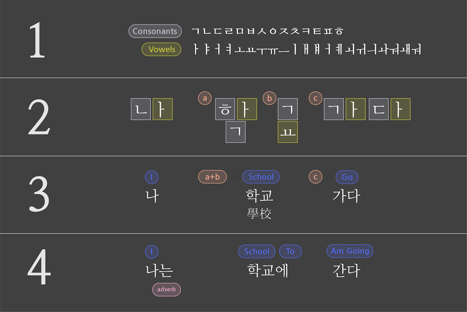
Hangul starts with a set of 19 consonants and 21 vowels (1). When writing a sentence, individual characters are first identified (2), then combined into blocks that represent compete words (3), and finally conjugated and arranged in grammatical form to create a sentence (4).

Despite the elegant logic underlying Hangul script, Korean fonts present the same basic difficulty for developers that Chinese and Japanese fonts do. Hangul characters may be constructed from just 40 basic elements, but the final forms add up quickly. Korean fonts eventually require over ten thousand characters, meaning the files are too large for most users to download so that they will appear instantly upon visiting a website. A typical full Korean font hovers around 4Mb, whereas even fairly extensive Latin fonts rarely exceed 250Kb.

During the time that Korean fonts were only available on the Google Fonts Early Access system, we were surprised that many web developers were willing to accept the latency implications of serving full font files to their users. Still, in order to graduate these fonts out of our Early Access system, we needed to devise a way for them to work for a wider cross-section of web users, especially those with relatively slow connections.

The Google Fonts API offers larger font files as several subsets, such as "latin" and "cyrillic." When the service launched, these subsets had to be selected by developers. For a few years, we've enabled the 'unicode-range' property of CSS3 for browsers that support it. This means when a large font file is sliced into subsets, the ranges of the Unicode characters in each subset are declared as part of the @font-face declaration. This allows browsers to fetch only a particular subset when those characters appear in a web page.

One of the key benefits of the Google Fonts API is cross-site caching, and this benefit continues to apply to the delivery of font subsets through unicode-range. The font files we serve are used by many domains, so after you visit a site and your browser downloads its fonts, the files are saved in the browser's cache. Then the next time you visit another site that uses the same font files, there's no need for your browser to download it again. This latency benefit only increases over time, and since the many subsets of large font files are cached the same way, you'll see the same cross-site benefits with our CJK fonts.

Over the years we have worked with the W3C and browser developers to ensure that unicode-range would become well supported. Now that Chrome, Firefox, Safari, and Edge have shipped this feature, there is enough support to enable a new means of delivering Korean web fonts that works seamlessly for these browsers.

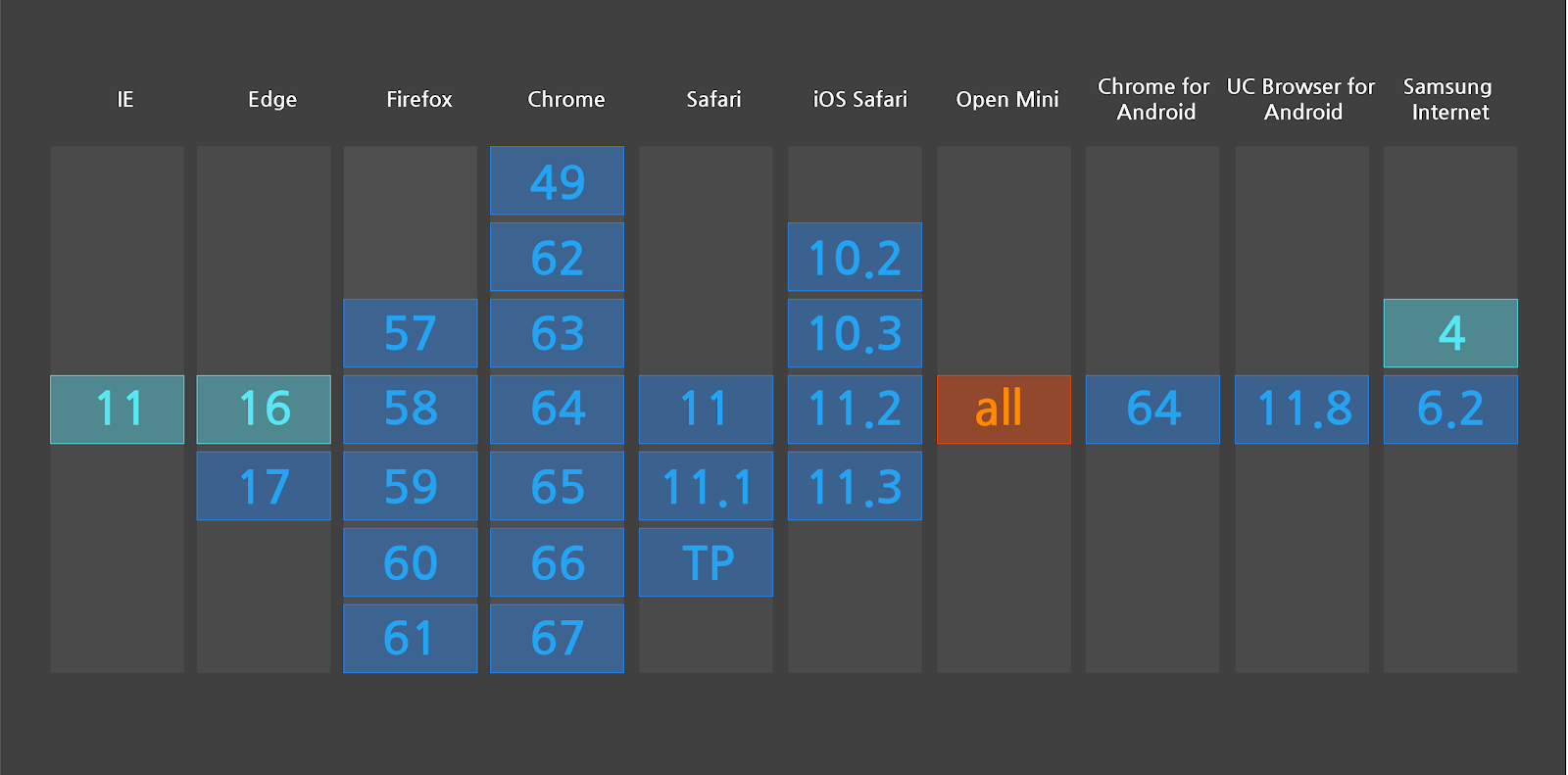
Support for the unicode-range feature has become widespread, according to caniuse.com

In order maximize efficiency, we wanted to know which characters it made the most sense to cluster together in a subset. We devised a slicing strategy by analyzing text on the Korean-language web to extract patterns of Unicode characters, building topic models of which ones tend to appear together on the same page.

As we evaluated different slicing strategies to decide which Korean characters to include in each subset, our goal was to minimize both the number of subsets and the number of requests. If we sliced the script into 1,000 arbitrary subsets, without factoring in usage and commonality, we would get way too many HTTP requests. We built a testing framework to see how a variety of strategies worked with real-world traffic using our Early Access system, and we launched Korean fonts in our directory with the most efficient one we've found so far.

Strategy 1 is no slicing. The best strategy had 20 times fewer connection requests than the worst, which simply divides the font into equal parts without accounting for patterns of language use.

Moving forward, we think we can do even better. With our scale, a small improvement can justify a lot of effort. By continuing to use our testing framework on different approaches to slicing, we can tune our serving to be as efficient as possible. For the web developers who use our API, and all end users, these kinds of changes are totally transparent and don't require any further work on your part. For example, when WOFF2 came out in 2015, every user with a browser supporting WOFF2 got a 25% faster experience. We transparently make things better for all users on an ongoing basis, and there's enormous potential for future improvements in the delivery of CJK fonts.

This launch began with five Korean fonts originally designed by the leading Korean type foundry Sandoll for Naver. Since the initial launch, we have grown the collection to 23 Korean families, and to showcase them we commissioned a digital specimen website from Math Practice, a digital design studio in New York City. Here you can see beautiful Korean typography in action—and with fast page loads made possible by our new slicing technique.

Thanks to SooYoung Jang, Irin Kim, E Roon Kang, Wonyoung So, Guhong Min, Hannah Son, Aaron Bell, Marc Foley, and all the typeface designers involved in growing the Korean fonts collection and developing the minisite.

We’ve Moved!


Head over to our new Google Fonts Collection on Google Design to stay up-to-date with the latest and greatest developments at Google Fonts. Here you’ll find articles ranging from technical updates and creative improvements to in-depth case studies and curated fonts collections. You can also follow us on Twitter for up-to-the-minute news.

Stay in touch.

@GoogleFonts

Google Fonts Collection via Google Design

Google Fonts Github

Noto Serif CJK is here!

Crossposted from the Google Developers Blog

Today, in collaboration with Adobe, we are responding to the call for Serif! We are pleased to announce Noto Serif CJK, the long-awaited companion to Noto Sans CJK released in 2014. Like Noto Sans CJK, Noto Serif CJK supports Simplified Chinese, Traditional Chinese, Japanese, and Korean, all in one font.

A serif-style CJK font goes by many names: Song (宋体) in Mainland China, Ming (明體) in Hong Kong, Macao and Taiwan, Minchō (明朝) in Japan, and Myeongjo (명조) or Batang (바탕) in Korea. The names and writing styles originated during the Song and Ming dynasties in China, when China's wood-block printing technique became popular. Characters were carved along the grain of the wood block. Horizontal strokes were easy to carve and vertical strokes were difficult; this resulted in thinner horizontal strokes and wider vertical ones. In addition, subtle triangular ornaments were added to the end of horizontal strokes to simulate Chinese Kai (楷体) calligraphy. This style continues today and has become a popular typeface style.

Serif fonts, which are considered more traditional with calligraphic aesthetics, are often used for long paragraphs of text such as body text of web pages or ebooks. Sans-serif fonts are often used for user interfaces of websites/apps and headings because of their simplicity and modern feeling.

Design of '永' ('eternity') in Noto Serif and Sans CJK. This ideograph is famous for having the most important elements of calligraphic strokes. It is often used to evaluate calligraphy or typeface design.

The Noto Serif CJK package offers the same features as Noto Sans CJK:

  • It has comprehensive character coverage for the four languages. This includes the full coverage of CJK Ideographs with variation support for four regions, Kangxi radicals, Japanese Kana, Korean Hangul and other CJK symbols and letters in the Unicode Basic Multilingual Plane of Unicode. It also provides a limited coverage of CJK Ideographs in Plane 2 of Unicode, as necessary to support standards from China and Japan.


Simplified Chinese
Supports GB 18030 and China’s latest standard Table of General Chinese Characters (通用规范汉字表) published in 2013.
Traditional Chinese
Supports BIG5, and Traditional Chinese glyphs are compliant to glyph standard of Taiwan Ministry of Education (教育部國字標準字體).
Japanese
Supports all of the kanji in  JIS X 0208, JIS X 0213, and JIS X 0212 to include all kanji in Adobe-Japan1-6.
Korean
The best font for typesetting classic Korean documents in Hangul and Hanja such as Humninjeongeum manuscript, a UNESCO World Heritage.
Supports over 1.5 million archaic Hangul syllables and 11,172 modern syllables as well as all CJK ideographs in KS X 1001 and KS X 1002
Noto Serif CJK’s support of character and glyph set standards for the four languages
  • It respects diversity of regional writing conventions for the same character. The example below shows the four glyphs of '述' (describe) in four languages that have subtle differences.
From left to right are glyphs of '述' in S. Chinese, T. Chinese, Japanese and Korean. This character means "describe".
  • It is offered in seven weights: ExtraLight, Light, Regular, Medium, SemiBold, Bold, and Black. Noto Serif CJK supports 43,027 encoded characters and includes 65,535 glyphs (the maximum number of glyphs that can be included in a single font). The seven weights, when put together, have almost a half-million glyphs. The weights are compatible with Google's Material Design standard fonts, Roboto, Noto Sans and Noto Serif(Latin-Greek-Cyrillic fonts in the Noto family).
Seven weights of Noto Serif CJK
    • It supports vertical text layout and is compliant with the Unicode vertical text layout standard. The shape, orientation, and position of particular characters (e.g., brackets and kana letters) are changed when the writing direction of the text is vertical.


    The sheer size of this project also required regional expertise! Glyph design would not have been possible without leading East Asian type foundries Changzhou SinoType Technology, Iwata Corporation, and Sandoll Communications.

    Noto Serif CJK is open source under the SIL Open Font License, Version 1.1. We invite individual users to install and use these fonts in their favorite authoring apps; developers to bundle these fonts with your apps, and OEMs to embed them into their devices. The fonts are free for everyone to use!

    Noto Serif CJK font download:https://www.google.com/get/noto
    Noto Serif CJK on GitHub:https://github.com/googlei18n/noto-cjk
    Adobe's landing page for this release: http://adobe.ly/SourceHanSerif
    Source Han Serif on GitHub: https://github.com/adobe-fonts/source-han-serif/tree/release/

    By Xiangye Xiao and Jungshik Shin, Internationalization Engineering team

    Raising the quality of fonts in our collection

    Since the new Google Fonts directory launched in May, we’ve been hard at work improving the quality of the fonts in our collection. In June we invited a team of typeface designers and font engineers from around the world to our New York City offices  to kick off a 4-months font improvement project. Each member of the team was selected for their extensive industry experience in type design or font production:

    • Jacques Le Bailly (Latin type designer)
    • Lasse Fister (font engineer)
    • Marc Foley (font engineer)
    • Kalapi Gajjar (Indian type specialist)
    • Thomas Jockin (Latin type designer)
    • Nhung Nguyen (Vietnamese type specialist)
    • Alexei Vanyashin (Cyrillic type specialist)
    The team was tasked with improving the quality of fonts in our catalog. During the first week we examined the entire Google Fonts collection to determine the strengths and weaknesses. We considered various possible approaches to improving quality, and at the end of the week we decided to focus on typefaces that were already widely used and had great potential. We divided the project into three sprints.

    Design work consisted of adding glyphs to support more languages, fixing incorrectly placed or shaped accent marks, re-spacing the type’s metrics and kerning, and in some cases re-drawing the designs from scratch. In each sprint we spent one week on quick improvements to one or two families, and three weeks for a deep dive on a single project.

    To ensure we maintained a high standard of work and stayed true to the original intent of each design, our entire design process was done in the open (on GitHub) and was regularly documented in the Google Fonts Discussions Group. For each design, our team critiqued each other’s work, and kept in touch with the original designers whenever possible.
    Pacifico - Comparison of original and new fontsQuicksand - Comparison of original and new fonts
    Pacifico and Quicksand
    In the coming weeks, our team will push the new versions of these fonts. Updated fonts will appear in the Google Fonts directory, and the new higher quality designs will automatically benefit any site or product that uses the Google Fonts API.

    Larger, deep-dive projects:
    Alfa Slab One, Cabin + Cabin Condensed, Comfortaa, Didact Gothic, Inconsolata, Jura, Maven Pro, MuliNunito (and a new Nunito Sans!), Pacifico, Quicksand, RubikVT323.


    Smaller projects with wider language support:
    Anaheim, Anton, Arvo, Bad Script, Bangers, Bevan, Bitter, Cabin Sketch, Cutive Mono, Dancing Script, Francois One, Homenaje, Indie Flower, Kurale, Lobster, Lora, Marmelad, Metrophobic, Merriweather, Neuton, Oswald, Play, Podkova, Poiret One, Prata, Press Start 2P, Raleway, Rokkit, Ropa Sans, Rubik Mono, Share Tech, Sigmar One, Telex, Trocchi, Varela Round, Yanone Kaffeesatz.


    Keep watching this blog for new posts by the team summarizing their type design processes, thoughts and decisions.

    Posted by Dave Crossland, Program Manager

    An open source font system for everyone

    Originally posted on the Google Developers Blog

    A big challenge in sharing digital information around the world is “tofu”—the blank boxes that appear when a computer or website isn’t able to display text: ⯐. Tofu can create confusion, a breakdown in communication, and a poor user experience.

    Five years ago we set out to address this problem via the Noto—aka “No more tofu”—font project. Today, Google’s open source Noto font family provides a beautiful and consistent digital type for every symbol in the Unicode standard, covering more than 800 languages and 110,000 characters.

    A few samples of the 110,000+ characters covered by Noto fonts.
    The Noto project started as a necessity for Google’s Android and ChromeOS operating systems. When we began, we did not realize the enormity of the challenge. It required design and technical testing in hundreds of languages, and expertise from specialists in specific scripts. In Arabic, for example, each character has four glyphs (i.e., shapes a character can take) that change depending on the text that comes after it. In Indic languages, glyphs may be reordered or even split into two depending on the surrounding text.

    The key to achieving this milestone has been partnering with experts in the field of type and font design, including Monotype, Adobe, and an amazing network of volunteer reviewers. Beyond “no more tofu” in the common languages used every day, Noto will be used to preserve the history and culture of rare languages through digitization. As new characters are introduced into the Unicode standard, Google will add these into the Noto font family.

    Google has a deep commitment to openness and the accessibility and innovation that come with it. The full Noto font family, design source files, and the font building pipeline are available for free at the links below. In the spirit of sharing and communication across borders and cultures, please use and enjoy! 
    By Xiangye Xiao and Bob Jung, Internationalization

    Introducing OpenType Font Variations

    Cześć and hello from the ATypI conference in Warsaw! Together with Microsoft, Apple and Adobe, we’re happy to announce the launch of variable fonts as part of OpenType 1.8, the newest version of the font standard. With variable fonts, your device can display text in myriads of weights, widths, or other stylistic variations from a single font file with less space and bandwidth.
     OpenType variable fonts support OpenType Layout variation.
    To prevent that the $ sign becomes a black blob,
    the stroke disappears at a certain weight.


    At Google, we started tinkering with variable fonts about two years ago. We were fascinated by the typographic opportunities, and we got really excited when we realized that variable fonts would also help to save space and bandwidth. We proposed reviving Apple’s TrueType GX variations in OpenType, and started experimenting with it in our tools. The folks at Microsoft then started a four-way collaboration between Microsoft, Apple, Adobe, and Google, together with experts from type foundries and tool makers. Microsoft did the spec work; Apple brought their existing technology and expertise; Adobe updated their CFF format into CFF2; and we brought the tools and testing we’d been developing.  After months of intense polishing, the specification is now finished.

    On the Google end, we did a lot of work to build, edit and display variable fonts:
    As always, all our font tools are free and open source for everyone to use and contribute.

    Now that the spec is public, we can finish the work by merging the changes upstream so that our code will soon flow into products. We’ll also update Noto to support variations (for many writing systems, the sources are already there — the rest will follow). Much more work lies ahead, for example, implementing variations in Google Fonts. Together with other browser makers, we’re already working on a proposal to extend CSS fonts with variations. Once everyone agrees on the format, we’ll support it in Google Chrome. And there are many other challenges ahead, like incorporating font variations into other Google products—so it will be a busy time for us!  We are incredibly excited that an amazing technology from 23 years ago is coming back to life again today. Huge thanks to our friends at Adobe, Apple, and Microsoft for a great collaboration!

    To learn more, read Introducing OpenType Variable Fonts, or talk to us at the FontTools group.

    By Behdad Esfahbod and Sascha Brawer, Fonts and Text Rendering, Google Internationalization