Tag Archives: new fonts

Raising the quality of fonts in our collection

Since the new Google Fonts directory launched in May, we’ve been hard at work improving the quality of the fonts in our collection. In June we invited a team of typeface designers and font engineers from around the world to our New York City offices  to kick off a 4-months font improvement project. Each member of the team was selected for their extensive industry experience in type design or font production:

  • Jacques Le Bailly (Latin type designer)
  • Lasse Fister (font engineer)
  • Marc Foley (font engineer)
  • Kalapi Gajjar (Indian type specialist)
  • Thomas Jockin (Latin type designer)
  • Nhung Nguyen (Vietnamese type specialist)
  • Alexei Vanyashin (Cyrillic type specialist)
The team was tasked with improving the quality of fonts in our catalog. During the first week we examined the entire Google Fonts collection to determine the strengths and weaknesses. We considered various possible approaches to improving quality, and at the end of the week we decided to focus on typefaces that were already widely used and had great potential. We divided the project into three sprints.

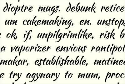
Design work consisted of adding glyphs to support more languages, fixing incorrectly placed or shaped accent marks, re-spacing the type’s metrics and kerning, and in some cases re-drawing the designs from scratch. In each sprint we spent one week on quick improvements to one or two families, and three weeks for a deep dive on a single project.

To ensure we maintained a high standard of work and stayed true to the original intent of each design, our entire design process was done in the open (on GitHub) and was regularly documented in the Google Fonts Discussions Group. For each design, our team critiqued each other’s work, and kept in touch with the original designers whenever possible.
Pacifico - Comparison of original and new fontsQuicksand - Comparison of original and new fonts
Pacifico and Quicksand
In the coming weeks, our team will push the new versions of these fonts. Updated fonts will appear in the Google Fonts directory, and the new higher quality designs will automatically benefit any site or product that uses the Google Fonts API.

Larger, deep-dive projects:
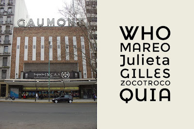
Alfa Slab One, Cabin + Cabin Condensed, Comfortaa, Didact Gothic, Inconsolata, Jura, Maven Pro, MuliNunito (and a new Nunito Sans!), Pacifico, Quicksand, RubikVT323.


Smaller projects with wider language support:
Anaheim, Anton, Arvo, Bad Script, Bangers, Bevan, Bitter, Cabin Sketch, Cutive Mono, Dancing Script, Francois One, Homenaje, Indie Flower, Kurale, Lobster, Lora, Marmelad, Metrophobic, Merriweather, Neuton, Oswald, Play, Podkova, Poiret One, Prata, Press Start 2P, Raleway, Rokkit, Ropa Sans, Rubik Mono, Share Tech, Sigmar One, Telex, Trocchi, Varela Round, Yanone Kaffeesatz.


Keep watching this blog for new posts by the team summarizing their type design processes, thoughts and decisions.

Posted by Dave Crossland, Program Manager

Easier ways to find the right font

We know that finding the right font for your website or blog is a personal choice, and there are many great fonts available to choose from on the web. Now when you search for a font that isn’t available on Google Web Fonts, we show you additional fonts available from Monotype. Each result is shown in the actual font so you can easily preview your options. To get more information on a font, simply click the link under it’s name.


We look forward to adding results from more web font providers in the future.

Posted by Raziel Alvarez, Software Engineer

More places to get great fonts

Open source fonts are good for the web: they’ve helped spur web font adoption, and made it easier for anyone to contribute improvements to fonts for the whole web community.

Today, we’re happy to announce that all the fonts in the Google Web Fonts directory are also available via Adobe’s new Edge Web Fonts service.

And on the heels of the recent release of Source Sans Pro, another Adobe designed open source font, Source Code Pro, is available today from both Google Web Fonts and Edge Web Fonts.

We’re also working with the Adobe team to hint some of the fonts in the collection, a process that will make them look better at smaller text sizes.

Here’s to a more accessible, translatable, and beautiful web!

Posted by Ajay Surie, Product Manager

New Fonts, Early Access, and More

Over the last few months, we’ve been busy adding support for web fonts to Google documents and Google presentations. Today, we’re adding seven font families in Google Web Fonts, a new tool to compare similar fonts, and an early access program to get feedback on non-latin scripts in development.

When you choose a new font, you want it to look good for all your readers, regardless of the platform or browser they’re using. To help make fonts look better in more places, we’re starting to hint more families in Google Web Fonts, thanks to the ttfautohint project, which automates this process. Amarante, Capriola, Courgette, and Quando were hinted using this tool.

Eagle Lake expands on our existing collection of calligraphic font styles, and you can use Metal Mania to bring out your inner guitarist. We’re also very excited to be including a special contribution from our friends over at Adobe - Source Sans Pro, their first open source type family.

As the number of fonts in Google Web Fonts continues to grow, it’s becoming harder to select the right font from among many potential choices. To make this process easier, you can now easily compare two fonts side by side using the new comparison tool. Just add a few fonts to your collection, select Review, and click on the Compare tab at the top.


You can then overlay glyphs from each font on top of each other, and use the slider to transition between fonts to see the differences between them more clearly.

Non-latin fonts can be more complex than latin fonts, both as designs and as font software, which often require more time to develop and polish. The designers of these fonts may not be native readers, and we’re hoping for your feedback to help them understand where their fonts need improvement. You can try them out by downloading them from the Google Web Fonts early access page.

Posted by Ajay Surie, Product Manager

Kickstart new fonts!

Google Web Fonts is proud to announce a new funding experiment, using Kickstarter - a popular way to fund creative projects.

Each month there are many typeface designs proposed to our team for publication and financial support. But we can’t support everything! Even with the best quality proposals, it can be hard to decide about those that are quite similar to ones already published. Really the best judge of which web fonts you want to use is you!

So we invited the designers of three recent proposals to try out Kickstarter and see how it works for font projects. There are some fun rewards for pledging a contribution so click through to see the details!

Folk


First is Marcello Magalhaes’ Folk, which transforms the vernacular lettering of Sao Paulo into a font. Already popular as web font, it has been used by The Independent Film Channel and Mozilla - but it only includes an uppercase set of glyphs, and not all the symbols and accents that Google Web Fonts requires. For this project, Marcello will complete the font to the Basic Latin character set, and has designed a poster to go with the new release.

Fast Brush Script


Fast Brush Script is the working name for a font by Pablo Impallari. Pablo's first font, Lobster, is one of the most popular Google Web Fonts, having been served over 2 billion times.

Pablo is offering a very unusual reward - choosing the name! Normally the name of a font is sacred to the designer, but Pablo is opening up the opportunity for corporate patronage of his work. The development name 'Fast Brush Script' reflects the core concept of the typeface. This font is currently in an early development stage with the lowercase letters now fully prototyped, as you can see above, and you can download the current develop version from the Kickstarter project page.

Montserrat


Montserrat is an extremely high quality sans serif text typeface by Julieta Ulanovsky. Advancing substantially during her studies at the prestigious University of Buenos Aires' Masters degree in Typeface Design, the design revives the historical type of the Montserrat neighbourhood where Julieta lives and works.

This genre of type has been a popular trend in recent years and this typeface in particular stands out with its excellent quality. Setting it apart are the set of alternative caps, which add a little fun to a very functional text typeface.


The Google Web Fonts team has already contributed directly to these Kickstarter projects, and we hope you will also become a backer for all three projects as well - let's hope the type designers will be paid far beyond their minimum funding goals!


Update: When fonts are made available in Google Web Fonts, all their source files are also available from the 'Google Font Directory' Google Code Project in a Mercurial version control system, under a free, libre and open source license - typically the SIL Open Font License.

Posted by Dave Crossland, Font Consultant, Google Web Fonts

Scary Fonts For Halloween

Halloween is here - what a fun time of year! The pumpkins are carved and the seeds are roasting in the oven, a chill is in the air, and all the little monsters are busy planning their best tricks and hoping for excellent treats. With all the trick or treating & costume planning, why not add some Halloween spirit to your website as well? We're happy to publish 4 new, fun, and scary fonts this week that are sure to provide a spoooooky feel for your website!


We would love to see how creative you can get with these fonts - please let us know where you are using them in the comments of this post, and we'll send out a Google Web Fonts T-shirt for our favorite!


Creepster by Sideshow


Its ghastly! Its gory! Its gruesomely gleeful! It's Creepster, the blood-curdling new font from Squid and Sideshow. This fright-filled font has so many alternates its like stitching together your own monster every time you use it. Creepster: perfect for all of your grisly graphic needs!


Eater by Typomondo


Eater is a display font infected by the darkest of rare disease that slowly spreads at night while the webfont user sleeps.


Nosifer by Typomondo


Nobody knows where Nosifer comes from. It emanates a dark stench as it drips from the internet.


Butcherman by Typomondo


Butcherman is a zombified display font, hacked and chopped and left for dead, yet still crawling!


Posted by Posted by Dave Crossland, Font Consultant, Google Web Fonts

Introducing Expletus Sans

Expletus Sans was added to Google Web Fonts this week.

Jasper de Waard, born in 1996, first came in contact with the beauty of type design when he was 10, and developed his skills as a type and graphic designer ever since. He was born and raised in Rotterdam, the Netherlands, and went to a bilingual high school there, training him to read and write English fluently and have a more international focus. He is currently in his third year, three years before his exam. He hopes to continue his practices in the fields of type and graphic design after he finishes school and release many more typefaces in the future.

His love for the tiny details, balance in proportions and urge for perfection made him into what he is today. However, the great support and feedback from people on several forums can't be denied as a great source of inspiration and evaluation material, giving him a greater understanding of the method behind type design. He is also available for custom type work and identity design.


Q: What inspired you to create the font?

It was a single x in a logo that started me off, but it was largely a search for my own opinions in type design so in a way you could say Expletus Sans was 'self-inspired'.

Q: Did you try to accomplish something specific with this font, and did you succeed?

I wanted to create a look that was completely different from everything I knew. I feel like I definitely succeeded in this.

Q: What kinds of documents are most appropriate for this font?

It could be used for anything that needs a good dose of elegance. I would personally love to see it in identity work.

Q: Designing a new font is a long journey. What inspires you to keep motivated throughout all the different stages?

Ones I put my mind to something, I finish it. With designing a typeface I feel like I have no choice. Once I've started, I get obsessed with perfection. Apart from that, it was the many great responses I got on the internet on my work that kept me motivated.

Q: What is your favourite part of the type design process, and why?

The very beginning. Trying to work out the basic lines of a concept and see the skeleton of the typeface emerge. It pleases me most, because it's the fastest and most rewarding process. After that it's months of tiny little details.

Q: Can you recommend how other type designers can learn the skills involved in making a font like this?

Start drawing or straight on the computer and post your work on as many type-related websites as you can think of. Take your time to read through feedback and never dismiss an idea before you have seen it. Don't give yourself a deadline. You'll never make it in time.

Q: What are your favourite fonts, and why?

All fonts by Robert Slimbach, because of his brilliant eye for perfection. Dolly, because of it's comfortable, yet fresh feel. The Centro superfamily, for excellence throughout all styles. Many more, for even more different reasons.

Q: What do you think could be improved about the type design process?

Multiple Master should be used more extensively and automated processes like iKern are underrated.

Q: How do you feel about publishing your font as an open source project?

It just happened to me. I never particularly thought about it, until you knocked at my door. It seems like a good way to start and increases the chance of seeing my work in use. I feel like it gives me the chance to make the world just a little bit more beautiful and let others enjoy that too, without charge.