Author Archives: Dave Crossland

Morisawa BIZ Universal Design (UD) Japaese fonts added to Google Fonts and Google Workspace


As part of our larger effort to make great type accessible in more languages, Google Fonts is pleased to announce that the Japanese type foundry Morisawa has made 2 BIZ Universal Design (UD) font families available on Google Fonts, under the SIL Open Font License. These Gothic and Mincho designs, available in regular and bold weights and proportional and full width styles, are now also available in Google Workspace 


“Having these fonts available in Japan allows Google Education to align with the most widely used fonts in education publishing in Japan,” said Stuart Miller, Head of Marketing for Google Education in Asia Pacific (APAC)​. “This makes it easier for partners to collaborate with Google Education. It also ensures a more consistent, inclusive, delightful experience for the millions of teachers and students that use Google tools.”


Drawing on extensive end-user evaluation, the BIZ UD typefaces were developed using the principles of universal design (UD) to ensure legibility (the ease of differentiating individual characters) and readability (the ease of reading text overall). BIZ UD fonts are especially suited for conveying text accurately—for example, in educational settings, corporate communication environments, and other places that use ICT


Earlier versions of these fonts are available as part of the Windows 10 Japanese Supplemental Fonts package. Morisawa and Google collaborated with Type Network to update the fonts to the latest Google Fonts technical specifications for web fonts, and expand the Latin glyph set. 


BIZ UD is available in Gothic (BIZ UDGothic and BIZ UDPGothic) and Mincho (BIZ UDMincho and BIZ UDPMincho) in two weights (Regular and Bold). Try them out and let us know what you think!


About the type foundries

Morisawa is Japan’s leading font foundry that has never wavered from its commitment to undertaking research and development in typography since its establishment in 1924 – the year it invented the first Japanese phototypesetting machine. The company provides font licenses for over 1,500 typefaces of Japanese and multi-script, web font services, embedded fonts, and multilingual e-magazine/book solution services. Their library includes typefaces from TypeBank and its group company Jiyukobo.


Type Network brings together the world’s best independent type foundries and designers, offering a carefully chosen collection of their fonts for all uses and negotiating on their behalf with our clients on custom design projects and enterprise licensing. Through their partners, they also offer a wide range of other typographic services, including consulting, teaching, and lecturing around the world. The Type Network team has been working in digital type since desktop publishing first gave designers the tools to take control of their own typography.


Posted by Dave Crossland, Google Fonts Lead UX Programs and Operations Manager

We’ve Moved!


Head over to our new Google Fonts Collection on Google Design to stay up-to-date with the latest and greatest developments at Google Fonts. Here you’ll find articles ranging from technical updates and creative improvements to in-depth case studies and curated fonts collections. You can also follow us on Twitter for up-to-the-minute news.

Stay in touch.

@GoogleFonts

Google Fonts Collection via Google Design

Google Fonts Github

Raising the quality of fonts in our collection

Since the new Google Fonts directory launched in May, we’ve been hard at work improving the quality of the fonts in our collection. In June we invited a team of typeface designers and font engineers from around the world to our New York City offices  to kick off a 4-months font improvement project. Each member of the team was selected for their extensive industry experience in type design or font production:

  • Jacques Le Bailly (Latin type designer)
  • Lasse Fister (font engineer)
  • Marc Foley (font engineer)
  • Kalapi Gajjar (Indian type specialist)
  • Thomas Jockin (Latin type designer)
  • Nhung Nguyen (Vietnamese type specialist)
  • Alexei Vanyashin (Cyrillic type specialist)
The team was tasked with improving the quality of fonts in our catalog. During the first week we examined the entire Google Fonts collection to determine the strengths and weaknesses. We considered various possible approaches to improving quality, and at the end of the week we decided to focus on typefaces that were already widely used and had great potential. We divided the project into three sprints.

Design work consisted of adding glyphs to support more languages, fixing incorrectly placed or shaped accent marks, re-spacing the type’s metrics and kerning, and in some cases re-drawing the designs from scratch. In each sprint we spent one week on quick improvements to one or two families, and three weeks for a deep dive on a single project.

To ensure we maintained a high standard of work and stayed true to the original intent of each design, our entire design process was done in the open (on GitHub) and was regularly documented in the Google Fonts Discussions Group. For each design, our team critiqued each other’s work, and kept in touch with the original designers whenever possible.
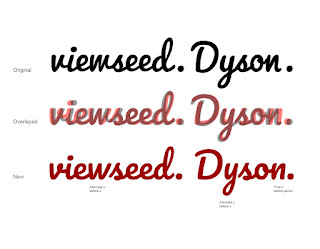
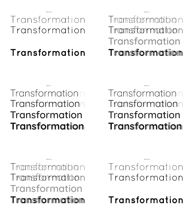
Pacifico - Comparison of original and new fontsQuicksand - Comparison of original and new fonts
Pacifico and Quicksand
In the coming weeks, our team will push the new versions of these fonts. Updated fonts will appear in the Google Fonts directory, and the new higher quality designs will automatically benefit any site or product that uses the Google Fonts API.

Larger, deep-dive projects:
Alfa Slab One, Cabin + Cabin Condensed, Comfortaa, Didact Gothic, Inconsolata, Jura, Maven Pro, MuliNunito (and a new Nunito Sans!), Pacifico, Quicksand, RubikVT323.


Smaller projects with wider language support:
Anaheim, Anton, Arvo, Bad Script, Bangers, Bevan, Bitter, Cabin Sketch, Cutive Mono, Dancing Script, Francois One, Homenaje, Indie Flower, Kurale, Lobster, Lora, Marmelad, Metrophobic, Merriweather, Neuton, Oswald, Play, Podkova, Poiret One, Prata, Press Start 2P, Raleway, Rokkit, Ropa Sans, Rubik Mono, Share Tech, Sigmar One, Telex, Trocchi, Varela Round, Yanone Kaffeesatz.


Keep watching this blog for new posts by the team summarizing their type design processes, thoughts and decisions.

Posted by Dave Crossland, Program Manager

Adobe Typekit improves the Rosario typeface family

Since 2010, Google Fonts been collaborating with the Adobe Typekit team to create better web font technology. And now that many fonts first published by Google Fonts are also available in Adobe Edge Web Fonts, we’re extending that collaboration beyond just software to fonts themselves.

Together with Adobe, we want to improve the quality of open source fonts available to everyone publishing on the web. As a first step, the Typekit team has optimized Rosario, a humanist sans serif based on the classic proportions of Garamond’s type.

To start the process, Typekit reached out to the foundry, Omnibus Type, to request up to date copies of the font source files. Here are some examples of the possible optimizations that the Adobe team might make to a web font:

  • Convert and/or clean up outlines, for design fidelity and file size efficiency
  • Re-componentize source fonts, for file size efficiency
  • Remove/reassign glyphs with incorrect Unicode code points, for semantic value
  • Add common missing glyphs (non-breaking space, soft hyphen)
  • Set vertical metrics values according to best practices
  • Set underline and strike-through values, for design consistency
  • Contribute PostScript hints and (if a typeface was designed for small sizes like paragraph text) TrueType instructions (also called hinting), which consist of instructions to the rasterizer embedded in the font file itself

After making some of these improvements, Typekit sent their version back to the foundry to review and release on the Omnibus Type homepage. The updated Rosario family is now available in Typekit, Adobe Edge Web Fonts and Google Fonts.

Together with the Typekit team, we’re looking forward to more quality improvements in the future!

ttfautohint reaches its $30,000 funding target!

The Google Web Fonts team would like to congratulate Werner Lemberg on reaching his $30,000 funding target for ttfautohint.

Here is a fun video that explains what the project is about:


As a true open source project, it has sought contributions from across the industry. Google Web Fonts, FontLab and many individuals have given the project financial support. This week the Extensis WebINK team announced they have enabled Werner to reach his goal:

blog.webink.com/webink/extensis-webink-funds-open-source-ttfautohint-better-fonts-on-screen

You can download a graphical user interface for GNU/Linux and Windows today, a command line tool for Mac OS X, and of course the source code, from the project homepage:

www.freetype.org/ttfautohint

Congratulations to All Designers of Tipos Latinos 2012!

¡Felicitaciones a todos los diseñadores de Tipos Latinos 2012!

The Google Web Fonts team would like to extend our congratulations to all designers selected for the Tipos Latinos 2012 Biennial.

El equipo de Google Web Fonts felicita a todos los diseñadores seleccionados en la Bienal Tipos Latinos 2012.

We were looking forward to seeing the results of this prestigious review of work by typeface designers across Latin America because we have been working with many of them.

Tenemos muchas ganas de ver los resultados de este prestigioso evento de diseño tipográfico de Latinoamérica, porque nosotros estuvimos trabajando con muchos de ellos.

Around a quarter of the typefaces featured are available in Google Web Fonts today – or very soon:

Aproximadamente un cuarto de las tipografías seleccionadas ya están disponibles en Google Web Fonts o lo estarán muy pronto:


  • Buenard, by Gustavo J. Ibarra (Argentina)

  • Petrona, by Ringo Romei (Argentina)

  • Ruluko, by A. Sanfelippo, A. Díaz y M. Hernández (Argentina, Colombia, Colombia)

  • Unna, by Jorge de Buen (Mexico)

  • Acme, by Juan Pablo del Peral (Argentina)

  • Macondo, by John Vargas Beltrán (Colombia)

  • Rufina, by Martín Sommaruga (Uruguay)

  • Abril, by José Scaglione y Veronika Burian (Argentina)

  • Alegreya, by Juan Pablo del Peral (Argentina)

  • Almendra, by Ana Sanfelippo (Argentina)

  • Andada, by Carolina Giovagnoli (Argentina)

  • Bitter, by Sol Matas (Argentina)

  • Delius, by Natalia Raices (Argentina)

  • Rosarivo, by Pablo Ugerman (Argentina)


The Alegreya family (including its Small Caps sister family) received a "Mención de Excelencia" (Recognition of Excellence) – congratulations Juan Pablo!

La familia Alegreya (que incluye una familia Small Caps) recibió la única "Mención de Excelencia" que en esta edición entregó el Jurado. ¡Felicitaciones, Juan Pablo!

You can read more about Tipos Latinos at tiposlatinos.com.

Pueden ver más sobre Tipos Latinos en tiposlatinos.com.


Google Web Fonts is integrated into Network Solutions’ Website Builder Tool

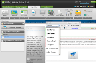
The Google Web Fonts team is proud to announce that Network Solutions have integrated our service with their Website Builder Tool.

Network Solutions is one of the largest domain registrars. When you register a domain with them, you can quickly and easily create a website using the Website Builder Tool. In the Page Editor, you can simply select a font from a drop down list in the typography palette for any text area:


Get a domain from Network Solutions, create your site and you’re good to go with web typography!

Read more at the Network Solutions blog.

Are you a web developer, looking to present our growing collection to your users? If so, you should definitely check out the Google Web Fonts Developer API, which allows convenient programmatic access to a list of all fonts in the directory.

Interview with Polish Type Designer Ania Kruk


Ania Kruk is a type designer from Poznan, Poland. She currently lives and works in Barcelona and Google Web Fonts is proud to include her first published typeface, Cookie.

Q: What is your background as a designer, and how did you become interested in type design?

Actually, I'm still a beginner in the world of type design: I have drawn letters for only 2 years. I've recently graduated from the University of Arts in Poznan, Poland. Originally, I studied product design, but after 3 years I found myself more interested in graphics than in furniture.

So I took a one year break and moved to Barcelona, Spain, where I worked as an intern in Estudio Mariscal (which was quite an experience, as they were working on the 'Chico y Rita' movie at that time), and did a one-year Masters in Typography and Editorial Design at Eina, Escola de Disseny i Art.

When I came back to Poland for my last year of studies, I was 100% sure that I wanted to focus on type design.
And here I am now, 3 months after my graduation, with my first typeface to be published: Cookie :)

Q: What is your favourite part of the type design process, and why?

Generally, I'm interested in complex, narrative projects that require creating a whole from various elements (meaning: editorial design, information design, typography). Type Design is not about designing one letter, it's about creating a system: the alphabet.

I like the moment when you can start writing words and sentences with your letters, because then you can actually work on the flow and on the balance between the characters. For example, to make some of them more 'normal', transparent, in order to make others more distinctive or decorative.

Q: Designing a new typeface is a long journey. What inspires you to keep motivated throughout all the different stages?

For sure, Type Design is all about details, that an average user won't even notice, so you need to be patient to do this kind of work. I'd say I'm quite competitive, so when I see other peoples projects and I think 'Wow, that's so cool!', it get's me motivated ;) I spend an awful amount of time digging through the internet, checking out blogs, personal websites, etc.


Q: Can you recommend how other type designers can learn the skills involved in making type?

It's hard to say, because I'm still learning myself. But I'd say that calligraphy and drawing are essential to understanding the construction of the letters.

Q: What do you think could be improved about the type design process?

For me the hard part is hinting ;)

Q: What inspired you to create Cookie?

Cookie is a script typeface, based on brush calligraphy. It has a little bit of the 1950s look, that makes you think about all the beautiful ads and pin-ups from this time. It's sweet and friendly - but not too decorative. I tried to keep it simple and legible.

Q: Did you try to accomplish something specific with this typeface design, and did you succeed?

It's my first script typeface, so the whole design process was like discovering a new way of working. I wanted to create a typeface with a nice flow between the letters, and I wanted the letters to join in a natural way - that's the tough part, if you think about all the possible combinations between 26 lowercase characters. I hope it works ok...!

Q: What kinds of uses are most appropriate for this font?

Its clearly a display typeface, suitable more for titles than main texts. But it can be used for short texts, if you're aiming for a hand-written look. It will look good on an invitation, menu, recipe... poster, flyer or as a header of your blog :)

Q: What are your favourite fonts, and why?

Well, I don't really have any favourites. It all depends on the context and what you want to communicate: a typeface can be perfect for one kind of a job, but look horrible when misused.

There are some surprises: I've always considered Mistral by Roger Excoffon as very kitsch and ugly, until I've seen it in on the opening credits for the movie 'Drive'. It looked just great, combined with the music and pictures.

Kickstart new fonts!

Google Web Fonts is proud to announce a new funding experiment, using Kickstarter - a popular way to fund creative projects.

Each month there are many typeface designs proposed to our team for publication and financial support. But we can’t support everything! Even with the best quality proposals, it can be hard to decide about those that are quite similar to ones already published. Really the best judge of which web fonts you want to use is you!

So we invited the designers of three recent proposals to try out Kickstarter and see how it works for font projects. There are some fun rewards for pledging a contribution so click through to see the details!

Folk


First is Marcello Magalhaes’ Folk, which transforms the vernacular lettering of Sao Paulo into a font. Already popular as web font, it has been used by The Independent Film Channel and Mozilla - but it only includes an uppercase set of glyphs, and not all the symbols and accents that Google Web Fonts requires. For this project, Marcello will complete the font to the Basic Latin character set, and has designed a poster to go with the new release.

Fast Brush Script


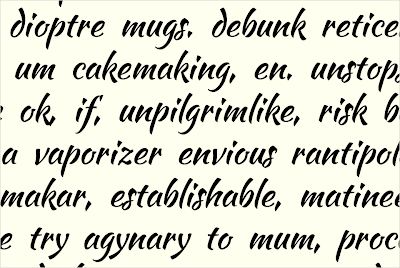
Fast Brush Script is the working name for a font by Pablo Impallari. Pablo's first font, Lobster, is one of the most popular Google Web Fonts, having been served over 2 billion times.

Pablo is offering a very unusual reward - choosing the name! Normally the name of a font is sacred to the designer, but Pablo is opening up the opportunity for corporate patronage of his work. The development name 'Fast Brush Script' reflects the core concept of the typeface. This font is currently in an early development stage with the lowercase letters now fully prototyped, as you can see above, and you can download the current develop version from the Kickstarter project page.

Montserrat


Montserrat is an extremely high quality sans serif text typeface by Julieta Ulanovsky. Advancing substantially during her studies at the prestigious University of Buenos Aires' Masters degree in Typeface Design, the design revives the historical type of the Montserrat neighbourhood where Julieta lives and works.

This genre of type has been a popular trend in recent years and this typeface in particular stands out with its excellent quality. Setting it apart are the set of alternative caps, which add a little fun to a very functional text typeface.


The Google Web Fonts team has already contributed directly to these Kickstarter projects, and we hope you will also become a backer for all three projects as well - let's hope the type designers will be paid far beyond their minimum funding goals!


Update: When fonts are made available in Google Web Fonts, all their source files are also available from the 'Google Font Directory' Google Code Project in a Mercurial version control system, under a free, libre and open source license - typically the SIL Open Font License.

Posted by Dave Crossland, Font Consultant, Google Web Fonts

Scary Fonts For Halloween

Halloween is here - what a fun time of year! The pumpkins are carved and the seeds are roasting in the oven, a chill is in the air, and all the little monsters are busy planning their best tricks and hoping for excellent treats. With all the trick or treating & costume planning, why not add some Halloween spirit to your website as well? We're happy to publish 4 new, fun, and scary fonts this week that are sure to provide a spoooooky feel for your website!


We would love to see how creative you can get with these fonts - please let us know where you are using them in the comments of this post, and we'll send out a Google Web Fonts T-shirt for our favorite!


Creepster by Sideshow


Its ghastly! Its gory! Its gruesomely gleeful! It's Creepster, the blood-curdling new font from Squid and Sideshow. This fright-filled font has so many alternates its like stitching together your own monster every time you use it. Creepster: perfect for all of your grisly graphic needs!


Eater by Typomondo


Eater is a display font infected by the darkest of rare disease that slowly spreads at night while the webfont user sleeps.


Nosifer by Typomondo


Nobody knows where Nosifer comes from. It emanates a dark stench as it drips from the internet.


Butcherman by Typomondo


Butcherman is a zombified display font, hacked and chopped and left for dead, yet still crawling!


Posted by Posted by Dave Crossland, Font Consultant, Google Web Fonts