Tag Archives: Analytics

Announcing: Smart, Fast-Acting Analytics — For Everyone

This past March, we launched the Google Analytics 360 Suite, a set of integrated data and marketing analytics products designed for the needs of enterprise-class marketers in today’s multi-screen world. 

Today we have another exciting announcement. Next month we’ll start rolling out a new product: Google Optimize — a free version of our enterprise-class testing and personalization product, Google Optimize 360. Google Optimize will be globally available at that time. Additionally, we’re including enhancements to many of our existing free products. Read on for details.

Businesses of all sizes need tools to measure and succeed 

First of all, why this free product now? Because companies big and small face the same challenge today: Consumer expectations are higher than ever in a mobile-first world. How can brands be more useful to people in their moments of need? With ever more data flooding in, marketers need access to the right data so they can uncover useful insights — and act on them quickly.

The companies that are already making this leap from data to action are transforming their businesses by becoming more useful to consumers throughout these micro-moments. How? Analytics and testing are the key. In fact, according to an Econsultancy survey of 4,000 marketers, the top two digital trends in 2020 are going to be a focus on customer experience (24%) and personalization (23%).

That’s what has led to today's announcement. We've made several advancements to the free versions of our analytics products to bring modern measurement to everyone, and help them create happier customers by providing more relevant experiences. Let’s take a closer look.


  1. How can every business deliver personalized customer experiences?
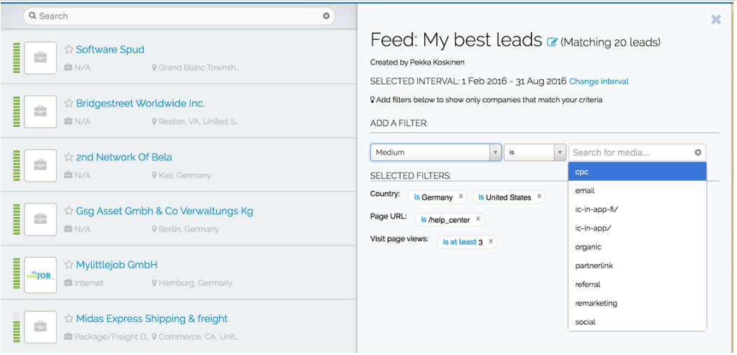
    Google Optimize
    (beta). This free web and mobile-web testing and personalization tool helps businesses improve their customer experiences and business metrics. Because it’s built on top of Google Analytics, businesses can use their existing information to experiment and personalize site experiences with minimal setup requirements. Request an invite.

"With Google Optimize, we’ve been able to provide more engaging content to The Next Web's readers – converting them from new readers to loyal customers."
Martijn Scheijbeler 
Director of Marketing - The Next Web


  1. How can everyone access and share powerful data?
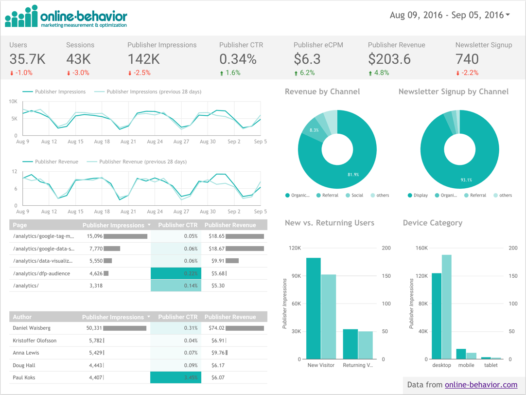
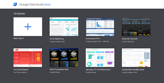
    Google Data Studio
    (beta), our free reporting and data visualization product, is now available globally in 21 new countries.* It enables businesses to easily spot and share insights, and collaborate to drive better decisions. Additionally, next month we’re launching report templates, making it even easier to get started. As with templates in Google Docs, Slides, and Sheets, businesses can create, edit, and use a library of templates to get up and running in a matter of minutes. Get started. The enterprise and free versions of Google Data Studio launched earlier this year in the U.S. These updates are also available in Data Studio 360, part of the Google Analytics 360 Suite.  


  1. How can everyone get useful insights, not just more data?
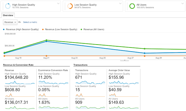
    Google Analytics
    , our free customer analytics product and measurement centerpiece, analyzes customer data from all touchpoints — and soon it’s becoming even smarter. Following the launch of our automated insight stream in the Google Analytics mobile app, we’re excited to announce Session Quality Score: A new metric that incorporates machine learning to predict the likelihood of a visitor making a transaction (purchase) on your site or app. Businesses can use session quality score to provide better customer experiences and / or remarket to their most engaged website visitors. This feature is coming soon in beta and will also be available in Analytics 360, part of the Google Analytics 360 Suite.


  1. How can everyone gain full visibility into customer journeys?
    Google Tag Manager empowers marketers to move faster and make decisions with confidence. It offers a simplified way to gather site information (all those tiny bits of code), and powerful APIs to increase data accuracy and streamline workflows. And today we’re greatly expanding our openness by integrating an additional 20 tags from Quantcast, Twitter, Microsoft Bing, Nielsen, and many more. See the full list of supported tags here. These updates will roll out over the next couple weeks and are also available in Tag Manager 360, part of the Google Analytics 360 Suite.


Modern measurement for everyone 

Put simply, that's our goal with these new free products. As today’s businesses are shifting to compete on customer experience and personalized marketing, we want to give all businesses the tools and access to compete — and ultimately, drive better online consumer experiences.

If you’re interested in learning more, please watch our blog this week and next. We’ll dive deeper into each product announcement and show you how they work. In the meantime, check out the resources below to learn more.
As always, you can visit our website to sign-up for our free analytics products.

*Canada, Brazil, Germany, Netherlands, Spain, France, United Kingdom, Italy, Indonesia, India, Japan, South Korea, Australia, Hong Kong, Malaysia, New Zealand, Philippines, Singapore, Thailand, Taiwan, Vietnam

How to set up Analytics on your AMP pages

Originally posted on Google Analytics blog

Posted by Arudea Mahartianto, Google AMP Specialist

In the digital world, whether you’re writing stories for your loyal readers, creating creative content that your fans love, helping the digital community, or providing items and services for your customer, understanding your audience is at the heart of it all. Key to unlocking that information is access to tools for measuring your audience and understanding their behavior. In addition to making your page load faster, Accelerated Mobile Pages (AMP) provides multiple analytics options without compromising on performance.

You can choose to use a solution like amp-pixel that behaves like a simple tracking pixel. It uses a single URL that allows variable substitutions, so it’s very customizable. See the amp-pixel documentation for more detail.

The amp-analytics component, on the other hand, is a powerful solution that recognizes many types of event triggers to help you collect specific metrics. Since amp-analytics is supported by multiple analytics providers, this means you can use amp-analytics to configure multiple endpoints and data sets. AMP then manages all of the instrumentation to come up with the data specified and shares it with these analytics solution providers.

To use amp-analytics, include the component library in your document's <head>:

<script async custom-element="amp-analytics"


src="https://cdn.ampproject.org/v0/amp-analytics-0.1.js"></script>

And then include the component as follows (for these examples, make sure to specify your own account number instead of the placeholder):

<amp-analytics type="googleanalytics">


<script type="application/json">
{
"vars": {
"account": "UA-YYYY-Y"
},
"triggers": {
"defaultPageview": {
"on": "visible",
"request": "pageview",
"vars": {
"title": "Name of the Article"
}
}
}
}
</script>
</amp-analytics>

The JSON format is super flexible for describing several different types of events and it does not include any JavaScript code which could potentially lead to mistakes.

Expanding the above example, we can add another trigger, clickOnHeader:

<amp-analytics type="googleanalytics">
<script type="application/json">
{
"vars": {
"account": "UA-YYYY-Y"
},
"triggers": {
"defaultPageview": {
"on": "visible",
"request": "pageview",
"vars": {
"title": "Name of the Article"
}
},
"clickOnHeader": {
"on": "click",
"selector": "#header",
"request": "event",
"vars": {
"eventCategory": "examples",
"eventAction": "clicked-header"
}
}
}
}
</script>
</amp-analytics>

For a detailed description of data sets you can request, as well as the complete list of analytics providers supporting amp-analytics, check out the amp-analytics documentation. You can also see more implementation examples in the Amp By Example site.

If you want to conduct a user experience experiment on your AMP pages, such as an A/B test, you can use the amp-experimentelement. Any configurations done in this element will also be exposed to amp-analytics and amp-pixel, so you can easily do a statistical analysis of your experiment.

There are still plenty of ongoing developments for AMP analytics to help you gain insights as you AMPlify the user experience on your site. Visit the AMP Project roadmap to see a summary of what the team is cooking up. If you see some features missing, please file a request on GitHub.

How to set up Analytics on your AMP page


In the digital world, whether you’re writing stories for your loyal readers, creating creative content that your fans love, helping the digital community, or providing items and services for your customer, understanding your audience is at the heart of it all. Key to unlocking that information is access to tools for measuring your audience and understanding their behavior. In addition to making your page load faster, Accelerated Mobile Pages (AMP) provides multiple analytics options without compromising on performance.

You can choose to use a solution like amp-pixel that behaves like a simple tracking pixel. It uses a single URL that allows variable substitutions, so it’s very customizable. See the amp-pixel documentation for more detail.

The amp-analytics component, on the other hand, is a powerful solution that recognizes many types of event triggers to help you collect specific metrics. Since amp-analytics is supported by multiple analytics providers, this means you can use amp-analytics to configure multiple endpoints and data sets. AMP then manages all of the instrumentation to come up with the data specified and shares it with these analytics solution providers.

To use amp-analytics, include the component library in your document's <head>:

<script async custom-element="amp-analytics" src="https://cdn.ampproject.org/v0/amp-analytics-0.1.js"></script>


And then include the component as follows (for these examples, make sure to specify your own account number instead of the placeholder):

<amp-analytics type="googleanalytics">
<script type="application/json">
{
 "vars": {
   "account": "UA-YYYY-Y"
 },
 "triggers": {
   "defaultPageview": {
     "on": "visible",
     "request": "pageview",
     "vars": {
       "title": "Name of the Article"
     }
   }
 }
}
</script>
</amp-analytics>


The JSON format is super flexible for describing several different types of events and it does not include any JavaScript code which could potentially lead to mistakes.

Expanding the above example, we can add another trigger, clickOnHeader:

<amp-analytics type="googleanalytics">
<script type="application/json">
{
 "vars": {
   "account": "UA-YYYY-Y"
 },
 "triggers": {
   "defaultPageview": {
     "on": "visible",
     "request": "pageview",
     "vars": {
       "title": "Name of the Article"
     }
   },
   "clickOnHeader": {
     "on": "click",
     "selector": "#header",
     "request": "event",
     "vars": {
       "eventCategory": "examples",
       "eventAction": "clicked-header"
     }
   }
 }
}
</script>
</amp-analytics>

For a detailed description of data sets you can request, as well as the complete list of analytics providers supporting amp-analytics, check out the amp-analytics documentation. You can also see more implementation examples in the Amp By Example site.

If you want to conduct a user experience experiment on your AMP pages,  such as an A/B test, you can use the amp-experiment element. Any configurations done in this element will also be exposed to amp-analytics and amp-pixel, so you can easily do a statistical analysis of your experiment.

There are still plenty of ongoing developments for AMP analytics to help you gain insights as you AMPlify the user experience on your site. Visit the AMP Project roadmap to see a summary of what the team is cooking up. If you see some features missing, please file a request on GitHub.

Posted by Arudea Mahartianto, Google AMP Specialist

Improving Google Analytics Events with Unique Events

Unique Events is a metric that counts the number of events with distinct Event attributes (Event Category, Action, and Label) that occur within a single user session. These events can be tracked independently from a web page or a screen load, giving you greater insight into actions taken within or across pages/screens. Downloads, mobile ad clicks, gadgets, Flash elements, AJAX embedded elements, and video plays are all examples of interactions you might want to track as Unique Events.

Some benefits of Unique Events include: 

  • Understanding how many users start/complete some action on your website 
  • Understanding the most popular media types/content consumed on your website 
  • Having an understanding of how many users repeat actions that should only occur once 
  • And many, many, more... 

How Unique Events Work 

Unique Events is a metric that counts the number of events with distinct Event attributes (Event Category, Action, and Label) that occur within a single user session.

This means that Analytics will increment the count of Unique Events by 1 for each unique combination of event category/action/label we receive the very first time we see them within a session, but will ignore future events with the same category/action/label when computing unique event counts. The metric Total Events will count each event regardless of the uniqueness of the category/action/labels therein.

Unique Events improves upon events in Google Analytics and will help make your measurement better.

 Learn more in our Help Center article here.

Posted by Breen Baker, Google Analytics Team

Using Google Analytics with Leadfeeder for B2B Lead Generation

Google Analytics is an important tool for marketers. It’s used to understand how people come to your website, how different content performs and how to get more conversions. All this is essential for knowing how to drive more high-quality traffic to your website.

For most B2B firms, the main purpose of their website is to generate sales leads by getting visitors to fill in some kind of contact form. But many see that just a fraction of visitors leave their contact information, and as a result, salespeople don’t get enough good quality leads from their website. So what can be done to improve this situation?

This guide will show you the 3 best ways to generate leads with Google Analytics:

1. Using Google Analytics Network report
2. Using a custom Google Analytics report template tool
3. Using Google Analytics with Leadfeeder for lead generation

One way to gain more leads from your website is identifying companies that visit, based on their IP address. With this data, you can have some information about the 98% of visitors that don’t explicitly contact you. When people visit a website using their office network, marketers can identify that someone from a certain company has visited and pinpoint what they have done there. For B2B outbound sales teams, this information can be very valuable.

If you see a company visiting your website, there’s a high probability that they’re in need of- and evaluating your product, which is the perfect time to get in touch with them.

Based on the IP address alone, it’s impossible to know exactly the name of the visitor, but in many cases this information is not needed. For example, if you sell email marketing tools and a company comes to your website and browses product pages, it’s a strong signal they are looking for a new email marketing tool. When you contact them, you want to contact the person who’s responsible for digital marketing, regardless of who visited your website.

For effective lead generation purposes, you should be able to identify real companies that have visited your website and see how they have behaved, to evaluate if they are a good lead.

1. Using Google Analytics Network Report

Using the Network report is the most common way to see which companies have been visiting your website. There have been many blog posts about this topic, for example this LunaMetrics post by Dan Wilkerson from 2012, this how-to article from Anna Lewis and a post by Traian Neacsu on uncovering hidden leads.

But these posts are all now a couple of years old and the Google Analytics interface has changed quite a lot since then. These days (2016) you can find the Network report in Google Analytics under Audience > Technology > Network.


Network report in Google Analytics

In the Network report (seen above) you will see a list of “Service Providers”. What Google Analytics means by “Service Provider” is the network where the visitor has been when they visited your website. Networks are always owned and registered by someone; typically a company, Internet Service Provider or some other organization.

One challenge in using the Network report is that many times the IP is registered by an Internet Service Provider (ISP) or some other non-interesting organization. In order to see the real companies, you should filter out ISPs from the list. The easiest way of doing this is to use the advanced search button and select to exclude Service Providers that match the following RegExp (just copy/paste this to the filter):
(not set|customer|internet|broadband|isp|cable com|network|tele|dsl|subscriber|pool|telecom|cable|addresses|telefonica|routed|leased line|communication|comcast|verizon|road runner|service provider|unknown|provider|t-mobile|wifi|telkom|sprint|at-t|residential|province|vodafone|clients|china|dial-up|netblock|wimax|wireless|elisa|sonera|dna oy|at&t|assigned|sl-cgn|block|consumers|kpn|telia|bredband|google|hosting|zscaler|city of|tdc|hubspot) 

Now the list of visiting companies should look a lot cleaner. If you wish to filter the results even further, e.g. only companies from a specific country, you should create a segment out of visitors from that country and look at the report again.

By default for each company in the list you can see how many sessions they have had during the selected time interval, how many pages they have visited and other metrics. When you click on one company, you can get to a more detailed report, like this one below.

In this view, select “Page Title” or “Page” as secondary dimension to know which pages the company has visited. This way you know what they have done on your website and what they were interested in. If they were visiting relevant product pages or they spent a lot to time on your site but didn’t contact you, maybe it’s a good lead for your outbound sales team to contact.


Using Network report to see what company did on the website

If you would really like to know what each company and their employees have done on your website, you can go to the brand new User Explorer report under the Audience section in Google Analytics. This report was introduced in Google Analytics in April 2016 and in the report you can dive into individual visitors and their behavior.

To know what a company did on your website, just create a segment where the Service Provider matches the company you are interested in (see below).

Using User Explorer to see visitors from one company

By doing this Google Analytics shows you Client IDs (anonymous and unique IDs of each visitor) from that company and by clicking one client ID (one user) you can see all the behavior of that user on your website. This way you can have a good understanding about what any given person from one specific company did on your website. Pretty powerful stuff, as you can see below.


Using User Explorer to see visits of one user

2. Using a custom Google Analytics report template tool

At Leadfeeder we created a ready-to-use Google Analytics custom report that anyone can take into use for free. Just click the link below and attach it as a custom report to the Google Analytics View you typically use: 

https://analytics.google.com/analytics/web/template?uid=zAQeJwWfT0yxlk8wfPWaGA 

When you click this link, you will be directed to Google Analytics and asked which view you want to attach it to. Remember that by default this custom report will be visible only for you. If other users want to use this report, they should also click the Add to Dashboard link above.


B2B Lead generation report by Leadfeeder

Our custom tool by default shows the most interested companies that have visited your website. To be more precise, this is a list of companies after ISP filtering (using the filter pasted above) sorted by pages / session, with the most interesting visits on top.

Typically companies that have spent a lot of time and loaded many pages are more interested than companies with many short visits. Once you click an interesting company, you can see a list of days on which they have visited. When you click even further into a specific date, you can see a breakdown of all the pages they visited. If page titles are not descriptive enough or not set, you can use “Page” as a secondary dimension to see page URLs (as shows below).


Using B2B Lead generation report by Leadfeeder

In the tool you can see several tabs that you can use (see above). The most interested companies tab is selected by default, but you can also select the second tab – companies with most visitors – that shows companies that have most visits on your website. Many times here you can find ISPs that were not filtered out along with other non-interesting companies. If you like, you can drill into details in the same way as in the first tab.

The 3rd and 4th tabs in the report are selectors that you can use to filter data. For example, if you are only interested in German companies, go to “Selector: Visitor location” tab and select Germany. After that click to the first tab to see the most interested companies from Germany. If you have a sales representative located in Germany searching for German leads, you can automatically have Google Analytics send this lead list by daily or weekly email.

Automating notifications from B2B Lead generation tool by Leadfeeder

Similarly, if your sales team’s responsibilities are divided by product, then sales reps might only be interested in leads that have visited certain product pages. Go to “Selector: Visited page” tab and select the product page each sales rep is interested in. Again, after making the selection, go to the first tab to see the list of the most interested companies visiting that product page and automate lead reports to your sales rep’s mailbox. You can also combine these selectors to create a list of companies from a specific country that have visited a specific product page.

3. Using Google Analytics with Leadfeeder for lead generation

Using the Google Analytics user interface for lead generation is possible as you can see, but not very salesperson-friendly.

 In order to better generate leads from your website for your sales department and do much much more, we created an online tool called Leadfeeder. Since Google Analytics is already collecting all the data about your website visitors, Leadfeeder fetches this data from Google Analytics API and does all the data crunching for you.

Leadfeeder lead generation main report

Once you sign up to Leadfeeder, it fetches all visitor data from your Google Analytics for the past 30 days. You don’t need to install any codes or script on your website; all you need to do is permit Leadfeeder to access your Google Analytics.

The web app filters out ISPs (a lot more than the Google Analytics filters shown in this post) handing you a clean list of companies. Once you see an interesting company and click on it, you see visit-by-visit, page-by-page what they have done on your website (as shown below). Leads are also enriched with additional company information such as company branch and size. With all this information it’s easier to determine whether the lead is interesting and whether they should be contacted.


Leadfeeder showing which pages a company has visited

Not all website visitors are interesting, so you can use custom feeds to filter out bounces and view only companies that have behaved in a way you find interesting. For example, you can define a custom feed rule to only show companies from a certain country, from a specific industry, companies that have visited a set number of pages and have visited a specific page but haven’t contacted you.

Using this kind of custom feed you can get a much more relevant list of leads for your sales team. In many companies sales responsibilities are divided by region or product so it’s good practice to make custom feeds for individual sales reps for only their areas of responsibility. Salespeople can subscribe to their personal custom feed to get daily or weekly email notifications about new companies that visit their website and match the set criteria. Understanding the online behaviour of your website visitors combined with knowing the location of the company visit gives sales reps powerful weapons for successful follow-up.


Using custom feeds in Leadfeeder to filter lead list

Seeing a qualified list of interested companies is already powerful, but this sales intelligence should fit within your existing sales process to be really useful. We know it’s the dream of many sales reps to have good leads magically appear in their CRM without the need to do anything, so that’s why at Leadfeeder we have built integrations to sync visitor data with your CRM.

The integration to Pipedrive and WebCRM are made two-way, which means that in Leadfeeder you can see CRM data for the visiting company, while in your CRM you can see all the website visits the company has made, once it’s been connected.

This makes it easier for sales reps to distinguish between new and old clients in Leadfeeder, create accounts and opportunities in their CRM with one click from Leadfeeder, and see in their CRM how prospects are interacting with their website.

Using CRM integration to sending leads from Leadfeeder to CRM

If you are not using a CRM at all, leads can also be sent to sales reps by email or you can assign leads for them to see inside Leadfeeder. It’s good practice to invite the whole sales team to use Leadfeeder with their own user profiles and it’s free to add users.

In addition, if you are using Mailchimp for email marketing, you can connect it to Leadfeeder to see in Leadfeeder what individuals do on your website when they click through from one of your MailChimp campaigns. This is possible because Mailchimp tags links uniquely for all recipients and Leadfeeder can transform these unique links into email addresses. This way you can know exactly who the visitor was on your website.

Leadfeeder offers a free 30-day trial with no credit card required, so if you are in B2B business and would like to get more sales leads, go and sign up at www.leadfeeder.com.

Conclusions

Web analytics has made marketing a lot more intelligent during the last 10 years, but similar development hasn’t transferred to sales.

Web analytics has enabled email tools to evolve into marketing automation by tracking what email clickers do on your website and triggering follow-up emails. Display marketing, similarly, has evolved into very efficient remarketing, where ads are shown to those who have completed action on your website.

In short, there are a lot of digital signals potential customers are giving all the time, but those haven’t been utilized well in sales so far. Many sales reps come to work, open their CRM and start calling through a lead list someone has given them. Meanwhile there are lots of potential customers browsing their website but sales reps aren’t aware of who they are. Our aim at Leadfeeder is to make sales more intelligent by providing salespeople actionable web analytics intelligence about potential customers, thereby making sales more effective.

Posted by Pekka Koskinen, Google Analytics Certified Partner

Google Consumer Surveys Launches Weekly U.S. Election Poll in Google Data Studio

With the U.S. presidential election less than 50 days away, the candidates are running full force to capture as many votes as possible. Worldwide, people are waiting anxiously to see whom the American people will pick as the 45th president. Now more than ever, the media is turning to polls to make sense of all the campaign activity.

Google Consumer Surveys — named as one of the “most accurate [polling] firms” by FiveThirtyEight in the 2012 election — has recently launched its 2016 U.S. Election Poll.


The 2016 election poll surveys more than 20,000 respondents each week from across the United States, demonstrating how Google Consumer Surveys can quickly collect thousands of representative responses. (Find out more about the poll methodology on page 3 of the polling report.)

Google Consumer Surveys, an online market research solution used to gain insights to inform important business decisions, has recently grown its footprint in politics with usage from groups such as NY Times Upshot, IJ Review, and Echelon Insights. Google’s survey platform and other online polling tools have gained popularity due to their accuracy, scalability, quick results, and low costs.

The election poll results from Google Consumer Surveys are displayed in an interactive data visualization in Google Data Studio, and voter preferences are updated weekly. This customized dashboard and report allows users to filter results by state, gender, and candidate to see different cuts of the data — and the report can easily be shared.

Check out the Google Consumer Surveys U.S. Election Poll for weekly updates as the American public gets closer to choosing its next president. Whether in politics or business, surveys are a powerful tool to get the public’s opinion. And spur lively discussions.

Happy Surveying!


More on Google Consumer Surveys

Many users, from small businesses to Fortune 500 companies, use Google Consumer Surveys today to run studies on consumer research, brand tracking, and ad effectiveness. Google also offers an enterprise survey solution with advanced targeting features such as user list and zip code targeting. 

Respondents answer questions on 1,000+ publisher sites to gain access to premium content. The publishers make money each time someone answers a question on their site. Google Consumer Surveys also has an app, Google Opinion Rewards, where people can answer survey questions for Google Play credit. There are over 10M potential respondents available to survey everyday.

Jackpot: APMEX Doubles New User Revenue with Google Optimize 360

A few months ago we shared a spotlight post on Google Optimize 360 (beta), a new testing and personalization solution in the Google Analytics 360 Suite. Today we’d like to share how one of our customers, APMEX, uses Optimize 360 to deliver an online shopping experience that matches the personal touch its customers get over the phone.

Built with full native integration for all the data that matters to your business, Optimize 360 let the APMEX team use their Analytics 360 goals and audiences to deliver better online experiences for their customers.


APMEX Case Study 

"Investments you hold" is the motto of APMEX, one of the nation's largest precious metals retailers. From the gold Maple Leafs of the Royal Canadian Mint to the platinum bars of Credit Suisse, APMEX offers thousands of bullion and numismatic products for easy sale online.

While APMEX is a large company, its marketing resources are limited. But APMEX works hard to give its online customers a concierge-level customer experience — the same personal experience customers get over the phone. "We refuse to believe that our customers’ experiences should be limited by our resources," says Andrew Duffle, Director of Analytics at APMEX.

APMEX relies on Optimize 360 to help it bring a personal concierge-level touch to its website users. "We test everything," says Duffle. "Creative versus non-creative, the impacts of SEO content on engagement, conversion rate optimization on low-performing pages, new user experiences, and even the price sensitivity of different products."

"One of our goals was to capture conversions on pages that were otherwise being used as educational resources," says Andy Mueller, Manager of Business Intelligence at APMEX. "We thought if people were checking the price of metals, they might respond to offers that really reflected their interests." In one test, new users coming to APMEX to check silver prices were given limited-time offers on United States Silver Eagles. If they're interested enough to check prices, the theory went, they might appreciate a chance to buy.

Before

After


The results were excellent, says Mueller: "We found the sessions that included an offer resulted in a median rate of 112% more revenue per session, with a 100% probability to beat baseline." The experiment did more than boost revenue: It also increased APMEX’s new customer counts. "We saw a 9% increase in new customer acquisition. Our customers have a long lifespan, so giving up a little margin on the first sale to the right customer is worth it to us."

Some of APMEX’s other tests have also produced astounding results. In one, the team used Analytics 360 to build an audience of people who had put Silver Buffalo coins in their shopping cart and then abandoned the cart. Those who returned to APMEX in the next few days saw the Silver Buffalo first thing on their homepage. As a result, the conversion rate for the coin doubled with this audience. 

"With all the data that Optimize 360 puts at our fingertips, we use it daily to build and evolve our customer relationships," says Duffle.

For more, read the full case study with APMEX.

Improved Analytics Administration via Property Moving

To meet our mission of providing world class digital analytics data, we’re pleased to announce the release of a feature we know many of you have been eager to use - the ability to move a Google Analytics or Analytics 360 property between accounts! It’s critical that we continually improve the core of Google Analytics, and we anticipate this will be a very helpful feature to improve users’ organization of Analytics accounts and get more power out of advanced features.

Benefits
Cleaner Accounts

With Google Analytics now over a decade old, it’s been a while since many of our customers created their first Analytics accounts. And until now, every time a property was created, it was housed permanently in its account. With the introduction of property moving, you are now able to simplify your accounts, and group properties together in a way that makes the most sense for your current business needs.

Enhancing Features like Rollup Reporting

There are many features in Google Analytics that work well across properties within a single account, but not across multiple Analytics accounts. With property moving, you can now consolidate properties in the individual accounts that make the most sense, and enjoy feature parity across all of those properties.

Roll-Up Reporting (available only in Analytics 360) lets you aggregate data from multiple properties within a single account; property moving lets you consolidate related properties within a single account. These two features combine to let you organize your data and reporting structure in the ways that are most relevant to your business.

Consolidating properties within a single account offers additional benefits:

  • You can apply the same set of filters to the views in all of those properties
  • You can easily manage users for the properties and views in a single account
  • You can use Change History to see all events from all properties in the same account

Ownership Transfers

Many customers may have had a third party (eg. an agency) create a property for their website inside the third party’s Analytics account. This effectively housed the property into an account that someone else owns & controls. With property moving, it’s now possible to move such a property outside of its original account and into a new one so that the property owner can have full control of their property.

How it works
No Retagging Required

We know how expensive it can be to retag a website, so we took special care to ensure moving a property does not require any retagging. Moving a property can be completed entirely within Google Analytics’ Admin section.

Moving a Property

In order to move a property from one Google Analytics account (called the “source account”) to another (called the “destination account”), you must have full access to both accounts. This means you must have Edit and Manage Users permissions for both the source and destination accounts. We have these high requirements to ensure only properly authorized users can perform this powerful action; and, in case a mistake is made, the user can move the property back to the source account. Learn More

To get started, login to your Google Analytics account, and visit the Admin section. Visit the “Property Settings” page for the property you’d like to move, and select the “Move Property” button in the top right corner. Here’s what the process looks like:


Make use of this feature whenever you need it. This is simply one example of many features we are building to constantly make Analytics work better for you, our loyal customers!

Posted by Tim Cao & Matt Matyas, Google Analytics team

Google Data Studio for Publishers


As we have seen in a previous post, Google Data Studio (beta) is a great solution for visualizing Ecommerce data. But if you are a publisher and your website is supported by ads, you might be wondering if it would work well for you...wonder no more! In this post we will look at a sample report with real-world data from a publisher.

The report below was created for Online Behavior, , an ad-supported content website. The ads are delivered using DoubleClick for Publishers (DFP), an ad management solution that helps publishers sell, schedule, deliver, and measure their digital ad inventory. On top of that, the website uses DoubleClick Ad Exchange (AdX), which provides a vast global inventory in real time.

With the configurations above in mind, you will notice that the main conversion shown in the Data Studio report below is the metric Publisher Revenue - this represents all revenue coming from DFP and DFP Backfill (in this case, AdX). Please note that this metric is not available by default on Data Studio, if you have the same settings you can create this metric using a calculated field to sum DFP Revenue and DFP Backfill Revenue. In addition to this metric, the website also uses Newsletter Signups as a secondary goal. A typical publisher! 


Let’s take a look at some of the elements shown in the report above:
  1. Scorecard strip: in order to highlight the overall metrics for traffic volume (Users, Sessions, Impressions) and outcomes (CTR, Revenue, Signups) we created a grey strip in the top of the chart. They show the last 28 days values, and right below them you will see a comparison to last period (green is good, red is bad).
  2. Line charts: while the total metric value is very important, it is also critical to keep track of the trends. The two line charts in the report will help the viewer understand if there are any sudden spikes or declines that require additional attention. In this case we chose the main volume metric (Impressions) and the main outcome metric (Revenue).
  3. Donut charts: who doesn’t love donuts?! Those charts are used to provide an overview of the most important Channels when it comes to the two conversion metrics: Publisher Revenue and Newsletter Signups. In summary, Organic brings a lot of Revenue and Display brings a lot of Signups.
  4. Tables: there is no chart that can beat a table when it comes to presenting detailed data. The two tables in the bottom left corner of the report show, for each article and author (author name is sent to Google Analytics through a Custom Dimension), how many impressions, the CTR, and the total Revenue. Using bar charts and heatmaps in a table greatly improves its readability.
  5. Bar charts: in the bottom right corner two bar charts were added to add more info about new and returning users and the devices used.
If you are a Publisher, we hope this will bring some inspiration! You can check out the full report above using this link

Please note that in order to report DFP data in Google Analytics you will need to use Google Analytics 360 integration with DFP (learn more). Happy visualizing!

Posted by Daniel Waisberg, Analytics Advocate


Enterprise-Class Tag Management: A look back on recent features

We built Google Tag Manager with the goal of solving tagging problems for our customers: decreasing implementation time so you can focus on the things that matter most to you, reducing errors so you can have more confidence in your data, and speeding up your tags to make your users’ experiences faster, and make the web a better place.

Last week, we launched workspaces to improve collaboration and enterprise workflows in Google Tag Manager. This is just the latest in a series of improvements designed to better meet the needs of our enterprise customers. In case you haven’t been keeping up with all of our many updates, here are some things you may have missed:

Testing & Security:
  • Environments – Building on our strong preview and debugging capabilities, Google Tag Manager and Tag Manager 360 now also support publishing changes to specific testing environments (e.g. Dev, Staging, QA). You can set up as many environments as you need for your organization and name them whatever makes sense for you. When you go to publish, simply choose the environment you’d like to publish your changes to. It’s never been easier to test your tags to make sure your upcoming tag changes align with your upcoming site changes, and that you get things right the first time.
  • Malware detection – To protect the safety and security of your users, Google Tag Manager and Tag Manager 360 will now automatically detect when tags deployed through your containers point to sites where we’ve found malware. You’ll be notified that there’s a problem, and the culprit tags will be paused so you can track down the issue without risk to your website and your users.
Organization:
  • Folders – As your containers grow over time, it can become difficult to keep track of all of your tags, triggers, and variables. With folders, you can organize these items into logical groupings, making them easier to work with for yourself and your team members.
  • Tag sequencing – Not all tags work independently. Sometimes it’s important for your tags to fire in a specific order. With tag sequencing you can specify tags to fire immediately before or after a given tag to ensure that things happen just the way you expect.
Mobile:
  • Mobile app tag management – Google Tag Manager for mobile apps has been rewritten to be simpler, smaller, and faster. It is now integrated with Firebase, Google’s new mobile app developer platform, which provides end-to-end development tools and analytics.
Services & Support:
  • Tag Manager 360 – Launched earlier this year as part of the Google Analytics 360 Suite, Tag Manager 360 includes services and support to help you get up and running faster, service level agreements (SLAs) to guarantee that you’ll be able to work on your tags as needed and that they’ll consistently fire based on your configuration, and integration with the 360 Suite for centralized account access and user management.
Interested in Google Tag Manager 360? Visit our website to learn more.