As we have seen in a previous post, Google Data Studio (beta) is a great solution for visualizing Ecommerce data. But if you are a publisher and your website is supported by ads, you might be wondering if it would work well for you...wonder no more! In this post we will look at a sample report with real-world data from a publisher.
The report below was created for Online Behavior, , an ad-supported content website. The ads are delivered using DoubleClick for Publishers (DFP), an ad management solution that helps publishers sell, schedule, deliver, and measure their digital ad inventory. On top of that, the website uses DoubleClick Ad Exchange (AdX), which provides a vast global inventory in real time.
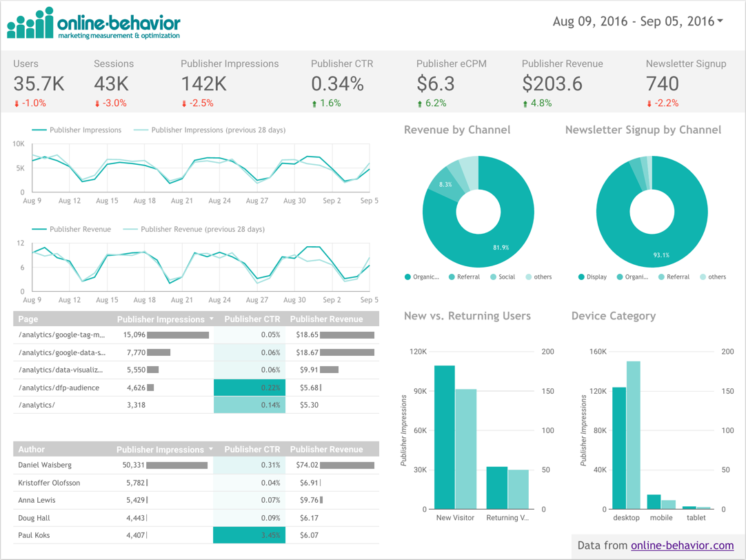
With the configurations above in mind, you will notice that the main conversion shown in the Data Studio report below is the metric Publisher Revenue - this represents all revenue coming from DFP and DFP Backfill (in this case, AdX). Please note that this metric is not available by default on Data Studio, if you have the same settings you can create this metric using a calculated field to sum DFP Revenue and DFP Backfill Revenue. In addition to this metric, the website also uses Newsletter Signups as a secondary goal. A typical publisher!
Let’s take a look at some of the elements shown in the report above:
- Scorecard strip: in order to highlight the overall metrics for traffic volume (Users, Sessions, Impressions) and outcomes (CTR, Revenue, Signups) we created a grey strip in the top of the chart. They show the last 28 days values, and right below them you will see a comparison to last period (green is good, red is bad).
- Line charts: while the total metric value is very important, it is also critical to keep track of the trends. The two line charts in the report will help the viewer understand if there are any sudden spikes or declines that require additional attention. In this case we chose the main volume metric (Impressions) and the main outcome metric (Revenue).
- Donut charts: who doesn’t love donuts?! Those charts are used to provide an overview of the most important Channels when it comes to the two conversion metrics: Publisher Revenue and Newsletter Signups. In summary, Organic brings a lot of Revenue and Display brings a lot of Signups.
- Tables: there is no chart that can beat a table when it comes to presenting detailed data. The two tables in the bottom left corner of the report show, for each article and author (author name is sent to Google Analytics through a Custom Dimension), how many impressions, the CTR, and the total Revenue. Using bar charts and heatmaps in a table greatly improves its readability.
- Bar charts: in the bottom right corner two bar charts were added to add more info about new and returning users and the devices used.
If you are a Publisher, we hope this will bring some inspiration! You can check out the full report above using this link.
Please note that in order to report DFP data in Google Analytics you will need to use Google Analytics 360 integration with DFP (learn more). Happy visualizing!
Posted by Daniel Waisberg, Analytics Advocate

