Category Archives: Google Web Fonts Blog

Posts from the web fonts team, working to make the web beautiful

Kickstart new fonts!

Google Web Fonts is proud to announce a new funding experiment, using Kickstarter - a popular way to fund creative projects.

Each month there are many typeface designs proposed to our team for publication and financial support. But we can’t support everything! Even with the best quality proposals, it can be hard to decide about those that are quite similar to ones already published. Really the best judge of which web fonts you want to use is you!

So we invited the designers of three recent proposals to try out Kickstarter and see how it works for font projects. There are some fun rewards for pledging a contribution so click through to see the details!

Folk


First is Marcello Magalhaes’ Folk, which transforms the vernacular lettering of Sao Paulo into a font. Already popular as web font, it has been used by The Independent Film Channel and Mozilla - but it only includes an uppercase set of glyphs, and not all the symbols and accents that Google Web Fonts requires. For this project, Marcello will complete the font to the Basic Latin character set, and has designed a poster to go with the new release.

Fast Brush Script


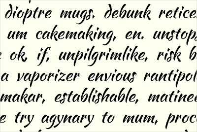
Fast Brush Script is the working name for a font by Pablo Impallari. Pablo's first font, Lobster, is one of the most popular Google Web Fonts, having been served over 2 billion times.

Pablo is offering a very unusual reward - choosing the name! Normally the name of a font is sacred to the designer, but Pablo is opening up the opportunity for corporate patronage of his work. The development name 'Fast Brush Script' reflects the core concept of the typeface. This font is currently in an early development stage with the lowercase letters now fully prototyped, as you can see above, and you can download the current develop version from the Kickstarter project page.

Montserrat


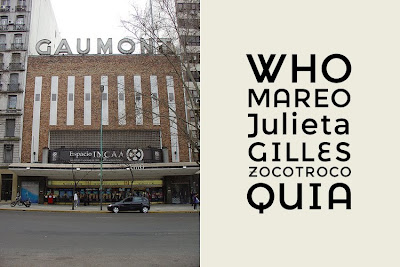
Montserrat is an extremely high quality sans serif text typeface by Julieta Ulanovsky. Advancing substantially during her studies at the prestigious University of Buenos Aires' Masters degree in Typeface Design, the design revives the historical type of the Montserrat neighbourhood where Julieta lives and works.

This genre of type has been a popular trend in recent years and this typeface in particular stands out with its excellent quality. Setting it apart are the set of alternative caps, which add a little fun to a very functional text typeface.


The Google Web Fonts team has already contributed directly to these Kickstarter projects, and we hope you will also become a backer for all three projects as well - let's hope the type designers will be paid far beyond their minimum funding goals!


Update: When fonts are made available in Google Web Fonts, all their source files are also available from the 'Google Font Directory' Google Code Project in a Mercurial version control system, under a free, libre and open source license - typically the SIL Open Font License.

Posted by Dave Crossland, Font Consultant, Google Web Fonts

Scary Fonts For Halloween

Halloween is here - what a fun time of year! The pumpkins are carved and the seeds are roasting in the oven, a chill is in the air, and all the little monsters are busy planning their best tricks and hoping for excellent treats. With all the trick or treating & costume planning, why not add some Halloween spirit to your website as well? We're happy to publish 4 new, fun, and scary fonts this week that are sure to provide a spoooooky feel for your website!


We would love to see how creative you can get with these fonts - please let us know where you are using them in the comments of this post, and we'll send out a Google Web Fonts T-shirt for our favorite!


Creepster by Sideshow


Its ghastly! Its gory! Its gruesomely gleeful! It's Creepster, the blood-curdling new font from Squid and Sideshow. This fright-filled font has so many alternates its like stitching together your own monster every time you use it. Creepster: perfect for all of your grisly graphic needs!


Eater by Typomondo


Eater is a display font infected by the darkest of rare disease that slowly spreads at night while the webfont user sleeps.


Nosifer by Typomondo


Nobody knows where Nosifer comes from. It emanates a dark stench as it drips from the internet.


Butcherman by Typomondo


Butcherman is a zombified display font, hacked and chopped and left for dead, yet still crawling!


Posted by Posted by Dave Crossland, Font Consultant, Google Web Fonts

Integrate Google Web Fonts selection into your apps

We’ve received lots of requests from developers for a dynamic feed of the most recent web fonts offered via Google Web Fonts. Such a feed would ensure that you can incorporate Google Web Fonts into applications and menus dynamically, without the need to hardcode any URLs. The benefits of this approach are clear. As Google Web Fonts continues to add fonts, these fonts can become immediately available within your applications and sites.

To address this need, we’ve built the Google Web Fonts Developer API, which provides a list of fonts offered via Google Web Fonts. Results can be sorted by alpha, date added, popularity, number of styles available, and trending (which is a measure of fonts growing rapidly in usage). Check out the documentation to get started.

Some developers have helped us test this new API over the last few months, and the results are already public. Take a look at TypeDNA’s photoshop plugin as well as Faviconist, an app that makes generating favicons as simple as can be, and Google Web Fonts Families, a list of Google Web Fonts that have more than one style.

We look forward to seeing what you come up with!

Posted by Jeremie Lenfant-Engelmann, Engineer, Google Web Fonts

The new Google Web Fonts – Now fully launched

At the end of June, we announced an experimental interface for the Google Web Fonts interface. Today, we’re pleased to offer this new interface to all users, by default. From now on, you can simply visit www.google.com/webfonts to use the new layout and functionality. The old interface will no longer be accessible.

There are a few things we’ve added since we initially launched the interface. We’d like to call attention to one of those features in particular. We’ve added the ability to bookmark your collection. Simply click the “Bookmark your collection” link from the top right of any page. This will give you a link that you can share with friends or coworkers to quickly share your selection.

There’s more to this than meets the eye. The bookmark will depend on which page you are currently on. For example, if you grab the bookmark link from the Review step, your link will forward to a page that displays your selection in the Review step. Similarly, if you grab the link from the Use step, the link will forward to the Use step. In this way, you can selectively choose which step in the font selection process you’d like to link to.


We hope you enjoy this new interface. We’re grateful for all the feedback we’ve received over the past 2 weeks, and we aim to continually improve the Google Web Font selection experience based on everything we hear. Keep it coming!

The New Face of Google Web Fonts

As we talked about at our Google IO session, the Google Web Fonts team has been hard at work designing a new font browsing experience for www.google.com/webfonts. Today, this new interface is available for you to try! Just click here, or you can click the New Version link at the top of our current product. The interface has a lot of the features you've requested, including the ability to preview your own custom text, the ability to compare fonts side-by-side, as well as an indication of page load times.


To arrive at the final design, our team spent significant time researching how users pick which fonts to use on your web pages, blogs and projects. Based on our findings, we sketched out dozens of possible ways to design our font browsing experience. After many iterations of testing with our test users, we believe we've arrived at a font browsing experience you'll really like.

Our primary goal with this new interface is to ensure that as the library of free, open source web fonts grows, you can still browse the library quickly and easily. To accomplish this goal, we've introduced the concept of a collection, which is similar to the concept of a shopping cart on your favorite ecommerce website. Just add fonts to your collection, and then proceed through the Choose, Review and Use steps. During this process, you can compare them side by side, experience with them in sample layouts using the new Test Drive feature, and finally copy and paste the HTML snippet to use these fonts in your pages.

During our user studies, we noticed that when users proceeded to select a font, they have a certain use case in mind. In other words, they knew they were looking for a font for a logo, for a heading or for body text. So we designed 3 different viewing modes - Word, Sentence and Paragraph - to facilitate font browsing in each of these cases. By default, you are in Sentence mode, which shows about a sentence length of preview text. But when you switch to Word mode, the font preview size increases, and the font cards shrink so you can see more fonts on the screen. When you switch to Paragraph mode, the text size will shrink significantly, and you'll see the fonts used in sample paragraphs instead.


Second, the new interface allows for easy font browsing by weight. Just use the thickness filter in the left hand panel. Looking for an Ultra black font? How about Ultra Light? Look no further. This feature relies on the font technology of TypeDNA. The Google Web Fonts are analyzed to determine each font's specific boldness characteristic. In this way, you see a consistent level of boldness across the fonts in your filter, regardless of how the font designer originally categorized them.

The new interface introduces the Test Drive module, which allows users to visualize their font collection in a sample layout. In this way, you can see what your fonts look like in practice, before embedding them in the final product. To take your fonts for a test drive, click on the Test Drive tab from within the Review step.

And finally, the new interface has a final step, Use. Here you'll find an indication of page load time based on your font selections. It's important to remember that the more fonts you use on your page, the more font data needs to be downloaded before your users can use your pages. Although Google Web Fonts is highly optimized to serve web fonts quickly to any user in the world, it's always important to request only the font families and styles you intend to use on your pages.


Sometime in the next few weeks, this interface will replace the current homepage at www.google.com/webfonts. But until then you can give it a spin and let us know what you think.

Posted by Jeremie Lenfant-Engelmann, Engineer, Google Web Fonts

Interview with Argentinian Type Designer Pablo Impallari


Pablo Impallari's Lobster font is one of the most popular fonts on the web. Its exciting design, excellent OpenType features, constant development and inclusion in the launch of Google Web Fonts last year have made it a favourite for millions of people.

Pablo continues to actively design and release his own typefaces and help other designers learn and publish new fonts. You can see all his fonts and read more about Pablo on his Google Profile.

Q: What inspired you to create the Dancing Script font?

I love scripts, both formal and casual. For Dancing Script, my inspiration came from the many casual scripts of the 1950s. "Murray Hill" and "Mistral" were the two main references.

Q: Did you try to accomplish something specific with this font, and did you succeed?

I wanted to create an informal flowing script where the letters bounce up and down the baseline. And to keep it friendly and legible at the same time.


Q: What kinds of documents are most appropriate for this font?

Any place where Arial and Times New Roman look boring. Informal invitations, party flyers, Happy Birthday cards... you name it! Its better to use it together with sans-serif fonts, so the spontaneous effect is enhanced through visual contrast.

Q: Designing a new font is a long journey. What inspires you to keep motivated throughout all the different stages?

If you look at the whole picture, thinking that you have to complete more than 200 glyphs, that can be overwhelming. But if you goes one letter at the time you get little "Eureka moments" each time you get finish a glyph. That motivates me to move on to the next one. Also, being able to write more words every time a new letter is added feels fantastic.

Q: What is your favourite part of the type design process, and why?

Designing the lowercase letters. Don't really know why... maybe because this is where everything else is defined.

Q: Can you recommend how other type designers can learn the skills involved in making a font like this?

Doyald Young's books are mind blowing. I encourage everyone to buy them. Sadly Doyald passed away recently and he surely will be missed!

Q: What are your favourite fonts, and why?

So many...

Young Galland and Young Finesse from Doyald Young, they are just perfect!

Montague Script from Stephen Rapp, its a truly lively script.

Pooper Black and Sneacy from Michael Clark, for the same reason.

Cabazon from Jim Parkinson, a legible, friendly Blackletter.

Tyffany and Ronaldson, for they spikey caps.

I can continue forever... There is always something to love in almost every typeface.

Q: What do you think could be improved about the type design process?

Hinting TrueType fonts is very hard to do. On Type 1 or OpenType-CFF fonts, that was not really a big problem since their hinting is much easier and looks much better. But since TrueType fonts are coming back for the web, TrueType hinting is important once again. This is my new reason to hate IE. Having a nice TrueType autohinter would be great!

Streamline your web font requests. Introducing “text=”

Oftentimes, when you want to use a web font on your website or application, you know in advance which letters you’ll need. This often occurs when you’re using a web font in a logo or heading.

That’s why we’re introducing a new beta feature to the Google Web Fonts API. The feature is called “text=”, and allows you to specify which characters you’ll need. To use it, simply add “text=” to your Google Web Fonts API requests. Here’s an example:
<link
href='http://fonts.googleapis.com/css?family=Special+Elite&text=MyText'
rel='stylesheet' type='text/css'>

Google will optimize the web font served based on the contents of this parameter. For example, if you only require a few letters for a logo, such as “MyText”, Google will return a font file that is optimized to those letters. Typically, that means Google will return a font file that contains only the letters you requested. Other times, Google might return a more complete font file, especially when that will lead to better caching performance.

The “text=” parameter has the potential to dramatically cut down web font file size. In some preliminary studies, web fonts can be cut from 35k down to just 5k (or even smaller), if only short strings of text are required. If you have a longer string, you can shorten the request by removing duplicate characters, as the order of characters in the string doesn’t matter.

The effect of this feature is even more pronounced on mobile devices, where connection speeds are limited. Using the text= parameter, you can ensure your users will have a great, quick loading experience.

We’re happy to say that the feature also works for international fonts. There’s no need to also specify the subset= parameter, as text= has access to all the characters in the original font. To access Unicode characters, use standard technique of url-encoding the UTF-8 representation of the string. Therefore, ¡Hola! is represented as: text=%c2%a1Hola! .

Enjoy!

Using UX Research to make Google Web Fonts even better!

Late in 2010, our team spent hours learning more about our users through surveys and traditional usability methods. In our survey, users spoke up loud and clear - “We want more fonts!” We are working hard to add new fonts with 35 font families added since December. What did users like best about the Google Font Directory? It is easy to use, available, dependable, and it has decent font choices and features... all at a great price - free!


What new features would you like to see added to the Google Font Directory?
More fonts! (More in general, international fonts, basic fonts, more weights/variants, & specific fonts)


What, if anything, do you like best about the Google Font Directory?

During our usability sessions, we were able to see many types of users interact with our web fonts. We identified major user groups and documented their typical workflow. The research we conducted took us to the brainstorming table. Our whole team spent an entire day brainstorming goals and priorities based on user research. The brainstorming day was followed by a design sprint in our Seattle office. Four talented Google designers and other team members spent five full days working through hundreds of mocks and design concepts. Stay tuned for the results of this effort!

So what’s next? More user testing, of course! Our engineers and user experience team have been busy working on ideas from the design sprint, and we are ready to get some feedback. If you would like to help us, sign up here!

Brainstorming involved lots of discussions & lots of stickies!


Hard at work in the design sprint.

Sign up to help us make Google Web Fonts even better!
http://goo.gl/1hmDN

posted by Dawn Shaikh, Senior User Experience Researcher, Google Web Fonts

Introducing Expletus Sans

Expletus Sans was added to Google Web Fonts this week.

Jasper de Waard, born in 1996, first came in contact with the beauty of type design when he was 10, and developed his skills as a type and graphic designer ever since. He was born and raised in Rotterdam, the Netherlands, and went to a bilingual high school there, training him to read and write English fluently and have a more international focus. He is currently in his third year, three years before his exam. He hopes to continue his practices in the fields of type and graphic design after he finishes school and release many more typefaces in the future.

His love for the tiny details, balance in proportions and urge for perfection made him into what he is today. However, the great support and feedback from people on several forums can't be denied as a great source of inspiration and evaluation material, giving him a greater understanding of the method behind type design. He is also available for custom type work and identity design.


Q: What inspired you to create the font?

It was a single x in a logo that started me off, but it was largely a search for my own opinions in type design so in a way you could say Expletus Sans was 'self-inspired'.

Q: Did you try to accomplish something specific with this font, and did you succeed?

I wanted to create a look that was completely different from everything I knew. I feel like I definitely succeeded in this.

Q: What kinds of documents are most appropriate for this font?

It could be used for anything that needs a good dose of elegance. I would personally love to see it in identity work.

Q: Designing a new font is a long journey. What inspires you to keep motivated throughout all the different stages?

Ones I put my mind to something, I finish it. With designing a typeface I feel like I have no choice. Once I've started, I get obsessed with perfection. Apart from that, it was the many great responses I got on the internet on my work that kept me motivated.

Q: What is your favourite part of the type design process, and why?

The very beginning. Trying to work out the basic lines of a concept and see the skeleton of the typeface emerge. It pleases me most, because it's the fastest and most rewarding process. After that it's months of tiny little details.

Q: Can you recommend how other type designers can learn the skills involved in making a font like this?

Start drawing or straight on the computer and post your work on as many type-related websites as you can think of. Take your time to read through feedback and never dismiss an idea before you have seen it. Don't give yourself a deadline. You'll never make it in time.

Q: What are your favourite fonts, and why?

All fonts by Robert Slimbach, because of his brilliant eye for perfection. Dolly, because of it's comfortable, yet fresh feel. The Centro superfamily, for excellence throughout all styles. Many more, for even more different reasons.

Q: What do you think could be improved about the type design process?

Multiple Master should be used more extensively and automated processes like iKern are underrated.

Q: How do you feel about publishing your font as an open source project?

It just happened to me. I never particularly thought about it, until you knocked at my door. It seems like a good way to start and increases the chance of seeing my work in use. I feel like it gives me the chance to make the world just a little bit more beautiful and let others enjoy that too, without charge.


Google Web Fonts – New Stats, New Name

Web fonts are taking off in a big way. Back in November, the Google Web Fonts team first published stats on the rapid adoption curve of the Google Font API. Then, Google was serving approximately 17 million daily font requests[1] to roughly 400,000 unique websites[2].

And today, less than 4 months later, we’re excited to announce that Google Web Fonts has since grown by another 290%. The Google Font API now serves roughly 50 million daily requests[1], across roughly 800,000 unique websites[2]. This equates to over 30% month over month growth. Amazingly, these stats don’t factor in caching, so the actual views of Google Web Fonts may far exceed these numbers.


Growth picked up considerably after Google Web Fonts announced over 20 new font families for the New Year. From these numbers, it’s clear that web fonts are quickly becoming part of the standard practice of web developers, game developers, and bloggers.

To make it easier for all, we’re also pleased to announce a re-branding of the “Google Font Directory” to “Google Web Fonts.” The service is now available via the simple, memorable URL: www.google.com/webfonts.

Web fonts are on their way to changing the very fabric of the web, and this is very exciting to Google.

Here’s to a beautiful web!

Posted by David Wurtz, Product Manager, Google Web Fonts


[1] A request is a single call to the Google Font API for one or more fonts.
[2] We count a unique website as unique domains, except that “www” subdomains are not counted. For example, www.myblog.com and myblog.com would count as one domain. However, sam.myblog.com and sally.myblog.com would count as two domains.