Category Archives: Google Web Fonts Blog

Posts from the web fonts team, working to make the web beautiful

Preview fonts with the new Poster mode

Selecting just the right font for your website or application is a personal decision, and making sure the font harmonizes with your content is often time consuming. To help you narrow down your font choices, last week we announced a new tool to compare individual characters in a pair of fonts side by side. Today, we’re introducing Poster Images, which allows you to easily see what a font looks like with different effects, on a variety of different backgrounds.

To start, visit the Google Web Fonts directory and select the Poster tab at the top.


Change the font size or the appearance of the poster to check out how different styles look. When you find a font you like, hover over it to see more details and add it to your collection.


We hope this makes choosing the right font easier and more fun!

Posted by Sang Tian, Software Engineering Intern

New Fonts, Early Access, and More

Over the last few months, we’ve been busy adding support for web fonts to Google documents and Google presentations. Today, we’re adding seven font families in Google Web Fonts, a new tool to compare similar fonts, and an early access program to get feedback on non-latin scripts in development.

When you choose a new font, you want it to look good for all your readers, regardless of the platform or browser they’re using. To help make fonts look better in more places, we’re starting to hint more families in Google Web Fonts, thanks to the ttfautohint project, which automates this process. Amarante, Capriola, Courgette, and Quando were hinted using this tool.

Eagle Lake expands on our existing collection of calligraphic font styles, and you can use Metal Mania to bring out your inner guitarist. We’re also very excited to be including a special contribution from our friends over at Adobe - Source Sans Pro, their first open source type family.

As the number of fonts in Google Web Fonts continues to grow, it’s becoming harder to select the right font from among many potential choices. To make this process easier, you can now easily compare two fonts side by side using the new comparison tool. Just add a few fonts to your collection, select Review, and click on the Compare tab at the top.


You can then overlay glyphs from each font on top of each other, and use the slider to transition between fonts to see the differences between them more clearly.

Non-latin fonts can be more complex than latin fonts, both as designs and as font software, which often require more time to develop and polish. The designers of these fonts may not be native readers, and we’re hoping for your feedback to help them understand where their fonts need improvement. You can try them out by downloading them from the Google Web Fonts early access page.

Posted by Ajay Surie, Product Manager

450+ new ways to make your Google presentations pop

(Cross-posted from the Google Drive blog)

Good design is an important part of getting your point across in a presentation. Over time we’ve added a bunch of features to help you bring a little something extra to your decks, like slide transitions and animations, thousands of free stock photos, and a growing collection of templates.

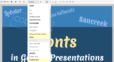
Today, creating eye-catching presentations gets even easier, with more than 450 new fonts to choose from. (flip through the presentation below to see them in action)


To browse and select new fonts, click on Add fonts from the bottom of the fonts dropdown in the toolbar. This will take you to the menu of all available fonts, where you can pick the ones you want to use.


Any fonts that you select will get automatically added to your fonts list so it’s easy to find them later.


Plus, fonts that you’ve already added to Google documents will automatically appear in your presentations font list too.

So next time you're working on a presentation, jazz it up with some Calligrafitti, Indie Flower, Short Stack, or hundreds of other new choices.

Posted by Erin Rosenbaum, Software Engineer

Google documents, now with web fonts!

(Cross-posted from the Google Docs Blog)

In the past month we’ve made updates both big and small to Google Docs, and today we’re announcing one more: web fonts in Google documents. Often the best way to get your point across is to present your idea in a creative, captivating way. Today, we added over 450 new fonts to Google documents to make it easier for you to add a little something extra to whatever you create.

To use these new fonts, click on the font menu and select “Add fonts” at the very bottom, which will take you to a menu of all the Google Web Fonts available.


Once you’ve selected new fonts, you’ll be able to select them from the font menu.


Whether you’re looking for the perfect font for your first comic book or fancy handwriting for your wedding invitations, we hope you try out the new fonts and create some eye-catching documents.

In addition to hundreds of new fonts, we have a lot of other exciting updates to report:
  • Google Drive launched as a place where you can create, share, collaborate, and keep all your stuff. 
  • There are now a few more options for inserting images in Docs, including inserting from Google Drive, searching for images from the LIFE Photo archive, or taking a snapshot with your webcam. 
  • Charts in spreadsheets now has support for minor gridlines and options to customize the formats of axis labels 
  • Accessibility in Docs got better with support for screenreaders in presentations and with the addition of NVDA to our list of supported screenreaders
  • From File > Page setup... you can now set the default page size for your new documents. 
  • It's now easier for speakers of right-to-left languages by automatically showing bidirectional controls when you type in a language that might use them. 
  • Apps Script had many improvements, including 
    • A new ScriptService for programmatically publishing your scripts and controlling when they run. 
    • A new function to find the root folder of someone’s Drive. 
    • An increase in the allowed attachment size in emails from 5MB to 25MB. 
    • An increase in the size of docs files you can create from 2MB to 50MB. 
  • There are now over 60 new templates in our template gallery.

    ttfautohint reaches its $30,000 funding target!

    The Google Web Fonts team would like to congratulate Werner Lemberg on reaching his $30,000 funding target for ttfautohint.

    Here is a fun video that explains what the project is about:


    As a true open source project, it has sought contributions from across the industry. Google Web Fonts, FontLab and many individuals have given the project financial support. This week the Extensis WebINK team announced they have enabled Werner to reach his goal:

    blog.webink.com/webink/extensis-webink-funds-open-source-ttfautohint-better-fonts-on-screen

    You can download a graphical user interface for GNU/Linux and Windows today, a command line tool for Mac OS X, and of course the source code, from the project homepage:

    www.freetype.org/ttfautohint

    Congratulations to All Designers of Tipos Latinos 2012!

    ¡Felicitaciones a todos los diseñadores de Tipos Latinos 2012!

    The Google Web Fonts team would like to extend our congratulations to all designers selected for the Tipos Latinos 2012 Biennial.

    El equipo de Google Web Fonts felicita a todos los diseñadores seleccionados en la Bienal Tipos Latinos 2012.

    We were looking forward to seeing the results of this prestigious review of work by typeface designers across Latin America because we have been working with many of them.

    Tenemos muchas ganas de ver los resultados de este prestigioso evento de diseño tipográfico de Latinoamérica, porque nosotros estuvimos trabajando con muchos de ellos.

    Around a quarter of the typefaces featured are available in Google Web Fonts today – or very soon:

    Aproximadamente un cuarto de las tipografías seleccionadas ya están disponibles en Google Web Fonts o lo estarán muy pronto:


    • Buenard, by Gustavo J. Ibarra (Argentina)

    • Petrona, by Ringo Romei (Argentina)

    • Ruluko, by A. Sanfelippo, A. Díaz y M. Hernández (Argentina, Colombia, Colombia)

    • Unna, by Jorge de Buen (Mexico)

    • Acme, by Juan Pablo del Peral (Argentina)

    • Macondo, by John Vargas Beltrán (Colombia)

    • Rufina, by Martín Sommaruga (Uruguay)

    • Abril, by José Scaglione y Veronika Burian (Argentina)

    • Alegreya, by Juan Pablo del Peral (Argentina)

    • Almendra, by Ana Sanfelippo (Argentina)

    • Andada, by Carolina Giovagnoli (Argentina)

    • Bitter, by Sol Matas (Argentina)

    • Delius, by Natalia Raices (Argentina)

    • Rosarivo, by Pablo Ugerman (Argentina)


    The Alegreya family (including its Small Caps sister family) received a "Mención de Excelencia" (Recognition of Excellence) – congratulations Juan Pablo!

    La familia Alegreya (que incluye una familia Small Caps) recibió la única "Mención de Excelencia" que en esta edición entregó el Jurado. ¡Felicitaciones, Juan Pablo!

    You can read more about Tipos Latinos at tiposlatinos.com.

    Pueden ver más sobre Tipos Latinos en tiposlatinos.com.


    Google Web Fonts is integrated into Network Solutions’ Website Builder Tool

    The Google Web Fonts team is proud to announce that Network Solutions have integrated our service with their Website Builder Tool.

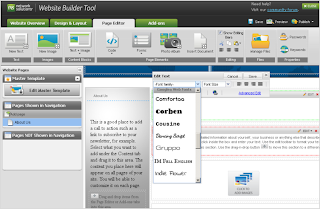
    Network Solutions is one of the largest domain registrars. When you register a domain with them, you can quickly and easily create a website using the Website Builder Tool. In the Page Editor, you can simply select a font from a drop down list in the typography palette for any text area:


    Get a domain from Network Solutions, create your site and you’re good to go with web typography!

    Read more at the Network Solutions blog.

    Are you a web developer, looking to present our growing collection to your users? If so, you should definitely check out the Google Web Fonts Developer API, which allows convenient programmatic access to a list of all fonts in the directory.

    Web Fonts, now more compressed

    One of Google’s core principles is that "fast is better than slow", and the Web Fonts team takes that to heart. We’re always looking for ways to make web fonts load faster, and that’s doubtless a key factor in our rapid user adoption. Today, we are announcing a new way to make web fonts smaller and faster, in collaboration with the Monotype Imaging Fonts.com Web Fonts team. Google Web Fonts now implements Monotype Imaging’s MicroType Express compression format, which yields an approximate 15% savings in file size over using gzip alone. This change will automatically speed up Google Web Fonts for Internet Explorer browsers (version 6 and up). We’re also actively working to offer improved compression with other modern browsers, including Google Chrome.

    We’ve kept the interface simple, so designers don’t need to update their integrations in any way — we’ll automatically upgrade the CSS snippet and font files so that site designers and visitors get their fonts faster. We’ve done this for previous speed optimizations as well, such as automatically stripping the hints (metadata used for improving rendering quality on Windows) when serving fonts to Mac, iOS, and Android clients. We expect that most future optimizations will also be automatic and transparent.

    Monotype Imaging has agreed to make MicroType Express available to the public at no cost; the license can be found at monotypeimaging.com/aboutus/mtx-license. We believe it’s friendly to both open source and proprietary implementations.

    Today, we are also releasing an implementation of MicroType Express compression as part of the Embedded OpenType converter in the open-source sfntly library, adding to the existing WOFF compression. The sfntly library, developed by the Google Internationalization Engineering team, serves as the core conversion engine in Google Web Fonts for subsetting, hint stripping, and related functions of our dynamic serving path. We hope that all web font services, as well as people hosting their own web fonts, will use sfntly to optimize font serving across the web.

    We are proud to be working with Monotype Imaging, and we look forward to learning more from designers, users, sites and other partners to advance the state of web fonts together!

    Posted by Raph Levien, Engineer, Google Web Fonts

    Extensis plug-in now supports Google Web Fonts

    Do you use Photoshop® to design your website? Looking to spice it up with cool web fonts like Lobster or Dancing Script? Well, now you can do that and more (with over 280 font families) using Google Web Fonts right in Photoshop®.

    That’s because, today, Extensis has added support for Google Web Fonts to their Web Font Plug-in for Photoshop®. Now, the entire catalog of Google Web Fonts is only a click or two away!


    In addition to making the entire catalog of Google Web Fonts easily accessible, the plug-in takes advantage of the full power of Suitcase Fusion 3. This means that any web fonts you choose to use for your designs are automatically kept up to date, and fully activated as needed. For example, this makes it easy for you to send your Photoshop® files around to your coworkers and not worry whether they have the font(s) installed — it will "just work"!

    The free Extensis Web Font Plug-in for Photoshop® can be downloaded now, from: webfontplugin.com

    Posted by David Kuettel, Technical Lead, Google Web Fonts

    Interview with Polish Type Designer Ania Kruk


    Ania Kruk is a type designer from Poznan, Poland. She currently lives and works in Barcelona and Google Web Fonts is proud to include her first published typeface, Cookie.

    Q: What is your background as a designer, and how did you become interested in type design?

    Actually, I'm still a beginner in the world of type design: I have drawn letters for only 2 years. I've recently graduated from the University of Arts in Poznan, Poland. Originally, I studied product design, but after 3 years I found myself more interested in graphics than in furniture.

    So I took a one year break and moved to Barcelona, Spain, where I worked as an intern in Estudio Mariscal (which was quite an experience, as they were working on the 'Chico y Rita' movie at that time), and did a one-year Masters in Typography and Editorial Design at Eina, Escola de Disseny i Art.

    When I came back to Poland for my last year of studies, I was 100% sure that I wanted to focus on type design.
    And here I am now, 3 months after my graduation, with my first typeface to be published: Cookie :)

    Q: What is your favourite part of the type design process, and why?

    Generally, I'm interested in complex, narrative projects that require creating a whole from various elements (meaning: editorial design, information design, typography). Type Design is not about designing one letter, it's about creating a system: the alphabet.

    I like the moment when you can start writing words and sentences with your letters, because then you can actually work on the flow and on the balance between the characters. For example, to make some of them more 'normal', transparent, in order to make others more distinctive or decorative.

    Q: Designing a new typeface is a long journey. What inspires you to keep motivated throughout all the different stages?

    For sure, Type Design is all about details, that an average user won't even notice, so you need to be patient to do this kind of work. I'd say I'm quite competitive, so when I see other peoples projects and I think 'Wow, that's so cool!', it get's me motivated ;) I spend an awful amount of time digging through the internet, checking out blogs, personal websites, etc.


    Q: Can you recommend how other type designers can learn the skills involved in making type?

    It's hard to say, because I'm still learning myself. But I'd say that calligraphy and drawing are essential to understanding the construction of the letters.

    Q: What do you think could be improved about the type design process?

    For me the hard part is hinting ;)

    Q: What inspired you to create Cookie?

    Cookie is a script typeface, based on brush calligraphy. It has a little bit of the 1950s look, that makes you think about all the beautiful ads and pin-ups from this time. It's sweet and friendly - but not too decorative. I tried to keep it simple and legible.

    Q: Did you try to accomplish something specific with this typeface design, and did you succeed?

    It's my first script typeface, so the whole design process was like discovering a new way of working. I wanted to create a typeface with a nice flow between the letters, and I wanted the letters to join in a natural way - that's the tough part, if you think about all the possible combinations between 26 lowercase characters. I hope it works ok...!

    Q: What kinds of uses are most appropriate for this font?

    Its clearly a display typeface, suitable more for titles than main texts. But it can be used for short texts, if you're aiming for a hand-written look. It will look good on an invitation, menu, recipe... poster, flyer or as a header of your blog :)

    Q: What are your favourite fonts, and why?

    Well, I don't really have any favourites. It all depends on the context and what you want to communicate: a typeface can be perfect for one kind of a job, but look horrible when misused.

    There are some surprises: I've always considered Mistral by Roger Excoffon as very kitsch and ugly, until I've seen it in on the opening credits for the movie 'Drive'. It looked just great, combined with the music and pictures.