What’s changing
Now, when you’re working on a chart in Sheets, you can give a design element (such as a bar on a bar graph or a point or line on a line graph) a unique color, instead of all similar elements being the same color. This works for bar charts, column charts, line charts, scatter charts and for certain series in combination charts.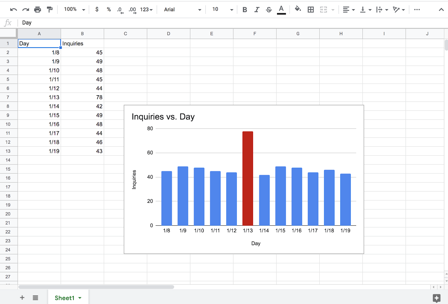
Who’s impacted
End usersWhy you’d use it
You can emphasize a part of a chart by changing its color to a different one than the main color of the series, allowing you to tell a better story.How to get started
- Admins: No action needed
- End users: To learn more about this new feature, check out this Help Center article.
Helpful links
Help Center: Add & edit a chart or graphAvailability
Rollout details- Rapid Release domains: Full rollout (1-3 days for feature visibility) starting on January 7, 2019
- Scheduled Release domains: Full rollout (1-3 days for feature visibility) starting on January 7, 2019
G Suite editions
- Available to all G Suite editions
On/off by default?
- This feature will be ON by default.
Stay up to date with G Suite launches
Notice the new format for these launch announcements? Give us feedback on it here.