Tag Archives: UI

Build your own Machine Learning Visualizations with the new TensorBoard API


When we open-sourced TensorFlow in 2015, it included TensorBoard, a suite of visualizations for inspecting and understanding your TensorFlow models and runs. Tensorboard included a small, predetermined set of visualizations that are generic and applicable to nearly all deep learning applications such as observing how loss changes over time or exploring clusters in high-dimensional spaces. However, in the absence of reusable APIs, adding new visualizations to TensorBoard was prohibitively difficult for anyone outside of the TensorFlow team, leaving out a long tail of potentially creative, beautiful and useful visualizations that could be built by the research community.

To allow the creation of new and useful visualizations, we announce the release of a consistent set of APIs that allows developers to add custom visualization plugins to TensorBoard. We hope that developers use this API to extend TensorBoard and ensure that it covers a wider variety of use cases.

We have updated the existing dashboards (tabs) in TensorBoard to use the new API, so they serve as examples for plugin creators. For the current listing of plugins included within TensorBoard, you can explore the tensorboard/plugins directory on GitHub. For instance, observe the new plugin that generates precision-recall curves:
The plugin demonstrates the 3 parts of a standard TensorBoard plugin:
  • A TensorFlow summary op used to collect data for later visualization. [GitHub]
  • A Python backend that serves custom data. [GitHub]
  • A dashboard within TensorBoard built with TypeScript and polymer. [GitHub]
Additionally, like other plugins, the “pr_curves” plugin provides a demo that (1) users can look over in order to learn how to use the plugin and (2) the plugin author can use to generate example data during development. To further clarify how plugins work, we’ve also created a barebones TensorBoard “Greeter” plugin. This simple plugin collects greetings (simple strings preceded by “Hello, ”) during model runs and displays them. We recommend starting by exploring (or forking) the Greeter plugin as well as other existing plugins.

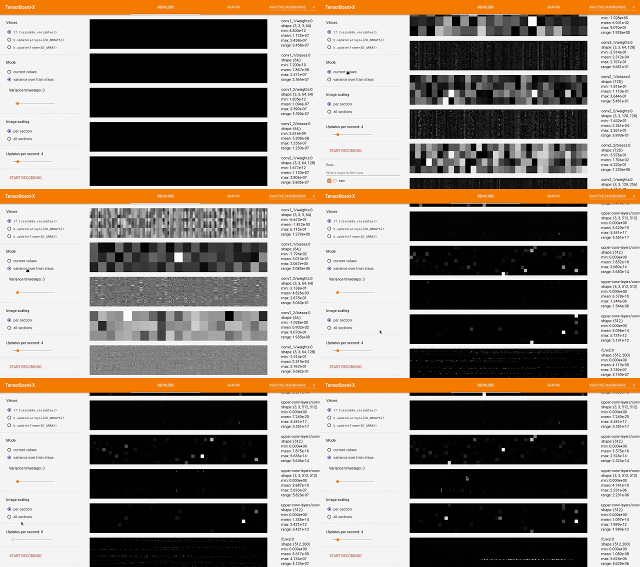
A notable example of how contributors are already using the TensorBoard API is Beholder, which was recently created by Chris Anderson while working on his master’s degree. Beholder shows a live video feed of data (e.g. gradients and convolution filters) as a model trains. You can watch the demo video here.
We look forward to seeing what innovations will come out of the community. If you plan to contribute a plugin to TensorBoard’s repository, you should get in touch with us first through the issue tracker with your idea so that we can help out and possibly guide you.

Acknowledgements
Dandelion Mané and William Chargin played crucial roles in building this API.


Harness the Power of Machine Learning in Your Browser with Deeplearn.js


Machine learning (ML) has become an increasingly powerful tool, one that can be applied to a wide variety of areas spanning object recognition, language translation, health and more. However, the development of ML systems is often restricted to those with computational resources and the technical expertise to work with commonly available ML libraries.

With PAIR — an initiative to study and redesign human interactions with ML — we want to open machine learning up to as many people as possible. In pursuit of that goal, we are excited to announce deeplearn.js 0.1.0, an open source WebGL-accelerated JavaScript library for machine learning that runs entirely in your browser, with no installations and no backend.
There are many reasons to bring machine learning into the browser. A client-side ML library can be a platform for interactive explanations, for rapid prototyping and visualization, and even for offline computation. And if nothing else, the browser is one of the world's most popular programming platforms.

While web machine learning libraries have existed for years (e.g., Andrej Karpathy's convnetjs) they have been limited by the speed of Javascript, or have been restricted to inference rather than training (e.g., TensorFire). By contrast, deeplearn.js offers a significant speedup by exploiting WebGL to perform computations on the GPU, along with the ability to do full backpropagation.

The API mimics the structure of TensorFlow and NumPy, with a delayed execution model for training (like TensorFlow), and an immediate execution model for inference (like NumPy). We have also implemented versions of some of the most commonly-used TensorFlow operations. With the release of deeplearn.js, we will be providing tools to export weights from TensorFlow checkpoints, which will allow authors to import them into web pages for deeplearn.js inference.

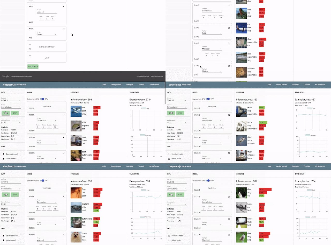
You can explore the potential of this library by training a convolutional neural network to recognize photos and handwritten digits — all in your browser without writing a single line of code.
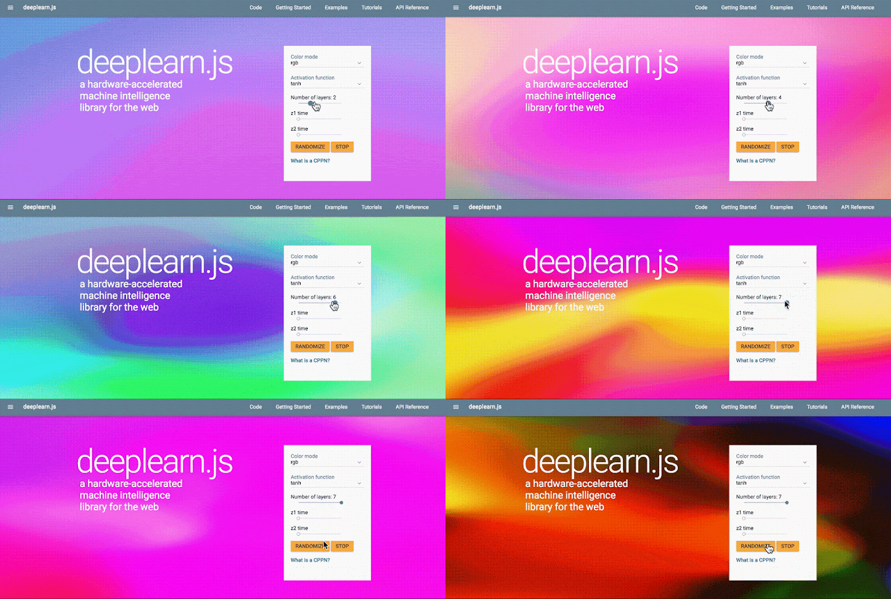
We're releasing a series of demos that show deeplearn.js in action. Play with an image classifier that uses your webcam in real-time and watch the network’s internal representations of what it sees. Or generate abstract art videos at a smooth 60 frames per second. The deeplearn.js homepage contains these and other demos.

Our vision is that this library will significantly increase visibility and engagement with machine learning, giving developers access to powerful tools while simultaneously providing the everyday user with a way to interact with them. We’re looking forward to collaborating with the open source community to drive this vision forward.

Build beautiful apps and websites with modular, customizable UI components

Posted by Adrian Secord and Omer Ziv, Material Design

Material Components lets you build easily for Android, iOS, and the web using open-source code for Material Design, a shared set of principles uniting style, brand, interaction, and motion.

These components are regularly updated by a team of engineers and designers to follow the latest Material Design guidelines, ensuring well-crafted implementations that meet development standards such as internationalization and accessibility support.

Accurate

Pixel-perfect components for Android, iOS, and the web

Current

Maintained by Google engineers and designers, using the latest APIs and features.

Open-source

The code on GitHub is available for you to contribute or simply use elements as needed

Industry standards

Also used in Google's products, these components meet industry standards, such as internationalization and accessibility

Material Components are maintained by a core team of Android, iOS, and web engineers and UX designers at Google. We strive to support the best of each platform by:

  • Supporting older Android versions with graceful degradation
  • Developing iOS apps that use industry standards like Swift, Objective-C, and storyboards
  • Integrating seamlessly with popular web frameworks and libraries

With these components, your team can easily develop rich user experiences using Material Design. We'll be continually updating the components to match the latest Material Design guidelines, and we're looking forward to you and your team contributing to the project. To get the latest news and chat with us directly, please check out our GitHub repos, follow us on Twitter (@materialdesign), and visit us at https://material.io/components/.

How to measure translation quality in your user interfaces


Worldwide, there are about 200 languages that are spoken by at least 3 million people. In this global context, software developers are required to translate their user interfaces into many languages. While graphical user interfaces have evolved substantially when compared to text-based user interfaces, they still rely heavily on textual information. The perceived language quality of translated user interfaces (UIs) can have a significant impact on the overall quality and usability of a product. But how can software developers and product managers learn more about the quality of a translation when they don’t speak the language themselves?

Key information in interaction elements and content are mostly conveyed through text. This aspect can be illustrated by removing text elements from a UI, as shown in the the figure below.
Three versions of the YouTube UI: (a) the original, (b) YouTube without text elements, and (c) YouTube without graphic elements. It gets apparent how the textless version is stripped of the most useful information: it is almost impossible to choose a video to watch and navigating the site is impossible.
In "Measuring user rated language quality: Development and validation of the user interface Language Quality Survey (LQS)", recently published in the International Journal of Human-Computer Studies, we describe the development and validation of a survey that enables users to provide feedback about the language quality of the user interface.

UIs are generally developed in one source language and translated afterwards string by string. The process of translation is prone to errors and might introduce problems that are not present in the source. These problems are most often due to difficulties in the translation process. For example, the word “auto” can be translated to French as automatique (automatic) or automobile (car), which obviously has a different meaning. Translators might chose the wrong term if context is missing during the process. Another problem arises from words that behave as a verb when placed in a button or as a noun if part of a label. For example, “access” can stand for “you have access” (as a label) or “you can request access” (as a button).

Further pitfalls are gender, prepositions without context or other characteristics of the source text that might influence translation. These problems sometimes even get aggravated by the fact that translations are made by different linguists at different points in time. Such mistranslations might not only negatively affect trustworthiness and brand perception, but also the acceptance of the product and its perceived usefulness.

This work was motivated by the fact that in 2012, the YouTube internationalization team had anecdotal evidence which suggested that some language versions of YouTube might benefit from improvement efforts. While expert evaluations led to significant improvements of text quality, these evaluations were expensive and time-consuming. Therefore, it was decided to develop a survey that enables users to provide feedback about the language quality of the user interface to allow a scalable way of gathering quantitative data about language quality.

The Language Quality Survey (LQS) contains 10 questions about language quality. The first five questions form the factor “Readability”, which describes how natural and smooth to read the used text is. For instance, one question targets ease of understanding (“How easy or difficult to understand is the text used in the [product name] interface?”). Questions 6 to 9 summarize the frequency of (in)consistencies in the text, called “Linguistic Correctness”. The full survey can be found in the publication.

Case study: applying the LQS in the field

As the LQS was developed to discover problematic translations of the YouTube interface and allow focused quality improvement efforts, it was made available in over 60 languages and data were gathered for all these versions of the YouTube interface. To understand the quality of each UI version, we compared the results for the translated versions to the source language (here: US-English). We inspected first the global item, in combination with Linguistic Correctness and Readability. Second, we inspected each item separately, to understand which notion of Linguistic Correctness or Readability showed worse (or better) values. Here are some results:
  • The data revealed that about one third of the languages showed subpar language quality levels, when compared to the source language.
  • To understand the source of these problems and fix them, we analyzed the qualitative feedback users had provided (every time someone selected the lower two end scale points, pointing at a problem in the language, a text box was surfaced, asking them to provide examples or links to illustrate the issues).
  • The analysis of these comments provided linguists with valuable feedback of various kinds. For instance, users pointed to confusing terminology, untranslated words that were missed during translation, typographical or grammatical problems, words that were translated but are commonly used in English, or screenshots in help pages that were in English but needed to be localized. Some users also pointed to readability aspects such as sections with old fashioned or too formal tone as well as too informal translations, complex technical or legal wordings, unnatural translations or rather lengthy sections of text. In some languages users also pointed to text that was too small or criticized the readability of the font that was used.
  • In parallel, in-depth expert reviews (so-called “language find-its”) were organized. In these sessions, a group of experts for each language met and screened all of YouTube to discover aspects of the language that could be improved and decided on concrete actions to fix them. By using the LQS data to select target languages, it was possible to reduce the number of language find-its to about one third of the original estimation (if all languages had been screened).
LQS has since been successfully adapted and used for various Google products such as Docs, Analytics, or AdWords. We have found the LQS to be a reliable, valid and useful tool to approach language quality evaluation and improvement. The LQS can be regarded as a small piece in the puzzle of understanding and improving localization quality. Google is making this survey broadly available, so that everyone can start improving their products for everyone around the world.