Category Archives: Google Web Fonts Blog

Posts from the web fonts team, working to make the web beautiful

Say Hello to our big new Japanese collection with Zen Fonts: Learn about the complex beauty of Japanese fonts


日本語で記事を読む

By Min-Young Kim

In 2019, Google Fonts started an ambitious project to expand its font library with a variety of typeface designs for Japanese. At that point Google Fonts had fewer than 10 Japanese families, most of which were basic Mincho (serif) and gothic (sans) designs. Since then the collection of Japanese fonts within the library has grown, now with 38 font families from 18 designers, in a variety of styles – from formal text types to fun display fonts. All these Japanese fonts are now live on Google Fonts for anyone to test out and use in any project.

A featured image in the Zen font family in light purple, green, red, and light brown, with black shapes and lines, and the name of the Zen font
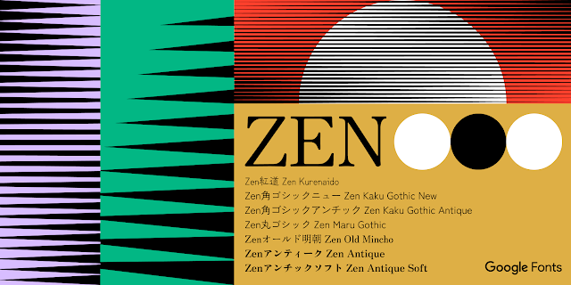
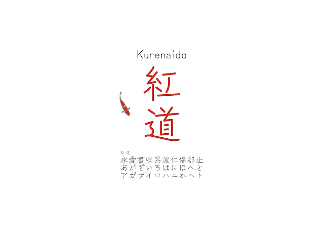
The Zen Fonts collection is the largest set of Japanese fonts on Google Fonts
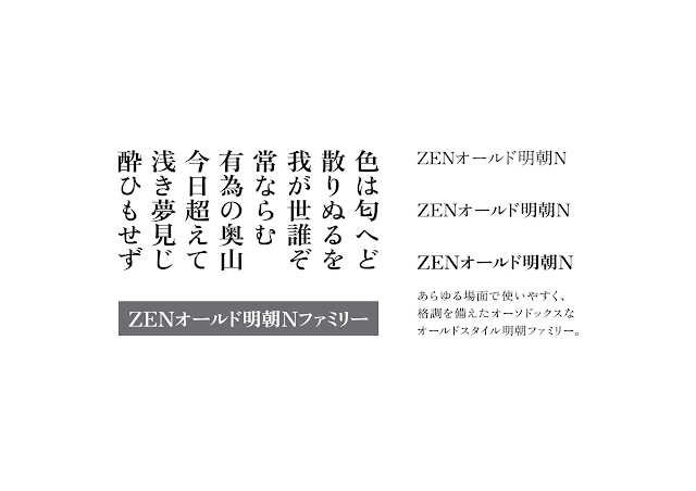
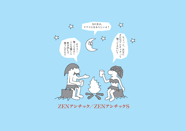
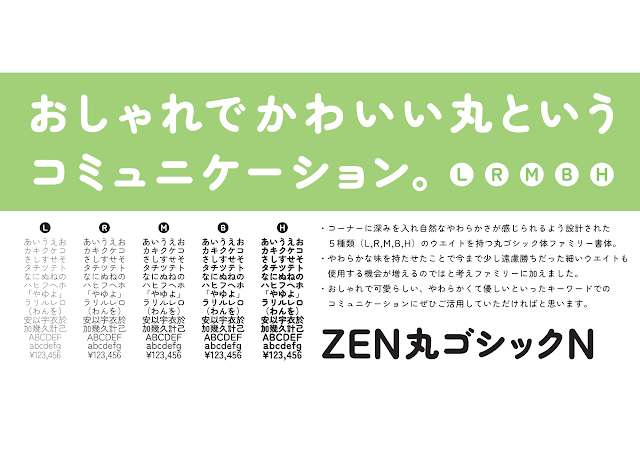
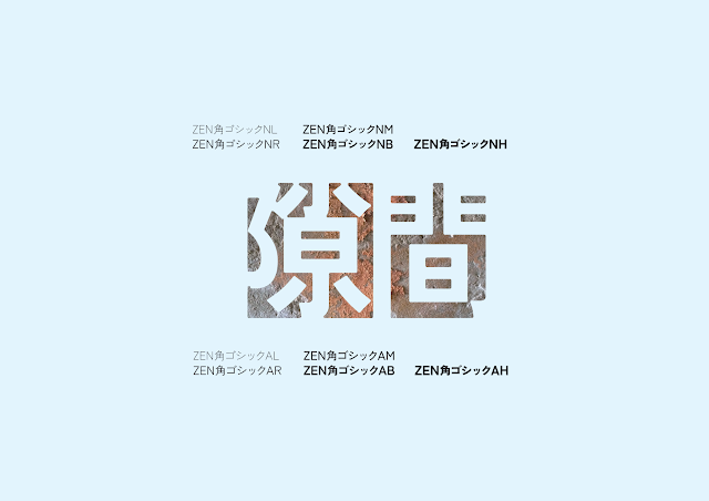
As part of this larger effort to expand Japanese offerings, Google Fonts collaborated with type designer Yoshimichi Ohira to open his prestigious collection of Zen Fonts typefaces to the public. With 23 Japanese and three Latin fonts in various styles of mincho (serif), gothic (sans serif), maru (rounded), and display styles, the Zen Fonts collection is now the largest set of Japanese fonts in Google Fonts’ expansive library, and is also available in Adobe Fonts. Check out The Story of Zen Fonts - interview with Yoshimichi Ohira to learn more.


Four lines of Japanese text with labels for “Katakana,” “Hiragana,” “Kanji,” and “Japanese Punctuation
Different kinds of scripts are used to write in Japanese

Understanding the culture of Japanese fonts

Japanese fonts have unique features and systems that aren’t seen in other Asian scripts. To understand, evaluate, develop, and release quality fonts for partners and users, the Google Fonts team needed to learn about and respect this unique typography culture. As a typography consultant, I developed a new evaluation criteria for Google Fonts that included all the important characteristics of good Japanese fonts.


Japanese is a complicated script

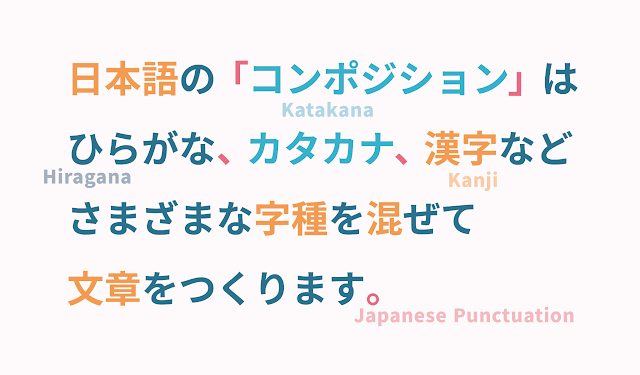
Japanese is a melting pot of scripts! There are five scripts most commonly used today in Japan. The first can be traced back more than a thousand years to China, when Japanese people borrowed Chinese characters to write their language. These Chinese characters are called “Kanji” in Japan. In the 1100s, the Japanese developed much simpler forms of letters called Kana. There are two sets of Kana, Hiragana, and Katakana; Hiragana is used for Japanese words, while Katakana is an alternative to Hiragana used for foreign or unfamiliar words. Kanji, Hiragana, and Katakana were used together to write Japanese text for hundreds of years. In recent centuries, Japanese people also adopted Arabic numerical figures and the Latin script, which is commonly used for English or other European languages—similar to many other places around the world. The very best Japanese fonts support all these writing systems, but many excellent Japanese fonts may have limited or zero Kanji characters.


What a big character set!

Compared to Latin fonts made for European language users, Japanese fonts with Kanji typically contain a huge number of characters—the biggest common standard for Japanese character sets spans over 23,000 glyphs. Not only do Japanese typeface designers have many glyphs to draw, but they must also handle many different kinds of character sets. There are also various different standards for categorizing.   


Kanji sets: Adobe, JIS, Jōyō, and educational Kanji

The Japanese Industrial Standards (JIS) system, with its four levels, is a popular way to categorize Kanji characters. “Name Kanji” are used specifically for names of places and people, and each of the JIS levels has a different selection of them. “Educational Kanji” is the smallest Kanji set, which includes Kanji that are taught in elementary schools, divided into 6 levels. “Jōyō” means “usual usage” and refers to the 2,136 Kanji that are used in official documents or news broadcasts, which people learn up until the end of high school. 


Many Japanese fonts support Adobe’s Japanese character sets. The Adobe Japan 1-3 set (with 9,354 glyphs) is perhaps the most common, while the Adobe-Japan 1-6 set is the biggest. 


These are related to the JIS levels, such as the Adobe-Japan 1-3 character set matching the JIS level 2. These contain all the Kanji used in everyday life, plus some more specific, yet common ones. Adobe-Japan 1-6 supports all four levels of JIS Kanji and enables texts for any occasion in Japan.


  • JIS Level 1:  With a foundation of 2,965 characters, this level includes the “educational Kanji” and “Jōyō Kanji” groups.

  • JIS level 2: With the addition of 3,390 Kanji to the Level 1 set, Level 2 covers all the most commonly used characters in everyday Japanese life. It also matches the Adobe-Japan 1-3 character set.

  • JIS Level 3: This matches Adobe-Japan 1-4 with an additional  1,259 characters, but is a midway to a wider range of Kanji expression; many recently-developed Japanese fonts cover either JIS level 2 or 4.

  • JIS Level 4: This is the JIS Kanji classification level with the biggest character set. Most of the 2,436 Kanji included here are rarely seen in daily life but are still needed for formal publications and government-related texts to address specific words or names.


JIS Level 1 contains simple Kanjis, while JIS Level 4 Kanjis are more complex and consist of more strokes.
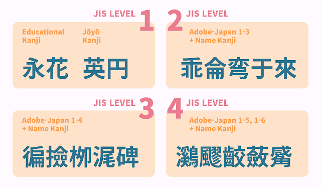
The higher the JIS level is, the more often complicated and rare Kanjis are included


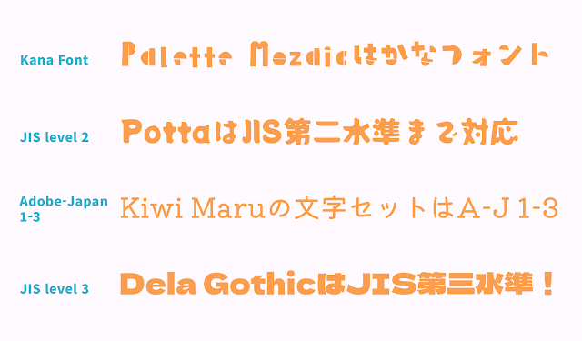
In working to publish new font families in the Japanese font development programme, we had to juggle an enormous number of characters. Most font families passed the bar set by the Adobe-Japan 1-3 standard—as that is commonly used as a minimal “full set”—while some fonts had coverage of JIS level 3. Some supported only the Educational Kanji.


Four lines of text displaying the variety of different character types
Japanese fonts with the different kinds of character sets available on Google Fonts

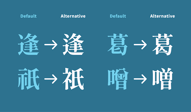
Alternative Kanji glyphs

Kanji can have alternative glyphs and there are two perspectives on the need for this.


Current Kanji letterforms in digital fonts are different from what we write with a pen and a brush. They often use more simple structures, which are easier to design as fonts, but harder for readers to understand as the actual anatomy of the Kanji letterforms may be unclear—especially to learners. An alternative Kanji glyph design trend is to add brush-like characteristics to the letterform designs, which is known as a “humanist” style. These design details allow readers to see more familiar Kanji forms and may enable children to learn Kanji more easily. 


There are several alternative glyphs for the older form of Kanji, mostly used for publications, official documents, or intended design. Even though it’s an “old form”, these Kanjis are still seen on many occasions.


Four examples of default Kanji glyphs vs. their common alternative glyph counterparts (逢, 葛,祇, 噌)
Common alternative Kanji glyphs


The Latin inside Japanese fonts
Japanese typeface designers call the Latin script section of their projects the “Subordinate Latin.” The typical Latin typeface has glyphs with varying proportional widths, but Kanji are designed to fit within a square space which means they are much wider than most Latin letterforms. This means a typical Latin font will look much too narrow when mixed in among Japanese characters.  To allow Latin to blend with the other scripts in Japanese text, Latin letterforms are modified to be slightly wider and have shorter ascenders and descenders and bigger counters. In addition to this adjusted Latin, Japanese fonts also include a “full width” Latin design.


“Hello Type” set in Shippori Mincho Subordinate Latin vs. Times New Roman
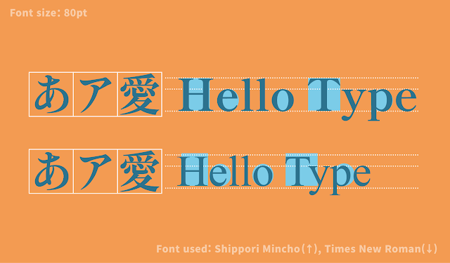
Japanese Subordinate Latin (top) compared to Times New Roman (bottom)


What the Japanese library means to the design community

This project to expand the Google Fonts library to better support Japanese users was not just about expanding the fonts themselves. Adding new Japanese fonts to the global font platform demonstrates Google’s recognition of Japanese fonts and culture. Today, in Japan and Korea, many fonts are only available in-country and are not available for purchase or subscription abroad. Through Google Fonts, users from all over the world can now access and use Japanese fonts, and they have a new opportunity to meet and experience the beauty of this unique language.


About the author
Min-Young Kim is a UI/UX & typography consultant based in Tokyo, with a focus on trilingual Korean-Japanese-Latin multiscript typography. While not yet a typeface designer herself, Min has developed a career in the font business as a type project manager, and started her own studio “Em Dash” in 2020. She has recently worked with Google Fonts on Japanese and Korean font development projects, Adobe Creative Cloud on East-Asian UX research & design, and was invited to the jury of the D&AD Awards 2021 for type design, and presented at AtypI Tokyo. With a deep understanding of typography, Min is dedicating her life to diversifying the potential of fonts in various products and environments, and hopes more people can find the fun in choosing and using type. @mintoming 


Zenフォント: 新しい日本語フォントコレクションの登場 – 日本語フォントの複雑な美しさについて –


筆者: きむみんよん

2019年、Google Fontsは日本語フォントコレクションの大幅な拡大プロジェクトを始めた。当時Google Fontsには10ファミリー程度の日本語フォントしかなく、そのほとんどは基本的な明朝体やゴシック体のみだった。それが今では、本文用から見出し用まで様々なスタイルの38の書体が、18組のデザイナーより追加され、豊富で多彩な日本語コレクションとなった。これら新しく追加された日本語フォントは、すべてGoogle Fontsを通して誰でも簡単にダウンロードして、どのようなプロジェクトにも使用することができる。


7種類のZenフォントファミリーの名前と、薄紫、緑、赤、黄土色のそれぞれの背景色にさまざな太さの黒いラインでグラデーションが描かれている
Google Fonts最大規模の日本語フォントコレクション、Zenフォントファミリー

この日本語コレクションの拡大において最も力を注いだものの一つは、大平義道さんによるZenフォントコレクションの招致だった。ZenフォントはGoogle Fontsの新しい日本語コレクションにおける最も大きいファミリーとして、明朝体、ゴシック体、丸ゴシック体、そしてデザイン書体など全部で23の日本語書体と3つの欧文書体が加わり、更にはAdobe Fontsでも利用可能となった。(より詳しくは:『Zenフォントのおはなし:大平義道さんとのインタビュー』


日本語のコンポジションはひらがな、カタカナ、漢字などさまざまな字種を混ぜて文書を作ります。それそれの字種の部分にタグが貼られている。
日本語を書くときは様々な字種を使用する。

日本語フォントの構造を理解する

日本語フォントには他の言語にはない独特の機能やシステムがある。それらを理解しクオリティの高い日本語フォントをリリースするため、Google Fontsチームはこの独特なタイポグラフィカルチャーを学ぶ必要があった。そのため、私はタイポグラフィコンサルタントとして、クオリティの高い日本語フォントが持つべき重要な特徴を評価する新しい基準を設けた。


日本語は複雑な文字である

日本語は文字のるつぼかもしれない。日本語を書くためには、5種類の文字が必要だ。大昔の日本では、中国より漢字を借りて当て字をしていた(これを万葉仮名という)。1100年ごろになって、万葉仮名をくずして書いたひらがな、省略して書いたカタカナが生まれ、現代ではカタカナは外来語表記に使われている。さらに、アラビア数字と、欧米圏の言語表記のためのラテンアルファベットが加わった。これらすべての文字種を含む日本語フォントが主流だが、中には収録している漢字の数が少なかったり、漢字が全く入っていないけれども素晴らしいクオリティの日本語フォントもある。


多様多彩な文字セット

欧米圏のユーザーのために作られた欧文書体に比べ、漢字を含む日本語フォントは膨大な文字数を持っている。最も大きい日本語の文字セットでは、なんと2万3千を超える文字が収録されており、日本語のタイプデザイナーは単純に描かなければいけない文字数が多いだけでなく、たくさんの種類の文字セットを扱わなければいけないのだ。これら日本語文字セットには様々な区分と基準が存在する。


漢字の文字セット:Adobe、JIS、常用漢字、そして教育漢字

日本産業規格(JIS)に則った漢字の区分は4つの水準があり、一般的な漢字の文字セット分類の一つである。「人名用漢字」は戸籍に人の名前として登録できる漢字のうち常用漢字に含まれないものを言い、JIS漢字区分の各水準に分散して収録されている。最も小さい漢字の文字セットの「教育漢字」は、小学校で学ぶ漢字を収録しており、6つの段階で分かれている。「常用漢字」は高校までで習う漢字領域で、法令、公用文書、新聞、雑誌、放送など、一般の社会生活において現代日本で必要不可欠な2,136字の漢字を収録している文字セットである。


多くの日本語フォントはAdobe-Japan 1に準拠しており、Adobe Japan 1-3(9,354文字)が最も一般的で、Adobe-Japan 1-6が最も大きい文字セットだ。

これらはJISの漢字水準とも繋がっており、例えばAdobe-Japan 1-3はJIS漢字の第二水準に相当する。この文字セットは一般生活で必要な漢字に加えて、利用頻度が低めの珍しい漢字もいくつか収録している。Adobe-Japan 1-6はJIS漢字の第四水準まですべて収録しており、どのような日本語文章も組むことができる。


  • JIS 第一水準:  全ての教育漢字と常用漢字の一部を含めた2,965文字を収録している。

  • JIS 第二水準: 第一水準に3,390文字を追加しており、一般生活で必要な漢字が含まれている。Adobe-Japan 1-3文字セットに相当する。


  • JIS 第三水準: 第二水準にさらに1,259文字が追加された、Adobe-Japan 1-4に相当する文字セットだが、中途半端な範囲なため、近年開発される日本語フォントの多くはJIS第二水準もしくは第四水準のどちらかの文字セットを収録している。


  • JIS 第四水準: JIS漢字水準のうち最も大きい文字セット。第四水準で追加される2,436文字のほとんどは極めて珍しい漢字だが、出版物や行政書類などで必要な単語や固有名詞を記すのに必要となる。


JIS 第一水準は永、花、円、英など馴染みのある漢字が含まれ、JIS 第四水準では飂、蘞など日常では滅多に目にすることない漢字が含まれる。
 JISの水準が高いほど、より複雑で珍しく画数も多い漢字が多くなる

Google Fontsの日本語フォントコレクション拡大において、膨大な数のフォントを開発・管理しなければいけなかったため、文字セットの理解はとても重要だった。ほとんどのフォントは最も一般的な文字セットのAdobe-Japan 1-3に準拠していたが、JIS第三水準に準拠したフォントや、教育漢字のみ収録しているフォントなど、様々なフォントがあった。


かなフォントのPalette Mosaicから、JIS第三水準までカバーしているDela Gothicまで4種類のフォントの使用例。
日本語フォントの様々な文字セットの例。すべてGoogle Fontsから利用することができる


漢字の異字体切替

同じ漢字でも異なる形の「異体字」が存在することをご存知だろうか?


現在デジタルフォントで見る漢字と、ペンや筆で書くときの漢字は字体が異なることがある。フォントはよりシンプルで簡素化した形をしているが、そこから漢字そのものの構造や字形を学ぶことは難しい。異体字の中にはこのように実際手で書くときの字体に近い楷書体的な特徴を着せた字形をしているものもある。これによって読者はより見慣れた形の漢字を目にすることができ、子供たちの漢字学習にも役立つ。


さらに、異体字の中には旧字体の漢字を含むものもある。出版物や公式文書、意図的なデザインとして利用されることが多いが、旧字体と言っても中には生活でまだよく目にする、使用頻度の高いものもある。


逢, 葛,祇, 噌の異体字切替。
漢字の異体字切替の例。

日本語フォント内のラテンアルファベット(従属欧文)

日本のタイプデザイナーは、日本語フォント内に入っているラテンアルファベットを「従属欧文」と呼ぶ。一般的な欧文書体は文字によってそれぞれ異なる字幅を持っているが(これをプロポーショナル字幅と言う)、漢字は全角で描かれているため、ほとんどのラテンアルファベットより横に長い平体に見えてしまう。これを解決すべく、日本語フォント内の他の字種と調和させるために、字幅を若干広くする、アセンダーやディセンダーを狭くする、カウンター(ふところ)を大きくするなどの調整を施したものが従属欧文である。加えて、他の言語では類を見ない「全角アルファベット」の収録も日本語フォントでは一般的である。


“Hello Type”の文で比較する従属欧文と純欧文の違い
2つの文章は、各自、上は日本語フォント「しっぽり明朝」の従属欧文、下はTimes New Romanと異なるラテンアルファベットで組まれている。比べて見ると、日本語フォントの従属欧文のほうが、純欧文よりも字面が大きく、カウンター(ふところ)も広く描かれている。

デザインコミュニティにとって日本語フォントコレクション拡大が意味すること

Google Fontsの日本語コレクション拡大は、単にフォントの数が増えるという事実以上の意味を持っている。グローバルフォントプラットフォームに日本語フォントが多数追加されることは、Googleがいかに日本語フォントと文化に注力しているかの証明でもあるのだ。現在、日本や韓国では、フォントの利用は国内でのみ可能で、海外からの購入やサブスクリプション契約はできないことが多い。今回の日本語フォントコレクション拡大により、Google Fontsを通して、全世界のユーザーが日本語フォントが使えるようになっただけではなく、日本語という独特な言語の美しさと出会い、体験することができるのだ。


きむみんよん
日欧韓トリリンガルのUIUX&タイポグラフィコンサルタント。専門は多言語タイポグラフィ。日本の大手タイプファウンダリにてフォントのプロジェクトマネージャーを経て、現在は個人事務所Em Dash(エムダッシュ)を立ち上げ、様々なプロジェクトに参加している。近年ではGoogle Fontsとの日本語および韓国語のフォント開発、Adobe Creative Cloudの東アジア言語のUXリサーチ&デザイン、D&AD Awards 2021にてタイプデザイン部門の審査委員などに携わっている。タイポグラフィの知識を活かし、フォントの可能性を広げ、より多くの人々に文字とフォントの楽しさを伝えていくことを目標としている。 @mintoming  AtypI presentation 


New font family: Urbanist by Corey Hu


Urbanist is a low-contrast, geometric sans-serif inspired by Modernist typography and design. The project was launched by Corey Hu in 2020 with 9 weights and accompanying italics. Conceived from elementary shapes, Urbanist's neutrality makes it a versatile display font for print and digital mediums. 

It is currently available as a variable font with a weight axis: https://fonts.google.com/specimen/Urbanist


Posted by Tobias Kunisch, Design Lead for Google Fonts

We’ve Moved!


Head over to our new Google Fonts Collection on Google Design to stay up-to-date with the latest and greatest developments at Google Fonts. Here you’ll find articles ranging from technical updates and creative improvements to in-depth case studies and curated fonts collections. You can also follow us on Twitter for up-to-the-minute news.

Stay in touch.

@GoogleFonts

Google Fonts Collection via Google Design

Google Fonts Github

Raising the quality of fonts in our collection

Since the new Google Fonts directory launched in May, we’ve been hard at work improving the quality of the fonts in our collection. In June we invited a team of typeface designers and font engineers from around the world to our New York City offices  to kick off a 4-months font improvement project. Each member of the team was selected for their extensive industry experience in type design or font production:

  • Jacques Le Bailly (Latin type designer)
  • Lasse Fister (font engineer)
  • Marc Foley (font engineer)
  • Kalapi Gajjar (Indian type specialist)
  • Thomas Jockin (Latin type designer)
  • Nhung Nguyen (Vietnamese type specialist)
  • Alexei Vanyashin (Cyrillic type specialist)
The team was tasked with improving the quality of fonts in our catalog. During the first week we examined the entire Google Fonts collection to determine the strengths and weaknesses. We considered various possible approaches to improving quality, and at the end of the week we decided to focus on typefaces that were already widely used and had great potential. We divided the project into three sprints.

Design work consisted of adding glyphs to support more languages, fixing incorrectly placed or shaped accent marks, re-spacing the type’s metrics and kerning, and in some cases re-drawing the designs from scratch. In each sprint we spent one week on quick improvements to one or two families, and three weeks for a deep dive on a single project.

To ensure we maintained a high standard of work and stayed true to the original intent of each design, our entire design process was done in the open (on GitHub) and was regularly documented in the Google Fonts Discussions Group. For each design, our team critiqued each other’s work, and kept in touch with the original designers whenever possible.
Pacifico - Comparison of original and new fontsQuicksand - Comparison of original and new fonts
Pacifico and Quicksand
In the coming weeks, our team will push the new versions of these fonts. Updated fonts will appear in the Google Fonts directory, and the new higher quality designs will automatically benefit any site or product that uses the Google Fonts API.

Larger, deep-dive projects:
Alfa Slab One, Cabin + Cabin Condensed, Comfortaa, Didact Gothic, Inconsolata, Jura, Maven Pro, MuliNunito (and a new Nunito Sans!), Pacifico, Quicksand, RubikVT323.


Smaller projects with wider language support:
Anaheim, Anton, Arvo, Bad Script, Bangers, Bevan, Bitter, Cabin Sketch, Cutive Mono, Dancing Script, Francois One, Homenaje, Indie Flower, Kurale, Lobster, Lora, Marmelad, Metrophobic, Merriweather, Neuton, Oswald, Play, Podkova, Poiret One, Prata, Press Start 2P, Raleway, Rokkit, Ropa Sans, Rubik Mono, Share Tech, Sigmar One, Telex, Trocchi, Varela Round, Yanone Kaffeesatz.


Keep watching this blog for new posts by the team summarizing their type design processes, thoughts and decisions.

Posted by Dave Crossland, Program Manager

Adobe Typekit improves the Rosario typeface family

Since 2010, Google Fonts been collaborating with the Adobe Typekit team to create better web font technology. And now that many fonts first published by Google Fonts are also available in Adobe Edge Web Fonts, we’re extending that collaboration beyond just software to fonts themselves.

Together with Adobe, we want to improve the quality of open source fonts available to everyone publishing on the web. As a first step, the Typekit team has optimized Rosario, a humanist sans serif based on the classic proportions of Garamond’s type.

To start the process, Typekit reached out to the foundry, Omnibus Type, to request up to date copies of the font source files. Here are some examples of the possible optimizations that the Adobe team might make to a web font:

  • Convert and/or clean up outlines, for design fidelity and file size efficiency
  • Re-componentize source fonts, for file size efficiency
  • Remove/reassign glyphs with incorrect Unicode code points, for semantic value
  • Add common missing glyphs (non-breaking space, soft hyphen)
  • Set vertical metrics values according to best practices
  • Set underline and strike-through values, for design consistency
  • Contribute PostScript hints and (if a typeface was designed for small sizes like paragraph text) TrueType instructions (also called hinting), which consist of instructions to the rasterizer embedded in the font file itself

After making some of these improvements, Typekit sent their version back to the foundry to review and release on the Omnibus Type homepage. The updated Rosario family is now available in Typekit, Adobe Edge Web Fonts and Google Fonts.

Together with the Typekit team, we’re looking forward to more quality improvements in the future!

A new look and name for Google Web Fonts

This week, Google Web Fonts got a simpler, cleaner look that makes searching and accessing your fonts easier than ever. And in the spirit of simplicity, today Google Web Fonts is now just “Google Fonts.” It’s still the same great collection of free fonts you know and love, but with a new name.


You can get started with Google Fonts here: www.google.com/fonts

Posted by Ajay Surie, Product Manager

Easier ways to find the right font

We know that finding the right font for your website or blog is a personal choice, and there are many great fonts available to choose from on the web. Now when you search for a font that isn’t available on Google Web Fonts, we show you additional fonts available from Monotype. Each result is shown in the actual font so you can easily preview your options. To get more information on a font, simply click the link under it’s name.


We look forward to adding results from more web font providers in the future.

Posted by Raziel Alvarez, Software Engineer

Web fonts: a look under the hood

Google Web Fonts are viewed more than 1 billion times every day across the web, on more than 100 million web pages. To help you sort through and pick the right font for your site you can order fonts by popularity, and now you can check out usage data for each font too.

Click on "Analytics" in the upper right corner of the homepage to view the new analytics tab, where you can see and compare numbers for individual font views by browser, operating system and see usage trends.


You’ll see a list of fonts, ranked by the total number of all-time font views and sortable by time period. To see a graph of font data for an individual font or a set of fonts, check the box next to the font name and click on the Trend button.


Clicking the views by platform tab on the left pane shows you a heatmap and pie charts of usage of each font by browser or operating system.


While browsing through fonts in the directory, you can also access analytics for an individual font at anytime by navigating to the Statistics tab on the font’s specimen page.


And finally, to help you compare and select fonts, clicking on the “Pairings” tab on the Specimen page will show you groupings of fonts that are frequently used together, based on actual usage data via the API.


Selecting the right font for your website is an expression of your personal style, and we hope to continue expanding the set of tools to help you do that. Happy browsing!

Posted by Raziel Alvarez, Software Engineer

More places to get great fonts

Open source fonts are good for the web: they’ve helped spur web font adoption, and made it easier for anyone to contribute improvements to fonts for the whole web community.

Today, we’re happy to announce that all the fonts in the Google Web Fonts directory are also available via Adobe’s new Edge Web Fonts service.

And on the heels of the recent release of Source Sans Pro, another Adobe designed open source font, Source Code Pro, is available today from both Google Web Fonts and Edge Web Fonts.

We’re also working with the Adobe team to hint some of the fonts in the collection, a process that will make them look better at smaller text sizes.

Here’s to a more accessible, translatable, and beautiful web!

Posted by Ajay Surie, Product Manager