Author Archives: Gary Lewis

Project Tango heads to GDC with new updates and games

Posted by Alex Lee, Program Manager, Project Tango

This week we’re headed to the Game Developer Conference in San Francisco—it’s a great opportunity to get inspired, engage with new technology and learn from each other.

In fact, one of the things we’ve heard from game developers in particular, is that it’d be awesome to have a plugin for Unreal. We agree. Which is why we’re excited to announce that Opaque has just released the beta version of their Project Tango plugin! Stop by our booth at GDC to learn more (Zone 1, Booth 612), and to see all the newest Project Tango games in action. We’re also hosting two talks we think you’ll like:

  • Wednesday March 16th, 11-11:20 am: Jesse Schell, CEO of Schell Games, discusses building with Tango and demonstrates his company’s apps
  • Thursday March 17th, 12:30 -12:50 pm: Randall Eike, President of Eike Consulting and Daniel Winkler, Lead Programmer at Iguanabee introduce two new Tango-powered games, Raise and Slingshot Islands

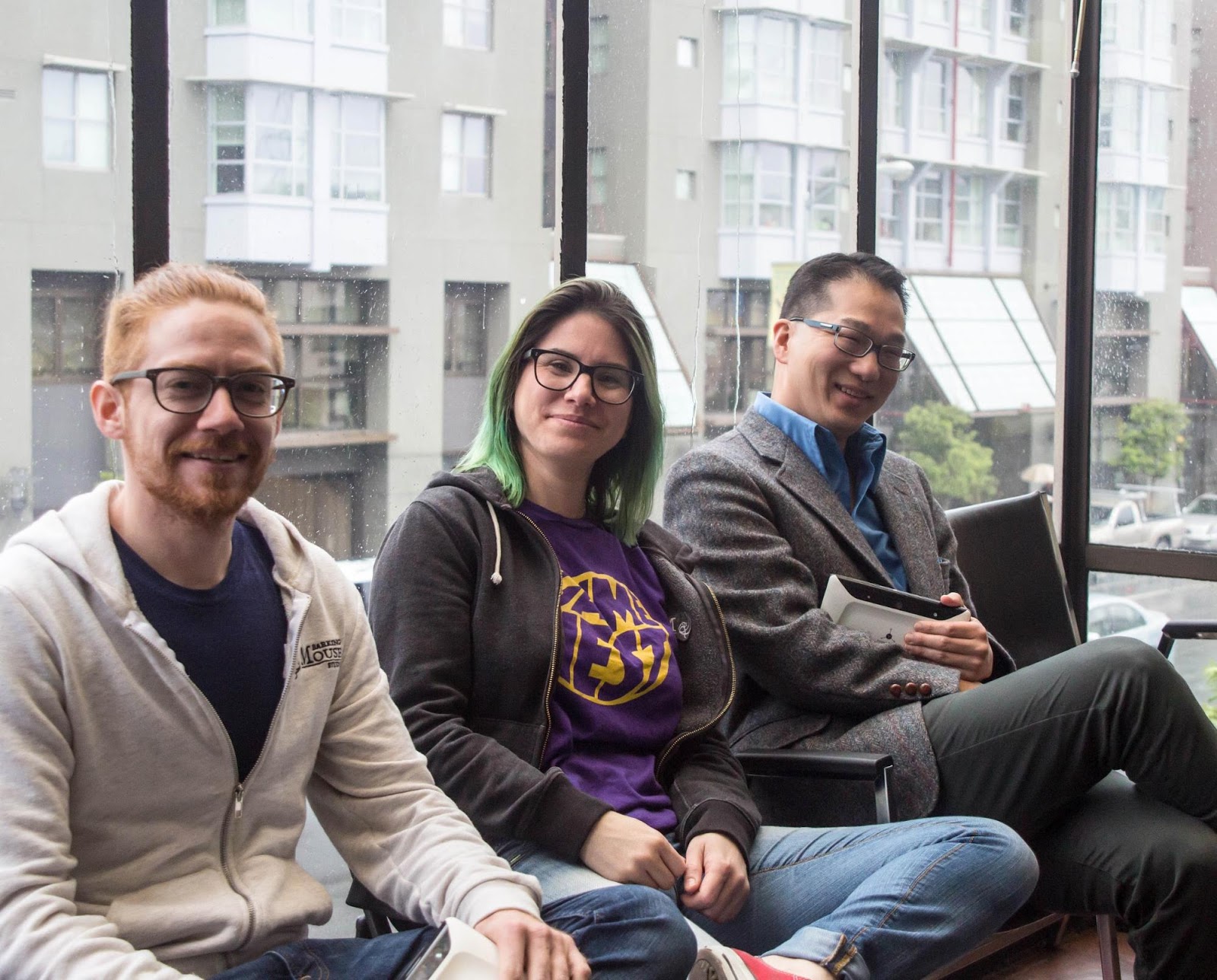
In the meantime, enjoy an in-depth interview with game developers Danielle Swank and Jim Fleming of Barking Mouse Studio, and Josh Lee of Floor is Lava. The three recently met up at Gamenest, and created a brand new Project Tango game, World of Orbles.

Tell us about The World of Orbles

Danielle: The World of Orbles is a real-time strategy game that deals with fictional creatures called Orbles. Orbles are very smart and can build really amazing things, like trans-dimensional portals, but they also have a tendency to get distracted and forget to double check their math. So when their trans-dimensional portal malfunctions and leaves them stranded, it’s no surprise to anyone. Chaos ensues as you try to get the Orbles back to their home dimension. By using Project Tango AR features, you can see the Orbles right in your physical environment.

What got you excited about developing for Project Tango?

Jim: Mixed reality is really compelling. Literally placing something you’ve created into the real world and being able to walk around it feels like the future.

Josh: A lot of my work involves playing in physical spaces, and Project Tango's ability to map a real room and blend digital objects with it opens up all kinds of new possibilities for gameplay.

How do you think Project Tango enhances your user’s experience?

Josh: Giving users the ability to engage with digital games the way they would with a physical space is extremely powerful. Interacting with digital objects in a more physical way – looking at them from different angles, tracking their movement, etc. – makes it possible for users to play games much more intuitively, with less fiddling around with camera controls and such.

What is your favorite Project Tango feature?

Jim: Real-time mesh generation and out-of-the-box Unity integration.

Josh: Building a digital model of a physical room in real time is pretty hard to beat.

What was your biggest hurdle getting starting with Project Tango?

Danielle: Having to write our own pathfinding was an unexpected hurdle. We normally rely on Unity and static environments to provide character and npc movements. Since it’s dynamic, you can’t use Project Tango’s area mesh generation with the Unity pathfinding. Instead we had to rely on ray casting against the depth map that the Tango generates and use a modified boids algorithm to control our npcs.

What creative solution did you come up when using Project Tango for your app?

Danielle: We had to come up with a creative solution to what happens with our characters if they move behind a real-world object so we decided to write a glitch shader. It transitions the character from visible to hidden in a believable manner since we can’t partially occlude game objects.

What resources were most helpful for you?

Danielle: The Project Tango developer docs and just reading the Unity integration. There a lot of good information in the source code. Also having Unity experience was really helpful.

What tip would you give a developer who wants to get started with Project Tango

Danielle: Getting the game characters to look like they are part of the environment was tough. It’s definitely harder to make an AR game then a normal game, so be sure to give yourself enough time. That all said, I think there are all sorts of possibilities for AR that you can’t do with a normal game.

Jim: You’ll have to get creative when working with AR. Some things you would do in a normal game don’t make sense in AR.

What are you most excited to see with a the launch of Lenovo’s phone with Project Tango?

Danielle: I’m excited to see the devices in a lot of people’s hands. I think it’s really awesome that I can build a world that’s different than everyday reality and share it with people around the globe.

Jim: The smaller phone form factor opens up more use cases such as Cardboard.

Josh: I want to go to an AR gaming party, where all the partiers bring their Tango-enabled devices to a special location and play crazy games together.

Grow your games business on Google Play: Game parameters management, video recording, streaming ads, and more

Originally posted on Android Developers blog

Posted by Morgan Dollard, Product Manager of Google Play Games

With mobile gamers across 190 countries, Google Play Games is made up of a vibrant and diverse gaming community. And these players are more engaged than ever. Over the past year, the number of games reaching over 1 million installs grew by 50 percent.

Today, at our annual Developer Day at the Game Developers Conference, we announced new platform and ads tools for developers, of all sizes reach, to reach this global audience and accelerate the growth of their games business. Check out below the full range of features that will help game developers build their apps, grow their users base, and earn more revenue.

Making Google Play Games better for players

In February, we introduced Gamer IDs so that anyone could create a gaming persona. We also simplified the sign-in process for Google Play Games so players could pick up playing their game more quickly. We’re also working on product enhancements to make Play Games a little more social and fun, which will mean more engaged players who’re playing your game for longer. One example is the launch of Gamer friends (coming soon!), where your players can add and interact with their friends from within the Google Play Games app (without needing a Google+ account).

We’re also launching the Indie Corner, a new collection on Google Play, that will highlight amazing games built by indie developers. You can nominate your awesome indie game for inclusion at g.co/indiecornersubmission. We’ll pick the best games to showcase based on the quality of the experience and exemplary use of Google Play game services.

Grow your game with powerful new features from Google Play game services

In January, we added features to Player Analytics, the free reporting tool of Google Play game services, which helps you understand how players are progressing, spending and churning. Today, we previewed some upcoming new tools that would be available in the coming months, including:

  • Game parameters management: With game parameters management, you will be able to update gameplay and game economy parameters without the need for APK changes or resubmitting your app. You’ll be able to optimize virtual goods and currencies from the Developer Console or the Google Play Developer API.

Game parameters management in the Google Play Developer Console

  • Video Recording API: You will be able to easily add video recording to your app and let users share their videos with their friends and on YouTube in a few simple steps. We are also adding live streaming functionality to allow your fans to broadcast their gameplay experiences in real time on YouTube.
  • Predictive Analytics: The Player Stats API now has Predictive Analytics to help you identify which groups of players are likely to spend or churn, and we are adding new predictions for how much a player is likely to spend within 30 days and the probability that a player is a high spender. This allows you to tailor experiences for these players to try to increase their spend or engagement. Learn more about the
    Player Stats API.

“Not showing ads to users that were probable to spend increased number of IAP transactions by 15%.” – Avetis Zakharyan, CEO Underwater Apps

New ad formats and targeting to find, keep and monetize high-quality gamers

Promoting your game and growing your audience is important, but it’s just as important to reach the right audience for your game, the players who want to open the game again and again. That’s why today we’ve unveiled new features that make it simpler to reach the right audience at scale.

  • Search Trial Run Ads: In the next few weeks, we’ll launch a new way for users to try your game out when they do a search for games on Google through a new ad format, Search Trial Run Ads. After tapping “Try now”, an individual can play your game for up to 10 minutes, and then download the game in full if they choose. These ads will appear to smartphone users on WiFi. Using this format, you can drive qualified users who are likely to stay engaged with your game after install.

SGN’s Search Trial Run Ad for Panda Pop

  • Portrait Video Ads: More than 80% of video ad views in mobile apps on the Google Display Network are from devices held vertically, but often these videos are created for landscape viewing. Over the next few weeks, we’re launching Portrait Video Ads for a full-screen, immersive portrait video experience. Developers have seen significant improvement in both click-through and conversion rates, resulting in lower cost per install and more installs.
  • Active User Targeting for Games: In the coming weeks, we’re rolling out a new type of targeting for Android apps that allows you to show ads to users who have spent more than 30 minutes playing games, or who have played a Google Play Games integrated game, in the last 30 days.

Earn more revenue in your game with AdMob

AdMob helps game developers around the world maximize revenue through in-app advertising. At GDC, we also announced a new way to help you earn more through AdMob Mediation. Rewarded advertising is a popular form of game monetization -- users are given the choice to engage with ads in exchange for an in-app reward. AdMob Mediation will enable you to easily monetize your apps with rewarded video ads from a number of ad providers. Supported networks and platforms include AdColony, AppLovin, Chartboost, Fyber, Upsight and Vungle, with more being added all the time.

You can learn more about this, and all our ads announcements on the Inside AdWords blog.

This is just the start of what we’ve got planned for 2016. We hope you can make use of these tools to improve your game, engage your audience, and grow your business and revenue.

App Monetization Insights: How TapBlaze designed their game app for user retention

Originally posted by Inside AdMob blog

Posted by Joe Salisbury, Product Specialist, AdMob

This is post 3 of AdMob's 5-part blog series featuring monetization tips straight from successful app developers. If you’re interested in further exploring the question, “what’s the best way to monetize my app?”, check out AdMob's free No-nonsense Guide to App Monetization.


AdMob's guest this week is Anthony Lai, founder of TapBlaze, a popular game app company based in Los Angeles, California. TapBlaze has developed over 15 titles, collectively garnering millions of downloads. Anthony’s been able to grow the company from a one-person show, to a team of 7 full-time developers, designers, and artists. Check out these tips from Anthony.


1. Design your app for retention.


When Anthony first started TapBlaze, he initially focused on building simple, virtual simulation games. An example was his app “Good Pizza, Great Pizza”, which allowed users to virtually make and sell pizza. These early apps were interesting concepts and received a lot of attention but had a difficult time retaining customers. After the novel experience wore off, users had little reason to come back.

For his next game, Anthony wanted to build something that would keep users engaged for months, not days. To do this, he infused 4 elements into his new match 3 puzzle game named Gummy Gush: 1) a compelling story, 2) fun challenges, 3) rewards, and 4) multiple levels that built on each other. This took a lot more time to develop, and his key metric (retention) took a little longer to measure than downloads, but the work payed off.

“When we first launched Gummy Gush there were some players that only played for a few days, but there were others that clearly liked the art, story and puzzles and just kept playing. It was working! That was enough encouragement for us to keep improving these elements into the game. Ultimately this investment lead to much higher revenue, and even to rapid growth. Since launching in March of 2015, we have over 1,000,000 downloads.”

Consider designing your app for retention. Retention is a key metric for successful monetization and nailing retention will lead to a much more long term, sustainable business. To learn more about practically how to retain users, check out this video from Google Developers called “The Zen of Monetization: The Art of Retaining Users”.

2. Understand the amount of polish your app needs to succeed.


Early last year, Anthony’s team was focused on launching Gummy Gush as quickly as possible. Anthony’s a firm believer in swiftly getting product in the hands of users to collect real user feedback, then iterate. His aggressive timeline meant making sacrifices with the polish of the app, but because he had a few artists on the team he was confident that v1 would be “good enough”.

After launch, there was no user feedback on the polish of the game. But, a new engineering hire with a lot of game development experience urged them to invest in perfecting the look and feel of the game – standardizing UI elements, smoothing out all animation, and adding the finishing touches to the art work.

At first, Anthony was skeptical. But, they decided to devote 2 weeks to the initiative and see how it affected their key metrics. The overhaul paid off big time. Within the first week of the update, Gummy Gush saw a 25% in average revenue per user (ARPU).

Depending on the type of app you're building, fierce competition may have raised the bar for the amount of polish that users expect. For Anthony’s niche, a beautifully designed app built trust and increased revenue. If you’re in a highly competitive sector, it's important to assess what the industry’s threshold for aesthetic finish looks like and decide whether an investment in design app is worth making. Check out Google Play’s “Top Charts” to see what the benchmark is for your category.

3. Use analytics to prioritize your team’s next steps.


After launching, user feedback started rolling in. Although a lot of the reviews were helpful, there were also a number of issues that were unclear. He explained,

“We’d receive a lot of positive and negative reviews and emails from users and didn’t know how representative the feedback were of the broader user base. Were the complaints from users who’d complain no matter what? Or were the complaints serious problems that deserved to prioritize?”

What made it tougher was the time already spent on some of the features being criticized. For example, Anthony had invested in building an engaging introduction story that played the first time users opened the app. He even worked with a professional story writer to impart light-hearted humor in the story. His instincts knew that the story made this new app more compelling than his older apps, but did he go too far?

His solution: test solutions with his users. The team built the smallest version of solutions to proposed problems, taking no more than 2 weeks to release. They’d then monitor key metrics to see if the change had a positive affect. For the introduction story, the team quickly built a “skip” button. After releasing it, nearly 60% of users used it, confirming that it was a real problem worth solving more deeply.

For your app, use in-app analytics to test the individual pieces of feedback you get from users and internal hunches your team comes up with. Overdevelopment is more costly only to find out that your assumptions are wrong is much more costly that actual testing and observation. To learn more about observational testing, check out Tomer Sharon’s talk at Google I/O called “Don't Listen to Users, Sample Their Experience!”.

If you found these tips helpful, don’t forget to check out The No-nonsense Guide to App Monetization. Also, stay connected on all things AdMob by following their Twitter and Google+ pages and be sure to connect with TapBlaze on Twitter here.

Introducing Chrome Music Lab

Posted by Alex Chen, Coder and Designer, Google Creative Lab

This year, for Music in Our Schools Month, we wanted to help make learning about music a bit more accessible to everyone by using technology that’s open to everyone: the web. We built a set of experiments that let anyone explore how music works. It’s called Chrome Music Lab, and you can check it out at g.co/musiclab.


The experiments all use the Web Audio API, an open web standard that lets you create and manipulate sound right in the browser. In Chrome Music Lab, we’re using Web Audio to create interactive drum machines, pianos, synthesizers, and more. A few experiments also let you use the microphone input in Chrome through WebRTC. This lets you use your own voice or real sounds around you as part of the experiment.

The web has always been a space for open collaboration. Many of these experiments use grassroots efforts such as Tone JS, a framework built on top of the Web Audio API that makes it even easier to build interactive music experiences in the browser.

We’re also providing open-source code. So if one of our experiments sparks an idea, check out our repository and start building your own.

Coffee with Now on Tap PM Paige Dunn-Rankin

Posted by Laurence Moroney, Developer Advocate

Google Now on Tap is a feature for Android phones that lets you get quick information about what you’re doing without leaving your app, simply by holding the Home button. Laurence catches up with Paige Dunn-Rankin a product manager for Now on Tap to discuss this great technology.


It builds upon what Google Now has already done -- but making it much more personal, based on what’s on your screen right now.

She demonstrates a chat session with a friend, where from the context of their conversation, Now on Tap can figure out the landing time for the flight he’s on, the location and reviews of the restaurant they want to attend, and even integrate neatly with calendar to create a calendar event. She also shows me how natural language processing does this -- in the conversation they didn’t talk about a calendar, just about having dinner, but Now on Tap figured out the correct time and date for them. For example, when watching a YouTube video, you can hold the Home button to launch Now on Tap and it will give you related content and events!

Now on Tap works on top of most apps with no changes needed. If you want to make sure that Now on Tap works seamlessly on top of your app, make sure to check out "Optimizing Content for the Assistant" here. To make your app show up in Now on Tap links, use App Indexing.

Change to Mail Service in Apps Script

Originally posed Google Apps Developers Blog

Posted by Saurabh Gupta, Product Manager, Google Apps Script

There are two ways to send email in Apps Script: MailApp's sendEmail and GmailApp's sendEmail method. One of the differences between these two methods is that the MailApp’s sendEmail method doesn’t require the developer to be a Gmail user. For example, a Google Apps customer who doesn’t use Gmail, but uses Apps Script instead, can send emails through MailApp but not GmailApp.

Starting on September 13, 2016, users with free public Google Accounts (consumers) and Google Apps for Education and Google Apps Free edition users, will be required to have Gmail access to send messages through Apps Script’s Mail Service. Consumers can enable Gmail on their Google account after signing-in—note your Gmail will then become the primary address of your Google account. Administrators of Google Apps domains (Education and Free edition only) can use the Admin console to turn on Gmail for their domain.

This change does not require any updates to your code. You can continue to use MailApp as before; just make sure that you have signed up for Gmail. We realize that sometimes these changes are disruptive to our developers, but we can assure you that we put lot of care and deliberation into this process.

Apply now to join us and celebrate our #love4dev at #io16

Published by Mike Pegg, Head of Developer Marketing

One day in June of 2006 a very special thing happened. For the first time ever, we invited a handful of developers to spend the day with us at Google celebrating what they had achieved with our Maps APIs. Our engineering team came all the way from the Sydney office to help answer questions from developers, and help them learn new ways to solve problems in the apps they were building.

What a difference a decade makes. We’re absolutely amazed with all that developers from around the world have created and changed since that day in 2006. We’ve enjoyed this journey with you, and as developers ourselves we continue to be excited by the challenges that lie ahead.


It was this thinking that drove us to bring I/O back to where it all started 10 years ago and to continue celebrating this developer journey we’re on together. We’re really excited for I/O 2016 and we hope this year’s festival, happening May 18-20 at Shoreline Amphitheatre, is just as special as that first gathering at Google back in 2006.

We know a lot has changed over the years and the opportunities (and challenges) are even greater today than they were back then. We’re gearing up for an I/O festival that will celebrate your accomplishments, answer your burning technical questions, and hopefully help make your life as a developer a little bit easier. We hope you can join us! Applications for attendance opened today and will remain open until 3/10, 5PM PST. And in the meantime, share your #love4dev back with us.

Introducing Analytics for Google Cast Applications

Posted by Chris Dolan, Software Engineer on the Google Cast Server Infrastructure Team

As a Google Cast developer, you may be wondering how many devices access your application, how many sessions those devices initiate, and how long those sessions play media. Until now, you needed to implement your own instrumentation to get this information. Not anymore! Today, we’re excited to announce that we’re making all this data available right from the Google Cast Developer Console.

To check it out, log on as usual to the developer console with your developer account. In the ‘Application’ table, click on the ‘View’ link in the new ‘Statistics’ column for your application

Caption: The applications page showing a single app with the ‘View’ link called out

The analytics page contains a tab for each metric, an interactive graph of the metric’s values over time, and tables containing the most recent day’s data. The devices tab shows the number of Cast devices that have launched your application, the sessions tab shows the number of Cast sessions of your application, and the average playback tab shows the average length of media playback time per session for your *application.

The analytics page showing the tabs, graph, and tables of data

Each tab’s data can be viewed in total, by country, or by sender platform. To see data for a particular country or platform, simply click the appropriate row in the table. Each tab’s data is available on a per-day basis, as well as in seven, fourteen, and twenty-eight day rolling totals. To change the aggregation range, select the desired range from the range picker at the top right.

We hope these analytics give you insight into how your Google Cast applications are being used and enable you to see the impact of your improvements. To learn more, see the developer documentation.

* Applications that do not play media will have no average media playback

Coffee with a Googler talks Identity with Adam Dawes

Posted by Laurence Moroney, Developer Advocate

Coffee with a Googler catches up with Adam Dawes, leader of Google’s Federated Identity team. His team builds seamless identity experiences for users. He tells us about Google Sign-In, and the simplifications to the APIs, focusing on decoupling from the Google+ sign-in to make the user experience more streamlined.

The landscape for users has changed over the last few years, and the user’s expectation of information that they provide for signing in is very different now. Adam shares about how his team have been engineering sign in APIs to meet these needs.

Adam demonstrates the new APIs using the runkeeper app as an example, and how it avoids ‘cognitive overload.’

We learn about OpenID connect, to make it super simple to use the authentication APIs with your own backend servers. It’s a much simpler experience, so that if all you want to do is sign the user in, without social, we made it simpler for you to do so.

One question we’ve had extensively is with using iOS apps with Google Sign-In. Adam shares how Google Sign-In uses the new Safari View Controller in iOS 9 to ensure that the API will work well on iOS.

To learn more about all these offerings, visit developers.google.com/identity.

5 Simple Design Tips for Better Add-ons

Originally posted on Google Apps Developers Blog

Posted by Ben Greve, Developer Support Specialist, Google Apps Script

So you’ve started to build an add-on. Congrats! You identified a problem, figured out a solution, and wrote some code to accomplish it like a pro. Now it’s time to focus on design, to make sure your audience understands what your add-on does and how to use it.

In this post, I will outline five simple design tips to help make your add-on a pleasure to use. Don’t worry if you’re not an artist – these are basic concepts that anyone can apply.

Create a clear workflow for the user to follow. PandaDoc by PandaDoc

1. Guide the User

Crafting a guided workflow takes the guesswork (and stress) out of using an add-on. Your user should never wonder, ‘What am I supposed to do next?’ Actions, forms, text, and buttons should be designed to create a natural flow guiding the user from one step to the next.

This can be accomplished in a number of ways. Try presenting actions in a natural order: from left to right and from top to bottom (assuming LtR language; adjust as needed). You can indicate which button is the primary action by styling it using the blue .action class. You can guide the user’s behavior by limiting the actions available (sometimes referred to as ‘forcing function’). For example, actions/options with dependencies can be disabled or hidden until they should be used. Another option is to spread a workflow across several pages and require the user to complete a given page before they can proceed to the next.

Communicate each step so the user is never lost. Remove Duplicates by AbleBits

2. Communicate Effectively

Complex add-ons require effective communication. Simple add-ons do, too. Effective communication is necessary for your audience to understand what your add-on does and how they should use it.

Use accessible language that anyone can understand. Don’t use complex wording if more easily digestible terminology is available. Unless your target audience has been demanding a feature to “asynchronously call an RPC with dependent proto messages,” you should avoid using unnecessarily technical or jargony language.

Present information when and where it’s needed. Instructions should be displayed in the context which they will be used. Actions should be clearly labeled so that users will know exactly what they do. Provide enough information so the user understands what they are doing, why they are doing it, and where they are going.

Inform the user of the results of their actions. VisualCV Resume Builder by VisualCV

3. Provide Feedback

Have you ever used an app where you click on a button and nothing happens? You sit there wondering: Did it work? Did it not work? Did anything happen at all? When building your add-on, don’t do this to your users. Make sure that all actions have clear and immediate feedback, so no one is never left wondering, “What just happened?”.

With this in mind, there is still room for graceful design. Feedback can be subtle - it doesn’t need to shout, ‘ACTION 1 COMPLETED’! Leverage nuanced changes, such as displaying a quick message in a toast or moving to the next step in the workflow.

What happens if an action takes a long time to complete? Someone clicks a button and waits… and waits… and waits. A good UI will account for this scenario, too. Try using a loading graphic (i.e. a spinner or a progress bar) and for longer loading times consider including a button to cancel.

Protect the user and include safety measures.

4. Keep The User Safe

People make mistakes. It’s sad but true, and unlikely to change any time soon. Keep your users safe from themselves and design actions to have minimal risk.

The ideal solution is to remove the risk entirely. Inserting a bunch of data into a spreadsheet? Consider creating a new sheet and insert the data there. When appropriate, configure actions to add rather than replace, minimizing potential damage to existing content.

There will be situations where avoiding risk entirely won’t be possible. In these cases, do the best you can to explicitly communicate the action’s effect so your user can make a well-informed decision. A preview or a warning of the impending changes will help ensure that the user is aware of what’s coming. And of course, provide a method to ‘undo’ when possible.

Design around core functionality. Easy Accents by Daniel Baker

5. Keep It Simple

Each UI element in your add-on should serve a purpose; consider removing anything that doesn’t. For the best design, keep it focused on functionality and trim any excess.

Using a large range of styling can actually undermine the power of the design. When a website is covered with different colors, styles, and fonts, it makes it difficult for any styling to communicate a specific meaning. Design patterns that are overly complicated or inconsistent make it difficult for users to learn what’s important and what isn’t.

Instead, consider an app with only three text stylings: one large, one bold, and one plain. The large style is always (and only) used for headers/titles, the bold style is used for labels, and the plain style is normal body text. Any time a user sees one of these, they’ll know exactly what they are looking at. Less is more.

Closing Comments

Too many brilliant add-ons and apps have failed due to simple design flaws that made them inaccessible to users. These five tips are intended to help you prevent those common mistakes and provide a foundation for a great user experience.

As you work on your next add-on, remember the five lessons here:

  1. Guide the user
  2. Communicate effectively
  3. Provide feedback
  4. Keep the user safe
  5. Keep it simple

Finally: please make sure to include the necessary onOpen() and onInstall() functions (if you want the add-on to work), follow our UI Style Guide, and use the provided CSS Package.

Have any tips or tricks of your own? Leave a comment below and share your design insights with the rest of the Apps Script community!