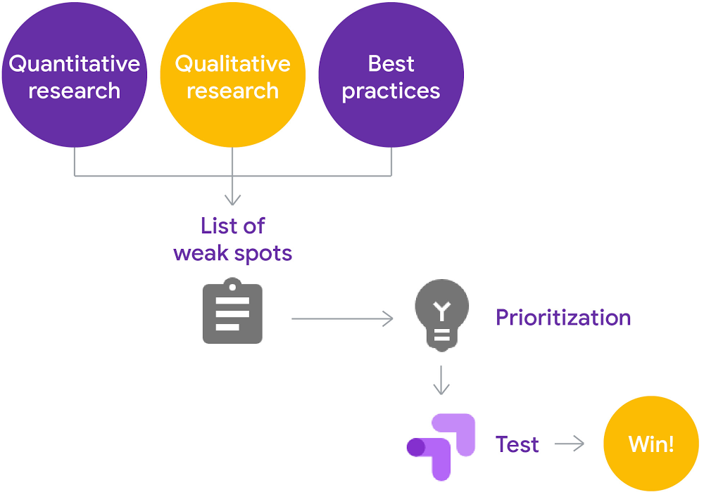
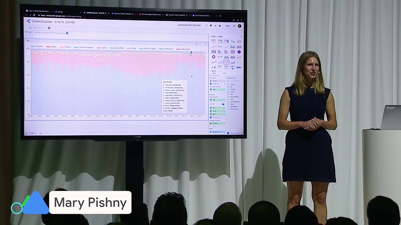
As people use Data Studio throughout their organizations, IT administrators have asked to manage how Data Studio can be used. Today, we’re launching three free enterprise features providing IT administrators new visibility and control over Data Studio in their organization.
Organization management through Cloud Identity integration
Data Studio now integrates with Google Cloud Identity to provide organization-wide administrative capabilities. With this integration, Cloud Identity admins can manage who can use Data Studio and how they can use it. Existing G Suite and Cloud Identity customers get Data Studio integration out of the box, and can start using the new Data Studio administration features today. Customers using other identity providers, such as Active Directory, can synchronize their users with Google Cloud Identity, so that creating, suspending, and deleting users happens in one place.
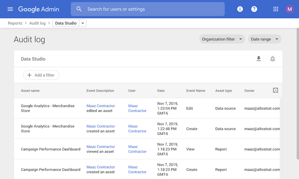
Enterprise audit logging
Data Studio now offers audit logging, providing IT admins organization-wide visibility into Data Studio usage, similar to that available for apps like Drive and Calendar. For example, admins can understand which users are creating Data Studio reports, and who they are sharing those reports with. Admins can also identify which reports have the most engagement, to scale successful reports across the organization. With custom alerts, you can monitor potentially risky activity like external sharing of data sources, and can export audit logs to BigQuery and use Data Studio to drill into the details. Learn more.
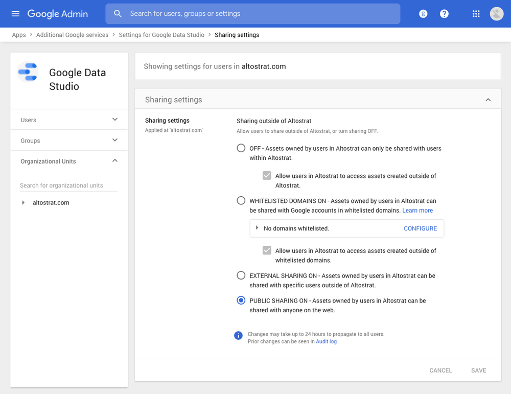
Organization sharing policies
New Data Studio sharing policies allow you to reduce the risk of data exfiltration. You can set limits to prevent users from sharing reports outside of your organization, or make sure they don’t expose company data by disabling public link sharing.
Sharing policies offer you the flexibility to define sharing permissions that meet your business needs. You can give certain users the ability to share reports externally, while allowing other users to share only within the organization. Learn more.
There’s no charge for audit logging or sharing controls — they’re included with every edition of G Suite and Cloud Identity, including Cloud Identity Free. We’re committed to making Data Studio a solution that works for businesses of all sizes, and we’ll continue to build on this foundation. That way, everyone in your organization can uncover insights that matter, and you can rest assured knowing that your valuable business data is safe.