What’s changing
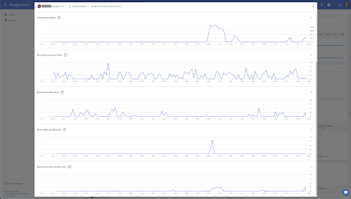
We’ve added detailed metrics over time for endpoints in Meet Quality Tool, which will help admins perform more advanced troubleshooting. When clicking any endpoint in the meeting timeline, admins can now view charts showing:
- Average CPU usage,
- Connection delay,
- Microphone audio level (what is heard at the user's location),
- Received audio level (audio from others),
- Sent video packet loss,
- Received video packet loss.
When viewing metrics for meetings that are still in progress, you can refresh to see a timeline and metrics with near-real-time values.
Please note: The available metrics for any given endpoint depend on which device and Meet client was used for the connection.
Who’s impacted
Admins
Why it’s important
There are many factors that can affect the quality of a meeting — by providing detailed information and metrics of those factors overtime, admins can more effectively analyze and troubleshoot issues and therefore improve the quality of meetings for their users.
For example, the graph below shows a user who experienced a loss of video during a meeting.
The admin can further drill down into the metrics and see that the exact time of the video loss corresponds with the loss of the user’s network connection. Using these metrics, the admin was able to quickly diagnose this as a temporary network connection issue.
Getting started
- Admins: These metrics are available by default when viewing a meeting in the Meet Quality Tool. Visit the Help Center to learn more about tracking meeting quality and statistics and troubleshooting issues with Google Meet.
- End users: There is no end user impact. Visit the Help Center to learn more about troubleshooting issues with Google Meet.
Rollout pace
- This feature is available now.
Availability
- Available to all Google Workspace customers, as well as G Suite Basic and Business customers

