By Roman Nurik, lead designer for the Google I/O Android App
Every year for Google I/O, we publish an Android app for the conference that serves two purposes. First, it serves as a companion for conference attendees and those tuning in from home, with a personalized schedule, a browsing interface for talks, and more. Second, and arguably more importantly, it serves as a reference demo for Android design and development best practices.
Last week, we announced that the Google I/O 2014 app source code is now available, so you can go check out how we implemented some of the features and design details you got to play with during the conference. In this post, I’ll share a glimpse into some of our design thinking for this year’s app.
On the design front, this year’s I/O app uses the new material design approach and features of the Android L Developer Preview to present content in a rational, consistent, adaptive and beautiful way. Let’s take a look at some of the design decisions and outcomes that informed the design of the app.
Surfaces and shadows
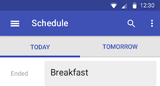
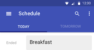
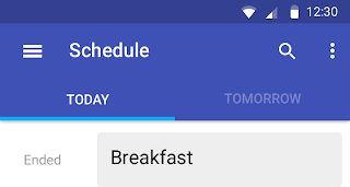
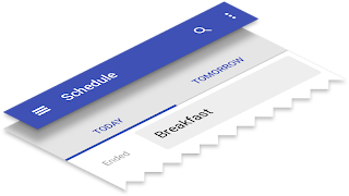
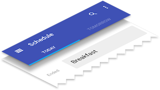
In material design, surfaces and shadows play an important role in conveying the structure of your app. The material design spec outlines a set of layout principles that helps guide decisions like when and where shadows should appear. As an example, here are some of the iterations we went through for the schedule screen:
Another area where the concept of “surfaces” played a role was in our details page. In our first release, as you scroll the details screen, the top banner fades from the session image to the session color, and the photo scrolls at half the speed beneath the session title, producing a parallax effect. Our concern was that this design bent the physics of material design too far. It’s as if the text was sliding along a piece of paper whose transparency changed throughout the animation.
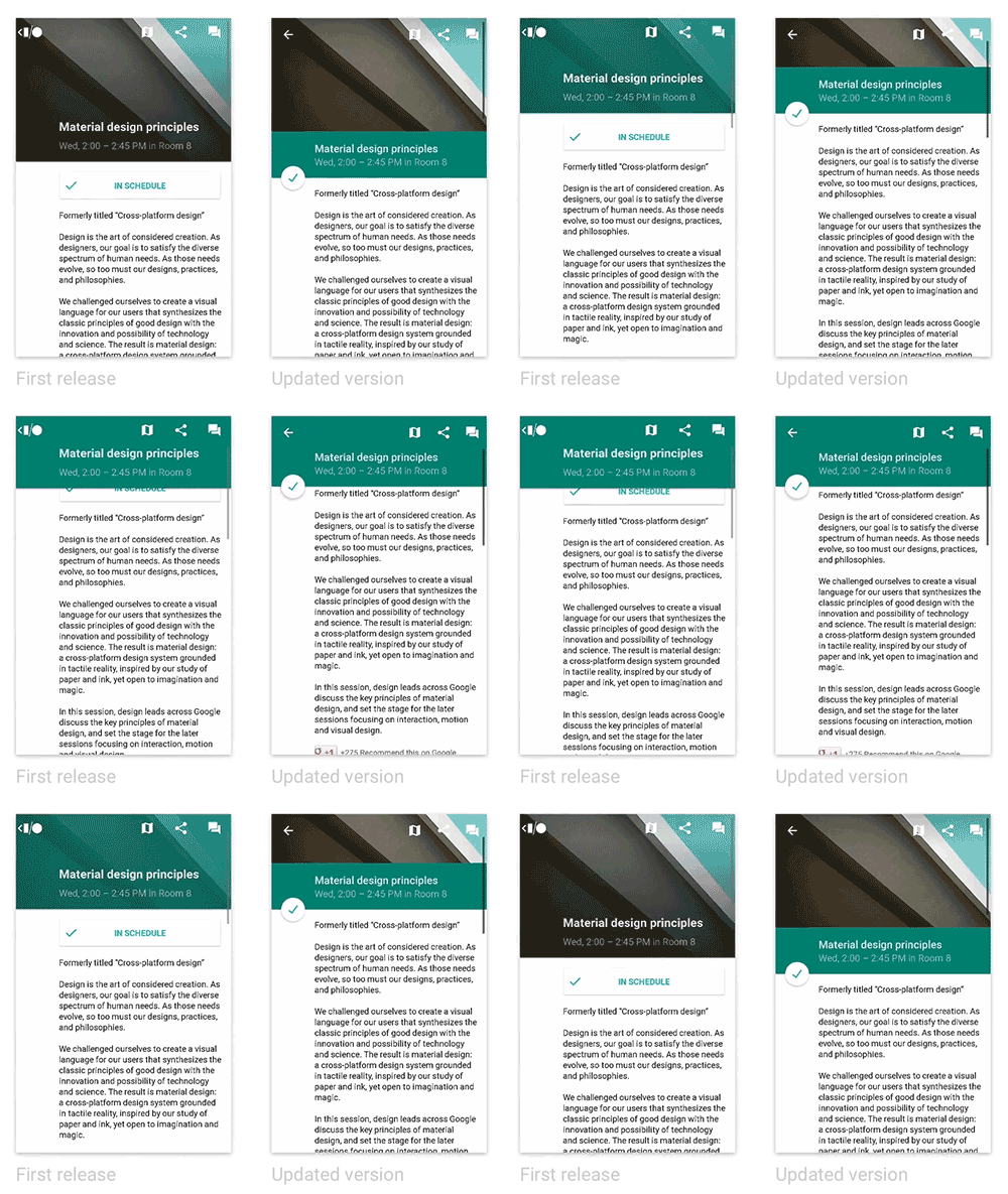
A better approach, which we introduced in the app update on June 25th, was to introduce a new, shorter surface on which the title text was printed. This surface has a consistent color and opacity. Before scrolling, it’s adjacent to the sheet containing the body text, forming a seam. As you scroll, this surface (and the floating action button attached to it) rises above the body text sheet, allowing the body text to scroll beneath it.
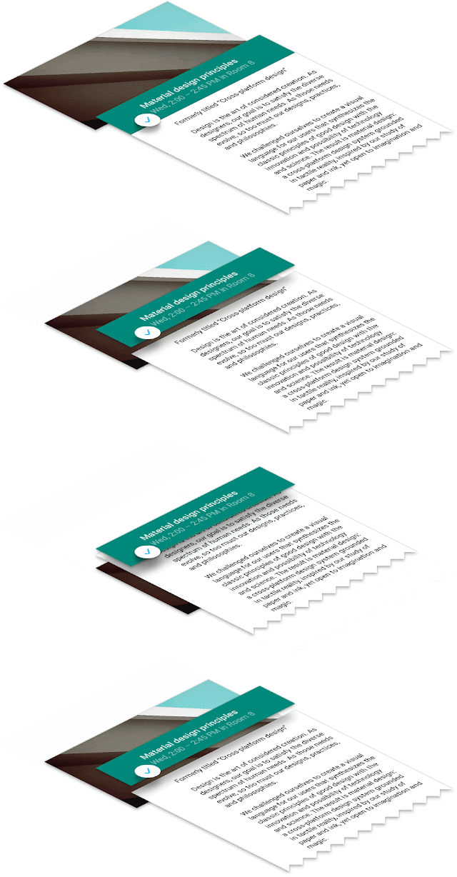
This aligns much better with the physics in the world of material design, and the end result is a more coherent visual, interaction and motion story for users. (See the code: Fragment, Layout XML)
Color
A key principle of material design is also that interfaces should be “bold, graphic, intentional” and that the foundational elements of print-based design should guide visual treatments. Let’s take a look at two such elements: color and margins.
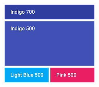
In material design, UI element color palettes generally consist of one primary and one accent color. Large color fields (like the app bar background) take on the main 500 shade of the primary color, while smaller areas like the status bar use a darker shade, e.g. 700.
The accent color is used more subtly throughout the app, to call attention to key elements. The resulting juxtaposition of a tamer primary color and a brighter accent, gives apps a bold, colorful look without overwhelming the app’s actual content.
In the I/O app, we chose two accents, used in various situations. Most accents were Pink 500, while the more conservative Light Blue 500 was a better fit for the Add to Schedule button, which was often adjacent to session colors. (See the code: XML color definitions, Theme XML)
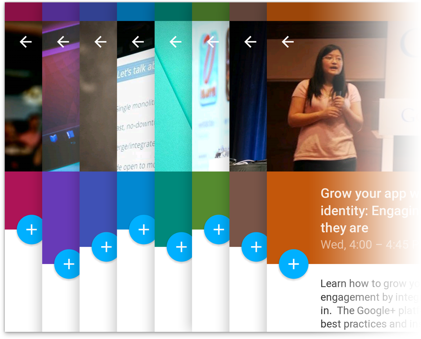
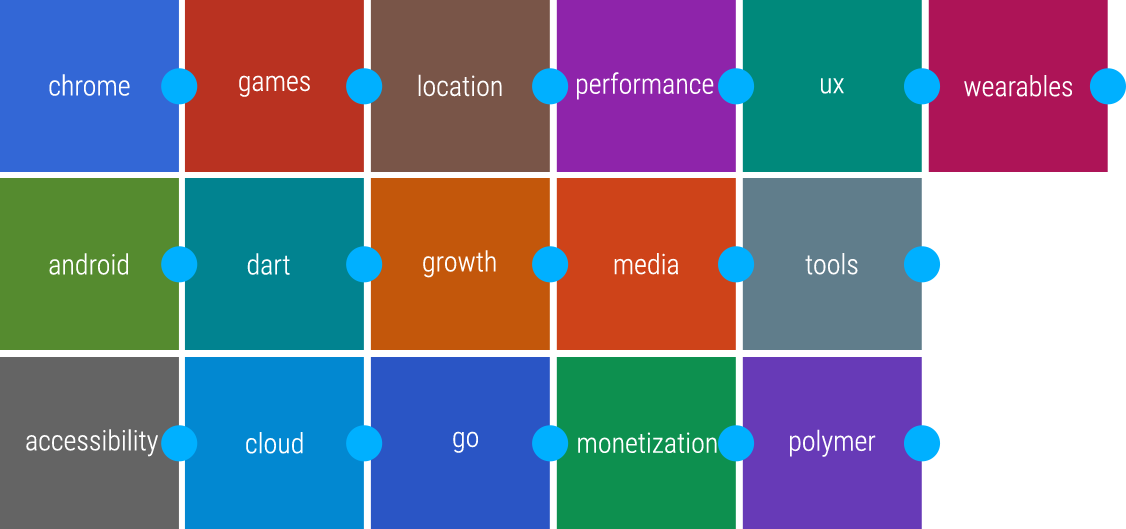
And speaking of session colors, we color each session’s detail screen based on the session’s primary topic. We used the base material design color palette with minor tweaks to ensure consistent brightness and optimal contrast with the floating action button and session images.
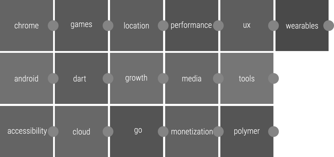
Below is an excerpt from our final session color palette exploration file.
Margins
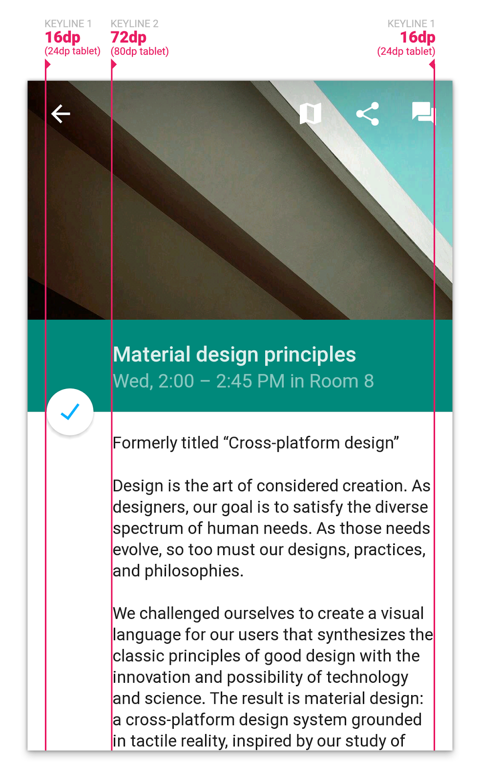
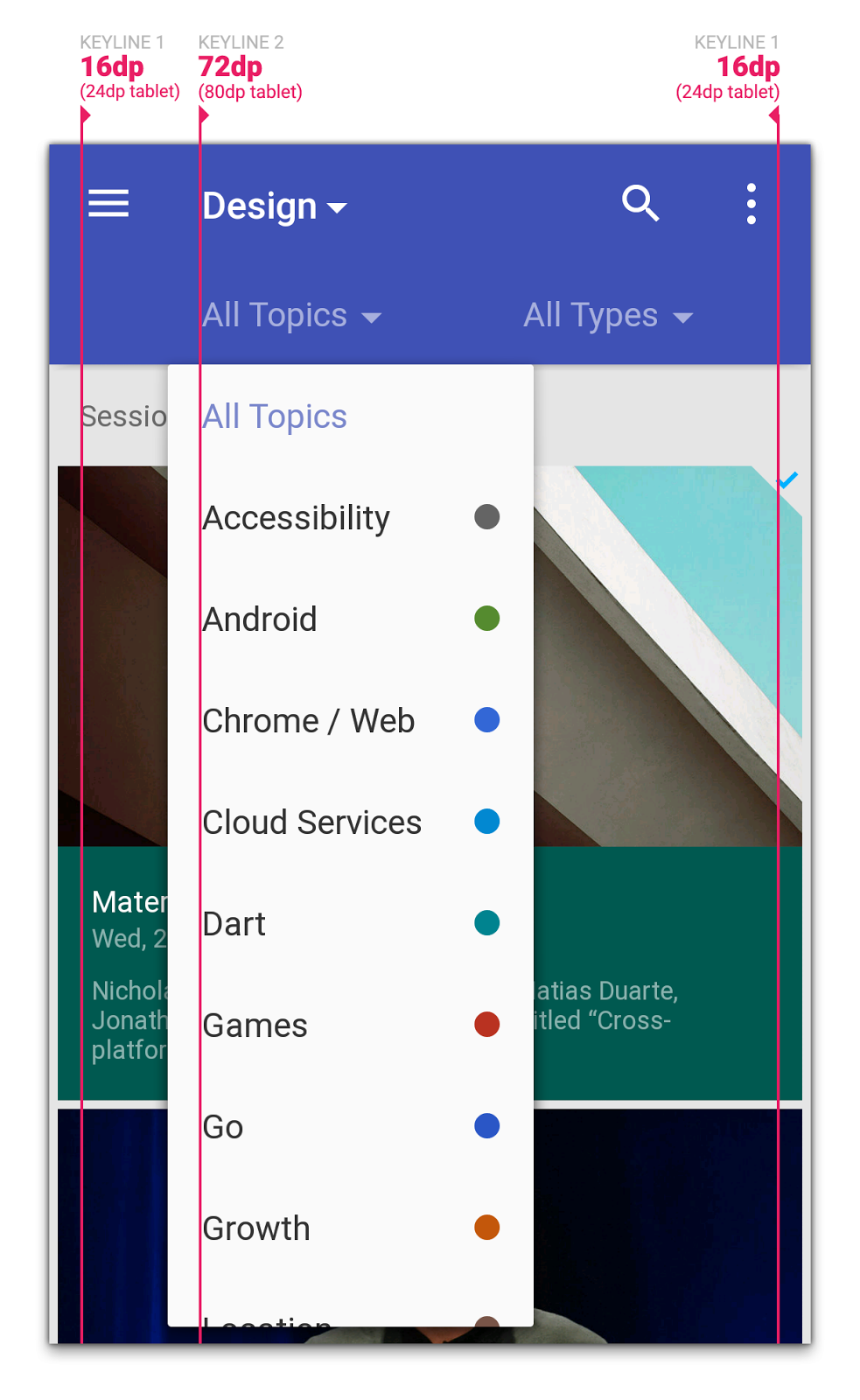
Another important “traditional print design” element that we thought about was margins, and more specifically keylines. While we’d already been accustomed to using a 4dp grid for vertical sizing (buttons and simple list items were 48dp, the standard action bar was 56dp, etc.), guidance on keylines was new in material design. Particularly, aligning titles and other textual items to keyline 2 (72dp on phones and 80dp on tablets) immediately instilled a clean, print-like rhythm to our screens, and allowed for very fast scanning of information on a screen. Gestalt principles, for the win!
Grids
Another key principle in material design is “one adaptive design”:
A single underlying design system organizes interactions and space. Each device reflects a different view of the same underlying system. Each view is tailored to the size and interaction appropriate for that device. Colors, iconography, hierarchy, and spatial relationships remain constant.
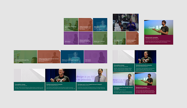
Now, many of the screens in the I/O app represent collections of sessions. For presenting collections, material design offers a number of containers: cards, lists, and grids. We originally thought to use cards to represent session items, but since we’re mostly showing homogenous content, we deemed cards inappropriate for our use case. The shadows and rounded edges of the cards would add too much visual clutter, and wouldn’t aid in visually grouping content. An adaptive grid was a better choice here; we could vary the number of columns on screen size (see the code), and we were free to integrate text and images in places where we needed to conserve space.
Delightful details
Two of the little details we spent a lot of time perfecting in the app, especially with the L Developer Preview, were touch ripples and the Add to Schedule floating action button.
We used both the clipped and unclipped ripple styles throughout the app, and made sure to customize the ripple color to ensure the ripples were visible (but still subtle) regardless of the background. (See the code: Light ripples, Dark ripples)
But one of our favorite details in the app is the floating action button that toggles whether a session shows up in your personalized schedule or not:
We used a number of new API methods in the L preview (along with a fallback implementation) to ensure this felt right:
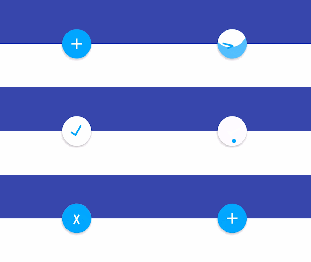
View.setOutlineandsetClipToOutlinefor circle-clipping and dynamic shadow rendering.android:stateListAnimatorto lift the button toward your finger on press (increase the drop shadow)RippleDrawablefor ink touch feedback on pressViewAnimationUtils.createCircularRevealfor the blue/white background state revealAnimatedStateListDrawableto define the frame animations for changes to icon states (from checked to unchecked)
The end result is a delightful and whimsical UI element that we’re really proud of, and hope that you can draw inspiration from or simply drop into your own apps.
What’s next?
And speaking of dropping code into your own apps, remember that all the source behind the app, including L Developer Preview features and fallback code paths, is now available, so go check it out to see how we implemented these designs.
We hope this post has given you some ideas for how you can use material design to build beautiful Android apps that make the most of the platform. Stay tuned for more posts related to this year’s I/O app open source release over the coming weeks to get even more great ideas for ways to deliver the best experience to your users.