Author Archives: Simon Rogers

Data Journalism Awards 2018: call for entries

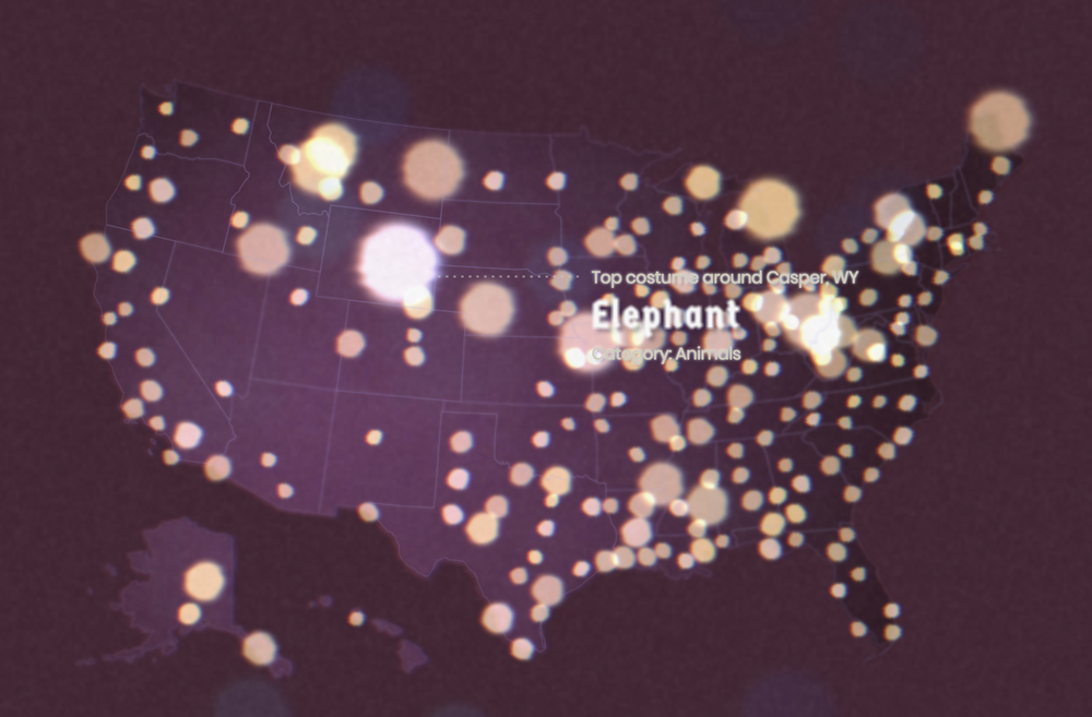
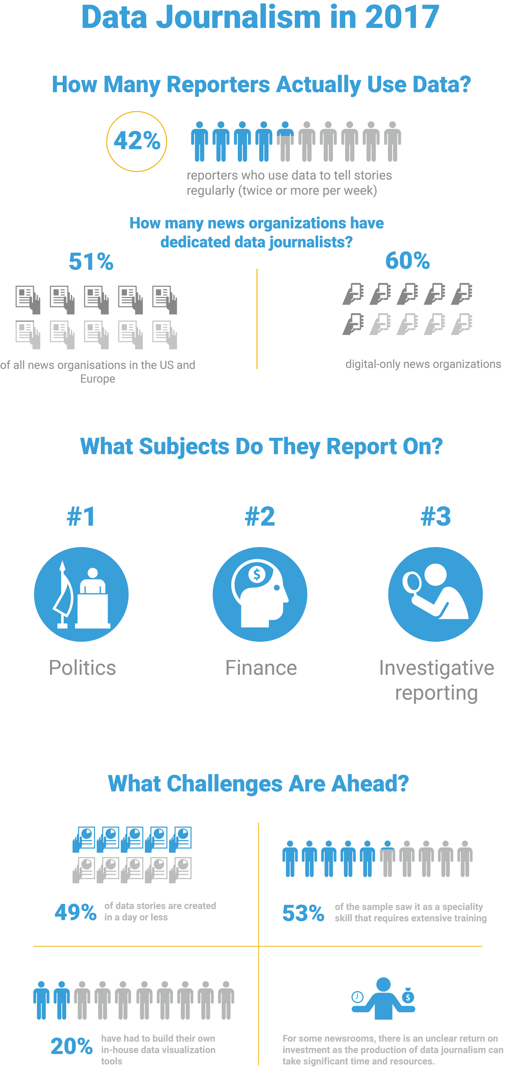
Data Journalism—the skill of combining reporting with data—is becoming an increasingly important part of every journalist’s toolkit. That’s not just anecdotal: a recent study commissioned by the Google News Lab found that half of all news outlets have at least one dedicated data journalist.


So, for the seventh consecutive year, we’re proud to support the 2018 Data Journalism Awards.

These are the only global awards recognizing work that brings together data, visualization and storytelling. It’s a part of our commitment to supporting innovative journalism around the world.


Data journalists, editors and publishers are encouraged to submit their work for consideration using this form by March 29, 2018. But don’t get too comfortable with that deadline, early applications are encouraged.


Last year there were 573 entries from 51 countries across five continents. Past winners of the $1,801 prizes include include BuzzFeed, The Wall Street Journal, The New York Times, FiveThirtyEight, ProPublica, and La Nación, as well as smaller organizations such as Rutas Del Conflicto, Civio Foundation and Convoca. And if you’re wondering why the prize is $1,801, It’s because William Playfair invented the pie chart in 1801.


Aimed at newsrooms and journalists in organizations of all sizes, the 2018 awards will recognize the best work in key categories, including:

  • Data visualization of the year
  • Investigation of the year
  • News data app of the year
  • Data journalism website of the year
  • Best use of data in a breaking news story, within first 36 hours
  • Innovation in data journalism
  • Open data award
  • Small newsrooms (one or more winners)
  • Student and young data journalist of the year
  • Best individual and team portfolio

The competition is organized by the Global Editors Network: a cross-platform community of editors-in-chief and media professionals committed to high-quality journalism, with the support of Google and the Knight Foundation.


The Data Journalism Awards offer another way to foster innovation by partnering with the news industry, in addition to our efforts with the Digital News Initiative. A jury of peers from the publishing community will decide on the winners.


Winners will be announced in May 2018 at a ceremony in Lisbon. Good luck!

More realtime data on Google Trends

Google Trends can be window into the world, giving us a peek into what people are searching for—whether it’s elections, music, sports or games. Now you can see the world in realtime through more lenses: News, Shopping, Images and YouTube. We’re opening up more data to show what people in the world are looking for, as they’re looking for it—whether it’s just out of curiosity, to write a story or something else.

And it’s really easy to do: say you’re curious about search interest in Taylor Swift following the recent release of her latest album. You now have the option to explore that data in different ways, like finding the related videos that people are searching for on YouTube.

How it works

First, type your search at the top of the Trends screen, in this box:

RealtimeData_1.png

As you can see, the topic of “American singer-songwriter” comes up—that’s the one you want to click on, otherwise it will only look for searches for the words “Taylor” and “Swift.”

That takes you to a page like this, which shows search interest in Taylor, worldwide. You can then change the time range to within the last seven days and the geography to the United States. That’s now showing search interest in the U.S. for the past week, and looks like this.

RealtimeData_2.png

But that’s just web search. Click on the button on the right and more options appear:

RealtimeData_3.png

We search in different ways on different platforms. So, when you look at the search on YouTube, you can see the spike in searches for video of Taylor’s performance on “The Tonight Show.”

RealtimeData_4.png

But switch it to Google Images and you can see a 700 percent spike in searches for “Saturday Night Live,” after her performance on the show.

RealtimeData_5.png

You can also use the tool to see where interest is strongest (in this case, Utah and Nebraska are top states for YouTube searches):

RealtimeData_6.png

Explore the Google Trends site and see more of how the world searches for Taylor, her music or anything that you’re interested in. And you can read more about how Trends data works here.

Shields are in, brooms are out: this year’s top Halloween costume trends

What are you dressing up as this year? Every Halloween, people across the United States turn to Google to search for what to wear on the spookiest night of the year. And with our tool Frightgeist, you’ll get a view of Halloween costume trends across the U.S., and you can see the most-searched costumes near you (and avoid those embarrassing Halloween party costume clashes).

fr

This year, the top 10 costume list reflects everything from movie hits like “Wonder Woman” and “It” to the perennial appeal of the (walking) undead.

  1. Wonder Woman
  2. Harley Quinn
  3. Clown
  4. Unicorn
  5. Rabbit
  6. Witch
  7. Mouse
  8. Pirate
  9. Zombie
  10. Dinosaur

If the top 10 isn’t enough, you can explore the top 100 costumes across the country: Click on a costume and you can see how it’s trending, where it’s searched, and how it’s changed over time. In the top 100 list, film characters account for a fifth of costume searches, followed by animals at 12 percent and comic book characters at 11 percent.

nn

In 2016 Harley Quinn, inspired by “Suicide Squad,” ruled All Hallows Eve—but this year the Princess of the Amazons has dethroned her. We’re also seeing some new entries to the list—these are new additions to the top 100 list since last Halloween:

  1. Moana
  2. IT
  3. Emoji
  4. Stranger Things
  5. Thing 1

To see what people are searching in your hometown or other cities around the country, click on “Costume Map.” (We see you and your elephants, Casper, WY. But no love for the friendly ghost?)


Screen Shot 2017-10-18 at 2.13.00 PM.png

Just because a costume is in the top 10 doesn’t mean it will stay there. These are the costumes with the biggest drop in rankings over the last year:


1. Maleficent

2. Knight

3. Frankenstein

4. Evil Queen

5. Snow White


And if you still can’t decide what to wear, you should check out the costume wizard. Set the spookiness and originality settings and see what it comes back with.

The state of data journalism in 2017

Data journalism has been a big focus for us at the Google News Lab over the past three years—in building tools, creating content and sharing data with the data journalism community. We wanted to see if we’re taking the right approach: how big is data journalism, what challenges do data journalists face and how is it going to change?

Up until today, we really haven’t had clear answers to those questions. So, in collaboration with PolicyViz, we conducted a series of in-depth qualitative interviews and an online survey to better understand how journalists use data to tell stories. We conducted 56 detailed in-person interviews with journalists in the U.S., UK, Germany and France and an online survey of more than 900 journalists. Our analysis offers a glimpse into the state of data journalism in 2017 and highlights key challenges for the field moving forward. 

The result is one of the first comprehensive studies of the field and its activity. A decade ago, data journalists there was only handful of data journalists. 

Today, this research shows that:

  • 42% of reporters use data to tell stories regularly (twice or more per week).
  • 51% of all news organizations in the U.S. and Europe now have a dedicated data journalist—and this rises to 60% for digital-only platforms.
  • 33% of journalists use data for political stories, followed by 28% for finance and 25% for investigative stories.

There is a big international variation, even within our study. In France, 56% of newsrooms have  a data journalist, followed by Germany with 52%, the UK with 52%, and the U.S. with 46%. Despite its huge growth, data journalism still faces challenges as we head towards 2018.

  • 53% of the sample saw data journalism as a speciality skill that requires extensive training, and is not easy to pick up.

  • Survey respondents also discussed the time pressures they face and the limited bandwidth from dedicated data journalists who can clean, process, and analyze data. We found that 49% of data stories are created in a day or less.

  • Our research also found that data visualization tools are not keeping up with the pace of innovation. As a result, reporters are building their own solutions: a fifth of data journalists use in-house tools and software, whether it’s data visualization tools or even data cleaning solutions.

9

More than half of respondents want their organizations to use more data to tell stories. But, some felt the return on investment was unclear as the production of data journalism can take significant time and resources.


The future of data journalism, though, has never been as important as it is today, nor as much a part of the way journalists work every day, as this study shows. As one of our interviewees put it:


We heard from one data journalist in the U.S. that “data is a good way of getting to the truth of things ... in this post-truth era, this work is increasingly important. We are all desperately searching for facts.”

How to fix a toilet (and other things you couldn’t do without Search)

Every year, millions come to Google to search for news and information that helps illuminate the world around them. While people often search for breaking news, the latest sports scores, or what's playing at a local movie theater, they also often look for answers on how to fix the more mundane items around them.

Recently, we noticed that “how to…” searches have increased by more than 140% since 2004, and much of that search interest is directed towards how to “fix” things—whether it’s a lightbulb, window, washing machine, or even the toilet. In fact, “How to fix…” is consistently near the top of the list of most common queries, year after year, around the world. That’s why the Google Trends team teamed up with award-winning designer Xaquín González Veira —formerly of “The Guardian”, “National Geographic” and “the New York Times”—to create our latest visual: How to fix a toilet...and other things you couldn’t do without Search.

The first data visualization shows household items people ask Google how to fix, and how those searches vary by country. For instance, in the United States, the top “how to fix" items are doors, followed by windows, toilets, washing machines and refrigerators. While in Japan, the order is:  windows, doors, washing machines, and toilets.

Check out the map of the world below, to see how it shifts:

map

Xaquin noticed some neat (and weird) patterns in the data. Searches for “how to fix a toilet” and “how to use chopsticks” follow a very similar pattern. Wonder why that is? Just check out the site. You’ll be surprised what tops the list in each country and which places need to fix the same things (washing machines in Russia and Colombia and windows in Brazil and Eritrea).

The visual also showcases data for the top searched “how to’s” around the world. The top ten are:

  1. how to tie a tie
  2. how to kiss
  3. how to get pregnant
  4. how to lose weight
  5. how to draw
  6. how to make money
  7. how to make pancakes
  8. how to write a cover letter
  9. how to make french toast
  10. how to lose belly fat
Check out the interactive guide here, to explore more of this fascinating data.

This data visualization is the latest in the Google News Lab’s series of collaborations with designers, working alongside the University of Miami’s Alberto Cairo to re-examine how news designers can tell stories using new types of data (including new sources of Google data)  and by experimenting with new kinds of data visualizations. You can see some more of the projects we’ve launched so far here.

We’ve loaded the top how-to’s data on our GitHub page for you to download and explore. And if you do, tell us more about you’re using the data at [email protected].

Source: Search


How to fix a toilet (and other things you couldn’t do without Search)

Every year, millions come to Google to search for news and information that helps illuminate the world around them. While people often search for breaking news, the latest sports scores, or what's playing at a local movie theater, they also often look for answers on how to fix the more mundane items around them.

Recently, we noticed that “how to…” searches have increased by more than 140% since 2004, and much of that search interest is directed towards how to “fix” things—whether it’s a lightbulb, window, washing machine, or even the toilet. In fact, “How to fix…” is consistently near the top of the list of most common queries, year after year, around the world. That’s why the Google Trends team teamed up with award-winning designer Xaquín González Veira —formerly of “The Guardian”, “National Geographic” and “the New York Times”—to create our latest visual: How to fix a toilet...and other things you couldn’t do without Search.

The first data visualization shows household items people ask Google how to fix, and how those searches vary by country. For instance, in the United States, the top “how to fix" items are doors, followed by windows, toilets, washing machines and refrigerators. While in Japan, the order is:  windows, doors, washing machines, and toilets.

Check out the map of the world below, to see how it shifts:

map

Xaquin noticed some neat (and weird) patterns in the data. Searches for “how to fix a toilet” and “how to use chopsticks” follow a very similar pattern. Wonder why that is? Just check out the site. You’ll be surprised what tops the list in each country and which places need to fix the same things (washing machines in Russia and Columbia and windows in Brazil and Eritrea).

The visual also showcases data for the top searched “how to’s” around the world. The top ten are:

  1. how to tie a tie
  2. how to kiss
  3. how to get pregnant
  4. how to lose weight
  5. how to draw
  6. how to make money
  7. how to make pancakes
  8. how to write a cover letter
  9. how to make french toast
  10. how to lose belly fat
Check out the interactive guide here, to explore more of this fascinating data.
how

This data visualization is the latest in the Google News Lab’s series of collaborations with designers, working alongside the University of Miami’s Alberto Cairo to re-examine how news designers can tell stories using new types of data (including new sources of Google data)  and by experimenting with new kinds of data visualizations. You can see some more of the projects we’ve launched so far here.

We’ve loaded the top how-to’s data on our GitHub page for you to download and explore. And if you do, tell us more about you’re using the data at [email protected].

Source: Search


A new machine learning app for reporting on hate in America

Hate crimes in America have historically been difficult to track since there is very little official data collected. What data does exist is incomplete and not very useful for reporters keen to learn more. This led ProPublica — with the support of the Google News Lab — to form Documenting Hate earlier this year, a collaborative reporting project that aims to create a national database for hate crimes by collecting and categorizing news stories related to hate crime attacks and abuses from across the country.

Now, with ProPublica, we are launching a new machine learning tool to help journalists covering hate news leverage this data in their reporting.

The Documenting Hate News Index — built by the Google News Lab, data visualization studio Pitch Interactive and ProPublica — takes a raw feed of Google News articles from the past six months and uses the Google Cloud Natural Language API to create a visual tool to help reporters find news happening across the country. It’s a constantly-updating snapshot of data from this year, one which is valuable as a starting point to reporting on this area of news.

The Documenting Hate project launched in response to the lack of national data on hate crimes. While the FBI is required by law to collect data about hate crimes, the data is incomplete because local jurisdictions aren't required to report incidents up to the federal government.

All of which underlines the value of the Documenting Hate Project, which is powered by a number of different news organisations and journalists who collect and verify reports of hate crimes and events. Documenting Hate is informed by both reports from members of the public and raw Google News data of stories from across the nation.

The new Index will help make this data easier to understand and visualize.  It is one of the first visualisations to use machine learning to generate its content using the Google Natural Language API, which analyses text and extracts information about people, places, and events. In this case, it helps reporters by digging out locations, names and other useful data from the 3,000-plus news reports. The feed is updated every day, and goes back to February 2017.

The feed is generated from news articles that cover events suggestive of hate crime, bias or abuse — such as anti-semitic graffiti or local court reports about incidents. We’re also monitoring the feed to ensure that errant stories don’t slip in; i.e., searches for phrases that just include the word ‘hate’. (This hasn’t happened yet but we will continue to pay close attention.)

The Documenting Hate coalition of reporters has already covered a number of stories on this area, including an examination of white supremacy in Charlottesville, racist graffiti, aggression at a concert in Columbus, Ohio and the disturbing rise of hate incidents in schools.

Users of the app can filter the reports by searching for a keyword in the search box or by clicking on algorithmically-generated keywords. They can also see reports by date by clicking ‘calendar’.

Screen Shot 2017-08-18 at 10.48.29 AM.png

The Hate News Index is available now and we will be developing it further over the next few months as we see how journalists use it day to day to unearth these stories of hate and help collate a national database to monitor.

The ProPublica-led coalition includes The Google News Lab, Univision News, the New York Times, WNYC, BuzzFeed News, First Draft, Meedan, New America Media, The Root, Latino USA, The Advocate, 100 Days in Appalachia and Ushahidi. The coalition is also working with civil-rights groups such as the Southern Poverty Law Center, and schools such as the University of Miami School of Communications.

As part of our mission to create new resources for the journalism community, we are also open-sourcing the data on our GitHub page — let us know what you do with it by emailing [email protected].

A new machine learning app for reporting on hate in America

Hate crimes in America have historically been difficult to track since there is very little official data collected and what does exist, is incomplete and not very useful for reporters desperate to find out the facts. This led ProPublica — with the support of the Google News Lab — to form Documenting Hate earlier this year, a collaborative reporting project that aims to create a national database for hate crimes by collecting and categorizing news stories related to hate crime attacks and abuses from across the country.

Now, with ProPublica, we are launching a new machine learning tool to help journalists covering hate news leverage this data in their reporting.

The Documenting Hate News Index — built by the Google News Lab, data visualization studio Pitch Interactive and ProPublica — takes a raw feed of Google News  articles from the past six months and uses the Google Cloud Natural Language API to create a visual tool to help reporters find the news happening all over the country, from Oklahoma to Florida, California to Kentucky. It’s a constantly-updating snapshot of data from this year, one which is valuable as a starting point to reporting on this area of news.

The Documenting Hate project was in response to the lack of national data on hate crimes. While the FBI is required by law to collect data about hate crimes its database is patchy and almost unusable for reporters because local jurisdictions aren't required to report incidents up to the federal government.

All of which underlines the value of the Documenting Hate Project, which is powered by a number of different news organisations and journalists who collect, and verify reports of hate crimes and events. Documenting Hate is informed by both reports from members of the public and raw Google News data of stories from across the nation.

The new Index will help make this data easier to understand and visualize.  It is one of the first visualisations to use machine learning to generate its content using the Google Natural Language API, which analyses text and extracts information about people, places, and events. In this case, it helps reporters by digging out locations, names and other useful data from the 3,000-plus news reports - the feed is updated every day, and goes back to February 2017.

The feed is generated from news articles that cover events suggestive of hate crime, bias or abuse — such as anti-semitic graffiti or local court reports about incidents. And we are monitoring it to look out for errant stories that slip in, ie searches for phrases that just include the word “hate” — it hasn’t happened yet but we will be paying close attention.

The Documenting Hate coalition of reporters has already covered a number of stories on this area, including an examination of white supremacism in Charlottesville, racist graffiti

http://www.azcentral.com/story/news/local/phoenix/2017/07/06/phoenix-couple-reports-anti-semitic-graffiti-over-july-fourth-weekend/453709001/

, aggression at a concert in Columbus, Ohio and the disturbing rise of hate in schools.

Users of the app can filter the reports by searching for a keyword in the search box or by clicking on algorithmically-generated keywords. They can also see reports by date by clicking ‘calendar’.

HateNews_1.png

The Hate News Index is available now and we will be developing it further over the next few months as we see how journalists use it day to day to unearth these stories of hate and help collate a national database to monitor.

The ProPublica-led coalition includes The Google News Lab, Univision News

http://www.univision.com/

, the New York Times, WNYC, BuzzFeed News, First Draft, Meedan, New America Media, The Root, Latino USA, The Advocate, 100 Days in Appalachia and Ushahidi. They are also working with civil-rights groups such as the Southern Poverty Law Center, and schools such as the University of Miami School of Communications.

As part of our mission to create new resources for the journalism community, we are also open-sourcing the data on our GitHub page — let us know what you do with it by emailing [email protected].