Abby is a designer and illustrator living in San Francisco. In building her site, Abby wanted to take users on a journey to discover and explore some of her favorite places in San Francisco, in a way that reflected her illustration style. Taking Abby’s design direction into account, I began building the site, working with the Google Maps API to make the visual experience come to life for visitors of the site. The app is powered by Ember.js, so the application template includes a helper to render a MapView. Custom Overlays are used to take users on a journey around San Francisco.

Designing in Reverse
To make the map feel like an illustration, Abby used the Styled Maps Wizard to play with colors of the map. By using very few colors and disabling most of the roads and landmarks, she was able to give the map a flat, simple look. After exporting the JSON from the Styled Maps Wizard, Abby worked with screenshots of the map to design the rest of the experience.


Some of Abby’s favorite landmarks in San Francisco
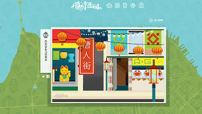
The animated GIF in situ on the map as a custom overlay.
Defining a custom overlay
To create a fullscreen overlay, the bounds are set to the Southwest and Northeast corners.
The MapView has two child views. The DOM element for a custom overlay actually needs to reside inside the markup generated by Google Maps, but the overlay is an Ember.View so the MapOverlayView is actually rendered as a sibling of the MapCanvas and then moved into the correct spot later.
Keep the overlay centered while panning
The default behavior for a custom overlay is to re-calculate the styles when the map is panned, but to build an overlay that stays centered on the map, the overlay should only be drawn once and then pan with the map.
Creating the overlay
Finally, once the overlay has been created and rendered, resolve a promise letting the application know the map is ready.
Final Thoughts
This project was extremely fun and was successful due to the collaboration between design and development. The Google Maps API gave us the creative freedom to completely customize the map, while Custom Overlays really pulled the experience together.
Posted by Monica Tran, Google Maps API Marketing
Adam and Abby Putinski are a husband and wife design/dev team located in San Francisco. Learn more about their work at abbyputinski.com