Editor's note: This week our Google for Education team will be joining thousands of educators at the annual ISTE conference in San Antonio. Follow along here and on Twitter for the latest news and updates.
Technology is transforming how students learn and the skills they need to succeed.
Today at the ISTE (International Society for Technology in Education) conference, we’ll be highlighting new tools and programs built to empower students to explore, build and think critically as active learners. Look out for a deeper dive on each of these announcements on the blog throughout this week.
Students as inventors and explorers
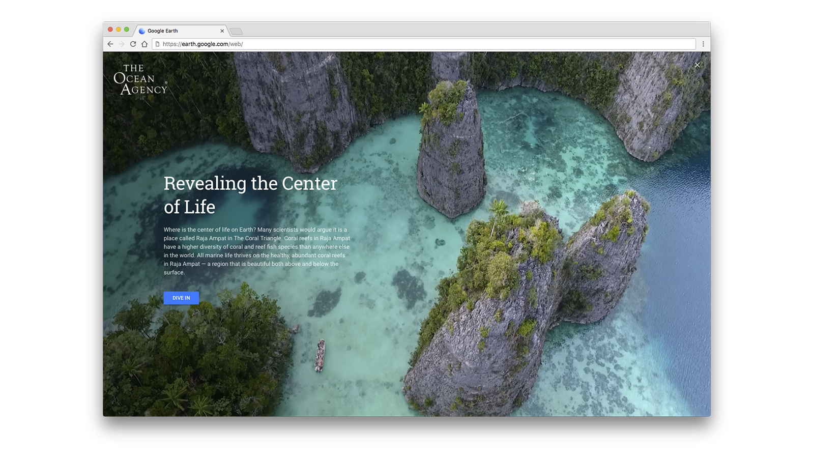
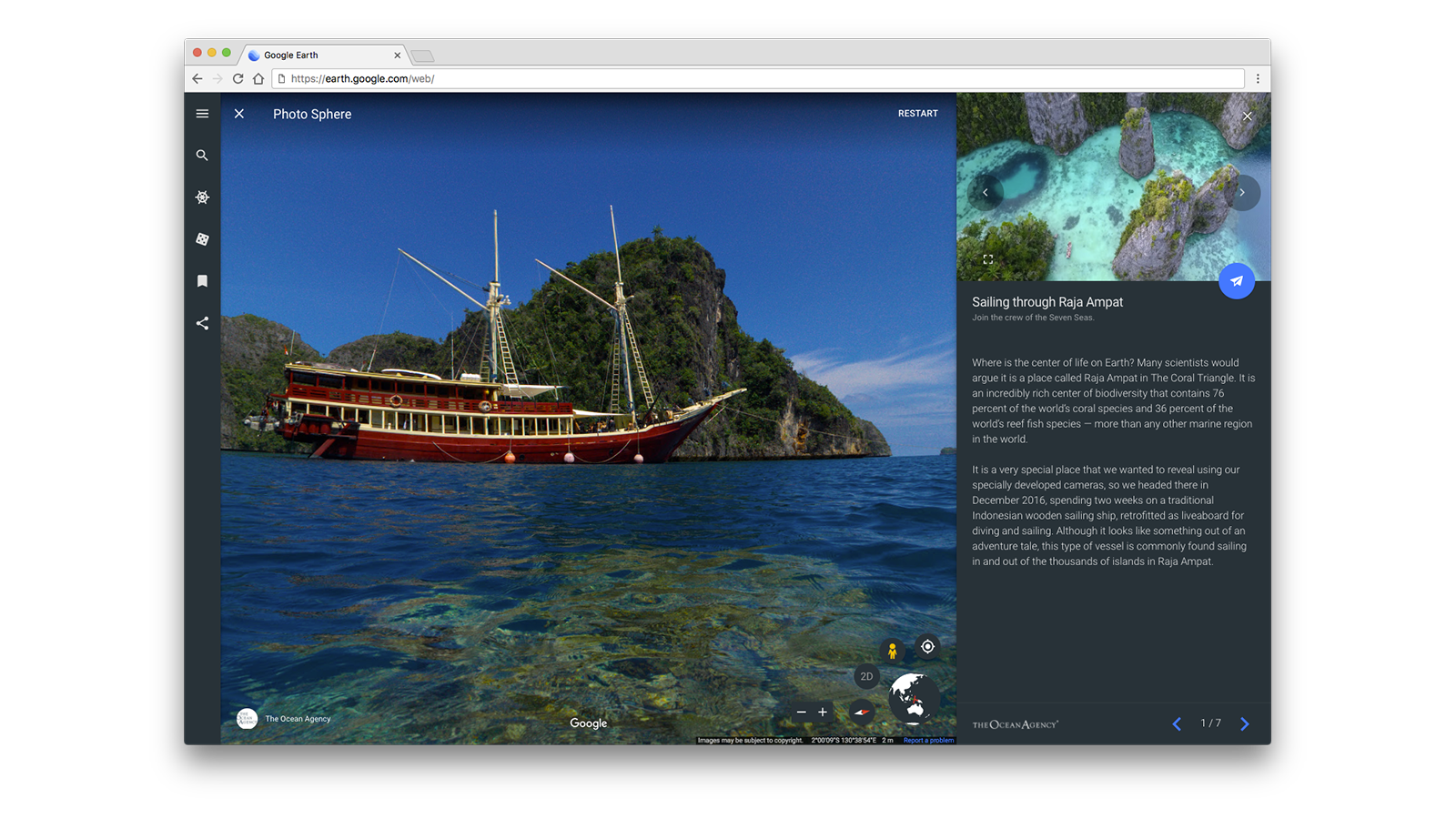
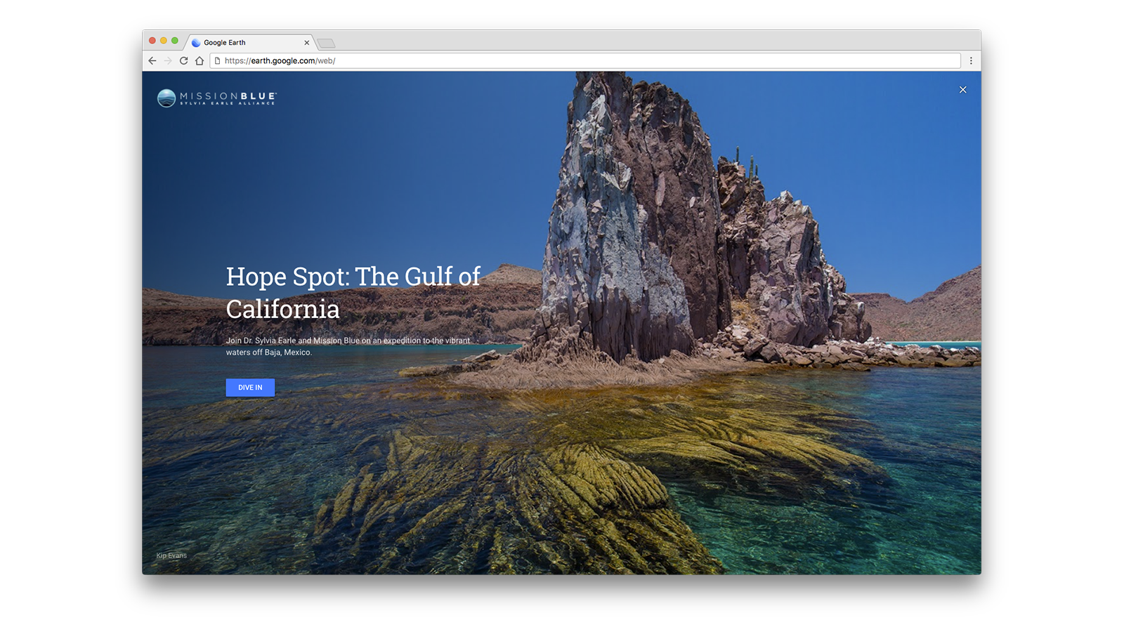
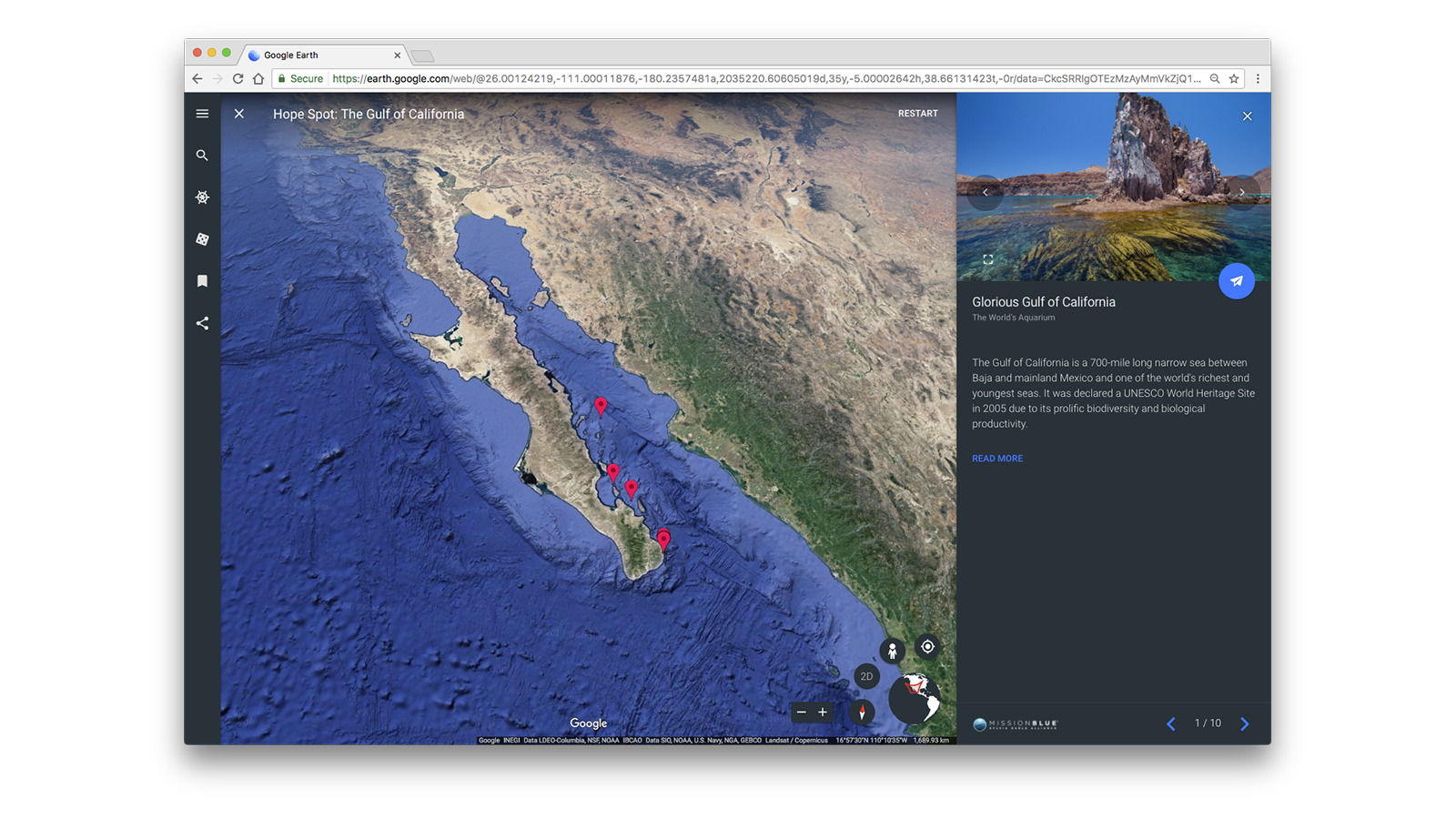
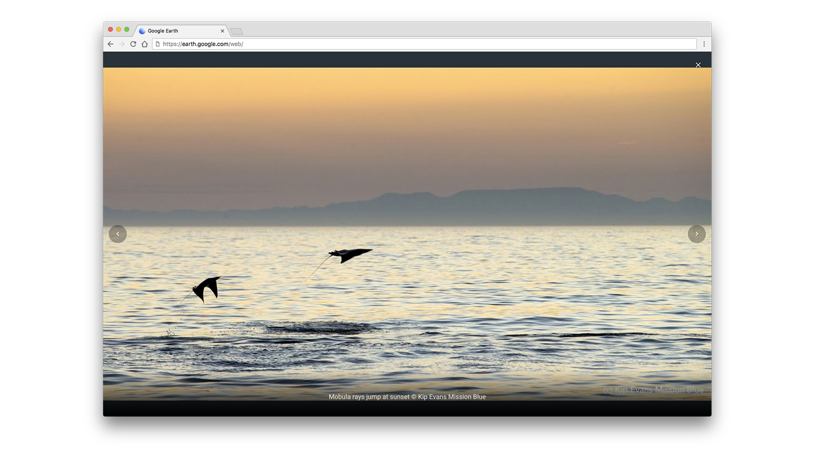
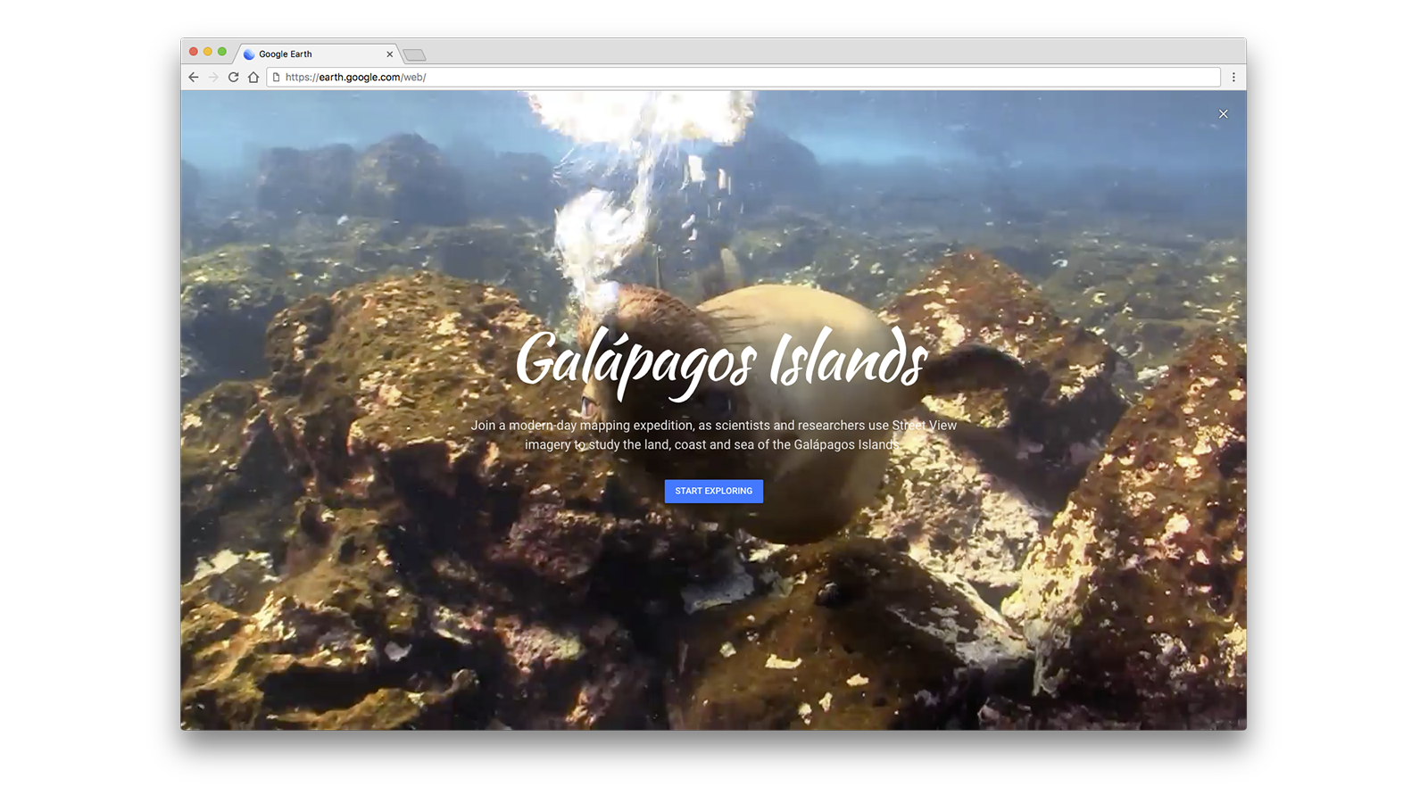
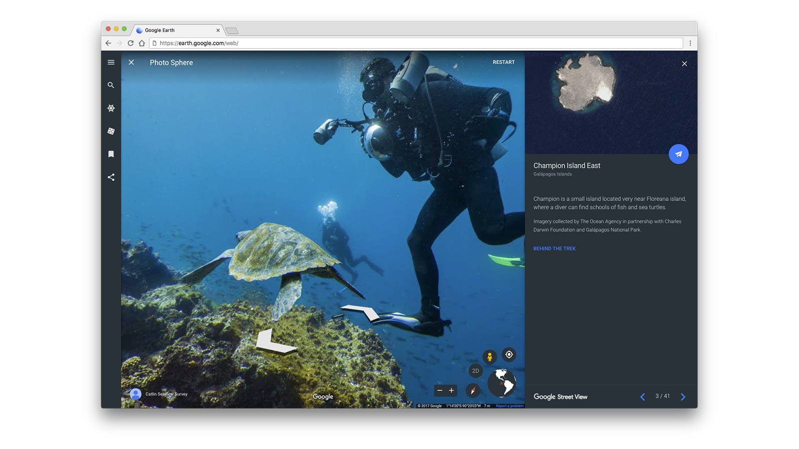
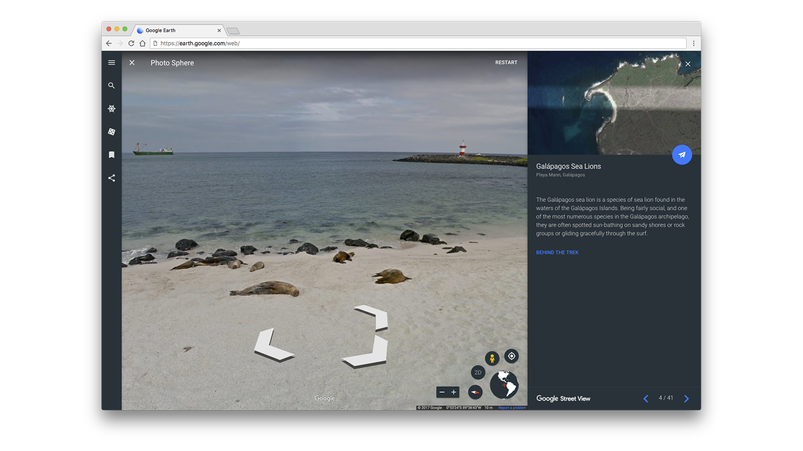
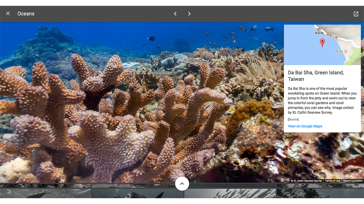
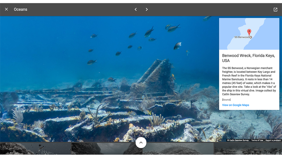
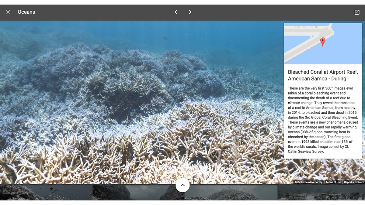
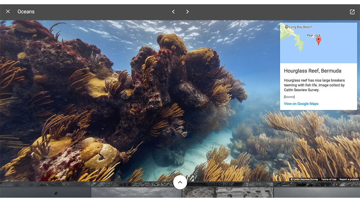
Recently we announced a new browser-based version of Google Earth that makes it easier than ever for teachers to bring the world into the classroom using Chromebooks. Today we are excited to introduce 10 new stories in Google Earth Voyager, our new storytelling platform, built specifically for the classroom. We collaborated with National Geographic Society, PBS Education, HHMI Biointeractive and Mission Blue to create beautiful, curated Voyager stories which offer students a new perspective on the world. We’re also unveiling new classroom activities for teachers to get started today. This week, Google Earth will become an additional service for Google for Education users, which can be managed by IT administrators through the Google Admin panel.
![[edu] earth alamo.png](https://storage.googleapis.com/gweb-uniblog-publish-prod/images/alamo.width-1686.png)
Google Earth knowledge card of the Alamo, not far from the ISTE 2017 conference!
We’re always looking to highlight great educational content on Chromebooks that can be seamlessly integrated into the classroom, while also fostering skills of the future. Today we’re announcing a collection of STEM tools for Chromebooks -- Dremel 3D40 3D Printer and littleBits Code Kit -- that schools can purchase at a bundle discount from their Chromebook reseller. These tools bring engineering into the classroom and help students become inventors.
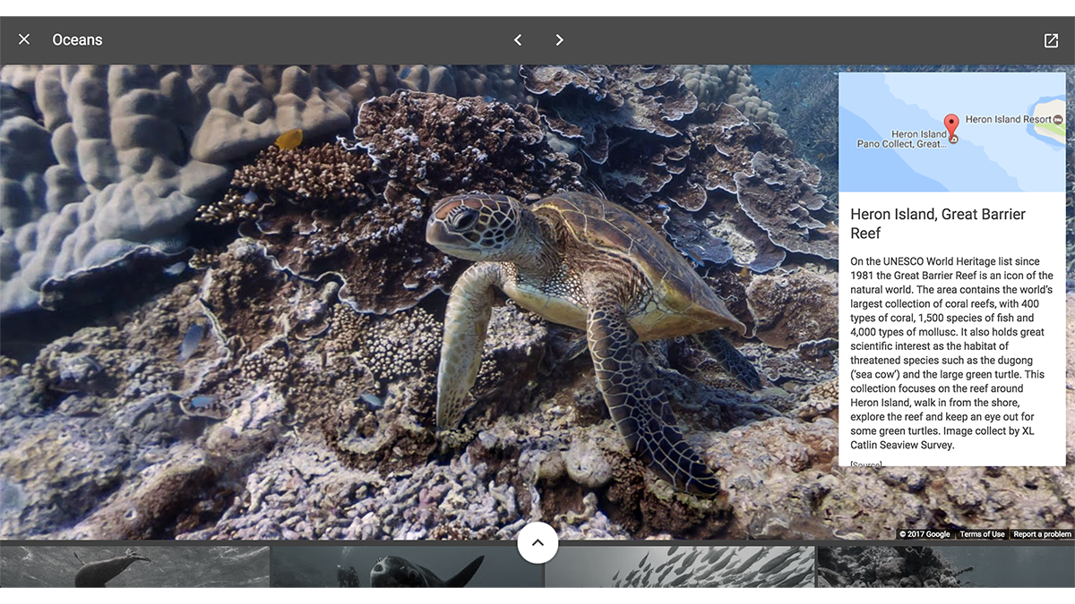
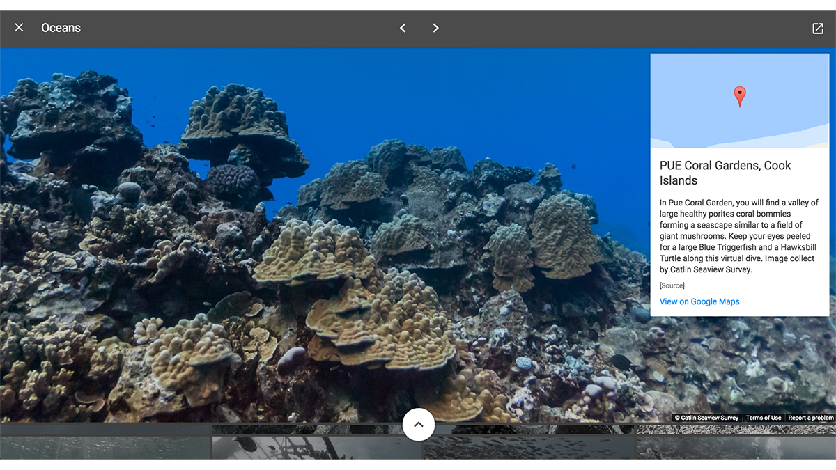
Coming soon, the Expeditions app for Cardboard and Daydream will offer a self-guided mode so anyone can access more than 600 virtual field trips on their own. Students and teachers will be able to pick an adventure to anywhere—from the Great Barrier Reef to the Great Wall of China—and see details on points of interest highlighted on cards. We hope that this encourages exploration and personal education, making it easy to learn using virtual reality.
Students as critical thinkers and responsible digital citizens
In addition to the bundle of STEM tools announced above, we are offering a discounted bundle of media literacy apps on Chromebooks, Scrible and eSpark Frontier. The tools are designed to support students as they research and write using contemporary online information and help students form opinions about the media they consume.
Be Internet Awesome is a new digital citizenship and safety program to help kids make smart decisions online. Developed in collaboration with online safety experts like the Family Online Safety Institute, the Internet Keep Safe Coalition and ConnectSafely, the program includes resources for kids, educators and families. ISTE has awarded Be Internet Awesome its Seal of Alignment for Readiness. Educators can find the curriculum on the Be Internet Awesome resource hub, or as part of a new online course for teachers of all grade levels in the Google for Education Training Center.
![[edu] Be Internet Awesome - Animation.gif](https://storage.googleapis.com/gweb-uniblog-publish-prod/original_images/Be_Internet_Awesome_-_Animation.gif)
Impact Portraits paint a picture of school success with Chromebooks and G Suite
Today, we’re sharing seven new Impact Portraits from school districts across the U.S. The districts range in size and demographics from Florida’s Brevard County, which covers a diverse coastal area with 73,000 students, to upstate New York’s Amherst Central, with 2,944 students.
One thing these schools have in common: they're using Chromebooks and G Suite to drive measurable improvements in everything from reading skills to AP diploma graduation rates. In the Metropolitan School District of Wayne Township, for example, Indiana’s measure of third grade reading skills has grown by 10% since adopting Chromebooks. Check out g.co/EduImpact to find all of the Impact Portraits, and stay tuned for a closer look at the collection later this week.
The school districts whose Impact Portraits we’re sharing today include:
Look out for a deeper dive on each of these updates on our Keyword blog throughout this week. If you’re at ISTE in San Antonio, visit us at booth #1718 in the expo hall. And check out our teaching theater sessions—taking place in room #214D—where educators and Googlers will be giving short presentations throughout the conference.
![[edu] earth alamo.png](https://storage.googleapis.com/gweb-uniblog-publish-prod/images/alamo.width-1000.png)