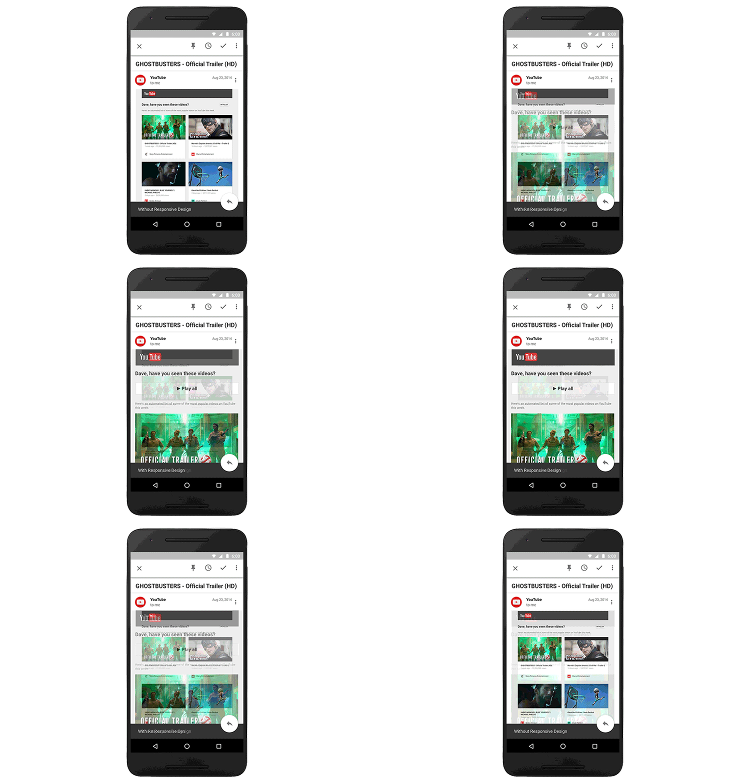
Have you ever opened an email on your phone and something about the formatting just looks … off? Maybe the text is hard to read, or the buttons and links too small to tap. That’s because many emails are still formatted for computers' larger screens, which means reading them on mobile can be a hassle.
Starting later this month, Gmail and Inbox by Gmail will support emails created with responsive design, meaning their content adapts to fit screens of all sizes. Text, links, and even buttons will enlarge to make reading and tapping easier on a smaller screen. If you’re on desktop, you’ll also see improvements, since emails designed for mobile can also adapt to fit larger screens.

These changes will make your email experience as comfortable and intuitive as possible. And as responsive design becomes more common, you’ll continue to see emails that fit better on all your screens and devices.