With much of the world physically apart right now, people are finding creative ways to use custom-built maps to maintain a shared sense of community, albeit virtually.
In 2007, we launched a tool called My Maps to help people create their own custom maps on top of Google Maps. With a simple drag-and-drop interface you can add placemarks, draw lines and shapes, and embed text, photos and videos. You can share your map via public URL, embed it on websites or publish your map for others to see.
Over the past four months, we’ve seen a surge in the number of people creating and viewing My Maps. From December 2019 to April 2020, we saw nearly a billion more My Maps creations, edits and views compared to the same time period last year, growing from 2 billion to nearly 3 billion. With My Maps, communities have been sharing helpful, local information in rapidly changing situations—from COVID-19 testing sites and food banks to where first responders can access childcare facilities.
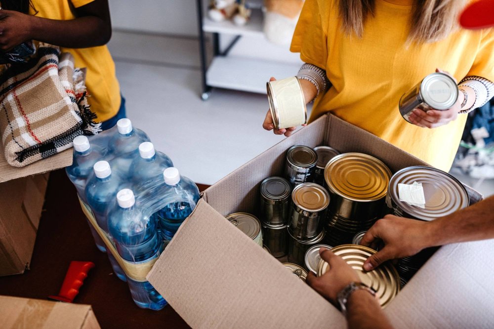
Maps can help us and our communities stay safe
A map can be helpful in ways that a simple list of text is not: it helps us instantly see information in the context of where we are, with the locations of the resources we might need.
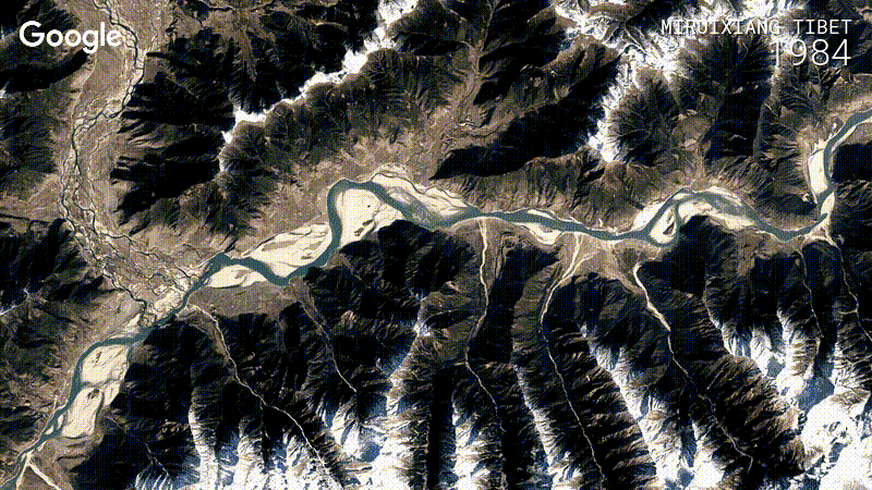
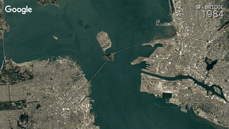
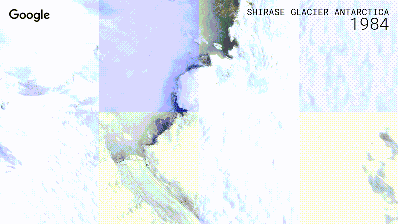
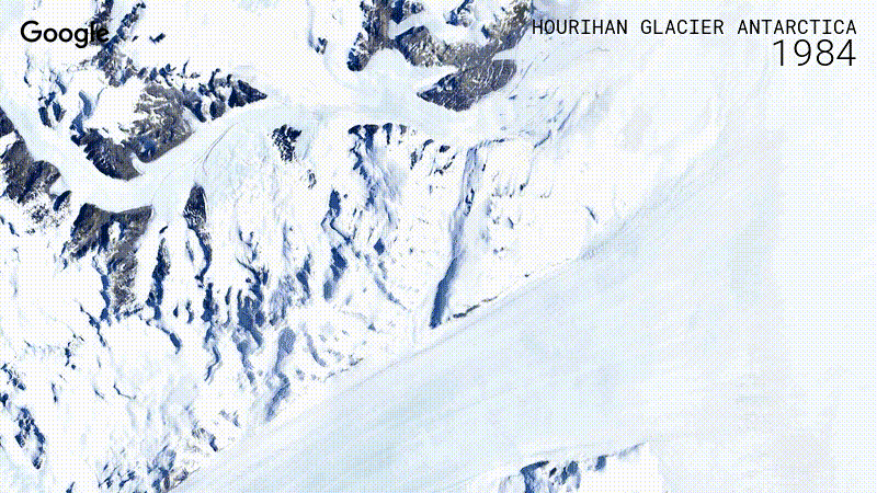
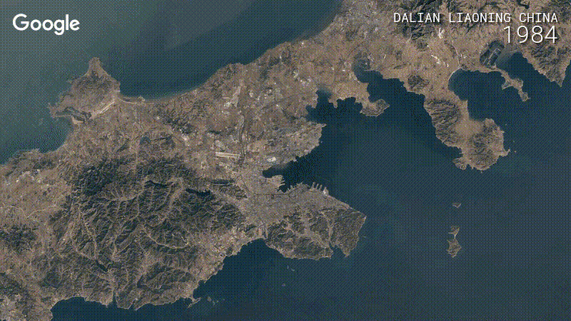
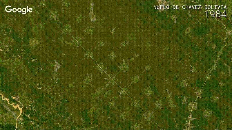
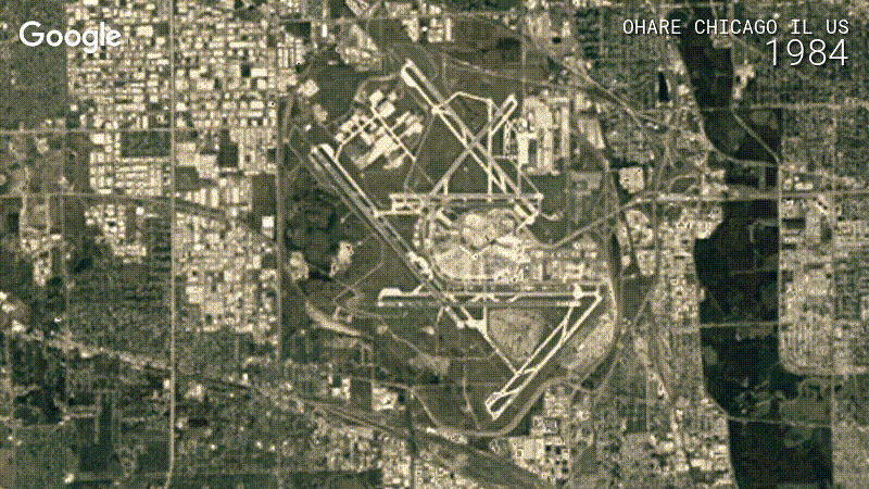
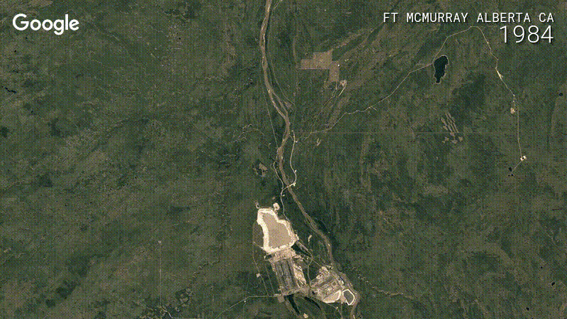
 We’re adding imagery from 2021-2022 to Timelapse in Google Earth, so you can see how the earth’s surface has changed over time.