Tag Archives: text

What’s new for text in Android Q

Posted by Florina Muntenescu, Android Developer Advocate

Displaying text is an important task in most apps, so in Android Q we're continuing to introduce new features to support your needs and improve performance. We disabled hyphenation by default, enabled creating a typeface using multiple fonts or font families, exposed the list of fonts installed on the device, and improved some of the most-used text styling APIs.

Hyphenation is off by default in Android Q and AppCompat v1.1.0

Our performance tests showed that when hyphenation is enabled, up to 70% of the time spent on measuring text is on hyphenation.

pie chart showing CPU of time spent making StaticLayout: Hyphenation takes up to 70% of the time spent measuring text, 30% Other text

Hyphenation takes up to 70% of the time spent measuring text

Given that hyphenation often isn’t needed for all TextViews in an app, and because of the impact on performance, we decided to turn hyphenation off by default in Android Q and AppCompat v1.1.0. If you want to use hyphenation, you need to manually turn it on in your app by setting the hyphenation frequency to normal. You can set this in multiple ways:

As a TextAppearance attribute in styles.xml:

<style name="MyTextAppearance" parent="TextAppearance.AppCompat">
    <item name="android:hyphenationFrequency">normal</item>
</style>

As a TextView attribute:

<TextView android:hyphenationFrequency="normal" />

Directly in code:

textView.hyphenationFrequency = Layout.HYPHENATION_FREQUENCY_NORMAL

Find out more about how hyphenation works from this talk at Android Dev Summit 2018.

Use multiple custom fonts in the same TextView

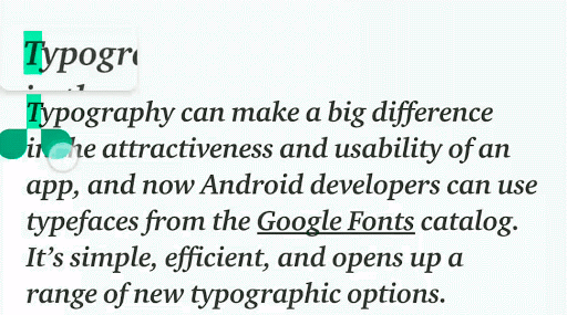
Consider a button which mixes a custom font (Lato in this example) with an icon font:

Secure Checkout Button with lock icon, icon and latin fonts

Button with icon and Latin fonts

The Button class accepts only a single instance of a typeface to be set on the text. Pre-Android Q, you can create a Typeface using a single font family. Android Q enables the creation of a typeface from multiple font families with a new API, Typeface.CustomFallbackBuilder, that allows adding up to 64 font families per typeface.

Our icon font example can be implemented like this:

button.typeface = Typeface.CustomFallbackBuilder(
    // add the Latin font
    FontFamily.Builder(
        Font.Builder(assets, "lato.ttf").build()
    ).build()
).addCustomFallback(
    // add the icon font
    FontFamily.Builder(
        Font.Builder(assets, "icon_font.ttf").build()
    ).build()
).build()

When creating the font family, make sure you don’t put fonts that belong to different families in the same font family object nor the same style fonts into the same font family. For example, putting Lato, Kosugi, and Material into the same font family creates an invalid configuration, as does putting two bold fonts into the same font family.

To define the general font family (serif, sans-serif, or monospace) to be used when text is rendered using system fonts, use the setSystemFallback() method to set the system fallback font:

Typeface.CustomFallbackBuilder(
    FontFamily.Builder(
       ...
    ).build()
).setSystemFallback("sans-serif")
.build()

Text styling API updates

Android Q brings several updates to different text styling APIs:

Improved support for variable fonts

TextAppearance now supports the fontVariationSettings attribute:

<style name="MyTextAppearance" parent="TextAppearance.AppCompat">
    <item name="android:fontVariationSettings">...</item>
</style>

The fontVariationSettings attribute can be set directly on the TextView in Android Q and in AppCompatTextView:

<TextView
    ...
    app:fontVariationSettings="..."
/>

Improved spans APIs

TextAppearanceSpan now supports typeface, shadow settings, fontFeatureSettings and fontVariationSettings.

LineBackgroundSpan and LineHeightSpan interfaces now have standard implementations: LineBackgroundSpan.Standard and LineHeightSpan.Standard.

Access system fonts

With more than 100 languages supported by Android, and with different fonts supporting different character sets, knowing which system font can render a given character is not trivial. Apps doing their own text rendering such as games, document viewers, or browsers need this information. In Android Q, you can retrieve the supported system font for a string with the FontMatcher NDK API.

System fonts that can render this text

System fonts that can render this text

Let’s consider the above search string. The FontMatcher API returns us the font object and length. A simplified pseudocode example looks like this:

// font = NotoSansCJK-Regular.ttc
// length = 2
auto[font, length] = AFontMatcher_match("たすく a.k.a. のな");

// font = Roboto-Regular.ttf
// length = 8
auto[font, length] = AFontMatcher_match(" a.k.a. のな");

// font = NotoSansCJK-Regular.ttc
// length = 2
auto[font, length] = AFontMatcher_match("のな");

The FontMatcher API never returns nullptr:

  • If no font supports the given string, a font for Tofu (?), the missing glyph symbol, is returned.
  • If no exact style is supported, a font with the closest, most similar style is returned.

If you want to get all available system fonts, you can do this with a new font enumeration API. In Java, you can use SystemFonts.getAvailableFonts, or in the NDK, you can use ASystemFontIterator. The results of the font enumeration are changed only by a system update, so you should cache them.

Font updates

New Myanmar font

Android added a new Myanmar font to Android Q that is Unicode-compliant and capable of rendering both Unicode and non-Unicode Burmese (commonly known as Zawgyi), right out of the box. This means starting in Android Q, Android makes it easier for users to switch to Unicode: a user can now use a Unicode font to read Unicode and non-Unicode text for the first time. Android also added new requirements to the Android ecosystem CDD that takes a stronger stance in requiring Unicode, including a new subtag "Qaag" which OEMs should use as a locale designating non-Unicode Burmese. All of these changes should make developers’ life easier in the long term, as reduced ecosystem fragmentation makes it easier to develop for our 50M users in Myanmar.

New emojis

New emojis in Android Q

New emojis in Android Q

Say Hello to your new emoji friends! The latest update includes a number of disability-focused emojis, 59 gender-inclusive designs, multi-racial couples, as well as a few cute animals and household objects. See the latest and greatest in Gboard on your Android Q device of choice.

Text plays an important role in a vast majority of apps, so we’re continuing to invest in improving text API features and performance. Learn more about the new APIs in Android Q along with best practices when working with text in our Google I/O 2019 talk:

What’s new for text in Android P

Posted by Florina Muntenescu, Developer Advocate & Siyamed Sinir Android Text Technical Lead

In "What's new in Android P Beta" we mentioned two of the new text features in Android.. Now that Android P Beta 2 and the final APIs are here, it's time to dive deeper into what's new for text. We know that TextView is one of the most critical components of the Android view system. This is why we continue to invest in both developer- and user-facing features and API improvements.

PrecomputedText

Displaying text can be complex, encompassing features like multiple fonts, line spacing, letter spacing, text direction, line breaking, hyphenation and more. TextView has to do a lot of work to measure and lay out the given text: reading the font file, finding a glyph, decide the shape, measure the bounding box, and caching the word in an internal word cache. What's more, all of this work takes place on the UI thread, where it could potentially cause your app to drop frames.

We found that measuring text can take up to 90% of the time required to set the text. To solve this problem, in Android P and as part of Jetpack, we introduced a new API: PrecomputedText. This API is available as far back as API 14 via PrecomputedTextCompat.

PrecomputedText enables an app to perform the most time-consuming parts of text layout beforehand, even on a background thread, caching the layout result and returning valuable measurement data. The result of PrecomputedText.create(CharSequence, params) can then be set on a TextView. With this, only about 10% of the work remains to be done by the TextView.

Percentage of time taken to measure and layout text

Percentage of time taken to measure and layout text

// UI thread
val params: PrecomputedText.Params = textView.getTextMetricsParams()
val ref = WeakReference(textView)
executor.execute {
    // background thread
    val text = PrecomputedText.create("Hello", params)
    val textView = ref.get()
    textView?.post {
        // UI thread
        val textViewRef = ref.get()
        textViewRef?.text = text
    }
}

Magnifier

Even with features like Smart Text Selection, precisely selecting text can be challenging. Android P introduces the text Magnifier to improve the user experience of selecting text. The magnifier helps users precisely position the cursor or the text selection handles by viewing magnified text through a pane that can be dragged over the text.

Magnifying text in Android P

Magnifying text in Android P

We wanted users to have the same experience across all apps, whether in custom widgets or during custom text-rendering, so we provided a Magnifier widget that can be applied to any view that is attached to a window. The Magnifier widget can provide a zoomed-in version of any view or surface, not just text.

The Magnifier has 3 main methods: show, update and dismiss. For example, you could call these methods when implementing onTouchEvent-handling for your custom view. This would cause the Magnifier to follow the user's finger along the screen.

fun onTouchEvent(event: MotionEvent): Boolean {
    when (event.actionMasked) {
        MotionEvent.ACTION_DOWN -> 
              magnifier.show(event.x, event.y)
        MotionEvent.ACTION_MOVE -> 
             magnifier.show(event.x, event.y)
        MotionEvent.ACTION_UP -> 
             magnifier.dismiss()
    }
}

Smart Linkify

The Linkify class, which has existed since API 1, allows adding links to text using regexes. On top of that, finding physical addresses spins up a WebView instance to produce the results, which can degrade the performance of the app requesting links. To make link resolution more accurate, especially for internationalized text, and to mitigate the performance degradation caused by the WebView, we created Smart Linkify. Smart Linkify can be accessed using TextClassifier API.

Smart Linkify uses machine-learning algorithms and models to recognize entities in text. This improves the reliability of the entities recognized. Smart Linkify can, based on entity type,suggest actions that the user can perform. For example, if Smart Linkify recognizes a phone number, the API suggests actions such as sending a text message, making a call, or adding to contacts.

Smart Linkify in Android P

Smart Linkify in Android P

To improve the performance of your app, move the work of generating and applying links to a background thread.

// UI thread
val text: Spannable = ...
val request = TextLinks.Request.Builder(text)
val ref = WeakReference(textView)
executor.execute {
    // background thread
    TextClassifier.generateLinks(request).apply(text)
    val textView = ref.get()
    textView?.post {
        // UI thread
        val textViewRef = ref.get()
        textViewRef?.text = text
    }
}

Line Height and Baseline Text Alignment

Designers sometimes provide layout specifications to developers that do not match existing TextView attributes perfectly. On Android P and in Jetpack we added three attributes, together with their corresponding functions, to help bridge this gap between how designers and developers work.

Setting line height

Before Android P, the spacing between lines could be controlled using the lineSpacingExtra and lineSpacingMultiplier attributes. However, designers will commonly provide these values as a simple line height, instead. For this reason, on Android P, we added the lineHeight attribute to set the line height of the text: that is, the distance between the top and bottom of a line (or distance between subsequent baselines). Under the hood, this attribute actually uses and modifies the existing lineSpacingExtra and lineSpacingMultiplier attributes.

Size of line height and font size

Size of line height and font size

<TextView
    android:layout_height="wrap_content"
    android:layout_width="match_parent"
    android:text="Lorem ipsum dolor sit amet"
    app:lineHeight="50sp"/>

// or in code
TextView.setLineHeight(@Px int)

Setting the baseline text alignment

To control the distances of the first and last baselines from the view boundaries, we added two new attributes: firstBaselineToTopHeight and lastBaselineToBottomHeight.

firstBaselineToTopHeight: Sets the distance between the TextView's top boundary and the baseline of the first line of the TextView. Under the hood this attribute updates the top padding.

lastBaselineToBottomHeight: Sets the distance between the TextView's bottom boundary and the baseline of the last line of the TextView. Under the hood, this attribute actually updates the bottom padding.

Distances between first base line to top and last baseline to bottom

Distances between first base line to top and last baseline to bottom

<TextView
    android:layout_height="wrap_content"
    android:layout_width="match_parent"
    android:text="Lorem ipsum dolor sit amet"
    app:firstBaselineToTopHeight="28sp"
    app:lastBaselineToBottomHeight="20sp"/>

// or in code
TextView.setFirstBaselineToTopHeight(@Px int)
TextView.setLastBaselineToBottomHeight(@Px int)

Text plays an important role in a vast majority of apps - it's a crucial part of an app's design language. Text is consumed by users, and it even renders emoji ?. We're continuing to invest in text, improving the experience of both app users and developers.

To learn more about working with text APIs and what's new in Android P for text, check out the Google I/O 2018 talk on "Best practices with text":