Tag Archives: Environment

Exploring strategies to decarbonize electricity

Climate change is one of the greatest challenges of our time, and the way we generate and use electricity now is a major contributor to that issue. To solve it, we need to find a way to eliminate the carbon emissions associated with our electricity as quickly and as cheaply as possible.

Many analysts have come up with a number of possible solutions: renewable energy plus increased energy storage capacity, nuclear power, carbon capture and sequestration from fossil fuels, or a mixture of these. But we realized that the different answers came from different assumptions that people were making about what combination of those technologies and policies would lead to a positive change.

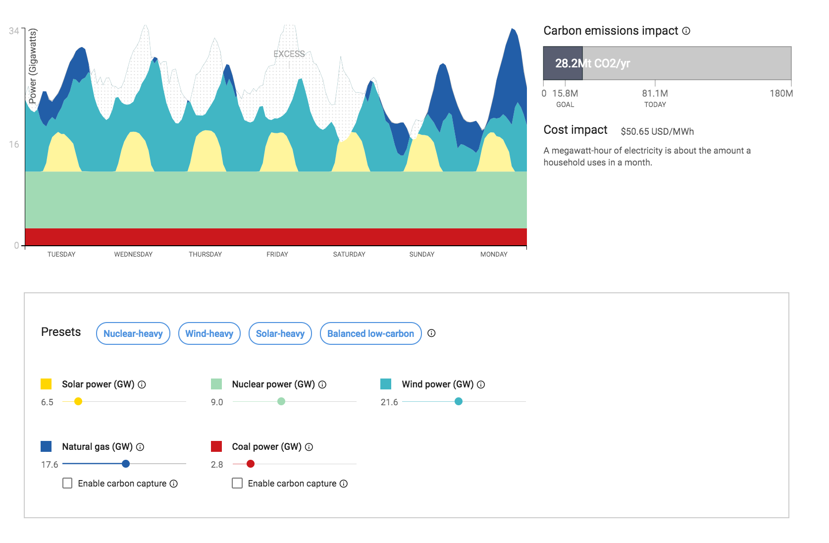
To help our team understand these dynamics, we created a tool that allows us to quickly see how different assumptions—wind, solar, coal, nuclear, for example—affect the future cost to generate electricity and the amount of carbon dioxide emitted.

We created a simplified model of the electrical grid, where demand is always fulfilled at least cost. By “least cost,” we mean the cost of constructing and maintaining power plants, and generating electricity (with fuel, if required). For a given set of assumptions, the model determines the amount of generation capacity to build and when to turn on which type of generator. Our model is similar to others proposed in other research, but we’ve simplified the model to make it run fast.

We then ran the model hundreds of thousands of times with different assumptions, using our computing infrastructure. We gather all of the runs of the model and present them in a simple web page. Anyone —from students to energy policy wonks—can try different assumptions and see how those assumptions will affect the cost and CO2. The web UI is available for you to try: you can explore the how utilities decide to dispatch their generation capacity, then can test different assumptions. Finally, you can compare different assumptions and share them with others.

1

We’ve written up the technical details of the model in this paper. In case you want to change the assumptions in the model, we are also releasing the code on Github. The paper shows how the cost of generation technologies change as a function of the fraction of demand that they fulfill. The paper also discusses the limitations and validity of the model.

One interesting conclusion of the paper: if we can find a zero-carbon, 24x7 electricity source that costs about $2200/kW to build, it can displace carbon emission from the electricity grid in less than 27 years. We hope that the tool and the paper help people understand their assumptions about the future of electricity, and stimulate research into climate and energy.

Seeing is believing in the fight against climate change

In 2005, more than a thousand of acres of land in my hometown in the Santa Cruz mountains were under threat from a proposed logging contract that would have severely damaged our ecosystem by tearing down ancient Redwoods, increasing potential fire danger and endangering public safety. As part of the community group Neighbors Against Irresponsible Logging, I used Google Earth to build a flyover of the area to show how closely this logging would take place to residential life, and the dangers it would create. Making geographic data visible and easily intelligible helped to bring together the community to defeat the logging proposal. Seeing is often believing.

That’s the core mission behind Google Earth. We aim to build the most detailed and realistic digital replica of our changing planet and make it universally accessible to the public—a utility for all. We’re trying to fix what former Vice President Al Gore, in his speech on the Digital Earth, called the challenge of “turning raw data into understandable information.”

Emerging technologies like our own Google Earth Engine and Google Cloud Machine Learning, and artificial intelligence in general are doing just that: empowering scientists and practitioners to create solutions at the cutting edge of global sustainability, and turning the mountains of geo-data we have into the insights and knowledge needed to guide better decision-making. This work helps drive adoption of renewable energy technologies such as solar, and allows us to better understand and manage the world’s forests, oceans, water and air.

Our team had the chance to sit down with former Vice President Al Gore to discuss the roles of data, tools and technology in solving the climate crisis.

We’re grateful to leaders like Al Gore, and all who act as stewards of our shared planetary home. The last decade has seen immense technological progress—and we'll continue to work on data and tools to guide us to a more sustainable world.

Chasing Coral on Google Earth

Editor’s Note: Richard Vevers, Founder and CEO at the Ocean Agency, talks about his quest to protect our oceans and the underwater journey with Street View that led to “Chasing Coral,” a new Netflix documentary.

I am floating above a graveyard, millions of tiny skeletons below me. I am stunned, I am silent. I am witnessing a tragedy in progress. My camera clicks and whirrs, capturing a 360-degree picture of the devastation.

The graveyard was once a thriving coral reef, one of our planet’s most gorgeous and awe-inspiring marvels and home to thousands of species. Colorful corals growing in all shapes and sizes, clownfish peeking out of every anemone. Up above, manta rays and turtles swam in lazy circles, scattering the great glittering schools of tiny blue fish.

What happened? 

That’s the question “Chasing Coral” seeks to answer. The film, a Netflix original documentary released today, follows my crew of divers, photographers, and scientists on our quest to reveal what is killing our oceans … and how we can stop it.

“Chasing Coral” was born from a simple idea: If we could give people a personal, up-close look at how their oceans are being destroyed, they would want to protect them. For the past five years, we’ve been working with Google to make this happen. We created Underwater Street View, which lets people take virtual dives in some of the world’s most beautiful coral reefs. Now with Google Earth, you can splash around in the sparkling waters of a coral reef without even leaving the house.

From there, we set out to show people the great beauty of our coral reefs, as well as the terrible danger that threatens their existence. By collecting Underwater Street View, we found undeniable proof of climate change destruction in the ocean. Documented so spectacularly by Jeff Orlowski in “Chasing Coral,” the warning signs are unmistakable. The countdown has already begun.

Fortunately, it’s not all bad news. Some coral reefs are less vulnerable to the rising water temperatures that have already killed so many others. This year we started the 50 Reefs to find these resilient reefs—the ones that with the greatest capacity to repopulate other reefs—so that we can bolster our efforts to protect the corals that still remain. In October we’ll announce a list of the reefs that could be pivotal for the future of the ocean, a list that can catalyze global action.

The release of “Chasing Coral” and the launch of 50 Reefs share two critical ideas: what happens to coral reefs affects every single person on Earth (even if they’re thousands of miles from the nearest coast); and, if we want to save the reefs, we need everyone to pitch in now.

There’s already been an outpouring of support for our work from philanthropic foundations like Bloomberg Philanthropies, The Tiffany & Co. Foundation, and Paul G. Allen Philanthropies. With their help, we’ve been able to launch an initiative that could make all the difference. We’ve got a lot of work yet to do, but we’re off to a promising start.

Now that “Chasing Coral” is free to stream on Netflix, I hope that you’ll watch it. I hope that you’ll feel the same wonder that I felt as a child when I slipped beneath the waves for the first time and found myself in an underwater paradise of beauty and color. I hope the film will both sadden and strengthen you. I hope you will spread the word.

Most of all, though, I hope you join the fight to save coral reefs. Please follow our story on Google Earth and support us at 50Reefs.org.

I Am Amazon: Discover your connection to the rainforest with Google Earth

For many people around the world, the Amazon is a mysterious faraway land of impenetrable jungles, majestic rivers and indigenous peoples. But what many of us may not realize is that we all have a connection to the Amazon—through the air we breathe, the water that irrigates the food we eat, the natural ingredients in the medicines we use, or the shifting weather patterns that we experience around the globe.

Today we invite you to venture into the heart of the Amazon and discover your connection to the world's largest rainforest through Voyager, Google Earth's storytelling platform. You’ll find 11 new interactive stories about different parts of the vast Brazilian Amazon region, which is home to about 27 million people and a wide array of cultures.

All of these stories are told by the diverse peoples who call the forest home, and some were produced by one of Brazil's greatest storytellers, the acclaimed film director Fernando Meirelles. Combined, they create an immersive web and mobile experience told through video, mapping, audio and 360° virtual reality, covering a broad range of issues facing the future of the rainforest—and, consequently, the planet.

These stories reflect the complexity of the Amazon, which produces 20 percent of the Earth's oxygen and is home to one in 10 of the world's animal species. Learn about the supply chain behind the vast array of forest delicacies, like Brazil nuts and açaí, that end up on supermarket shelves worldwide; or about local economies once dependent on illegal logging that are now reorganized around sustainability efforts; or about Quilombolas, communities of descendants of enslaved peoples, and their struggle to obtain titles for their lands.

Image
View "I Am Amazon" in Google Earth

Thanks to our partnership with the Instituto Socioambiental, we're also publishing in Google Earth Voyager for the first time a comprehensive atlas of indigenous lands in Brazil and the people who live there. And we're filling in those maps with in-depth interactive stories told by the Amazon communities themselves.

You can learn about indigenous peoples like the Tembé and the Paiter Suruí, who are using monitoring technologies to protect their territories from illegal incursions by outsiders and deforestation; or the Yawanawá, a tribe that under the leadership of women has revived its cultural heritage and carved out a place in the global cosmetics industry by sustainably harvesting urucum, a reddish seed used in lipstick and other products.

These stories are the culmination of 10 years of work with the peoples of the Amazon. Back in 2007, Paiter Suruí leader Chief Almir came across Google Earth and quickly saw its potential to help safeguard the heritage and traditions of his people. So he proposed a partnership with Google that resulted in an online map of Suruí cultural heritage, the first ever indigenous community-led deforestation and forest carbon mapping project. Through this project, the Suruí calculated the value of their forest on the voluntary carbon marketplace, and became the first indigenous community to receive funds for preserving their lands.

Technology is an important tool that is helping us to protect the forest and keep our traditions alive. Ubiratan Suruí Suruí Indigenous People's Association

Over the years, we've built on this work with the Suruí and expanded it to an additional 30 communities in the Amazon, with more to come. We also recently integrated certified Brazilian indigenous territories into Google Maps, all 472 of them.

Since its creation more than a decade ago, Google Earth has always aimed to bring the magic of our planet to everyone in a beautiful, accessible and enriching way. We hope these fascinating stories from the Amazon do all of that and more, inspiring curious minds to explore, learn and care about our vast, fragile planet.

Source: Google LatLong


I Am Amazon: Discover your connection to the rainforest with Google Earth

For many people around the world, the Amazon is a mysterious faraway land of impenetrable jungles, majestic rivers and indigenous peoples. But what many of us may not realize is that we all have a connection to the Amazon—through the air we breathe, the water that irrigates the food we eat, the natural ingredients in the medicines we use, or the shifting weather patterns that we experience around the globe.

Today we invite you to venture into the heart of the Amazon and discover your connection to the world's largest rainforest through Voyager, Google Earth's storytelling platform. You’ll find 11 new interactive stories about different parts of the vast Brazilian Amazon region, which is home to about 27 million people and a wide array of cultures.

All of these stories are told by the diverse peoples who call the forest home, and some were produced by one of Brazil's greatest storytellers, the acclaimed film director Fernando Meirelles. Combined, they create an immersive web and mobile experience told through video, mapping, audio and 360° virtual reality, covering a broad range of issues facing the future of the rainforest—and, consequently, the planet.
View "I Am Amazon" in Google Earth

These stories reflect the complexity of the Amazon, which produces 20 percent of the Earth's oxygen and is home to one in 10 of the world's animal species. Learn about the supply chain behind the vast array of forest delicacies, like Brazil nuts and açaí, that end up on supermarket shelves worldwide; or about local economies once dependent on illegal logging that are now reorganized around sustainability efforts; or about Quilombolas, communities of descendants of enslaved peoples, and their struggle to obtain titles for their lands.

Image
View "I Am Amazon" in Google Earth

Thanks to our partnership with the Instituto Socioambiental, we're also publishing in Google Earth Voyager for the first time a comprehensive atlas of indigenous lands in Brazil and the people who live there. And we're filling in those maps with in-depth interactive stories told by the Amazon communities themselves.

You can learn about indigenous peoples like the Tembé and the Paiter Suruí, who are using monitoring technologies to protect their territories from illegal incursions by outsiders and deforestation; or the Yawanawá, a tribe that under the leadership of women has revived its cultural heritage and carved out a place in the global cosmetics industry by sustainably harvesting urucum, a reddish seed used in lipstick and other products.
I Am Food

These stories are the culmination of 10 years of work with the peoples of the Amazon. Back in 2007, Paiter Suruí leader Chief Almir came across Google Earth and quickly saw its potential to help safeguard the heritage and traditions of his people. So he proposed a partnership with Google that resulted in an online map of Suruí cultural heritage, the first ever indigenous community-led deforestation and forest carbon mapping project. Through this project, the Suruí calculated the value of their forest on the voluntary carbon marketplace, and became the first indigenous community to receive funds for preserving their lands.

Technology is an important tool that is helping us to protect the forest and keep our traditions alive. Ubiratan Suruí
Suruí Indigenous People's Association

Over the years, we've built on this work with the Suruí and expanded it to an additional 30 communities in the Amazon, with more to come. We also recently integrated certified Brazilian indigenous territories into Google Maps, all 472 of them.

Since its creation more than a decade ago, Google Earth has always aimed to bring the magic of our planet to everyone in a beautiful, accessible and enriching way. We hope these fascinating stories from the Amazon do all of that and more, inspiring curious minds to explore, learn and care about our vast, fragile planet.

Source: Google LatLong


Using machine learning to help people make smart decisions about solar energy

 A few years ago, when my family was first deciding whether or not to go solar, I remember driving around the neighborhood, looking at all the solar arrays on nearby rooftops. It made me realize: Wow, solar isn’t some futuristic concept, it’s already part of the fabric of my town! Seeing that others around me were already benefiting from solar helped me decide to do the same.

We want to make it easy for people to make informed decisions about whether to invest in solar. Project Sunroof already shows you solar potential and cost saving for more than 60 million individual homes. Today we’re adding a new feature, Project Sunroof Data Explorer, which shows a map of existing solar installations in neighborhoods throughout the United States. Now instead of driving street to street, it’s a little easier to see if houses around you and communities nearby have already gone solar.  
one
Click on “existing arrays” in the upper right corner to see number of existing installations in your region

This feature combines machine learning with imagery from Google Maps and Google Earth to provide an estimate of how many houses in an area have solar. We started by taking in high-resolution imagery of rooftops and manually identifying solar installations. We then used that data as the initial training set for our algorithm. After many iterations, our machine learning algorithms can now automatically find and identify installations in the imagery (both photovoltaic panels, which produce electricity, and solar hot water heaters). Even for machines, practice makes perfect!

2

So far we’ve identified around 700,000 installations in the U.S. and over time, as we continue to train the algorithms and apply improvements, we will be able to find and show more installations. We hope that this new feature will provide policy makers, communities and individuals with more information to help make smarter decisions in their transition to cleaner power sources.

Let’s clear the air: mapping our environment for our health

How hot will it be today? What is the traffic for my commute to work? Where’s the nearest grocery store? Every day we use data about the world around us to make decisions. One useful dataset is air pollution data, which contains much-needed information that can help us understand how to live healthier lives, build smarter and more sustainable cities, and reduce climate-changing greenhouse gases in both urban and rural areas.

Mapping air pollution at street level

Today, with our partners at Environmental Defense Fund (EDF) and Aclima, we’re sharing the first results of an endeavor we started in 2015: to measure air quality using Aclima equipment mounted on Google Street View cars. You can now see maps for Oakland, CA, released by EDF, of nitric oxide (NO), nitrogen dioxide (NO2) and black carbon—pollutants emitted from cars, trucks and other sources that can affect our health and our climate.

airview-blackcarbon1.png
Black carbon particles come from burning fuel, especially diesel, wood and coal. High exposure is associated with heart attacks, stroke and some forms of cancer. Air quality data from Google/Aclima; analysis by Apte et al/EDF. Colors on the map do not correlate to colors on the Air Quality Index.

Zooming in, you can see street-level details that show how pollution can change block by block. For example, the area where the Bay Bridge meets the I-80, a major freeway, has sustained higher pollution levels due to vehicles speeding up to cross under I-80 and merge onto the bridge. These insights can help community groups like the West Oakland Environmental Indicators Project get a better understanding of local air quality and assist regulators like the Bay Area Air Quality Management District in identifying opportunities to achieve greater air quality improvements. This kind of information can also be applied to other cities, who are trying to understand local air quality patterns and implement solutions that improve the local environment.

airview-blackcarbon2.png
Zoom-in of black carbon in Oakland, where you can see block-by-block air quality. Air quality data from Google/Aclima; analysis by Apte et al/EDF. Colors on the map do not correlate to colors on the Air Quality Index.

We hope Bay Area residents use this resource to explore air quality in Oakland, and find out how you can do your part to improve it. Scientists can request access to the validated data now. You can also learn more about the science behind these maps in the journal Environmental Science & Technology, authored by a scientific team led by Dr. Joshua Apte, at the University of Texas-Austin.


Today’s news follows our 2014 project with EDF to map methane leaks, and our 2015 announcement with Aclima to map air quality in Los Angeles, San Francisco and the Central Valley communities. We’re excited to share the data that made this science possible with more researchers.

With nearly 3 million measurements and 14,000 miles captured in the course of a year, this is one of the largest air quality datasets ever published, and demonstrates the potential of  neighborhood-level air quality mapping. This map makes the invisible, visible, so that we can breathe better and live healthier. It helps us understand how clean (or not clean) our air is, so that we can make changes to improve it.

Source: Google LatLong