To do everything you need to do - working, learning, staying healthy, having entertainment options, finding jobs, starting businesses, doing business, creating communities, connecting to loved ones - you don’t just need internet, you need fast internet. You need enough internet for everyone in your home. And internet that’s open, without data caps or hidden fees. And you need all of that internet at a fair price.
At Google Fiber and Google Fiber Webpass, we believe that everyone, in every community — big, small, urban, rural, and everywhere in between — deserves access to internet that’s fast, reliable, fairly priced, and open.
Since our start in 2011 in Kansas City, that’s been our goal. We know we can’t do it alone, no one company, organization, or type of network can or ever will. But we know that there are lots of companies, organizations, and cities working to make this vision a reality across our country. And we believe that if we work together, we can make faster, better internet happen for more people.
In the last few years, we’ve worked to live up to this vision for better internet in more places: raising the bar for customer service, strengthening networks, improving equipment and experience, building for the future, expanding in the cities we’re in, and working with cities in new ways to expand.
We‘ve got a long way to go. We’re humbled by the recognition we’ve received over the past year for speed and for customer service and satisfaction. But we’re still working on making our customers even happier, reaching more people, making our products easier, better, and faster, and finding new ways to keep moving towards what we believe internet access should be.
And we’re working on new ways to tell our story. If you’re in a city served by Google Fiber and/or Google Fiber Webpass, you also might notice that we’re telling our story in ads, in mailers, and with local internet reps in Google Fiber spaces and in your neighborhood.
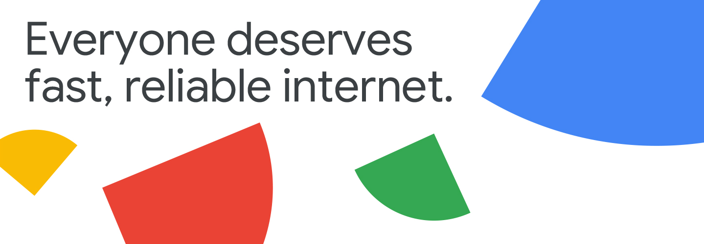
A small part of that storytelling is a new icon for Google Fiber and Google Fiber Webpass.
As the design team at Google’s Brand Studio explained, “The icon represents two key concepts, core to Google Fiber’s mission. The first is that of a catalyst. The dynamic shape upon which the icon is built inspires a feeling of movement in its upward arcing motion. The second concept is scalable impact, represented through its modular pattern. This new icon acts as the cornerstone upon which the brand is built, signaling the ambition to galvanize and uplift communities: from the single family home or small business, through to an entire city”
The shapes can represent being fast, fairly priced, reliable, and open — critical pieces of our mission. Or they could be communities of all shapes and sizes: big, small, urban, rural. Or all of the different things you do with your internet. Or how your internet throughput is divvied up across everything you and your household is doing - not just fast internet for a single fast connection. Or even how it’s going to take all of us, coming together, to make sure everyone has access to the fast, reliable internet we think everyone deserves. Or, maybe it’s just a fun, colorful shape.
In any case, we hope you like it. And, even more, we hope that, whether it’s in an ad, on social media, in our app, or anywhere else you see it, you know it’s Google Fiber, and that there’s more of our story on its way.
Posted by Amanda Peterson, Head of Brand and Product Marketing

~~~~
author: Amanda Peterson
title: Head of Brand and Product Marketing
category: company_news
imagealign: 0 0
