If you analyze and visualize data often enough, there are good chances that at some point you felt the “analyst’s block” (a less famous version of the writer’s block). We thought you might feel that way at times, so we provide here some ideas for you to explore and build great Reports in Data Studio.
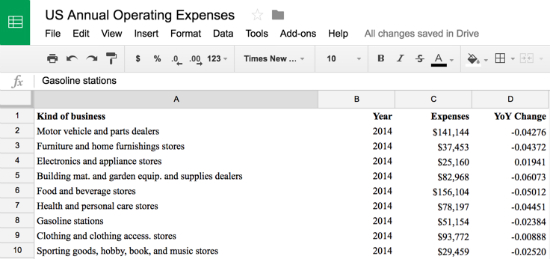
In this post we will use a sample dataset from the U.S. Census Bureau. The data is about annual operating expenses of U.S. Retail, Accommodation, and Food Services between 2006 and 2014. The dataset is not complex, just 10 types of businesses and their expenses in that time period. Here is the Google Sheet data that was connected to Data Studio.
Now the important question: what should you do first when opening a blank canvas? Below is a set of three charts that will often give you some insight into the nature of data, they will help you to explore the data and build an insightful report. You will probably also have requests coming from your audience, but those can be helpful both for your own understanding and for enhancing those requests.
Below is a quick explanation of each chart and how they can bring insights into your data:
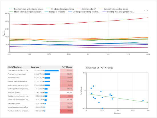
- Line chart: this is extremely useful if you have time series data, it will help you quickly identify trends over time. It is recommended you use not only the time dimensions (which would aggregate all other dimensions), but also segment the data by a second dimension, to see how different groups behave over time. In this case we are using the Business Type to segment the main trend. Once you do that, you will see one line per value (see legend above the chart) - as you can see, 10 lines is a bit crowded, so you might want to use 6-8 lines only
- Table: it is hard to find a better way to get a feeling for the data than tabular data! To help visualize the stats, you can also use bar charts and heatmaps inside the tables (see blue bars on second column and red heatmap on third column), they are pretty helpful visual clues especially in tables with lots of data.
- Scatter chart: the scatter charts are great to understand how two metrics correlate. In the screenshot above you will also note that there is a trend line (green) in the chart; it shows that as the expense grows, the YoY Change has a lower value, meaning that it decreases quicker.
Hopefully those three charts will help you get a feeling for the data. You can also take a look at the Report at https://goo.gl/QqNFWn
Happy visualizing!
Posted by Daniel Waisberg, Analytics Advocate

