
Why are there so few Urdu fonts?
If there is such a large population of Urdu speakers, you might wonder why there are so few typefaces for this population. One reason is that technology companies have not seen Urdu-speaking communities as important markets and have not invested resources to develop Nasta’liq typefaces.
Let’s go back in history and review some features of the Urdu language, the Nasta'liq script, and technological problems to find some more reasons.
Writing the Urdu language
To a great extent, the Urdu language is similar to Hindi. Speakers of both languages can understand each other. Yet the writing systems used for each language are very different. Hindi is written from left to right in the Devanagari writing system, while Urdu is written from right to left in the Nasta'liq style of the Arabic writing system. When calligraphers used to write Nasta’liq by hand, they traditionally used a reed pen.

Reed pens used for Nasta’liq calligraphy, Photo credit: Borna Izadpanah
1. Nasta'liq
2. Naskh
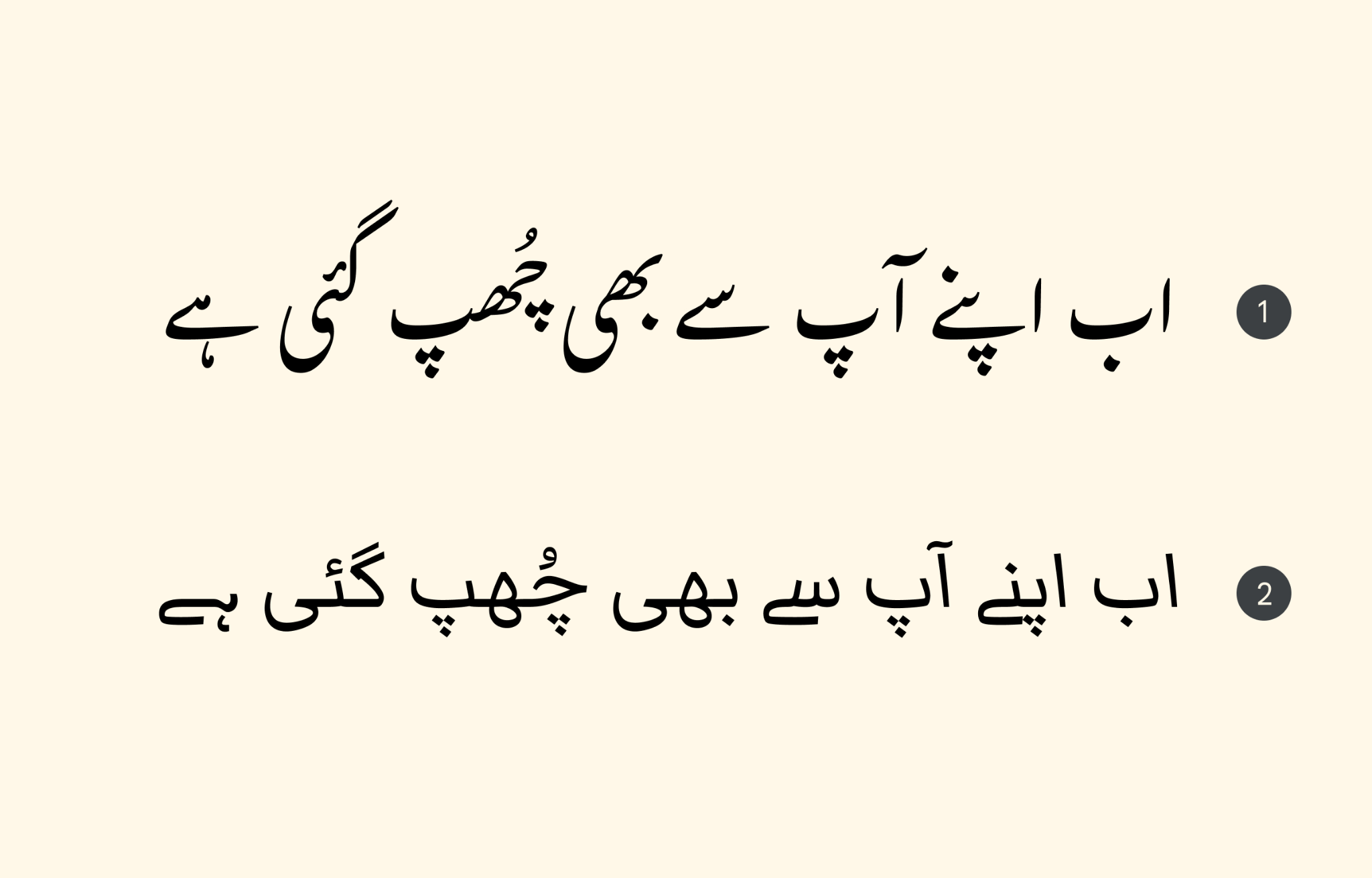
Transliteration: Ab apne aap se bhi chup gai hai An Urdu poetry verse (“Now she is hiding from herself too”) by the poet Zehra Nigah, set in the Gulzar Nasta’liq typeface (top) and in a simplified Naskh typeface Markazi (bottom).
Transliteration: Ab apne aap se bhi chup gai hai An Urdu poetry verse (“Now she is hiding from herself too”) by the poet Zehra Nigah, set in the Gulzar Nasta’liq typeface (top) and in a simplified Naskh typeface Markazi (bottom).
Urdu cascades
Latin and many other writing systems can be written with unconnected letters and are more horizontally aligned on the baseline. In contrast, "most Arabic script writing styles are written in a cascading format in which characters are joined on multiple horizontal levels.” explained Borna Izadpanah, the designer of the Gulzar typeface.
Typesetting technologies have been primarily designed for non-joining and horizontally aligned scripts like Latin. The cascading nature makes Nasta'liq typeface design, production, and composition more software reliant than Naskh.
Designers have to find a solution for kerning the cascading forms and the precise positioning of diacritic dots for vowel marks to avoid clashes and overlaps.
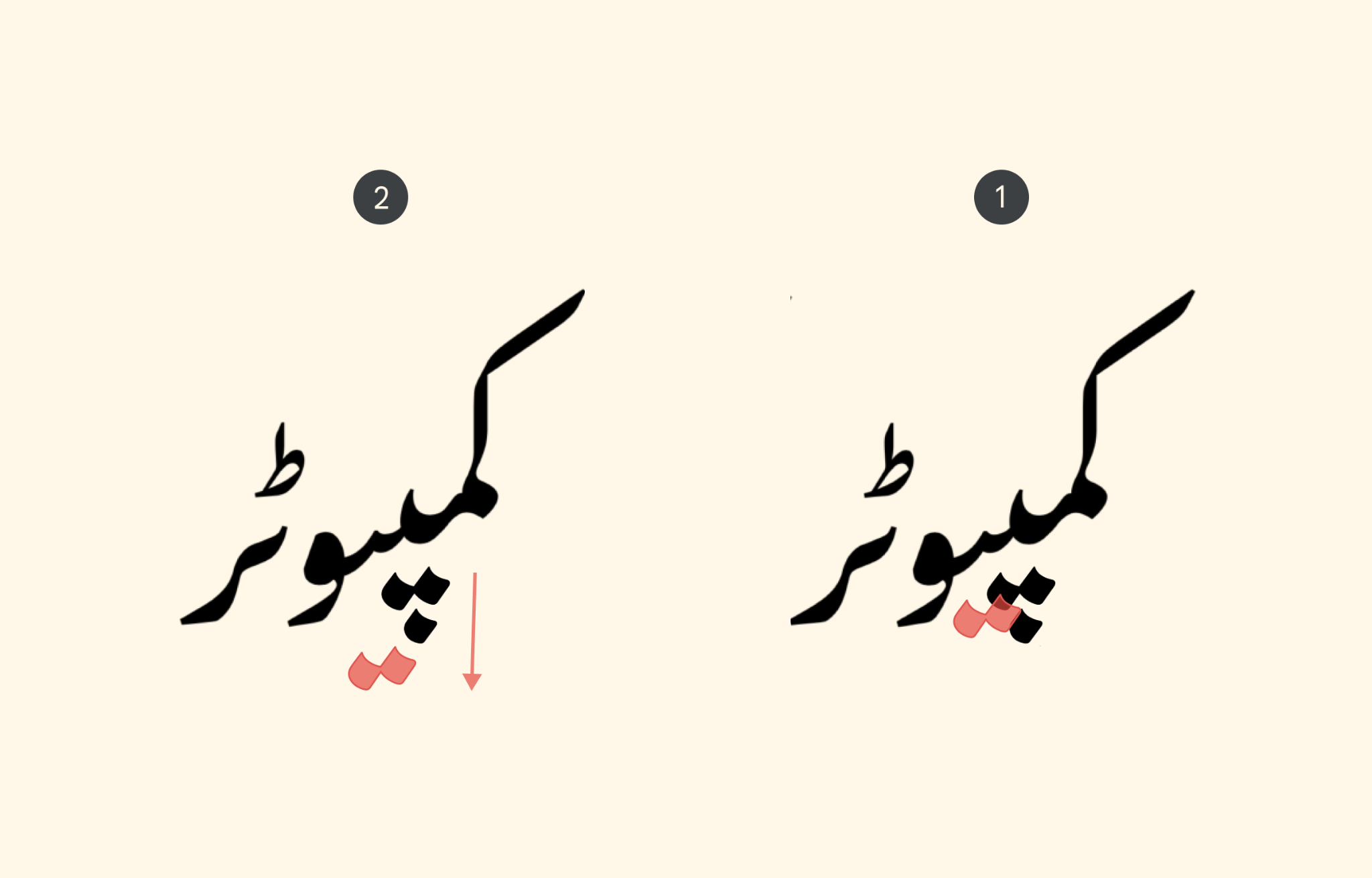
The word “computer” کمپیوٹر in the Gulzar typeface. From right to left:
1. The diacritical dots used in the word are shown in their default positions.
2. Since this word has two dotted letters consecutively, the leftmost set of dots must be moved downwards to avoid a collision.
 |
From right to left. This animated GIF shows the composition of characters with kerning and also how dots and marks move around to avoid clashes and overlaps. Characters change shapes depending on the letters that come before and after. (Set in the Gulzar typeface.) |
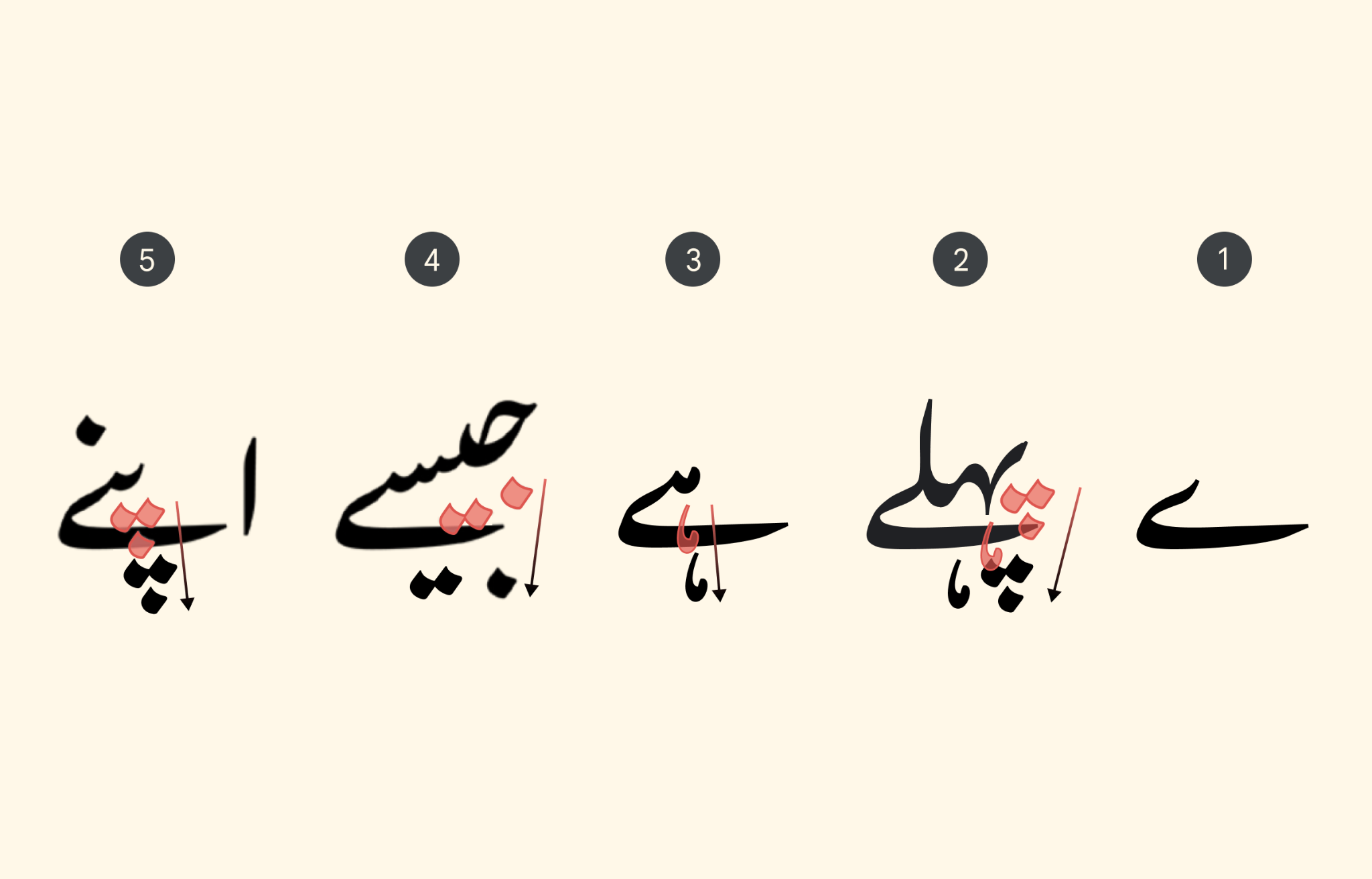
The bari-ye vowel
Designers have to pay special attention to the bari-ye vowel (ے, /eː/ /ɛː/) which frequently appears in Urdu. Even though Urdu is written from right to left, the bari-ye sweeps backwards (left to right) and underneath preceding letters, especially impacting dotted letters which precede it.
 |
From right to left: |
Shapeshifting
In Nasta'liq, letters change their form based on their position in the word (initial, medial, final, and unconnected) and depending on the neighboring letters before and after.
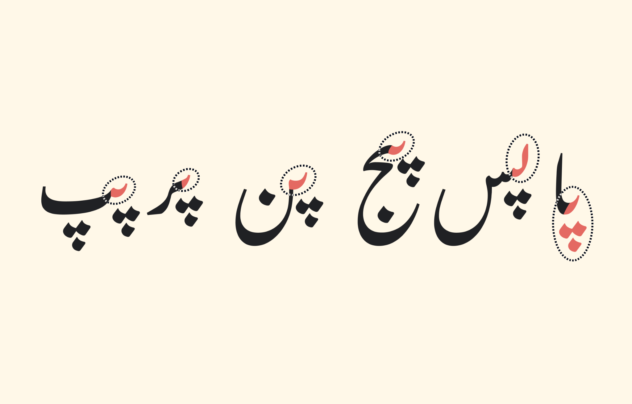
From right to left: The letter پ (“P” sound) in initial position (circled and in red) taking different shapes based on the next letter. (Set in the Gulzar typeface.) |
Latin has something similar to shapeshifting. In some Latin writing styles, letters change depending on their position and connection to the letters around them.
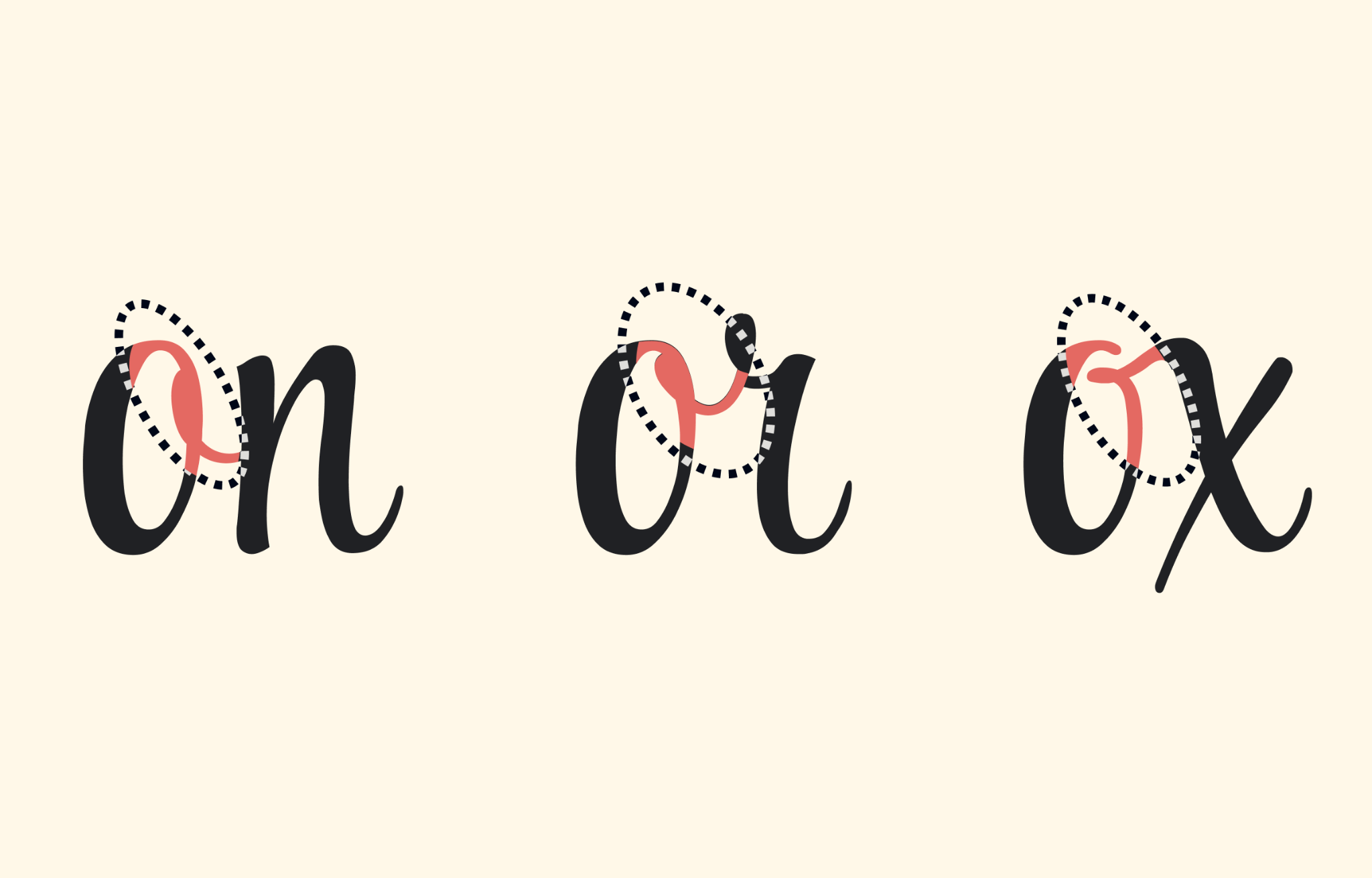
The angles of the connecting strokes of the lowercase “o” change depending on the following letter. Set in Style Script by Robert Leuschke.
One of the main differences between the Latin and Arabic writing systems is that Latin can be written in both connected cursive and unconnected forms, but the Arabic letters (apart from a few exceptions) must be written in a connected form. Additionally, most Arabic letters alter their shape depending on the preceding and following letters.
Technical difficulties
Urdu Nasta'liq is poorly supported on digital platforms because the writing system requires software-intensive support. Some text-rendering systems/software are not designed to accommodate it.
For a long time Urdu speakers have had to use existing simplified Naskh typefaces with distorted Urdu characters or find a way to hack operating systems to install their preferred Nasta'liq typefaces. However, this is changing.
Google Fonts has two Urdu Nasta'liq fonts, Noto Nasta'liq Urdu (a variable font) and Gulzar. To learn about how Gulzar was made and new tools to make typefaces for typographically complex scripts such as Nasta'liq, read Gulzar: Expanding the variety of Urdu Nasta’liq options.
To learn more about Urdu Nasta'liq:
The Death of the Urdu Script