Gemini in Google Sheets helps you create dynamic and easily referenced tables

What’s changing 

Building on the introduction of intelligent suggestions for table conversion, we’re now using Gemini to make tables in Sheets even more useful. Now, when you accept a “Convert to table” suggestion, Gemini will automatically format your data as a table and create a meaningful table name (e.g., Project_Status).

Tables help organize your data, simplifying common tasks like sorting and filtering. They also enable the use of table references, which use the table's meaningful name in place of cell coordinates. For example, a formula like =SUM(E2:E15) becomes the more descriptive =SUM(2025_Office_Expenses[Amount]). These names are not only easier to read and understand, but they are also easier to write, appearing in formula autocomplete suggestions as you type. 

Crucially, table references are dynamic. The formula's range automatically expands and contracts as you add or remove rows from your table, ensuring your calculations are always up to date and accurate, without you ever needing to manually edit cell ranges again. 


Getting started 


Rollout pace 

  • Rapid Release domains: Gradual rollout (up to 15 days for feature visibility) currently underway 
  • Scheduled Release domains: Gradual rollout (up to 15 days for feature visibility) starting on September 12, 2025 

Availability 

Available for Google Workspace: 
  • Business Standard and Plus 
  • Enterprise Standard and Plus 
  • Customers with the Gemini Education or Gemini Education Premium add-on 
  • Google AI Pro and Ultra 

Anyone who previously purchased these add-ons will also receive this feature: 
  • Gemini Business*
  • Gemini Enterprise* 
*As of January 15, 2025, we’re no longer offering the Gemini Business and Gemini Enterprise add-ons for sale. Please refer to this announcement for more details. 

Resources 

Image editing now available in the Gemini app

What’s changing 

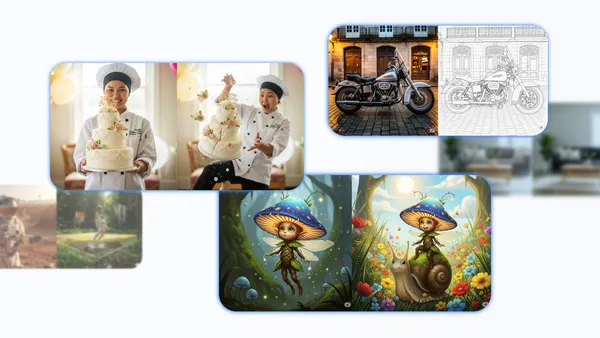
We’re bringing a significant update to the Gemini app for Google Workspace users: the introduction of powerful image editing capabilities. The updates will enable you to reimagine photos with prompts. 

You can start with a generated image or upload your own, and then prompt Gemini to combine it with other photos, change the context or location, change details within the image, and more. And with an improved understanding of your instructions, it's easier than ever to bring your ideas to life with Gemini. 

See our Keyword blog post to learn more about the major upgrade to image editing in Gemini. 

Getting started 


Rollout pace 

  • This feature is available now. 

Availability 

Available for Google Workspace*: 
  • Business Starter, Standard and Plus 
  • Enterprise Starter, Standard and Plus 
  • Education Fundamentals, Standard and Plus 
  • Frontline Starter, Standard, and Plus 
  • Essentials, Enterprise Essentials, and Enterprise Essentials Plus 
  • Nonprofits 

Available for Google Workspace customers with these add-ons: 
  • Gemini Business** 
  • Gemini Enterprise** 
  • Gemini Education 
  • Gemini Education Premium 
*For now, this feature isn’t available to users under 18. 
**As of January 15, 2025, we’re no longer offering the Gemini Business and Gemini Enterprise add-ons for sale. Please refer to this announcement for more details. 

Resources 


Chrome for Android Update

 Hi, everyone! We've just released Chrome 139 (139.0.7258.158) for Android. It'll become available on Google Play over the next few days. 

This release includes stability and performance improvements. You can see a full list of the changes in the Git log. If you find a new issue, please let us know by filing a bug.


Android releases contain the same security fixes as their corresponding Desktop releases (Windows & Mac: 139.0.7258.154/.155, Linux: 139.0.7258.154) unless otherwise noted.


Krishna Govind
Google Chrome

Stable Channel Update for Desktop

 The Stable channel has been updated to 139.0.7258.154/.155 for Windows, Mac and 139.0.7258.154 for Linux which will roll out over the coming days/weeks. A full list of changes in this build is available in the Log.

Security Fixes and Rewards

Note: Access to bug details and links may be kept restricted until a majority of users are updated with a fix. We will also retain restrictions if the bug exists in a third party library that other projects similarly depend on, but haven’t yet fixed

This update includes 1 security fix. Below, we highlight fixes that were contributed by external researchers. Please see the Chrome Security Page for more information.


[N/A][437825940] Critical CVE-2025-9478: Use after free in ANGLE. Reported by Google Big Sleep on 2025-08-11


We would also like to thank all security researchers that worked with us during the development cycle to prevent security bugs from ever reaching the stable channel.


Interested in switching release channels? Find out how here. If you find a new issue, please let us know by filing a bug. The community help forum is also a great place to reach out for help or learn about common issues.


Krishna Govind
Google Chrome

Building experiences for Wear OS

Posted by Michael Stillwell – Developer Relations Engineer
This post is part of Wear OS Spotlight Week. Today, we're focusing on creating engaging experiences across the various surfaces available on the wrist.

Developing for the growing ecosystem of Wear OS is a unique and rewarding challenge that encourages you to think beyond mobile patterns. Wear's design philosophy focuses on crafting experiences for a device that's always with the user, where meaningful interactions take seconds, not minutes. A successful wearable app doesn't attempt to maximize screen time; it instead aims to deliver meaningful glanceable experiences that help people stay present and productive while on the go. This vision is now fully enabled by the next generation of hardware, which we explored last week with the introduction of the new Pixel Watch 4.

Wear OS devices also introduce constraints that push you to innovate. Power efficiency is critical, requiring you to build experiences that are both beautiful and battery-conscious. You'll also tackle challenges like handling offline use cases and catering for a variety of screen sizes.

Despite these differences, you'll find yourself on familiar technical foundations. Wear OS is based on Android, which means you can leverage your existing knowledge of the platform, architecture, developer APIs, and tools to create wearable experiences.

Wear OS surfaces

Wear OS offers a range of surfaces to inform and engage users. This allows you to tailor your app's presence on the watch, providing the right information at the right time and scaling your development investment to best meet your users' needs.

Watch faces display the time and are the first thing a user sees when they look at their watch. We'll cover watch faces in more detail in other blog posts across Wear OS Spotlight week.

A round, analog Wear OS watch face
The Watch face is the first thing a user sees when they look at their watch

Apps provide a richer, more immersive UI for complex tasks that are too involved for other surfaces.

A scrollable app experience on a round, digital watch face showing daily goals for drinking water, vegtable consumption, and fiber intake
Apps support complex tasks and can scroll vertically

Notifications provide glanceable, time-sensitive information and actions.

A calendar notification for a dentist appointment on a round watch face
A notification provides glanceable, time-sensitive information

Complications display highly-glanceable, relevant data from your app directly on the user's chosen watch face. Learn more about building complication data sources for Wear OS.

A complications display on a round watch face
Complications display glanceable data from your app directly on the user's watch face.

Tiles (Widgets for Wear OS) offer fast, predictable access to information and actions with a simple swipe from the watch face.

An example of a tile conveying information for daily step count on a round watch face
Tiles offer fast, predictable information and actions

Whilst a variety of Wear OS surfaces let developers to engage with users in different ways, it may be overwhelming to get started. We recommend approaching Wear OS development in phases and scale up your investment over time:

illustration of the recommended 3-step Wear OS development process
Recommended Wear OS development phases: enhance the wearable experience of your Android app, build Tiles and complications, and then create a complete wearable experience.

    • Improve the wearable experience of your mobile app. You can improve the wearable experience with minimal effort. By default, notifications from your phone app are automatically bridged to the watch. You can start by enhancing these with wearable-specific actions using NotificationCompat.WearableExtender, offering a more tailored experience without building a full Wear OS experience.
    • Build a companion experience. When you're ready for a dedicated UI, create a tethered app experience that depends on the phone app for its core features and data. This involves creating a tethered app that works in tandem with your phone app, allowing you to design a customized UI for the wrist and take advantage of surfaces like tiles and complications.
    • Graduate to a standalone app. Finally, you can evolve your app into a standalone experience that works independently of a phone, which is ideal for offline scenarios like exercising. This provides the most flexibility but also requires more effort to optimize for constraints like power efficiency.

Notifications

Notifications are a core part of the Wear OS experience, delivering glanceable, time-sensitive information and actions for the user. Because Wear OS is based on Android, it shares the same notification system as mobile devices, letting you leverage your existing knowledge to build rich experiences for the wrist.

From a development perspective, it helps to think of a notification not as a simple alert, but as a declarative UI data structure that is shared between the user's devices. You define the content and actions, and the system intelligently renders that information to best suit the context and form factor. This declarative approach has become increasingly powerful. On Wear OS, for example, it's the mechanism behind ongoing activities.

Alert-style notifications

One great thing about notifications is that you don't even need a Wear OS app for your users to see them on their watch. By default, notifications generated by your phone app are automatically "bridged", or mirrored, to a connected watch, providing an instant wearable presence for your app with no extra work. These bridged notifications include an action to open the app on the phone.

You can enhance this default behavior by adding wearable-specific functionality to your phone notifications. Using NotificationCompat.WearableExtender, you can add actions that only appear on the watch, offering a more tailored experience without needing to build a full Wear OS app.

// Prerequisites:
//
//   1. You've created the notification channel CHANNEL_ID
//   2. You've obtained the POST_NOTIFICATIONS permission

val channelId = "my_channel_id"
val sender = "Clem"
val subject = "..."

val notification =
    NotificationCompat.Builder(applicationContext, channelId)
        .apply {
            setContentTitle("New mail from $sender")
            setContentText(subject)
            setSmallIcon(R.drawable.new_mail_mobile)
            // Added for Wear OS
            extend(
                NotificationCompat.WearableExtender().apply {
                    setSmallIcon(R.drawable.new_mail_wear)
                }
            )
        }
        .build()

NotificationManagerCompat.from(applicationContext).notify(0, notification)

Prevent duplicate notifications

Once you build a dedicated app for Wear OS, you'll need to develop a clear notification strategy to avoid a common challenge: duplicate notifications. Since notifications from your phone app are bridged by default, a user with both your phone and watch apps installed could see two alerts for the same event.

Wear OS provides a straightforward way to manage this:

  1. On the mobile app's notification, assign a string identifier using setBridgeTag().
  2. In your Wear OS app, you can then programmatically prevent notifications with certain tags from being bridged using a BridgingConfig. This gives you fine-grained control, allowing you to bridge some notifications while handling others natively in your Wear OS app.

If your mobile and watch apps generate similar but distinct notifications, you can link them using setDismissalId(). When a user dismisses a notification on one device, any notification with the same dismissal ID on another connected device is also dismissed.

Creating interactive experiences

From a user's perspective, apps and tiles may feel very similar. Both are full-screen experiences that are visually rich, support animations, and handle user interaction. The main differences are in how they are launched, and their specific capabilities:

    • Apps can be deeply immersive and handle complex, multi-step tasks. They are the obvious choice when handling data that must be synced between the watch app and its associated phone app, and the only choice for long-running tasks like tracking workouts and listening to music.
    • Tiles are designed for fast, predictable access to the information and actions users need most, providing glanceable content with a simple swipe from the watch face. Think of tiles as widgets for Wear OS.

Apps and tiles are built using distinct technologies. Apps can be built with Jetpack Compose, while tiles are defined declaratively using the ProtoLayout library. This distinction allows each surface to be highly optimized for its specific role – apps can provide rich, interactive experiences while tiles remain fast and power-efficient.

Building apps

Apps provide the richest experience on Wear OS. Jetpack Compose for Wear OS is the recommended UI toolkit for building them – it works seamlessly with other Jetpack libraries and accelerates development productivity. Many prominent apps, like Gmail, Calendar and Todoist, are built entirely with Compose for Wear OS.

Compose for Wear OS for beautiful UIs

If you've used Jetpack Compose for mobile development, you'll find that Compose for Wear OS shares the same foundational principles and mental model. However, building for the wrist requires some different techniques, and the toolkit provides a specialized UI component library optimized for watches.

Wear OS has its own dedicated Material Design, foundation, and navigation libraries to use instead of the mobile Jetpack libraries. These libraries provide UI components tailored for round screens and glanceable interactions, and are each supported by Android Studio's preview system.

    • Lists: On mobile, you might use a LazyColumn to display a vertical collection of items. On Wear OS, the TransformingLazyColumn is the equivalent component. It supports scaling and transparency effects to items at the edge of a round screen, improving legibility. It also has built-in support for scrolling with rotary input.
    • Navigation: Handling screen transitions and the back stack also requires a component that’s specific to Wear OS. Instead of the standard NavHost, you must use SwipeDismissableNavHost. This component works with the system's swipe-to-dismiss gesture, ensuring users can intuitively navigate back to the previous screen.

Learn how to use Jetpack Compose on Wear OS to get started, including sample code.

Implementing core app features

Wear OS also provides APIs designed for power efficiency and the on-wrist use case, as well as Wear OS versions of mobile APIs:

    • Authentication: Credential Manager API unifies the user sign-in process and supports modern, secure methods like passkeys, passwords, and federated identity services (like Sign-in with Google), providing a seamless and secure experience without relying on a companion phone.
    • Health and Fitness (sensor data): While you can use the standard Android Sensor APIs, it's not recommended for performance reasons, especially for long-running workouts. Instead, use Health Services on Wear OS. It acts as an intermediary to the various sensors, providing your app with batched, power-efficient updates for everything from heart rate to running metrics, without needing to manage the underlying sensors directly.

Building tiles

Tiles offer quick, predictable access to the information and actions users need most, accessible with a simple swipe from the watch face. By using platform data bindings to display sources like step count or heart rate, you can provide timely and useful information in your tile.

Tiles are built declaratively using the ProtoLayout libraries, which are optimized for performance and power efficiency—critical considerations on a wearable device. Learn more about how to get started with tiles and how to make use of sample tile layouts.

More resources for building experiences for Wear OS

    • Wear OS Documentation Hub: The essential resource for developers looking to create experiences for Wear OS, from design guidelines to code samples.
    • WearTilesKotlin sample app: Demonstrates the fundamentals of building a tile but also includes templates for common layouts, letting you quickly bootstrap your own designs while following best practices.

There has never been a better time to start building for Wear OS. If you have feedback on the APIs, please let us know using the issue trackers for Wear Compose and Tiles. We look forward to seeing what you build!

Todoist’s journey to modernize Wear OS experience with Material 3 Expressive and Credential Manager

Posted by Kseniia Shumelchyk – Engineering Manager, Android Developer Relations, and Rastislav Vaško – Head of Android at Doist
Since we expanded Android to smartwatches, Todoist has continually evolved their Wear OS experience. In the latest version of the platform, Wear OS 6, they leveraged Compose for Wear OS to bring Material 3 Expressive best practices to life, refreshing their app’s and tile’s appearance in the process.

Todoist and the Wear OS opportunity

Todoist is a popular task management application designed to help users organize, prioritize, and complete their tasks across their personal and professional lives the moment they come to mind. Its core philosophy embraces a clean, simple interface that provides a robust set of features, making it accessible for casual users while still being effective for power users and teams.

Here, Wear OS comes into frame – a smartwatch isn't just a smaller phone, it's an immediate, personal companion. The ability to glance at your wrist for timely information or quickly capture a task is a uniquely powerful experience. With the revitalization of Wear OS, driven by a modern toolkit and a unified platform, the opportunity to create these delightful experiences has never been greater.

Todoist on their Wear OS evolution

The Todoist team has always been committed to being wherever their users are, helping them organize their work and lives with minimal friction.

“We’ve had a Wear OS app ever since Android Wear 1.0 came out in 2014! Since that time, our experience on Wear OS has evolved to become a perfect platform for quick interactions and easy data access,” said Rastislav Vaško, head of Android at Doist.

When Wear OS began its new chapter a few years ago, Todoist saw the chance to do more than just maintain their existing app, and instead completely reimagine what a task manager on your wrist could be. This marked an important milestone when they migrated the whole codebase to Jetpack Compose along with a UX refresh, and saw a solid user base growth rate increase by 50%.

Over the recent months, since Wear OS 6 Developer Preview came out, Todoist developers have been working on both visual and under-the-hood improvements of the Wear OS experience, specifically:

“This time we didn’t add new experiences, but we wanted the existing ones to get better – through new UI patterns, dynamic theming, and simpler authentication,” Rastislav said.

moving image of Todoist Wear OS app after Material 3 EXpressive migration
Todoist Wear OS app after Material 3 Expressive migration

Implementing Material 3 Expressive redesign

On wearables, a highly-glanceable form factor, developers need to make every tap count, and Todoist’s design philosophy is built on this principle. As the team put it, “On Wear OS, we’re focusing only on the very essential actions. Each screen and each tap should be meaningful and provide value to the user”.

This focus on simplicity allowed Todoist to fully embrace the new design language and APIs that make modern Wear OS development so compelling, so they knew from the start that they wanted to adopt Material 3 Expressive:

“Material 3 Expressive brings a lot of fluid interactions and delight to Wear OS, and we wanted to leverage these new patterns,” notes Rastislav. “It's more than just a fresh coat of paint; it’s a design system built for the modern wearable experience”.

As a first step, Todoist design team has used Wear Material 3 Expressive Figma design kits and guiding principles to craft an updated UX for Todoist app and tiles that allowed them to understand the new design language and use relevant Material 3 elements.

Implementing the new design language was made significantly easier by the modern developer toolkit, as the Wear Compose Material 3 and Wear Protolayout Material 3 libraries provide updated and extended color schemes, typography, and shapes, as well as a full set of UI components, and layouts that come with built-in support for expressive motion.

Perhaps best of all, Todoist was able to implement an elegant solution that didn’t require lots of complicated code, as Jetpack Compose matched nicely to design elements in Figma kit. According to the team, “That was the best part – we didn’t need to solve any hard challenges... The APIs work, and they’re simple and intuitive!”.

moving image of Todoist Wear OS app showing edge hugging button after Material 3 EXpressive migration
The “edge hugging” button provides a sleek and fun experience for users

Todoist developers have taken advantage of the new components introduced in the Material 3 library. In particular, a combination of ScreenScaffold, which lays out the structure of a screen and coordinates transitions of the scroll indicator and time text label; EdgeButton, which has a special shape designed for the bottom of the screen; and TransformingLazyColumn for vertically scrolling lists—altogether creates a coherent user experience.

@Composable
private fun CreateItemLayout(
    state: CreateItemViewModel.Parsed,
    // ...
    scrollState: TransformingLazyColumnState = rememberTransformingLazyColumnState(),
) = ScreenScaffold(
    modifier = Modifier.background(MaterialTheme.colorScheme.background),
    scrollState = scrollState,
    contentPadding = rememberResponsiveColumnPadding(
        first = ColumnItemType.Button,
        last = ColumnItemType.EdgeButtonPadding,
    ),
    edgeButton = {
        EdgeButton(
            text = stringResource(id = R.string.action_home_create_item),
            colors = TodoistButtonDefaults.primaryButtonColors(),
            onClick = onSubmitClick,
            enabled = state.isReadyToSubmit,
        )
    },
) { contentPadding ->
    val transformationSpec = rememberTransformationSpec()
    TransformingLazyColumn(
        modifier = modifier.fillMaxSize(),
        contentPadding = contentPadding,
        verticalArrangement = Arrangement.spacedBy(
            space = 4.dp,
            alignment = Alignment.Top,
        ),
        horizontalAlignment = Alignment.Start,
        state = scrollState,
    ) {
       // ...
    }
}
Implementation example for ‘Add new task’ screen

This seamless integration between design and development extended to tiles, where the library provides a composable-like, declarative approach to building tiles, which made integration feel like a natural extension of the main app: “Technically, the new Tiles API resembles Compose, which we’re big fans of, so it felt very natural to use it right away”.

example of the glanceable ‘Day Progress’ tile
The ‘Day Progress’ Tile provides a delightful and glanceable experience

As an example, for the ‘Day Progress’ Tile, Todoist used one of the standard layouts that use a Slots-based approach:

class DayProgressTileRenderer(
    context: Context,
    private val onClickAction: Action,
) : SingleTileLayoutRenderer<DayProgressTileState, Unit>(context) {
    override fun renderTile(
        state: DayProgressTileState,
        deviceParameters: DeviceParametersBuilders.DeviceParameters,
    ) = materialScope(
        context = context,
        deviceConfiguration = deviceParameters,
        defaultColorScheme = state.theme.toTileColorScheme(context),
    ) {
        primaryLayout(
            titleSlot = { titleSlot(context) },
            mainSlot = { mainSlot(context, state, onClickAction) },
            labelForBottomSlot = { labelForBottomSlot(context) },
            bottomSlot = { bottomSlot(context, state) },
            margins = PrimaryLayoutMargins.MIN_PRIMARY_LAYOUT_MARGIN,
        )
    }

// ...

private fun MaterialScope.mainSlot(...) = graphicDataCard(...)

private fun MaterialScope.labelForBottomSlot(context: Context) = text(
    text = context.getString(R.string.tile_day_progress_goal).layoutString,
    typography = Typography.TITLE_SMALL,
)

The slots extend MaterialScope automatically, which means no extra work is needed for styling.

The protolayout-material3 library provides a large number of components designed according to the Material 3 Expressive specifications and user interface recommendations, which the Todoist team has taken advantage of. An example is the graphicDataCard, which Todoist used for the main slot on this tile.

Todoist’s Tile also supports dynamic color theming, which, implementation-wise, requires no effort from developers as the top-level materialScope function has the allowDynamicTheme flag set to true by default.

examples of the 'Day Progress' tile supporting dynamic color
The ‘Day Progress’ Tile supports dynamic color theming on Wear OS 6

Streamlining authentication with Credential Manager

To put the cherry on top of the update, Todoist also implemented a new user authentication experience with the new Credential Manager API on Wear OS.

Credential Manager provides a simplified, standardized user sign-in experience that can be implemented with minimal effort by reusing the same code as the mobile version.

Todoist especially appreciated the standardized UI: “...the [Credential Manager] UI is managed by the [Wear OS] library, which makes the work easy, freeing us up to concentrate on our app's unique features, rather than reinventing the wheel...”.

moving examples of Todoist app authentication before migrating to Credential Manager on the left, and after on the right
Todoist authentication: before (left) and after (right) migrating to Credential Manager

Previously, Todoist had implemented its own UI that incorporated supported authentication methods, such as reusing an auth token from an existing mobile sign-in, legacy Google Sign-In, and OAuth 2.0, which allowed users to complete their sign-in on a connected phone.

After the migration, the Todoist authentication flow relies on the Credential Manager UI, which provides a single entry point for available sign-in methods and accounts, including passwords, passkeys, and federated identities like "Sign in with Google." Users can now enjoy a streamlined experience with a single-tap sign-in on their watch.

For apps migrating to Credential Manager, we recommend keeping at least one backup authentication method in case a user taps "Dismiss." The Todoist team reused their previous options: OAuth 2.0 and data layer token sharing.

And since they already had a mobile integration, Todoist was able to reuse their mobile code: “We were already using Credential Manager in Todoist for Android, so… it was a no-brainer to adopt it. We’re providing the same seamless experience in both apps while simplifying and reusing code.”

Impact of the transformation

With their revamped experience completed, Todoist was thrilled with the results: “the Edge Hugging Button just feels delightful to use! But seriously, authentication is simpler and faster with Credential Manager”. Rastislav reports excellent user feedback, and the team is now preparing to make the updates available to all users in the coming weeks.

By leveraging the fluid interactions and delightful design of Material 3 Expressive, we've elevated the Todoist expreience on Wear OS. Our Wear OS users are not only more engaged, but also show a significantly higher conversion rate than average – a trend we expect to continue – Rastislav Vasko, Head of Android at Doist

With their robust user base on Wear OS, Todoist expects to continue growing as they invest further and see a strong business case to continue their commitment to wearables.

Rastislav also sums it up well with the final future-looking quote: “We’re invested in Wear! Currently we’re exploring new Tiles, but also AI features.”

Todoist’s recommendations to Android and Wear OS developers

As an active member in the ever-growing Wear OS app ecosystem, Todoist was eager to provide some simple advice for other developers interested in Material 3 Expressive: “Just follow the docs and examples. The samples available for Wear OS are superb and always up-to-date”.

They also recommend embracing Wear OS as a whole: “It’s a mature yet fun platform to develop for! Your designers will need to focus on the essence of your product, your developers have a great testing ground to explore new patterns and APIs, and your users will appreciate having faster and easier access to your product.”

Get started with Material 3 Expressive and Credential Manager

With its new features and modern elegance, Wear OS 6 with Material 3 Expressive provides a smartwatch platform that is delightful for users, and convenient for developers.

Learn more about the Material 3 Expressive for Wear OS design system, and get access to the Material 3 Expressive components and layouts using latest Wear Compose Material 3 and Wear Protolayout Material 3 Jetpack libraries.

For even more resources for developers visit:

To learn more about Credential Manager on Wear OS check out developer guidance and sample app.