Quick launch summary
We’re adding new features to help you customize chart axes in Google Sheets and better visualize your data in charts. The new options are:- Add major and minor tick marks to charts.
- Customize tick mark location (inner, outer, and cross) and style (color, length, and thickness).
- Set the precise numeric spacing between major and minor axis ticks or grid lines.
- Choose to show or remove the line that marks the axis.
See how this works in the images below.
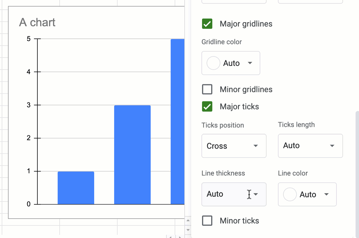
Customize the location and style of tick marks.
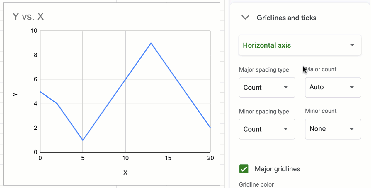
Set the spacing between tick marks and grid lines.

Choose to show or remove axis lines
Getting started
- Admins: There is no admin control for this feature.
- End users: This feature will be ON by default. Visit the Help Center to learn more about customizing axes in Google Sheets.
Rollout pace
- Rapid Release domains: Gradual rollout (up to 15 days for feature visibility) starting on 06/29/2020.
- Scheduled Release domains: Gradual rollout (up to 15 days for feature visibility) starting on 07/20/2020.
Availability
- Available to all G Suite customers and users with personal accounts