Explore art and culture with visual-first conversation search, a redesigned home feed, AI experiments and 27 new city guides in the Google Arts & Culture app.
Welcome back to the blog post series "Build intelligent Android apps" where you take a basic Android app and transform it into a personalized, intelligent, and agentic experience. In our previous post you learned how to connect to the intelligence system using AppFunctions.
In this post, you will learn how to build autonomous in-app agentic workflows running in the cloud.
Sometimes a task is too complex for a single device session. For example, booking a complete holiday itinerary involves coordinating flight times, selecting hotel rooms, reserving museum tickets, and planning restaurant reservations. If you run this multi-step process directly on a mobile device, the app might get closed and lose your progress. Managing all these steps and API credentials on a phone also gets complicated quickly.
For these long-running, multi-step workflows, you can use a custom self-hosted backend. The backend executes the booking agents in the background, while the Android app connects to the session, visualizes the progress, and requests user input only when necessary.
Using a cloud-hosted agentic backend offers a few advantages:
Background execution: Booking agents run autonomously in the cloud, so progress is never lost if the mobile app goes to the background or loses internet connectivity.
Complex multi-agent orchestration: A coordinator agent can delegate bookings to specialized subagents and handle dependencies between them.
Client-agnostic UI rendering: The backend describes the interface structure dynamically, letting you update the UI layout without releasing a new client version.
The booking assistant shows all booking progress, organized by event type.
With these benefits in mind, we added a Booking Assistant to Jetpacker that coordinates flights, hotels, museums, and restaurant reservations. Let's look at how we orchestrated a multi-agent system powered by the Agent Development Kit (ADK), with the Agent-User Interaction protocol(AG-UI) and Agent-to-User Interface protocol (A2UI) to send and display interactive cards natively in Jetpack Compose.
Powering complex workflows with ADK agents
Rather than coordinating the orchestration flow manually using custom REST endpoints or complex web sockets, you can use the Agent Development Kit (ADK). With ADK, you can define agents and equip them with python function tools to query databases and execute bookings.
The Android app sends the current trip itinerary data to the server. The coordinator agent chooses which subagents to trigger. Each subagent provides its results to a shared session queue that streams the results back to the Android app.
Here is how to define a simple agent and run it using ADK:
# android/booking-server/booking_server.py

# Note: ADK supports many different coding languages. For now, use the Python version as it includes support for A2UI which we'll use later in this blog post.

from google.adk import Agent
from google.adk.runners import InMemoryRunner
from google.adk.tools import FunctionTool

# Define custom tools to interact with database
def search_flights(destination: str, date: str) -> list[str]:
    # In production, here you would query our flight database and return dynamic results
    return ["10:00 AM", "2:00 PM"]

def reserve_flight(flight_time: str) -> str:
    # In production, here you would save the reservation transaction
    return "Reserved flight at " + flight_time

# Instantiate the booking agent with specialized tools
flight_agent = Agent(
    name="Flight Booker",
    model="gemini-3.1-flash-lite",
    instruction="Help the user search for flights and book a reservation.",
    tools=[
        FunctionTool(search_flights),
        FunctionTool(reserve_flight, require_confirmation=True)
    ]
)

# Run the agent in memory using a session ID
runner = InMemoryRunner(flight_agent)
async for event in runner.run_async(user_id=user_id, session_id=session_id):
    if event.content:
        print("Agent said:", event.content)
When you run an agent using this setup, ADK manages the execution steps for you. It automatically tracks the conversation context, routes messages between the user and the model, and executes the registered tools when the model requests them. This allows you to focus on writing clean procedural logic while the framework handles the orchestration in the background.
The ADK web interface shows how you can have a conversation with the multi-agent booking system.
To connect this backend agent to our Jetpacker app, the server needs a way to stream updates in real time to the device, which is handled using the AG-UI protocol. The agent also needs a structured way to describe and update interactive components (like option selectors and seating grids) dynamically on the phone, which is where the A2UI protocol comes in.
Standardizing agent-client communication with AG-UI
Running agents in the cloud and rendering UI on Android requires a standard communication channel. For this, you will use the AG-UI protocol.
AG-UI is a bidirectional transport layer protocol that standardizes message types between agents and UI clients. The agent can inform the client of lifecycle events, text messages, tool calls, and state management. The client, in turn, can send user text messages, tool call results, and custom action events back to the agent.
On the server side, it yields updates formatted as standard Server-Sent Events (like event: TEXT_MESSAGE_CONTENT containing the JSON delta). On Android, the Kotlin SDK listens to this stream and automatically maps the payloads to type-safe client events:
// https://github.com/android/ai-samples/tree/main/jetpacker/android/feature/trip/booking_assistant/src/main/kotlin/com/example/jetpacker/feature/booking_assistant/BookingAssistantViewModel.kt
import com.agui.client.agent.HttpAgent
import com.agui.client.agent.HttpAgentConfig
import com.agui.core.types.RunAgentInput
import com.agui.core.types.UserMessage
import com.agui.core.types.TextMessageStartEvent
import com.agui.core.types.TextMessageContentEvent
import com.agui.core.types.TextMessageEndEvent

val config = HttpAgentConfig(
    agentId = "booking-assistant",
    threadId = threadId,
    url = "https://<your-backend-url>"
)
val agent = HttpAgent(config, httpClient)

// Set up the input with the session thread and user instruction
val input = RunAgentInput(
    threadId = threadId,
    runId = runId,
    messages = listOf(UserMessage("Book a flight to Paris"))
)

// Run the agent flow and collect lifecycle events
agent.runAgentObservable(input)
    .collect { event ->
        when (event) {
            is TextMessageStartEvent -> { /* ... */ }
            is TextMessageContentEvent -> { /* ... */ }
            is TextMessageEndEvent -> {
                // Handle the completed message
            }
        }
    }
You can then write a UI to render these different types of standardized AG-UI events. This will give you the prototypical "Chatbot" experience:
A basic interface that lets a user chat with an assistant.
Letting the agent speak UI with A2UI
Traditional chatbots typically return plain text or custom JSON payloads. When building complex interfaces, the client application has to parse these payloads and map them to specific, pre-built screens. This creates a dependency: every time you add a new feature, change the layout, or support a new user interaction, you have to update both the backend agent and the mobile application. This requires publishing an app update and waiting for users to install it.
To solve this, use the A2UI protocol. A2UI allows agents to describe the UI components to render on the client dynamically. The client app declares a catalog of components it supports, and the server sends a JSON payload specifying the component layout and properties:
The server specifies which catalog components to render along with their active property values, cleanly decoupling the client's visual implementation details from the agent's workflow state.
Designing the backend UI schema
For the agent to generate these JSON payloads correctly, it needs to know which components are available and what properties they accept.
To do this, use the ADK A2UI integration. Instead of manually writing prompt instructions for every component in our catalog, the A2uiSchemaManager compiles their JSON schemas and layout instructions directly into the system prompt. This ensures the model learns the exact structure and formatting rules it must follow to generate valid A2UI payloads:
# android/booking-server/booking_server.py
from a2ui.schema.manager import A2uiSchemaManager
from a2ui.schema.constants import VERSION_0_9
from a2ui.schema.catalog import CatalogConfig
from a2ui.basic_catalog.provider import BasicCatalog

# Initialize A2UI Schema Manager with custom booking component catalog
schema_manager = A2uiSchemaManager(
    version=VERSION_0_9,
    catalogs=[
        BasicCatalog.get_config(version=VERSION_0_9),
        CatalogConfig.from_path(
            name="https://example.com/catalogs/booking_assistant/v1/catalog.json",
            catalog_path="booking_catalog.json"
        )
    ]
)

# Compile prompt instructions including the A2UI JSON schema
A2UI_SYSTEM_INSTRUCTION = schema_manager.generate_system_prompt(
    role_description="You are a helpful travel booking assistant.",
    ui_description="Use InteractiveOptionPicker for choices, SeatSelectionPicker for seat selection...",
    include_schema=True,
    include_examples=True,
    allowed_components=["InteractiveOptionPicker", "SeatSelectionPicker", "BookingStatus"]
)
With this generated system instruction, the LLM is grounded in the schema layout and knows exactly how to formulate component updates that the Android client is capable of rendering.
Natively rendering A2UI with Jetpack Compose
To render these component trees natively on Android, use the new Jetpack Compose A2UI Renderer library.
First, add the dependencies to our module's build.gradle.kts file:
Each component class in the catalog (such as BookingStatusComponent) defines how to map the properties received from the JSON payload into a Jetpack Compose composable function.
Tip: Jetpacker implements custom components (InteractiveOptionPicker, SeatSelectionPicker, BookingStatus) tailored for booking flows. If your agent uses standard elements (such as text, cards, buttons, rows, columns, checkboxes, and date-time pickers), material3-a2ui also provides materialA2uiBasicCatalogV1(...), giving you ready-to-use Material 3 implementations without writing any custom components.
Note: To keep the backend and mobile client aligned, both rely on the same catalog definition ID (https://example.com/catalogs/booking_assistant/v1/catalog.json). If you add or modify properties on the backend catalog, you must increase the version number, and update the matching Kotlin component class to prevent parsing errors.
In the BookingAssistantViewModel, process the A2UI messages using the A2uiMessageProcessor and update our active surfaces:
In the Compose screen, collect these surfaces and render each one using the official A2uiSurface composable from androidx.compose.material3:material3-a2ui. A2uiSurface automatically handles reactive component state observation, Material 3 loading indicators, error fallbacks, and animated transitions between updates:
You will now see several UI surfaces generated by our agent running in the backend:
A well-designed booking assistant that relies on UI instead of text to interact with the user.
Bringing it all together
By hosting agent workflows in the cloud and using the AG-UI and A2UI protocols together, we can build dynamic, native Android interfaces driven directly by AI models. AG-UI establishes the real-time bidirectional streaming channel for messages and lifecycle events, while A2UI enables the cloud agent to dynamically describe interactive UI components, keeping the client application perfectly decoupled from the step-by-step backend orchestration logic.
Check out the other parts of this blog post series:
▪️ Part 1: Introduction of the app and a high-level overview.
📱 Part 2: On-device intelligence. Dive deep into ML Kit’s GenAI APIs and Gemini Nano to build privacy-first features like itinerary summarization, receipt parsing, and local audio processing.
☁️ Part 3: Hybrid and cloud reasoning. Explore how to use Firebase AI Logic to ground LLM answers in real-world data like Google Maps and web context.
⚙️ Part 4: System integration. Integrating with the Android intelligence system using AppFunctions.
🤖 Part 5 (this post!): In-app agentic workflows. Extend the app with end-to-end booking assistants powered by A2UI and ADK.
Interested in more on Android Development? Follow Android Developers on YouTube or LinkedIn!
All code snippets in this blog post follow the following copyright notice:
Copyright 2026 Google LLC.

SPDX-License-Identifier: Apache-2.0
Use AI to supercharge your financial analysis with Workday for Google Sheets
Use AI to supercharge your financial analysis with Workday for Google Sheets Google Sheets Rapid Release Scheduled Release Workday for Google Sheets is a new add-on available in the Google Workspace Marketplace that connects Workday Adaptive Planning directly to Google Sheets and Slides. Deeply integrated with the AI-powered “Ask Workday” feature in Adaptive Planning, this add-on eliminates the need for manual CSV downloads. | Learn more.
New manual calculation setting in Google Sheets
We’re introducing a new manual calculation setting in Google Sheets to give you precise control over when formulas and other references update. The new manual calculation setting allows editors of complex or data-dense spreadsheets to pause automatic recalculation, batch their edits, and trigger a sheet-wide update at the exact moment they are ready to review the results. | Learn more.
Study notebooks in Gemini are now available for Google Workspace accounts
Now, we’re excited to share that users of all ages who are signed into a school or work-issued Google account will also have access to study notebooks if the Gemini app and Gemini Notebook are enabled by their admin. | Learn more.
Manually reorder and custom sort pivot tables in Google Sheets
Google Sheets now supports custom sorting and manual reordering in pivot tables. Users can now drag and drop rows and columns on a pivot table to match specific presentation needs and custom business hierarchies, rather than being restricted to standard ascending or descending alphanumeric order. | Learn more.
Introducing the new Confluence integration with Google Chat
Confluence by Atlassian is designed for teams to store and share ideas, docs, and knowledge. Workspace customers can now use Confluence for Google Chat to bring relevant project context and information from Confluence directly into Chat conversations. This integration, which is part of the Atlassian add-on, enables teams to work more effectively by connecting real-time collaboration with source-of-truth documentation. | Learn more.
Quick notes in Take notes for me
Introducing Quick notes – high-level overview of main takeaways from your meetings that empowers you to quickly review essential information without diving into every single detail. Designed specifically for the efficient consumption of knowledge, the content fits onto a single page and is strictly limited to the most important meeting action items, outcomes, and talking points. It is built primarily for executive users, or anyone less involved in the deep details, who needs to extract information as fast as possible. | Learn more.
New Google Meet 'Take notes for me' settings for admins and end users take effect September 29th
Previously, we announced new admin and end user settings for Google Meet ‘Take notes for me’ pre-configuration. These settings will begin to take effect September 29th. | Learn more.
Occupancy counting now available for Google Meet on Logitech room hardware
Occupancy counting is now available for Android-based Logitech Gen 2 room hardware (starting with Logitech Rally Board 65) to help measure how meeting rooms are used. This feature brings the same occupancy counting capabilities found on ChromeOS devices to Android-based hardware. Support for occupancy counting will be added next year for earlier Gen 1 devices later as part of an upcoming CollabOS update. | Learn more.
Seamlessly import your emails from any IMAP server to Google Workspace
We’re excited to announce the GA release of a new, simplified way for Workspace admins to import their past emails from any IMAP-based email provider while setting up Google Workspace. | Learn more.
Ground AI prompts in Google Docs on existing sources from Gemini Notebook
We are introducing the ability to use Gemini Notebook as a context source in Google Docs. Building on our Workspace Intelligence foundation, this feature bridges the gap between deep research and content creation by grounding your drafts in a curated knowledge base – all without the need to switch tabs or copy-paste between tools. | Learn more.
Gemini Omni 1.1 Flash now in Vids with improved extension quality, 1080p, and duration control
Users now have access to Gemini Omni 1.1 Flash directly within Google Vids. Omni 1.1 provides higher quality video extension with significant improvements in character and audio consistency. Additionally, Vids now supports generating AI videos and upscaling AI videos to 1080p to be publish ready. | Learn more.
Assign temporary administrator roles in the Google Admin console
Admins can now assign administrator roles to users, groups, or service accounts for a defined period of time. Once the expiration time is reached, the access granted by the role is automatically revoked. | Learn more.
Now in beta: Import and convert your PowerPoint files to client-side encrypted Slides
Eligible customers can now import PowerPoint files as client-side encrypted (CSE) Slides, allowing users to access and edit content. This enables interoperability with Microsoft Office, with this launch PowerPoint files are encrypted on the client before the content is imported to Workspace, and then converted to high-fidelity encrypted Slides. | Learn more.
View up to three time zones in Google Calendar on the web
We’re making it easier to schedule and coordinate meetings across global teams by expanding time zone support in Google Calendar on the web. You can now configure and display up to three time zones—a primary, secondary, and new tertiary time zone—directly on your calendar grid. Previously, users could only display a primary and secondary time zone. | Learn more.
The announcements above were published on the Workspace Updates blog over the last week. Please refer to the original blog posts for complete details.
Hi everyone! We've just released Chrome Dev 156 (156.0.8072.0) for Android. It's now available on Google Play.
You can see a partial list of the changes in the Git log. For details on new features, check out the Chromium blog, and for details on web platform updates, check here.
If you find a new issue, please let us know by filing a bug.
We’re making it easier to schedule and coordinate meetings across global teams by expanding time zone support in Google Calendar on the web. You can now configure and display up to three time zones—a primary, secondary, and new tertiary time zone—directly on your calendar grid. Previously, users could only display a primary and secondary time zone.
Whether you’re an executive assistant managing complex calendars for leaders across regions, a project manager coordinating global launches, or a team member working with colleagues in San Francisco, New York, and Zurich, viewing three time zones at once reduces scheduling friction and eliminates manual time conversions.
Main calendar grid (Day, Week, and Custom multi-day views): View up to three labeled time zone columns side-by-side along the left side of your calendar grid to compare local working hours at a glance.
Find a Time view while scheduling: When creating or editing events in “Find a Time”, Calendar displays up to three time zones.
Custom labels: Add custom labels (such as "SFO", "NYC", or "ZRH") to each of your three display time zones in Settings to easily identify them on the grid.
View up to three time zones side-by-side on Google Calendar on the web
Getting started
Admins: There is no admin control for this feature.
The Dev channel has been updated to 156.0.8072.0 for Windows, Mac and Linux.
A partial list of changes is available in the Git log. Interested in switching release channels? Find out how. If you find a new issue, please let us know by filing a bug. The community help forum is also a great place to reach out for help or learn about common issues.
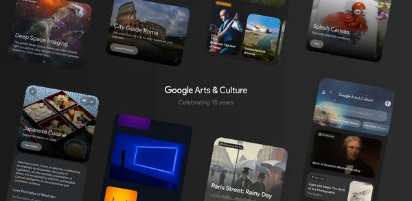 Explore art and culture with visual-first conversation search, a redesigned home feed, AI experiments and 27 new city guides in the Google Arts & Culture app.
 Posted by Jolanda Verhoef, Senior Developer Relations Engineer, Android Developer Relations


 The ADK web interface shows how you can have a conversation with the multi-agent booking system.

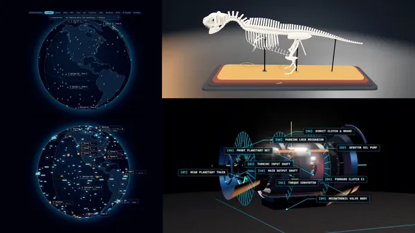 See what developers have built with Gemini 3.8 Flash, our most intelligent workhorse model, launched in early September.
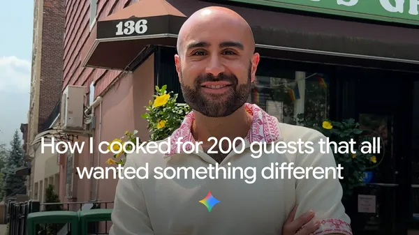 Edy Massih uses Gemini to transform regular recipes into massive catering spreads, automate grocery orders, and adapt menus for dietary restrictions.
 Unify vertical video buys with Google Display & Video 360. See how Unilever boosted reach by 24% using Gemini-powered measurement. Get the details.
