Posted by Allen Huang and Rohan Shah, Product Managers on Android UI

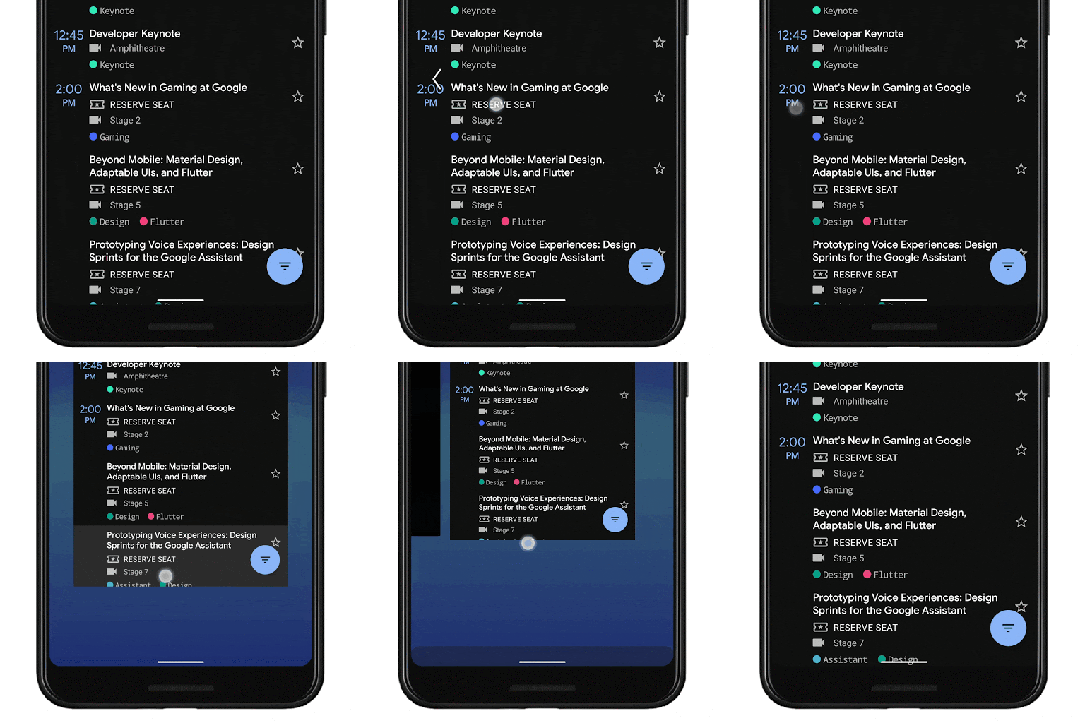
One of the biggest changes in Android Q is the introduction of a new gesture navigation. Just to recap - with the new system navigation mode - users can navigate back (left/right edge swipe), to the home screen (swipe up from the bottom), and trigger the device assistant (swipe in from the bottom corners) with gestures rather than buttons.
By moving to a gesture model for system navigation, we can provide more of the screen to apps to enable a more immersive experience.
We wanted to give folks an inside look at how we’ve approached this challenge, the rationale, and some of the trade-offs as well. There is some nerding out on design around gestures ahead, but hopefully it provides some insight into our process and how we balance the developer and OEM ecosystem in service of users. If you’re looking for more detail on how to handle these changes as an app developer, check out Chris’s “Going edge-to-edge” article series.
Why gestures?
One of the amazing things about Android is the opportunity for app developers and Android partners to try new, innovative approaches on the phone.
In the last 3 years, we’ve seen gesture navigation patterns proliferate on handheld devices (though gestures have been around as early as 2009!).
This trend was led by innovative Android partners and Android apps trying some very cool ideas (for example: Fluid NG, XDA).
When we started researching this more, we honed in on the user benefits:
- Gestures can be a faster, more natural and ergonomic way to navigate your phone
- Gestures are more intentional than software buttons that you might trigger just by grabbing your phone
- Gestures enable a more immersive experience for apps by minimizing how much the system draws over app content, i.e. HOME/BACK buttons and the bar they sit on - especially as hardware trends towards bigger screens and smaller bezels
It wasn’t all roses though - we also saw issues with many of the gesture modes:
- Gestures don’t work for every user
- Gestures are harder to learn and can take some adjustment
- Gestures can interfere with an app’s navigation pattern
But most of all, we realized that there was a larger issue of fragmentation when different Android phones had different gestures, especially for Android developers.
Over the last year, we worked with partners like Samsung, Xiaomi, HMD Global, OPPO, OnePlus, LG, Motorola, and many others to standardize gesture navigation going forward. To ensure a consistent user and developer experience, the Android Q gestures will be the default gesture navigation for new Q+ devices.
Understanding that these gestures don’t work for every user, especially those with more limited dexterity and mobility, three-button navigation will continue to be an option on every Android device.
So why these gestures?
We started with research to understand how users held their phones, what typical reach looked like, and what parts of the phone users used the most. From there, we built many prototypes that we tested across axes like desirability, speed-of-use, ergonomics, and more. And we put our ultimate design through a range of studies - how quickly users learned the system, how quickly users got used to the system, how users felt about it.
A unique element of Android navigation since the very beginning is the Back button. It is appreciated by many users that find Android easier to navigate and learn (despite many debates on what the “correct” behavior is) -- and it's used a lot! In fact, 50% more than even Home. So one of our design goals was to make sure the back gesture was ergonomic, dependable, and intuitive -- and we prioritized this goal above other less frequent navigation such as drawers and recents.
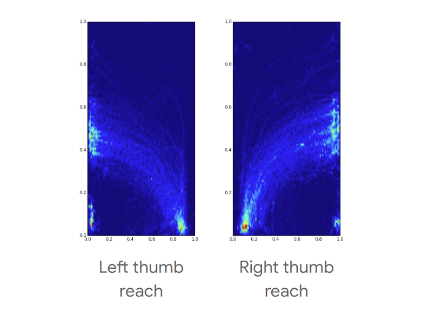
Looking at the reachability charts below, we designed our two core gestures (Back and Home) to coincide with the most reachable/comfortable areas and movement for thumbs.

Phone screen heatmaps showing where users can comfortably do gestures, holding the phone in only one hand
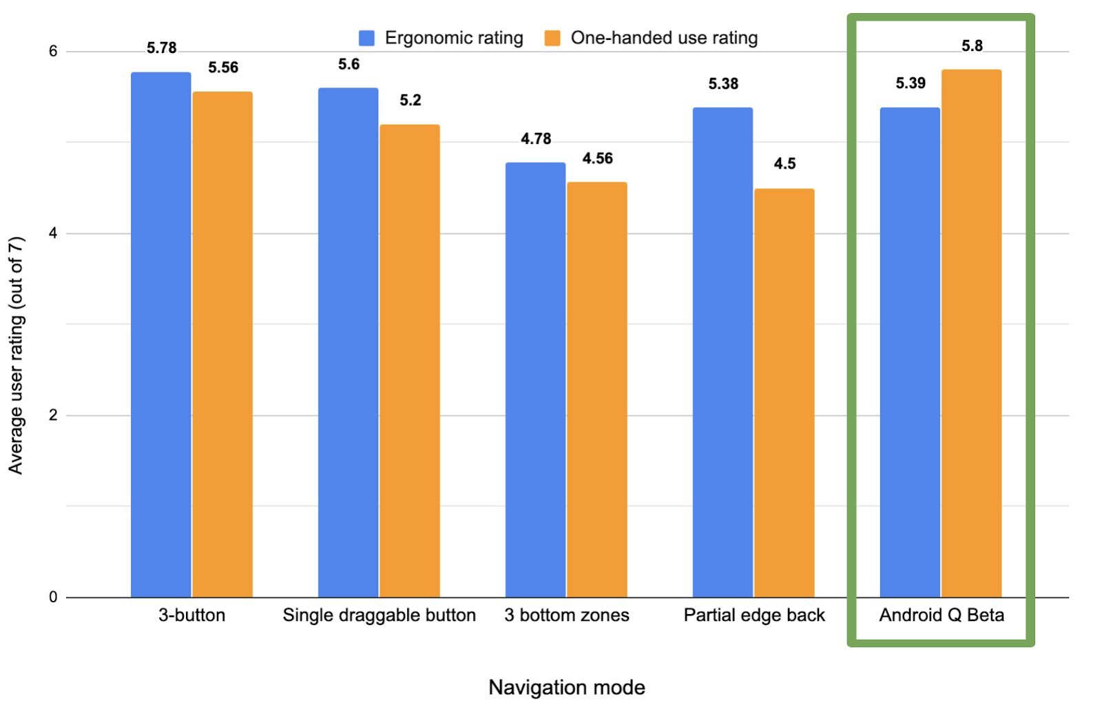
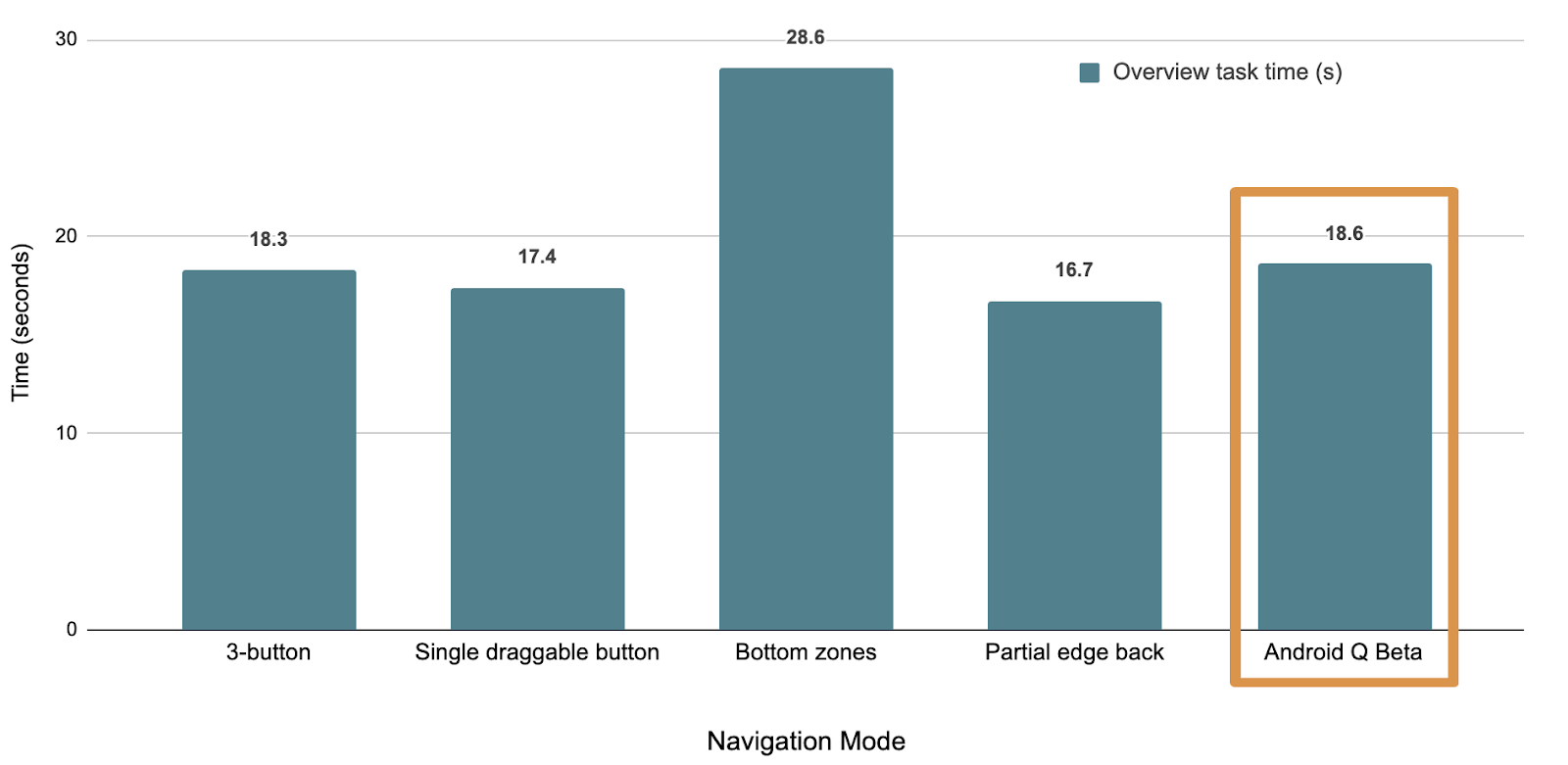
As mentioned, we built prototypes of many different gesture models, comparing user ratings and timed user tasks on what ultimately became the Q model to several other navigation paradigms. Here’s a few graphs showing the results of our testing:

Comparison of user ratings for ergonomics and one-handed use across different navigation modes (higher is better)

Comparison of average time required to complete Home/Back tasks across various navigation modes (lower is better)

Comparison of average time required to complete Overview/Recents-based tasks across various navigation modes (lower is better)
Users, on average, performed tasks involving Home and Back more quickly than most other models - even faster than they did with buttons. The model did, however, come at the cost of being able to quickly access Overview/Recent apps, which users go to less than half as often as the Home screen.
From a more qualitative perspective, users viewed the Q model as more one-handed and reachable, although buttons were still viewed as more ergonomic for more users.
App Drawers and other App Swipes
Although we arrived at the side swipe as the gesture for back that best balanced many tradeoffs, it is important to note that there were hard decisions, particularly in how that gesture impacted apps.
For example, we found that ~3-7% of users (depending on the Google app) swipe to open the App Navigation Drawer - the rest of our users push the hamburger menu to invoke the drawer. This drawer swipe gesture is now overloaded with back and some users will need to adapt to using the hamburger menu. This was a tough choice but given the prolific use of back we optimized for what worked best there.
Because it’s never a goal to change out behavior on users, we tried several ways to enable users to distinguish the drawer gesture from the Back gesture. However, all these paths led to users pulling in the drawer when they were trying to go Back and having less confidence that Back would work.
Beyond drawers, gestures are a big change for people and it took on average 1-3 days to adapt - in particular, users struggled with patterns like swiping right or left on a carousel and triggering Back.
In qualitative studies, we found that after an initial break-in period of 1-3 days, users became fluent and could consistently distinguish between these two gestures. The majority of users did not want to switch back to 3 button nav (even though that remains an option).
Additional research showed that there is a clear adjustment phase for users to get used to a new system navigation (across many different navigations). In our Q model, we found that usage of Back goes down for the first 1-3 days. After that period, the average # of Back presses/day ends up being the same as 3-button and our P navigation.
So What Does This Mean for Developers?
With gestural navigation, we are aiming to move forward and standardize the user experience on Android. The model we landed on is the optimal one for most users, but it also means that some of the gestures conflict with existing app gestures, necessitating developer adjustments to how users interact with your apps. We take our responsibility to Android developers seriously and want to help you in this process.
There are three key steps to support gesture navigation:
- Go edge-to-edge to enable your app to draw across the entire screen
- Handle any visual overlaps with the system user interface (i.e. navigation bar)
- Resolve any gesture conflicts with the system gestures
We’ve just published the first article in our “Going edge-to-edge” series on Medium, detailing those steps in turn. The final article in the series will cover some of the common scenarios we’ve seen, and how you can best support them in your apps.
Thank you all for the feedback -- all of your comments and interactions have helped us improve the gesture navigation experience in Android Q and, more broadly, help make Android better each day.

.jpg)
