Tag Archives: Responsive Web Design

Mobile-First Indexing by default for new domains

Over the years since announcing mobile-first indexing - Google's crawling of the web using a smartphone Googlebot - our analysis has shown that new websites are generally ready for this method of crawling. Accordingly, we're happy to announce that mobile-first indexing will be enabled by default for all new, previously unknown to Google Search, websites starting July 1, 2019. It's fantastic to see that new websites are now generally showing users - and search engines - the same content on both mobile and desktop devices!

You can continue to check for mobile-first indexing of your website by using the URL Inspection Tool in Search Console. By looking at a URL on your website there, you'll quickly see how it was last crawled and indexed. For older websites, we'll continue monitoring and evaluating pages for their readiness for mobile first indexing, and will notify them through Search Console once they're seen as being ready. Since the default state for new websites will be mobile-first indexing, there's no need to send a notification.


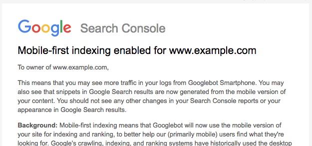
Using the URL Inspection Tool to check the mobile-first indexing status

Our guidance on making all websites work well for mobile-first indexing continues to be relevant, for new and existing sites. For existing websites we determine their readiness for mobile-first indexing based on parity of content (including text, images, videos, links), structured data, and other meta-data (for example, titles and descriptions, robots meta tags). We recommend double-checking these factors when a website is launched or significantly redesigned.

While we continue to support responsive web design, dynamic serving, and separate mobile URLs for mobile websites, we recommend responsive web design for new websites. Because of issues and confusion we've seen from separate mobile URLs over the years, both from search engines and users, we recommend using a single URL for both desktop and mobile websites.

Mobile-first indexing has come a long way. We're happy to see how the web has evolved from being focused on desktop, to becoming mobile-friendly, and now to being mostly crawlable and indexable with mobile user-agents! We realize it has taken a lot of work from your side to get there, and on behalf of our mostly-mobile users, we appreciate that. We’ll continue to monitor and evaluate this change carefully. If you have any questions, please drop by our Webmaster forums or our public events.

Rolling out mobile-first indexing

Today we’re announcing that after a year and a half of careful experimentation and testing, we’ve started migrating sites that follow the best practices for mobile-first indexing.

To recap, our crawling, indexing, and ranking systems have typically used the desktop version of a page's content, which may cause issues for mobile searchers when that version is vastly different from the mobile version. Mobile-first indexing means that we'll use the mobile version of the page for indexing and ranking, to better help our – primarily mobile – users find what they're looking for.

We continue to have one single index that we use for serving search results. We do not have a “mobile-first index” that’s separate from our main index. Historically, the desktop version was indexed, but increasingly, we will be using the mobile versions of content.

We are notifying sites that are migrating to mobile-first indexing via Search Console. Site owners will see significantly increased crawl rate from the Smartphone Googlebot. Additionally, Google will show the mobile version of pages in Search results and Google cached pages.

To understand more about how we determine the mobile content from a site, see our developer documentation. It covers how sites using responsive web design or dynamic serving are generally set for mobile-first indexing. For sites that have AMP and non-AMP pages, Google will prefer to index the mobile version of the non-AMP page.

Sites that are not in this initial wave don’t need to panic. Mobile-first indexing is about how we gather content, not about how content is ranked. Content gathered by mobile-first indexing has no ranking advantage over mobile content that’s not yet gathered this way or desktop content. Moreover, if you only have desktop content, you will continue to be represented in our index.

Having said that, we continue to encourage webmasters to make their content mobile-friendly. We do evaluate all content in our index -- whether it is desktop or mobile -- to determine how mobile-friendly it is. Since 2015, this measure can help mobile-friendly content perform better for those who are searching on mobile. Related, we recently announced that beginning in July 2018, content that is slow-loading may perform less well for both desktop and mobile searchers.

To recap:

  • Mobile-indexing is rolling out more broadly. Being indexed this way has no ranking advantage and operates independently from our mobile-friendly assessment.
  • Having mobile-friendly content is still helpful for those looking at ways to perform better in mobile search results.
  • Having fast-loading content is still helpful for those looking at ways to perform better for mobile and desktop users.
  • As always, ranking uses many factors. We may show content to users that’s not mobile-friendly or that is slow loading if our many other signals determine it is the most relevant content to show.

We’ll continue to monitor and evaluate this change carefully. If you have any questions, please drop by our Webmaster forums or our public events.

How to move from m-dot URLs to responsive site

With more sites moving towards responsive web design, many webmasters have questions about migrating from separate mobile URLs, also frequently known as "m-dot URLs", to using responsive web design. Here are some recommendations on how to move from separate urls to one responsive URL in a way that gives your sites the best chance of performing well on Google's search results.

Moving to responsive sites in a Googlebot-friendly way

Once you have your responsive site ready, moving is something you can definitely do with just a bit of forethought. Considering your URLs stay the same for desktop version, all you have to do is to configure 301 redirects from the mobile URLs to the responsive web URLs.

Here are the detailed steps:

  1. Get your responsive site ready
  2. Configure 301 redirects on the old mobile URLs to point to the responsive versions (the new pages). These redirects need to be done on a per-URL basis, individually from each mobile URLs to the responsive URLs.
  3. Remove any mobile-URL specific configuration your site might have, such as conditional redirects or a vary HTTP header.
  4. As a good practice, setup rel=canonical on the responsive URLs pointing to themselves (self-referential canonicals).

If you're currently using dynamic serving and want to move to responsive design, you don't need to add or change any redirects.

Some benefits for moving to responsive web design

Moving to a responsive site should make maintenance and reporting much easier for you down the road. Aside from no longer needing to manage separate URLs for all pages, it will also make it much easier to adopt practices and technologies such as hreflang for internationalization, AMP for speed, structured data for advanced search features and more.

As always, if you need more help you can ask a question in our webmaster forum.