Tag Archives: radio canada

Voici Radio-Canada, la police de caractères du diffuseur public canadien, plusieurs fois primée et maintenant disponible sur Google Fonts

caractères typographiques de la police Radio-Canada, supportant deux axes variables et 317 langues.


Une police de caractères créée pour renforcer l’identité distinctive de CBC/Radio-Canada sur toutes les plateformes du diffuseur public est maintenant disponible sur Google Fonts dans plusieurs langues (dont les langues autochtones parlées au Canada) utilisant les caractères latins.

CBC/Radio-Canada est le diffuseur public du Canada. Son mandat est de renseigner, d'éclairer et de divertir, afin de renforcer la culture et la diversité canadienne à la radio, la télé et sur les plateformes numériques. À titre de diffuseur public, CBC/Radio-Canada est fier d’offrir publiquement sa police de caractères par le biais des polices de caractères Google.

De style humaniste, elle se démarque par ses angles et ses empattements distinctifs. Sa hauteur d’x assure une excellente lisibilité conformément aux normes d’accessibilité numérique, ce qui la rend très performante lorsqu’utilisée en texte continu.

La police Radio-Canada a été créée en 2017 par le designer et typographe montréalais Charles Daoud, en collaboration avec Coppers and Brasses et Alexandre Saumier Demers. Elle a été conçue spécifiquement pour CBC/Radio-Canada afin de répondre à ses besoins de diffusion de contenus, tant sur le numérique qu'à la télévision ou qu'en imprimé. 

En 2018, la police Radio-Canada a raflé trois distinctions, dans la catégorie Design de police de caractères aux Communication Arts Typography, Applied Arts Design Annual et Grand Prix Grafika.

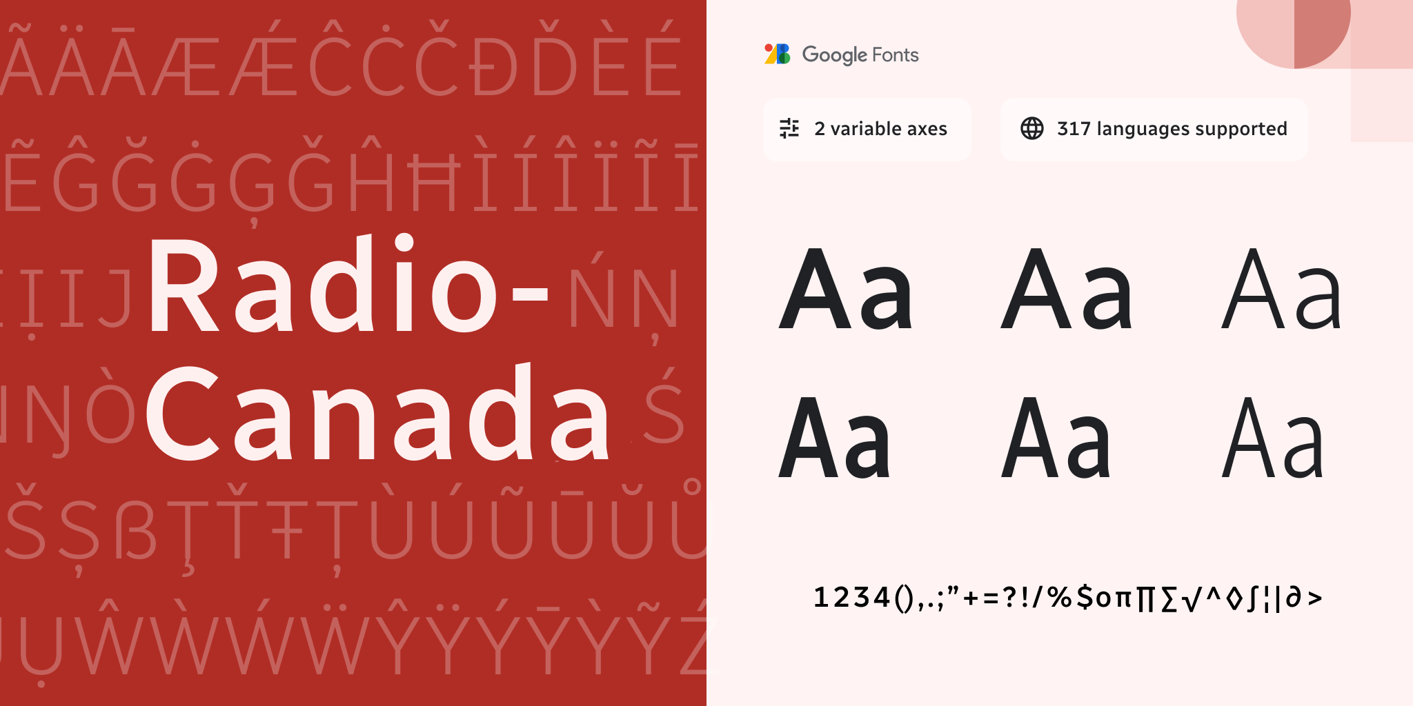
Plusieurs optimisations ont vu le jour en 2021 grâce à la collaboration d’Eli Heuer. Il a développé la fonction variable de la police de caractères basée sur les deux familles statiques, augmentant au passage les glyphes originaux (de 490 à 679) et les langues latines (de 106 à 317). 

En 2022, Jacques Le Bailly (Baron von Fonthausen), avec l’expertise d’Aaron Bell, a optimisé la police afin de supporter les langues autochtones du Canada (dont Sechelt, Algonquin, Ojibwé, Carrier, Chipewyan et d’autres langues ajoutées en continu).

La police Radio-Canada est offerte en deux styles (Romain et Italique), deux largeurs (Regulier et Condensé), et cinq graisses (Léger à Gras) ainsi qu’en fonte variable.

Publié par Susanna Zaraysky, Google Fonts Content Strategist


You can now use Radio-Canada’s brand typeface: The award-winning variable font comes to Google Fonts

Radio Canada character set, 2 variable axes, 317 languages supported


A typeface made to give a specific identity and distinction to the Canadian Broadcasting Corporation (CBC) and Radio-Canada’s public broadcasting platforms is now available on Google Fonts in many languages using the Latin writing system, including many indigenous languages spoken in Canada. 

CBC/Radio-Canada is Canada's national public broadcaster. Its mandate is to inform, enlighten, entertain, and strengthen Canadian culture and diversity on radio, television, and digital platforms. As part of this mandate, CBC/Radio-Canada is proud to release its original typeface publicly and make it available through Google Fonts.

The Radio-Canada typeface was created in 2017 by Montreal-based designer and typographer Charles Daoud, in collaboration with Coppers and Brasses and Alexandre Saumier Demers

The humanist style stands out with distinctive angles and subtle curves. In compliance with digital accessibility standards, the font’s x-height is intended to increase legibility, making it very effective when used in continuous text.


In 2018, the Radio-Canada typeface won three awards, in the Font Design category at Communication Arts Typography, Applied Arts Design Annual and at Grand Prix Grafika.

Several optimizations were made in 2021 thanks to Eli Heuer’s contributions. He expanded the static font into a variable font and increased the character set (490 to 679) and the number of supported Latin languages (106 to 317).  

In 2022, Jacques Le Bailly (Baron von Fonthausen), with the expertise of Aaron Bell, expanded the font to include support of indigenous languages used in Canada, such as Sechelt, Algonquin, Ojibway, Carrier, and Chipewyan (more languages to be released).

The Radio-Canada typeface is offered in two styles (Roman and Italic), two widths (Regular and Condensed), and five weights (Light to Bold); and as a variable font.

Posted by Susanna Zaraysky, Google Fonts Content Strategist