Tag Archives: Google Maps

An update on our COVID response priorities

 Our teams at Google continue to support the tireless work of hospitals, nonprofits, and public health service providers across the country. Right now, we’re focused on three priority areas: ensuring people can access the latest and most authoritative information; amplifying vital safety and vaccination messages; and providing financial backing for affected communities, health authorities and other organizations.

Providing critical and authoritative information

On all our platforms, we’re taking steps to surface the critical information families and communities need to care for their own health and look after others.

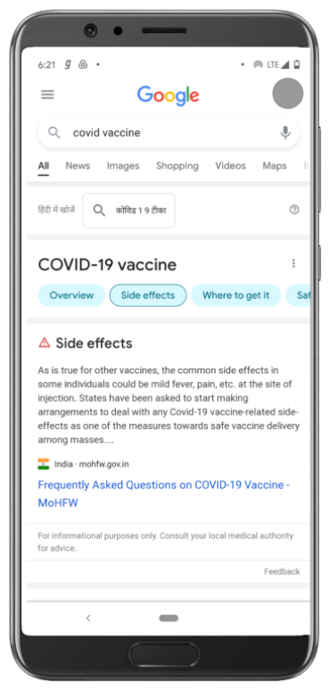
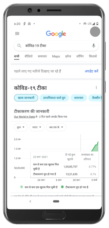
Searches on the COVID-19 vaccine display key information around side effects, effectiveness, and registration details, while treatment-related queries surface guidance from ministry resources

When people ask questions about vaccines on Google Search, they see information panels that display the latest updates on vaccine safety, efficacy and side-effects, plus registration information that directs users to the Co-WIN website. You will also find information about prevention, self-care, and treatment under the Prevention and Treatment tab, in easy-to-understand language sourced from authorised medical sources and the Ministry of Health and Family Welfare. 

On YouTube we’re surfacing authoritative information in a set of playlists, about vaccines, preventing the spread of COVID-19, and facts from experts on COVID-19 care.

Our YouTube India channel features a set of playlists to share tips and information on COVID-19 care 

Testing and vaccination center locations

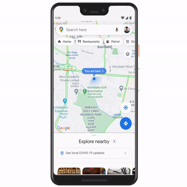
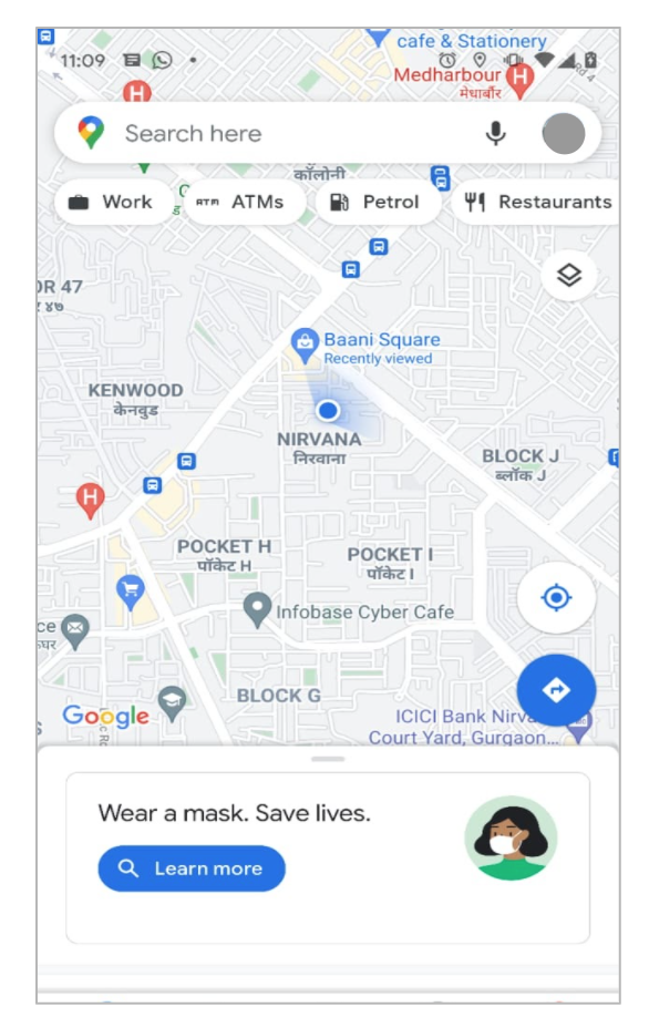
In addition to showing 2,500 testing centers on Search and Maps, we’re now sharing the locations of over 23,000 vaccination centers nationwide, in English and eight Indian languages. And we’re continuing to work closely with the Ministry of Health and Family Welfare to make more vaccination center information available to users throughout India.

Searching for vaccines in Maps and Search now shows over 23,000 vaccination centers across the country, in English and eight Indian languages

Pilot on hospital beds and medical oxygen availability

We know that some of the most crucial information people are searching for is the availability of hospital beds and access to medical oxygen. To help them find answers more easily, we’re testing a new feature using the Q&A function in Maps that enables people to ask about and share local information on availability of beds and medical oxygen in select locations. As this will be user generated content and not provided by authorised sources, it may be required to verify the accuracy and freshness of the information before utilizing it.

Amplifying vital safety and vaccination messages

As well as providing authoritative answers to queries, we’re using our channels to help extend the reach of health information campaigns. That includes the ‘Get the Facts’ around vaccines campaign, to encourage people to focus on authoritative information and content for vaccines. We’re also surfacing important safety messages through promotions on the Google homepage, Doodles and reminders within our apps and services.

Via the Google Search homepage and reminders within our apps and services, we are reminding people to stay safe and stay masked, and get authoritative information on vaccines

Supporting health authorities, organizations, and affected communities

Since the second wave began, we’ve been running an internal donation campaign to raise funds for nonprofit organizations helping those most in need, including GiveIndia, Charities Aid Foundation India, GOONJ, and United Way of Mumbai. This campaign has raised over $4.6 million (INR 33 crore) to date, and continues to generate much-needed support for relief efforts. 

We recognize that many more nonprofits need donations, and that Indians are eager to help where they can—so we’ve rolled out a COVID Aid campaign on Google Pay, featuring non-profit organizations like GiveIndia, Charities Aid Foundation, Goonj, Save the Children, Seeds, UNICEF India  (National NGOs) and United Way. We want to thank all our Google Pay users who have contributed to these organisations, and we hope this effort will make a difference where it matters most. 

On Google Pay people can contribute funds to non-profit organizations involved in COVID response

As India battles this devastating wave, we’ll keep doing all we can to support the selfless individuals and committed organizations on the front lines of the response. There’s a long way to go—but standing together in solidarity, working together with determination, we can and will turn the tide.  

Posted by the Covid Response team, Google India


Helping people find credible information as India gets into vaccination overdrive

Even as our country gradually returns to regular work and life, COVID-19 continues to be a reality for many. The commencement of vaccinations is a source of hope, especially with the second phase now underway, potentially targeting 100  million people who can benefit from it.

As the government continues to manage the logistics of the vaccine roll out -- one of the largest in the world -- it has taken proactive steps to provide timely, accurate, and science-based information about the vaccines to the public. This is crucial because instances of misinformation and disinformation about the vaccine,  its need, and it’s efficacy can seriously undermine this public health intervention.

As the government activates the processes involved in implementing these large-scale vaccinations, our teams have been hard at work to surface authoritative and timely information for people asking vaccine-related questions. We have worked with the Ministry of Health & Family Welfare (MoHFW) and the  Bill & Melinda Gates Foundation to amplify this science-based narrative around vaccination drive, and have been working closely with the Rapid Risk Response team at the MoHFW that is tracking misinformation using social media listening tools across region and languages, and countering it with science-based messaging on vaccines and pandemic response overall. 

Shortly after the first phase of vaccinations commenced, to help people find credible information we rolled out knowledge panels in Google Search that show up for queries relating to the COVID vaccine. These panels provide consolidated information such as details on the two vaccines, effectiveness, safety, distribution, side effects, and more, and is available in English and eight Indian languages (Tamil, Telugu, Malayalam, Kannada, Marathi, Gujarati, Bengali, and Hindi). This information is sourced from MoHFW, and provides answers to commonly asked questions, displays real-time statistics around vaccinations completed, and provides links to the MoHFW website for additional local resources.

Search queries on the COVID-19 vaccine display organized information on the subject including top news stories and resources from MoHFW on side effects, where to get it and more.

Our teams also supported the MoHFW in helping optimize their website for mobile viewers by improving the website’s page load times, enabling users to find information swiftly. We also helped localize their various vaccination resource pages into the eight Indian languages listed above.

On YouTube we launched information panels that show up when searching for COVID-related queries and also have a banner on the YouTube homepage, both of which redirect to key vaccine resources on the MoHFW website. We also featured FAQ videos from the MoHFW on the YouTube homepage.

With vaccinations for the vulnerable population having commenced from 1st March in thousands of hospitals across the country, we are also working with the MoHFW and the Bill & Melinda Gates Foundation to accurately surface the information on vaccination centers on Google Search, Maps and Google Assistant, and expect to roll this out in the coming weeks . 

To enable government officials as they make critical decisions during these vaccination rollouts, we also deliver regular Google Trends reports on COVID vaccine queries that reflect interest around the vaccination from month to month across regions.

As COVID-19 continues to challenge our communities, we remain committed to doing all we can to assist the country’s health agencies at this key juncture of the pandemic, where the successful rollout of these large-scale vaccinations can help us collectively turn a corner and see a much-needed return to normalcy.

Posted by the Google India team

Addressing Range Anxiety with Smart Electric Vehicle Routing

Mapping algorithms used for navigation often rely on Dijkstra’s algorithm, a fundamental textbook solution for finding shortest paths in graphs. Dijkstra’s algorithm is simple and elegant -- rather than considering all possible routes (an exponential number) it iteratively improves an initial solution, and works in polynomial time. The original algorithm and practical extensions of it (such as the A* algorithm) are used millions of times per day for routing vehicles on the global road network. However, due to the fact that most vehicles are gas-powered, these algorithms ignore refueling considerations because a) gas stations are usually available everywhere at the cost of a small detour, and b) the time needed to refuel is typically only a few minutes and is negligible compared to the total travel time.

This situation is different for electric vehicles (EVs). First, EV charging stations are not as commonly available as gas stations, which can cause range anxiety, the fear that the car will run out of power before reaching a charging station. This concern is common enough that it is considered one of the barriers to the widespread adoption of EVs. Second, charging an EV’s battery is a more decision-demanding task, because the charging time can be a significant fraction of the total travel time and can vary widely by station, vehicle model, and battery level. In addition, the charging time is non-linear — e.g., it takes longer to charge a battery from 90% to 100% than from 20% to 30%.

The EV can only travel a distance up to the illustrated range before needing to recharge. Different roads and different stations have different time costs. The goal is to optimize for the total trip time.

Today, we present a new approach for routing of EVs integrated into the latest release of Google Maps built into your car for participating EVs that reduces range anxiety by integrating recharging stations into the navigational route. Based on the battery level and the destination, Maps will recommend the charging stops and the corresponding charging levels that will minimize the total duration of the trip. To accomplish this we engineered a highly scalable solution for recommending efficient routes through charging stations, which optimizes the sum of the driving time and the charging time together.

The fastest route from Berlin to Paris for a gas fueled car is shown in the top figure. The middle figure shows the optimal route for a 400 km range EV (travel time indicated - charging time excluded), where the larger white circles along the route indicate charging stops. The bottom figure shows the optimal route for a 200 km range EV.

Routing Through Charging Stations
A fundamental constraint on route selection is that the distance between recharging stops cannot be higher than what the vehicle can reach on a full charge. Consequently, the route selection model emphasizes the graph of charging stations, as opposed to the graph of road segments of the road network, where each charging station is a node and each trip between charging stations is an edge. Taking into consideration the various characteristics of each EV (such as the weight, maximum battery level, plug type, etc.) the algorithm identifies which of the edges are feasible for the EV under consideration and which are not. Once the routing request comes in, Maps EV routing augments the feasible graph with two new nodes, the origin and the destination, and with multiple new (feasible) edges that outline the potential trips from the origin to its nearby charging stations and to the destination from each of its nearby charging stations.

Routing using Dijkstra’s algorithm or A* on this graph is sufficient to give a feasible solution that optimizes for the travel time for drivers that do not care at all about the charging time, (i.e., drivers who always fully charge their batteries at each charging station). However, such algorithms are not sufficient to account for charging times. In this case, the algorithm constructs a new graph by replicating each charging station node multiple times. Half of the copies correspond to entering the station with a partially charged battery, with a charge, x, ranging from 0%-100%. The other half correspond to exiting the station with a fractional charge, y (again from 0%-100%). We add an edge from the entry node at the charge x to the exit node at charge y (constrained by y > x), with a corresponding charging time to get from x to y. When the trip from Station A to Station B spends some fraction (z) of the battery charge, we introduce an edge between every exit node of Station A to the corresponding entry node of Station B (at charge x-z). After performing this transformation, using Dijkstra or A* recovers the solution.

An example of our node/edge replication. In this instance the algorithm opts to pass through the first station without charging and charges at the second station from 20% to 80% battery.

Graph Sparsification
To perform the above operations while addressing range anxiety with confidence, the algorithm must compute the battery consumption of each trip between stations with good precision. For this reason, Maps maintains detailed information about the road characteristics along the trip between any two stations (e.g., the length, elevation, and slope, for each segment of the trip), taking into consideration the properties of each type of EV.

Due to the volume of information required for each segment, maintaining a large number of edges can become a memory intensive task. While this is not a problem for areas where EV charging stations are sparse, there exist locations in the world (such as Northern Europe) where the density of stations is very high. In such locations, adding an edge for every pair of stations between which an EV can travel quickly grows to billions of possible edges.

The figure on the left illustrates the high density of charging stations in Northern Europe. Different colors correspond to different plug types. The figure on the right illustrates why the routing graph scales up very quickly in size as the density of stations increases. When there are many stations within range of each other, the induced routing graph is a complete graph that stores detailed information for each edge.

However, this high density implies that a trip between two stations that are relatively far apart will undoubtedly pass through multiple other stations. In this case, maintaining information about the long edge is redundant, making it possible to simply add the smaller edges (spanners) in the graph, resulting in sparser, more computationally feasible, graphs.

The spanner construction algorithm is a direct generalization of the greedy geometric spanner. The trips between charging stations are sorted from fastest to slowest and are processed in that order. For each trip between points a and b, the algorithm examines whether smaller subtrips already included in the spanner subsume the direct trip. To do so it compares the trip time and battery consumption that can be achieved using subtrips already in the spanner, against the same quantities for the direct a-b route. If they are found to be within a tiny error threshold, the direct trip from a to b is not added to the spanner, otherwise it is. Applying this sparsification algorithm has a notable impact and allows the graph to be served efficiently in responding to users’ routing requests.

On the left is the original road network (EV stations in light red). The station graph in the middle has edges for all feasible trips between stations. The sparse graph on the right maintains the distances with much fewer edges.

Summary
In this work we engineer a scalable solution for routing EVs on long trips to include access to charging stations through the use of graph sparsification and novel framing of standard routing algorithms. We are excited to put algorithmic ideas and techniques in the hands of Maps users and look forward to serving stress-free routes for EV drivers across the globe!

Acknowledgements
We thank our collaborators Dixie Wang, Xin Wei Chow, Navin Gunatillaka, Stephen Broadfoot, Alex Donaldson, and Ivan Kuznetsov.

Source: Google AI Blog


Improving Indian Language Transliterations in Google Maps

Nearly 75% of India’s population — which possesses the second highest number of internet users in the world — interacts with the web primarily using Indian languages, rather than English. Over the next five years, that number is expected to rise to 90%. In order to make Google Maps as accessible as possible to the next billion users, it must allow people to use it in their preferred language, enabling them to explore anywhere in the world.

However, the names of most Indian places of interest (POIs) in Google Maps are not generally available in the native scripts of the languages of India. These names are often in English and may be combined with acronyms based on the Latin script, as well as Indian language words and names. Addressing such mixed-language representations requires a transliteration system that maps characters from one script to another, based on the source and target languages, while accounting for the phonetic properties of the words as well.

For example, consider a user in Ahmedabad, Gujarat, who is looking for a nearby hospital, KD Hospital. They issue the search query, કેડી હોસ્પિટલ, in the native script of Gujarati, the 6th most widely spoken language in India. Here, કેડી (“kay-dee”) is the sounding out of the acronym KD, and હોસ્પિટલ is “hospital”. In this search, Google Maps knows to look for hospitals, but it doesn't understand that કેડી is KD, hence it finds another hospital, CIMS. As a consequence of the relative sparsity of names available in the Gujarati script for places of interest (POIs) in India, instead of their desired result, the user is shown a result that is further away.

To address this challenge, we have built an ensemble of learned models to transliterate names of Latin script POIs into 10 languages prominent in India: Hindi, Bangla, Marathi, Telugu, Tamil, Gujarati, Kannada, Malayalam, Punjabi, and Odia. Using this ensemble, we have added names in these languages to millions of POIs in India, increasing the coverage nearly twenty-fold in some languages. This will immediately benefit millions of existing Indian users who don't speak English, enabling them to find doctors, hospitals, grocery stores, banks, bus stops, train stations and other essential services in their own language.

Transliteration vs. Transcription vs. Translation

Our goal was to design a system that will transliterate from a reference Latin script name into the scripts and orthographies native to the above-mentioned languages. For example, the Devanagari script is the native script for both Hindi and Marathi (the language native to Nagpur, Maharashtra). Transliterating the Latin script names for NIT Garden and Chandramani Garden, both POIs in Nagpur, results in एनआईटी गार्डन and चंद्रमणी गार्डन, respectively, depending on the specific language’s orthography in that script.

It is important to note that the transliterated POI names are not translations. Transliteration is only concerned with writing the same words in a different script, much like an English language newspaper might choose to write the name Горбачёв from the Cyrillic script as “Gorbachev” for their readers who do not read the Cyrillic script. For example, the second word in both of the transliterated POI names above is still pronounced “garden”, and the second word of the Gujarati example earlier is still “hospital” — they remain the English words “garden” and “hospital”, just written in the other script. Indeed, common English words are frequently used in POI names in India, even when written in the native script. How the name is written in these scripts is largely driven by its pronunciation; so एनआईटी from the acronym NIT is pronounced “en-aye-tee”, not as the English word “nit”. Knowing that NIT is a common acronym from the region is one piece of evidence that can be used when deriving the correct transliteration.

Note also that, while we use the term transliteration, following convention in the NLP community for mapping directly between writing systems, romanization in South Asian languages regardless of the script is generally pronunciation-driven, and hence one could call these methods transcription rather than transliteration. The task remains, however, mapping between scripts, since pronunciation is only relatively coarsely captured in the Latin script for these languages, and there remain many script-specific correspondences that must be accounted for. This, coupled with the lack of standard spelling in the Latin script and the resulting variability, is what makes the task challenging.

Transliteration Ensemble

We use an ensemble of models to automatically transliterate from the reference Latin script name (such as NIT Garden or Chandramani Garden) into the scripts and orthographies native to the above-mentioned languages. Candidate transliterations are derived from a pair of sequence-to-sequence (seq2seq) models. One is a finite-state model for general text transliteration, trained in a manner similar to models used by Gboard on-device for transliteration keyboards. The other is a neural long short-term memory (LSTM) model trained, in part, on the publicly released Dakshina dataset. This dataset contains Latin and native script data drawn from Wikipedia in 12 South Asian languages, including all but one of the languages mentioned above, and permits training and evaluation of various transliteration methods. Because the two models have such different characteristics, together they produce a greater variety of transliteration candidates.

To deal with the tricky phenomena of acronyms (such as the “NIT” and “KD” examples above), we developed a specialized transliteration module that generates additional candidate transliterations for these cases.

For each native language script, the ensemble makes use of specialized romanization dictionaries of varying provenance that are tailored for place names, proper names, or common words. Examples of such romanization dictionaries are found in the Dakshina dataset.

Scoring in the Ensemble

The ensemble combines scores for the possible transliterations in a weighted mixture, the parameters of which are tuned specifically for POI name accuracy using small targeted development sets for such names.

For each native script token in candidate transliterations, the ensemble also weights the result according to its frequency in a very large sample of on-line text. Additional candidate scoring is based on a deterministic romanization approach derived from the ISO 15919 romanization standard, which maps each native script token to a unique Latin script string. This string allows the ensemble to track certain key correspondences when compared to the original Latin script token being transliterated, even though the ISO-derived mapping itself does not always perfectly correspond to how the given native script word is typically written in the Latin script.

In aggregate, these many moving parts provide substantially higher quality transliterations than possible for any of the individual methods alone.

Coverage

The following table provides the per-language quality and coverage improvements due to the ensemble over existing automatic transliterations of POI names. The coverage improvement measures the increase in items for which an automatic transliteration has been made available. Quality improvement measures the ratio of updated transliterations that were judged to be improvements versus those that were judged to be inferior to existing automatic transliterations.

Language 

Coverage Improvement

Quality Improvement

Hindi

3.2x

1.8x

Bengali

19x

3.3x

Marathi

19x

2.9x

Telugu

3.9x

2.6x

Tamil

19x

3.6x

Gujarati

19x

2.5x

Kannada

24x

2.3x

Malayalam

24x

1.7x

Odia

960x

*

Punjabi

24x

*


* Unknown / No Baseline.


Conclusion

As with any machine learned system, the resulting automatic transliterations may contain a few errors or infelicities, but the large increase in coverage in these widely spoken languages marks a substantial expansion of the accessibility of information within Google Maps in India. Future work will include using the ensemble for transliteration of other classes of entities within Maps and its extension to other languages and scripts, including Perso-Arabic scripts, which are also commonly used in the region.


Acknowledgments: This work was a collaboration between the authors and Jacob Farner, Jonathan Herbert, Anna Katanova, Andre Lebedev, Chris Miles, Brian Roark, Anurag Sharma, Kevin Wang, Andy Wildenberg, and many others.

Posted by Cibu Johny, Software Engineer, Google Research and Saumya Dalal, Product Manager, Google Geo


Improving Indian Language Transliterations in Google Maps

Nearly 75% of India’s population — which possesses the second highest number of internet users in the world — interacts with the web primarily using Indian languages, rather than English. Over the next five years, that number is expected to rise to 90%. In order to make Google Maps as accessible as possible to the next billion users, it must allow people to use it in their preferred language, enabling them to explore anywhere in the world.

However, the names of most Indian places of interest (POIs) in Google Maps are not generally available in the native scripts of the languages of India. These names are often in English and may be combined with acronyms based on the Latin script, as well as Indian language words and names. Addressing such mixed-language representations requires a transliteration system that maps characters from one script to another, based on the source and target languages, while accounting for the phonetic properties of the words as well.

For example, consider a user in Ahmedabad, Gujarat, who is looking for a nearby hospital, KD Hospital. They issue the search query, કેડી હોસ્પિટલ, in the native script of Gujarati, the 6th most widely spoken language in India. Here, કેડી (“kay-dee”) is the sounding out of the acronym KD, and હોસ્પિટલ is “hospital”. In this search, Google Maps knows to look for hospitals, but it doesn't understand that કેડી is KD, hence it finds another hospital, CIMS. As a consequence of the relative sparsity of names available in the Gujarati script for places of interest (POIs) in India, instead of their desired result, the user is shown a result that is further away.


To address this challenge, we have built an ensemble of learned models to transliterate names of Latin script POIs into 10 languages prominent in India: Hindi, Bangla, Marathi, Telugu, Tamil, Gujarati, Kannada, Malayalam, Punjabi, and Odia. Using this ensemble, we have added names in these languages to millions of POIs in India, increasing the coverage nearly twenty-fold in some languages. This will immediately benefit millions of existing Indian users who don't speak English, enabling them to find doctors, hospitals, grocery stores, banks, bus stops, train stations and other essential services in their own language.

Transliteration vs. Transcription vs. Translation
Our goal was to design a system that will transliterate from a reference Latin script name into the scripts and orthographies native to the above-mentioned languages. For example, the Devanagari script is the native script for both Hindi and Marathi (the language native to Nagpur, Maharashtra). Transliterating the Latin script names for NIT Garden and Chandramani Garden, both POIs in Nagpur, results in एनआईटी गार्डन and चंद्रमणी गार्डन, respectively, depending on the specific language’s orthography in that script.

It is important to note that the transliterated POI names are not translations. Transliteration is only concerned with writing the same words in a different script, much like an English language newspaper might choose to write the name Горбачёв from the Cyrillic script as “Gorbachev” for their readers who do not read the Cyrillic script. For example, the second word in both of the transliterated POI names above is still pronounced “garden”, and the second word of the Gujarati example earlier is still “hospital” — they remain the English words “garden” and “hospital”, just written in the other script. Indeed, common English words are frequently used in POI names in India, even when written in the native script. How the name is written in these scripts is largely driven by its pronunciation; so एनआईटी from the acronym NIT is pronounced “en-aye-tee”, not as the English word “nit”. Knowing that NIT is a common acronym from the region is one piece of evidence that can be used when deriving the correct transliteration.

Note also that, while we use the term transliteration, following convention in the NLP community for mapping directly between writing systems, romanization in South Asian languages regardless of the script is generally pronunciation-driven, and hence one could call these methods transcription rather than transliteration. The task remains, however, mapping between scripts, since pronunciation is only relatively coarsely captured in the Latin script for these languages, and there remain many script-specific correspondences that must be accounted for. This, coupled with the lack of standard spelling in the Latin script and the resulting variability, is what makes the task challenging.

Transliteration Ensemble
We use an ensemble of models to automatically transliterate from the reference Latin script name (such as NIT Garden or Chandramani Garden) into the scripts and orthographies native to the above-mentioned languages. Candidate transliterations are derived from a pair of sequence-to-sequence (seq2seq) models. One is a finite-state model for general text transliteration, trained in a manner similar to models used by Gboard on-device for transliteration keyboards. The other is a neural long short-term memory (LSTM) model trained, in part, on the publicly released Dakshina dataset. This dataset contains Latin and native script data drawn from Wikipedia in 12 South Asian languages, including all but one of the languages mentioned above, and permits training and evaluation of various transliteration methods. Because the two models have such different characteristics, together they produce a greater variety of transliteration candidates.

To deal with the tricky phenomena of acronyms (such as the “NIT” and “KD” examples above), we developed a specialized transliteration module that generates additional candidate transliterations for these cases.

For each native language script, the ensemble makes use of specialized romanization dictionaries of varying provenance that are tailored for place names, proper names, or common words. Examples of such romanization dictionaries are found in the Dakshina dataset.

Scoring in the Ensemble
The ensemble combines scores for the possible transliterations in a weighted mixture, the parameters of which are tuned specifically for POI name accuracy using small targeted development sets for such names.

For each native script token in candidate transliterations, the ensemble also weights the result according to its frequency in a very large sample of on-line text. Additional candidate scoring is based on a deterministic romanization approach derived from the ISO 15919 romanization standard, which maps each native script token to a unique Latin script string. This string allows the ensemble to track certain key correspondences when compared to the original Latin script token being transliterated, even though the ISO-derived mapping itself does not always perfectly correspond to how the given native script word is typically written in the Latin script.

In aggregate, these many moving parts provide substantially higher quality transliterations than possible for any of the individual methods alone.

Coverage
The following table provides the per-language quality and coverage improvements due to the ensemble over existing automatic transliterations of POI names. The coverage improvement measures the increase in items for which an automatic transliteration has been made available. Quality improvement measures the ratio of updated transliterations that were judged to be improvements versus those that were judged to be inferior to existing automatic transliterations.

  Coverage Quality
Language   Improvement    Improvement
Hindi 3.2x 1.8x
Bengali 19x 3.3x
Marathi 19x 2.9x
Telugu 3.9x 2.6x
Tamil 19x 3.6x
Gujarati 19x 2.5x
Kannada 24x 2.3x
Malayalam 24x 1.7x
Odia 960x *
Punjabi 24x *
* Unknown / No Baseline.

Conclusion
As with any machine learned system, the resulting automatic transliterations may contain a few errors or infelicities, but the large increase in coverage in these widely spoken languages marks a substantial expansion of the accessibility of information within Google Maps in India. Future work will include using the ensemble for transliteration of other classes of entities within Maps and its extension to other languages and scripts, including Perso-Arabic scripts, which are also commonly used in the region.

Acknowledgments
This work was a collaboration between the authors and Jacob Farner, Jonathan Herbert, Anna Katanova, Andre Lebedev, Chris Miles, Brian Roark, Anurag Sharma, Kevin Wang, Andy Wildenberg, and many others.

Source: Google AI Blog


“L10n” – Localisation: Breaking down language barriers to unleash the benefits of the internet for all Indians

In July, at the Google for India event, we outlined our vision to make the Internet helpful for a billion Indians, and power the growth of India’s digital economy. One critical area that we need to overcome is the challenge of India’s vast linguistic diversity, with dialects changing every hundred kilometres. More often than not, one language doesn’t seamlessly map to another. A word in Bengali roughly translates to a full sentence in Tamil and there are expressions in Urdu which have no adequately evocative equivalent in Hindi. 


This poses a formidable challenge for technology developers, who rely on commonly understood visual and spoken idioms to make tech products work universally. 


We realised early on that there was no way to simplify this challenge - that there wasn’t any one common minimum that could address the needs of every potential user in this country. If we hoped to bring the potential of the internet within reach of every user in India, we had to invest in building products, content and tools in every popularly spoken Indian language. 


India’s digital transformation will be incomplete if English proficiency continues to be the entry barrier for basic and potent uses of the Internet such as buying and selling online, finding jobs, using net banking and digital payments or getting access to information and registering for government schemes.


The work, though underway, is far from done. We are driving a 3-point strategy to truly digitize India:


  1. Invest in ML & AI efforts at Google’s research center in India, to make advances in machine learning and AI models accessible to everyone across the ecosystem.

  2. Partner with innovative local startups who are building solutions to cater to the needs of Indians in local languages

  3. Drastically improve the experience of Google products and services for Indian language users


And so today, we are happy to announce a range of features to help deliver an even richer language experience to millions across India.

Easily toggling between English and Indian language results

Four years ago we made it easier for people in states with a significant Hindi-speaking population to flip between English and Hindi results for a search query, by introducing a simple ‘chip’ or tab they could tap to see results in their preferred language. In fact, since the launch of this Hindi chip and other language features, we have seen more than a 10X increase in Hindi queries in India.

We are now making it easier to toggle Search results between English and four additional Indian languages: Tamil, Telugu, Bangla and Marathi.

People can now tap a chip to see Search results in their local language

Understanding which language content to surface, when

Typing in an Indian language in its native script is typically more difficult, and can often take three times as long, compared to English. As a result, many people search in English even if they really would prefer to see results in a local language they understand.

Search will show relevant results in more Indian languages

Over the next month, Search will start to show relevant content in supported Indian languages where appropriate, even if the local language query is typed in English. This functionality will also better serve bilingual people who are comfortable reading both English and an Indian language. It will roll out in five Indian languages: Hindi, Bangla, Marathi, Tamil, and Telugu.

Enabling people to use apps in the language of their choice

Just like you use different tools for different tasks, we know (because we do it ourselves) people often select a specific language for a particular situation. Rather than guessing preferences, we launched the ability to easily change the language of Google Assistant and Discover to be different from the phone language. Today in India, more than 50 percent of the content viewed on Google Discover is in Indian languages. A third of Google Assistant users in India are using it in an Indian language, and since the launch of Assistant language picker, queries in Indian languages have doubled.

Maps will now able people to select up to nine Indian languages

We are now extending this ability to Google Maps, where users can quickly and easily change their Maps experience into one of nine Indian languages, by simply opening the app, going to Settings, and tapping ‘App language’. This will allow anyone to search for places, get directions and navigation, and interact with the Map in their preferred local language.

Homework help in Hindi (and English)

Meaning is also communicated with images: and this is where Google Lens can help. From street signs to restaurant menus, shop names to signboards, Google Lens lets you search what you see, get things done faster, and understand the world around you—using just your camera or a photo. In fact more people use Google Lens in India every month than in any other country worldwide. As an example of its popularity, over 3 billion words have been translated in India with Lens in 2020.

Lens is particularly helpful for students wanting to learn about the world. If you’re a parent, you’ll be familiar with your kids asking you questions about homework. About stuff you never thought you’d need to remember, like... quadratic equations.

Google Lens can now help you solve math problems by simply pointing your camera 

Now, right from the Search bar in the Google app, you can use Lens to snap a photo of a math problem and learn how to solve it on your own, in Hindi (or English). To do this, Lens first turns an image of a homework question into a query. Based on the query, we will show step-by-step guides and videos to help explain the problem.

Helping computer systems understand Indian languages at scale

At Google Research India, we have spent a lot of time helping computer systems understand human language. As you can imagine, this is quite an exciting challenge.The new approach we developed in India is called Multilingual Representations for Indian Languages (or ‘MuRIL’). Among many other benefits of this powerful multilingual model that scales across languages, MuRIL also provides support for transliterated text such as when writing Hindi using Roman script, which was something missing from previous models of its kind. 

One of the many tasks MuRIL is good at, is determining the sentiment of the sentence. For example, “Achha hua account bandh nahi hua” would previously be interpreted as having a negative meaning, but MuRIL correctly identifies this as a positive statement. Or take the ability to classify a person versus a place: ‘Shirdi ke sai baba’ would previously be interpreted as a place, which is wrong, but MuRIL correctly interprets it as a person.

MuRIL currently supports 16 Indian languages as well as English -- the highest coverage for Indian languages among any other publicly available model of its kind.

MuRIL is free & Open Source,

available on TensorFlow Hub

https://tfhub.dev/google/MuRIL/1


We are thrilled to announce that we have made MuRIL open source, and it is currently available to download from the TensorFlow Hub, for free. We hope MuRIL will be the next big evolution for Indian language understanding, forming a better foundation for researchers, students, startups, and anyone else interested in building Indian language technologies, and we can’t wait to see the many ways the ecosystem puts it to use.

We’re sharing this to provide a flavor of the depth of work underway -- and which is required -- to really make a universally potent and accessible Internet a reality. This said, the Internet in India is the sum of the work of millions of developers, content creators, news media and online businesses, and it is only when this effort is undertaken at scale by the entire ecosystem, that we will help fulfil the truly meaningful promise of the billionth Indian coming online.

Posted by the Google India team


How a group of young developers want to help us vote

Posted by Erica Hanson, Global Program Manager, Google Developer Student Clubs

Stevens Institute of Technology’s Google Developer Student Club. Names left to right: Tim Leonard, Will Escamilla, Rich Bilotti, Justin O'Boyle, Luke Mizus, and Rachael Kondra

The Google Developer Student Club at the Stevens Institute of Technology built their own website that makes local government data user friendly for voters in local districts. The goal: Take obscure budget and transportation information, display it via an easy-to-understand UI, and help voters become more easily informed.

When Tim Leonard first moved to Hoboken, New Jersey to start school at the Stevens Institute of Technology, he was interested in anything but government. A computer science major with a deep interest in startups, one was more likely to find him at a lecture on computational structures than on political science.

However, as the founder of the Google Developer Student Club (DSC) chapter at his university, Tim and his fellow classmates had the opportunity to make the trip into New York City to attend a developer community meetup with Ralph Yozzo, a community organizer from Google Developer Groups (GDG) NYC. While Ralph had given several talks on different technologies and programming techniques, this time he decided to try something new: Government budgets.

A slide from Ralph’s presentation

Titled “Why we should care about budgets,” Ralph’s talk to the young programmers focused on why tracking government spending in their community matters. He further explained how public budgets fund many parts of our lives - from getting to work, to taking care of our health, to going to a good school. However, Ralph informed them that while there are currently laws that attempt to make this data public, a platform that makes this information truly accessible didn’t exist. Instead, most of this information is tucked away in different corners of the internet; unorganized, and hard to understand.

Tim soon realized programming could be the solution and that his team had the chance to grow in a whole new way, outside of the traditional classroom setting. With Ralph’s encouragement, Tim and his team started thinking about how they could build a platform to collect all of this data, and provide a UI that’s easy for any user to interact with. By creating a well-organized website that could pull all of this local information, streamline it, and produce easy-to-understand graphics, the DSC Stevens team imagined they could have an impact on how voters inform themselves before casting their ballots at local elections.

“What if we had a technical approach to local government? Where our site would have actionable metrics that held us accountable for getting information out to the public.”

Tim thought if local voters could easily understand how their representatives were spending their community’s money, they could use it as a new framework to decide how to vote. The next step was to figure out the best way to get started.

An image from the demo site

The DSC Stevens team quickly agreed that their goal should be to build a website about their own city, Hoboken. They named it “Project Crystal” and started taking Google App Engine courses and conducting Node.js server run throughs. With the data they would eventually store and organize, they also dove into Google Cloud demos and workshops on Google Charts. They were determined to build something that would store public information in a different way.

“Bounce rates and click through metrics ensure we evaluate our site like a startup. Instead of selling a product, our platform would focus on getting people to interact with the data that shapes their everyday lives.”

After participating in different courses on how to use Google Cloud, Maps, and Charts, they finally put it all together and created the first version of their idea - an MVP site, built to drive user engagement, that would serve as their prototype.

A video explaining the Project Crystal website

Complete with easy-to-understand budget charts, contact information for different public officials, and maps to help users locate important services, the prototype site has been their first major step in turning complicated data into actionable voting information. Excited about their progress, Tim wants to eventually host the site on Google Cloud so his team can store more data and offer the platform to local governments across the country.

Image of the DSC Steven's team adding Google Charts to their demo site

The DSC Stevens team agrees, access to resources like Project Crystal could change how we vote. They hope with the right technical solutions around data, voters will be better informed, eager to ask more of their representatives, and more willing to participate in the day-to-day work of building their communities, together.

“Our advice to other student developers is to find outlets, like DSC, that enable you to think about helping others. For us, it was figuring out how to use our Google Cloud credits for good.”

Want to start a project of your own? If you’re a university student, join a Developer Student Club near you. If you’re a professional, find the right Google Developer Group for you.

Environmental Insights Explorer Expands: 100 Australian councils and counting

Environmental Insights Explorer 

Reducing greenhouse gas (GHG) emissions is a crucial step in fighting the climate crisis. And cities now account for more than 70 percent of global emissions. But measuring exactly which activities—whether it’s buildings, cars, or public transport—are contributing to emissions, and by how much, is complex. Without this information, cities can neither understand the challenges they face, nor the impact of their environmental policies. 

This is the problem we’re working to solve with Environmental Insights Explorer (EIE), an online platform that provides building and transportation emissions, as well as solar potential analysis to make it easier for cities to measure progress against their climate action plans. Launched in 2018 for a handful of cities around the world including Melbourne, with Sydney, Canberra and Adelaide then added in 2019, EIE has helped councils accelerate GHG reduction efforts. Today, we’ve expanded EIE data access to thousands of cities worldwide, including 100+ Australian councils. 

To scale data access to local governments, policy makers and community groups, we’re also developing partnerships with leading Australian organisations, councils, and climate change experts. This includes a new partnership with Ironbark Sustainability and Beyond Zero Emissions to make EIE transportation data available for 100+ councils in Snapshot—a free tool that calculates major sources of carbon emissions, including stationary energy, transport, waste, agriculture, and land-use change. Snapshot allows municipalities to easily compare their sources of carbon emissions. This data integration will provide updated GHG profiles and enable local government policy decision-making for more than 86 percent of the country's population to put councils on a fast track for delivering commitments, building local resilience, and ensuring economic recovery. 
Accelerated city-wide analysis 
By analysing Google’s comprehensive global mapping data together with GHG emission factors, EIE estimates city-scale building and transportation carbon emissions data with the ability to drill down into more specific data such as vehicle-kilometres travelled by mode (automobiles, public transit, biking, etc.) and the percentage of emissions generated by residential or non-residential buildings. 
The insights that EIE provides have traditionally required many months of research, and a lot of resources for cities undertaking a climate action plan. Using Google’s proprietary data coupled with machine learning capabilities, we can produce a complete survey of a city that can be assessed very quickly. In this way, EIE allows cities to leapfrog tedious and costly data collection and analysis. 
EIE transport data now available in Snapshot for 100+ councils 

The next chapter 
Over the next few months, we’ll be working together to help Australian councils learn more about data insights from EIE and expand data coverage to more councils. We hope that by making EIE data accessible to more councils across Australia, we’ll help nurture an ecosystem that can bring climate action plans to life. 


Helping the Haitian economy, one line of code at a time

Posted by Jennifer Kohl, Program Manager, Developer Community Programs

Picture

Eustache Luckens Yadley at a GDG Port-au-Prince meetup

Meet Eustache Luckens Yadley, or “Yadley” for short. As a web developer from Port-au-Prince, Yadley has spent his career building web applications that benefit the local Haitian economy. Whether it’s ecommerce platforms that bring local sellers to market or software tools that help local businesses operate more effectively, Yadley has always been there with a technical hand to lend.

However, Yadley has also spent his career watching Haiti’s unemployment numbers rise to among the highest in the Caribbean. As he describes it,


“Every day, several thousand young people have no job to get by.”


So with code in mind and mouse in hand, Yadley got right to work. His first step was to identify a need in the economy. He soon figured out that Haiti had a shortage of delivery methods for consumers, making home delivery purchases of any kind extremely unreliable. With this observation, Yadley also noticed that there was a surplus of workers willing to deliver the goods, but no infrastructure to align their needs with that of the market’s.

picture

Yadley watching a demo at a GDG Port-au-Prince meetup

In this moment, Yadley did what many good developers would do: build an app. He created the framework for what is now called “Livrezonpam,” an application that allows companies to post where and when they need a particular product delivered and workers to find the corresponding delivery jobs closest to them.

With a brilliant solution, Yadley’s last step was to find the right technical tools to build the concept out and make it a viable platform that users could work with to their benefit.

It was at this crucial step when Yadley found the Port-au-Prince Google Developer Group. With GDG Port-au-Prince, Yadley was able to bring his young app right into the developer community, run different demos of his product to experienced users, and get feedback from a wide array of developers with an intimate knowledge of the Haitian tech scene. The takeaways from working in the community translated directly to his work. Yadley learned how to build with the Google Cloud Platform Essentials, which proved key in managing all the data his app now collects. He also learned how to get the Google Maps Platform API working for his app, creating a streamlined user experience that helped workers and companies in Haiti locate one another with precision and ease.

picture

This wide array of community technical resources, from trainings, to mentors, to helpful friends, allowed Yadley to grow his knowledge of several Google technologies, which in turn allowed him to grow his app for the Haitian community.

Today, Yadley is still an active member of the GDG community, growing his skills and those of the many friends around him. And at the same time, he is still growing Librezonpam on the Google Play App Store to help local businesses reach their customers and bring more jobs directly to the people of Haiti.


Ready to start building with a Google Developer Group near you? Find the closest community to you, here.